Purple is derived by mixing to primary color, blue and red – by this, we call it as a secondary color. The complement is yellow.
Physiological effect: strong hues of purple release energy, help creativity and memory. Pastel hues are relaxing, provide the feeling of protection, work against insomnia. In symbolism, it is associated to knowledge, mystique and wisdom. In movies and storybooks, dark hues are often displayed on the clothes of wizards, while light hues can be seen on dress of fairies. Reminds us to splendour and richness. Long ago it was a color of mourning of the French royal house.
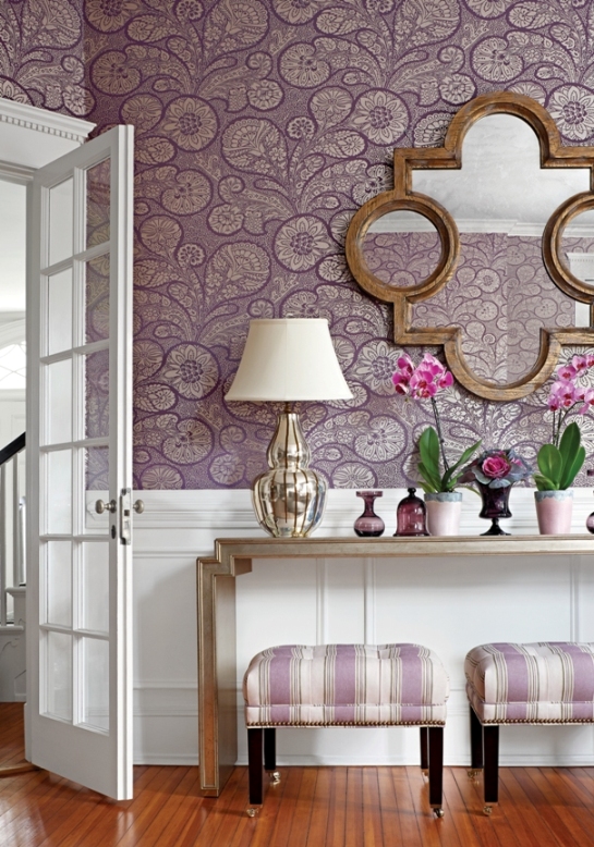
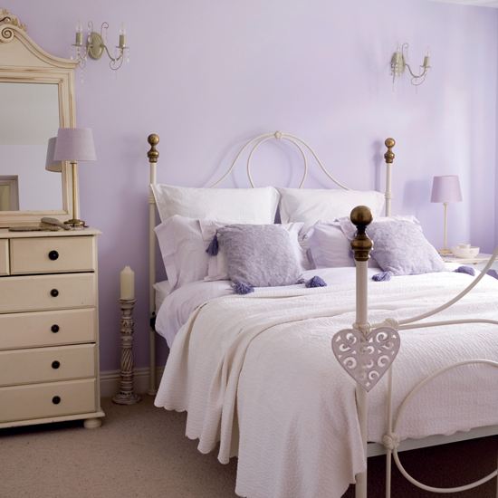
Purple can be cold and warm color depending on blue or red component predominates. Relatively new color in interior design, nowadays it is very popular. Darker and stronger hues can be perfectly combined to white, black or grey. Light hues look good with crème or light green. Combining purple with silver results a luxurious effect. It can be perfect in bedroom, child-room or playing room (light hues), or in wardrobes, home office or movie room (dark hues). Lavender is a favourite color of romantic, country styles. Since it is not a food color, we can use it carefully in kitchen, dining room, maybe on the accessories. Purple is the most loved color of 75% of the children under the age of 13.
According to feng shui, purple strengthens in changes and provides spiritual help. Assigned to the 6th chakra (third eye).
Since this color is a little bit “too much” in itself, and it can have strong, dramatic effect, for implementing a tasteful purple interior, ask help from an interior designer.