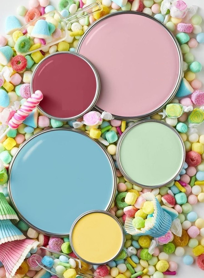
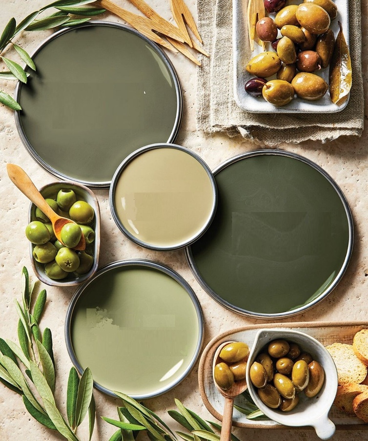
Inspiring summer color palettes: elegant tea party, amusement park, Mediterranean cruise
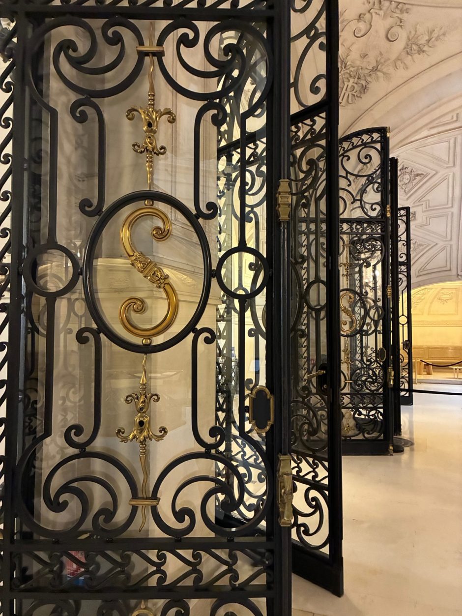
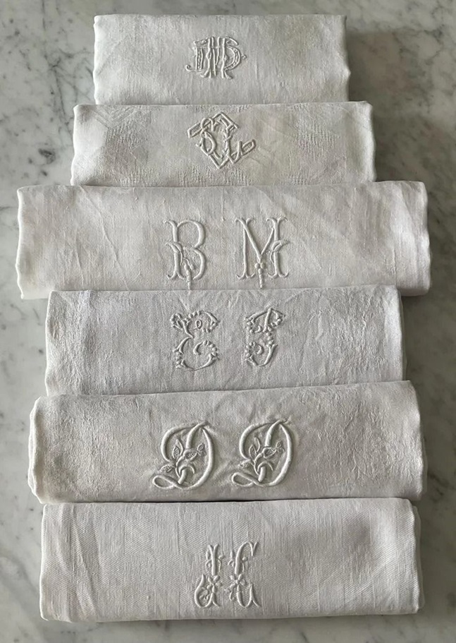
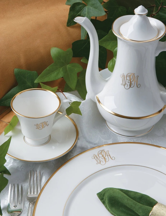
Monograms
The widespread use of monograms on household items began in the Middle Ages. They usually appeared as a combination of the initials and a noble coat of arms and were typically placed on personal objects: not for decorative purposes, but to indicate ownership.
By the mid-19th century, the use of monograms was adopted by the middle class. Since they did not have coats of arms, they made do with monograms that were comprised solely of their initials.
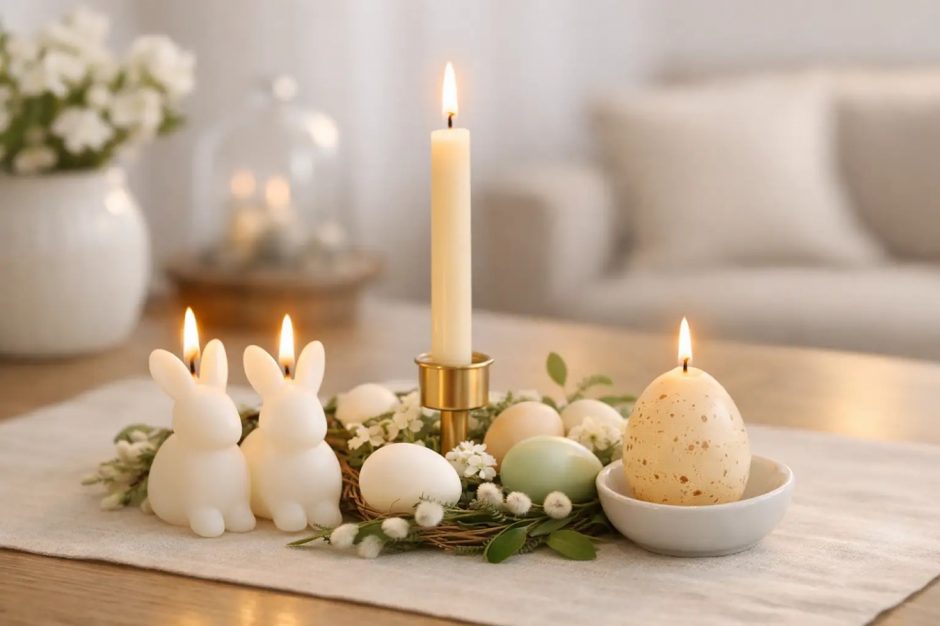
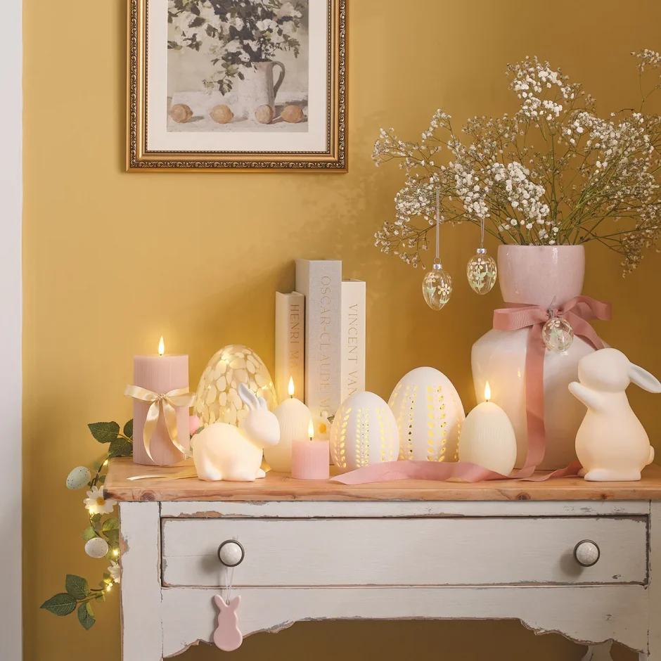
Easter candles
Although the days are already long at Easter, candles can make this holiday much cosier too
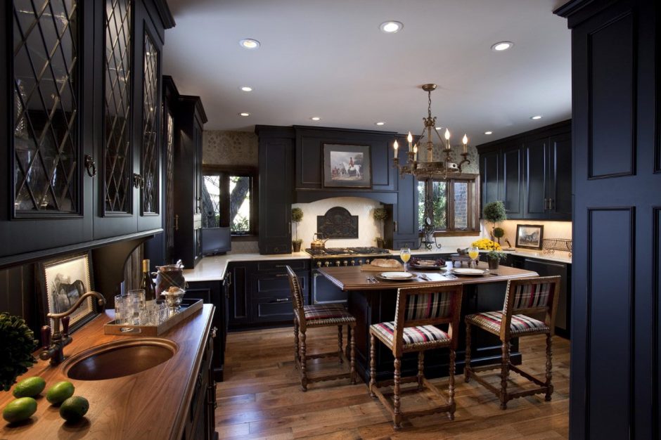
Dark Academia style
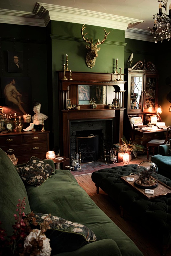
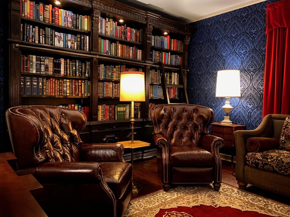
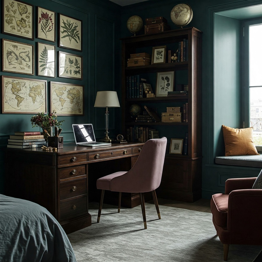
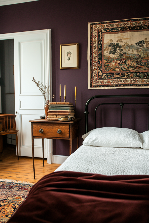
Dark Academia style is a recently popped-up trend in interior design. It is not just about decoration but conveys a whole lifestyle: finally, the classic literacy, desire of knowledge, love of literature and science are again in the spotlight. It draws heavily on Gothic and Victorian styles, but at the same time strives to create a sense of coziness and comfort.
The most important characteristic of Dark Academia style is the color palette. Almost any rich, deep shade work well with it, creating a comfortable, contemplative atmosphere. Tha base colors can be: forest green, chocolate brown, burgundy, navy blue, charcoal, deep purple and of course, black. These are balanced by a bit lighter but elegant colors of the accessories: gold, cream, deep amber, dark red. The key is the balance between these.
The most effective way creating the style in a living space is using wallpaper. Classic patterns will be the good choices in this case also: damask, woven patterns (e.g. linen-imitation), toile, striped. The tone-on-tone effect is important, so the base color is dark and the pattern is a slightly lighter shade, maybe with a metallic effect.
Let’s think about an old library or an office of a professor while furnishing a room. The most important furniture of the style are: bookshelves or bookcases, leather armchair, vintage wooden desk, bed with dark wood or black wrought iron-like headboard, buttoned upholstered chair and ottoman, (fake)fireplace.
Wall pictures are the basic elements of decoration. The theme can be various: old maps and celestial maps, botanical and anatomical prints, architectural drawings and engravings or reproductions of oil paintings (Renaissance, Baroque, Victorian) with proper subjects.
There is also a wide selection of other decorative elements, but the most important of these are books, in all quantities. Fill the shelves with volumes, their rows can be broken by other decorative objects. Other empty surfaces (tables, shelves, windowsill, mantel) can be decorated by objects that exude classic atmosphere. If the budget allows, use original vintage pieces. Copy of any ancient Greek or Roman marble statue, old scientific instruments (e.g. sextant, telescope, typewriter, globe) are suitable, and many candle-holders.
Candlelight will provide the basis for additional lighting. The light sources should be dimmable, as mood lighting suits this style best. Classic bronze is the good choice for light fittings, maybe with few chrystal decoration.
The textiles used exude warmth and luxury, such as velvet and wool. The pattern is sparse, restrained, creating a layered effect (herringbone, pinstripes, tartan). The mood is completed by heavy, rich curtains and drapery, Persian style carpet, thick blankets and cushions.
If you like plants in your home, choose only plants with decorative leaves and dark green shades (e.g. ferns, ivy, palms).
Ask for help of an interior designer creating the Dark Academia style in your home.
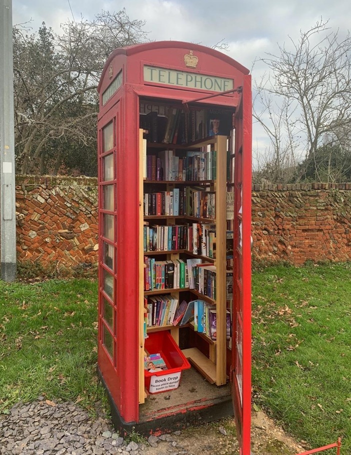
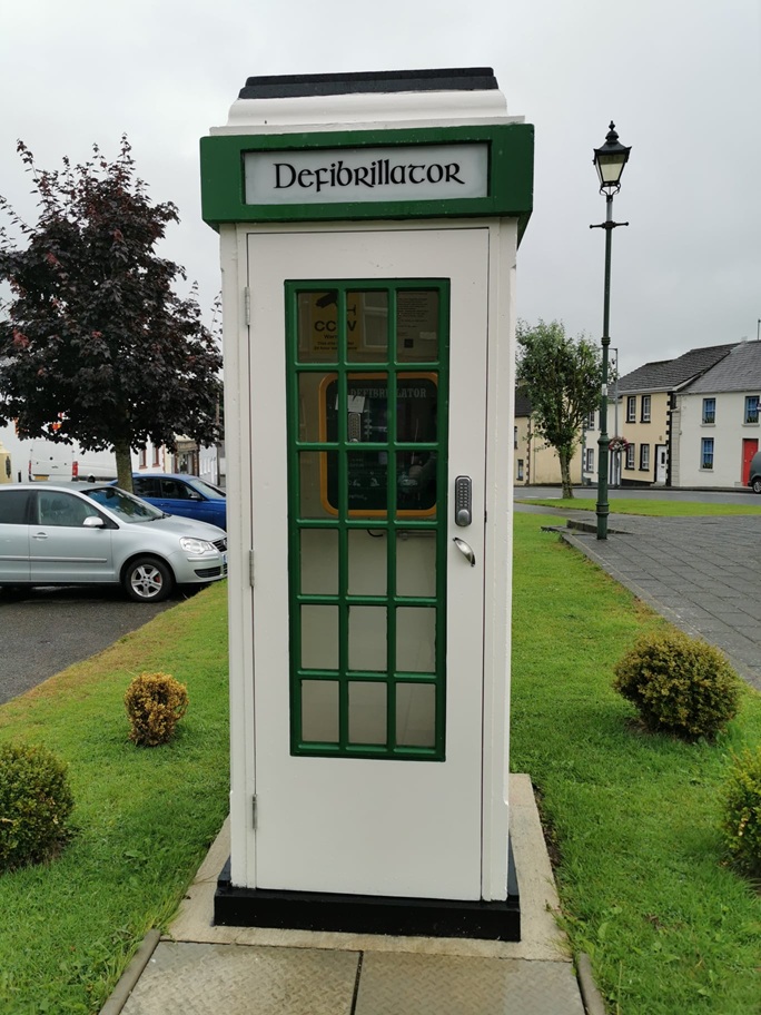
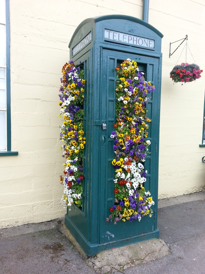
Telephone booths
How we can reuse (could have reused) old street telephone booths
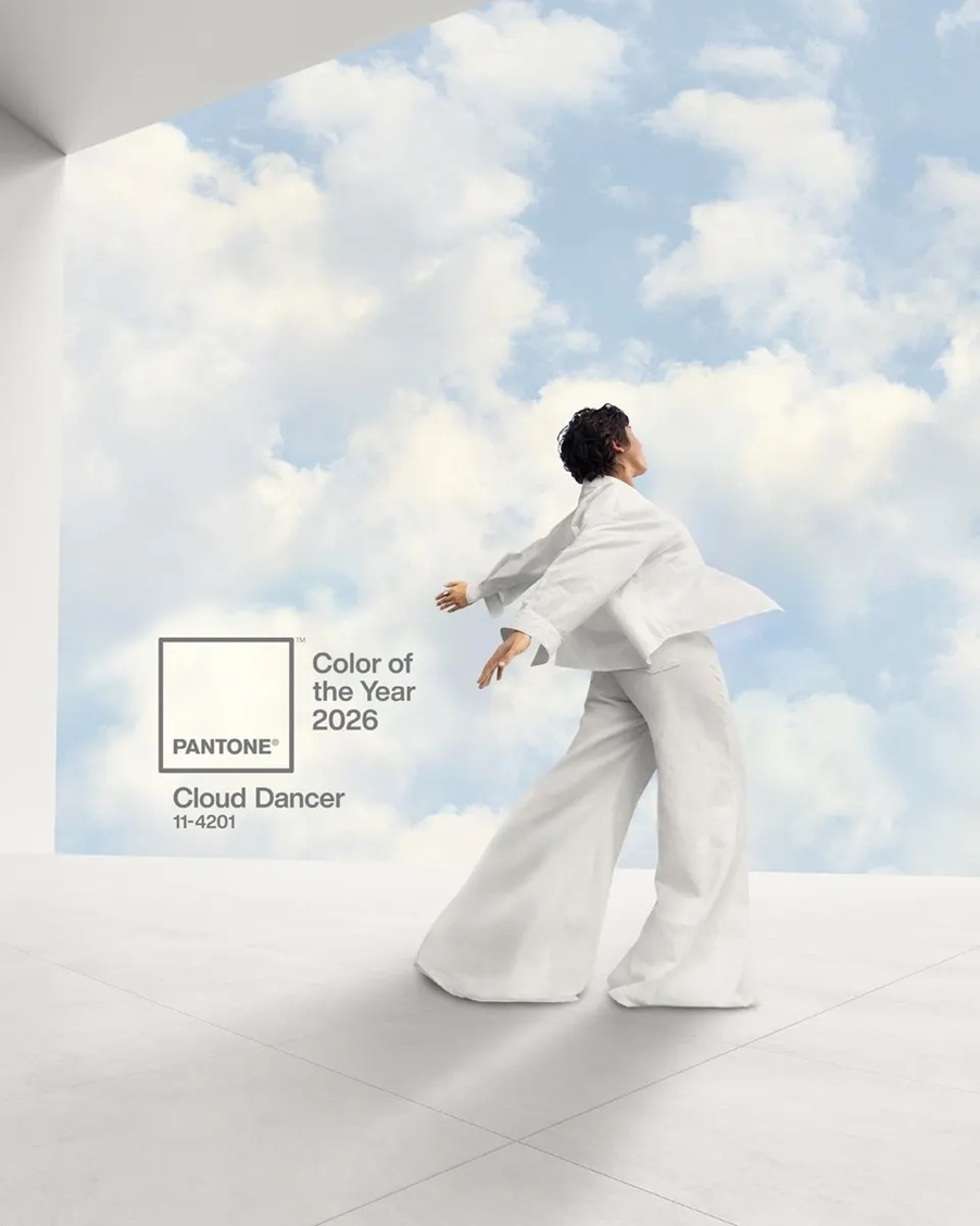
Color of the year 2026
Every December Pantone company announces the color of the next year which effects interior design also. Cloud Dancer no. 11-4201 is the color of the year 2026.
This is a shade of pure white, not actually a color, but rather allows all other colors to prevail. It symbolizes a new beginning, airiness and hope.
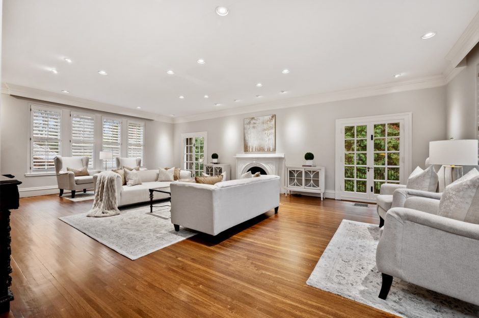
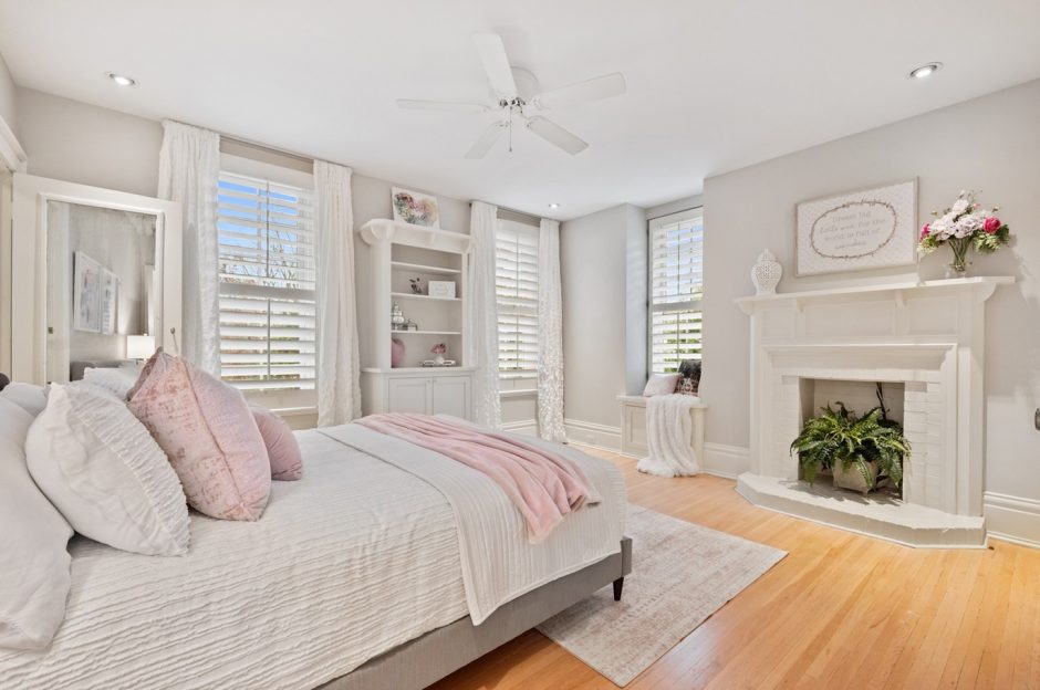
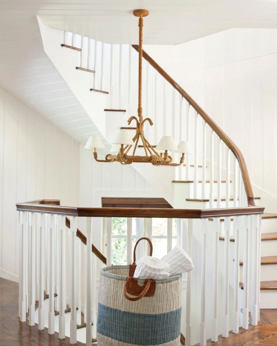
Feel free to use it in any room. However, keep in mind that if white dominates an interior, mix different textures during the furnishing process, so the space will gain depth and not resemble a hospital ward. Even in the currently fashionable, all-white homes, other colors are needed as a counterbalance, so our eyes can focus on every detail. For example, natural wood (floors, stair railings, wall panels) helps maintain a sense of purity and simplicity, dark colors make the space more modern through contrast, and pastel colors bring softness and femininity to the look.
Ask for help of an interior designer for making the color of the year 2026 appear in your home in style.
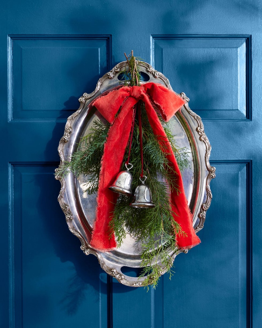
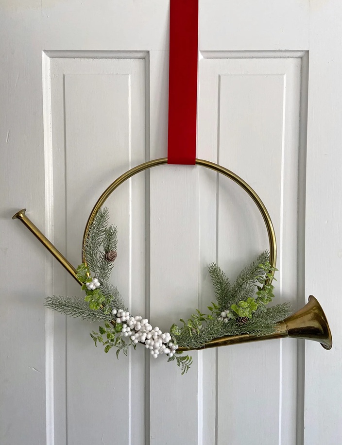
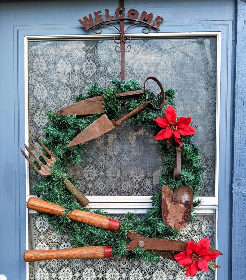
Door wreath 11.
We can make wonderful winter door wreaths from old items gathering dust in the closet or available for pennies at the flea market
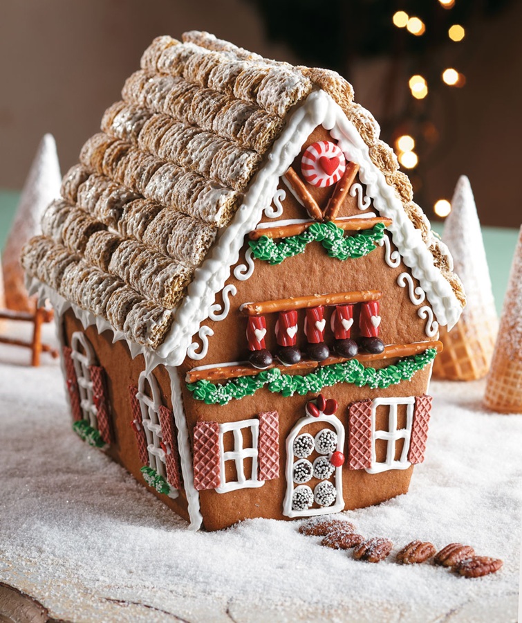
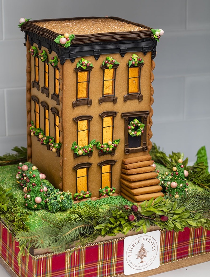
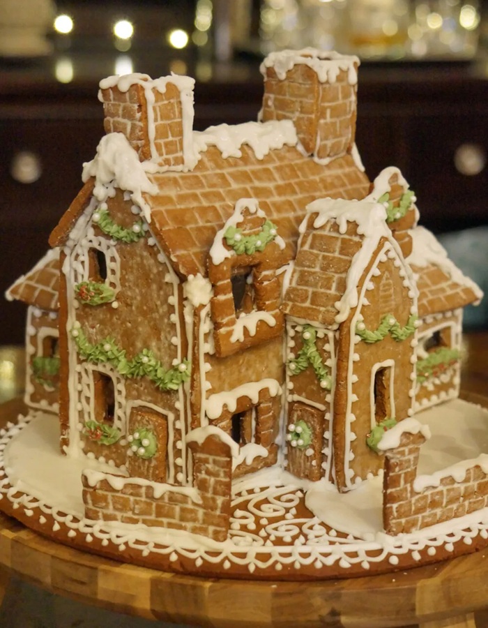
Gingerbread house 3.
House plans for Santa’s elves 🙂
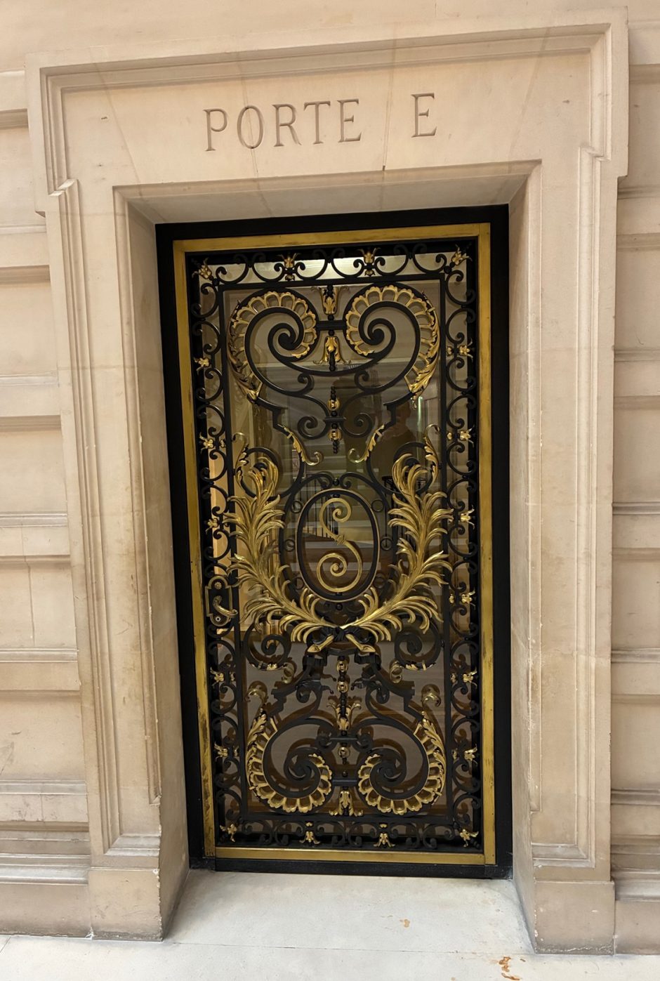
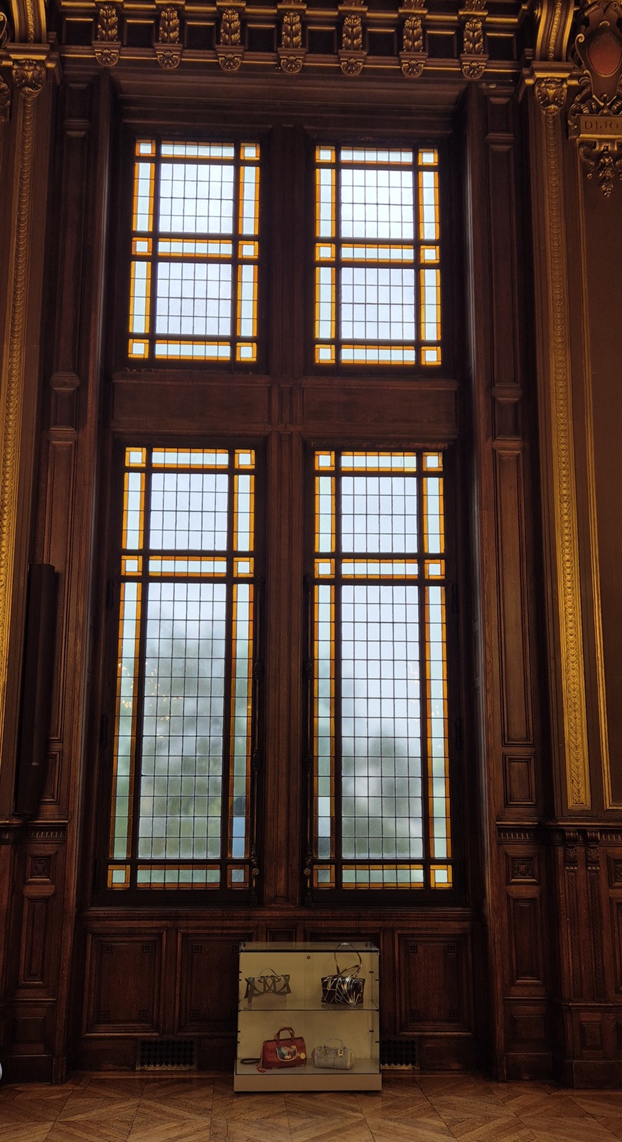
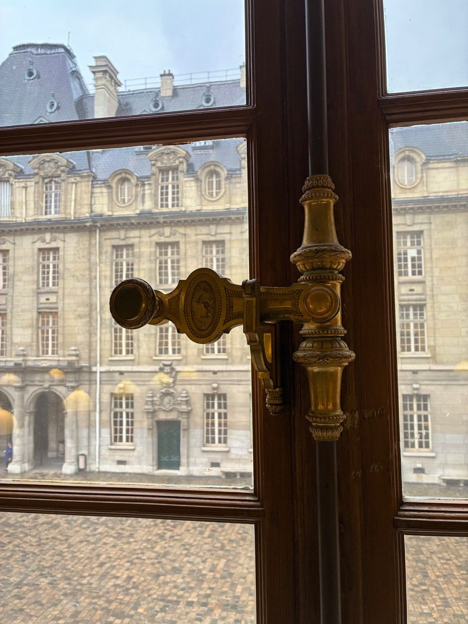
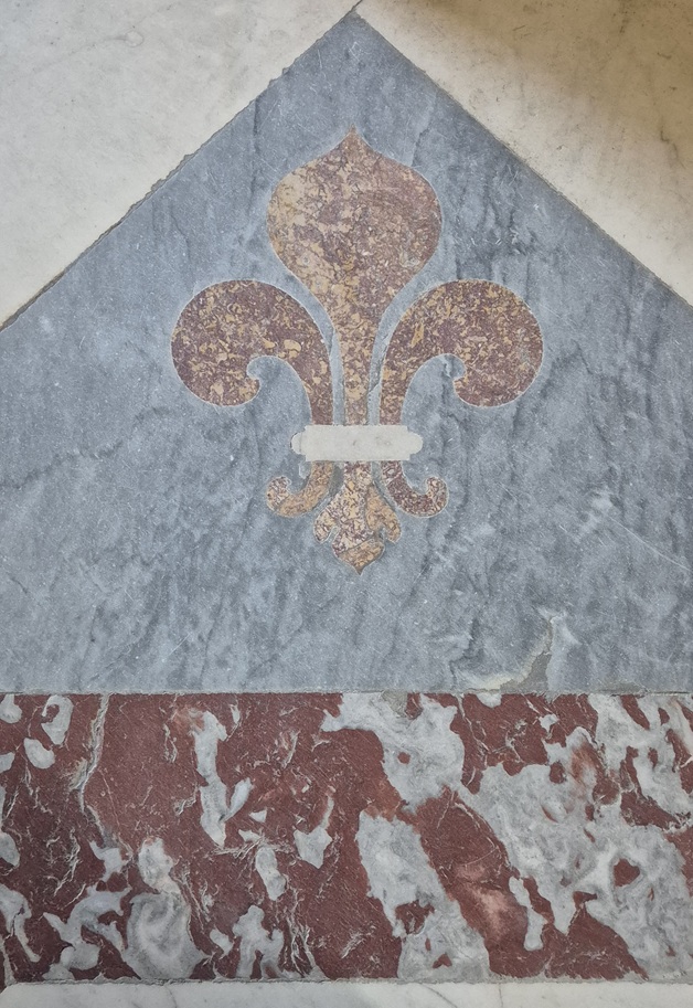
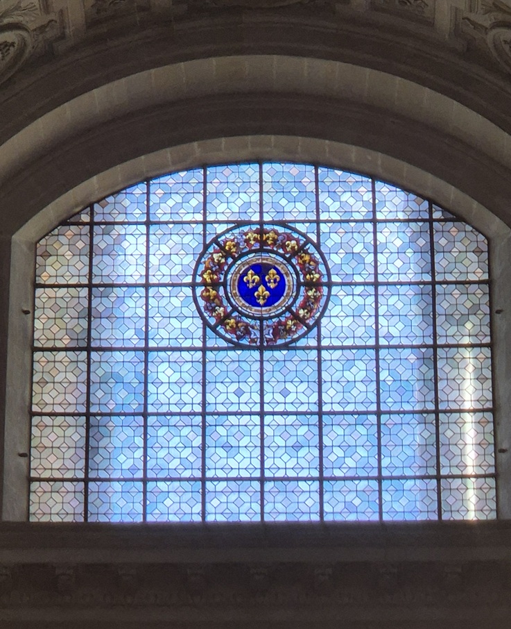
Les Invalides
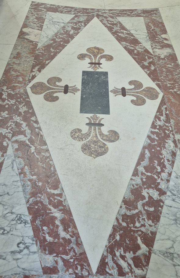
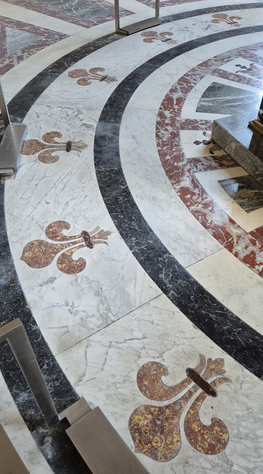
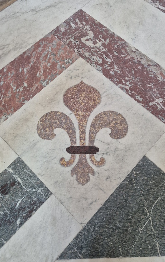
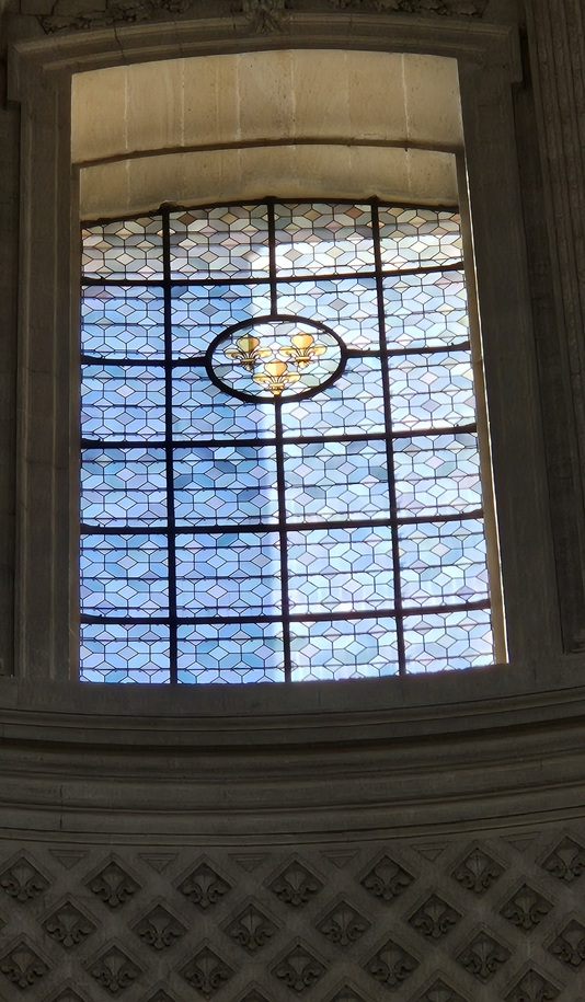
Fleur de lis decorations in all quantities – Les Invalides, Paris 2025
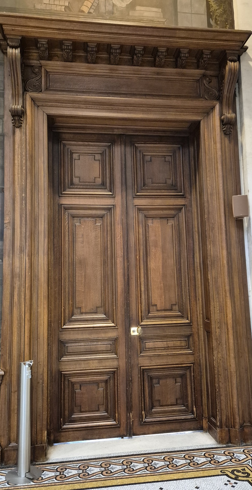
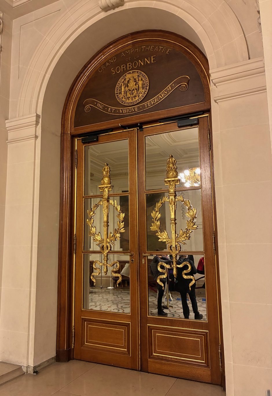
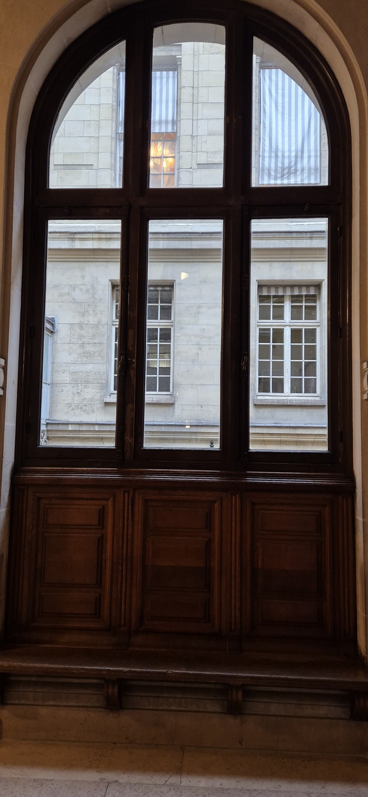
Sorbonne
Wonderful doors and windows – Sorbonne, Paris 2025