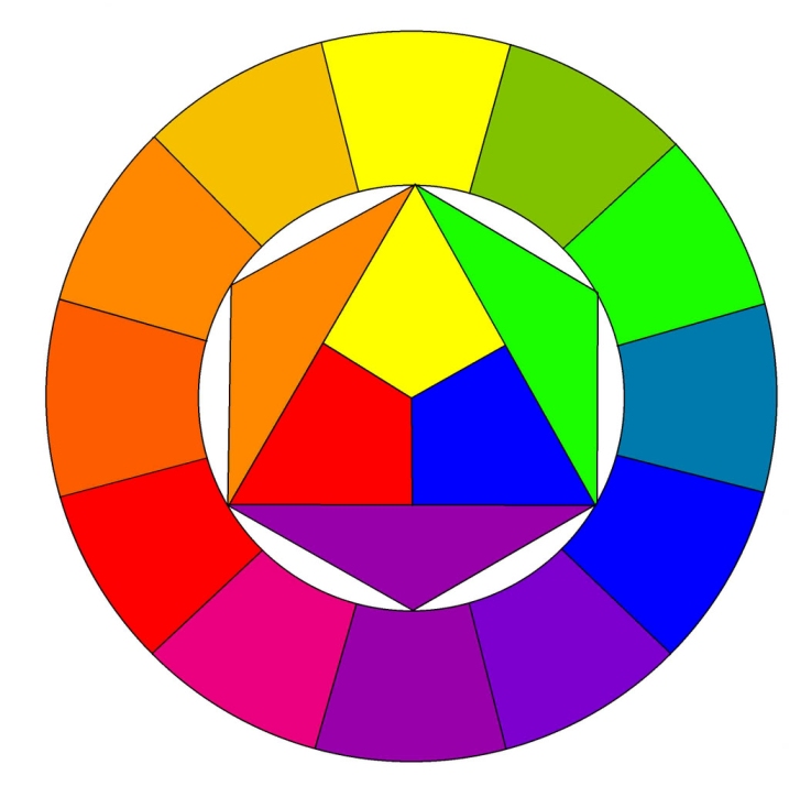
Supplementary colors are color pairs, that are located the opposite side of the color circle. They strengthen the effect of each other, resulting an eye-catcher pair. The color circle itself consists of three elementary (blue, yellow, red), three secondary (green, purple, orange) and six tertiary (transitions of the above mentioned) colors. The circle shows their relations also.
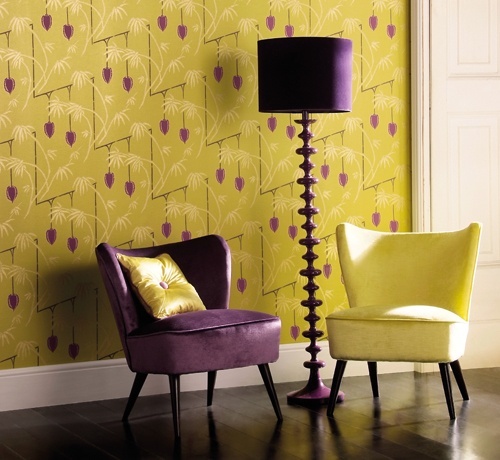
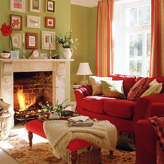
In interior design, we use them for reaching really striking, unforgettable experience and for defining focal points. If we would like to use them in the same share, a third, neutral color (black, white, cream) should be applied too. The supplementary color pair has to be used at a relatively low level in the space (e.g.: on decoration pillows, vases, pictures or on some smaller furniture). If both colors have to be emphasized, don’t use them in the same share, else the result will have unsettled or unfinished feeling without the required esthetics. One of them should me the main color, while the other is the secondary, as we have already seen it at the color balance. As a counterpoint, the supplementary should be used in small amount.
Most common pairs are green-red, blue-orange and purple-yellow combinations. If someone afraid of intensive colors, this scenario can be also realized with pastel colors as well: with pink-light green, lavender-vanilla and light blue-coral hues.
Using supplementary colors requires courage. If you are uncertain, but you would like to get a spectacular interior, ask help from an interior designer or color advisor.