Don’t afraid of using dark colors on walls: elegant, spectacular and make the room cozy
Archives
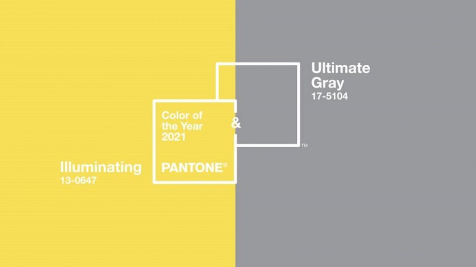
Colors of the year 2021
Every December Pantone company announces the color of the next year which effects interior design also. Illuminating no. 13-0647 and Ultimate Gray no. 17-5104 are the colors of the year 2021.
The grey member of the pair is a perfect neutral hue. It can be found in nature, for example among colors of pebbles and rocks. It works perfectly as a background because it strenghtens every other color. As its name indicates, it gives a solid base.
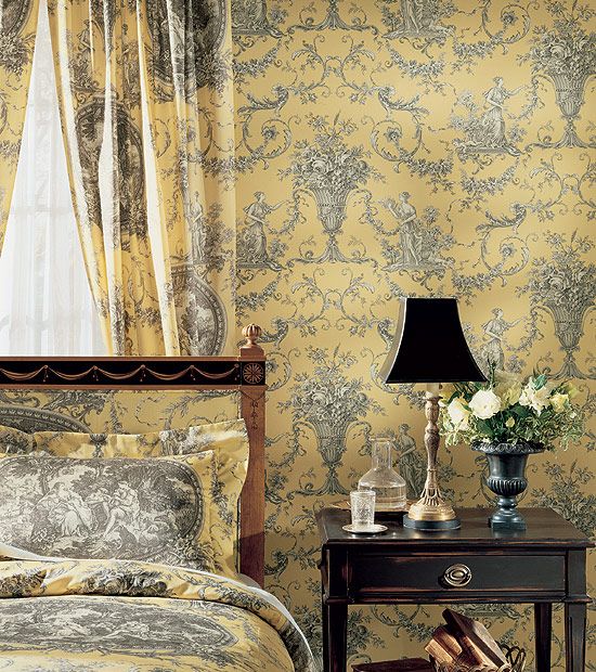
The yellow member of the pair is a warm and strong color, which enlivens the space and brings happyness in everyday life. It looks especially stong near the grey, although it is not a too vivid hue.
Both colors are mid-dark tones which can be used in interior design very well. Complementing them with white, a more subdued effect can be reached. However, adding a little black to them can further enhance the lightening effect of yellow.
The combination of the two colors can be freely used for example in kitchen, home office, living room or even in kids room.
Ask for help of an interior designer for making the colors of the year 2021 appear in your home in style.


Mixing grey
Grey color can be made in two ways:
– mixing black and white – in this case a cool grey will be the result
– mixing two supplementary colors – in this case a neutral grey will be the result


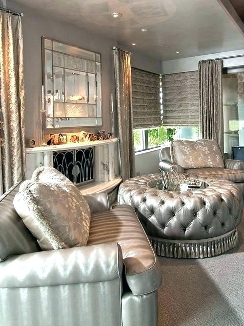
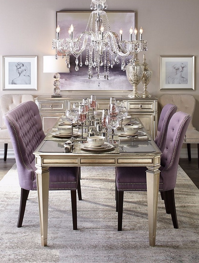
Glamour
Glamour style is very fashionable since a couple of years. It is a feminine trend which has classic style marks also.
Basic colors are neutral: black, white, beige and grey. Light reflecting surfaces break the monotony of them. Glimmer is reached by using metallic (golden, silver, rose gold, chrome), glass/crystal/mirror and high gloss surfaces. This can be involved into the interior with lamps, small furniture, picture frames, mirrors etc.
Stacking of fabrics and creating luxurious softness are typical. Characteristics of the Baroque, the Classicism and the Rococo are recognizable, but the furniture bring back the classic lines and decorations in a simple way (e.g. cabriole leg, buttoned back, drawer pulls). Seats are fully upholstered, just like the bed. The total effect is elegant but inviting. The amount of cushions on the sofa, in the armchairs and on the bed suggests the biggest comfort. Velvet, fur and satin-like fabrics are perfect to this style.
Design is accented beside the functionality in the lighting. Chandeliers are placed even in the smallest rooms. Glass pendants reflect light. Lamp shades made of light transmittance fabric can be used for the more mysterious and subdued effect. Candles have important role because the romantic overtone is connected to the style.
Neutral base can be broken with some dashes of colors. Then the subdued but not obviously pastel colors appear, first of all blues, purples and pinks. Although the used colors can be warm hues only but the whole effect is marked by some kind of coolness, maybe just because of the quantity of glimmer.
The modern twist is represented mostly by artworks. Pictures on the wall, statues and other decoration objects are commonly contemporary pieces. Their colors and glamour integrate them to the interior.
The place can be popped up with a few but determining patterns, if it shouldn’t be reached (only) with colors. Damask pattern, the eternal classic, provides a good result here also. Geometric patterns fit for glamour style too (e.g. chevron, trellis, orderly stripes).
Since the style has a lot of modernized classic marks, therefore original antique pieces are not fit in these surroundings. They are not mixed with shiny-glimmering brand-new elegance but rival with them which cause an embarrassing outcome.
Ask for help of an interior designer for creating glamour style in your home.


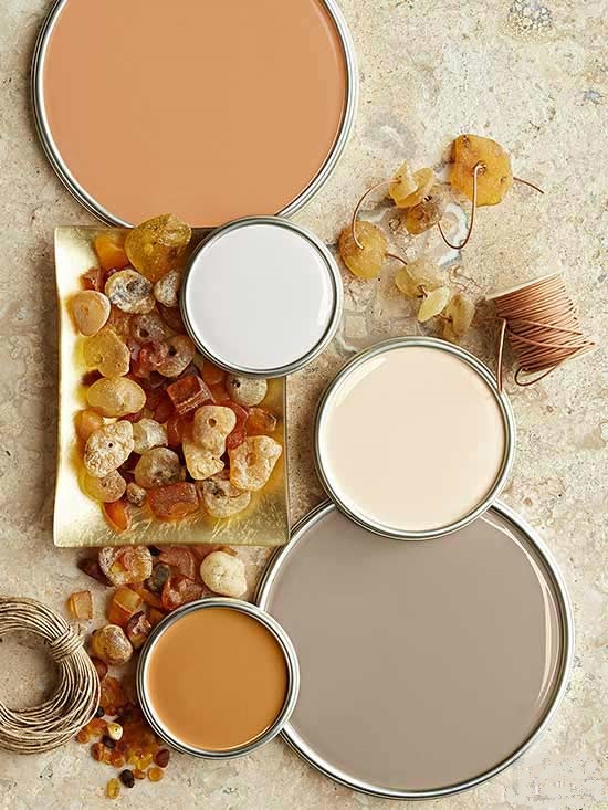
Greige
Greige (grey+beige) is made by a pinch of brown in grey paint. It works well with either cool or warm color palettes because greige is a perfect neutral color.


Color pairs 30.
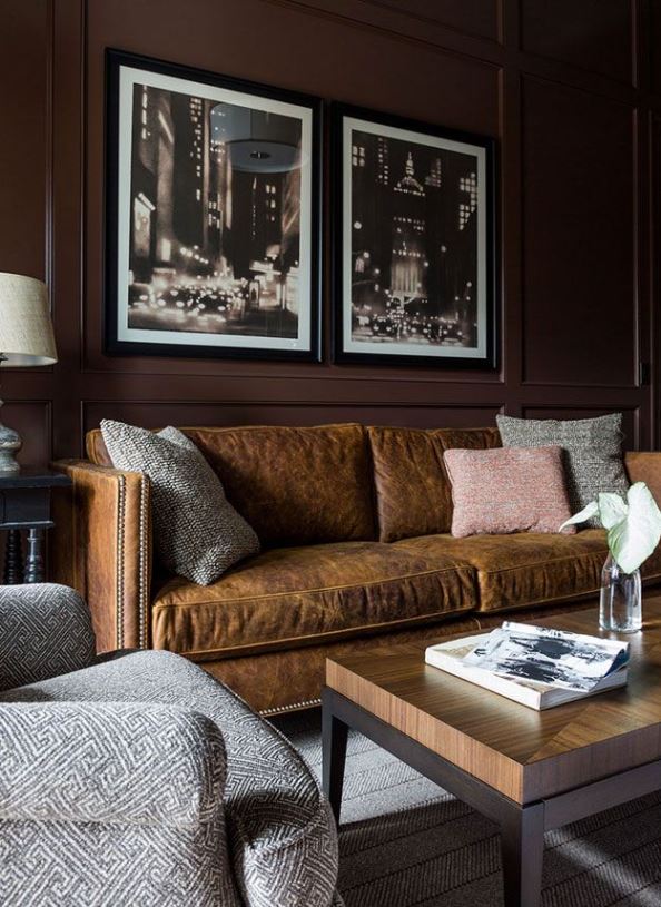
Color pairs: grey-brown
Color pairs 26.
Color pairs: blue-grey

Choosing wall paint
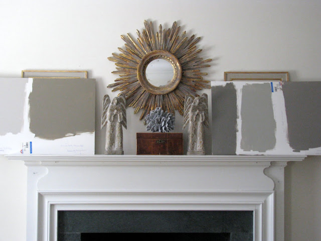
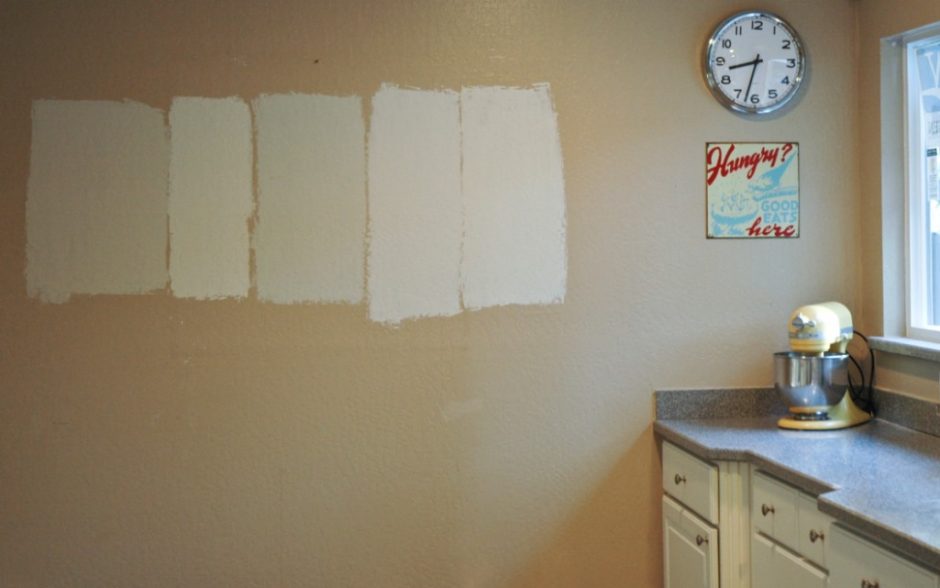
Many people make the mistake to fall in love with a color based on a very small sample and later they realize only after the finishing the painting that it is not what they originally wanted.
As far as possible, do not choose a wall paint based on a few square centimeters sample. Especially if it is a printed range of colors and it isn’t produced by using the real paint. Colors depend deeply on the lighting of the room, the paint absorptivity of the surface, number of layers, the surrounding colors etc. Always take home a sample if possible and try it in the room to be painted. Wait until it dries to see the final hue. If we don’t want to paint the wall itself, paint big cardboards (minimum size A3) with the given wallpaint. Stick them at least two walls of the room. Watch how the color changes throughout the day. The morning light is a bit yellowish, the light is always the strongest by noon and it has orange hues late in the afternoon. Orientation also matters a lot, as it depends on when and how long the room receives sunlight. Northern orientation pushes the effects of light to the blue range, western orientation does the same to the orange range. Shadows darken colors and make them greyish. All of these influence the way, how we see the color of the wall paint. Therefore, it is important not to choose colors in the shops under lights of lamps.
Most of the paint factories with permanent color assortment have sample pots for them also. With this, they make the perfect choice easier for the customers. For a small amount, we can prevent a bigger mistake which needs time, work and money to be corrected.
Any color can be mixed in the bigger paint shops and DIY stores in a couple of minutes based on NCS, RAL, Pantone etc. range of colors. Ask for the smallest quantity (commonly 1 liter), it is definitely enough to try the wanted color at home. This way we can be sure if the printed color truly fits for our idea and if we certainly endeavored to this effect.
Ask for help of an interior designer–color adviser for choosing wall paint, because he/she is a professional in harmonizing colors.
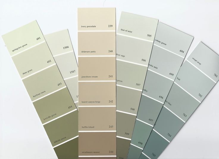
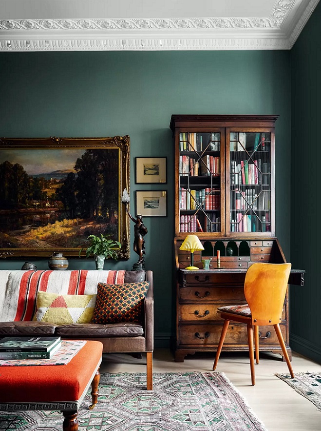
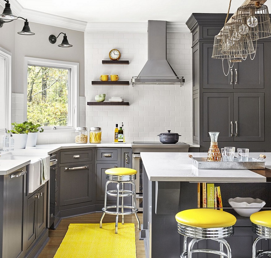
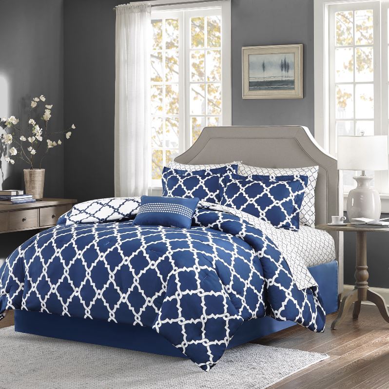
Color pairs 23.
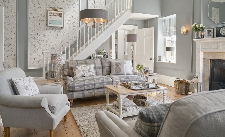
Color pairs: yellow-grey


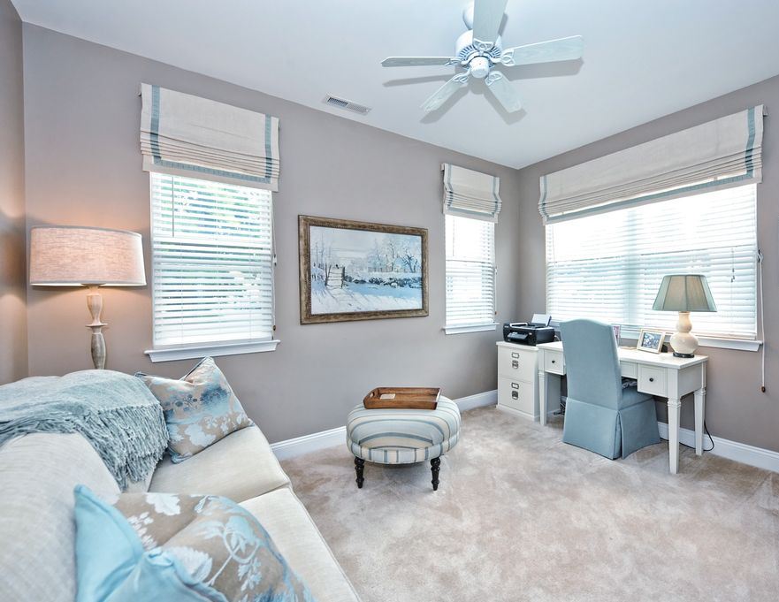
Color pairs 21.
Color pairs: green-grey


