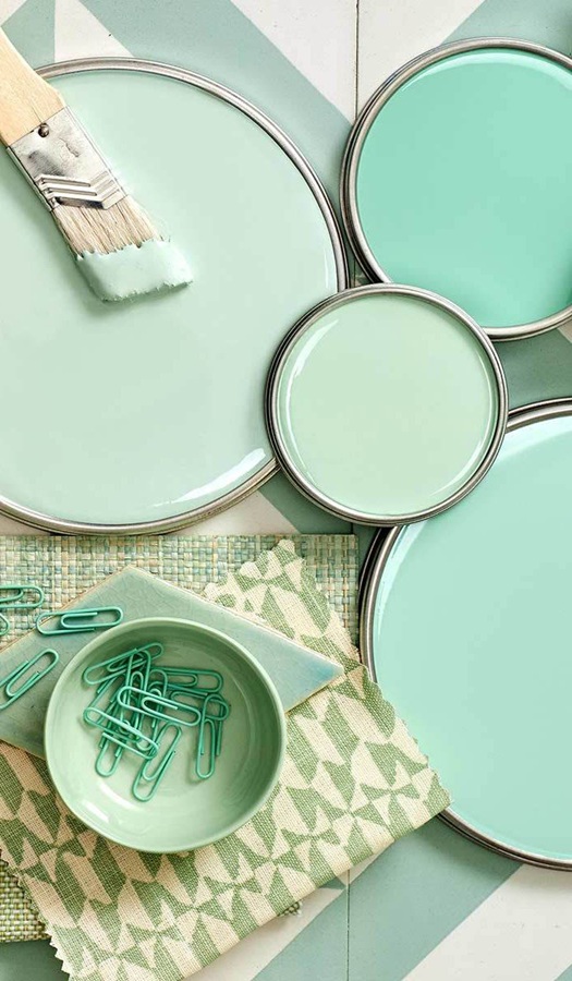
Mint green shades – neutral without being boring
Archives
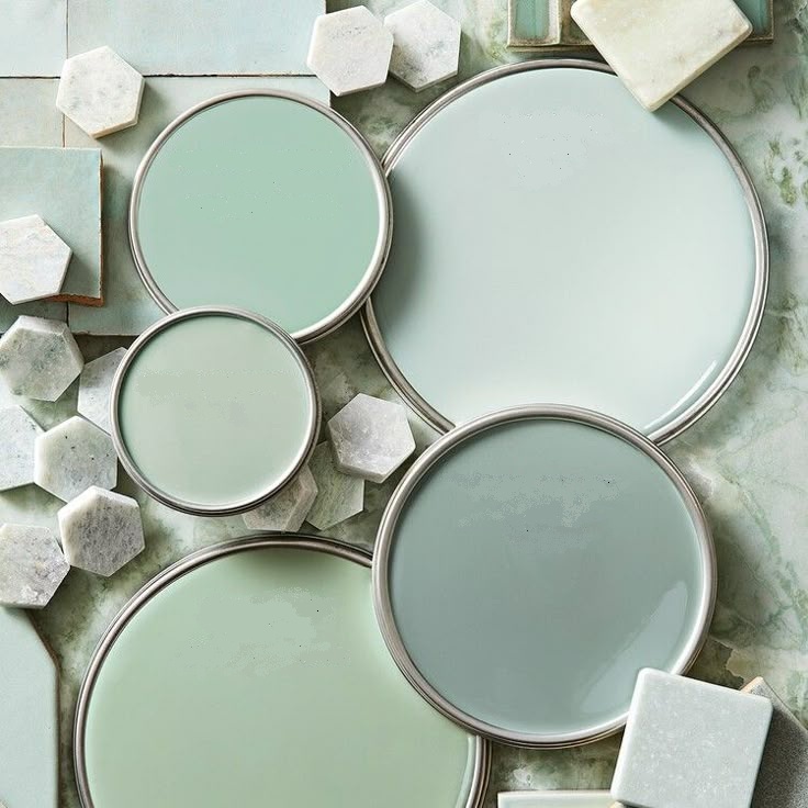
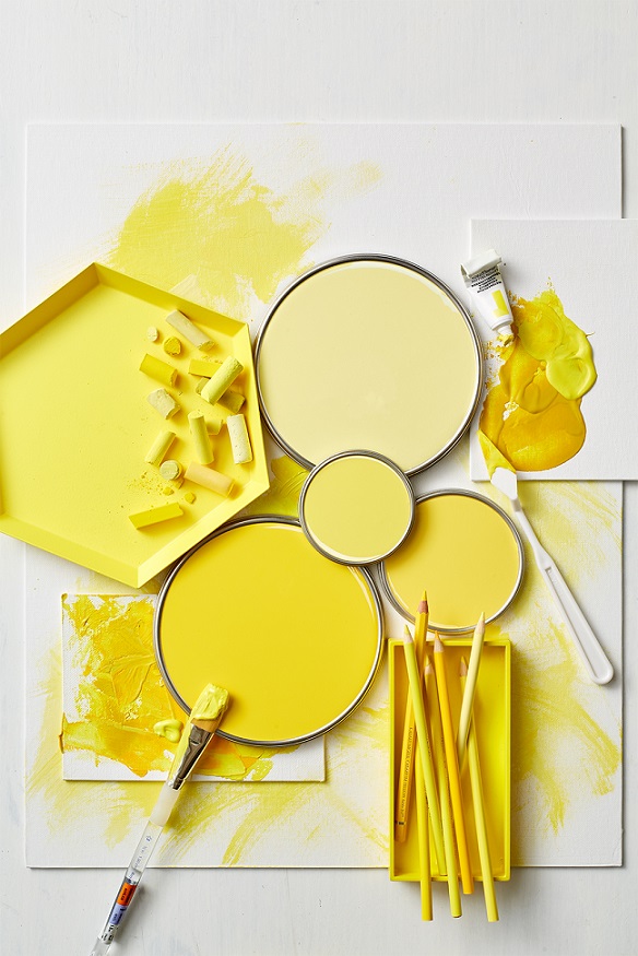
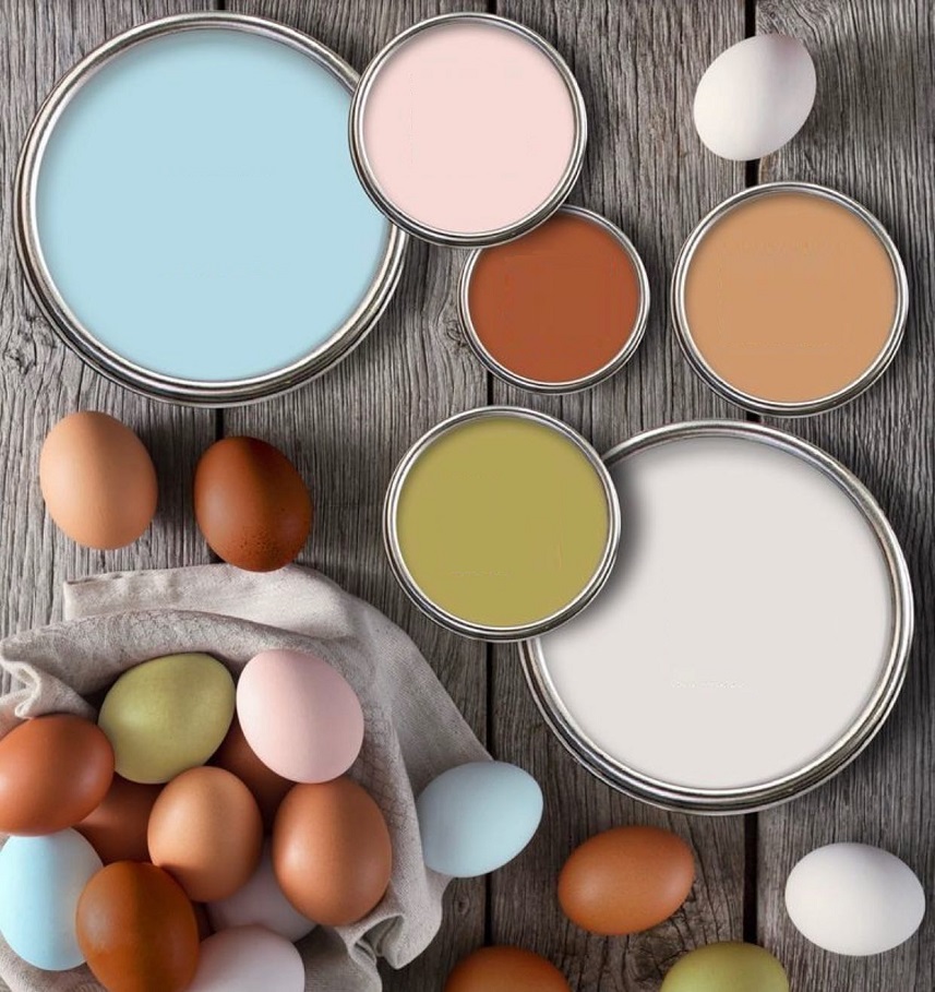
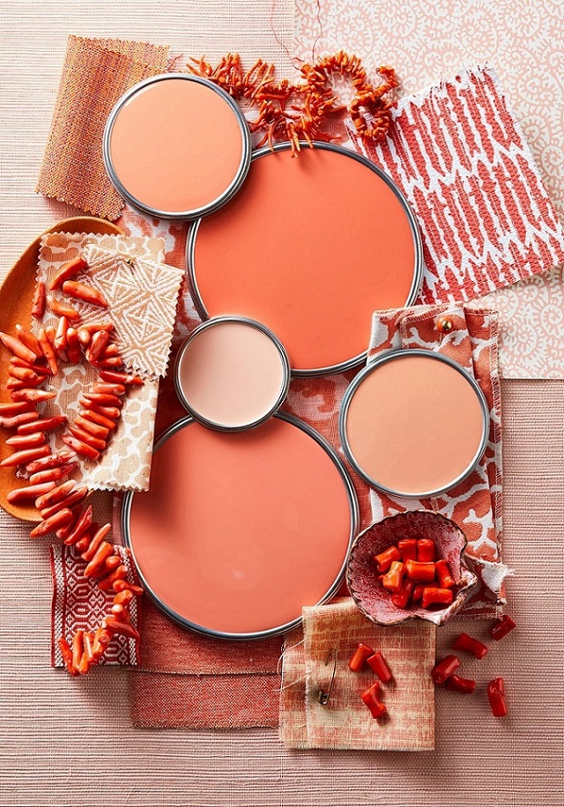
Paint palette 30.
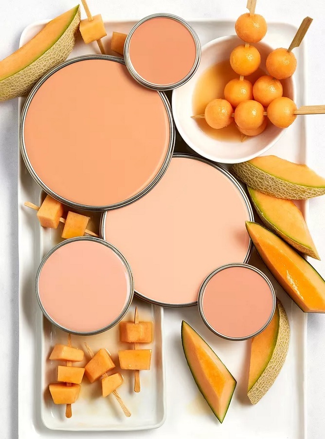
Palettes of summer colors
For 20th August
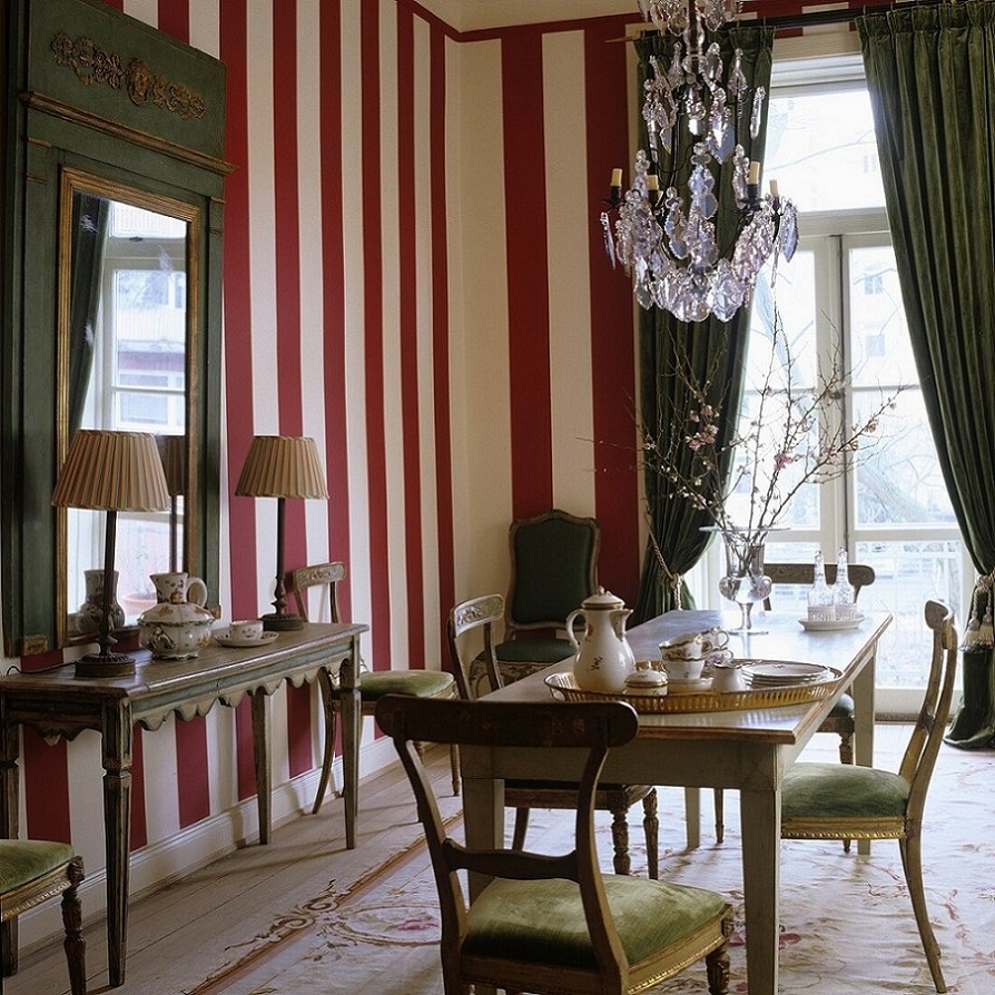
Red-white-green interior ideas for 20th of August, the Hungarian national holiday

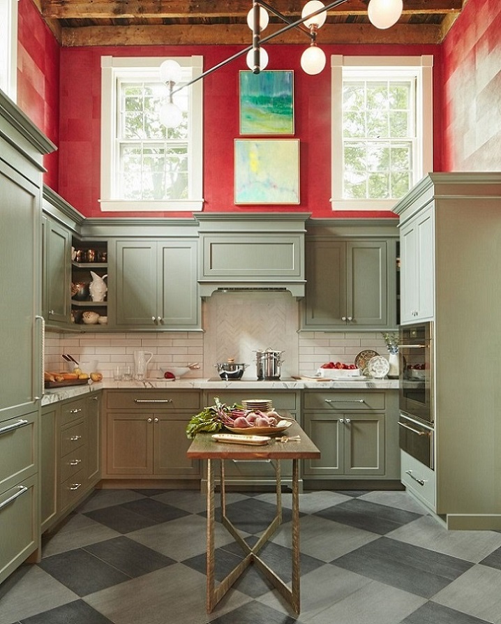
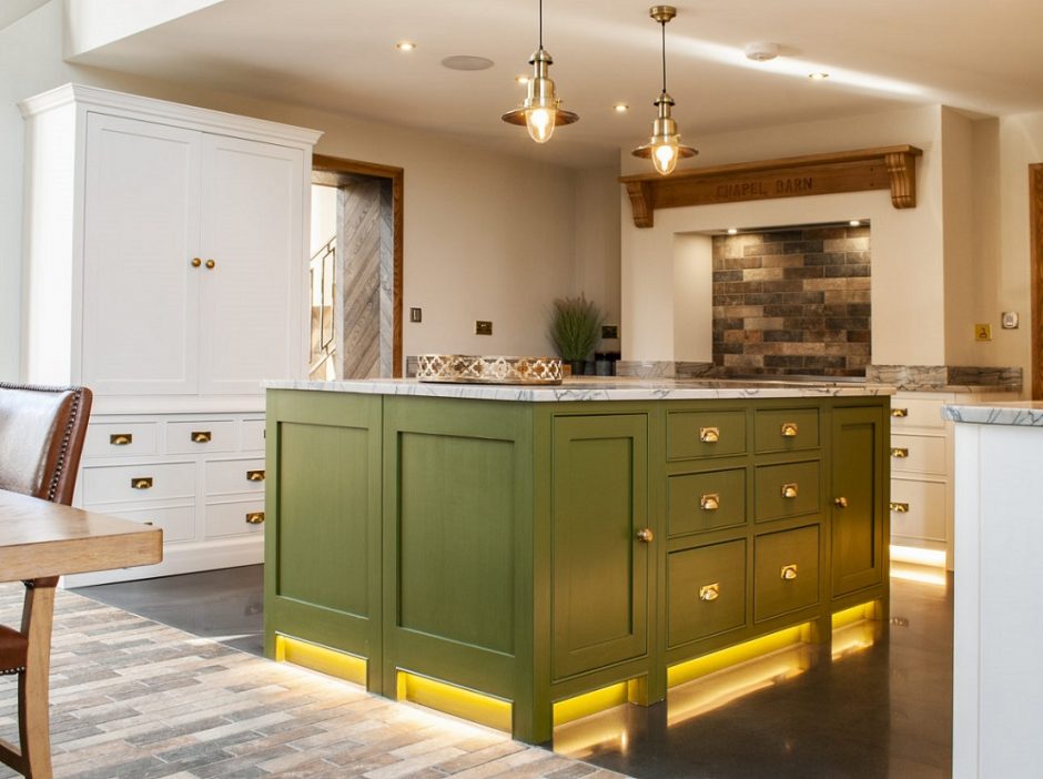
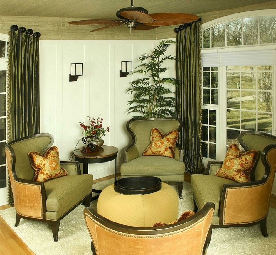
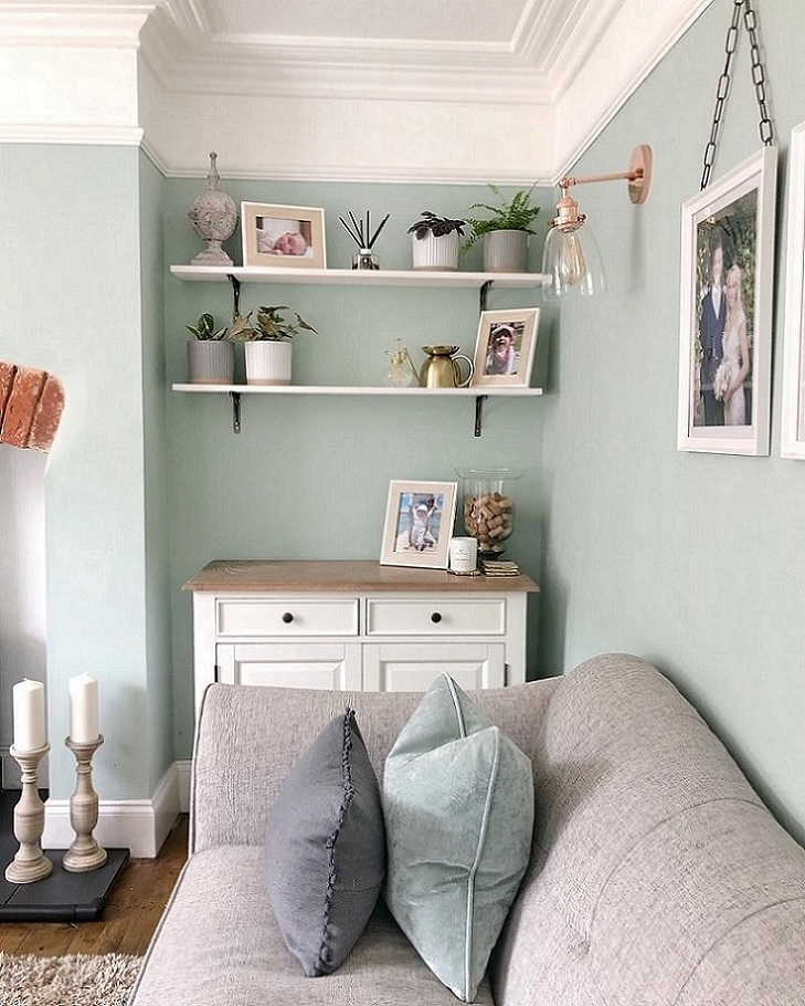
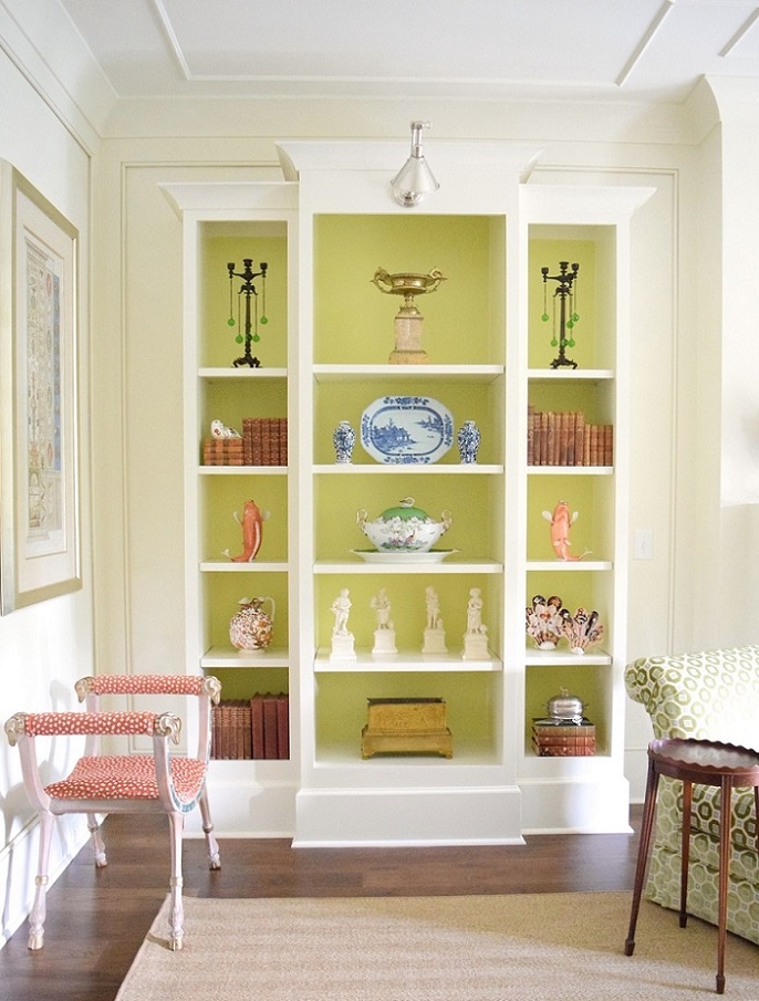
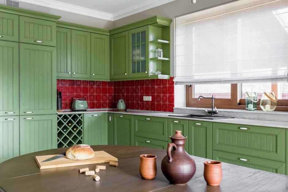
Olive
Olive is a relatively dark yellowish-green color. It has a few earthy undertone, zhanks to the hint of brown. It is not vivid, so it is very versatile in interior design. It is a very good complementary color for neutral palettes, for example. It was named after the green olives.

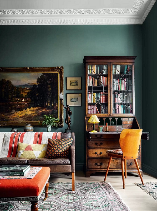
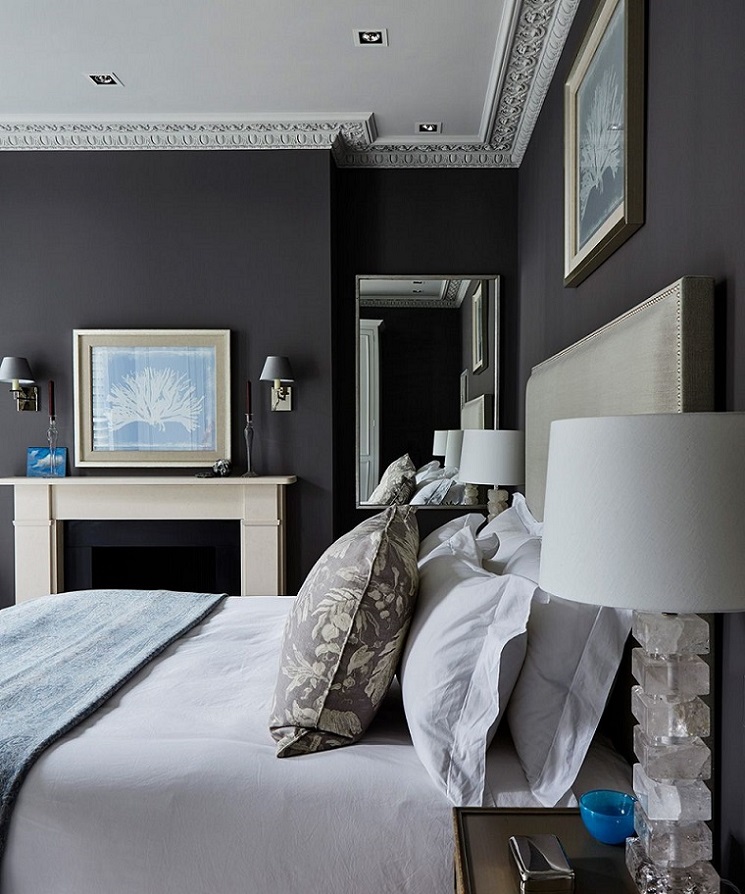
Dark walls 2.
Don’t afraid of using dark colors on walls: elegant, spectacular and make the room cozy
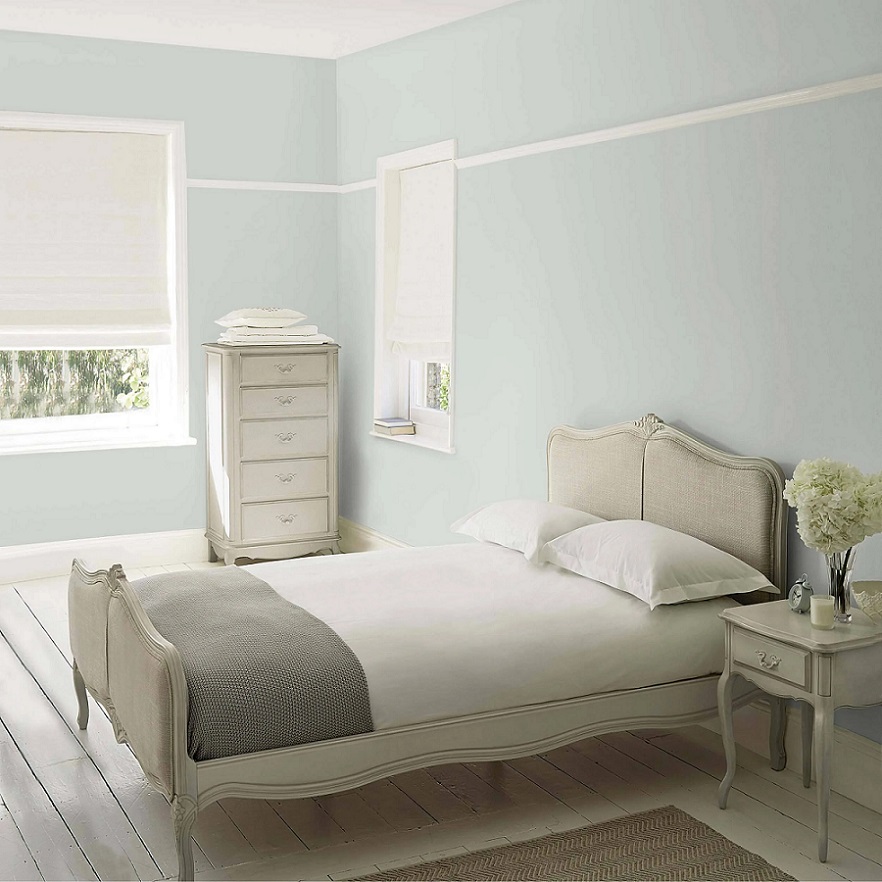
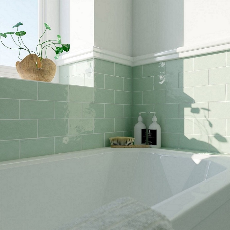
Eau de Nil
Eau de Nil (water of the Nile) is a cool, light bluish-green hue with a little tan undertone. It was popular in the middle of the 1800s when Europe was Egypt-obsessed but much more subdued colors were desired after Empire style. It complements very well the palette of light neutrals (e.g. creme, off-white, light beige, sand) but even looks good on big surfaces.
![]()
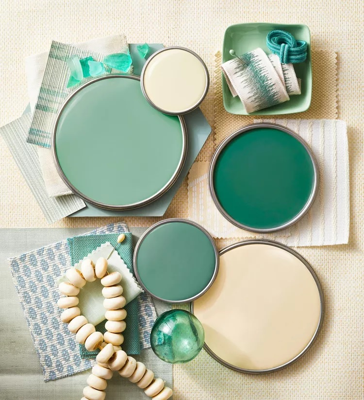
Paint palette 25.
Summer feelings expressed by paint palettes

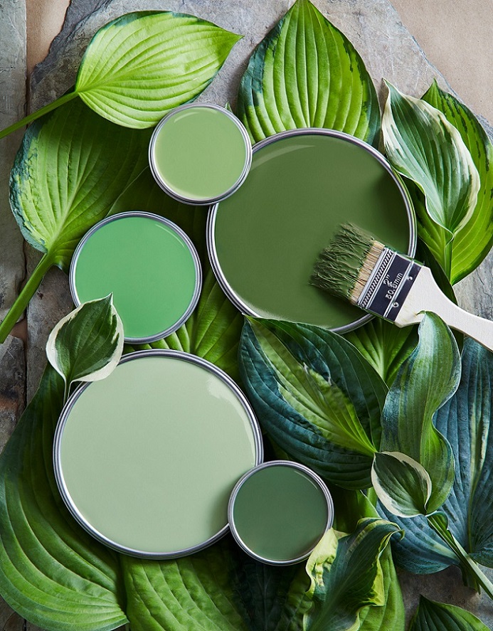
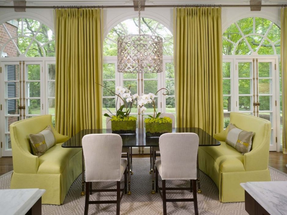
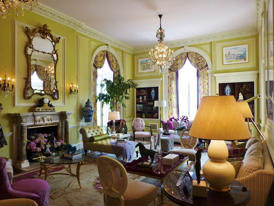
Chartreuse
Chartreuse color is in the middle between green and yellow on the color wheel. Although it is a vivid hue, it’s not very showish because of it’s mid-dark tone. It is perfect for focal points but looks good on big surfaces also. In the latter case, it might be outweighed by neutral colors. It was named after the French liqueur made by Carthusian monks since 1764, which is made from 130 plants and herbs, that gives its natural yellowish-green color.
For 15th March
Red-white-green interior ideas for 15th of March, the Hungarian national holiday

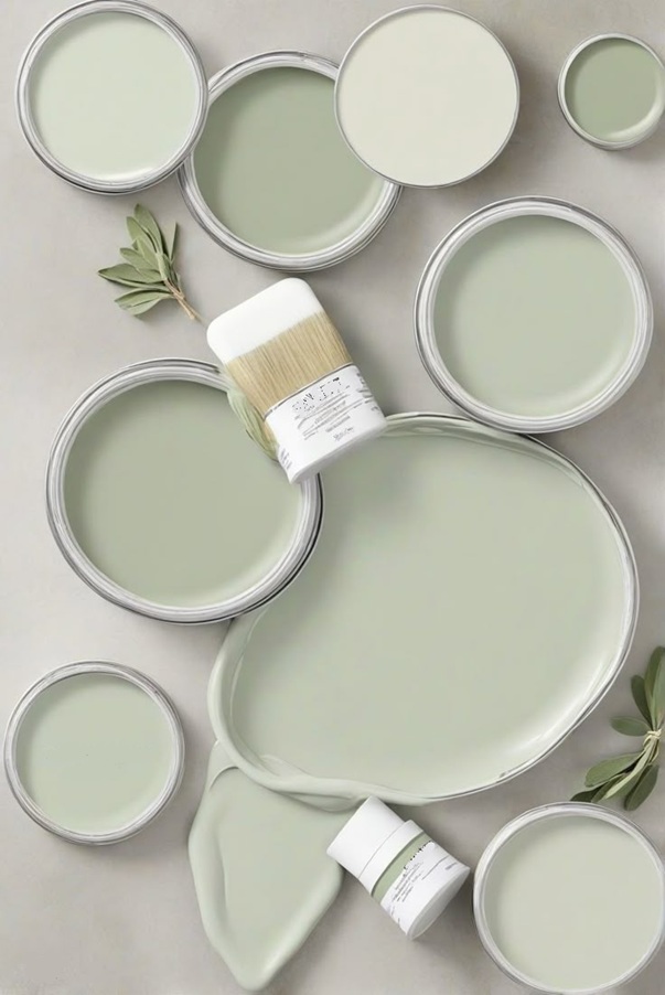
Paint palette 23.
Forceful paint palettes