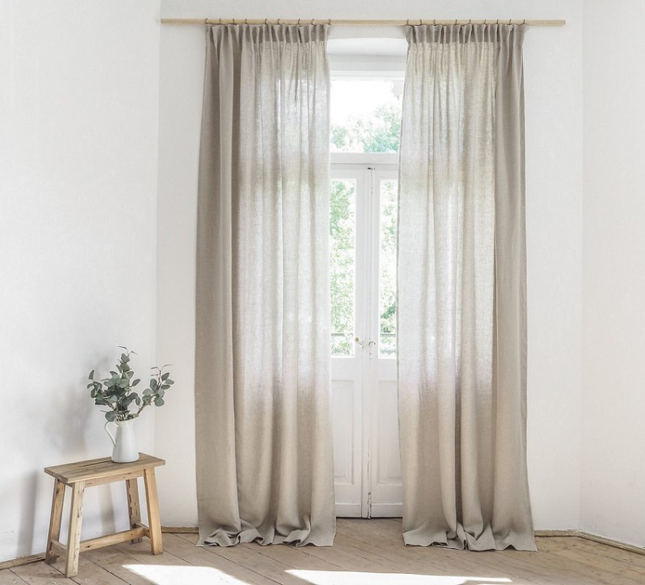
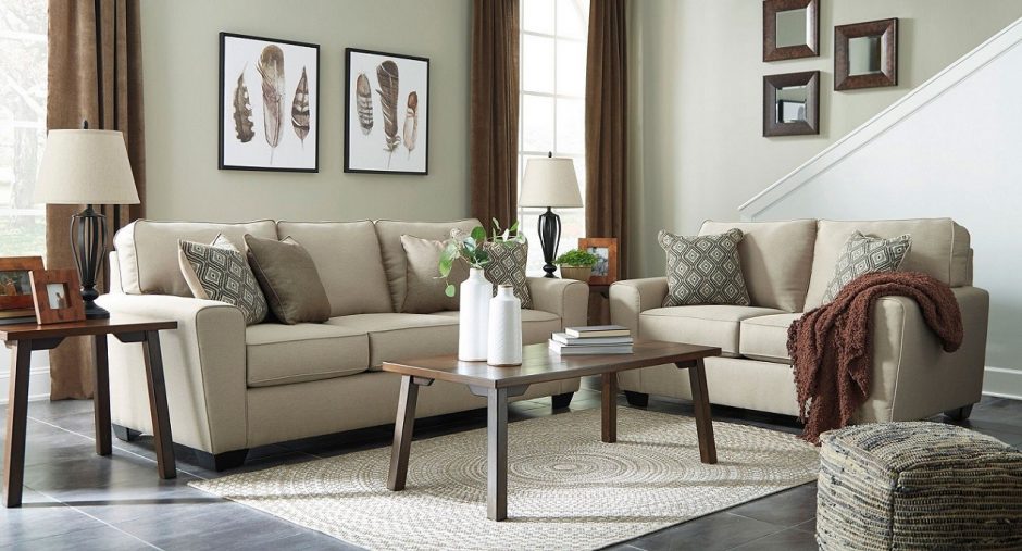
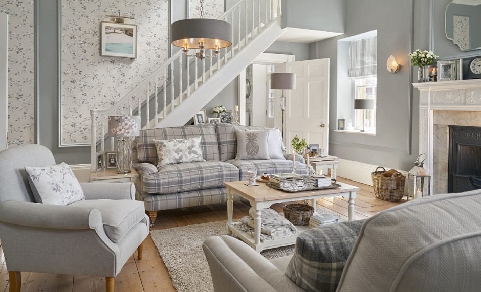
Ecru is a favourite color in interior design, because it is neutral, light and natural. Its name comes from the French word „écru”, which means raw or unbleached. This is the color of raw linen or silk fabrics. It contains brown, yellow and a tint of grey. This is rather masculin among similar hues. It is perfect for both basic and accent color.
Archives
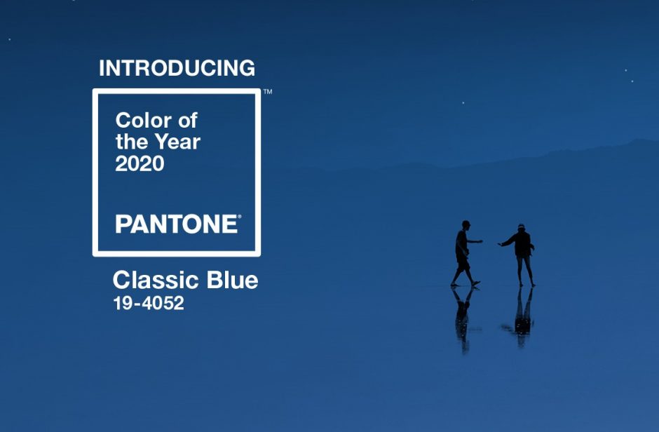
Color of the year 2020
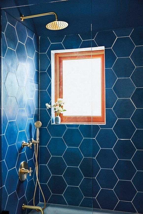
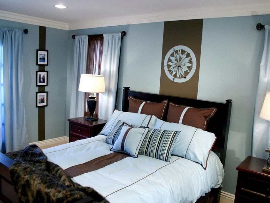
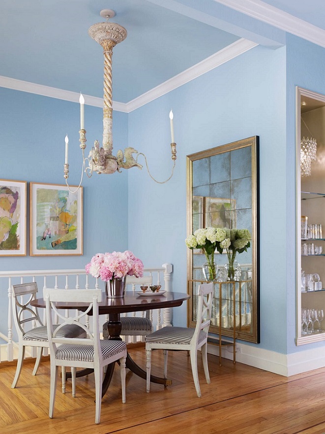
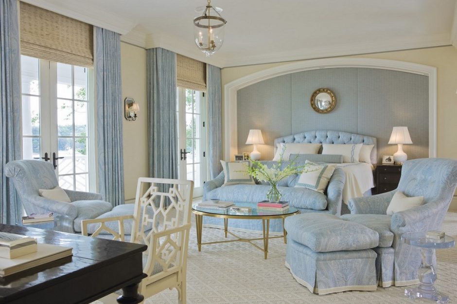
Every December Pantone company announces the color of the next year which effects interior design also. Classic Blue no. 19-4052 is the color of the year 2020.
This is a calming, medium dark blue, which is a cool but not too cold color. “Classic” attributive suggests that this hue is timeless, elegant and diffuses harmony. It symbolizes reconveyance of old values.
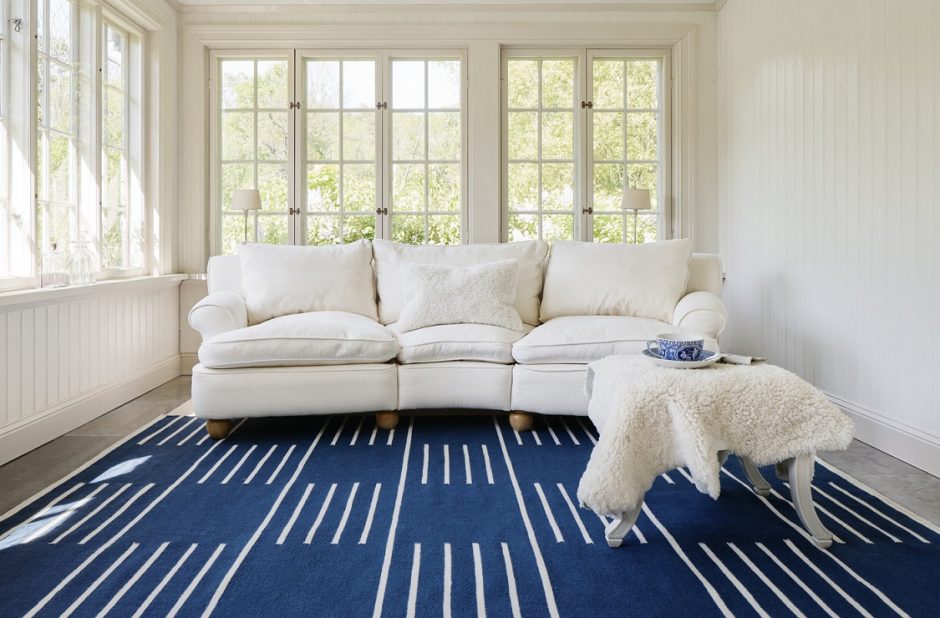
It is perfect both for base color and focal point. Since it is not a vivid color, it can be used in a large amount, even on all the four walls. A neutral color palette can be easily popped-up with it, without being too determining. Blue is not a food color, so use it moderately in the kitchen and dining room. It fits well for almost all styles.
Ask for help of an interior designer for making the color of the year 2020 appear in your home in style.


Babyblue
Baby blue is a pastel shade of azure. As its name indicates, it has a strong associative relationship with newborn boys. However, it can be made more mature by combining it with brown, black or beige.
Mixing grey
Grey color can be made in two ways:
– mixing black and white – in this case a cool grey will be the result
– mixing two supplementary colors – in this case a neutral grey will be the result


Powder rose
Powder pink is a soft pastel shade, in the half way between soft pink and light beige. Since it has a “dusty” pink effect, the interior won’t be too sweet, however it’s worth to counterweight it with neutral colors (e.g. grey, brown, white, beige). It was named after the cosmetic powder.


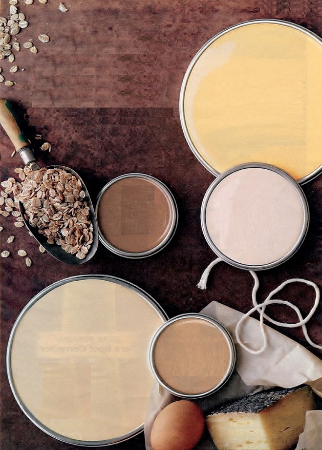
Paint palette 21.
Warm earth-colors for greeting autumn
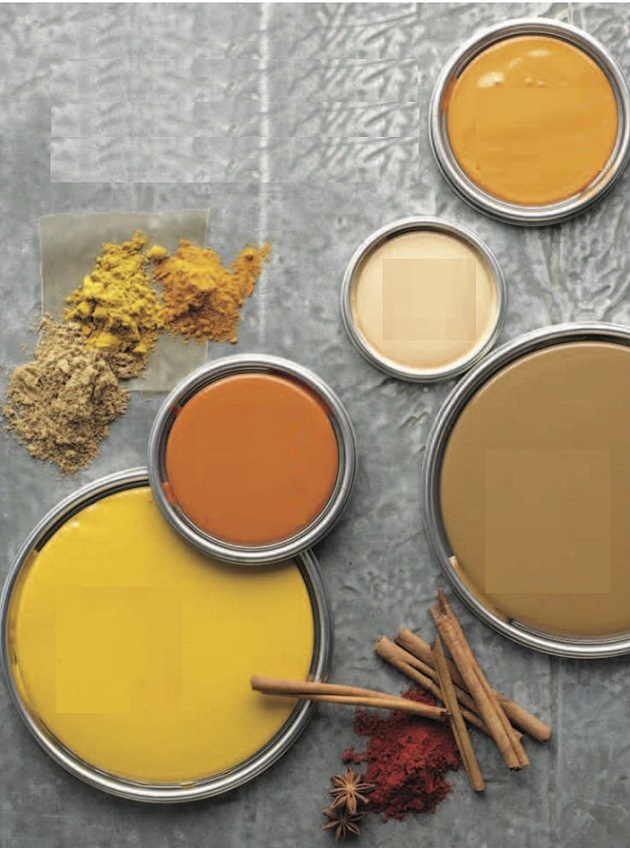

Inspiration 11.
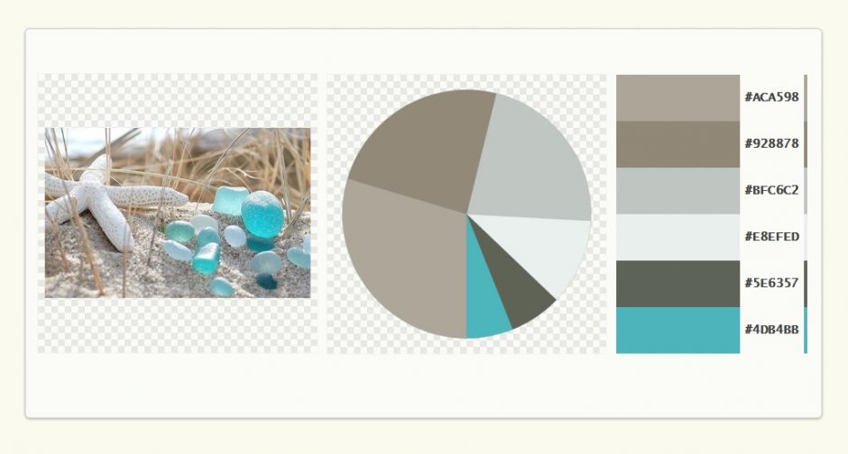
Use colors of our favourite photo for decorating our home

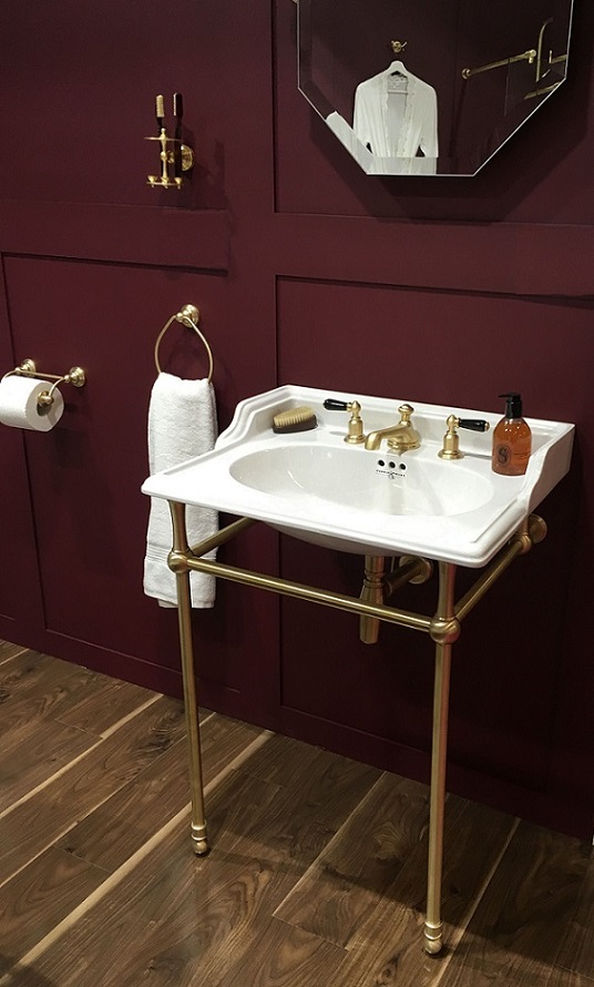
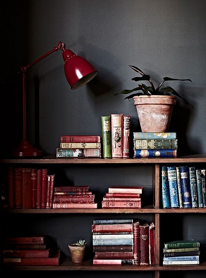
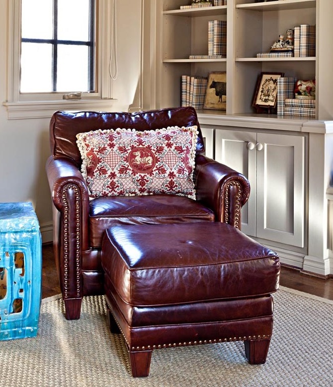
Burgundy red
Burgundy red is a dark, deep still vivid and elegant shade which contains a little purple and brown also. It is named after the vine.
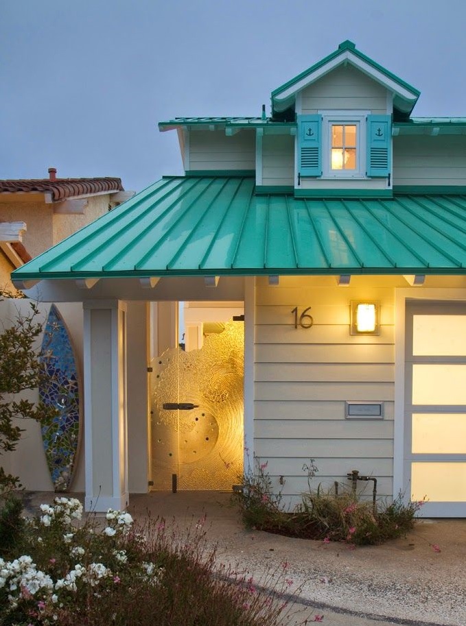
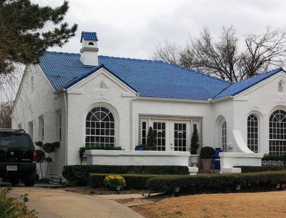
Color roofs
When not the walls of the house but the roof gets a brighter color

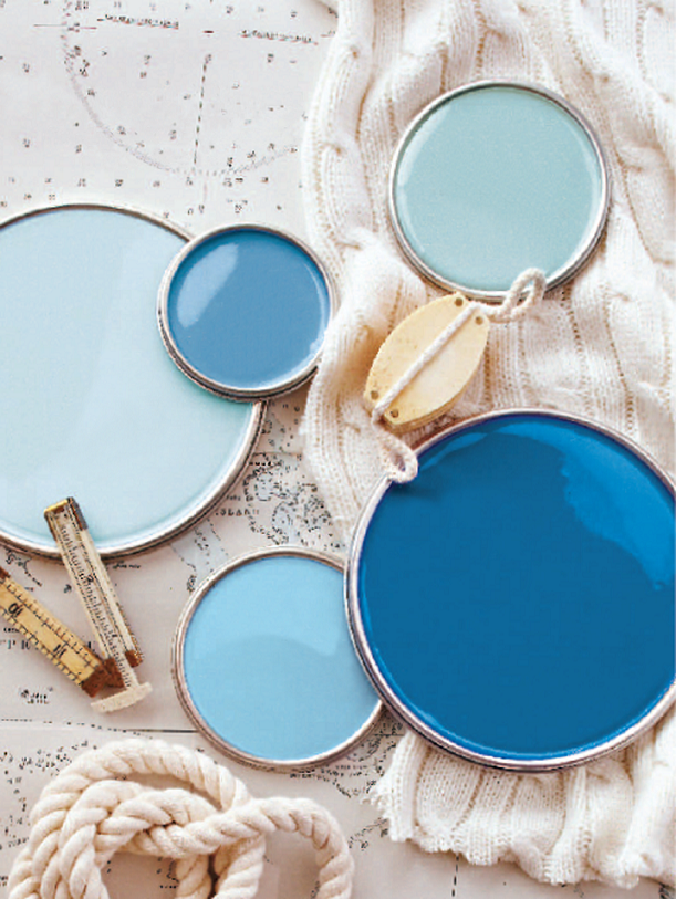
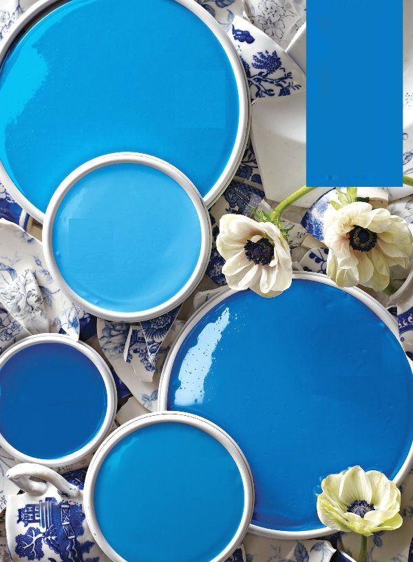
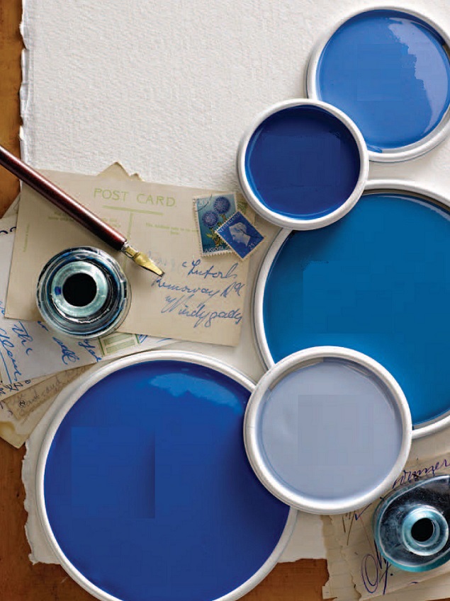
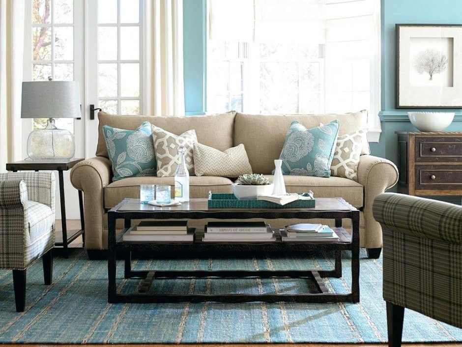
Paint palette 20.
Cooling blue color palettes for hot summer days