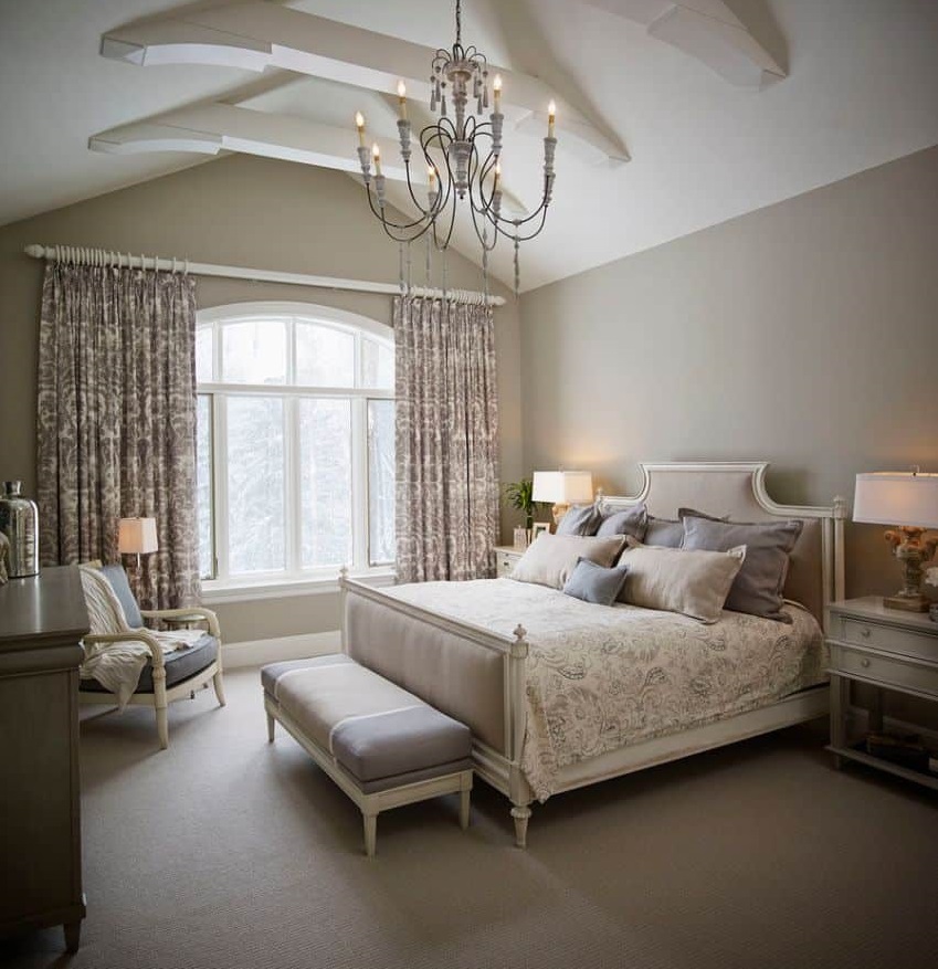
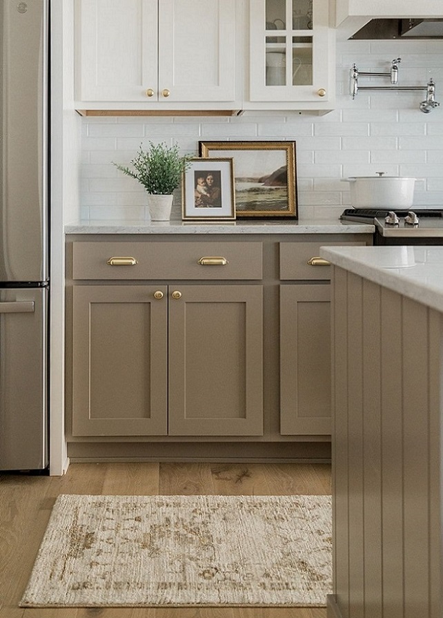
Taupe is a neutral color which is in the middle between brown and dark grey. Both lighter and darker hues are popular in interior design because it provides a natural base and it gives depth to the space. The French word taupe means mole, it was named after the color of the animal.
Archives
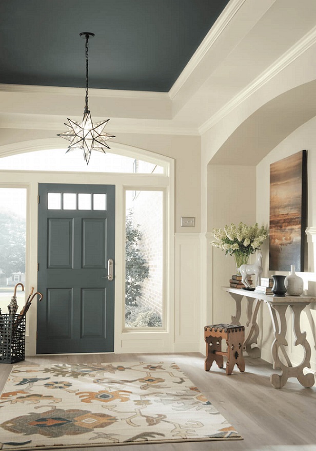
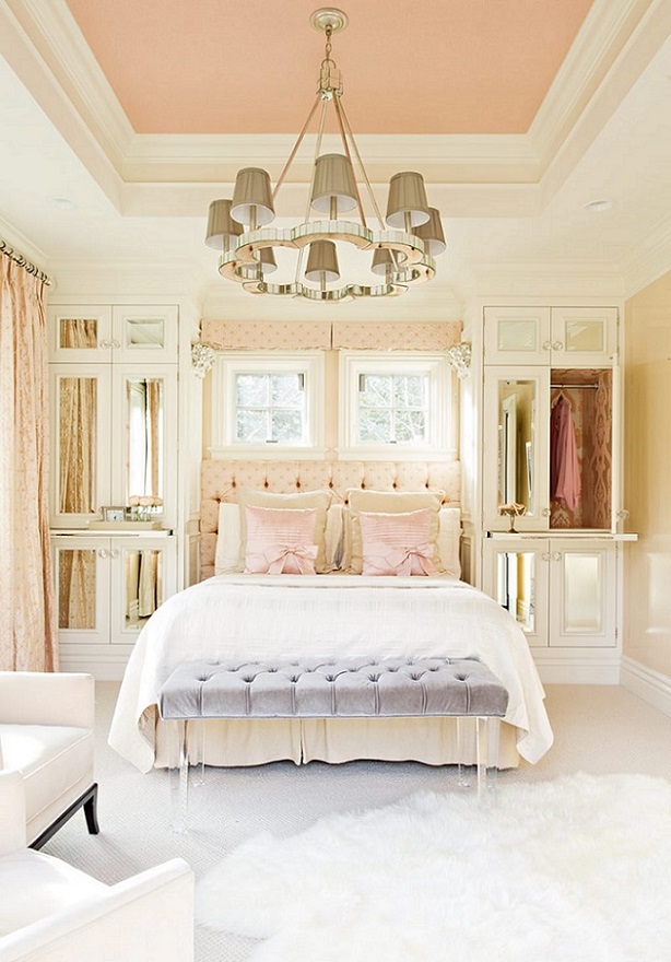
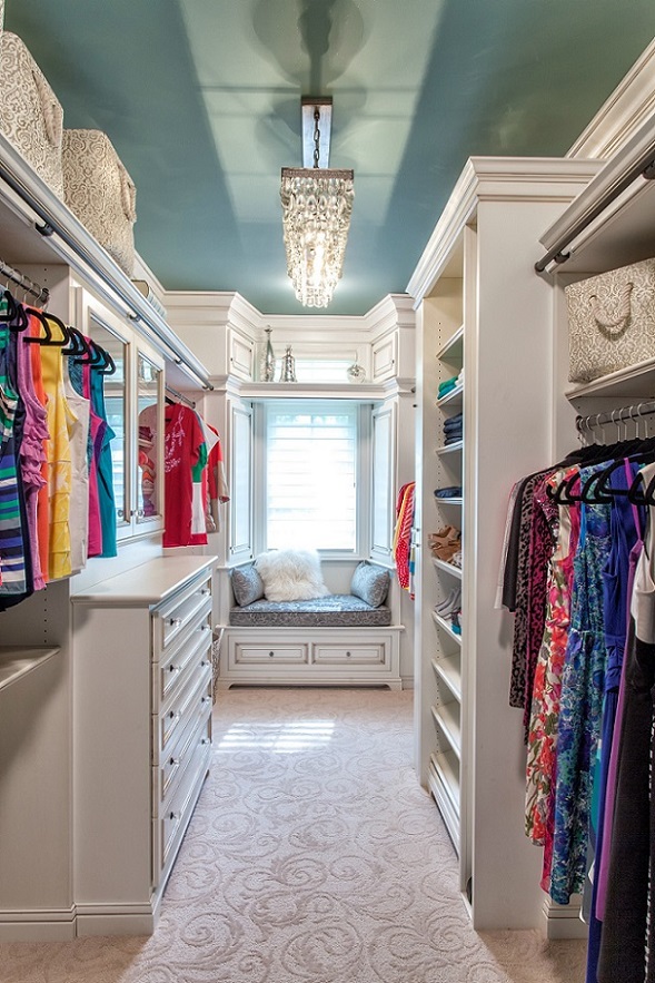
Color ceiling
Don’t be afraid of painting a color ceiling!
Paint palette 25.
Summer feelings expressed by paint palettes

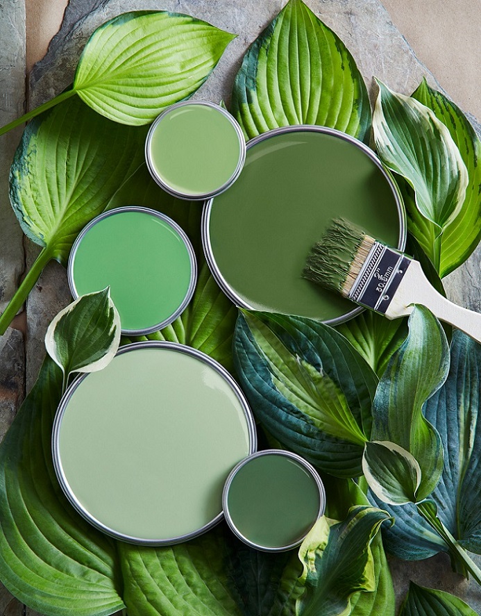
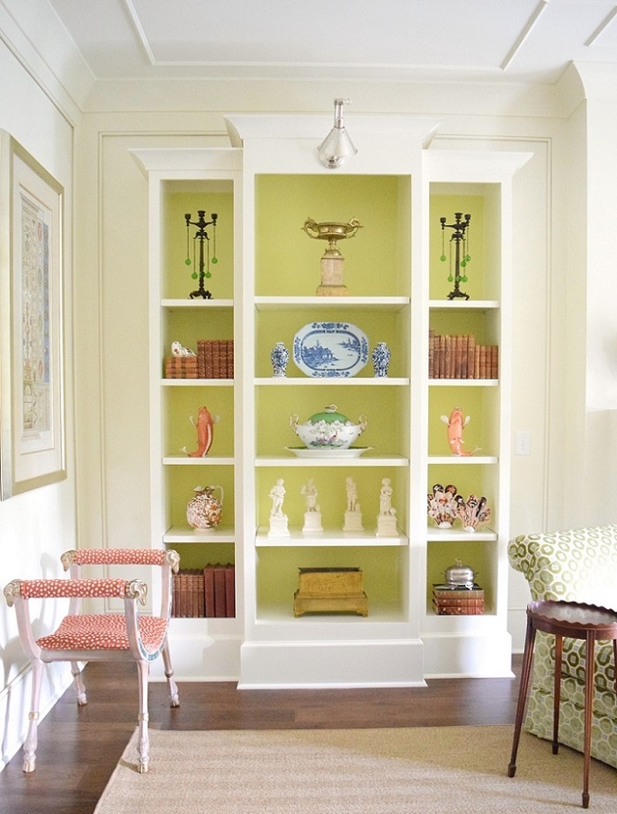
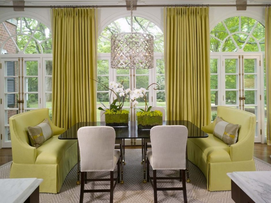
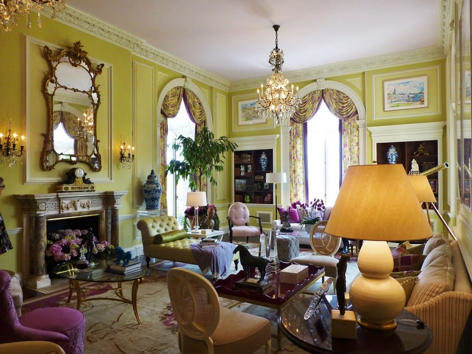
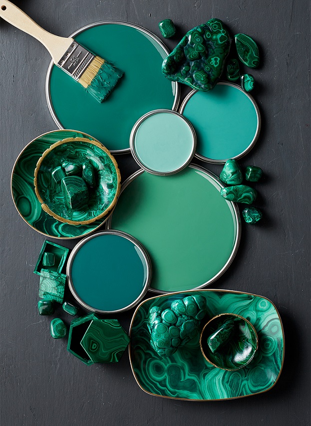
Chartreuse
Chartreuse color is in the middle between green and yellow on the color wheel. Although it is a vivid hue, it’s not very showish because of it’s mid-dark tone. It is perfect for focal points but looks good on big surfaces also. In the latter case, it might be outweighed by neutral colors. It was named after the French liqueur made by Carthusian monks since 1764, which is made from 130 plants and herbs, that gives its natural yellowish-green color.
Paint palette 24.
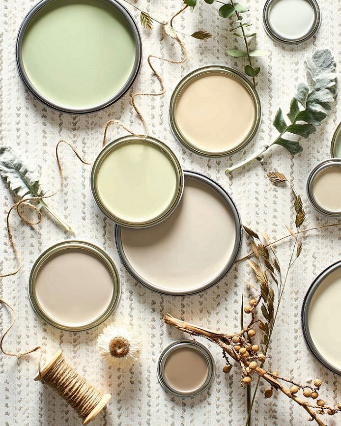
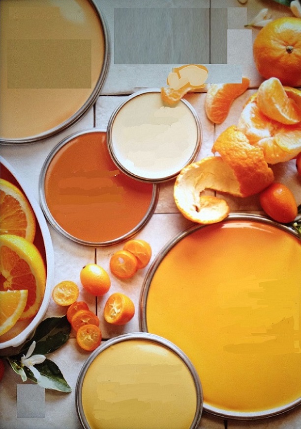
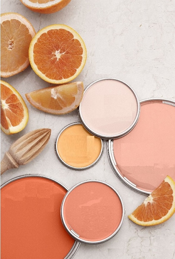
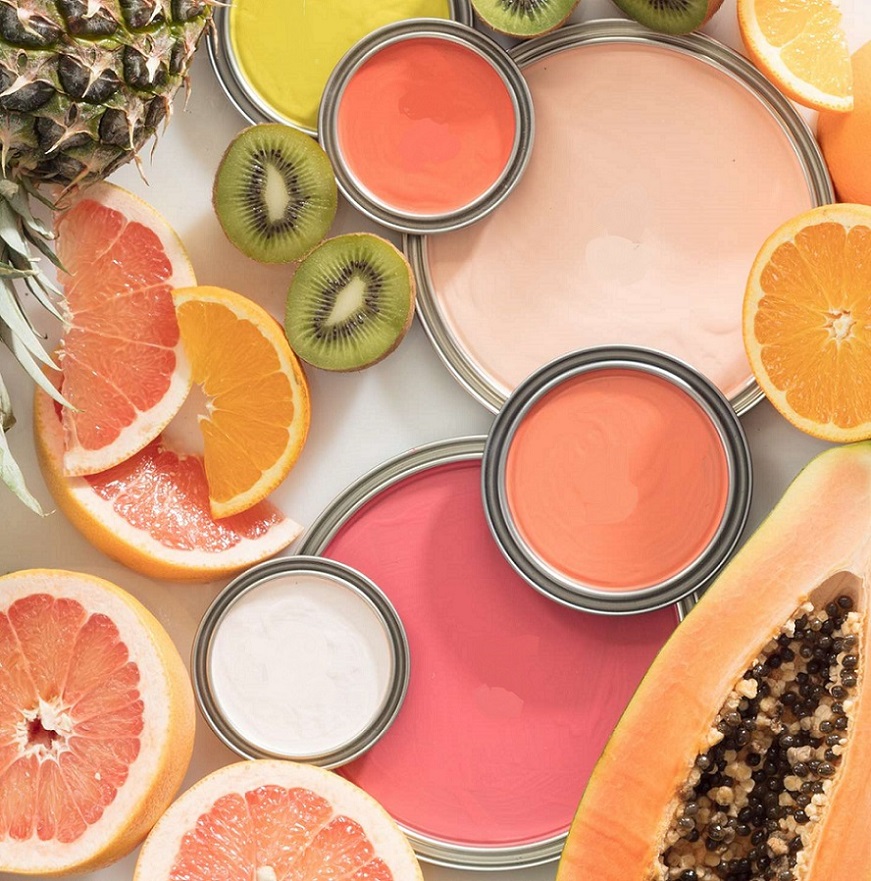
Warm citrus color palettes for compensating cloudy weather
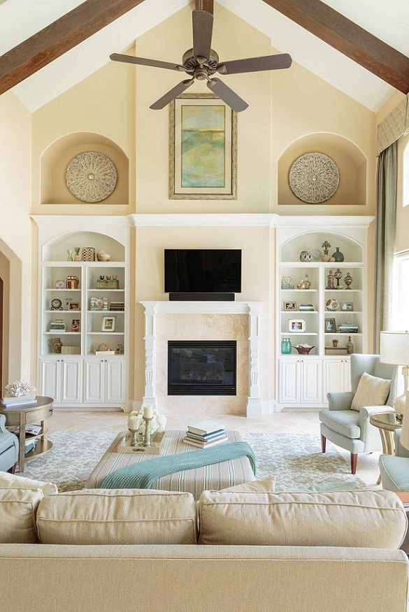
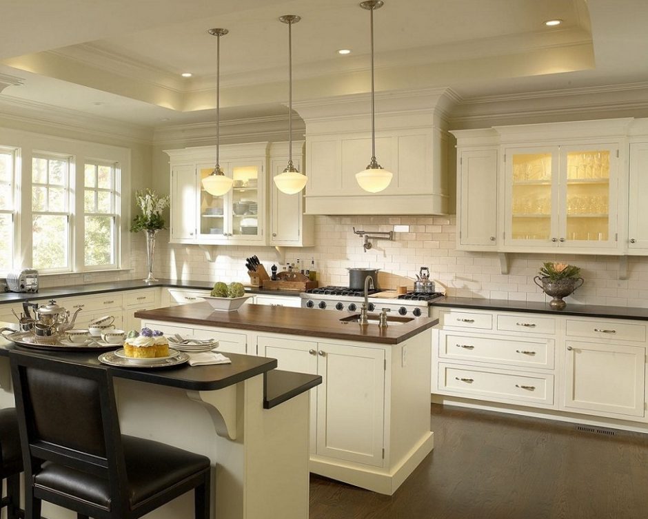
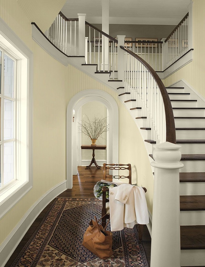
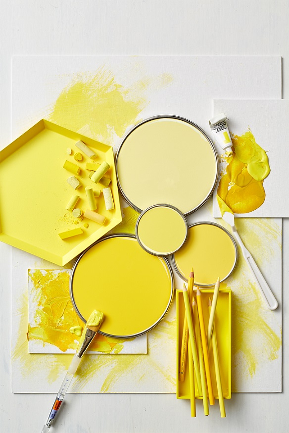
Cream
Cream color is produced by mixing white and some yellow. In interior design, it is frequently used instead of pure white, when it would convey too vivid or steril impression. A vintage effect can be reached by using it, which fits perfectly for antique objects. It was named after the milk of cattles grazing on fields rich in yellow flowers.
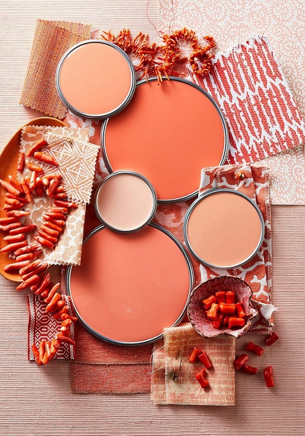
Fuchsia
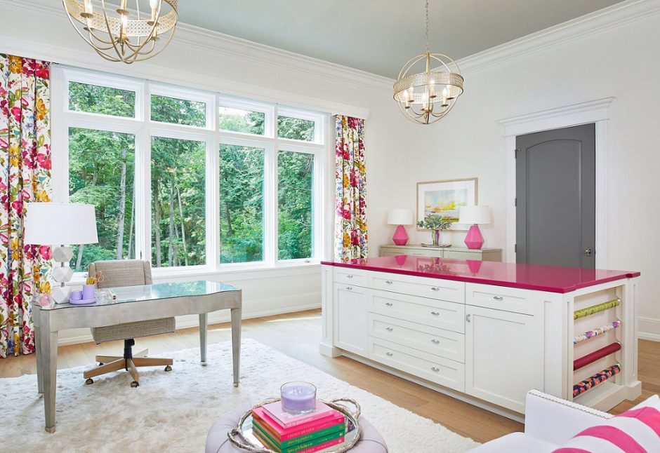
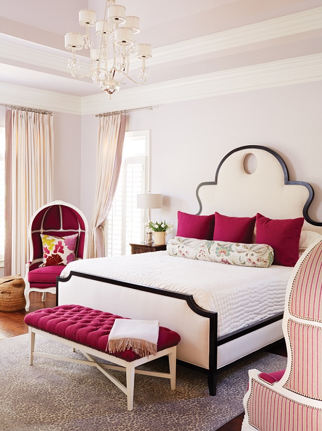
Fuchsia was patented in 1859 as an aniline dye. It was renamed magenta later, so the two colors are the same. This is a vivid, middark, purplish red hue. Originally it was named after the flower and renamed after the place of a victorious battle in 1859. Since it is a stron and energizing color, let’s use it moderate in interior design, rather as a focal point or pop-color. It can be a good alternative instead of using red.

Paint palette 23.
Forceful paint palettes
Umber
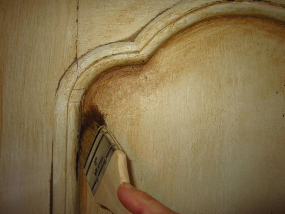
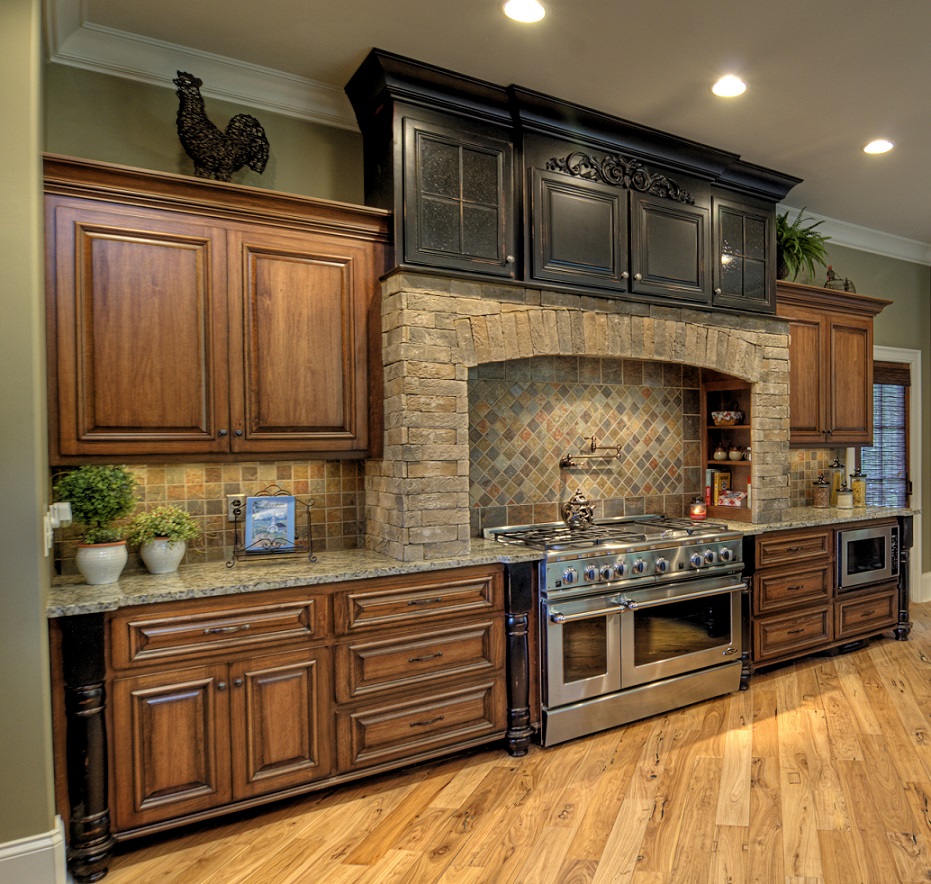
Umber is a yellowish, dark brown hue. It is made of a natural earth pigment which was named after its source, Umbria region of Italy. Both raw and burnt versions are used. Nowadays, umber brown is mostly used during aging furniture painting method: an antique look can be reached with applying it in a thin layer on a different color base, as shadowing.
Paint palette 22.
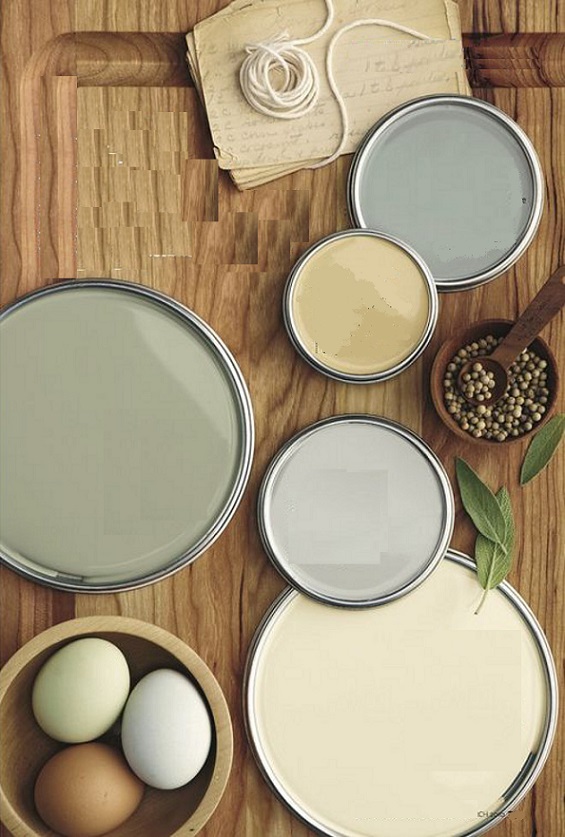
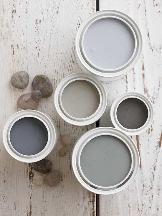
Natural, neutral color palettes