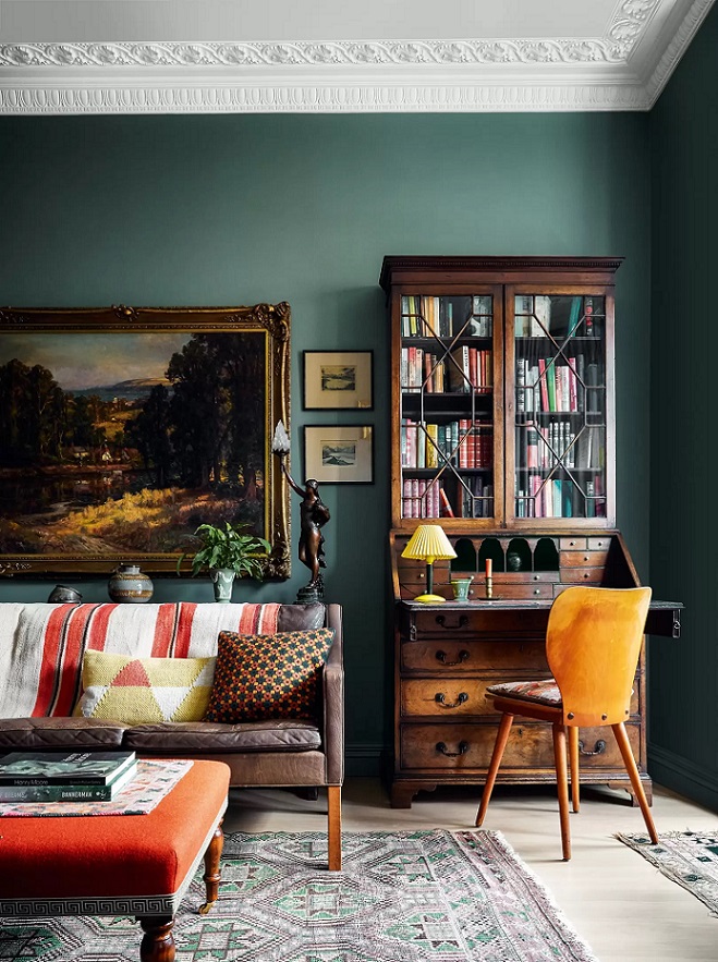
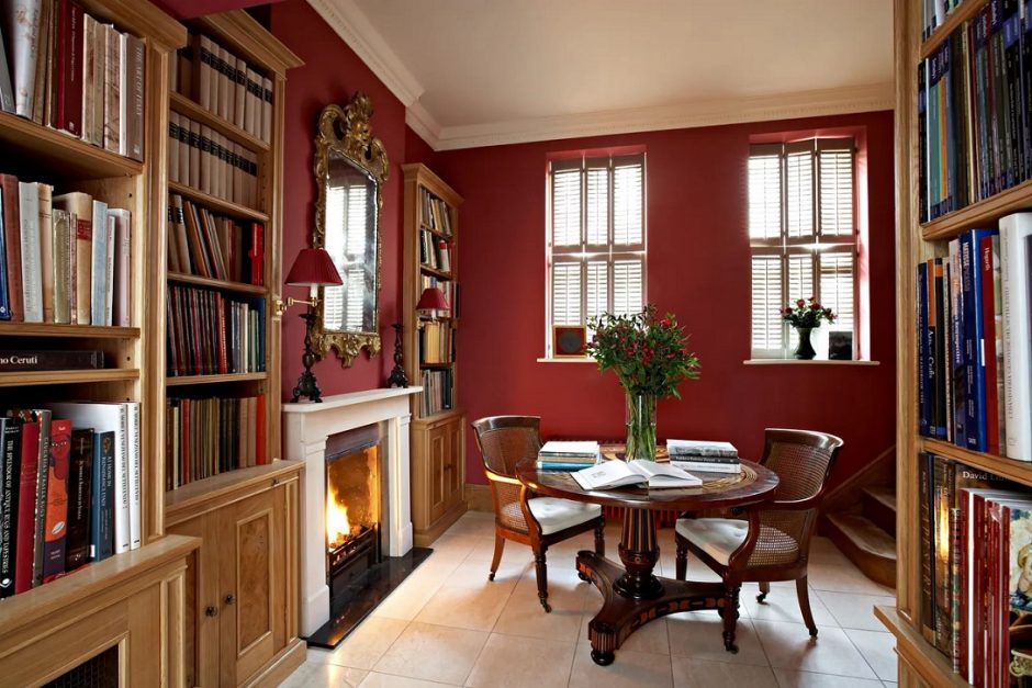
Don’t afraid of using dark colors on walls: elegant, spectacular and make the room cozy
Archives
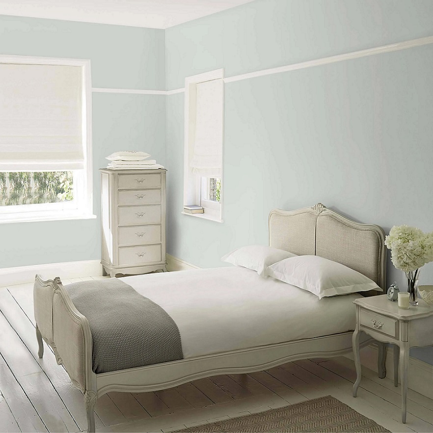
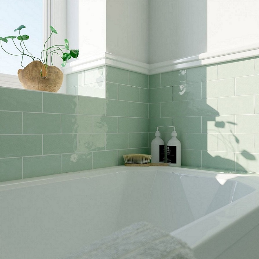
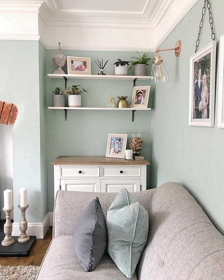
Eau de Nil
Eau de Nil (water of the Nile) is a cool, light bluish-green hue with a little tan undertone. It was popular in the middle of the 1800s when Europe was Egypt-obsessed but much more subdued colors were desired after Empire style. It complements very well the palette of light neutrals (e.g. creme, off-white, light beige, sand) but even looks good on big surfaces.
Paint palette 27.
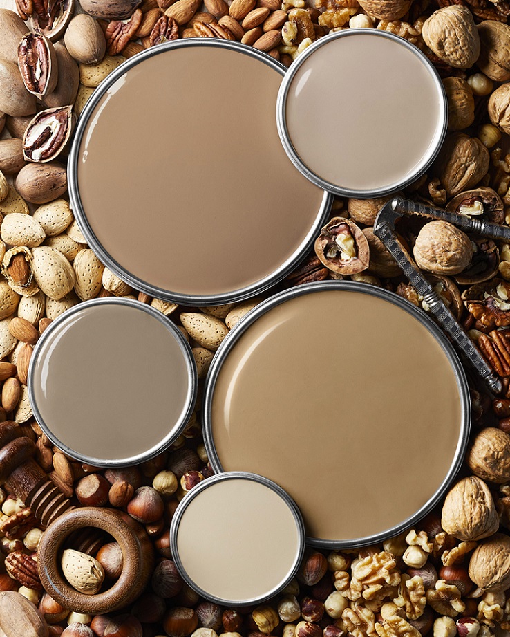
Neutral beiges and browns are thought to be safe color choices

Paint palette 26.
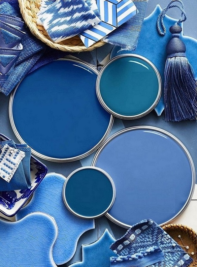
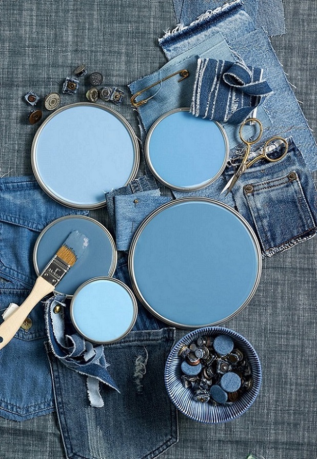
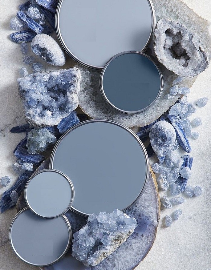
Fresh blue palettes from intensive to subdued tones
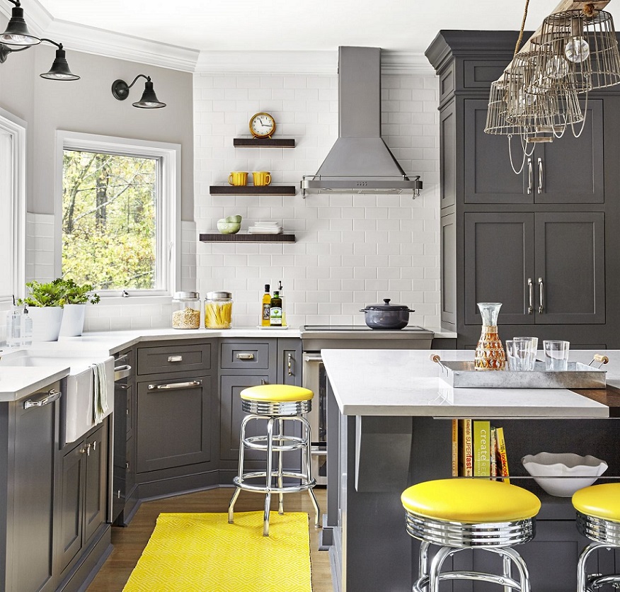
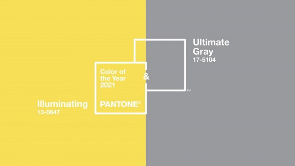
Colors of the year 2021
Every December Pantone company announces the color of the next year which effects interior design also. Illuminating no. 13-0647 and Ultimate Gray no. 17-5104 are the colors of the year 2021.
The grey member of the pair is a perfect neutral hue. It can be found in nature, for example among colors of pebbles and rocks. It works perfectly as a background because it strenghtens every other color. As its name indicates, it gives a solid base.
The yellow member of the pair is a warm and strong color, which enlivens the space and brings happyness in everyday life. It looks especially stong near the grey, although it is not a too vivid hue.
Both colors are mid-dark tones which can be used in interior design very well. Complementing them with white, a more subdued effect can be reached. However, adding a little black to them can further enhance the lightening effect of yellow.
The combination of the two colors can be freely used for example in kitchen, home office, living room or even in kids room.
Ask for help of an interior designer for making the colors of the year 2021 appear in your home in style.


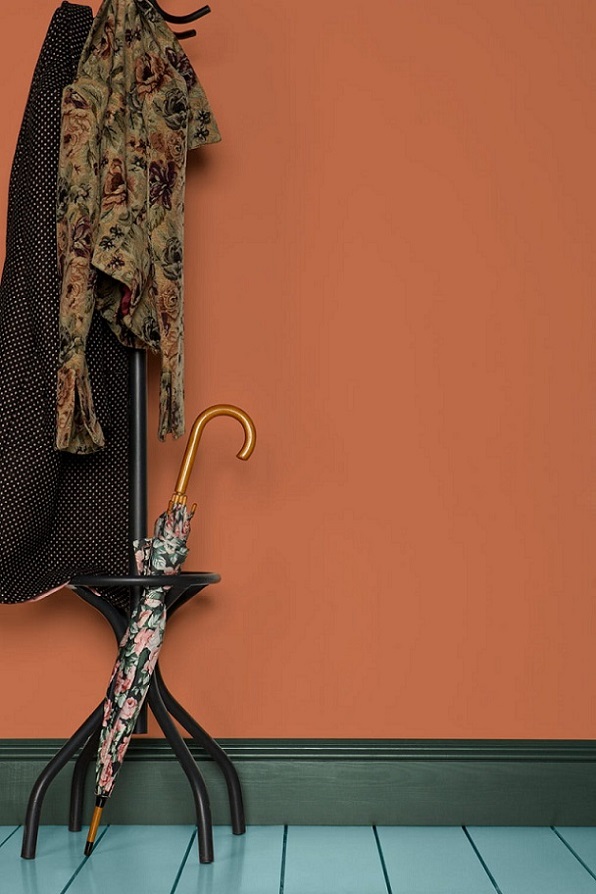
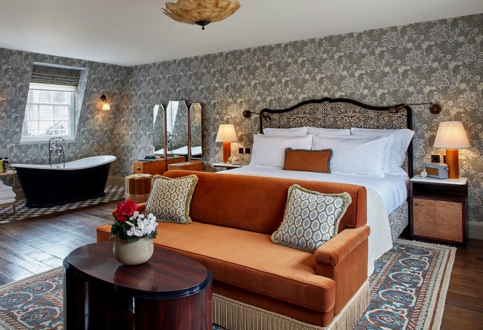
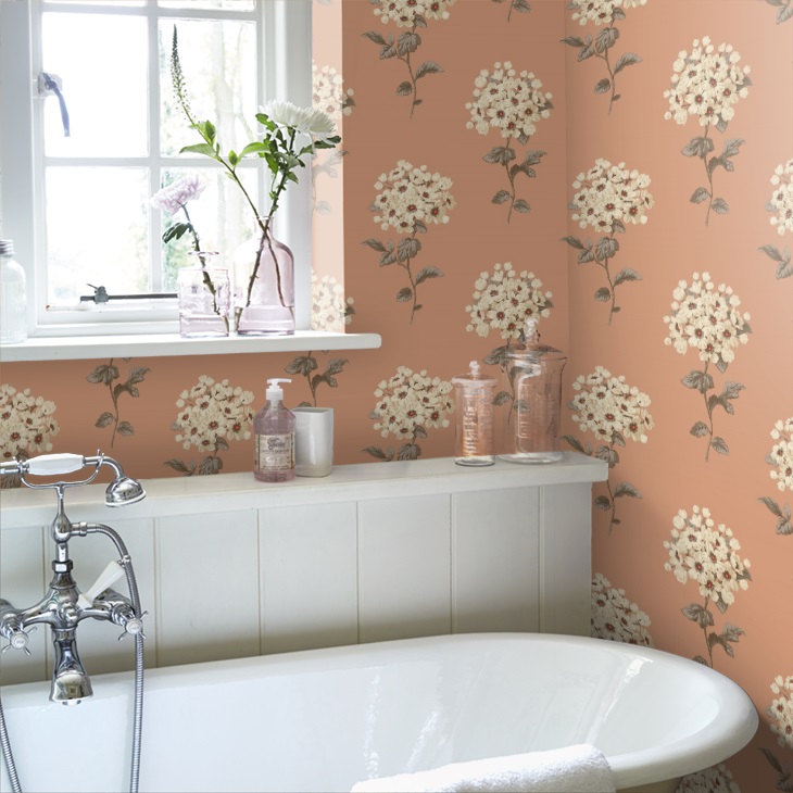
Terracotta
Terracotta color was named after pottery made of clay (terra cotta = baked clay). It is based on orange which contains a pintch of brown, this way it looses strength and becomes a more subdued earth color. It is warm and close to nature, its friendly effect makes the space cozy.
Advisory 3.
Interior design consultation, color and style consultation, consultation based on Feng Shui at Classic Interiors.
After working hours or at the weekend, when you have time also. Even online!
It is an hourly service, so it can be pre-calculated – you decide how much time to spend on it.
Contact me for further details via Messenger or e-mail.
https://classicinteriors.hu/en/contact


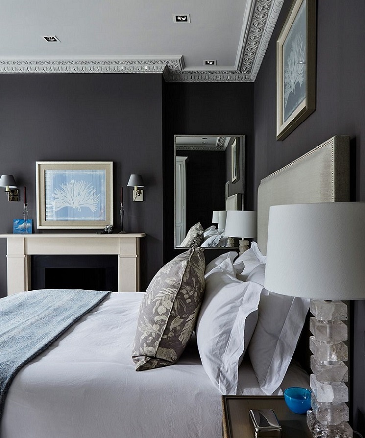
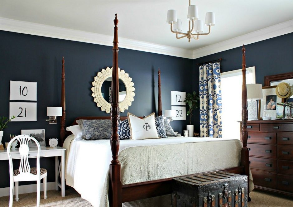
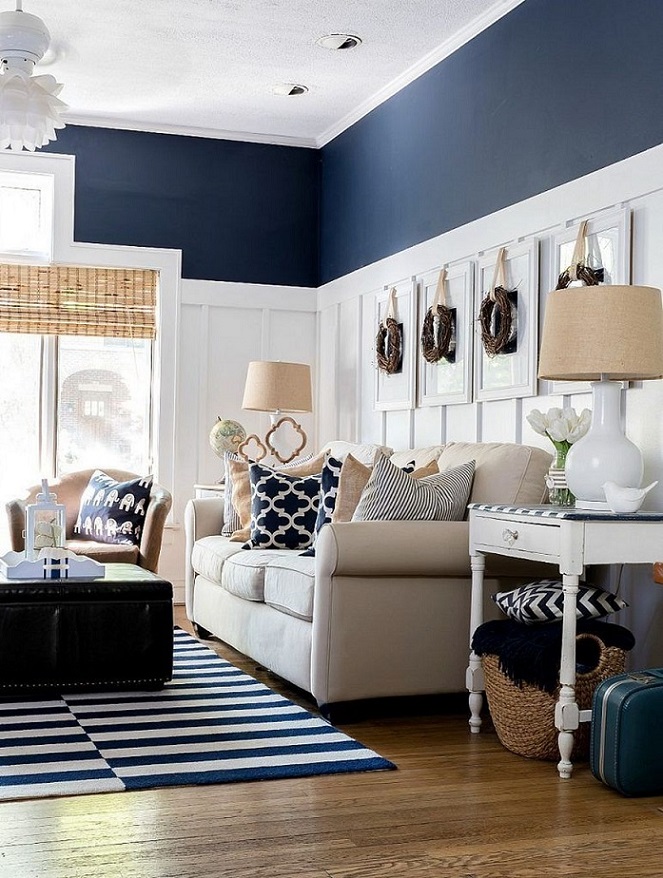
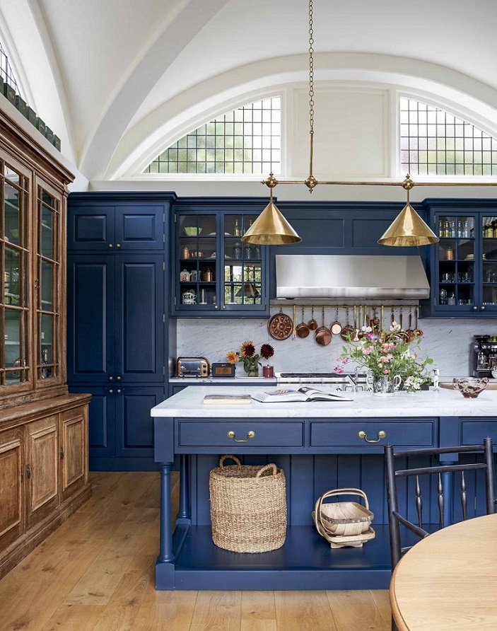
Navy blue
Navy blue is a really dark shade, which gives elegance and depth for the space. It can be used instead of black if it would be too rigid or sombre. It got its name from the color of clothes worn by officers in the Royal Navy since 1748 and adopted by other navies around the world. It looks best paired with white.
Monochrome
In the case of a monochromatic interior, make sure using several textures and patterns. This way it is avoidable to feel the room boring or depressing.


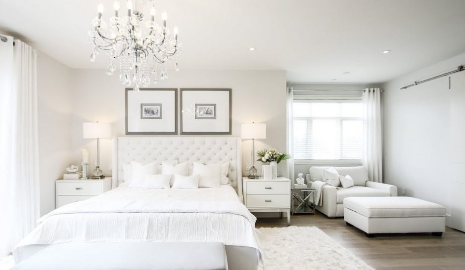
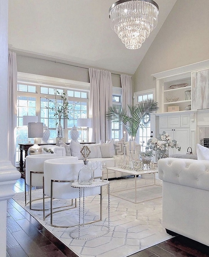
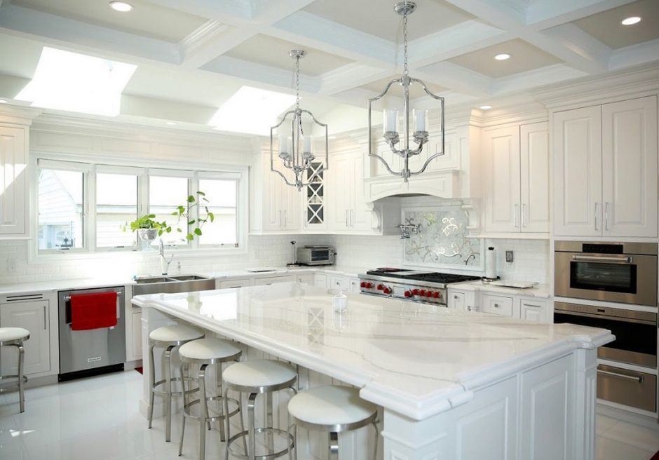
All white
White with white – but not Scandinavian or vintage