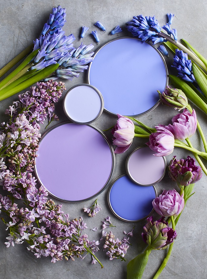
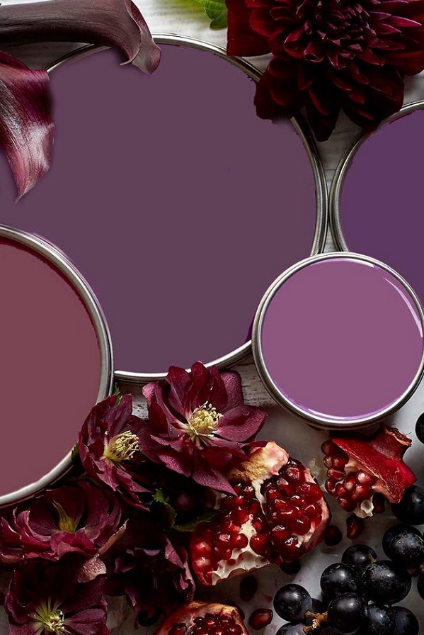
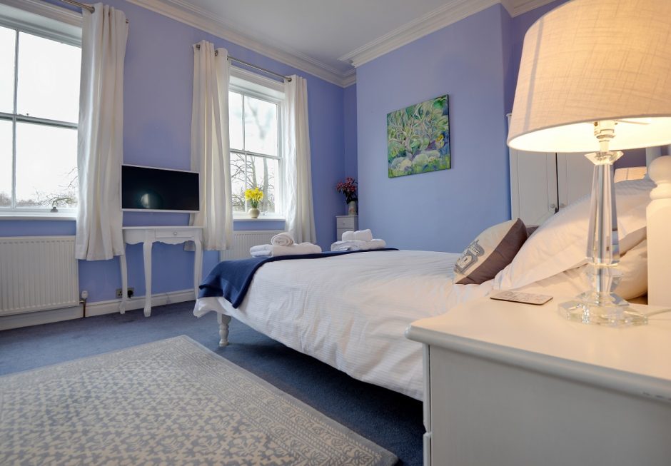
Bluish purples, mauves, purples – none of them is common or „safe” choice, but a pleasantly soothing mood can be achieved by them
Archives

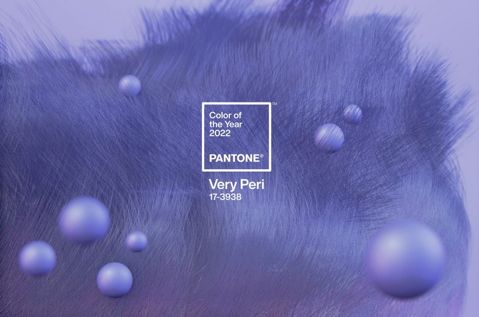
Color of the year 2022
Every December Pantone company announces the color of the next year which effects interior design also. Very Peri no. 17-3938 is the color of the year 2022, which is from periwinkle. It was created specifically for this occasion.
This is a soft, pleasing blue-violet hue, which looks like a pastel although it is not. The blue was mixed with pink rather than red, which gives the slightly airy effect. Since it contains much more blue than pink, it can be classified as blue. It gives you peace of mind, but also gives you curiosity.
It is a medium dark shade, so it can be used in larger quantities. It fits well for country and shabby chic styles, nursery, bedroom or even at home office. It can refresh a palette of neutral colors as it is a cool shade.
Ask for help of an interior designer for making the color of the year 2022 appear in your home in style.


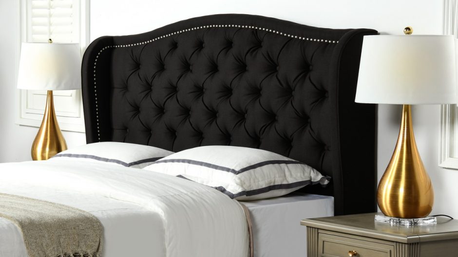
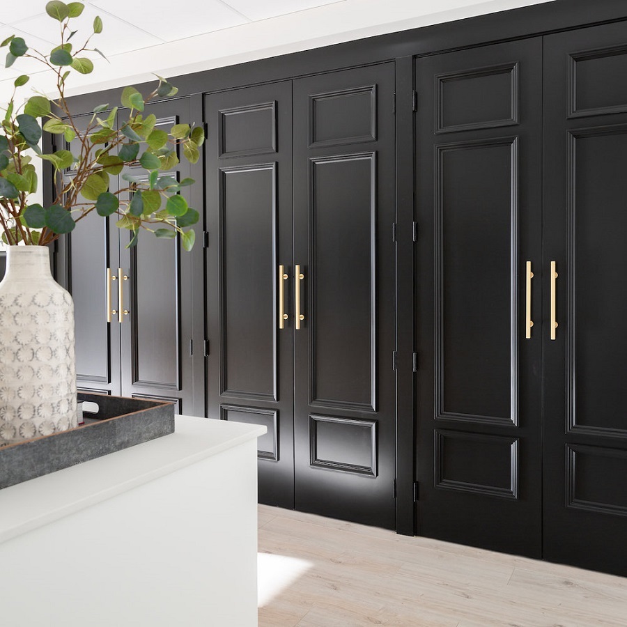
Jet-black
Jet-black is the darkest shade of black. The light shine (metallic luster) gives its elegance. It can be combined with any color, all of them will seem to be stronger and more vivid. Its use in interior design requires boldness even if it is only on accessories. It was named after the semi-precious stone jet, which is not a mineral but a piece of wood formed under high pressure and wet conditions. It is hard to work with it. It was mined for making mourning jewelry in the Victorian era.

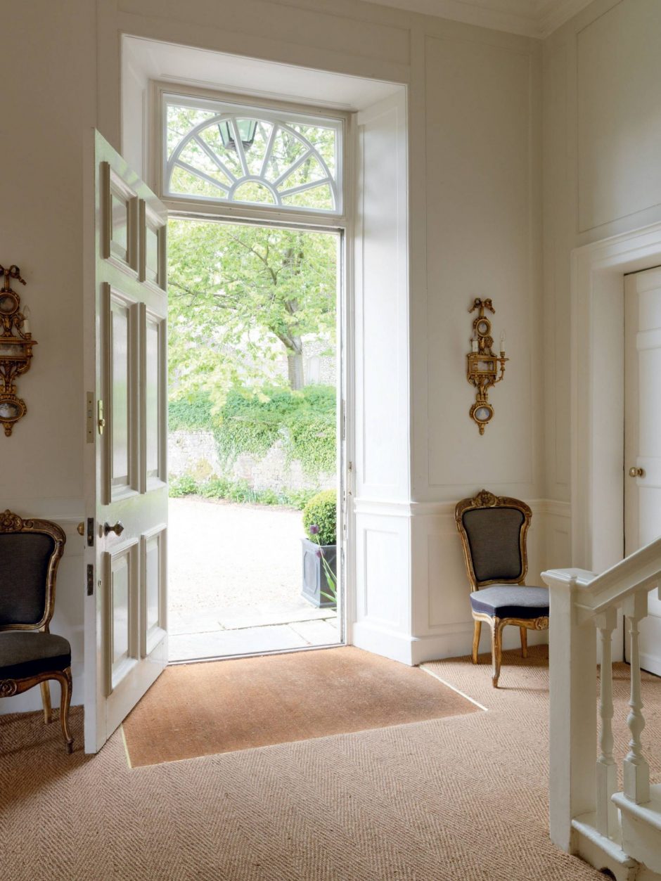
Off-white
Off-white is a shade of white with a few yellow undertone. It used alongside pure white can appear dirty – so, avoid this combination. It is used in interior design if pure white might look too rigid or intense. Off-white is a good complementary color for both strong colors and neutral palette and looks like white. For example, when painting door and window frames, wall panels, mouldings, it is worth trying next to the selected wall color.

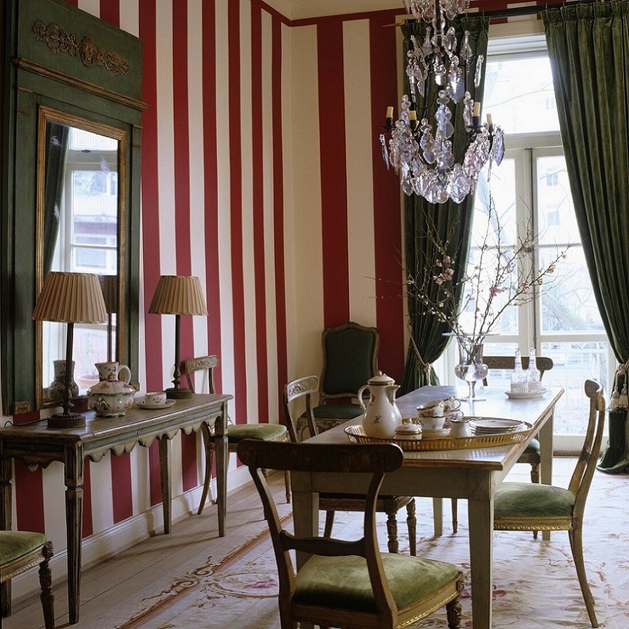
Tone-on-tone
If patterns are needed but don’t want them too dominant, tone-on-tone is the solution
For 20th August
Red-white-green interior ideas for 20th of August, the Hungarian national holiday

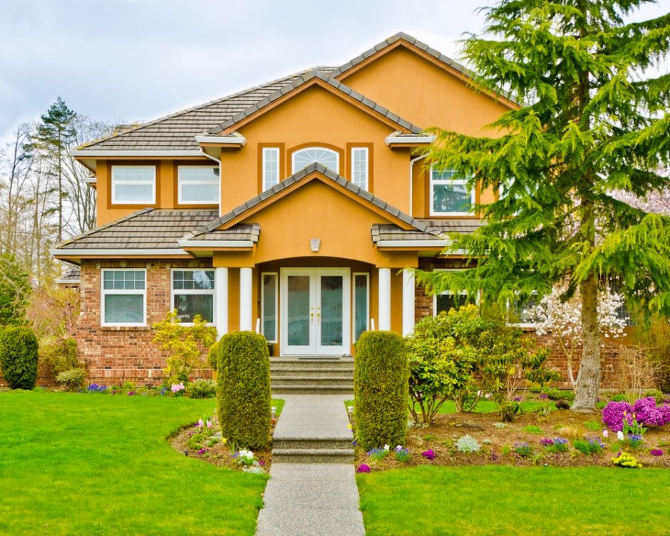
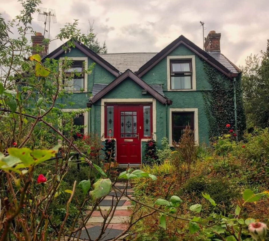
House colors
Instead of the ordinary and boring beige-white-grey, let’s choose a bold color for painting the walls of our house

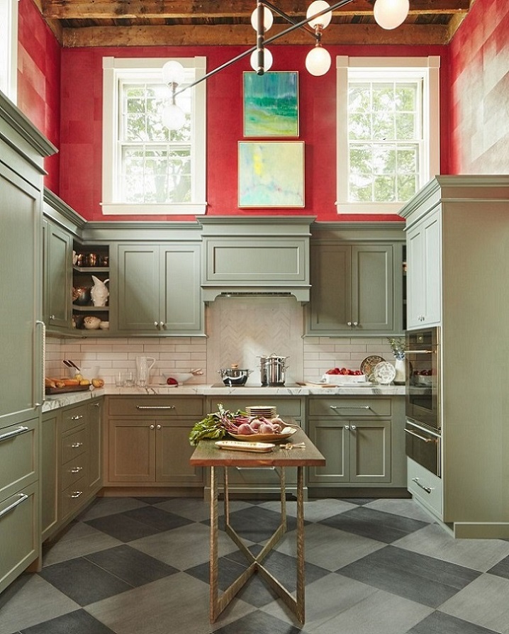
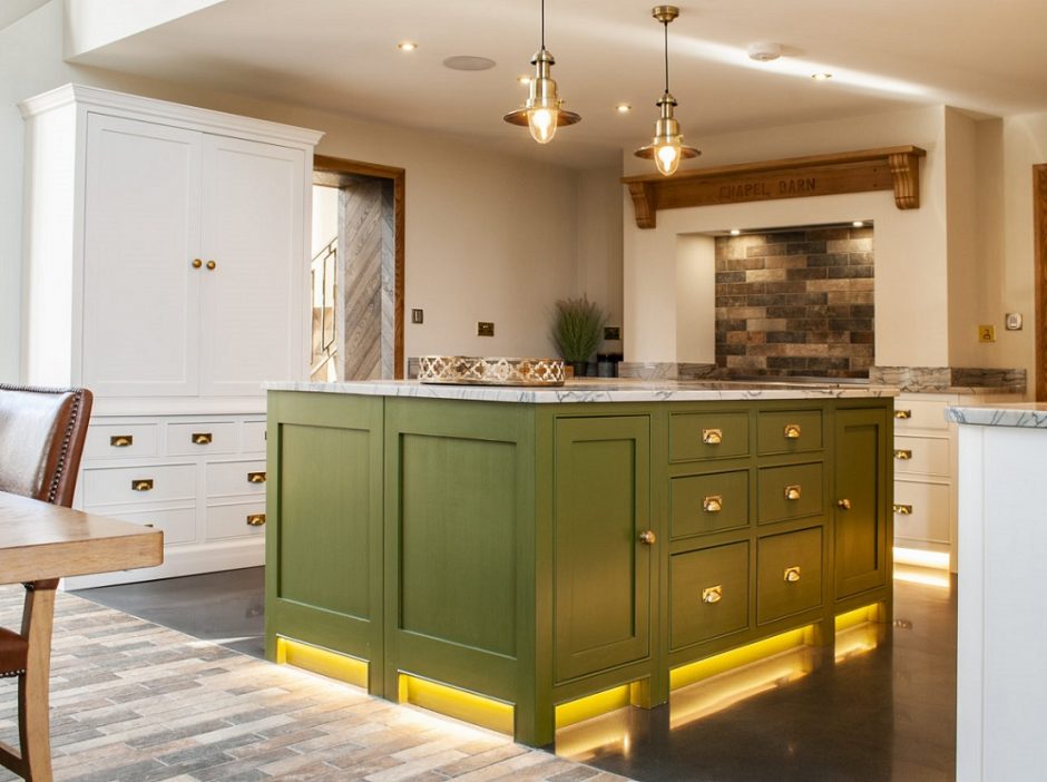
Olive
Olive is a relatively dark yellowish-green color. It has a few earthy undertone, zhanks to the hint of brown. It is not vivid, so it is very versatile in interior design. It is a very good complementary color for neutral palettes, for example. It was named after the green olives.

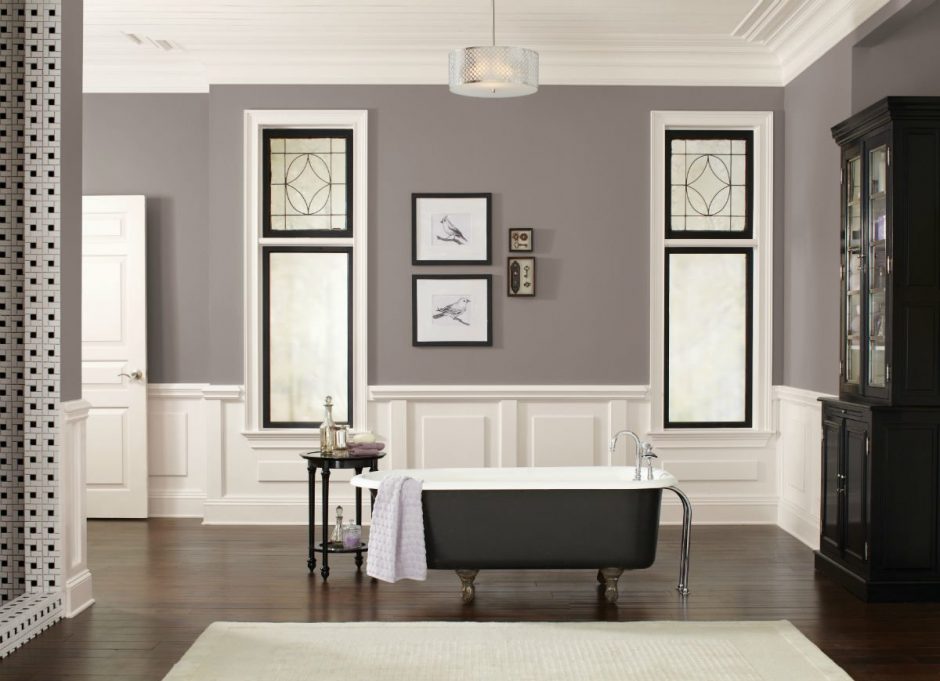
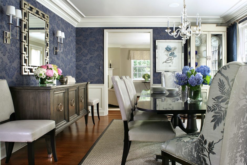
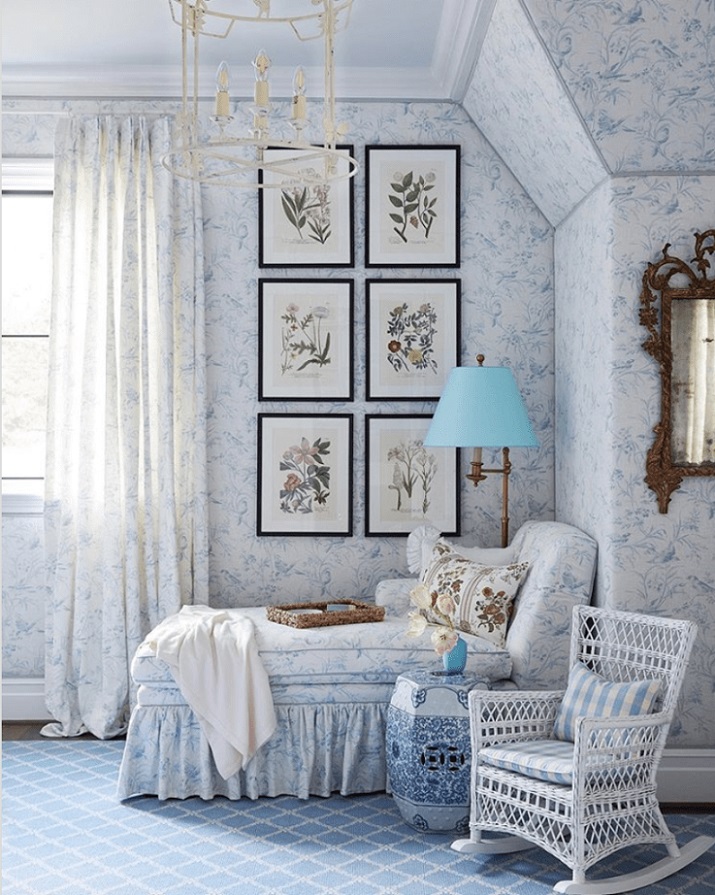
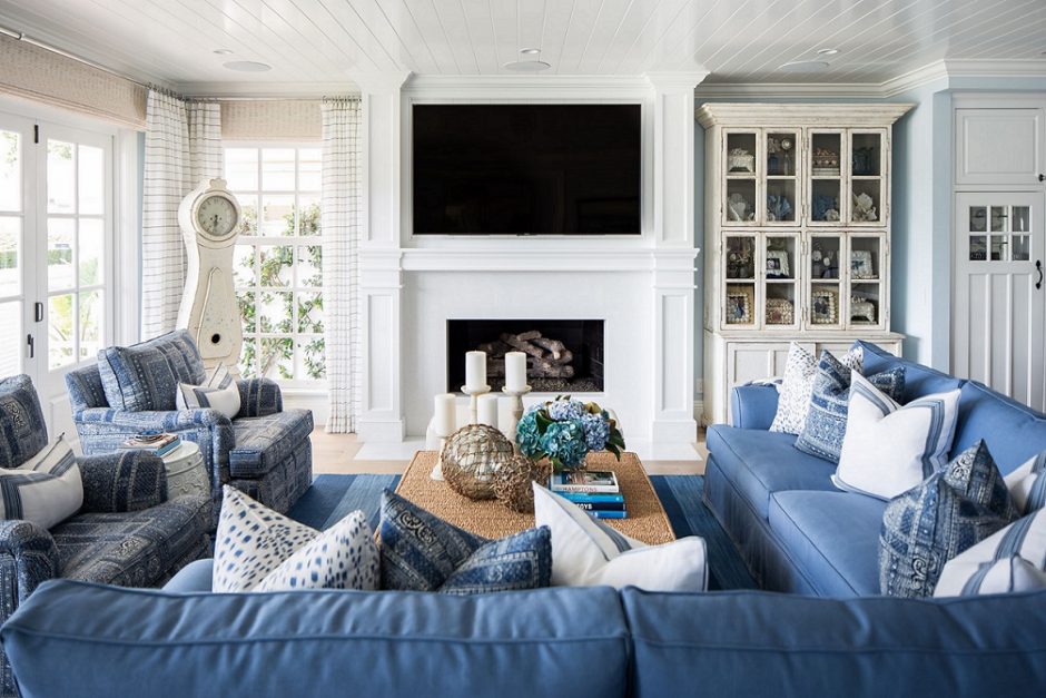
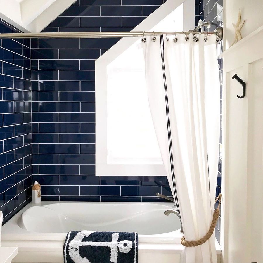
Blue-white
Blue-white is a classic pair which never goes out of fashion
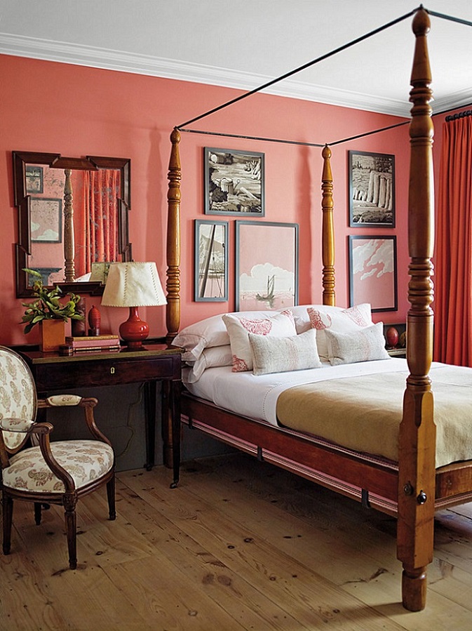
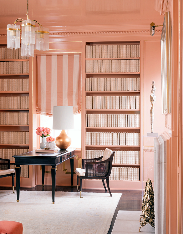
Salmon
Salmon color is a quite vivid pinkish-orange hue. It’s lighter and darker tones are both frequently used in interior design, first of all as an additional color. It fits well for seaside style, for example. It was named after the flesh of wild salmon, which get their color from eating krill and shrimp.