Colors of autumn in our home
Archives


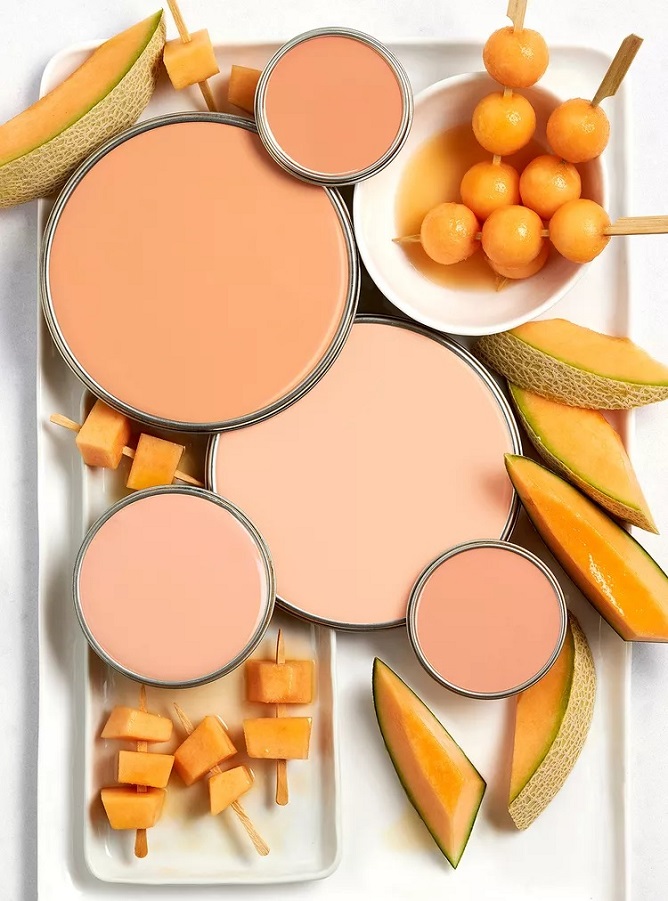
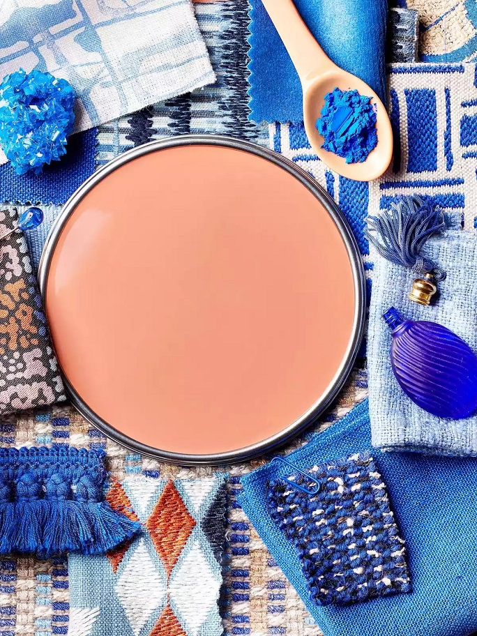
Paint palette 30.
Palettes of summer colors
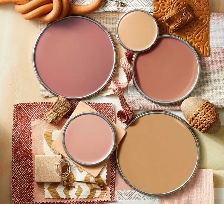
Paint palette 29.
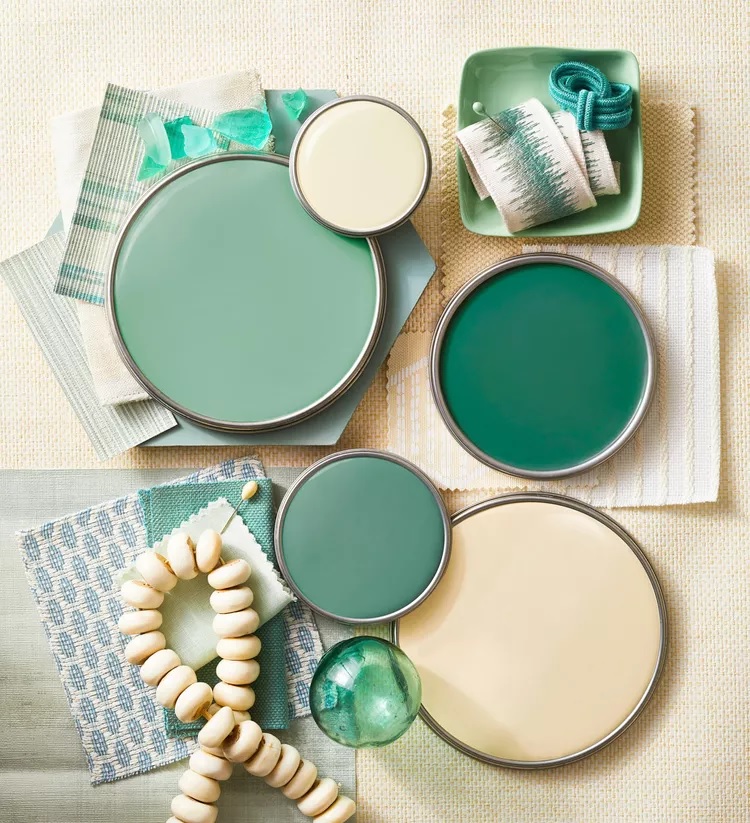
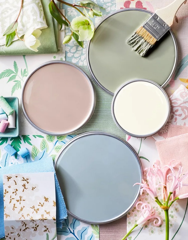
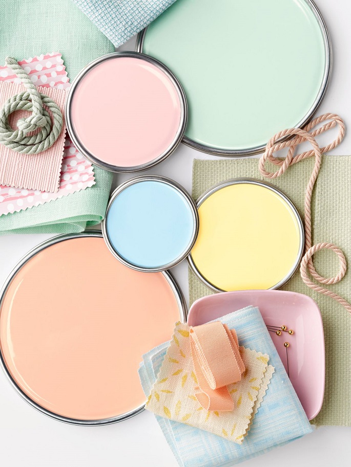
Harmonious palettes of paints and fabrics
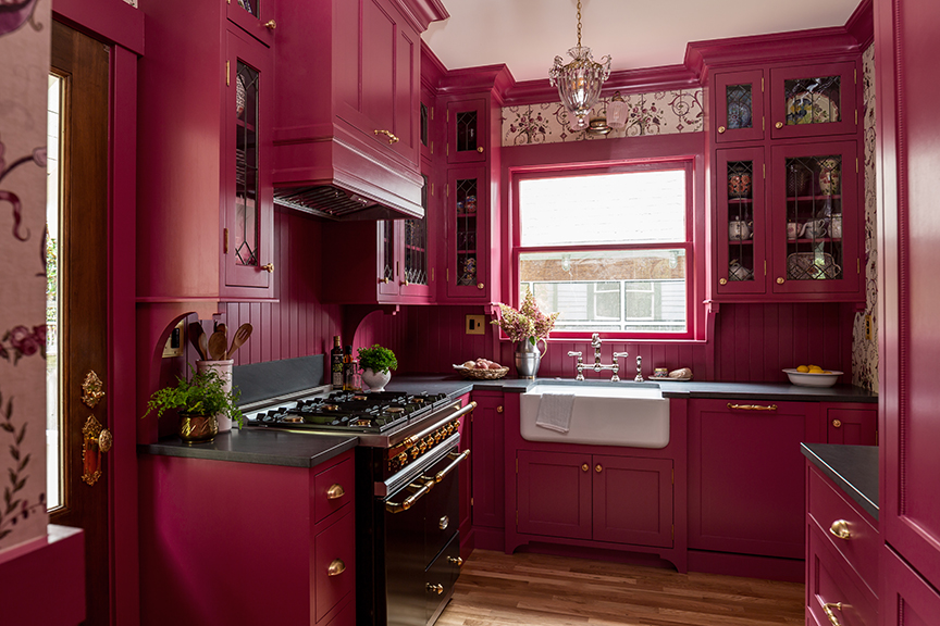
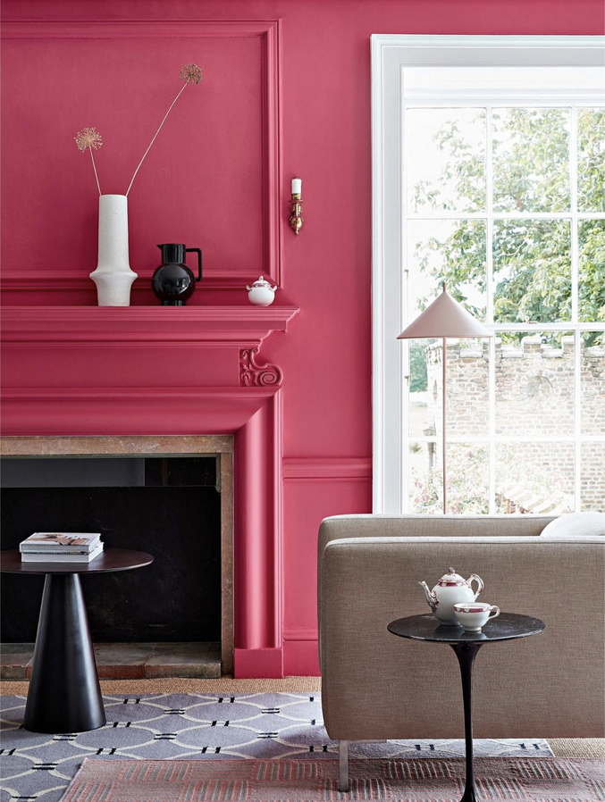
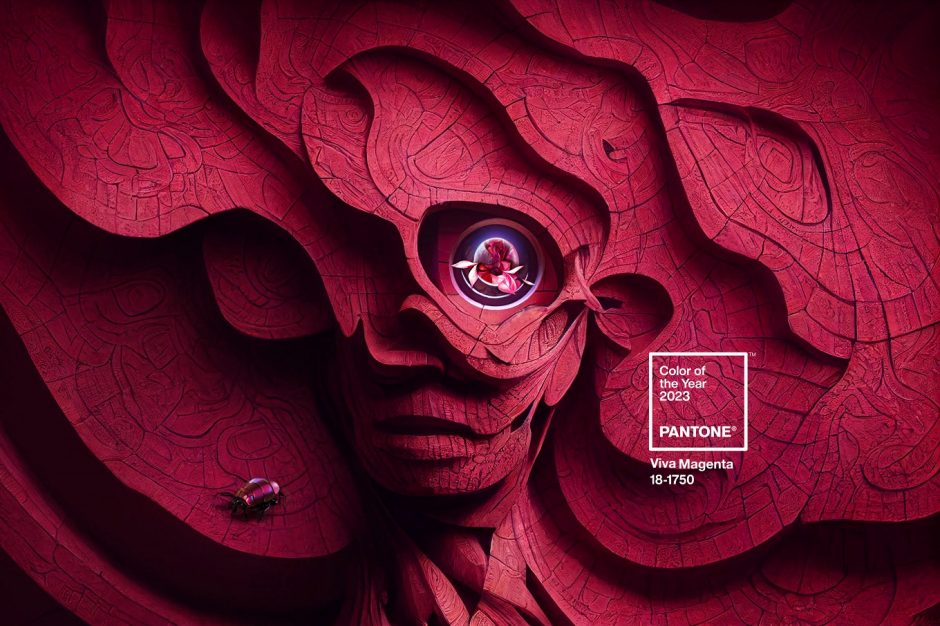
Color of the year 2023
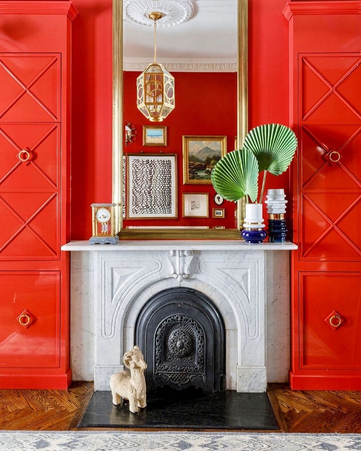
Every December Pantone company announces the color of the next year which effects interior design also. Viva Magenta no. 18-1750 is the color of the year 2023.
This is a powerful, although not intrusive, rich red hue (unlike the vigorously pink magenta color known in the common language). Creators were inspired by the original red color gained from cochineal. In this way, it can be traced back not only to nature, but also radiates luxury.
It is a medium dark shade, so it can be used in larger quantities. It fits well for kitchens, luxurious living rooms or even masculine interiors as a pop of color. As every red hue, this has invigorating, energizing effect, so it should be carefully used in bedrooms and children’s rooms. Ask for help of an interior designer for making the color of the year 2023 appear in your home in style.


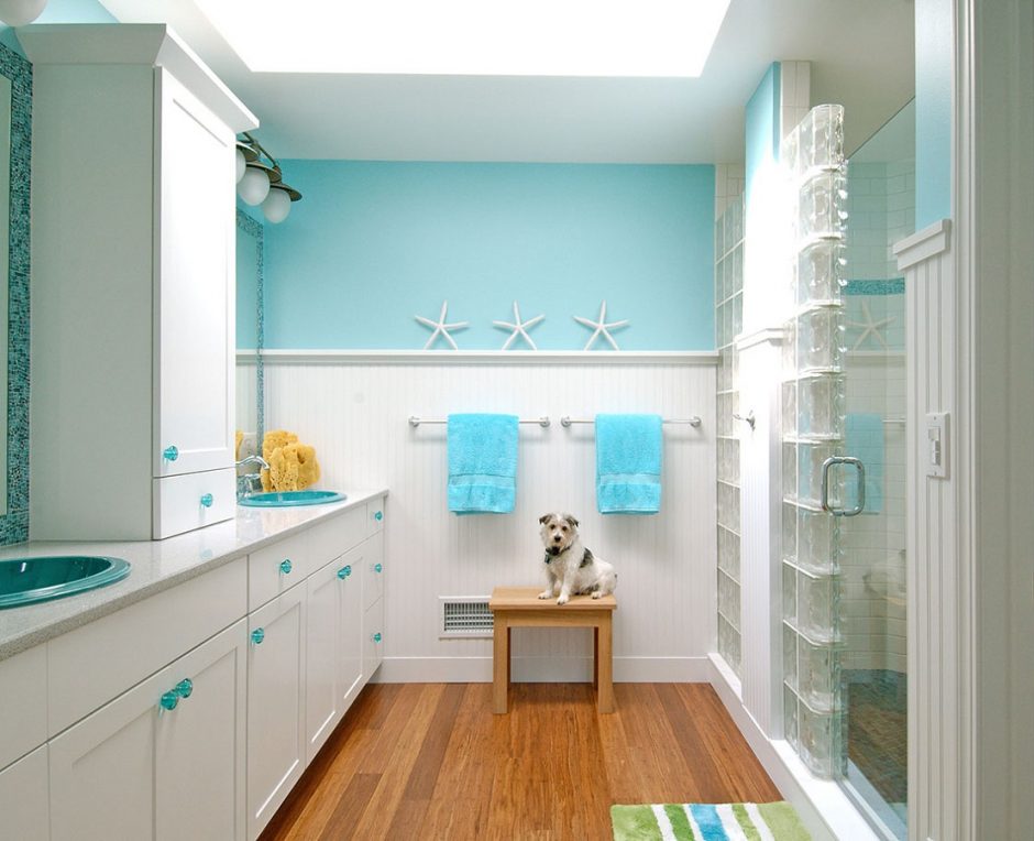
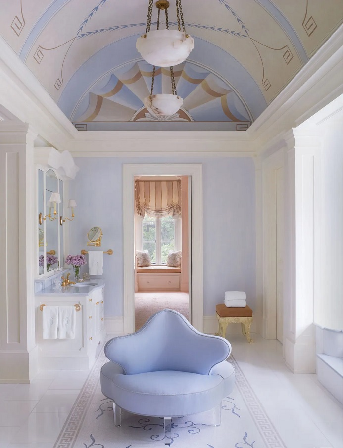
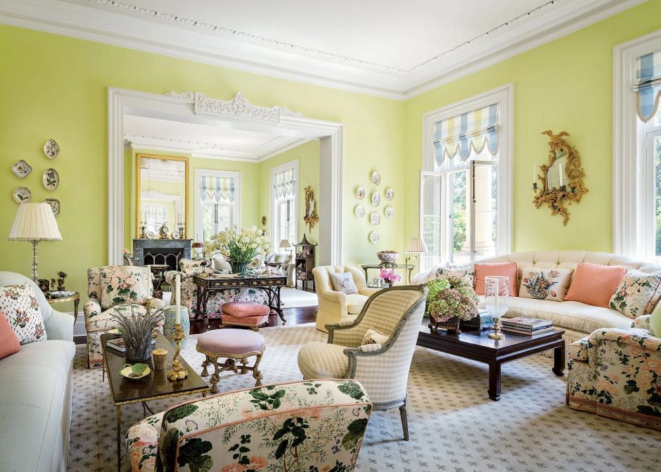
Pastels
Pastels are a family of colors of any hue characterized by relatively high lightness and low saturation. They get a place in almost all interior design styles because they are restrained and most of them give a neutral background. For example, the popular beige, powder and cream colours belong here also. Pastel colors can be boldly used on large surfaces, they combine well with each other and expand the feeling of space. They are named after an artistic technic. With the chalks applied here, such bright, airy colors can be achieved.
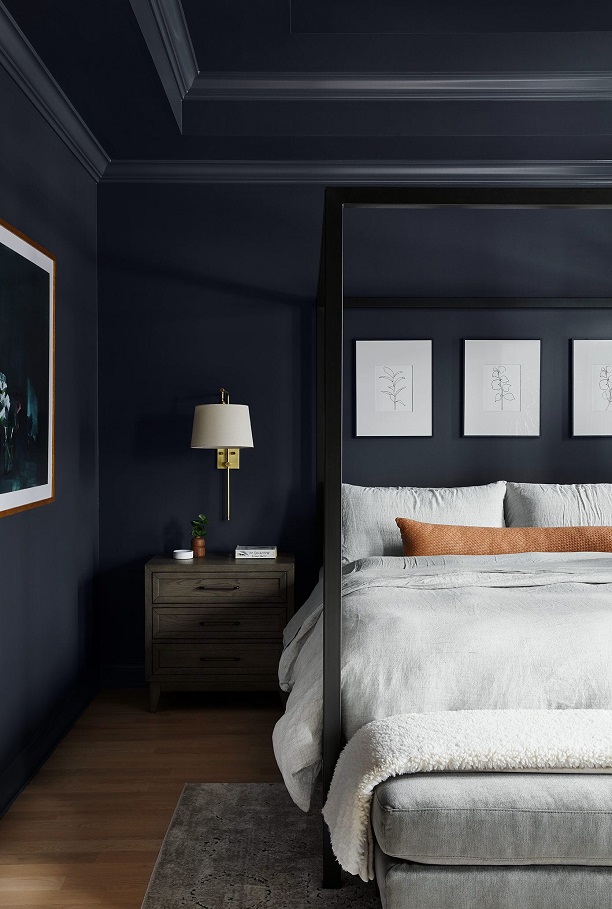
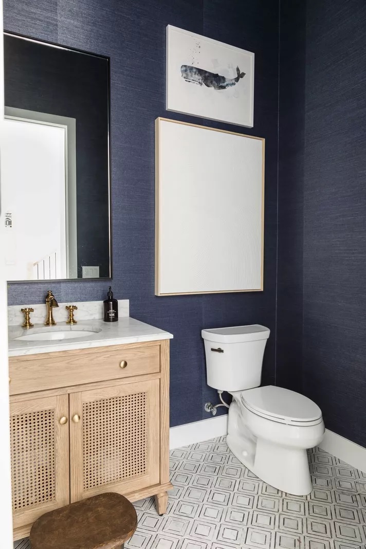
Indigo
Indigo is a dark but not vivid bluish-violet hue. It is the inner color of the rainbow, near blue. It was named after the natural blue dye which is extracted from the Indigo shrub.
Those who like dark colors in their home can use it even on all four walls. It gives depth to the space, but it also radiates elegance. If we want to pair it with other colors, pay attention to its clear purple tone. Thanks to this, it has less formal effect than clearly blues with similar tones and intensities. It can be well combined with both pure white and natural, neutral colors. To create a masculin interior, choose the shades of brown for pairing.

Summer colors
Colors of summer in our home

Spring colors
Colors of spring in our home
Vermilion
Vermilion (alias Chinese red) is a brilliant orage-red hue. It dominates the space, so use it very carefully in interior design. It is recommended as a color for accessories if you want to throw up space or creating a focal point is the target. It should be used on large surface in a room which we stay only a little, but not for sleeping (e.g. separate dining room). The pigment was made from mineral cinnabar (mercury sulfid) which is toxic, so it is now produced artificially.

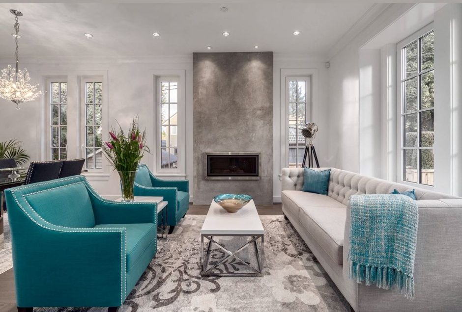
Turquoise 2.
Turquoise is a bright, happy shade of blue, containing green. It is the color of the Carribean waters and Mediterranian sea so, we mainly associate with water and seaside by it. It is a very good complementary color for the neutral colors (white, grey, beige, brown etc.), vitalize the space. It is popular in interior design. In larger quantities, use it in rather sunny rooms. It was named after the semi-precious stone.