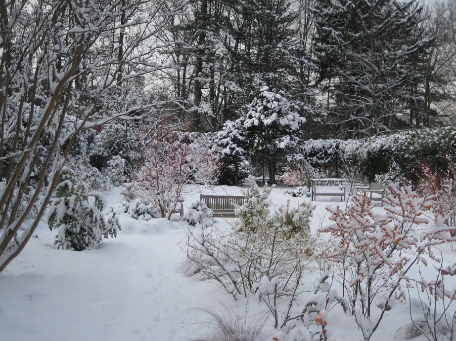
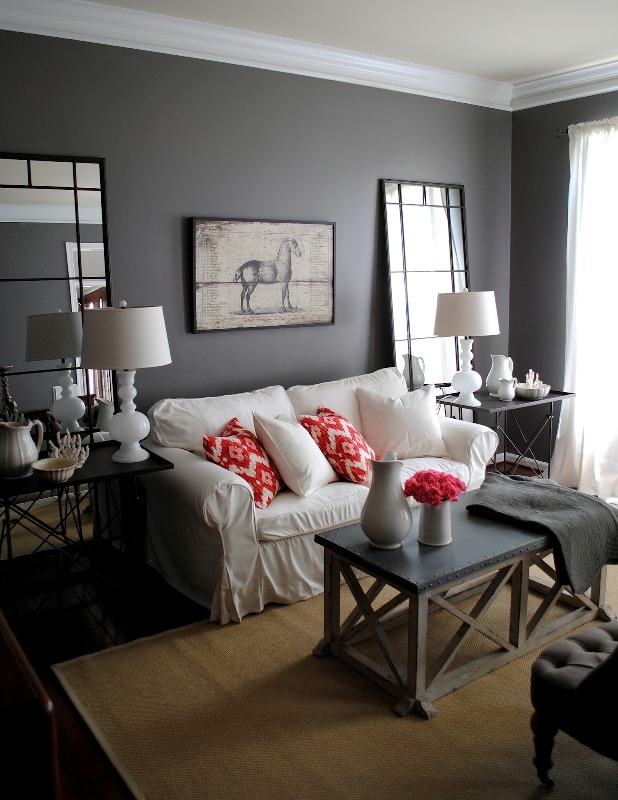
It’s winter again, the season of snow, clod and ice. The garden and the nature is not dull this time neither, since we can get inspiration from them.
Most plants and animals are having rest now. The amount of colors is limited and we can see muted hues. Nature is like an elegant lady in white coat. Characteristic winter colors are black, white, cold greys and browns, pine green, steel blue, cold red, ice blue and silver.
In our home, we can realize a really spectacular atmosphere by these colors. We can balance their coldness by the fire blazing in the fireplace and lots of candles. Use mood lighting instead of general lighting (standing or table lamp, hidden LED lights). Cover the couch with fur or polar blankets. Silver framed mirrors reflect the light of candles. Let’s use curtains made of light, monochrome or patterned material fabric with silky shine. Use middle hue paint on the walls, e.g. steel blue or gray-brown, which provide the background for the romantic and elegant mood. When purchasing decorations and accessories, choose the ones made of glass, shiny metallic or crystal. Using a muted red cushion, painting or vase, we can control the view of our guests creating focus points. Wooden floor, upholstered chairs, christal chandelier and wardrobe made of dark wood is a perfect combination for a winter style interior. White on moldings, doors and mantel can provide freshness in the view.
These colors have to be used with care, since the result can be very rigid. For an elegant winter home, ask help from an interior designer.
Archives
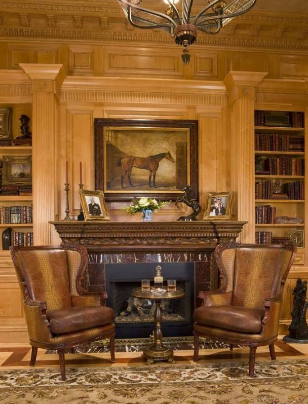
Brown
Brown is gained by mixing red and green colours, thus all the three base colours are involved. This is the most liked ground colour. It has warm and cold hues, the laters have greyish tone. Brown is considered as masculine colour.
This colour is associated to force, safety, maternity, simplicity, diligence. According to physiological effect it is relaxing, protecting. It’s also a food colour, first we associate to the fine cookies. In ancient Egypt, good dreams were marked with brown colour. In the medieval and early modern Europe it was one of the basic colour of the clothing of poor people, since they couldn’t afford the dyed fabrics. In England however brown was the determining colour of the wardrobe of the perfectly elegant gentlemen for long time.
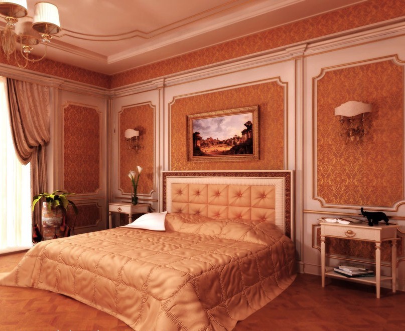
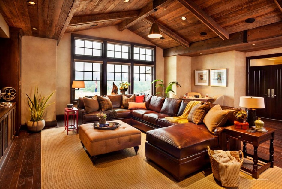
Since natural wood and leather are also brown, in interior design this is generally and frequently used. Using as wall paint, it gives depth to the space, as floor cover it gives stability. Dark hues can replace black – as its warm tone alternative – when we would like to emphasize something. It can be used in any room, but in case of dark brown walls, the proper lighting should be also provided. It is regular in historical styles, mainly the deeper hues. Combined with gold, a luxurious interior can be produced. Together with white, cream or beige, the result is classically elegant. Nowadays it is still very popular, it fits to practically any style.
Feng-shui associates brown with the earth element. Light hues are assigned to Jin, the feminine side, while dark hues to the Jang, the masculine side colours.
For advertising, it is used by companies that providing luxurious products or services to their customers, e.g. sweets, wellness, etc.
Most people like brown in their homes, but to avoid “cave like” result, it has to be used with sense. If you would like an elegant and stylish brown interior, ask for the help of a colour adviser.


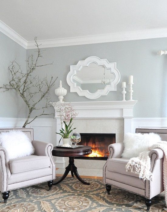
Neutral colors
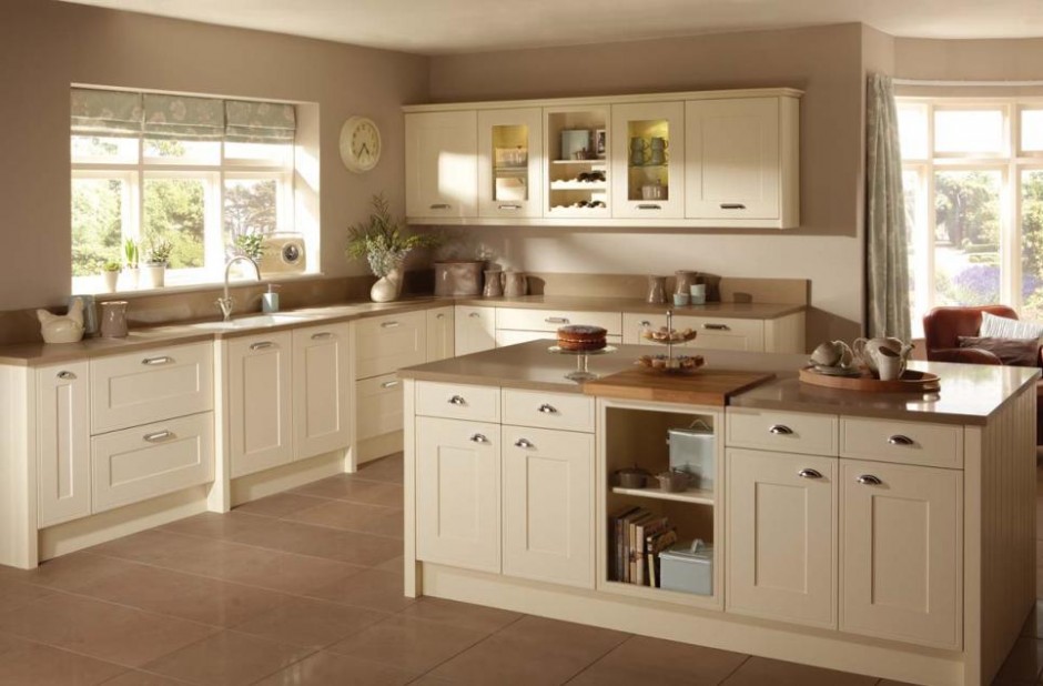
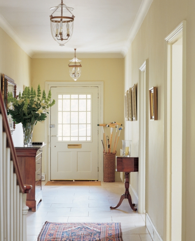
Natural, neutral colors are considered as the base elements of interior design. Many people think they are dull and impersonal, although they can be used versatile – resulting really wonderful interiors.
Some of the most well known natural colors are beige, taupe, creme, light hues of grey, egg shell, sand, ecru, lightest hues of brown, etc. Both cold and warm tones. Nature provides them ready-made. Let’s think about different stones, raw linen, wooden materials and sizal.
Nature colors are excellent background for vivid colors. They weaken strong, warm hues and strengthen the cold ones. If we are uncertain, which colors we would like to see in our home, let’s paint the walls first with the colors mentioned above and apply neutral fabric for larger furniture. After it, this base can be decorated with more intensive colors we like, e.g. on cushions, curtains, accessories. If we don’t like the result, the color of the decoration can be changed easily until we find the proper ones.
Neutral colors have calming, eye-relaxing effect. They fit to almost every interior design styles, we can use this palette bravely. They are perfect choice for French country style, Gustav style, or seashore style. Even the warm hues widen the space, since they are regularly light hues. For a more characteristic effect, darker tones also can be selected. Combining different textures, the view can be even more exciting.
Although using natural colors is considered to be a safe solution, it’s not easy to select them properly to get a really nice result. Ask help from an interior designer for reaching the optimal.


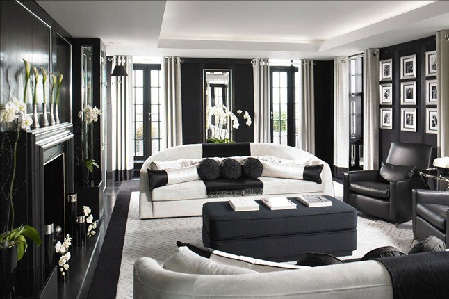
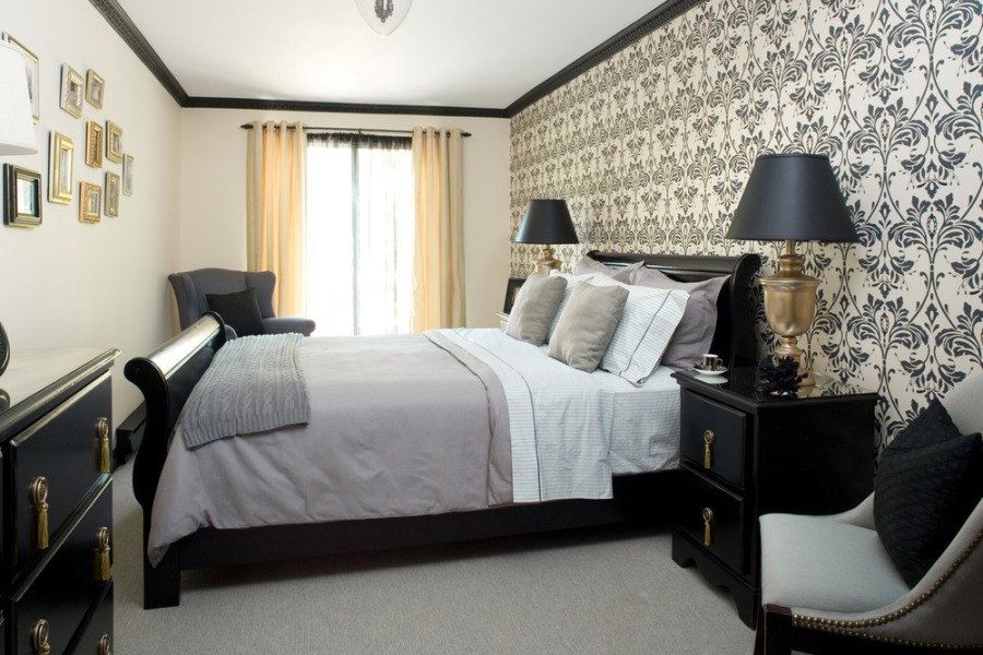
Black and white
The black-and-white interior is not only elegant but also exciting

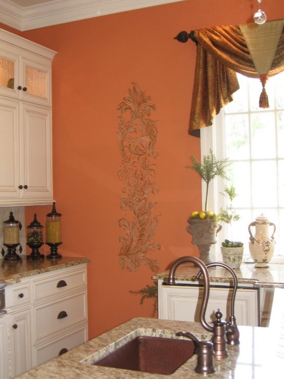
Orange
Orange is derived from mixing two primary colors, red and yellow. By this, we call it a secondary color. This is considered to be the funniest color. It has no cold hue. Blue is its complementary.
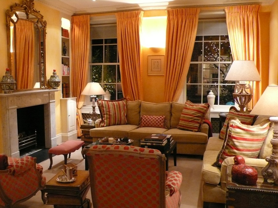
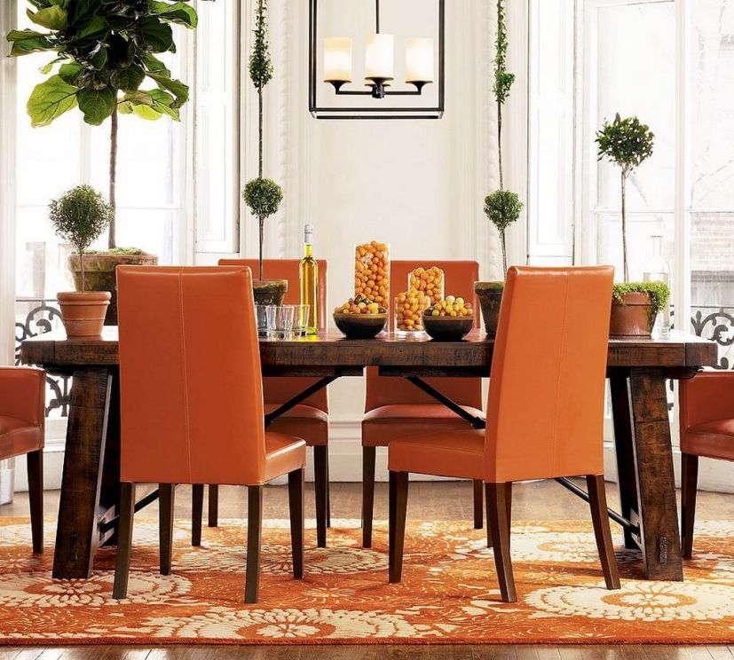
At physiologic effect, orange is relaxing and irritant at the same time. Increases appetite and creativity, it has positive effect on sexuality and human relations. In symbolism, orange is associated to strength, endurance, happiness and youth. We associate to fire, sunset, autumn, fruits by it.
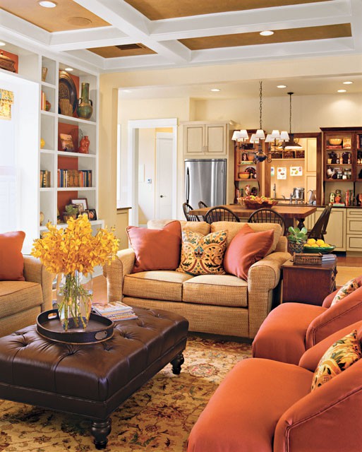
It replaces red perfectly. Energizing without increasing blood pressure. While striking color, doesn’t dominate fully its surroundings and not so provocatively irritating than red. It includes the fun of yellow and the feeling of sunshine also. A soil color, frequently used in interior design for vitalizing spaces decorated with other soil colors. We can use it bravely in living room, dining room, duller shades in child room or bedroom. Combining with crème and brown, it can be weakened, resulting and elegant interior. As warm colors generally, it also narrows the space feeling. Vivid hues are perfect for tropical or Mediterranean interiors.
In feng-shui, orange is the color of the male side (Jang). Assigned to the 2nd chakra (sex).
In business world, many designers chose this color for catching attention or highlighting, since it is not aggressive. Used frequently for advertising of food and toy manufacturers.
Using too much of orange can also be depressing. For implementing a cozy, classic interior in orange, ask help from an interior designer.

Black
Black means the lack of colors and light, so technically it cannot be considered as color. Anyhow, it has an important role in interior design and fashion.
In the symbolism, black is usually associated with death, evil, darkness and fear. In western cultures, black is obituary color. At the same time, it is also prestigious and powerful. Black increases the intensity of other colors. Combined with yellow, it means danger at different signs, just as originally in the nature.
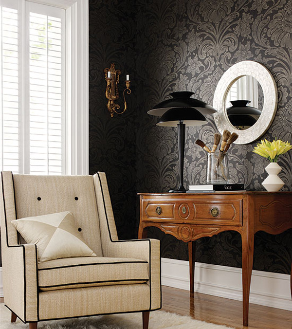
In interior design, we use it for emphasizing. With a black curtain, we can turn the lines of the window more definite. A black outline of a wallpaper motif strengthens the effect. In light interiors we can focus the view by creating focus points with black decoration items. Therefore it’s advisable to hide the black TV screen, so not to be in the focus. Using black provides the feeling of elegance, luxury and formality. Ideal background for paintings.
If we are brave enough, we can create definitely black interior also! With proper lighting it won’t be depressing at all, even all the walls are painted black. The most elegant result can be achieved if combined with white or cream. But we can also emphasize only one wall with wallpaper printed with black motif, selecting similarly upholstered heavy furniture. The contrast of glossy and matte surfaces should be considered all the time. Using different textures of black, the view can be even more exciting. Black is often used in different styles such as e.g.: art deco, chinoiserie and empire. Excellent choice for flooring, it gives stability, practically anchors the furniture. In bedroom a moderate use is recommended, only at feminine accessories, such as lace edging or sexy lampshade. Combined with silver, gold or crystals, the result will be really luxurious.
Feng shui connects black with water element, the color of Jin, the female side.
In business world, black expresses elegance and monetary value. Just think about black suites, tuxedos, luxury cars or gala dresses.
People usually afraid of this color when it comes to interior design. Anyhow, really spectacular and classy life area can be implemented using black. For achieving the desired effect, ask for help from an interior designer/color expert.


Autumn
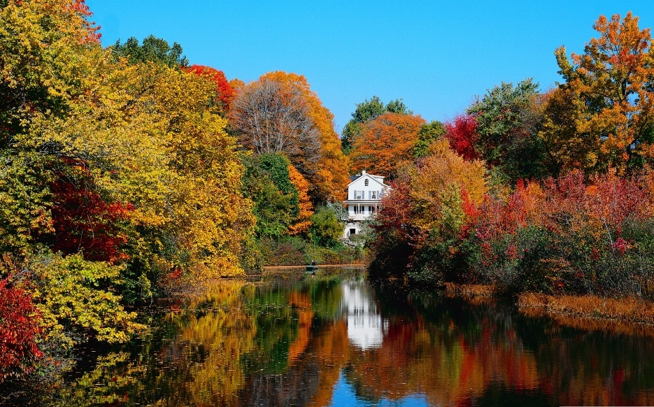
Autumn is here again, the weather turns a bit colder and rainier. The nature prepares for winter time but before this, it provides a colorful sight. Almost everybody likes the warm, inviting colors of autumn landscape. The leaves of plants have thousand shades of yellow, orange, red and brown, beside the green spots. Claret, dark purple and ochre can be also found among the ripe colors of fruits. Walking on the soft leaf-litter feels good. The blue color of the sky becomes a bit grayish but bold colors flash under the autumn sunshine.
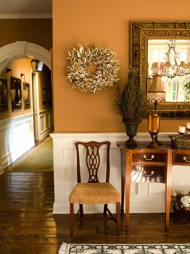
This season is the easiest to bring into our home. The mellow, warm colors aren’t hard to harmonize and making the space cozy. The brightness can be well blunted with beige or off-white walls, furniture get big emphasis at the front of it. If a daring total effect is desired, let’s paint the walls color mustard, brown or even claret or deep purple. In this case, furniture can be lighter, for example coffee brown, grey or darker beige. Brown leather sofa, wooden floor and natural wooden furniture are perfect choice for an autumn interior. Wool, chenille, velvet and thicker woven textiles can be used. Leaf, tartan, damask and paisley patterns fit for this very well. Woven baskets, glazed ceramic vases, wrought iron or wood decorating objects in the mentioned colors look good as accessories. Put autumn flowers (e.g. rose, lily, aster) or berries (e.g. wild rose, cotoneaster, sorb) or leafy branches in the vases. Put a bowl full of chestnuts and walnuts in the middle of the table. The luckier can lit the fireplace also, which light gives additional warmth to our home. Rather table and floor lamps and mood lights should be used instead of central lighting.
Resort to skills of an interior designer for implementation if you like such a friendly, cozy mood in your home during the whole year.
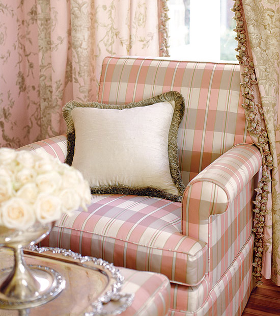
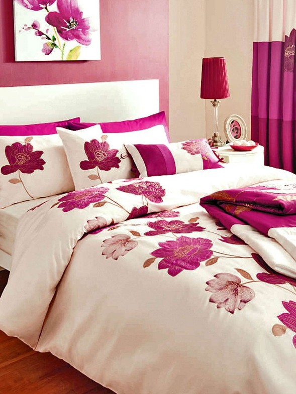
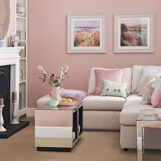
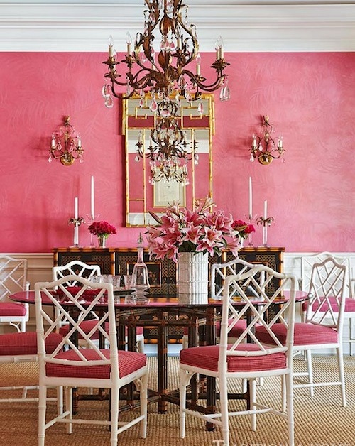
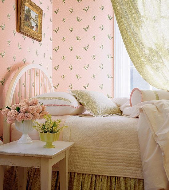
Pink
The shades of pink are from mixing red and white. All of its tones are popular in interior design. Commonly pastel or more subdued pinks fit for classic style.
This color is connected firstly with feminity, romance, flowers and girls. Strong shades (e.g. pink, purple) heighten pulse rate and blood pressure, have exciter effect. Soft tones (e.g. pearl pink, powder) are rather calming, inviting and have protecting effect.
There is a perfect shade for almost all of the interior design styles. The lighters can be used in nurseries, children’s rooms, bedroom and bathroom. Brighter tones are better to use only on accessories or maybe on bigger furniture as pop-color or focal point. They look good in living room, dining room and home office. If we are braver, walls can be painted pink also. Its sweetness or vibration can be blunted with white, beige, green, grey, brown or even black.
It was one of the favorite color of Madame Pompadour in the 18th century Rococo France, that’s why it was frequently used on Sévres porcelains, wallpapers and upholsteries. Rather pastel shades are beloved in English styles. It is connected to the feast of cherry tree blooming in Japan.
Business companies that choose pink or magenta for their logos are growing. They want to highlight their specialty, ability to develop and influence with this. Toy manufacturing, cosmetic and sweets manufacturing companies use its paler shades also.
Pinks can easily dominate the space, they might create depressing or sugary mood, so ask for help of a color advisor-interior designer for creating a subdued and tasty pink interior.
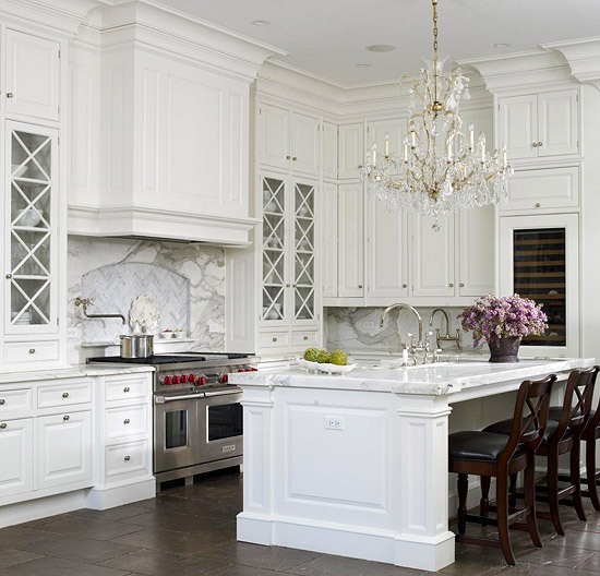
White
White merges all of the colors in itself. This can be easily recognized if white light passes through a prism: the result will be a rainbow of colors. As its physiological effect, it replenishes our body, gives a light and airy feeling, and meanwhile it decreases stress. There are mainly positive thoughts assigned to it in symbolism. It means, inter alia, innocence, purity, perfection, faithfulness, salvation and peace. In religions, it represents generally gods and their attendants (e.g.: the dove of Holy Spirit, the elephant signaling Buddha’s birth, the dress and wings of angels). In China and Japan, white is obituary color.
White has cold and warm hues, but generally it is considered as a cold color. At home decoration, it can be used practically everywhere. In the bathroom and kitchen, it provides sterility and cleanness. This color reflects light the most, making the interior shiny and light and spacious. As flooring, we use it carefully, as it cannot give a stabile base resulting a feeling of floating. If we are uncertain about the style, let’s leave the walls and ceiling white, this will provide the proper background for everything. Adding different materials and textures, white spaces can be real exciting. Of course, white furniture is fastidious, there cannot be a mess and the cleaning should be excellent. White can be combined with practically any colors. It soften warm colors and strengthen cold ones. It fits perfectly to e.g.: French country, coastal and Scandinavian styles also.
Feng shui connects white color to metal element. This is the color of the Jang, the male side, associated to the 7. chakra (crown).
In business life, all organization can use it, where cleanness is important, such as hospitals, food processing factories, laboratories, charity organizations, cosmetics firms.
White interior can turn to rigid, “hospital style” easily. To create a cozy and showy white living space, ask a color advisor.


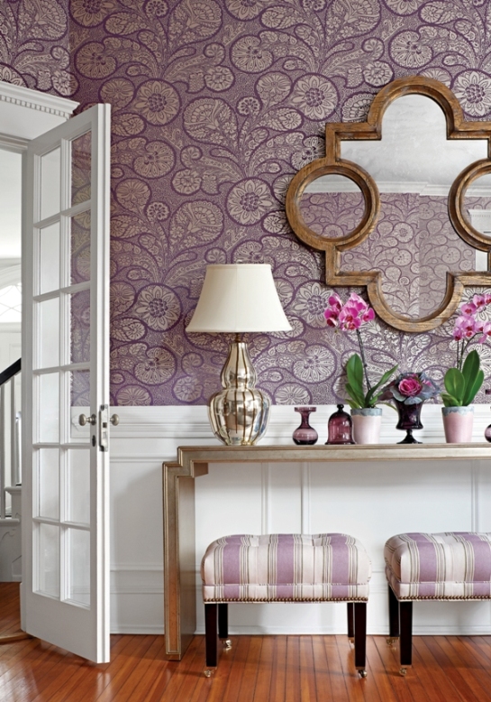
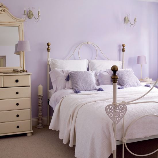
Purple
Purple is derived by mixing to primary color, blue and red – by this, we call it as a secondary color. The complement is yellow.
Physiological effect: strong hues of purple release energy, help creativity and memory. Pastel hues are relaxing, provide the feeling of protection, work against insomnia. In symbolism, it is associated to knowledge, mystique and wisdom. In movies and storybooks, dark hues are often displayed on the clothes of wizards, while light hues can be seen on dress of fairies. Reminds us to splendour and richness. Long ago it was a color of mourning of the French royal house.
Purple can be cold and warm color depending on blue or red component predominates. Relatively new color in interior design, nowadays it is very popular. Darker and stronger hues can be perfectly combined to white, black or grey. Light hues look good with crème or light green. Combining purple with silver results a luxurious effect. It can be perfect in bedroom, child-room or playing room (light hues), or in wardrobes, home office or movie room (dark hues). Lavender is a favourite color of romantic, country styles. Since it is not a food color, we can use it carefully in kitchen, dining room, maybe on the accessories. Purple is the most loved color of 75% of the children under the age of 13.
According to feng shui, purple strengthens in changes and provides spiritual help. Assigned to the 6th chakra (third eye).
Since this color is a little bit “too much” in itself, and it can have strong, dramatic effect, for implementing a tasteful purple interior, ask help from an interior designer.