Color pairs: yellow-red
Archives
Color pairs 4.
Color pairs: brown-green


Modern in classic
Modern art in classic interior – a lot depends on colors

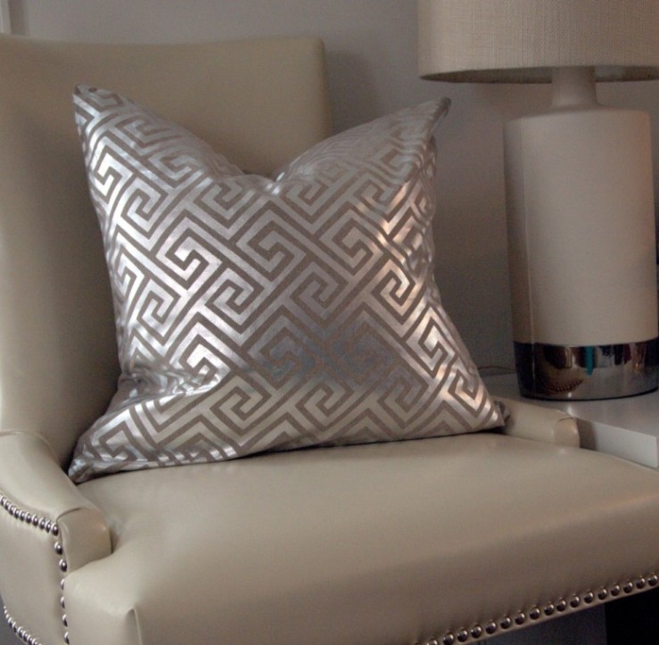
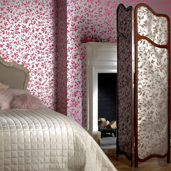
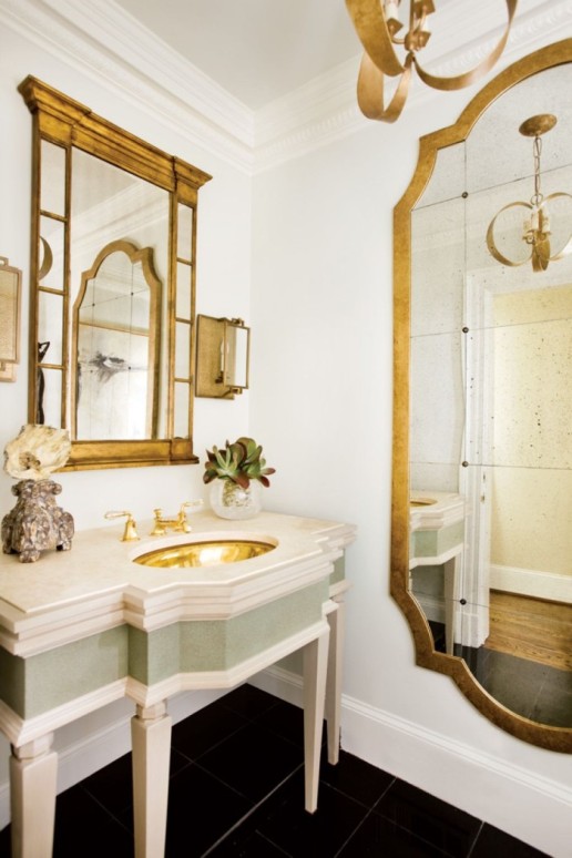
Metallic colors
When it comes to “metallic colors” we are thinking about gold and silver immediately, which are assigned to yellow and gray by most of the people. We are often associating to warm and cold contrast. Of course, there are much more metallic hues, in addition to, different colors can get a metallic shine also.
About the elements in our homes, first we consider the items and accessories really made of metal: faucets, door handles, lamps, picture frames etc. From the aspect of material, they can be made of copper, chrome, steel, iron, bronze, etc. These are automatically become parts of our interiors. Using paints, fabrics and wallpapers allow more emphasized usage. Wooden furniture painted to gold results luxury effect. Fabrics woven with metallic fibers make any style of seats exciting. A quite simple interior can get a focus point with a wallpaper with metallic motif. In case of historic styles, (e.g.: renaissance, rococo, empire) we often meet these solutions, sometimes even exaggerated. Gold was always the symbol of the wealthy. In a church, the respect of god(s) is being expressed by it. Nowadays chrome and nickel coatings provide not only the glazing, but also the endurance and long lifecycle.
Feng shui associates silver (lunar quality), copper and bronze (venus quality) with Jin, the feminin side. With Jang, the masculine side, gold (sun) and iron (martian quality) are assigned.
In business life, metallic hues have representative roles. At events the gilding of the cutlery or the gold wristwatch of a businessman has a clear meaning. Metallic luster paper of the sweets arouses our interest, implies exclusivity. Use metallic surfaces with care in your home, because they can easily rule the complete room. Ask for help from an interior designer to produce a real classy glamour.

Color pairs 3.
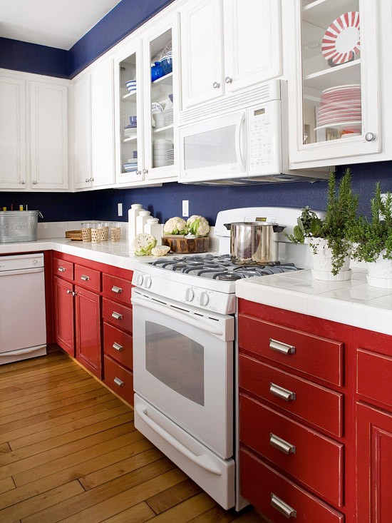
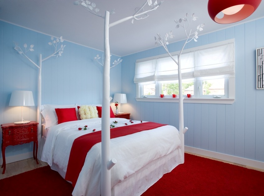
Color pairs: blue-red
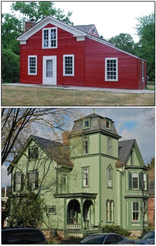
Colorful houses
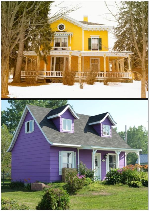
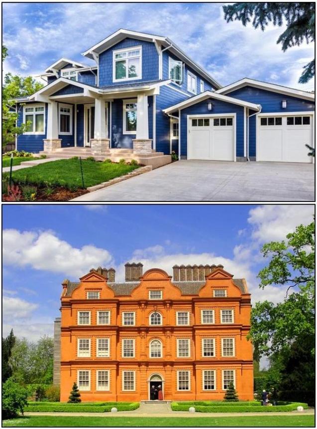
Dream colorful houses
Color pairs 2.
Color pairs: yellow-orange


Color pairs 1.
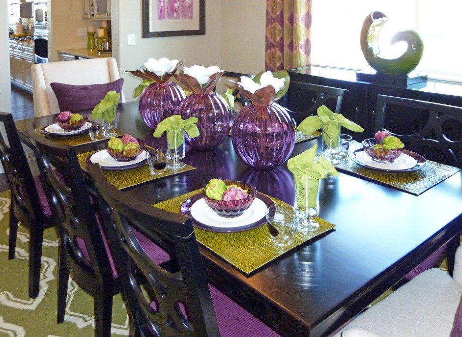
Color pairs: purple-green


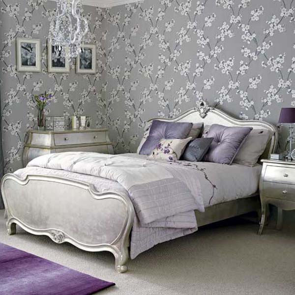
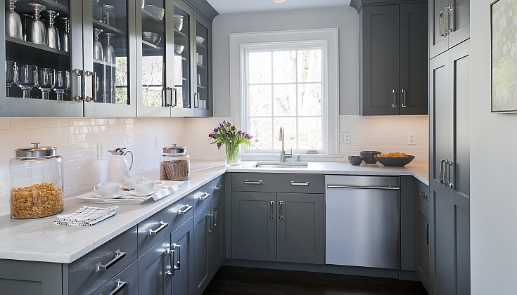
Grey
Who says that grey is unfeatured and boring?

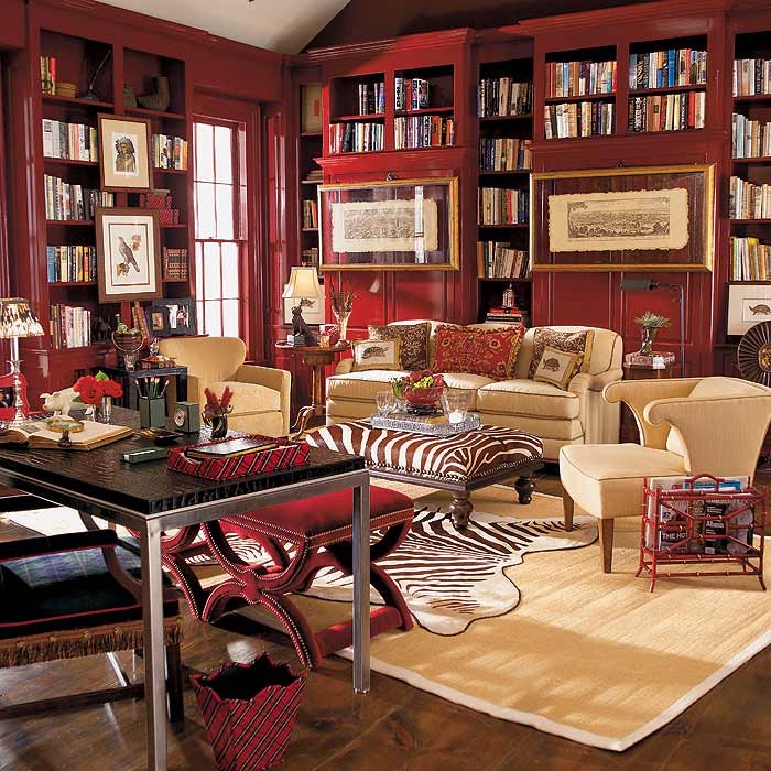
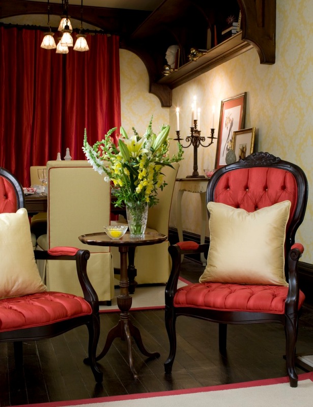
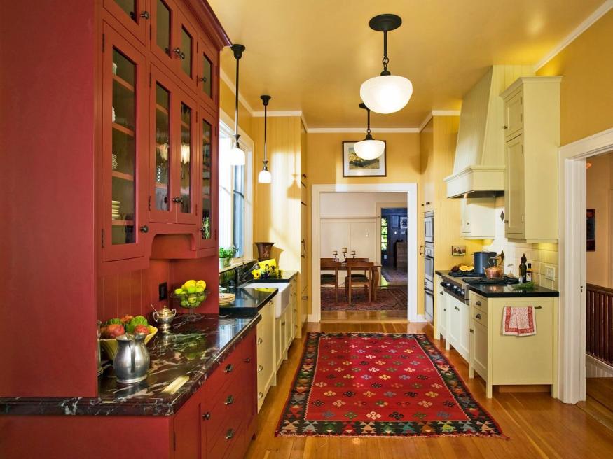
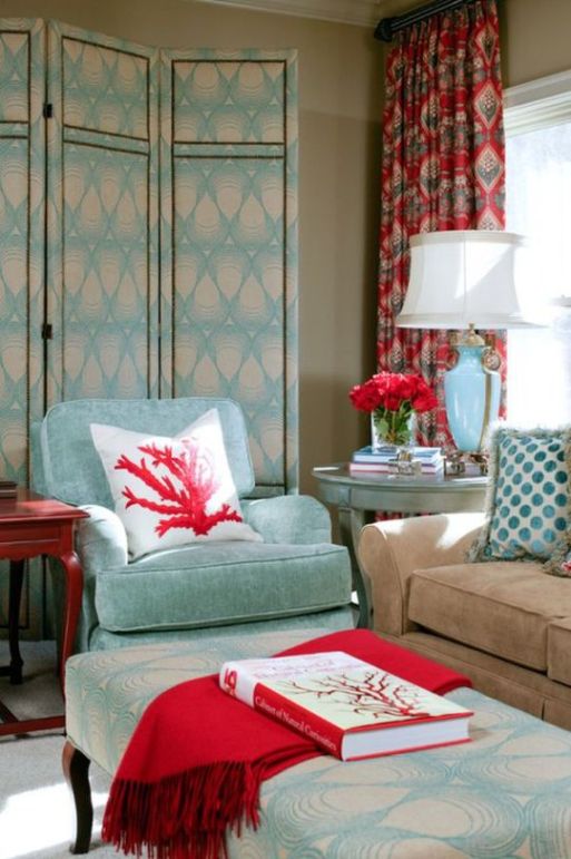
Red
Red is one of the three elementary colors. The most striking member of the color wheel, that’s why it is beloved by many people. Its complementary is green.
As a physiological effect, red increases blood pressure, has exciting effect on nervous system, fasten metabolism, it’s activating effect increases vitality but causes stress and makes one nervous at the same time. It is the most noticeable at daylight. We associate to love, sexuality, fire, blood and war by it. It means danger and prohibition in symbolism, that’s why it is used for danger signals in traffic. It is frequently used at groups of disaster protection and healthcare companies, just think about Red Cross and fire departments. In old times red was one of the most expensive clothes dyes which was made of cochineals or dye-murexes, thus only the rich could afford it, so it was connected with wealth also (e.g. carmine edged togas of ancient Romans, robes of the cardinals). The red lamp quarter got this name not by chance also.
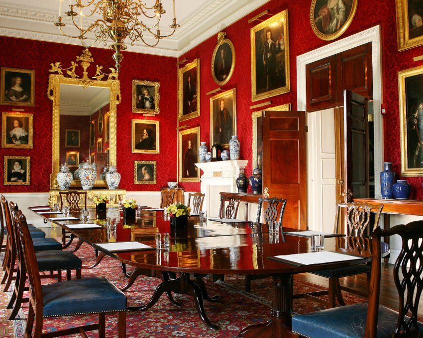
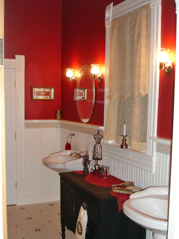
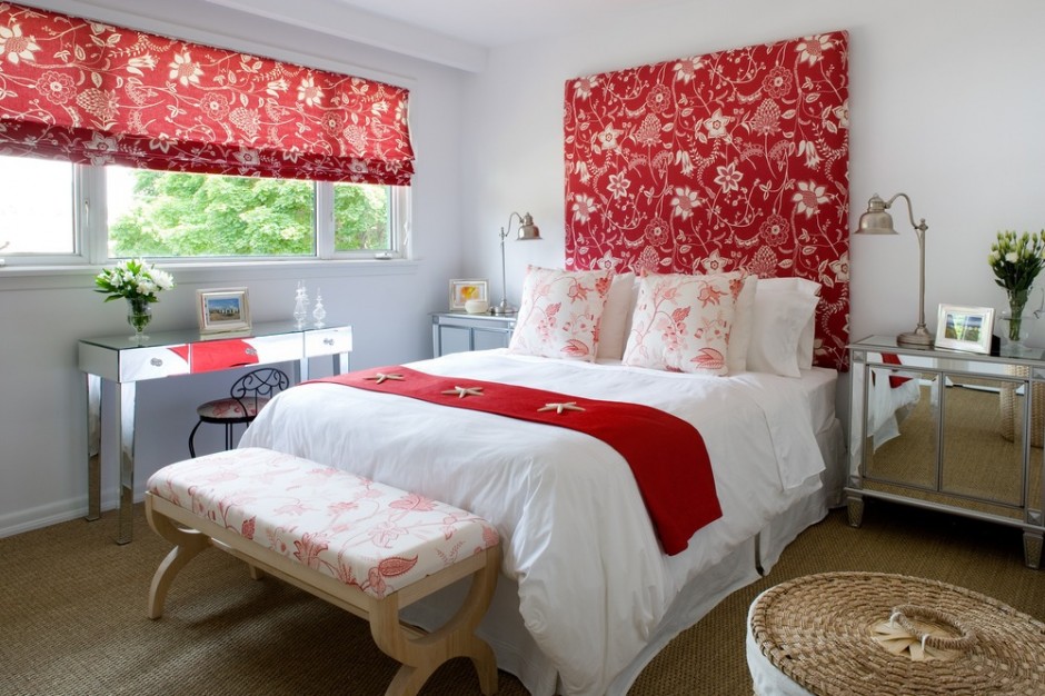
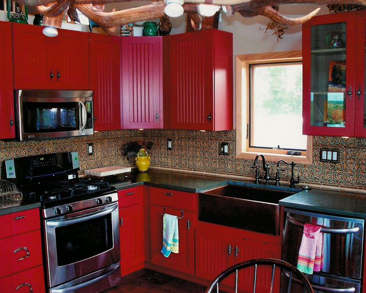
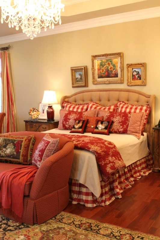
Red has the most intensive narrowing effect among warm colors, that’s why we feel the room in this color much smaller. It is a food-color, so fits well for dining room and kitchen but it can be used in home office too because of its stimulative effect. Many people paint the walls of their bedroom red because it is the color of love. But this is not a good solution for a long term, it causes sleep disorders and nervous tension. The bedroom should be calming, if red is desired to bring in anyway, it shouldn’t be seen from bed. For example, lay a red carpet, paint red only the wall behind the bed, put a bedspread or cushions on the bed which will be put away before sleeping. Handle it cautiously anyhow, because it is a very intrusive and aggressive color. Use it rather on accessories or as a focal point at home. Its strength can be blunted with white or cream. It looks very good in combination with black, dark brown or grey. Its deeper tones are more elegant, for example claret or burgundy red. These were frequently used as background color for gilded framed paintings as a gallery.
Feng Shui assigns red to fire element. It is the color of Jang, the male side. It belongs to the 1st chakra (root). This is the color of good luck in China.
It is used by very dashing, fast-expanding, mass-producing companies in business life as color of their logos or products. It comes into view immediately on the shelves of the shops or in the advertisements.
It’s not an easy task to create a real elegant red interior, so ask for help of an interior designer-color adviser already for planning!