Hues of colors had several names over time. Some of them are slightly different from each other but fashion always dictates something new. It was the same case with historical styles. Classic and popular hues are used by several companies, but of course there are differences between the colors in spite of the same name. It matters on what kind of surface we use them: wall paint, fabrics, porcelain etc. Let’s see some examples:
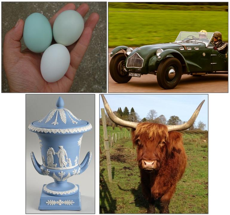
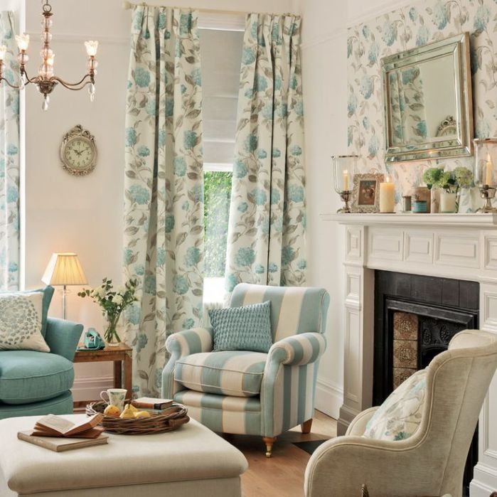
Duck Egg Blue: it is a light, soft, mildly greenish blue color with a tint of grey. Its darker hues are pastel shades also. Originally it was used on Chinese porcelains, it came to Europe from there. The name was given after the color of Mallard duck’s egg. It fits for several styles and looks good in every room, creating a calming, friendly and inviting interior. Impossible to overdose.
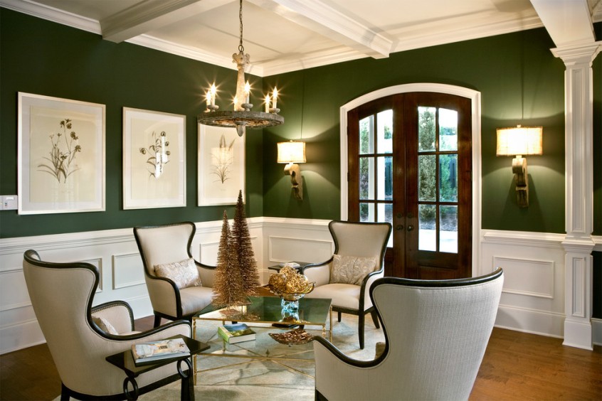
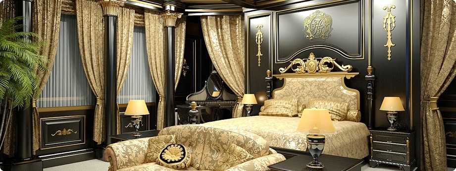
British Racing Green: originally it is a deep, almost black color, the lighter and brighter hues of it are also widespread. As the name indicates, there is a connection with car racing, it was chosen for the color of Napier racing cars in 1903. Elegant, traditional, dark color deepening the space. Using on bigger surface requires appropriate lighting.
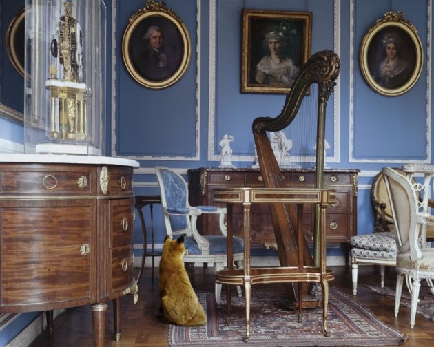
Wedgewood Blue: a light but quite bold blue color with a tint of grey and purple. It was named after the Wedgewood porcelain manufactory founded in 1759, which used this color hue on its matte surfaced products (jasperware). It creates an opulent mood but this can be heightened by combining with white. Airy but dominant hue.
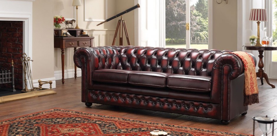
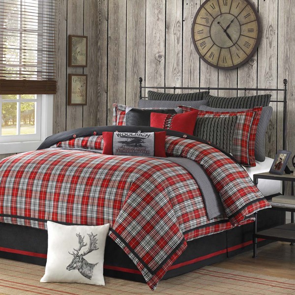
Oxblood Red: a warm deep red color with dark brown and purplish tones. The name was firstly mentioned around 1700. It was a popular autumn-winter color, frequently used for traditional leather furniture. More elegant than most of the red hues, strong but not obtrusive. It has to be counterweighted when applied on a big surface (e.g. wall).
For choosing the proper color, if possible, take the object of which’s color we like. If this is impossible, ask for help of an interior designer-color adviser for the perfect choice.
Archives
Paint palette 2.
Mineral-blue hues


Color pairs 8.
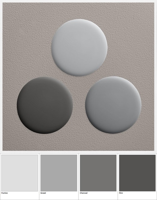
Color pairs: grey-red

Paint palette 1.
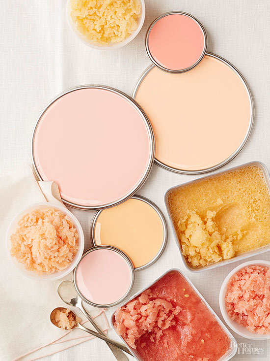
Appetizing colors 🙂


Color pairs 7.
Color pairs: brown-blue


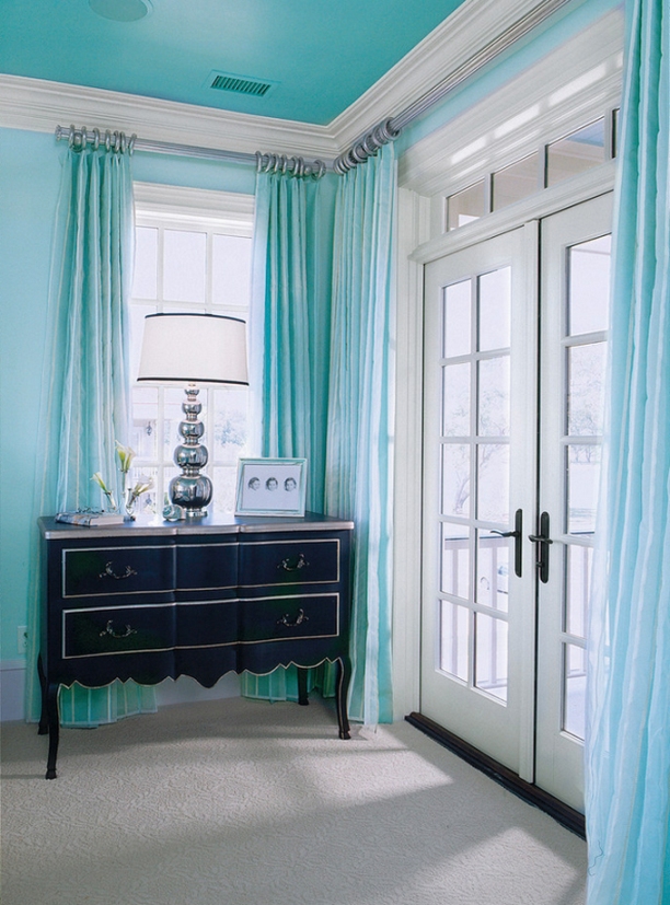
Turquoise
Turquoise is a happy, cool and juvenal color


Color and style advice
People often know that the colors of their homes represent their personalities, but the wide range of color hues can easily become frightening and disturbing.
It’s a fact: colors are the most flexible elements of the look and feel and aesthetics of our home. Flexibility is provided by the thousands of different color hues. A color can connect and align all elements in a given room to each other.
What is not well known, what colors are the best choices for a given room or functionality, and how color hues effect our feelings and behavior.
Of course, unique taste and current fashion can strongly determine the colors to be chosen with pleasure in someone’s home. Anyhow, lots of other aspects should be considered (e.g.: existing and remaining elements, orientation, etc.). Therefore, the choice of a decorator color can be most successfully accomplished with the help of a professional interior designer.
The style of the flat is also important. Most people think, that this has no sense and fully enough to dump lots of objects they like in one place. Harmony of the home can be reached more easily, if objects are grouped by a theme / color / collection or any other dominant element. If anyone has a specific idea of the style, but not sure how to implement it, or just doesn’t know how to give style to the home, an interior designer can help.
After detailed survey of the flat, house or just one room, the possibilities of changing colors or style will be discussed with the owner. As a result of this process, the most optimal combination can be reached. After the consultation, there are two options for the owner to proceed:
– Documentation only
– Common implementation
Visit my homepage for details:
http://www.classicinteriors.hu/
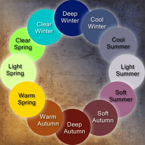
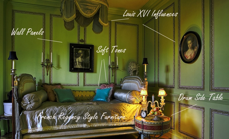

Historical colors
In the case of a low-budget renovation, where only a wall painting is possible, or wallpapering, maybe changing one or two furniture, colors have more important role. Their power is frequently underestimated, some people are afraid of them also. They are afraid that a stronger color might be boring soon, so they decide to choose white or pastel shades. The desired style is tried to be reached by excessive amount of decorating objects.
It is quite easy with classic historical styles. Every era had characteristic color hues which determined the mood of interiors of that time. Of course, all the colors of the rainbow were used then also, though there was always a shade of color which was among the most popular in its era. If these colors are used during renovating, a success can be reached with less effort. Although the mixed paint by a color code is more expensive than the ready-made versions, it is worth to spend it for the effect. In the case of wallpaper, pattern can be so important too.
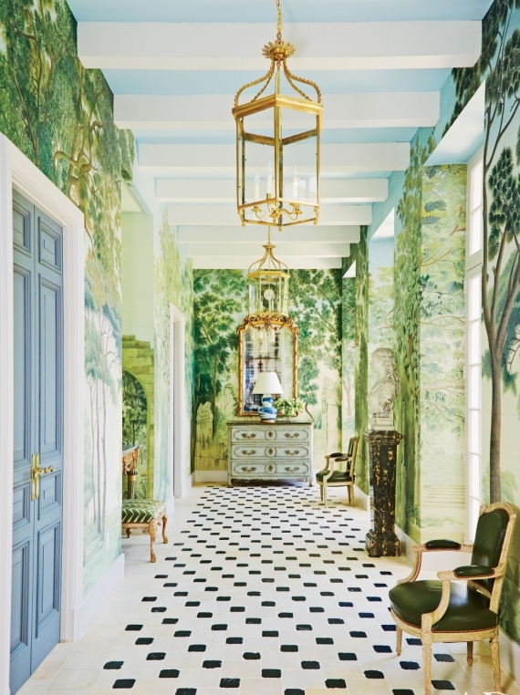
Some extracted examples: using of ebony black, gold and golden yellow was typify Empire style. Vine red, olive green and warm dark browns were common in Victorian style interiors. We associate to bubble gum pink, butter yellow and light turquoise blue from the 50s. Edwardian style is characterized by magnolia, bluish grey and off-white.
Don’t afraid of color painting the ceiling, doors and windows or even moldings, beside the walls. Draw inspiration from the pictures of interiors of the given era. Surviving buildings are commonly restored with using historically accurate colors, so we can see the total effect. Let’s be daring because painting is the easiest and cheapest way of makeover, so even if we make a mistake, it is remediable easily.
Ask for help of a color adviser/interior designer if you have doubts about the proper color-usage.


Color pairs 6.
Color pairs: blue-green
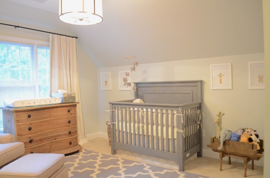
Nursery
A newborn is always a great event in a life of a family. Weeks before the child room will be finished, the furniture, clothes and other required accessories will be purchased. There are some issues to consider while doing the preparations.
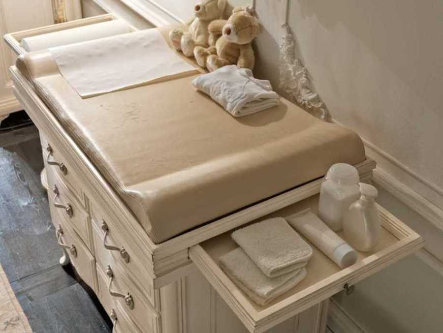
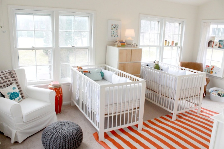
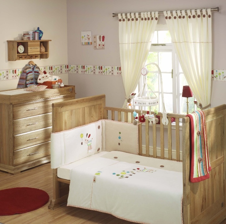
The baby’s room should be designed to let the baby grow up in it, that means to be suitable at least till 6 years without change. Cradle is a fashionable furniture again, but not too practical, since it can be used for only a few months. Instead, a cot should be bought that can be converted according to the future needs: the grid can be removed, the height can be adjusted and even the length can be extended. Diaper changing table has to be chosen to fit the height of the parents. The most practical ones have drawers and doors also, later it can act as a commode that gives place for all the small clothes.
Floor heating is not healthy in a baby’s room, it can cause dust allergy and the continuous heat coming from the floor is also not advantageous. A larger, loop pile carpet on a wooden floor or cork flooring can be ideal solution, they can be cleaned easily and warm enough for climbing and toddling.
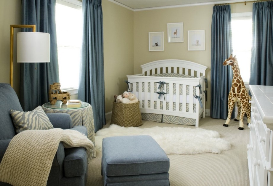
Generally the boy’s room is painted and decorated in blue and girl’s room in pink. Beneath, other colours can be applied of course, even natural tones like beige or cream. Babies need a big amount of visual stimuli, but not by the strong wall colours or brightly patterned wallpaper. The bottom third of the wall should be covered with resistant paint or wallpaper, since as the baby learns to walk, this area will be exposed to heavy duty. Because of this, framed pictures, photos should be positioned over access height. A shelf is needed for powders and lotions which can be easily accessed by parents when changing diapers, but not for the child.
Important to consider the requirements of the baby and the parents instead of the fashion at planning. If a practical and decorative baby’s room is the goal, ask for help from an interior designer.