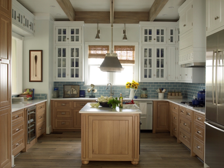
Two-tone kitchen cabinets are spectacular and elegant if we keep colors harmonious in the room
Archives


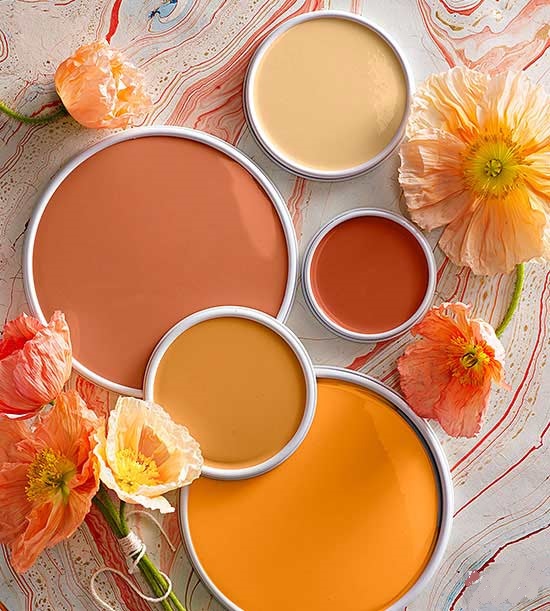
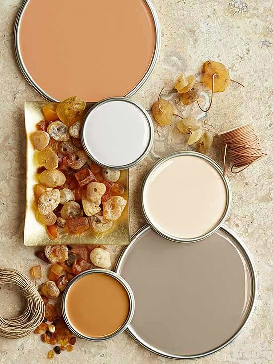
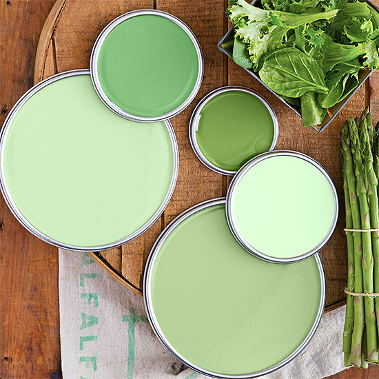
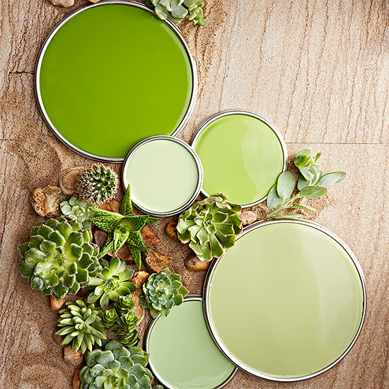
Paint palette 13.
Color palettes from the garden

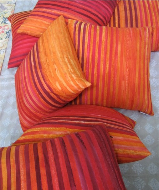
Color pairs 25.
Color pairs: red-orange
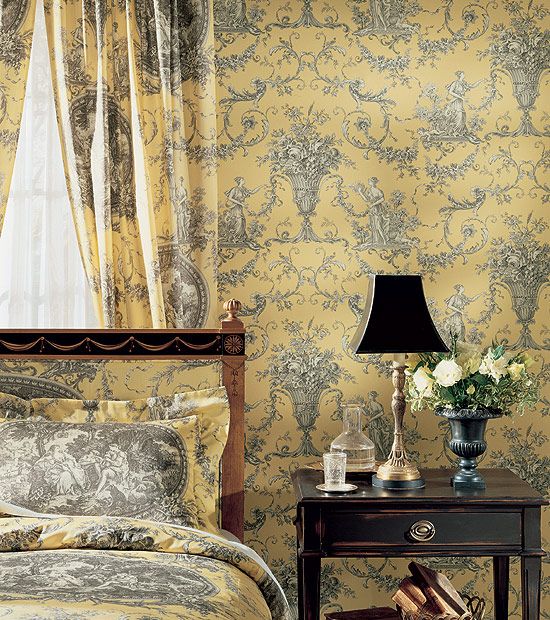
Choosing wall paint
Many people make the mistake to fall in love with a color based on a very small sample and later they realize only after the finishing the painting that it is not what they originally wanted.
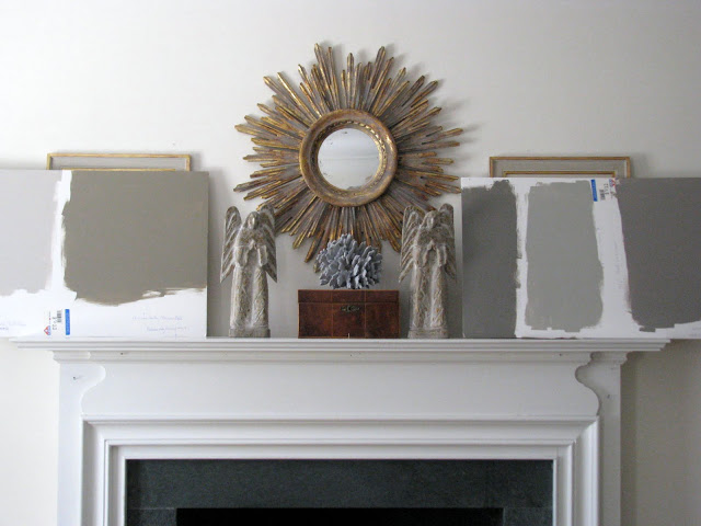
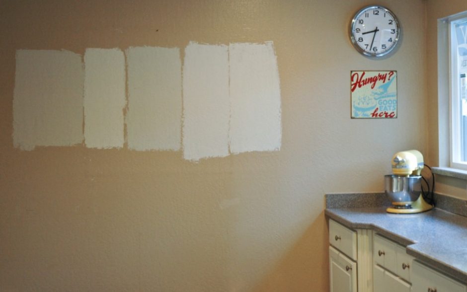
As far as possible, do not choose a wall paint based on a few square centimeters sample. Especially if it is a printed range of colors and it isn’t produced by using the real paint. Colors depend deeply on the lighting of the room, the paint absorptivity of the surface, number of layers, the surrounding colors etc. Always take home a sample if possible and try it in the room to be painted. Wait until it dries to see the final hue. If we don’t want to paint the wall itself, paint big cardboards (minimum size A3) with the given wallpaint. Stick them at least two walls of the room. Watch how the color changes throughout the day. The morning light is a bit yellowish, the light is always the strongest by noon and it has orange hues late in the afternoon. Orientation also matters a lot, as it depends on when and how long the room receives sunlight. Northern orientation pushes the effects of light to the blue range, western orientation does the same to the orange range. Shadows darken colors and make them greyish. All of these influence the way, how we see the color of the wall paint. Therefore, it is important not to choose colors in the shops under lights of lamps.
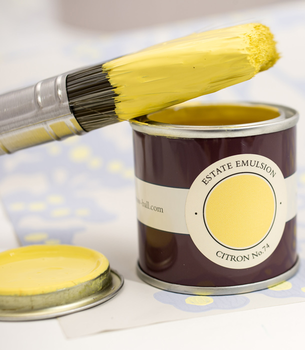
Most of the paint factories with permanent color assortment have sample pots for them also. With this, they make the perfect choice easier for the customers. For a small amount, we can prevent a bigger mistake which needs time, work and money to be corrected.
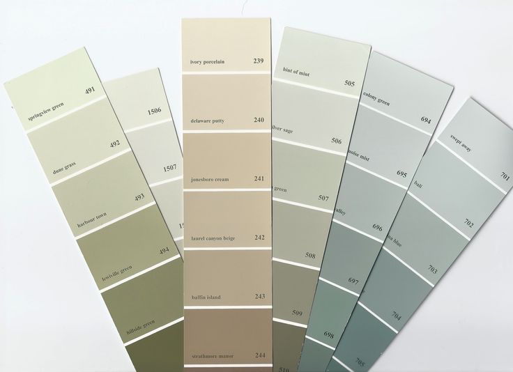
Any color can be mixed in the bigger paint shops and DIY stores in a couple of minutes based on NCS, RAL, Pantone etc. range of colors. Ask for the smallest quantity (commonly 1 liter), it is definitely enough to try the wanted color at home. This way we can be sure if the printed color truly fits for our idea and if we certainly endeavored to this effect.
Ask for help of an interior designer–color adviser for choosing wall paint, because he/she is a professional in harmonizing colors.
Blue in the kitchen
Blue is not a food-color, so use in a low key in the kitchen


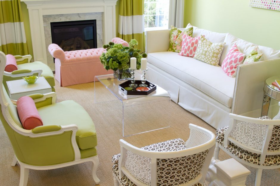
Color pairs 24.
Color pairs: green-pink


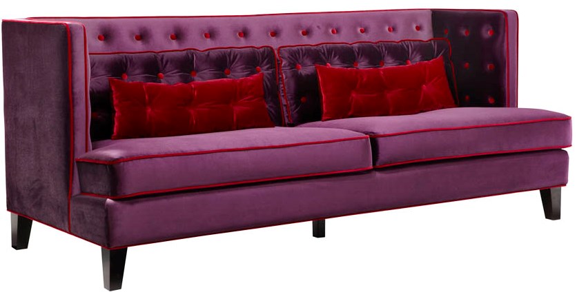
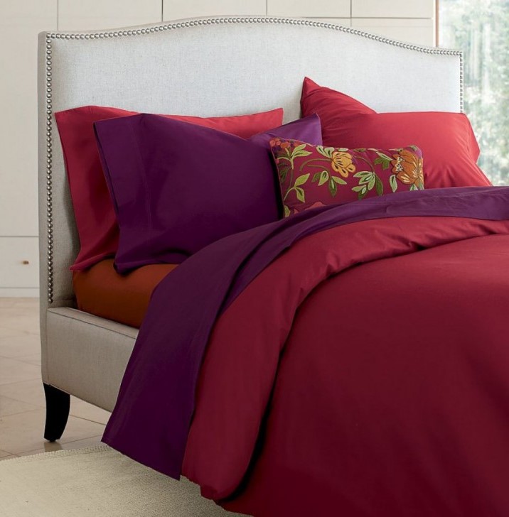
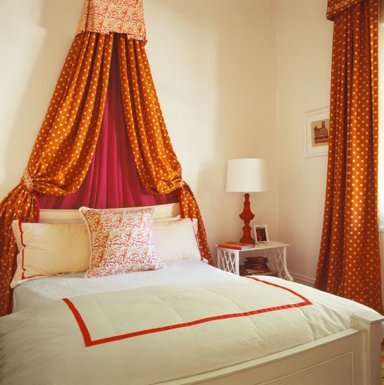
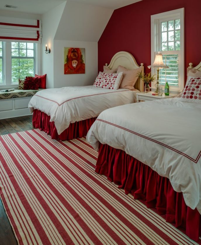
Red in the bedroom
Red is a very intensive, stimulating color, therefore in the bedroom it shouldn’t be visible from the bed in favour of calm rest

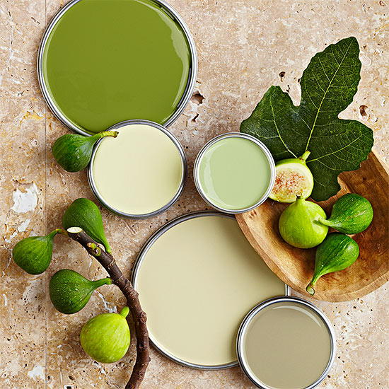
Paint palette 12.
Paint palettes of fresh greens
Color pairs 23.
Color pairs: yellow-grey


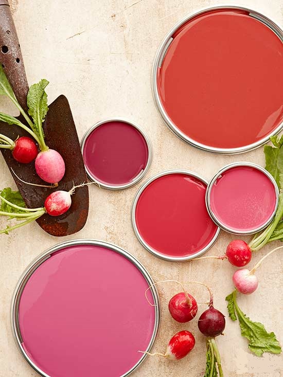
Color pairs 22.
Color pairs: red-purple