The pastel versions of the primary colors – the color wheel works with muted tones in the same way
Archives
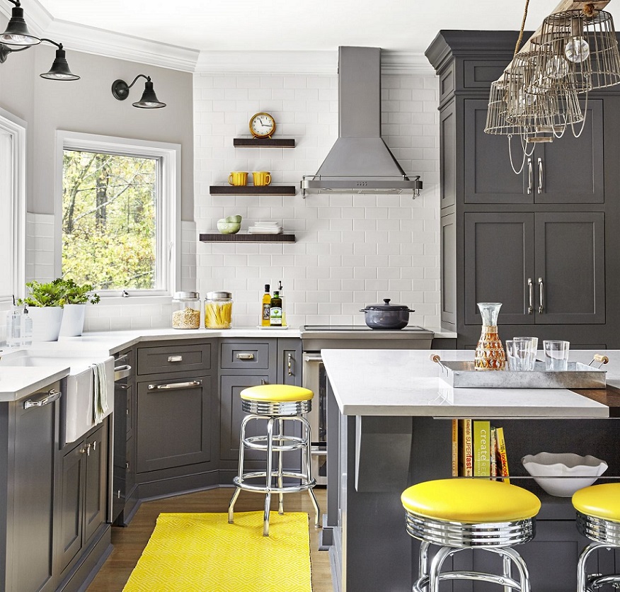
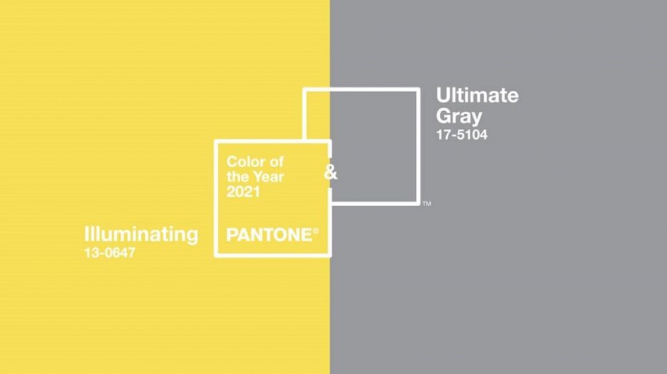
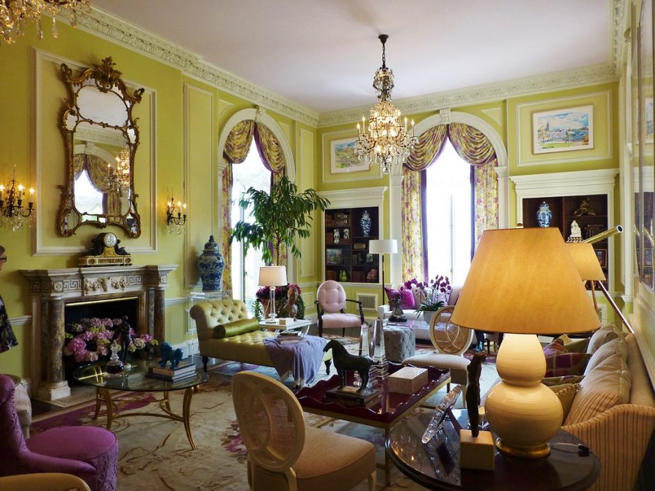
Colors of the year 2021
Every December Pantone company announces the color of the next year which effects interior design also. Illuminating no. 13-0647 and Ultimate Gray no. 17-5104 are the colors of the year 2021.
The grey member of the pair is a perfect neutral hue. It can be found in nature, for example among colors of pebbles and rocks. It works perfectly as a background because it strenghtens every other color. As its name indicates, it gives a solid base.
The yellow member of the pair is a warm and strong color, which enlivens the space and brings happyness in everyday life. It looks especially stong near the grey, although it is not a too vivid hue.
Both colors are mid-dark tones which can be used in interior design very well. Complementing them with white, a more subdued effect can be reached. However, adding a little black to them can further enhance the lightening effect of yellow.
The combination of the two colors can be freely used for example in kitchen, home office, living room or even in kids room.
Ask for help of an interior designer for making the colors of the year 2021 appear in your home in style.


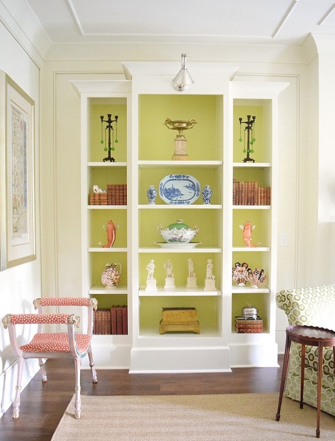
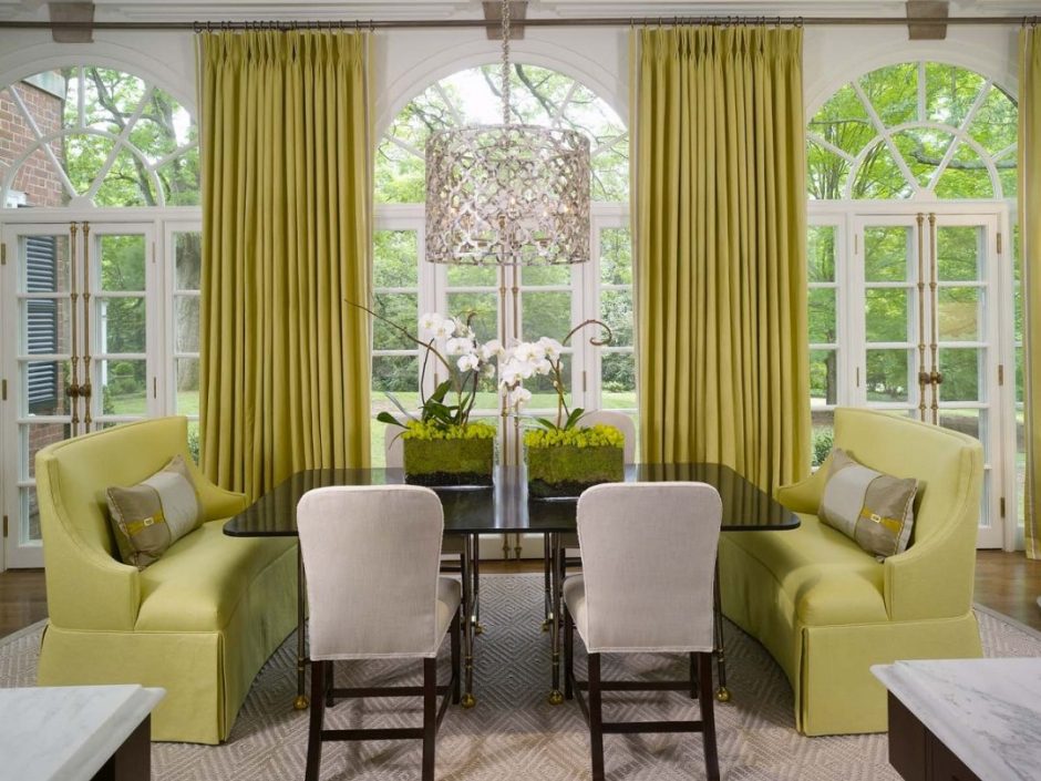
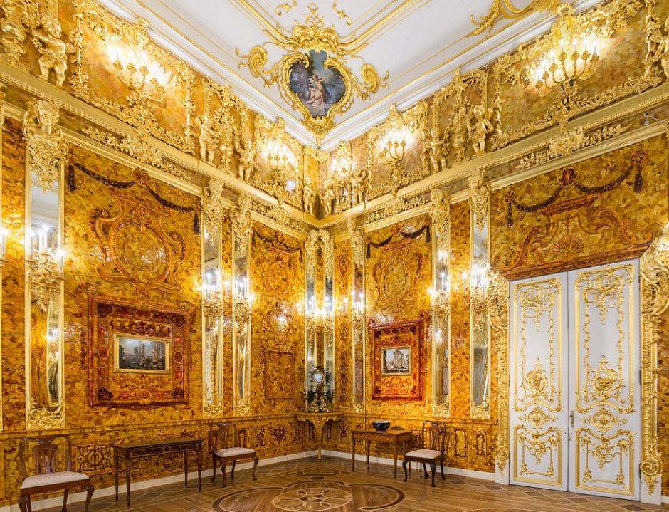
Chartreuse
Chartreuse color is in the middle between green and yellow on the color wheel. Although it is a vivid hue, it’s not very showish because of it’s mid-dark tone. It is perfect for focal points but looks good on big surfaces also. In the latter case, it might be outweighed by neutral colors. It was named after the French liqueur made by Carthusian monks since 1764, which is made from 130 plants and herbs, that gives its natural yellowish-green color.
Paint palette 24.
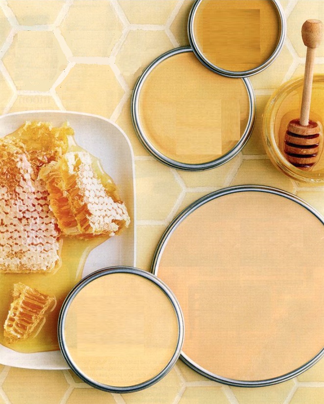
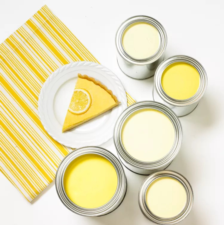
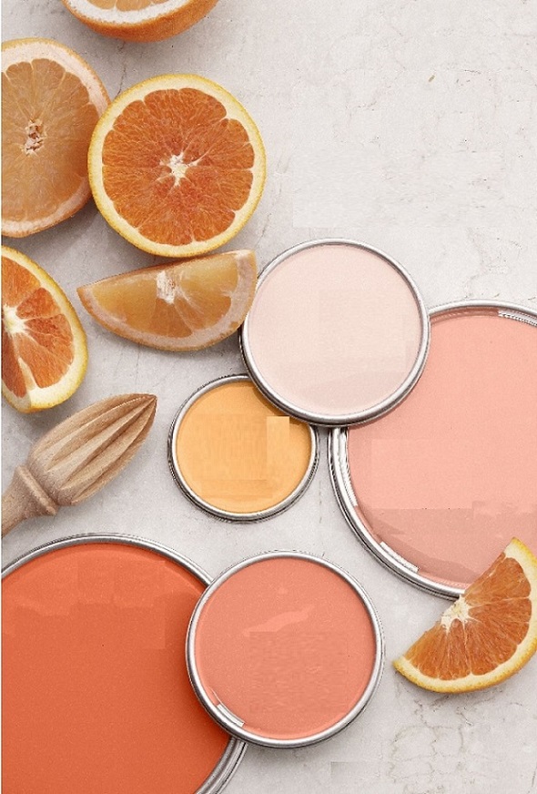
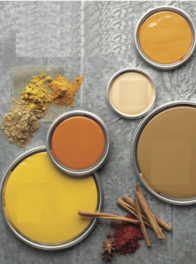
Warm citrus color palettes for compensating cloudy weather
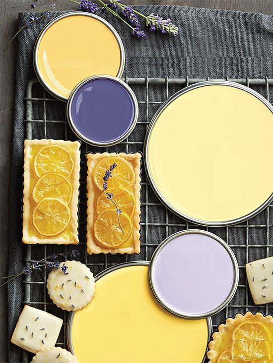
Paint palette 23.
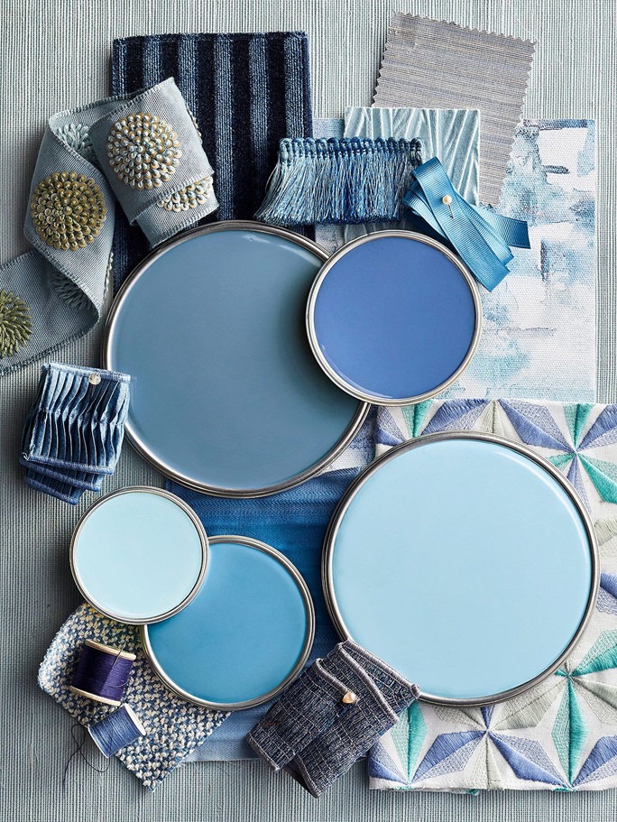
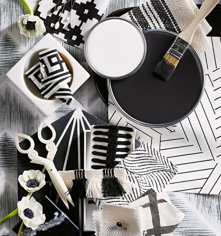
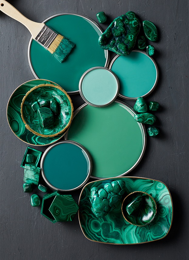
Forceful paint palettes
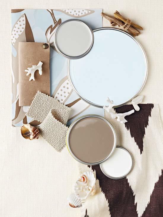
Paint palette 21.
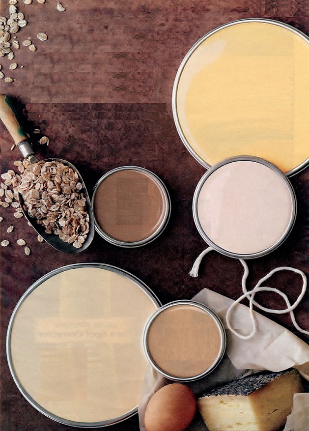
Warm earth-colors for greeting autumn

Inspiration 10.
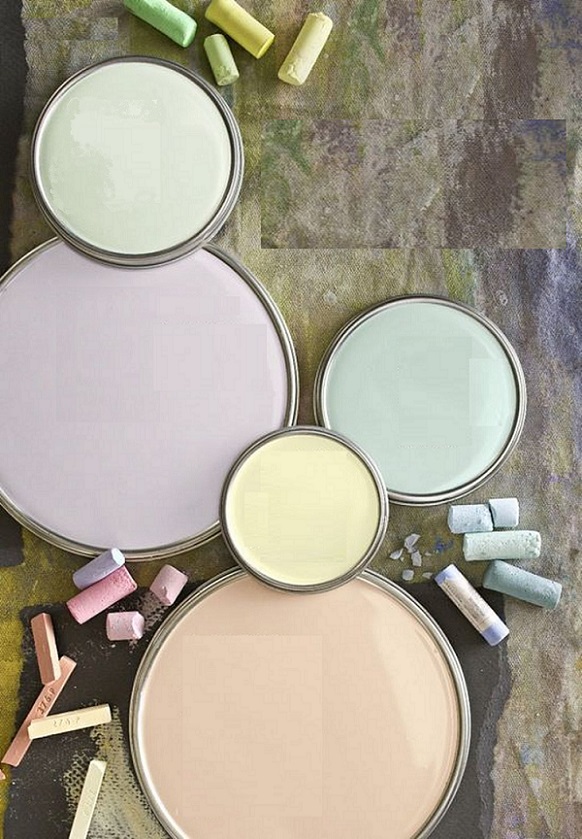
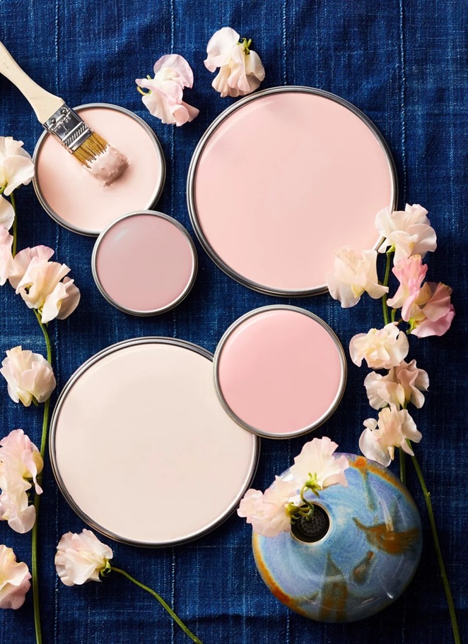
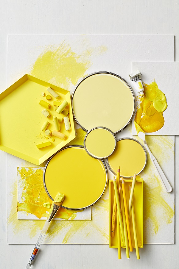
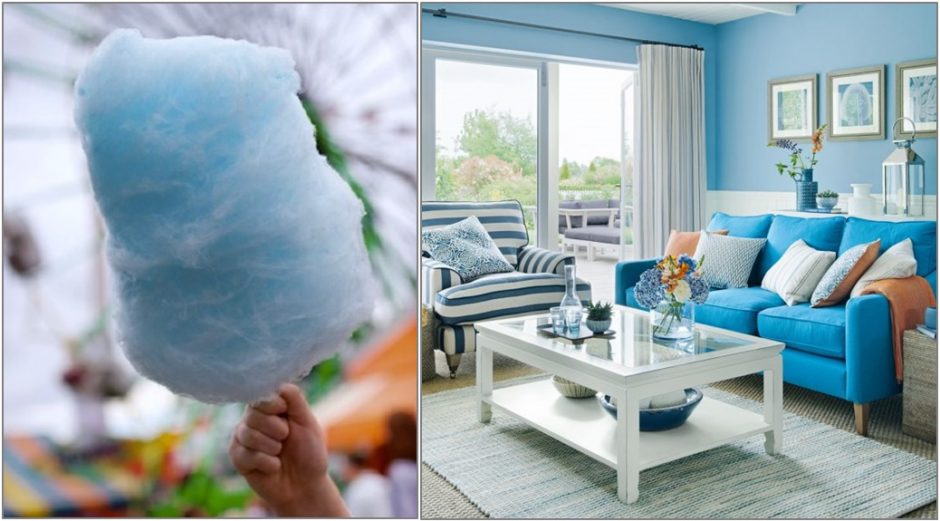
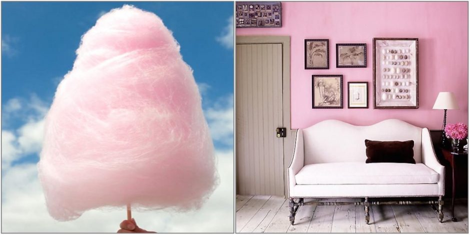
Summer, cotton candy, merry colors

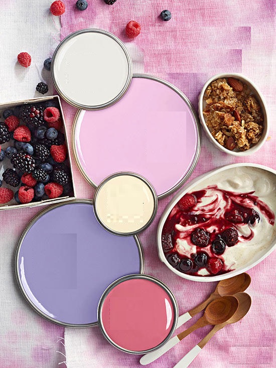
Paint palette 19.
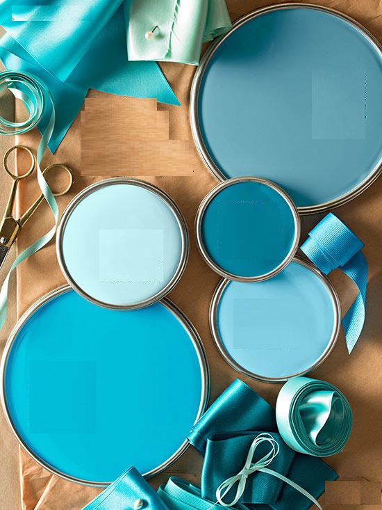
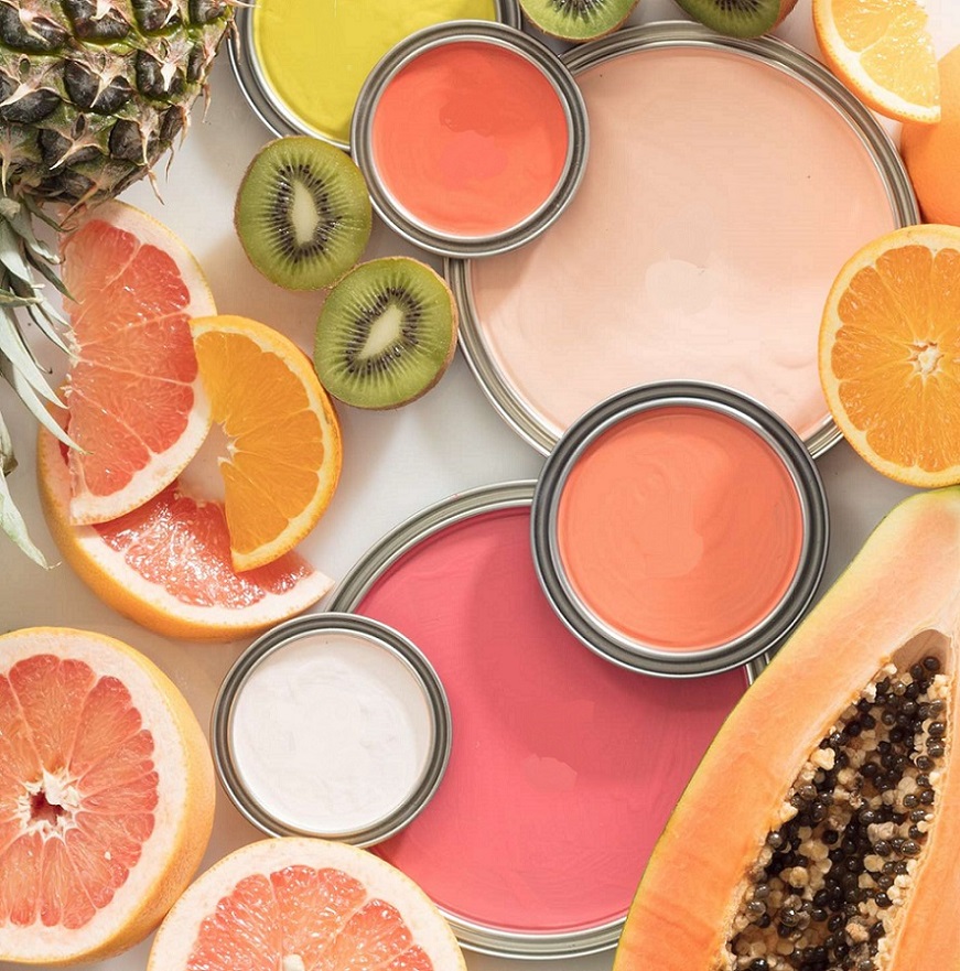
Summer summoning color palettes
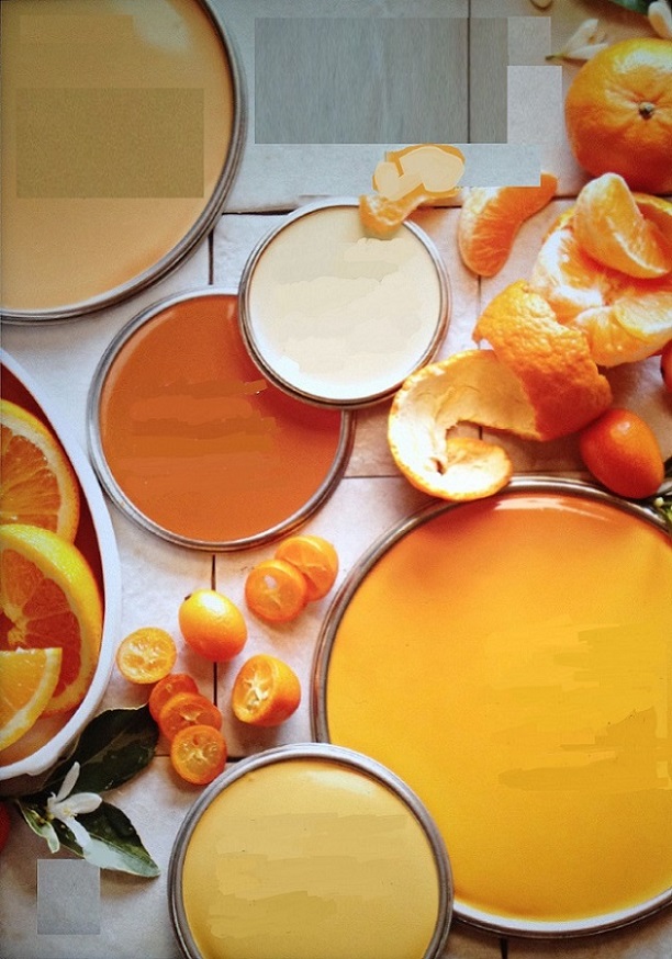
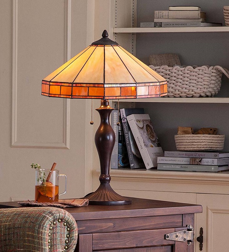
Amber
Amber is just in the half way between yellow and orange on the color wheel. It has rich, warm tone, some of its hues may contain brown also. It was named after the fossilized pine-resin.

Paint palette 17.
Paint palettes inspired by hobbies