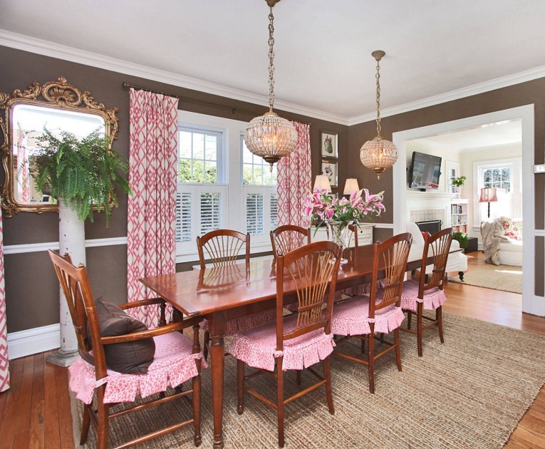
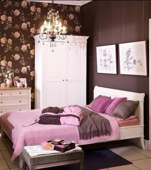
Color pairs: brown-pink
Archives

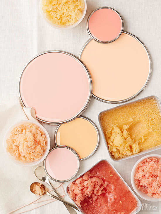
Color pairs 9.
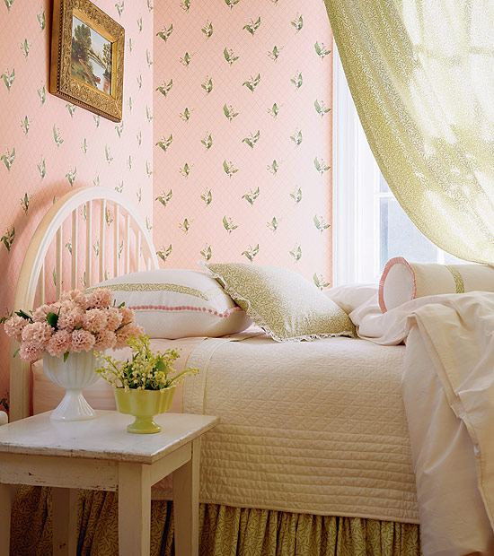
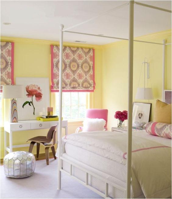
Color pairs: yellow-pink


Paint palette 1.
Appetizing colors 🙂


Pink
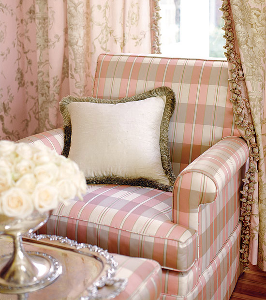
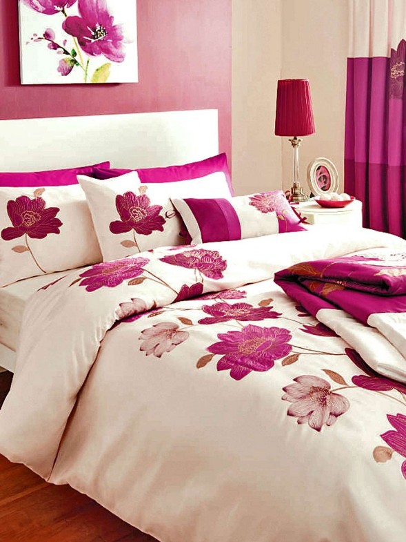
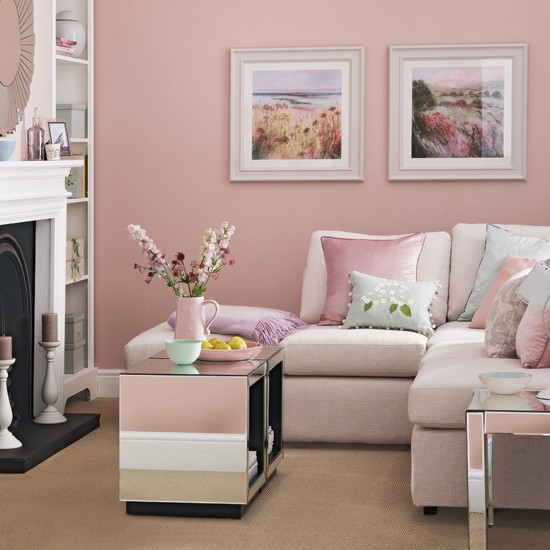
The shades of pink are from mixing red and white. All of its tones are popular in interior design. Commonly pastel or more subdued pinks fit for classic style.
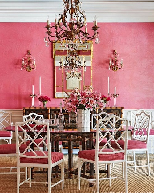
This color is connected firstly with feminity, romance, flowers and girls. Strong shades (e.g. pink, purple) heighten pulse rate and blood pressure, have exciter effect. Soft tones (e.g. pearl pink, powder) are rather calming, inviting and have protecting effect.
There is a perfect shade for almost all of the interior design styles. The lighters can be used in nurseries, children’s rooms, bedroom and bathroom. Brighter tones are better to use only on accessories or maybe on bigger furniture as pop-color or focal point. They look good in living room, dining room and home office. If we are braver, walls can be painted pink also. Its sweetness or vibration can be blunted with white, beige, green, grey, brown or even black.
It was one of the favorite color of Madame Pompadour in the 18th century Rococo France, that’s why it was frequently used on Sévres porcelains, wallpapers and upholsteries. Rather pastel shades are beloved in English styles. It is connected to the feast of cherry tree blooming in Japan.
Business companies that choose pink or magenta for their logos are growing. They want to highlight their specialty, ability to develop and influence with this. Toy manufacturing, cosmetic and sweets manufacturing companies use its paler shades also.
Pinks can easily dominate the space, they might create depressing or sugary mood, so ask for help of a color advisor-interior designer for creating a subdued and tasty pink interior.