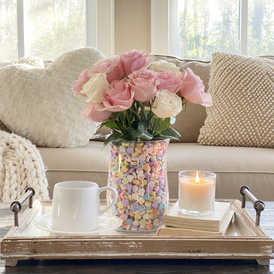
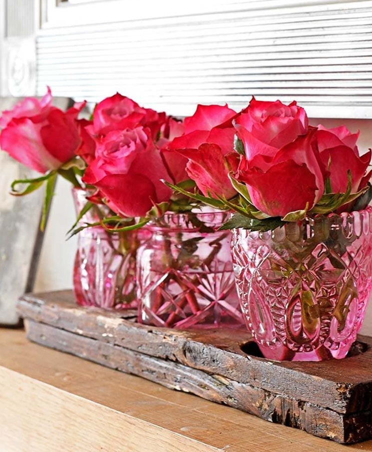
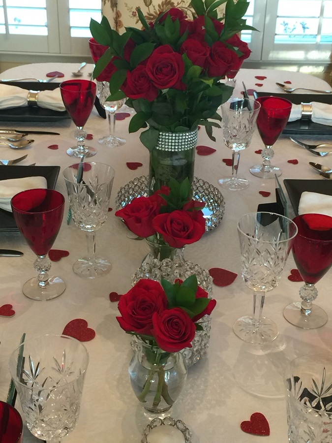
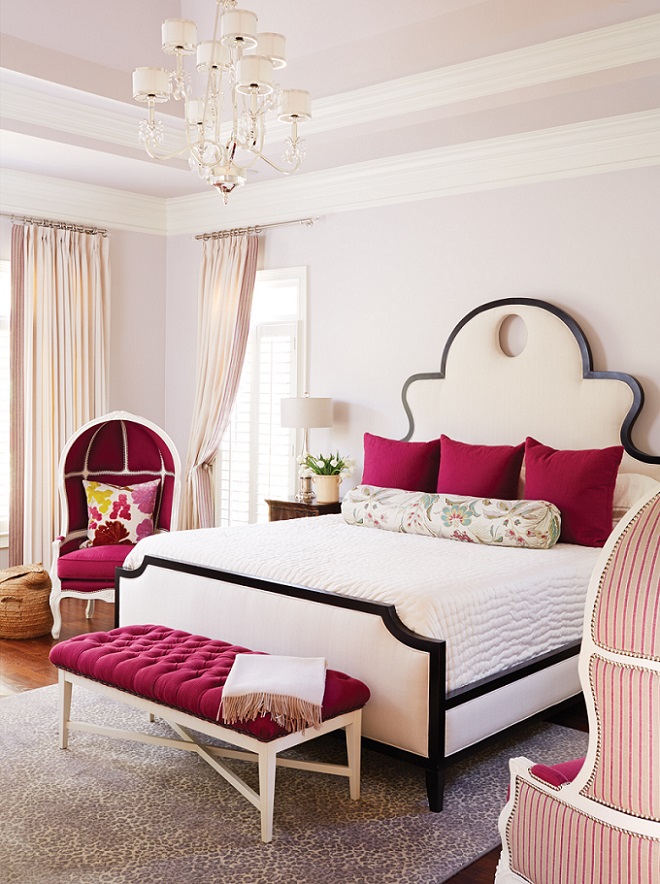
Red rose is one of the oldest symbols of love. However, for Valentine’s Day decoration, we can use any shade between pale pink and burgundy, matching the colors of the interior.
Archives
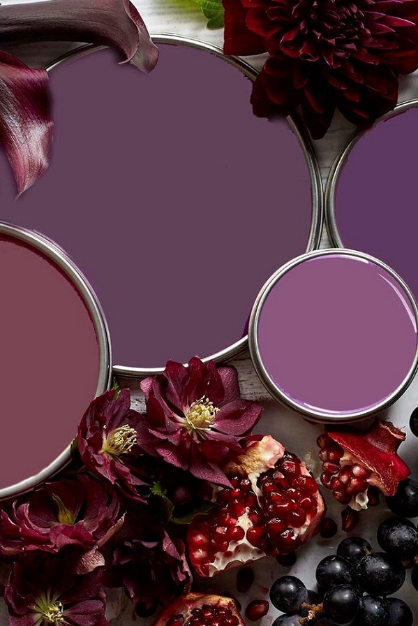
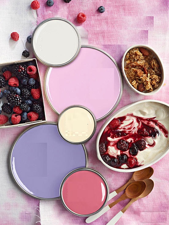
Paint palette 31.
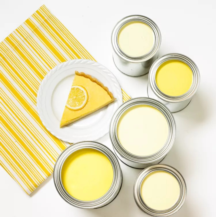
The pastel versions of the primary colors – the color wheel works with muted tones in the same way
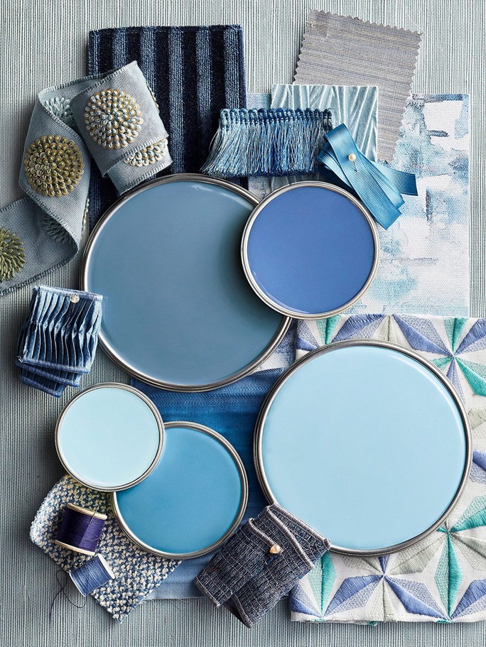
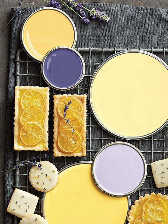
Paint palette 28.
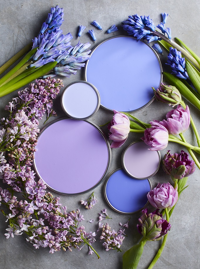
Bluish purples, mauves, purples – none of them is common or „safe” choice, but a pleasantly soothing mood can be achieved by them

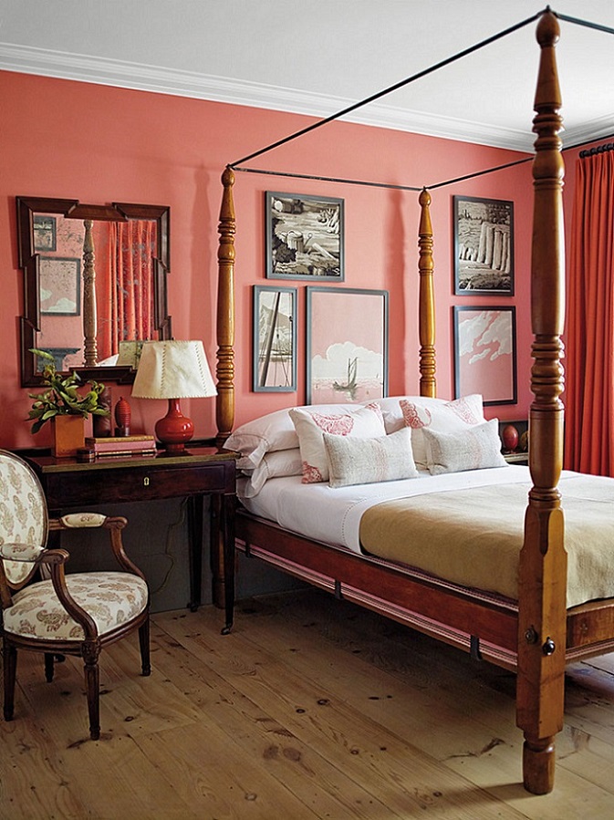
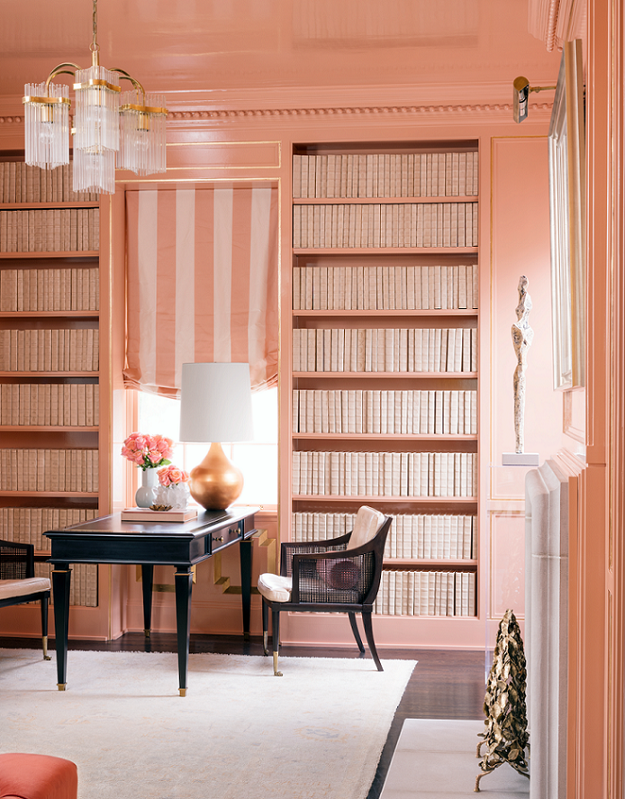
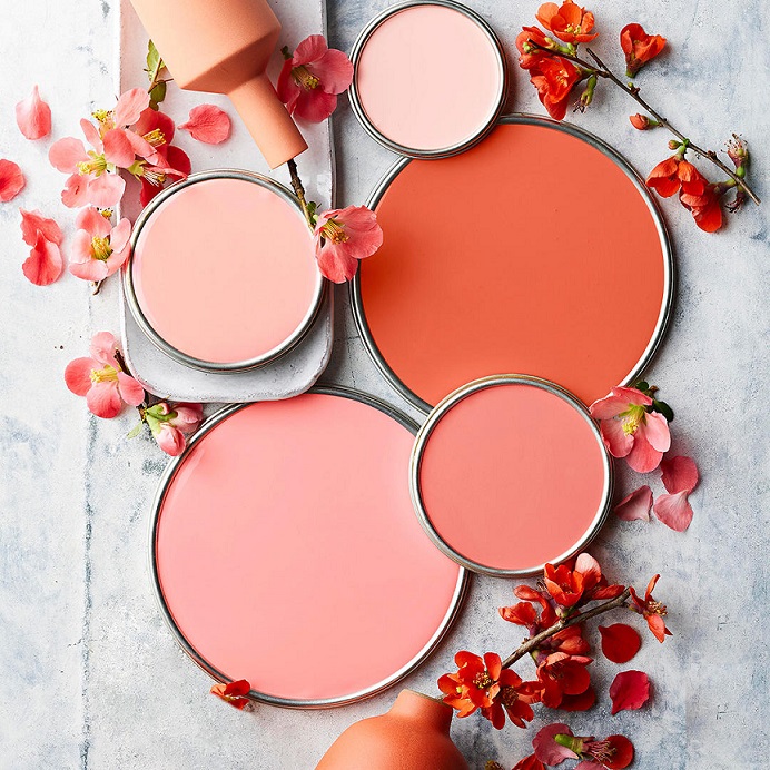
Salmon
Salmon color is a quite vivid pinkish-orange hue. It’s lighter and darker tones are both frequently used in interior design, first of all as an additional color. It fits well for seaside style, for example. It was named after the flesh of wild salmon, which get their color from eating krill and shrimp.

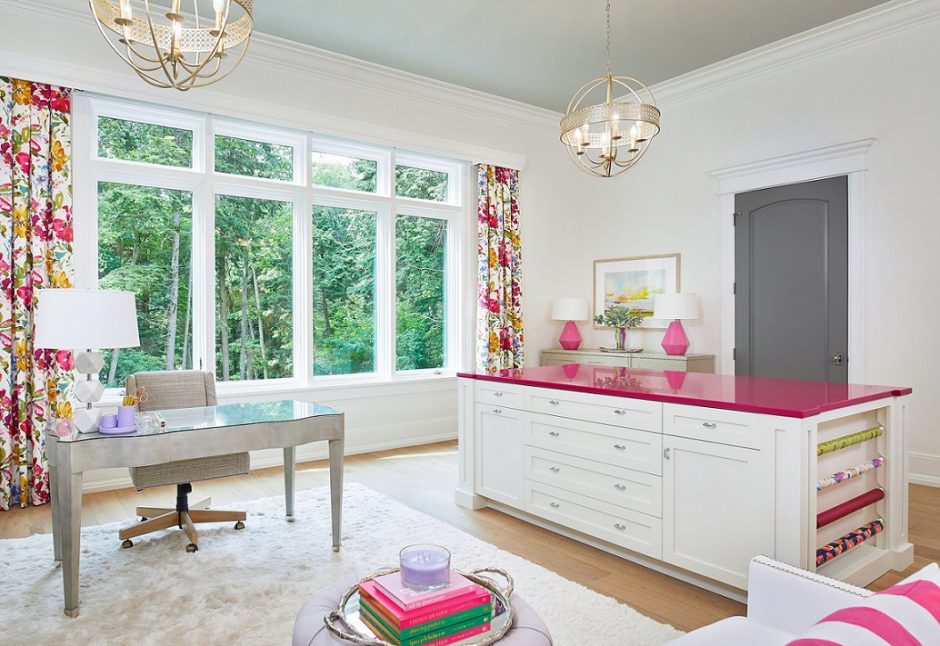
Fuchsia
Fuchsia was patented in 1859 as an aniline dye. It was renamed magenta later, so the two colors are the same. This is a vivid, middark, purplish red hue. Originally it was named after the flower and renamed after the place of a victorious battle in 1859. Since it is a stron and energizing color, let’s use it moderate in interior design, rather as a focal point or pop-color. It can be a good alternative instead of using red.

Powder rose
Powder pink is a soft pastel shade, in the half way between soft pink and light beige. Since it has a “dusty” pink effect, the interior won’t be too sweet, however it’s worth to counterweight it with neutral colors (e.g. grey, brown, white, beige). It was named after the cosmetic powder.


Inspiration 10.
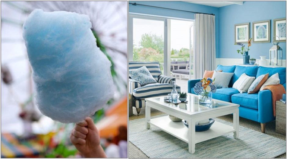
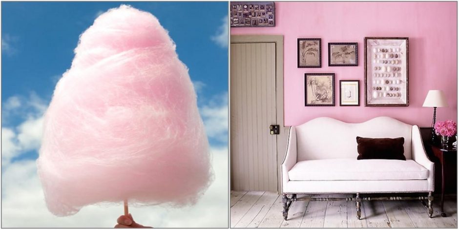
Summer, cotton candy, merry colors

Paint palette 19.
Summer summoning color palettes
Paint palette 16.
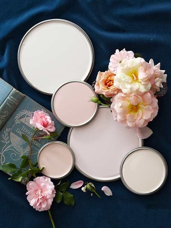
Paint palettes inspired by flowers

Color pairs 36.
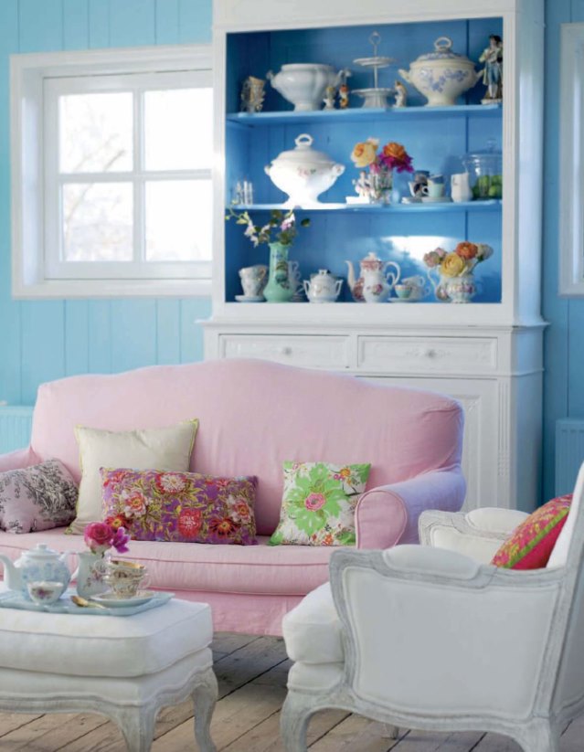
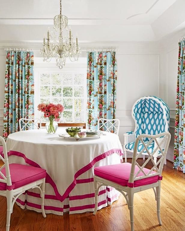
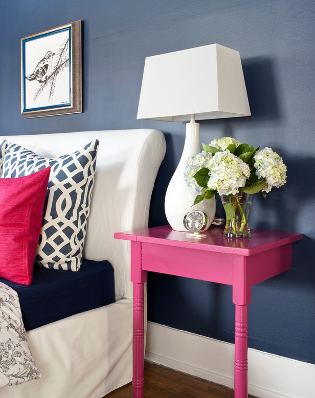
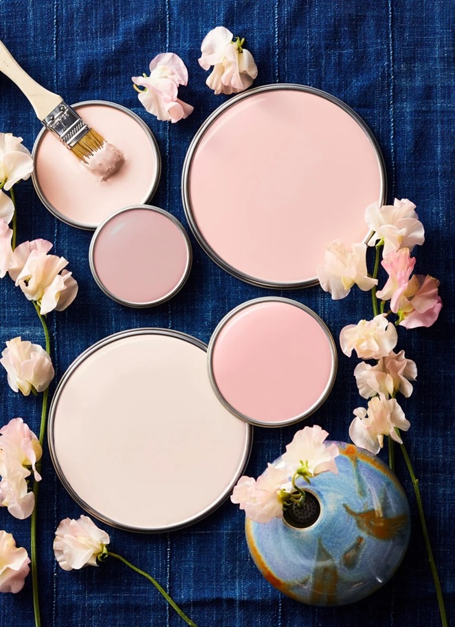
Color pairs: blue-pink