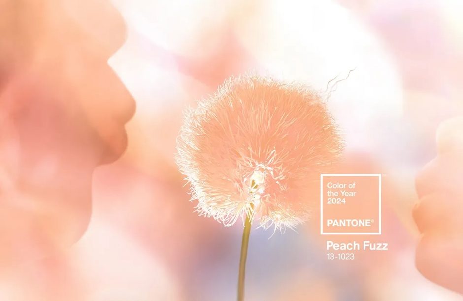
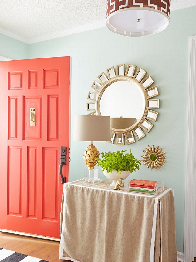
Pantone company announces the color of the next year in every December which has an effect on interior design also. Peach Fuzz no. 13-1023 is the color of the year 2024.
Its base is orange, mixed with a good amount of pink. It is a soft, restrained color that reminds us of softness, homeliness and tranquility. A more airy, pastel effect can be achieved if mixed with white.
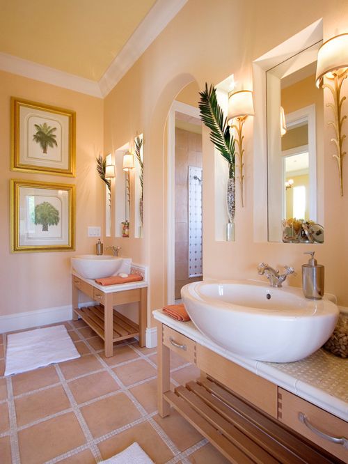
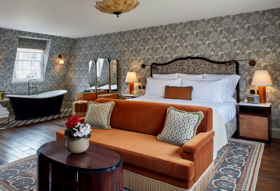
A feeling of excessive sweetness or femininity can be avoided by combining it with black and white. Its complement is baby blue, it looks good with shades of brown and gray, as well as mint green and sage green. It can also be used on large surfaces, but it also functions as a showy pop of color on accessories. It can be used in any room.
Ask for help of an interior designer for making the color of the year 2024 appear in your home in style.
Archives


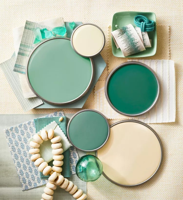
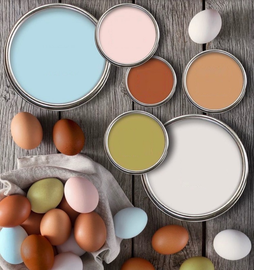
Paint palette 30.
Palettes of summer colors
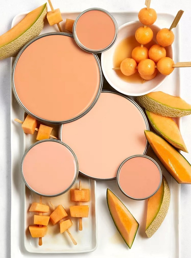
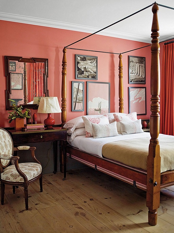
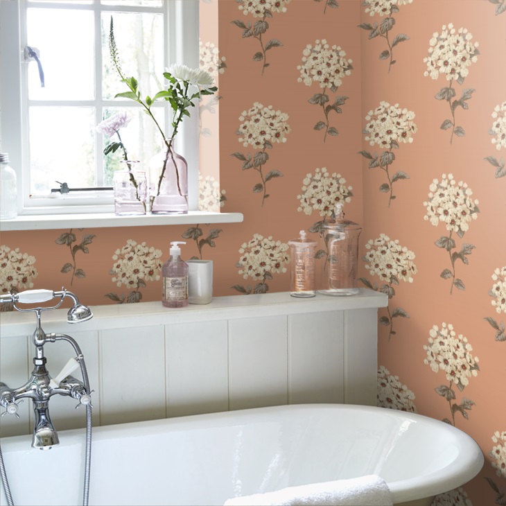
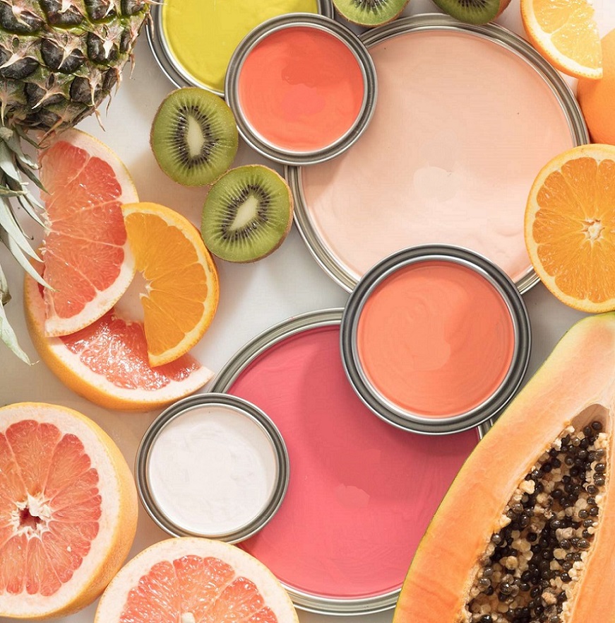
Salmon
Salmon color is a quite vivid pinkish-orange hue. It’s lighter and darker tones are both frequently used in interior design, first of all as an additional color. It fits well for seaside style, for example. It was named after the flesh of wild salmon, which get their color from eating krill and shrimp.

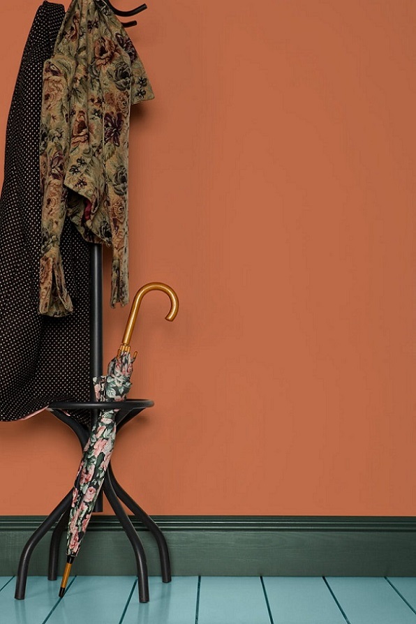
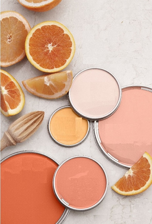
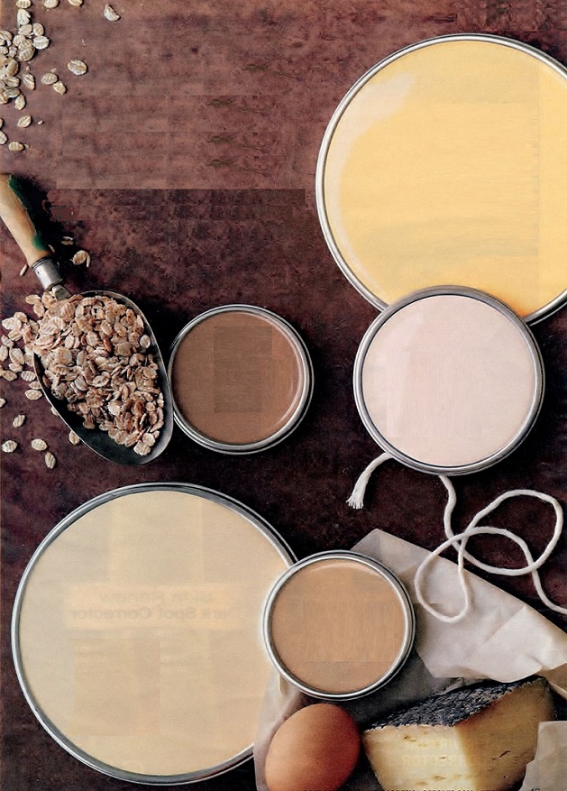
Terracotta
Terracotta color was named after pottery made of clay (terra cotta = baked clay). It is based on orange which contains a pintch of brown, this way it looses strength and becomes a more subdued earth color. It is warm and close to nature, its friendly effect makes the space cozy.
Paint palette 24.
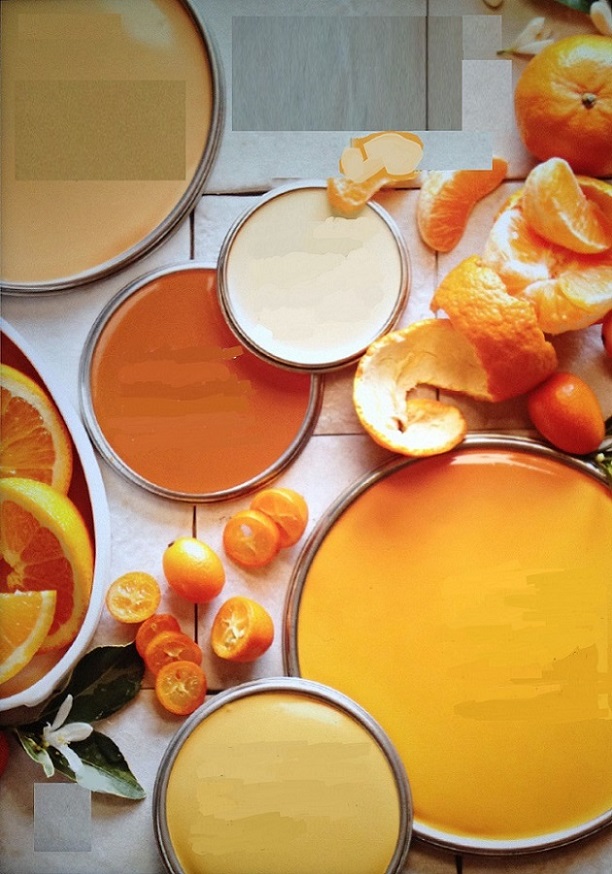
Warm citrus color palettes for compensating cloudy weather
Paint palette 21.
Warm earth-colors for greeting autumn
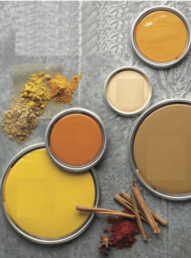

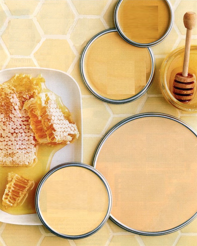
Amber
Amber is just in the half way between yellow and orange on the color wheel. It has rich, warm tone, some of its hues may contain brown also. It was named after the fossilized pine-resin.

Paint palette 17.
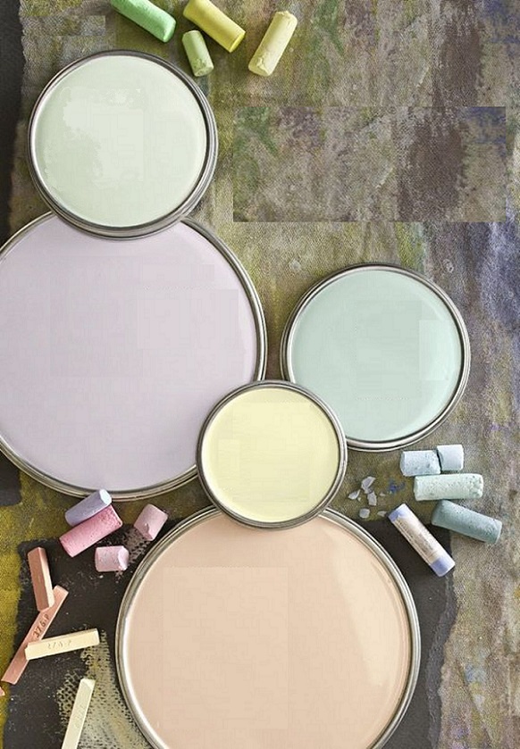
Paint palettes inspired by hobbies
Color of the year 2019
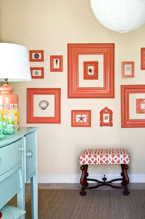
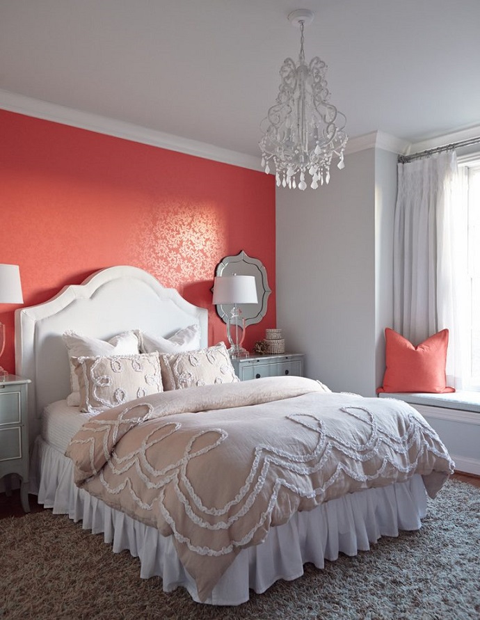
Every December Pantone company announces the color of the next year which has an effect on interior design also. Living Coral no. 16-1546 is the color of the year in 2019.
This is a bright orange color mixed with a tint of pink. It is a warm hue which symbolizes the wildlife and brings joy. Because of these features, perfect dashes of color and focal points can be created with it. Since it is a quite strong, energizing hue, it worth to use less in a bedroom, but can be freely used anywhere else.
It is present in interior design for a long while as an additional color, thanks to the seaside style. A neutral or a darker color palette can be easily popped-up with it. A shade of turquoise blue is its supplementary color which can be connected to water also.
Ask for help of an interior designer for making the color of the year 2019 appear in your home in style.

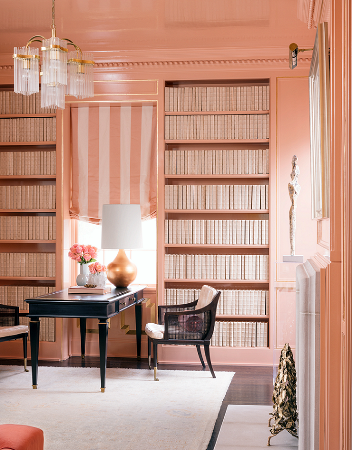
Peach
Peach is a warm, pastel hue based on orange