From all colors, blue is the most popular. Most people mention it as favorite color. Blue is an elementary color, its complementary is orange.
As a physiological effect, it decreases blood pressure and pulse. Calms, cools, makes you meditate and decreases appetite. We associate to sky, water, air by it – therefore it gives a light feeling. In symbolism, intelligence, loyalty, hope, truth, cleanness and heaven are associated to it. Helps to creativity and perspicacity.
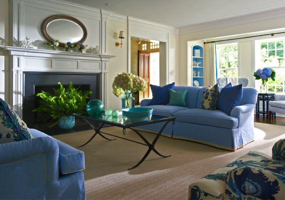
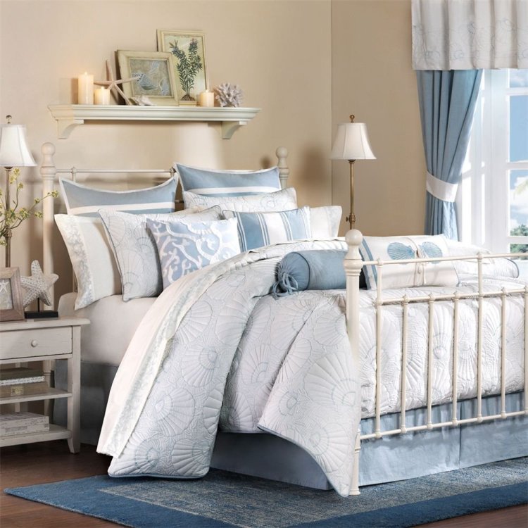
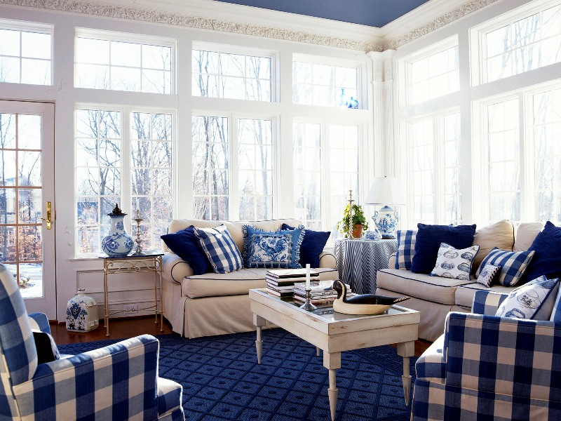
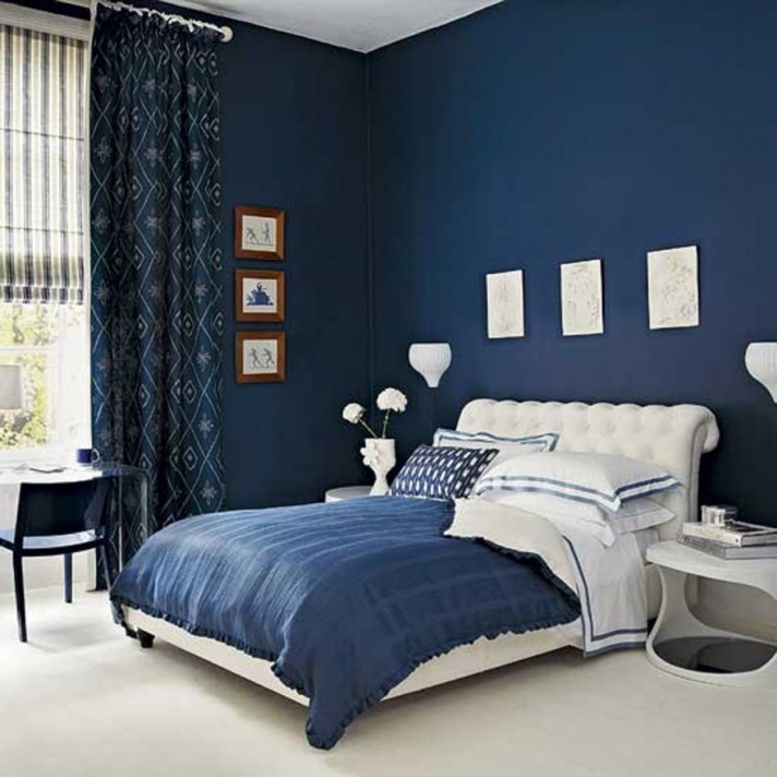
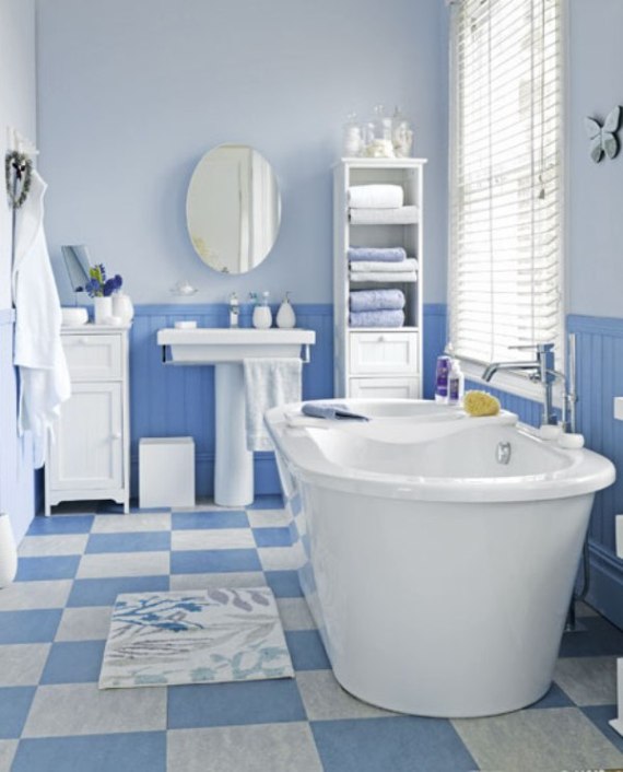
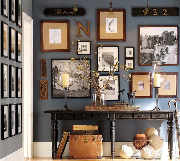
Blue is a cold color. In interior design, its light tones increase the space, make the room ethereal. Dark hues provide seriousness, stability and value. Use the warmer hues in North oriented rooms, else it can be felt too rigid without direct sunlight. In case of any other orientation, it can be ideal color for bedroom, living room, bathroom, or even for hall. Since blue is not a food color, use carefully in dining room and kitchen. Combined with white, beige and brown, it results a classic, elegant interior. Otherwise it cannot be overdosed. Wall or furniture can be blue, but in several cases both, if the hues are selected properly.
Feng shui assigns light blue hues to wood, dark hues to water element. Blue is the color of Jin, the female side. It belongs to the 5th chakra (throat).
It is frequently used in business life. People wearing dark blue suit are considered to be reliable. In logos of renowned companies, blue is the most common color.
Different hues of blue are hard to combine, because green and purple tones are incompatible. For implementing a real cozy blue interior, ask for help from a color advisor.
Archives

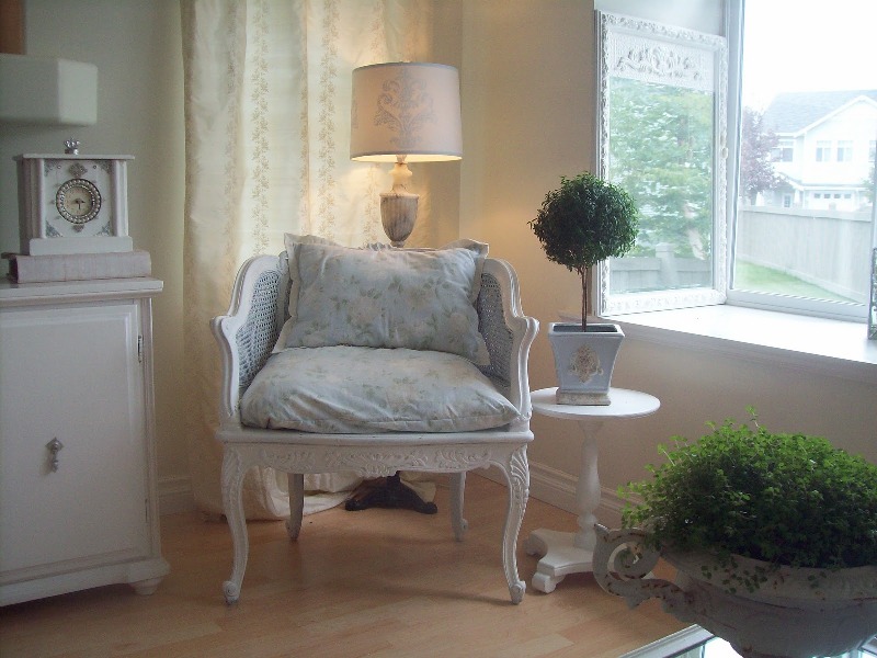
Plants – otherwise
Classical topiary for home decorating

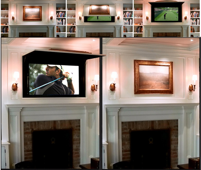
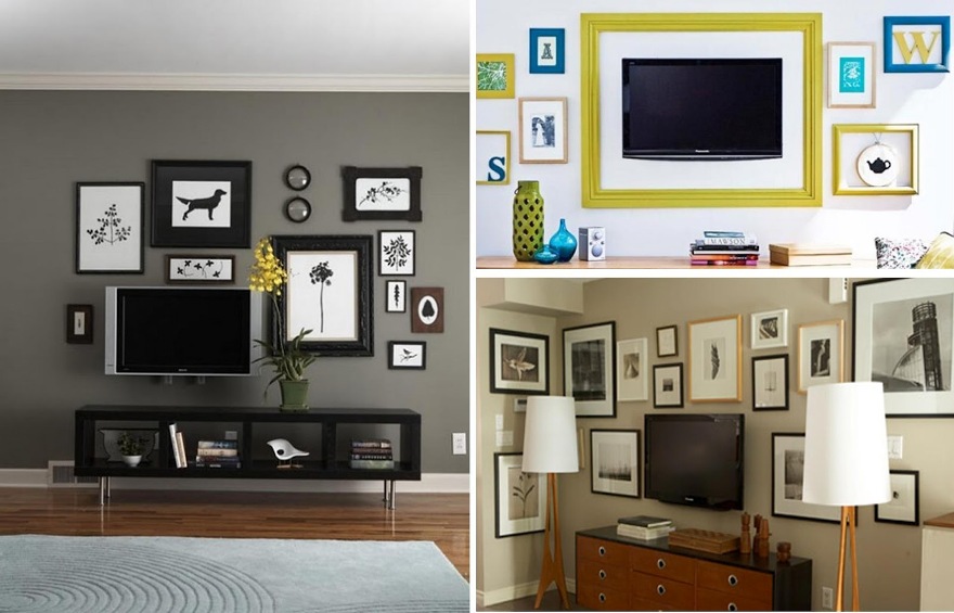
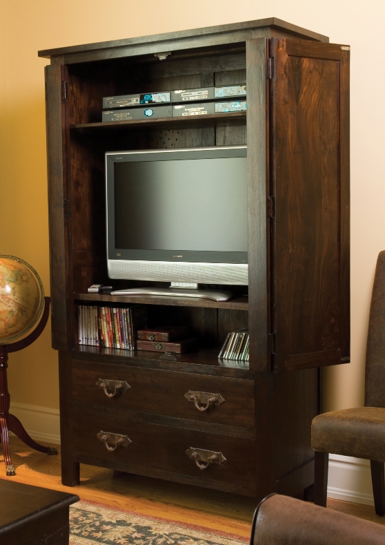
Don’t put the TV in the focus
Some ideas for hiding the TV
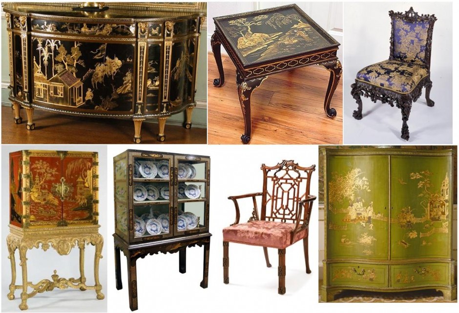
Chinoiserie
Chinoiserie style was very popular in Europe in the XVIII. century. By the vivid trading activities with the East, at the early XVII. century a large amount of furniture, usage- and ornamentical objects, silk arrived to the continent. The fashion of chinoiserie has spread in France thanks to Madame Pompadour (1721-1764). As a mistress of the king, she defined the fashion and most of the orders are placed by her also. In England, the style got known by the drawings and plans of Thomas Chippendale (1718-1779), who was a brilliant designer and furniture maker.
Chinoiserie style appeared as a part of rococo. The porcelain from China has always held in high esteem, because its price, they took place in the interiors of the aristocrats. In 1709, the secret of manufacturing porcelain has been deciphered, since that time, the Chinese pieces could been copied. Main characteristics of the furnitures of the style was lacqering technique. This was a time consuming procedure, even 30-50-100 layers cover a piece. Black, red and green lacquers were the most popular. The best replica was Vernis Martin, but not as good as the original. Often applied with golden decorations for higher contrast. In Europe the wallpaper was also a novelty, till then only painting or upholstery covered the walls. Main motives of chinoiserie style are birds (parrots and cranes), dragons, monkeys, grids, flowery branches, chinese genres and landscapes as the central decorations of furnitures. The pierced-backed chair became popular such as the pagoda like structures on beds and vardrobes, the rice paper covered paravan and the bamboo-like carvings.
From these features an interior designer easily can create an interior that fits to the present taste, providing classic and elegant solution for the nowadays popular oriental style.


Supplementary colors
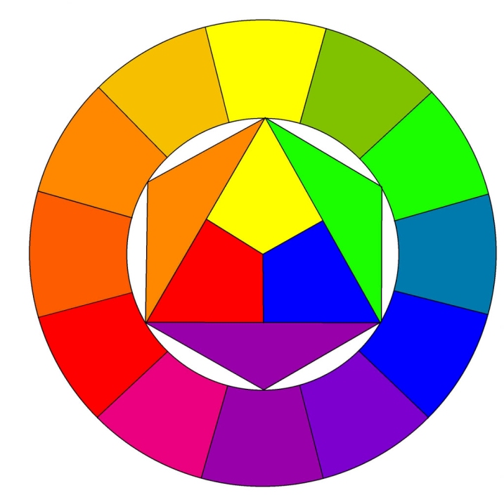
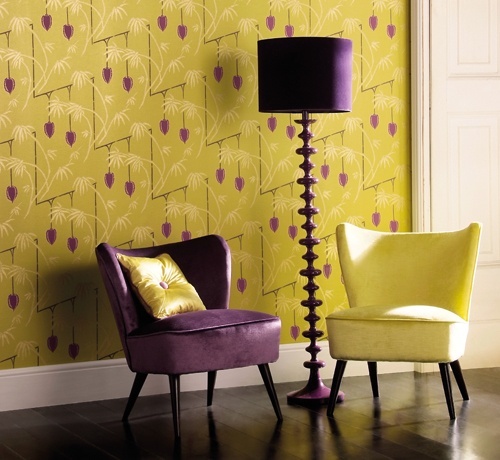
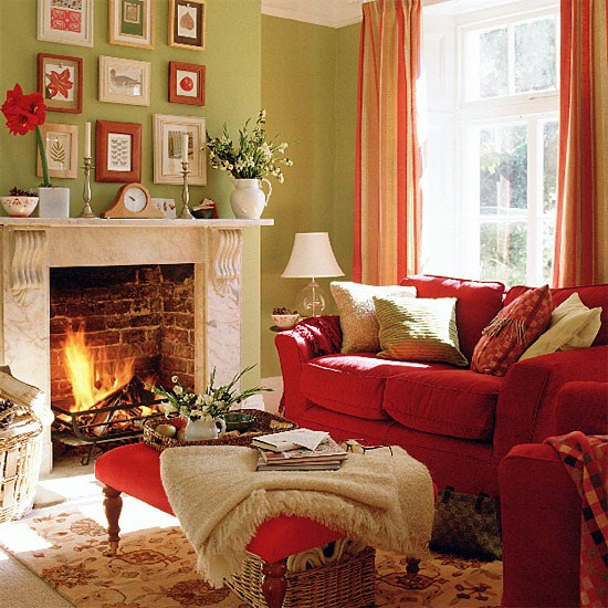
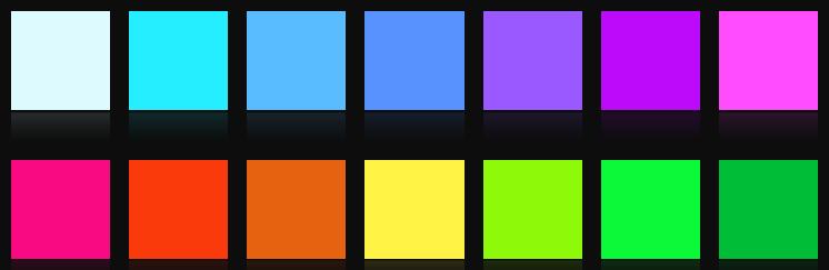
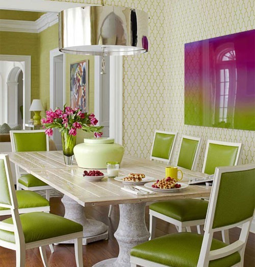
Supplementary colors are color pairs, that are located the opposite side of the color circle. They strengthen the effect of each other, resulting an eye-catcher pair. The color circle itself consists of three elementary (blue, yellow, red), three secondary (green, purple, orange) and six tertiary (transitions of the above mentioned) colors. The circle shows their relations also.
In interior design, we use them for reaching really striking, unforgettable experience and for defining focal points. If we would like to use them in the same share, a third, neutral color (black, white, cream) should be applied too. The supplementary color pair has to be used at a relatively low level in the space (e.g.: on decoration pillows, vases, pictures or on some smaller furniture). If both colors have to be emphasized, don’t use them in the same share, else the result will have unsettled or unfinished feeling without the required esthetics. One of them should me the main color, while the other is the secondary, as we have already seen it at the color balance. As a counterpoint, the supplementary should be used in small amount.
Most common pairs are green-red, blue-orange and purple-yellow combinations. If someone afraid of intensive colors, this scenario can be also realized with pastel colors as well: with pink-light green, lavender-vanilla and light blue-coral hues.
Using supplementary colors requires courage. If you are uncertain, but you would like to get a spectacular interior, ask help from an interior designer or color advisor.


Collections
The proper placement of different collections is not an easy issue. We don’t want to give it up, but we cannot store it as we would like to. The main reason is the lack of space or organization.
There are collections, which are evident to store, like books, stamps, DVDs, etc. We can find place for them on the bookshelf, the box under the TV or at the bottom of the coffee table. The unused space under the stairs or above the doors can be equipped by shelves to. But the real problem is caused by special collections to be exhibited in the department. We should find a worthy location for them, not to pick out from the drawer if we would like to take a look on them.
Sculptures, ceramics, glass objects look nice on a narrow shelf made for right this, lightened by spotlights or LED lights from above. Similarly suitable is a plasterboard niche-line as well. For maquettes, models, there are wall mountable storage compartments available. These later can be easily designed and implemented by us using some wood and paint.
In case of choosing the proper surface to place paintings, drawings and etchings, we have save them from direct sunlight which can be destructive. A glass covered frame can save avoid the contact with dust.
When collecting small objects (minerals, souvenirs from abroad, watches, etc) a good solution can be placing them on the top of a commode, the glass cabinet above the tv or under the glass surface of the coffee table. Let’s group the items by color, style, theme or form. Not only the living room can be the right place for them, but the hall, the bathroom (e.g. seashells or stones), or even the bedroom.
Important: avoid overdoing it! They souldn’t cover all corners of the room – if we haven’t got a separate room right for this purpose. If the collection grows too large, let’s try to sort: show only the nicest or favorite ones. The remaining others can be stored in a box in the cabinet. If you don’t know how to optimize the available space or how to exhibit your treasures the best way, ask help from an interior designer.


Spring
Spring is coming soon. The bright colors typical of the season can be brought in our home also – even all over the year.
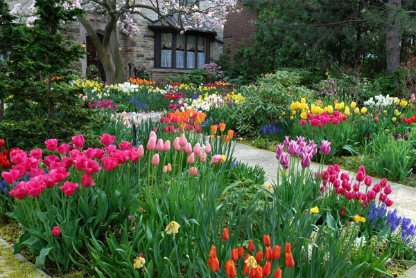
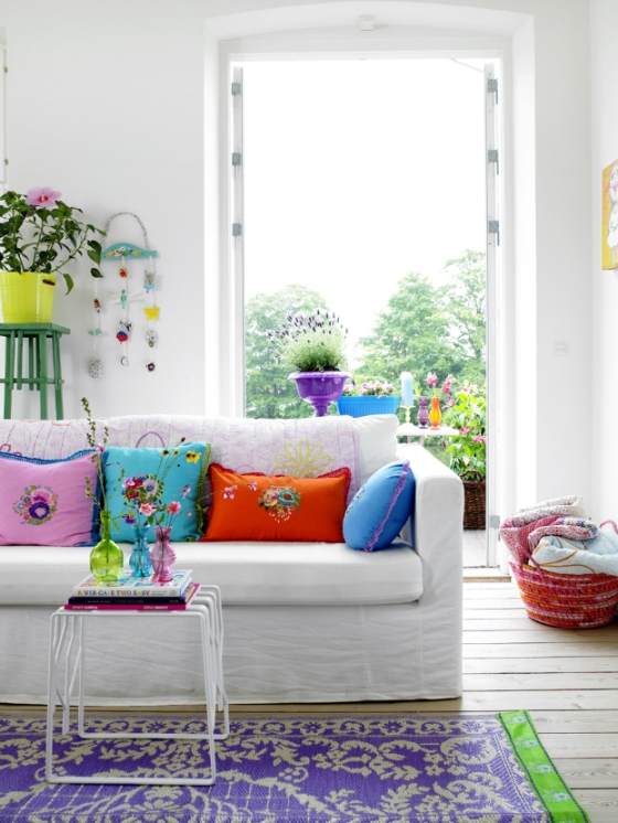
If we look at a spring flower garden we can see that the several hues of bright green give the background for the vivid colors of the first flowers. Primrose yellow, fuchsia, white, bud-green, bright red and sky-blue are the most common. Any of them is impressive in a flat, how can they be showed together for the real spring mood?
The best solution for this is using white. It is a neutral background; the vivid colors can be harmonized with it. Let’s paint the walls white (or off-white), cover the larger furniture with white fabrics and choose a neutral and light floor covering if white will be too much for the latter. Use the jewelry-like colors for decoration and highlighting. Cushions, vases, pictures and carpets should be dazzling. Don’t forget the real, spring-like flowers also! Color and fragrance are the most important, the flat is filled even with cut or potted flowers. The big advantage of this interior is that it is easy to change because of the neutral background, if the composition is boring or it should be changed season by season.
Green can be the uniting color if we are brave enough or want to have this mood for a long term or just wish to follow the nature much more. Don’t be afraid of it, if it works in the nature, it will work in the flat also! Let’s paint the walls to a warm green shade, upholster some larger furniture with green or green patterned fabrics. In this case, choose a warmer mid-brown hue for the floor which can even symbolize the soil. Then use colors also on accessories and flower bouquets. Entering in such a room will make everyone smile.
Many people are afraid of bright colors, uncertain in using them in the case of their home. However, if you would like to feel the mood of your favorite flowers every day, ask for help of an interior designer for the proper composition.

Color balance
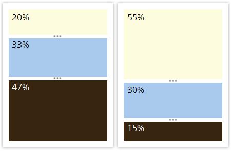
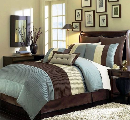
In an interior, color balance is almost as important issue as the style itself. Generally there are three main colors that are chosen into the palette of a room. Of course all colors of the rainbow can be presented additionally (think of the books, the cavalcade of objects given as a souvenir), but the mood is determined by the main colors. For example, let’s see a classic combination: chocolate brown – light blue – cream.
If we use all of the three in the same rate, the result will not be significant, there will be no focus point and our look will go around in the room. But if we modify the rate, the overall view will be much better immediately.
This means in the case of a room, that three walls and the floor can be brown (even a different hue), the main wall is light blue and the accessories (e.g. curtain and decorations) can be cream. If we would like more neutral result, the walls and the carpet are cream, the curtain and the couch are blue or having blue patterns and the wooden furniture, picture frames are chocolate brown. In all cases, good idea to insert objects, that combines all the three colors (e.g.: cushion, vase)
When choosing our favourite colors, we should check if they fit to each other and their rates must be determined for the required effect. If you are uncertain, ask the help of an interior designer or color advisor. One or two hours of consultation can be fully enough.