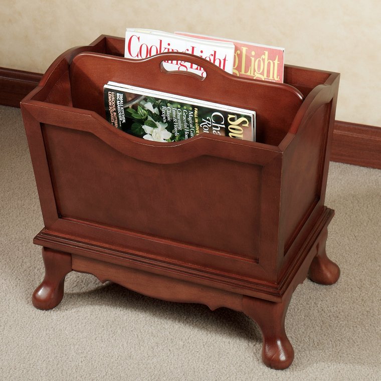
Useful accessories in the living room
Archives
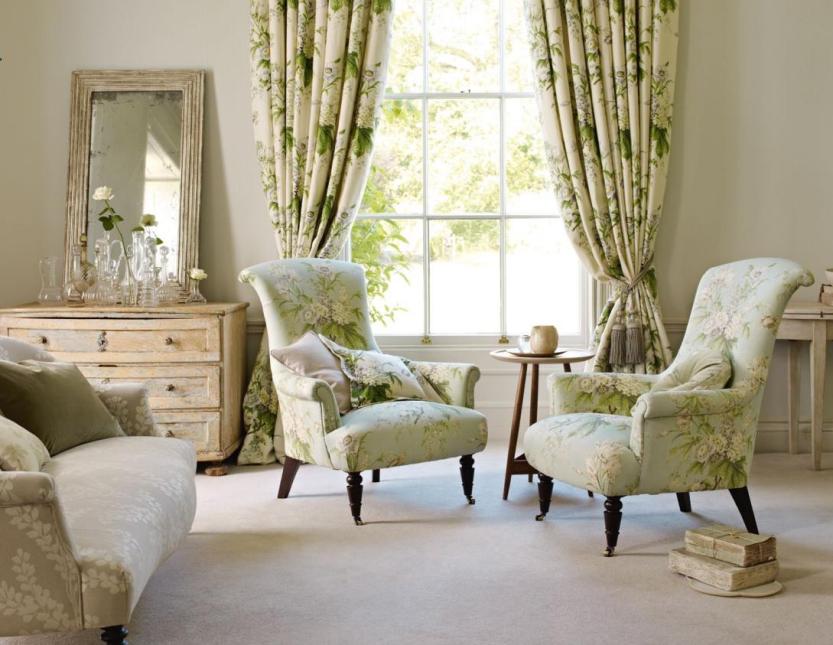
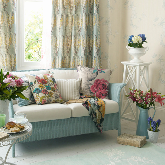
Floral fabrics
Romantic mood by floral patterns


Inspiration 4.
Interiors inspired by famous movies


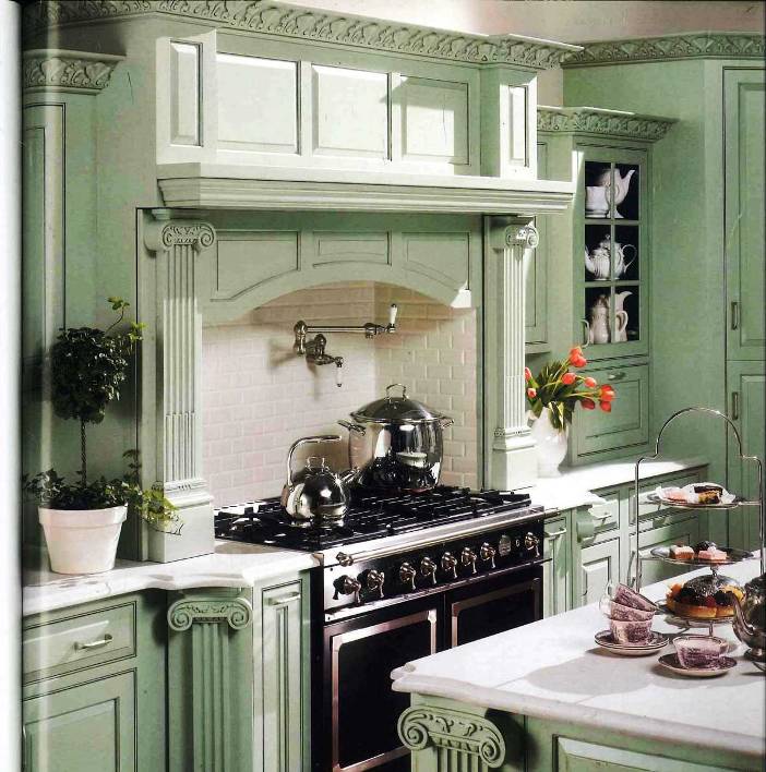
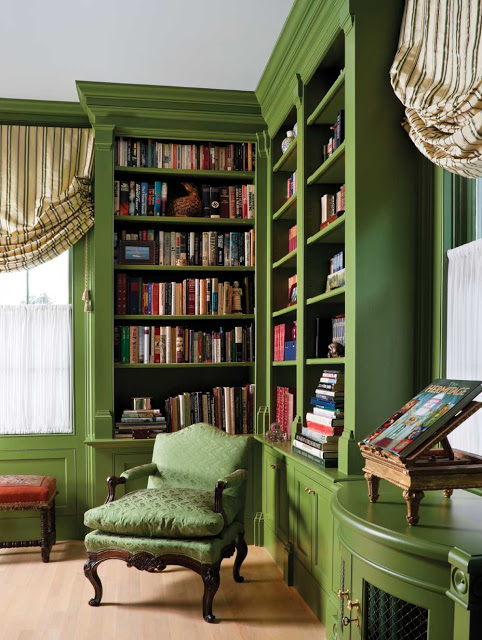
Green
Green is gained by mixing two primary color, blue and yellow. By this, we call it a secondary color. Most of the people consider it as a neutral, calm color. Its complementary is red.
According to physiological effect, green calms down, balances, relaxes the eye, therefore it is frequently applied in medical institutes and schools. We associate it with nature, life, it gives the feeling of free space. In symbolism, green is allocated to development, maturity, eternal life, but also to inexperience, jealousy and anger. Green is used for free, permissive signals.
Green can be cold and warm depending on the rate of blue and yellow. In interior design, it is a perfect background for strong, vivid colors. Can be applied in all rooms bravely, mainly the lighter hues. Combined with white, cream and brown, a classic, elegant interior can be resulted. Hues with more yellow provides freshness and happiness into the view. Perfect color for garden facilities (e.g. shed, swing, arbor frame structure) to hide them among the surrounding vegetation.
Feng shui assigns green to wood element. The color of the Jin, the female side. Associated to the 4th chakra (heart).
In business life nowadays it is used for advertising bio products and extensively used also by ecological and environment friendly companies. This is the color of money as well.
This is an extremely versatile color, for getting a cozy green interior, ask help from a color advisor.


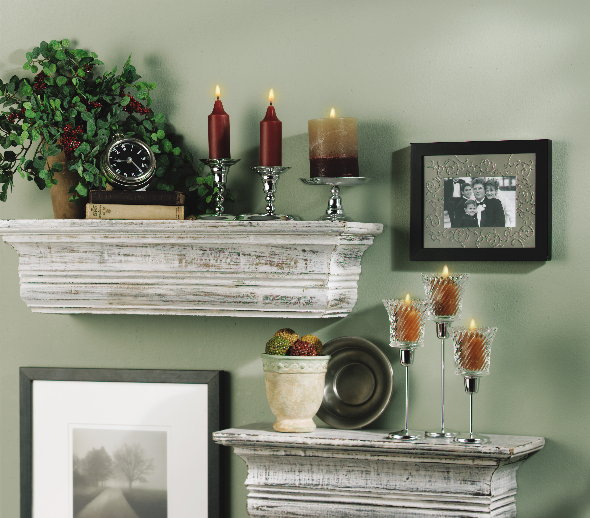
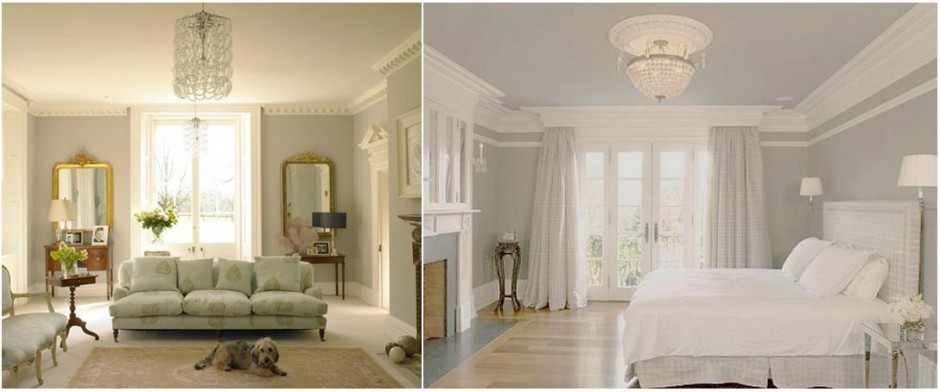
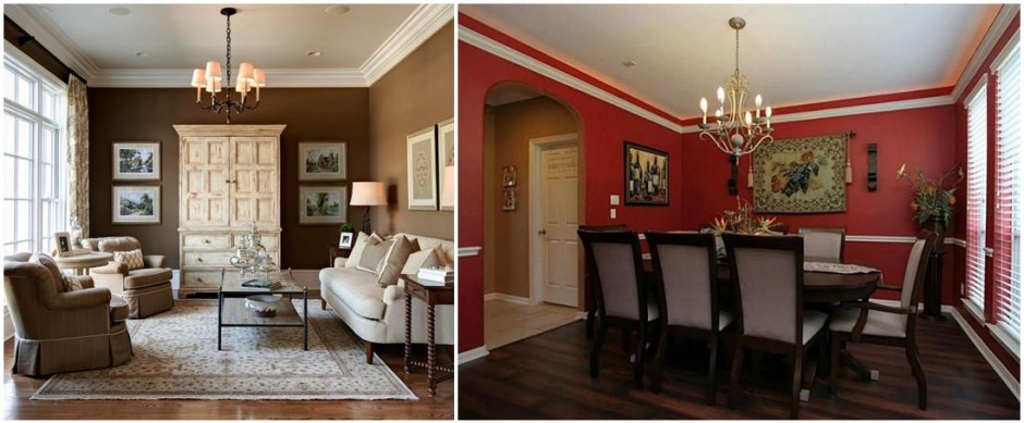
Mouldings and others
Crown and base mouldings and rosettes give character and elegance for the room and raise sense of space

Summer
Summer arrives soon, it’s the hottest season of the year and also the time for school and work holidays. For many people this is the favourite period because the time spent together.
To determine the colors of summer maybe the most difficult, if we would like to display them in our home. Let’s imagine a hot summer day, when the hot air is vibrating, the garden shows all of its colors and the objects are faded by the strong sunlight. We see leaves green, pale yellow, terracotta, water green, peach, off-white and light blue. Colors of natural materials such as linen, hemp rope, sand and driftwood shows this view perfectly. This can be a base when designing our home.
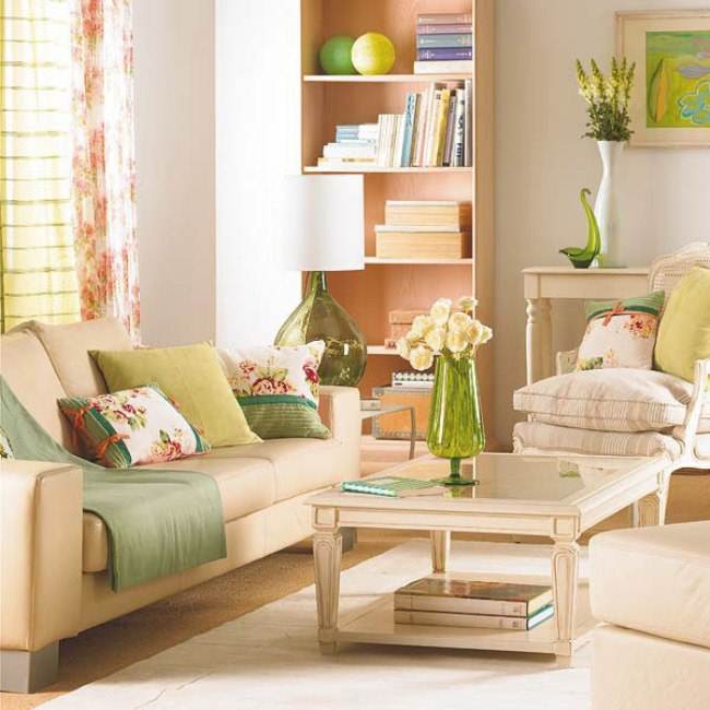
As a first solution, natural background can be selected. A lighter brown wooden floor and a sizal carpet can be emphasized with warm beige or sand color on the walls. Furniture can be upholstered with monochrome or striped fabric. Vivid colors can be displayed on cushions and curtains with summer style, flower patterned fabrics. For decoration, plant prints and landscapes are perfect. As always, cut flowers in vases (roses, gladiolus, hydrangea, etc.) cannot miss.
The other solution is for the lovers of colors: for the walls, one of the favourite summer color can be applied, e.g. the pale yellow provides happiness, water green means calmness and peach gives romantic atmosphere. For a summer interior, glazed ceramic floor tiles are also excellent covered by smaller carpets in the living room and dining room. In bedroom the wooden floor or carpet should be better choice. As for fabrics, linen is perfect such as cotton with printed flower pattern.
If you would like to realize the atmosphere of your holidays all year, ask help from an interior designer.


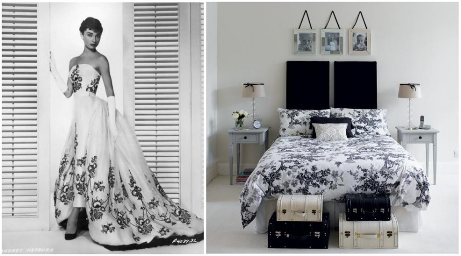
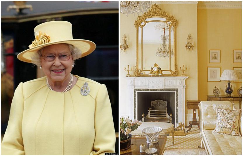
Inspiration 3.
When a celebrity gives inspiration for decorating our room

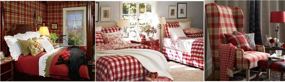
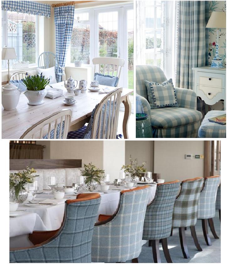
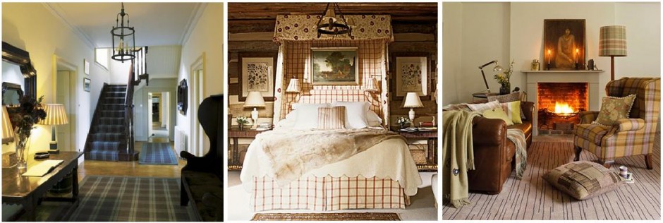
Checked
Providing style with checked fabrics
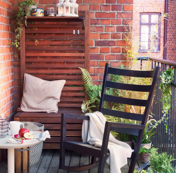
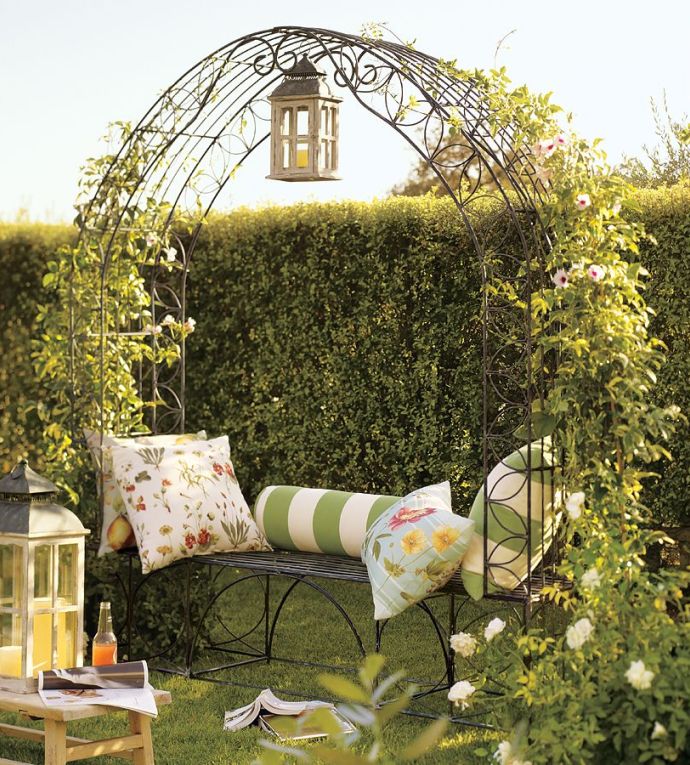
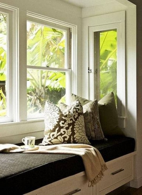
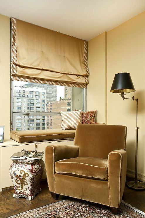
Reading nook
A cosy reading corner is the most desired dream of the book lovers for whom reading is a real hobby.
At home, we used to read at many different ways and places: in bed, curled up in a couch, in the bath or sitting at the desk. These are most often ad-hoc solutions, but whatever size of home we have, we can easily implement a separate oasis for our most favourable activity.
If there is a cosy bay window, that could be an ideal place for a built-in bench. Additional storing place also can be gained such a way. With a harder sitting cushion and some soft cushions for the back – covered by a textile fitting to the style of the home – can result a place where we can read at natural light.
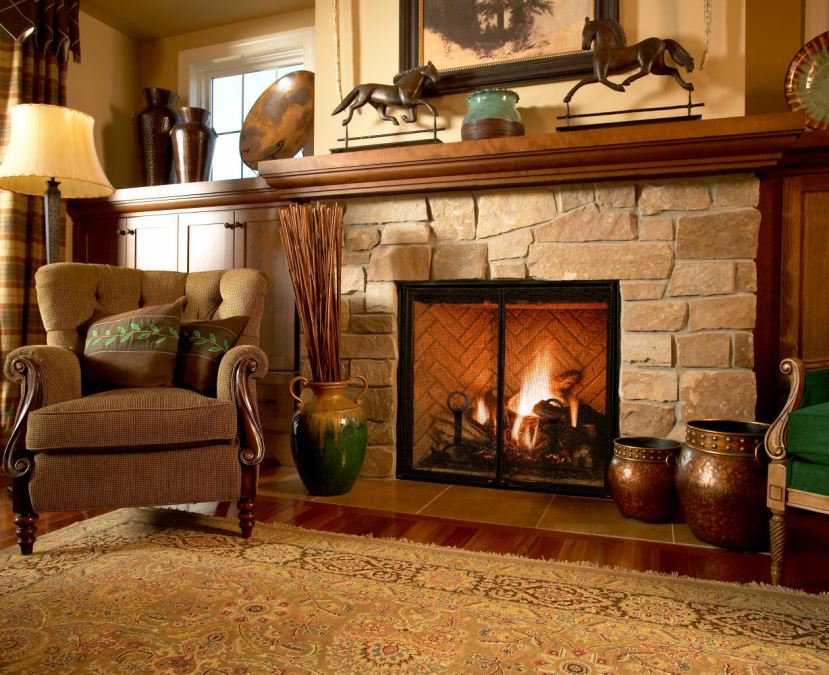
We also can purchase a big and comfortable armchair for this purpose, it can be placed e.g. near the fireplace or in a corner. It should be large enough to let us changing our position in it. Extended with a footrest, an additional cushion and a standing lamp, it can be even more comfortable.
Informal style and location can be solved by using three or four sitting cushions on the floor, which can be moved wherever in the flat. Cover large, at least 60×60 cm cushions with your favourite fabric. Placing them near each-other, we can read in laying position, but placed vertically they provide cosy sitting facility.
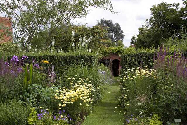
If we like to read outdoor and we have a balcony or terrace, a deck chair or rocking chair can be put out there, completed with a blanket and a cushion. If there is also a garden, a bench can be placed under an arbor or a larger tree, where we can read surrounded by flowers, enjoying the scents and the silence.
If you love to read at home as relaxing, but because of the dimension or features of your home, you have no idea to realize a reading corner, ask help from an interior designer.
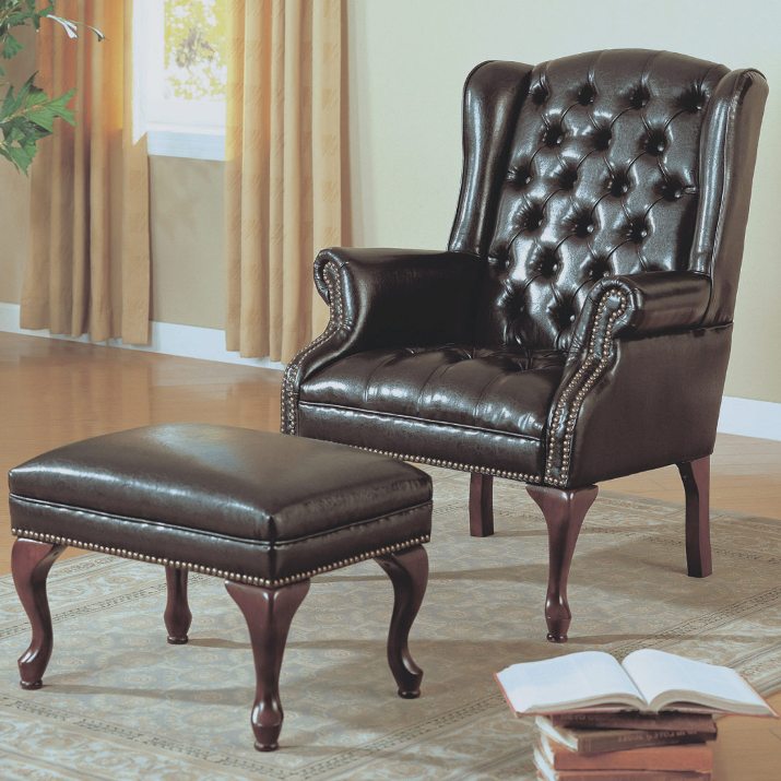
Leather furniture
Classical, elegant and comfortable leather furniture