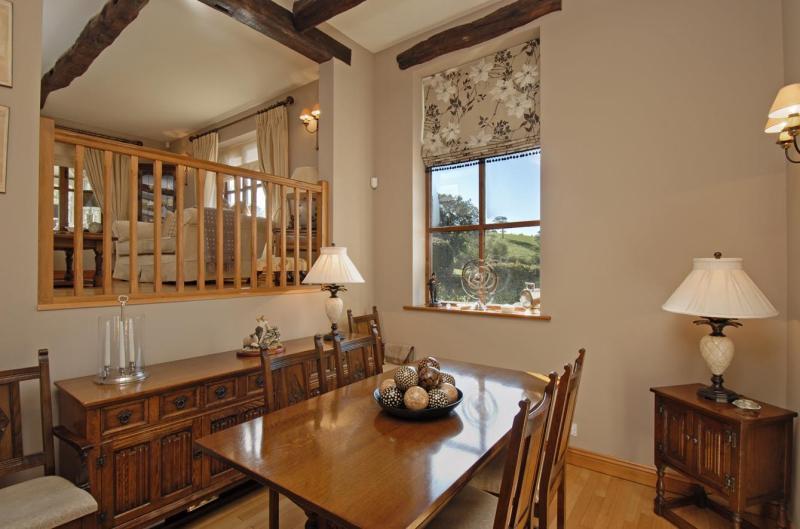
Don’t be afraid to furnish level-offset spaces
Archives
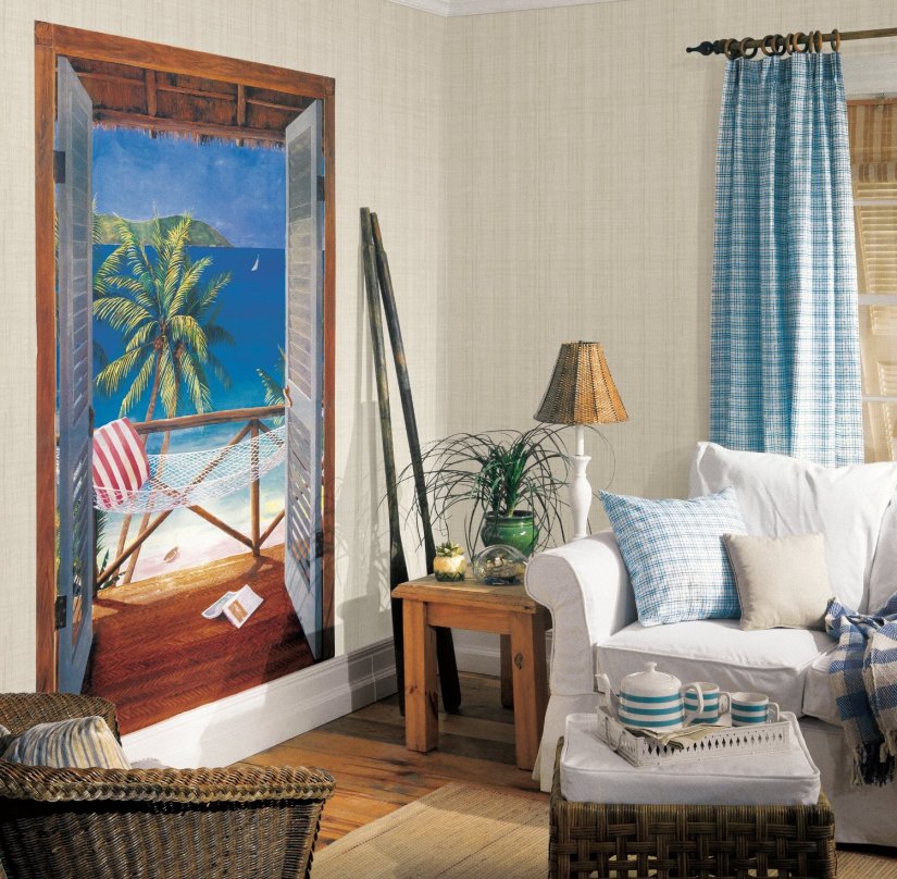
Trompe l’oeil
Trompe l’oeil never went out of fashion but have to be daring to use it
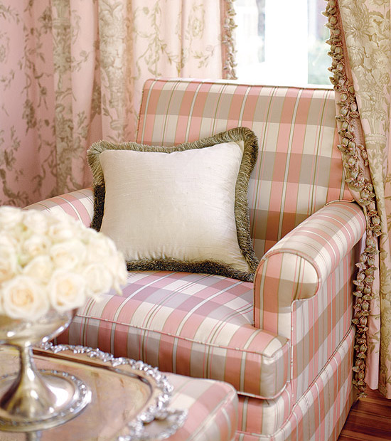
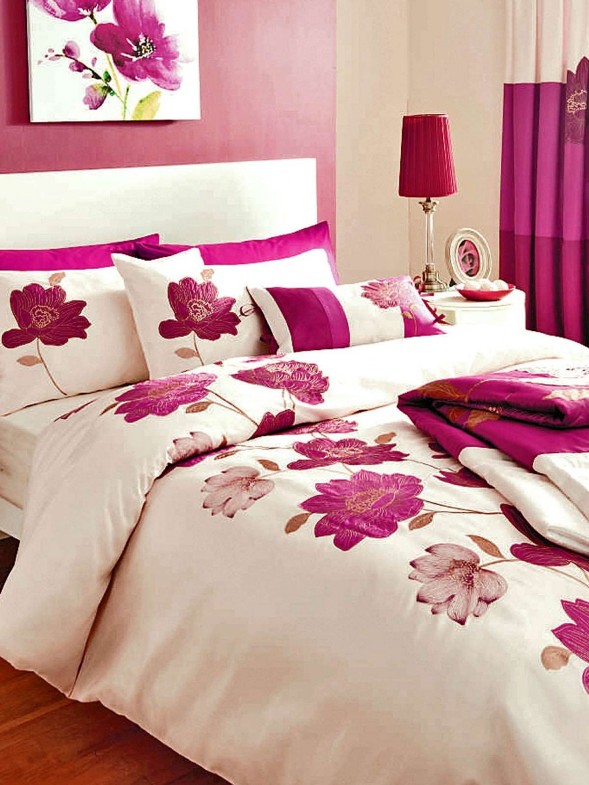
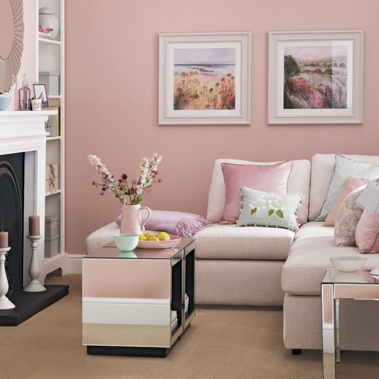
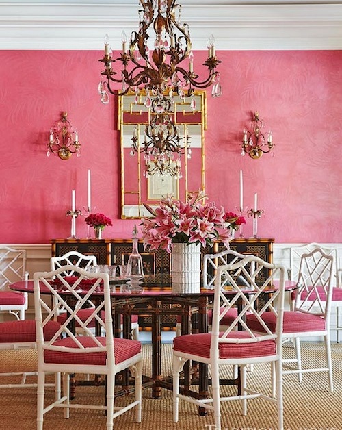
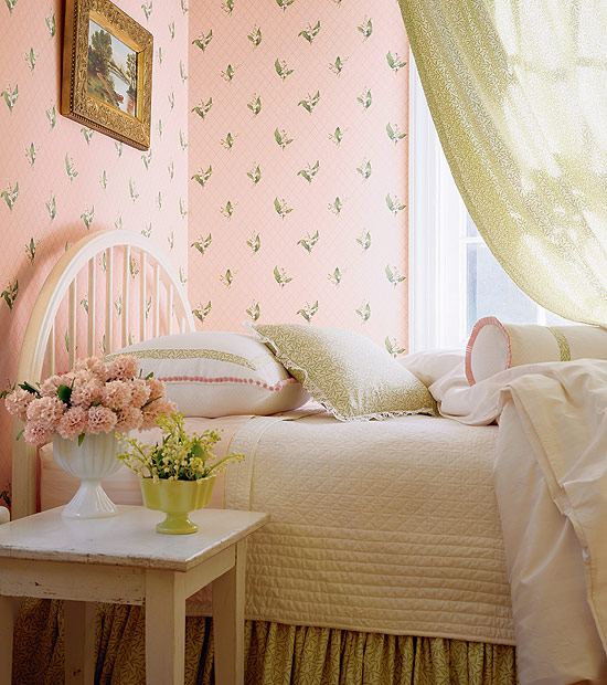
Pink
The shades of pink are from mixing red and white. All of its tones are popular in interior design. Commonly pastel or more subdued pinks fit for classic style.
This color is connected firstly with feminity, romance, flowers and girls. Strong shades (e.g. pink, purple) heighten pulse rate and blood pressure, have exciter effect. Soft tones (e.g. pearl pink, powder) are rather calming, inviting and have protecting effect.
There is a perfect shade for almost all of the interior design styles. The lighters can be used in nurseries, children’s rooms, bedroom and bathroom. Brighter tones are better to use only on accessories or maybe on bigger furniture as pop-color or focal point. They look good in living room, dining room and home office. If we are braver, walls can be painted pink also. Its sweetness or vibration can be blunted with white, beige, green, grey, brown or even black.
It was one of the favorite color of Madame Pompadour in the 18th century Rococo France, that’s why it was frequently used on Sévres porcelains, wallpapers and upholsteries. Rather pastel shades are beloved in English styles. It is connected to the feast of cherry tree blooming in Japan.
Business companies that choose pink or magenta for their logos are growing. They want to highlight their specialty, ability to develop and influence with this. Toy manufacturing, cosmetic and sweets manufacturing companies use its paler shades also.
Pinks can easily dominate the space, they might create depressing or sugary mood, so ask for help of a color advisor-interior designer for creating a subdued and tasty pink interior.
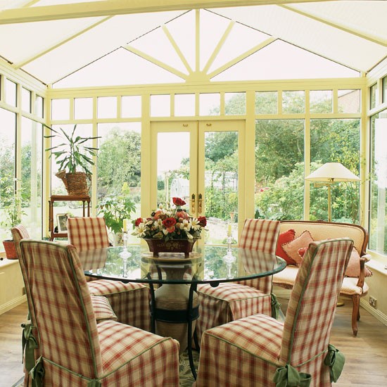
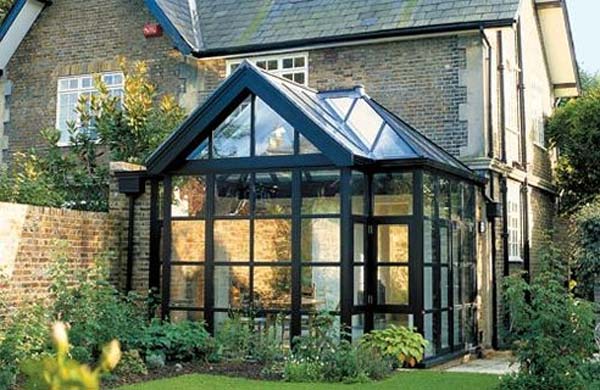
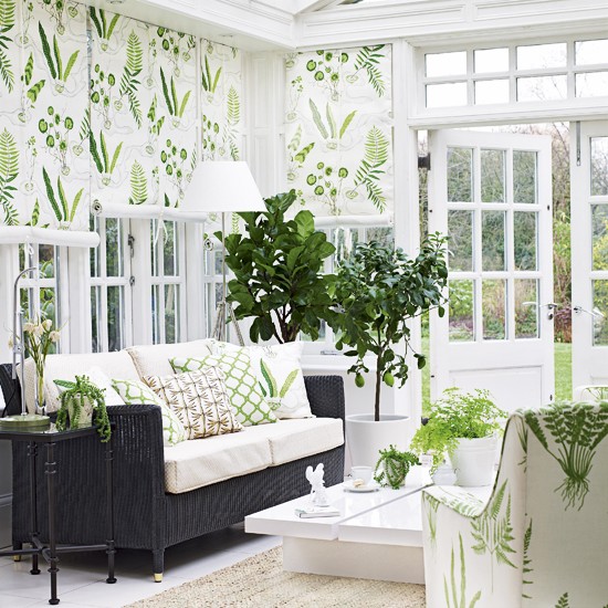
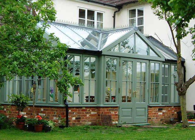
Orangery
A cleverly designed orangery built to the house will be usable all over the, which increases the value of the house also.
Firstly the purpose of the additional „room” has to be decided. It can be useful for anything else beside keeping and wintering plants: reading nook, playroom, additional dining room or living room. It is practical to build in a French door in its garden side for opening it up with the garden in good weather, this way creating an airy but covered outdoor seating place.
The building can be ordered from professional companies, which deliver it in the desired size, color and material after on-site survey. The frame can be made of metal or wood. The first one is the most common because it needs less care and sturdier. Any other color can be chosen beside the classic white, which matches to the house. The advantage of green is fading into the garden view. Black gives a more characteristic look, and also a beloved color for a long time. As far as possible, the roof should be made of the same glassed framework as the walls. Not only for the sake of a more uniform and beautiful appearance, but also for the plants to get more light.
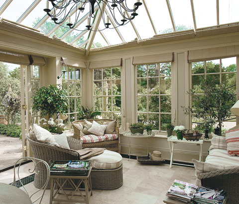
It’s practical to choose a kind of tile or hardwood covering for the floor. These don’t warp by moisture which is important because of the plants kept here. If carpet is preferred, let’s choose one made of coir or sisal. They are nature-looking and easy cleanable. It’s worth to lay a smaller carpet on the tiled floor in winter for improving comfort.
The cooling-heating question has to be solved during the building phase for the sake of all-year usage. Floor heating is the simplest way. If the frame is put on a lower parapet wall, long but narrow radiators can be placed also which will be almost invisible. The proper shading is a must against sunshine and over-warming. Roll-up or roman blinds are the best fitted solutions. They highlight the beauty of the structure with their simple and clear lines. An UV-proof fabric should be chosen for it which looks good with the furnishing also. Don’t forget the roof! It’s practical to make more glass panels openable for the better ventilation.
Attention should be paid to the problems linked to the room’s special features while furnishing, e.g. moisture and strong sunshine. That’s why garden furniture with metal or bamboo frame are good solutions which are more resistant than upholstered indoor furniture. Lighting is important if the room will be used in the evenings also. Let’s treat the orangery as an ordinary room and use floor lamp, chandelier, table lamp and wall scone. The frame commonly suits for hanging a chandelier but it should be discussed with the professional when ordering.
This room is transparent on all sides because of the glass walls. So, pay attention to safety by proper locks and alarm system. During the holidays, it will be a spectacularly decorated room to enjoy from the garden.
If you are not sure about what kind of orangery fits for your house or just want to furnish the present one in style, ask for help of an interior designer.
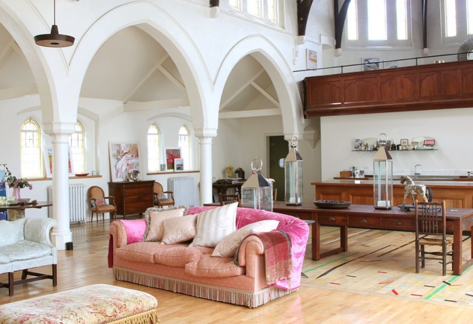
Church as home
Who is drawn by open spaces and high headroom, can live even in a church
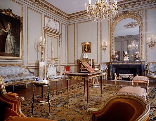
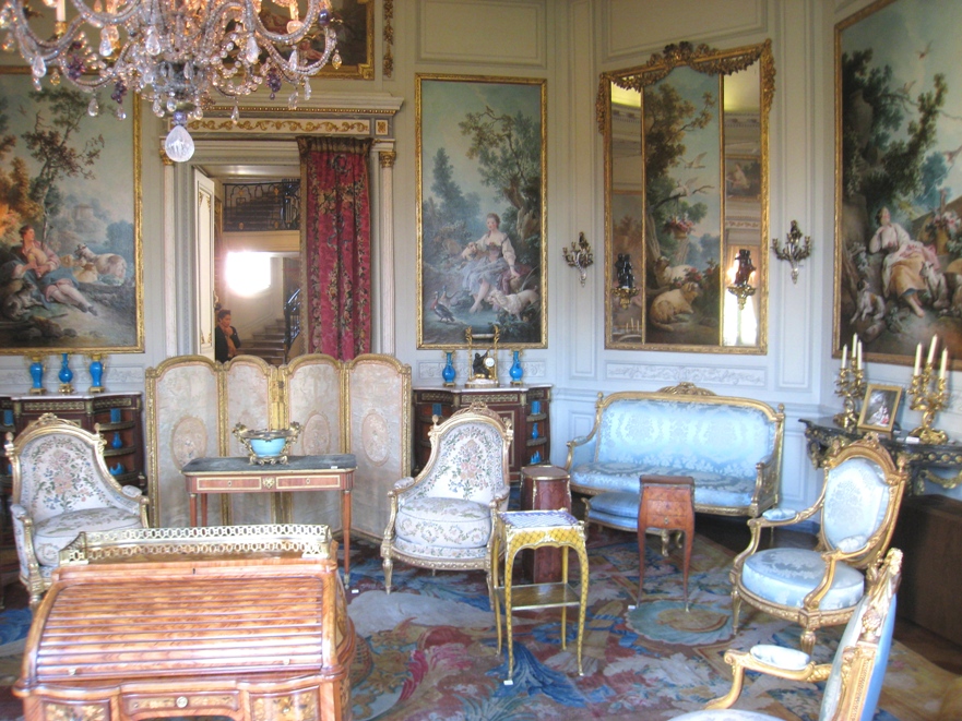
Louis-styles
The interior design styles of the era between 1610 and 1793 in France are called Louis-styles after the four reigning kings.
Baroque was half-baked and the effect of Renaissance was strong under Louis XIII. (1601-1643). That’s why the interiors were moderately decorated. Although furniture was richly carved, they were natural in color and large-scaled. Their architectural elements were determining. Chairs are upholstered, most of them are not folding. Louvre was the seat of the king by this time. Impact of Baroque began at the end of his reign.
Louis XIV., the Sun-king (1638-1715) was the lover of pomp. Baroque reached its peak under his reign. The aim was using the more decorating motifs, gildings and exotic materials in every fine arts. He had the castle of Versailles rebuilt to a world famous palace of the king. Boulle is the most known name in the field of furniture, he became famous by his marquetry. He used ormolu, tortoise shells, brass, noble woods by chance. Mansart created lasting in architecture. He is known by the roof type named after him. The beauty of the gardens were the works of Le Nôtre. The geometrically arranged flower beds, fountains, long promenades are spectacular even nowadays. The colorful frescos and murals of Versailles are the works of Le Brun.
Louis XV. (1710-1774) was the great-grandson of the Sun-king. Rococo is the style of his era which was marked by over-decorating, shell motifs, chinoiserie and feminine interior details. The fashion was dictated by his two famous lovers, Madame Pompadour and Madame Du Barry. Porcelain manufacturing started, the lace-manufactures and silk-weavers were sponsored for the most splendid fabrics which were matched with goods from abroad. The walls were covered by fabrics or wallpapers, furniture were lacquered and painted, the decorating C and S pieces were used inordinately.
The reign of Louis XVI. (1754-1793) was the era of Classicism. The ancient Roman buildings, sculptures and household objects found in excavation of Pompei had a big influence on the people of the age. The stifling over-decoration was followed by a more moderated style: the decoration elements of ancient times were used again, the shapes of furniture became clear, the lines straightened. Even dressing fashion turned to a more comfortable direction. Patterns and decorations of idealized country life were used on fabrics, porcelains and other household objects.
The revolution terminated Louis-styles and the ancient régime also. Several buildings, paintings, valuable statues, porcelains etc. were perished during the huddle and terror of years because of the intentional vandalism and fire-raising of the mob. These are lost forever for posterity.
Fortunately, enough sources and pictures remained for falling in love with any of the Louis-styles and for desiring to implement them at home. A good interior designer can help to realize this dream by refreshing and fitting it to the sizes of present flats/houses.


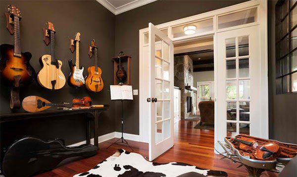
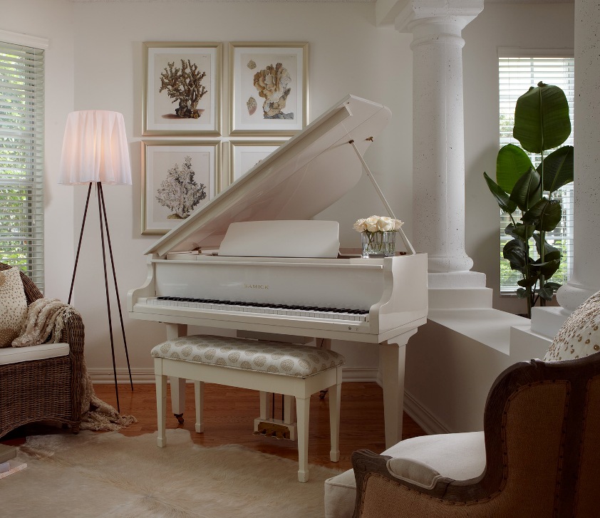
Music room
The meeting of love of music and classical interior design

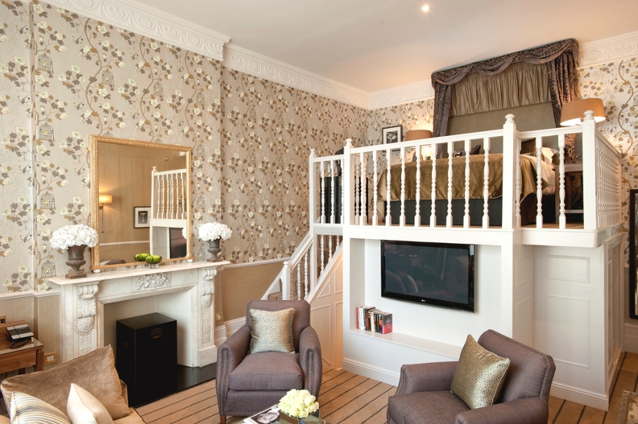
Lofted room
A well thought-out and choosy implemented loft doesn’t diminish the sense of space


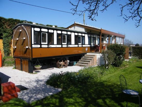
Train as home
A railway carriage can be conjured to a cosy home in classic style


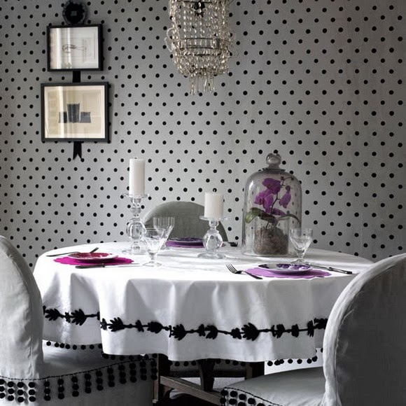
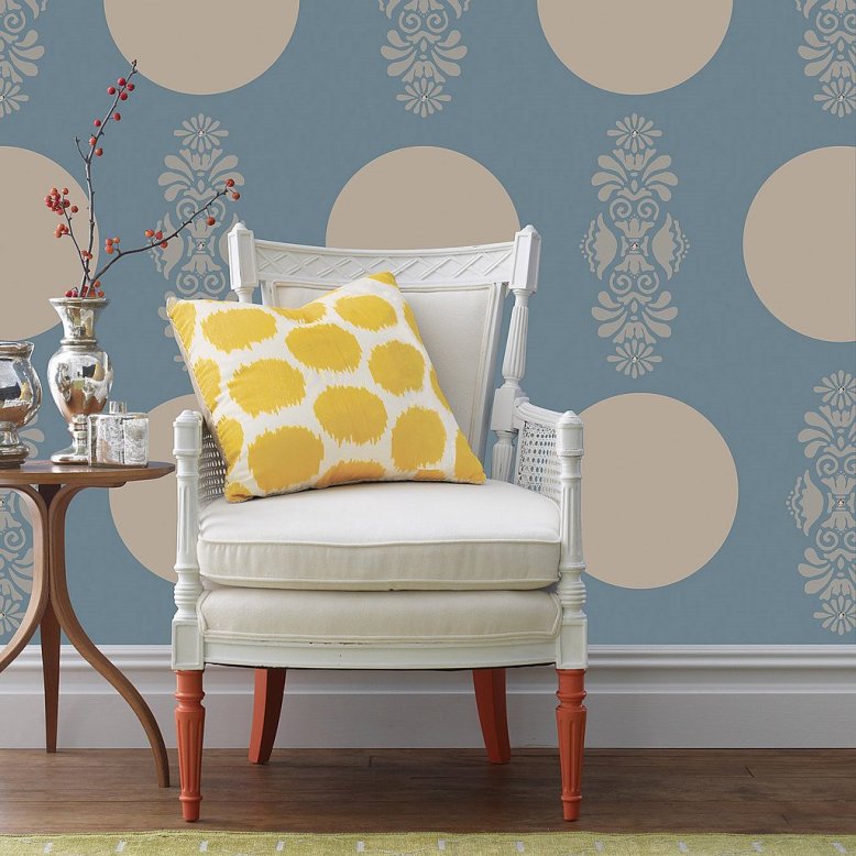
Dotted
Dotted materials are in fashion again in interior design