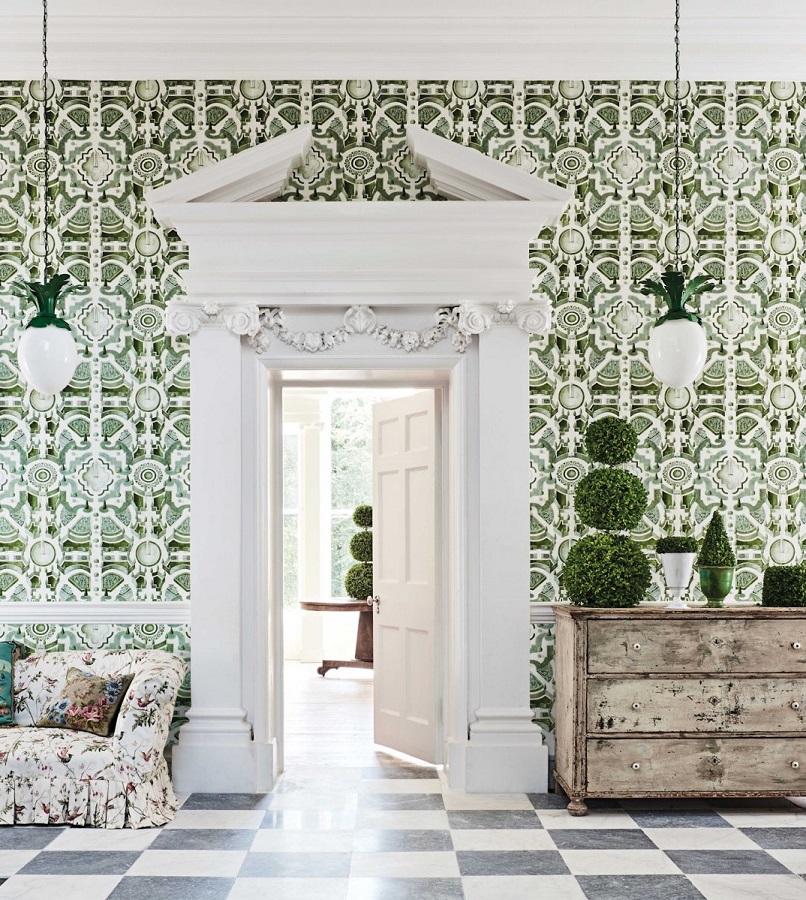
Topiary can be used to decorate not only the garden, but also spaces inside the house
Archives


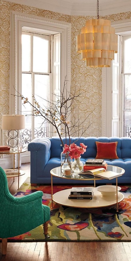
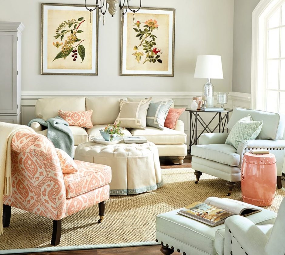
Spring colors
Colors of spring in our home
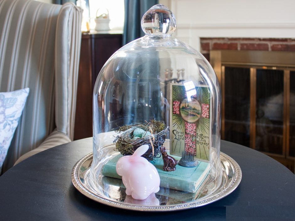
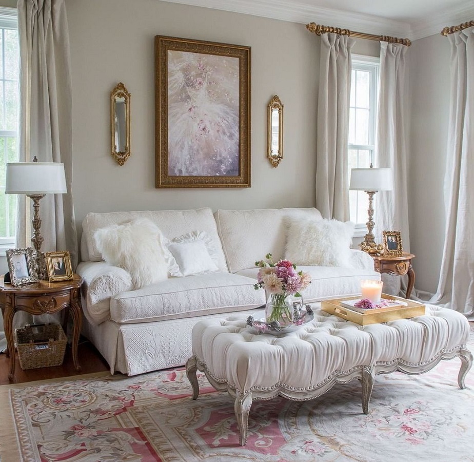
Classic Easter
For the Easter decoration of classic style homes, it is worth choosing antique/vintage pieces for complete harmony

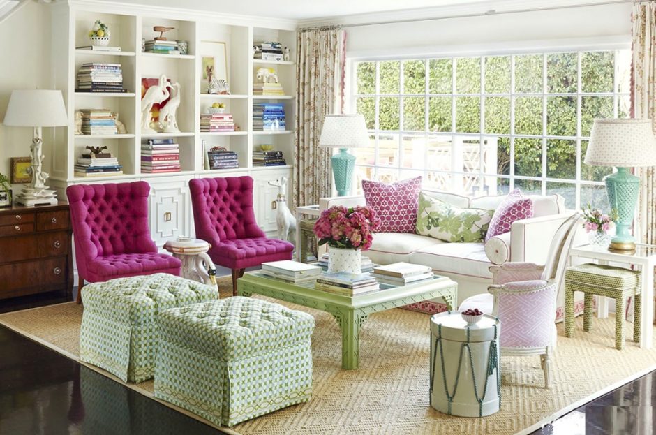
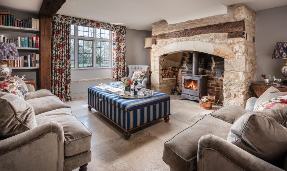
Instead of coffee table
If occasionally more seating is needed in the living room, but don’t want to make the space cluttered, place an upholstered pouf or ottoman instead of a coffee table is the solution. It will be a comfortable seat that also functions as a table using a tray.
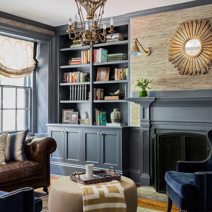
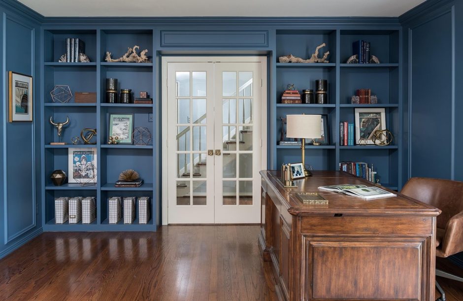
Built-in
Built-in cabinets and shelves are much more elegant than the freestanding variations

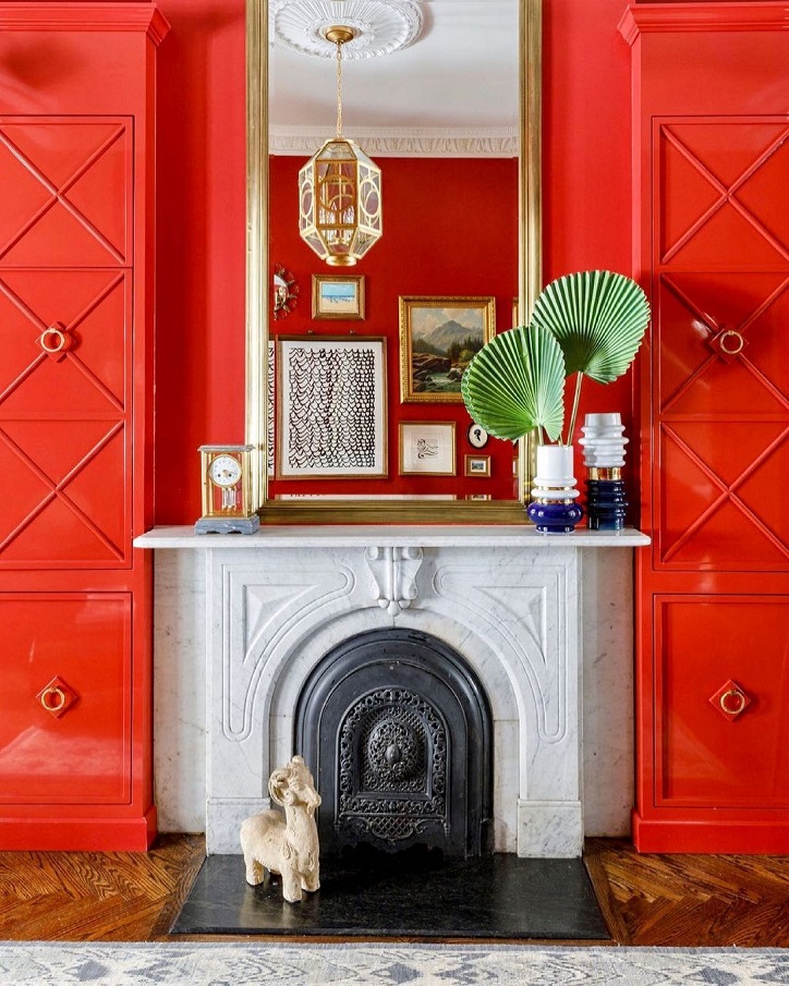
Vermilion
Vermilion (alias Chinese red) is a brilliant orage-red hue. It dominates the space, so use it very carefully in interior design. It is recommended as a color for accessories if you want to throw up space or creating a focal point is the target. It should be used on large surface in a room which we stay only a little, but not for sleeping (e.g. separate dining room). The pigment was made from mineral cinnabar (mercury sulfid) which is toxic, so it is now produced artificially.

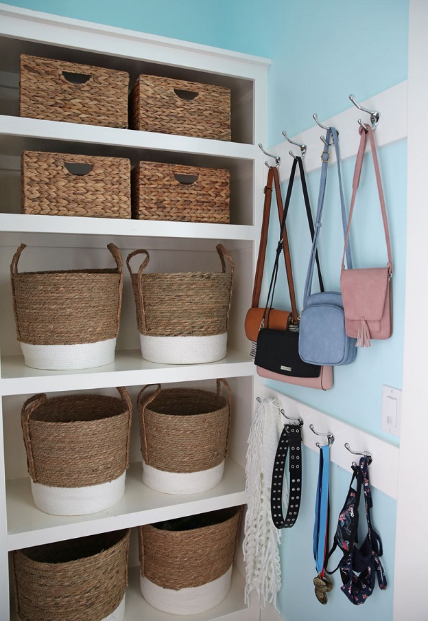
Rope
Accessories made of natural rope are suitable not only for beach style


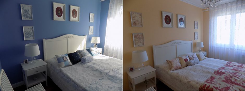
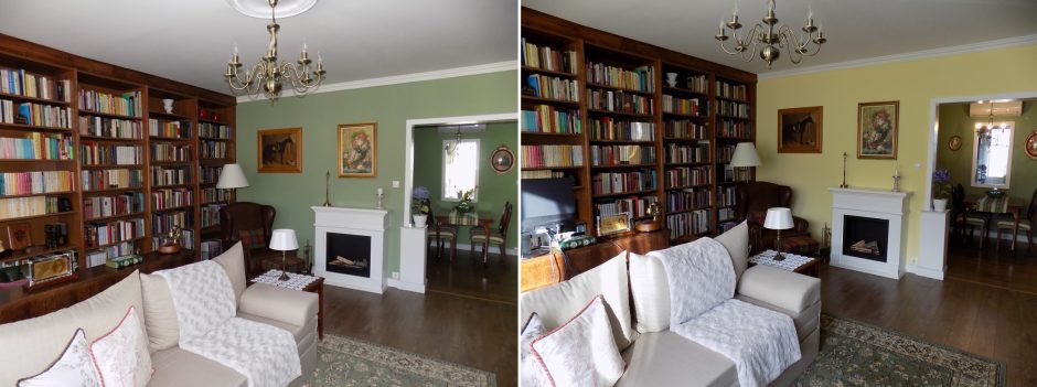
My project 41.
After seven years, it’s time of change 🙂 before-after

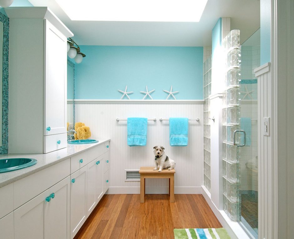
Turquoise 2.
Turquoise is a bright, happy shade of blue, containing green. It is the color of the Carribean waters and Mediterranian sea so, we mainly associate with water and seaside by it. It is a very good complementary color for the neutral colors (white, grey, beige, brown etc.), vitalize the space. It is popular in interior design. In larger quantities, use it in rather sunny rooms. It was named after the semi-precious stone.

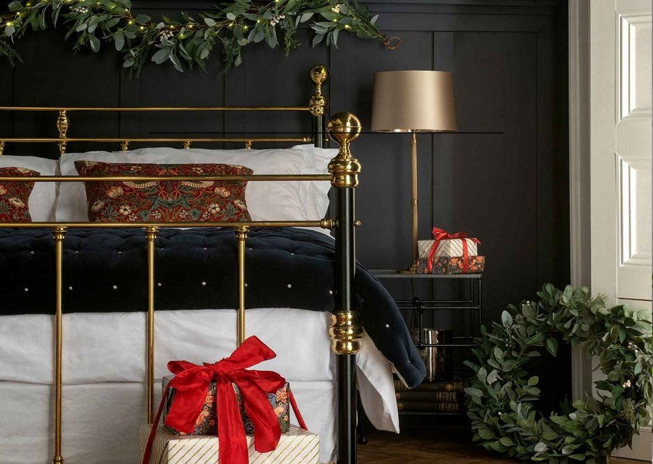
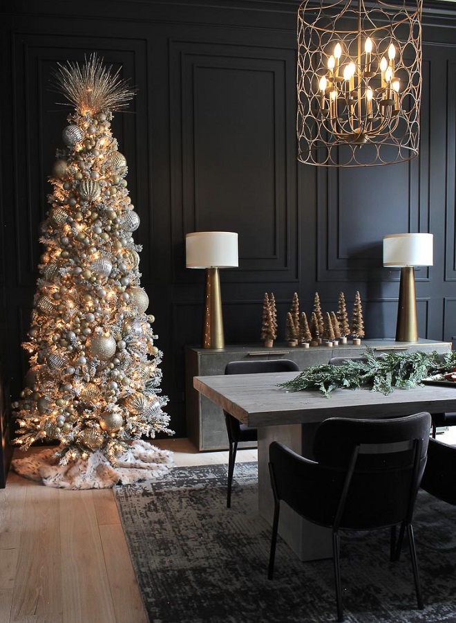
Black Christmas
Black is not exactly a Christmas color, but with a little glitter, anything is possible