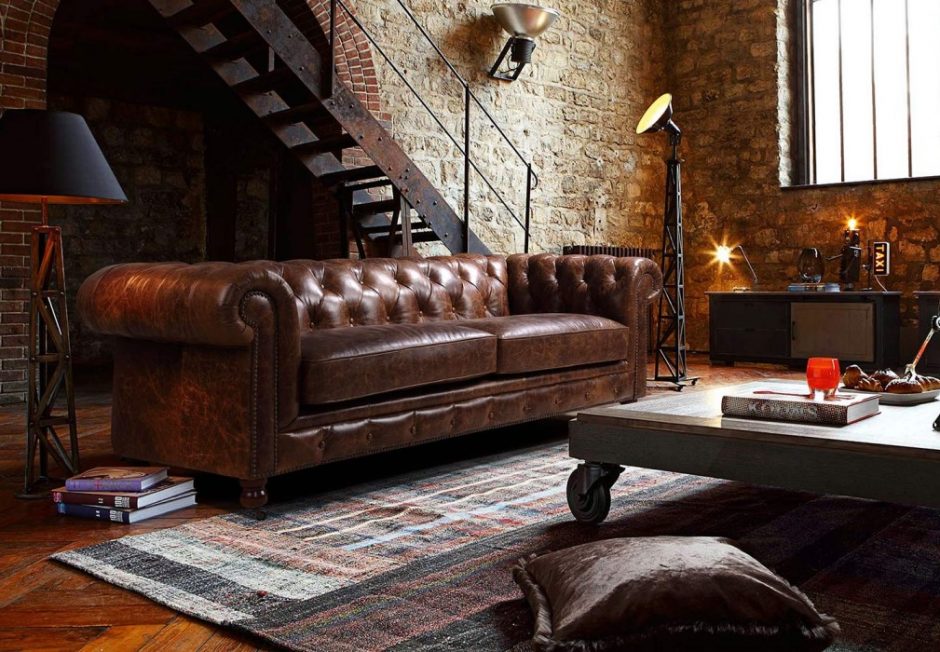
Real leather is present in homes since the prehistoric ages. First, it was used only as clothes and blankets, but later, when the quality of finish became finer, it was used for many other purposes. Nowadays leather is used as upholstery and carpet in interior design, although there are several other usages of it which make the interior more interesting. If the aim is creating a masculine home, this is more accentual.
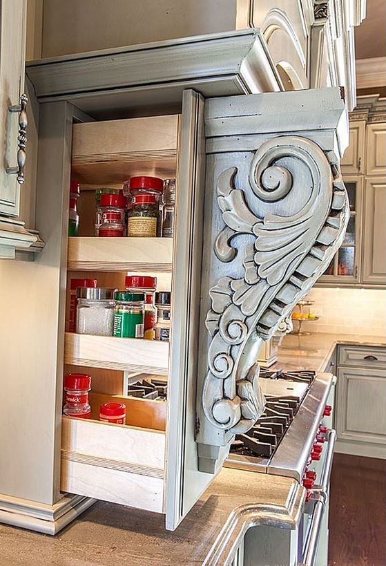
Several factories sell handles made of or covered with leather. Seam made by contrasting stiches conjures the required piece to a decorating motif. It is a fine detail on a kitchen cabinet, for example.
Sound-proofing was resolved in libraries of old houses by thick leather-covered padding on the inner side of the door, because frequently it was the home office too. Leather covered doors were often decorated with quilting or buttoning. This elegant solution is applied in modern times also, for example in managers’ offices. Even if there is no need for sound-proofing, let’s evoke this tradition, because it gives unique mood for our home office too.
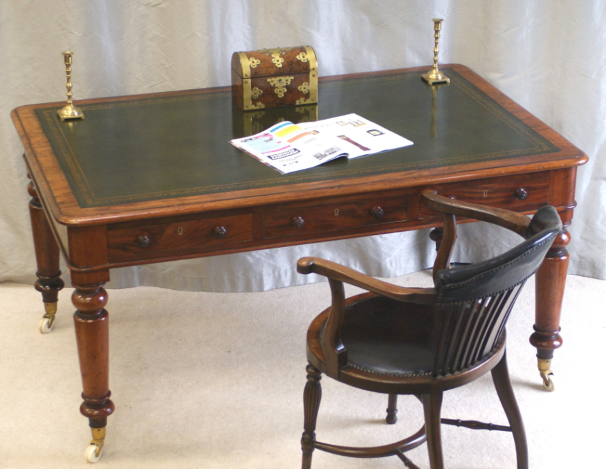
Anno top of the desks were covered by leather as well. Paper couldn’t slip while writing viz. high-gloss lacquer and varnish resulted a quite slippery surface and leather was more comfortable for the elbow also. These kinds of desks can be bought in firms producing classic furniture.
We can still find household and decoration objects in variations covered by leather. It is not only natural and elegant material but long-lasting too. Some examples without limitation: storage boxes, letter-opener knife, handle of magnifier, artisan pictures, coaster.
Nowadays faux-leather wall panels are more and more fashionable in homes, as an eye candy first of all. It is applicable behind TVs for hiding wires but holds on as hallway peg-wall and bedside wall covering because of its easy-clean feature. If somebody doesn’t like plastic at home, can order them made of real leather because these are always produced in unique sizes.
Ask for help of an interior designer for furnishing your home, even if you cling to a certain material.
Archives


Multifunction
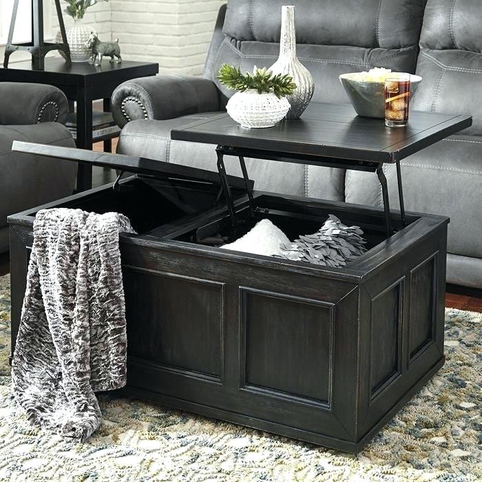
Multifunctional furniture with extra storage

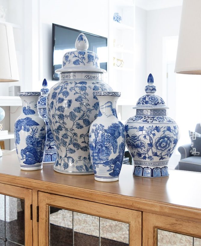
Types of ceramics
Various ceramics are present in our homes as interior domestic and decoration objects. Commonly we don’t care what they are made of and to which group of the main term they belong. Here is a brief review which can be useful in the case of planning to collect similar objects.
The main features of porcelain that provides its popularity are whiteness and translucency. Kaolin is the main material used. It is burnt glazed between 1200 and 1400 °C temperature. The two types of forming it are pottering and molding. It was discovered in China in the 14th century. The first porcelain manufactures appeared in Europe only in the 18th century (France, Prussia, England).
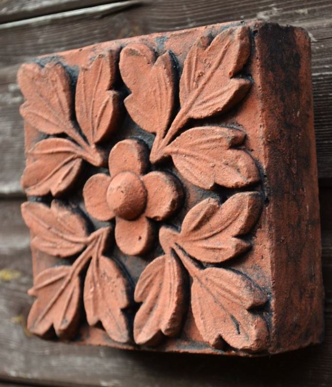
Terracotta is clay based, glazed or unglazed type of ceramics. This is the earliest material used in history. The end product’s surface is porous, brownish-orange in color, burnt around 1000 °C temperature. It is formed by potter’s wheel. The raw material is very soft, easy to form and decorate by different tools.
Stoneware were already made around 1900 B.C in the valley of Indus. The name is deceptive because the material is a special clay and not stone. It is burnt in a furnace between 1100 and 1300 °C. The end product’s surface is not porous and very hard. It is a non-transparent and commonly glazed ceramic.
Biscuit is an unglazed type of ceramics which is the product after the first burning in a lower temperature. It remains porous which makes glazing easy. Its surface is much finer and marble-like, its shine depends on the temperature of burning. It came to fashion in the second half of the 18th century.
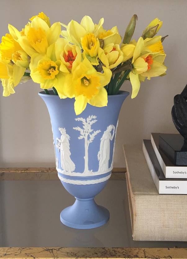
Jasperware is unglazed, matte ceramic which was invented by Josiah Wedgewood in the 1770s. Its special blue version, the Wedgewood blue is the most well-known. The surface is applied with relief work (commonly white). Barium is the main material used.
Ironstone is similar to stoneware as to durability and hardness. It was developed in Staffordshire in the 19th century. It was a much cheaper alternative of porcelain made in mass production. Doesn’t contain iron in contrast with its name.
All types are popular among collectors. Carefully look after the features, production marks and possible injuries before buying antique pieces.


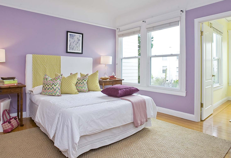
Color pairs 34.
Color pairs: purple-yellow


Choosing pictures
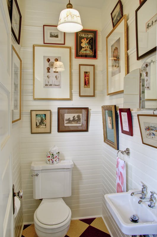
Decoration is the next thing after renovating/transforming our home, which is probably the most exciting part of the procedure. Still many people stuck here. Maybe decorating the walls intrigues the most: what kind of pictures should be put on? What should be the color, size, subject etc. of them? They are uncertain if the old pictures fit to the new look and if not, what should be purchased instead?
Maybe the most important thing is that pictures can be placed not only in rooms or corridors but also in the kitchen, bathroom, laundry room and even the toilet. These can be considered as rooms as well, of course keeping their practicality in scope. They will be more inviting and will fit more to the rest of the home.
Placing the existing pictures can be a bit harder, since they have to be integrated in a surrounding even in different style. Changing them is frequently not possible because of their theoretical or real value. Reframing them could improve the situation a lot. We can establish a connection between the picture and its environment by this. Basically, the frame should fit to the picture not to the surroundings, however in this case the latter can be concerned also. For those who like eclecticism, it’s not a problem to place a totally different picture in a given style.
Firstly, the total size should be defined when choosing new pictures, namely they should be measured with frame and matboard. Cutting newspaper to rectangular or square pieces is helpful to see if the size fits for the given place, if it fills the space nicely. If you wish to place more pictures organized in a shape, try the shape on the floor first and after this, take the newspapers to the wall for testing the final order. If unique paintings are liked to be purchased, first check with this method if they fit in the place, since in this case the size is totally determined.
Defining the subject can create further problems. Many people think that only pictures of seaside should be applied in bathrooms, pictures of foods to the kitchen and drawings to children’s room. But there is no such a rule. However, it’s practical to keep the basics of Feng Shui. For example, a ship tumbling on the stormy ocean is not exactly the best choice of subject for a bedroom…
Owners manage colors much better. The new picture should be fit to either the color theme of the whole home or be a part of the additional pop-colors. The sight can be made more accented with proper lighting. Sometimes in the designing phase the interior designer has to start with the color and subject of a given picture. In this case, the picture will harmonize with the implemented interior, of course.
Ask for help of an interior designer for choosing and placing the best pictures for your home.


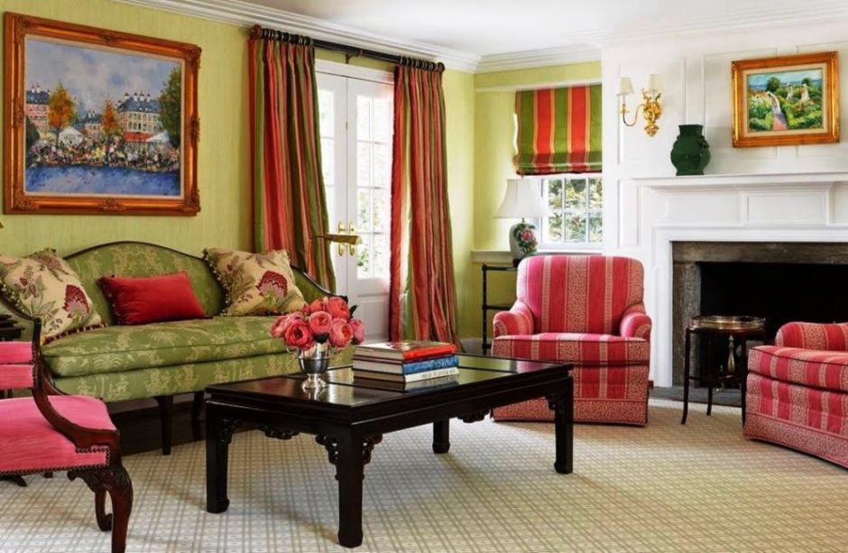
Color pairs 33.
Color pairs: green-red
Thousand faces of classic style
The „classic style” terminology sometimes causes difficulties to the prospective customer, there is a situation when it directly deters him/her from using the service. This definition in public awareness is equal to beige-brown colors, huge and over-decorated furniture or heavy draperies. Classic style however has several faces and all of them can be complemented with any technical solution which provides the comfort of present times.
Historical styles definition means those trends which were specific to a certain historical era, not only in interior design but almost every aspects of life. They contain music, literature, fine arts, architecture, gardening design, fashion etc. They closely linked to each other, just like we can see in historical books. Following these, it’s not necessary to completely copy furnishing of for example a palace, for reaching the desired effect, since the scales probably are quite different now and then. It might be enough to pick two or three main features from the all and the other details should be shaped for these to get a harmonious general aspect. Some examples without limitation: ancient Roman, Renaissance, Baroque, Victorian.
Styles using special features of countries and lands can be also called classic. Commonly they evoke the chosen style with using antique objects, archaic shapes, typical colors and materials, which cannot be reflected by a modern/minimal interior (of course, there are such homes also everywhere). It’s the total effect what really matters. Some examples without limitation: Provencal, Moroccan, (any kind of) rural, seaside style.
Thematic styles, as I call, are interior design solutions which based on a theme. This can be a movie, a city or even a present popular trend. They have in common using classic tracing furniture, accessories and decoration objects, if it is possible, together with antique pieces. Colors help a lot in this case also to reach the goal. Some examples without limitation: shabby chic, steampunk, Paris, industrial style.
Modern classic style cannot be classified to the previously mentioned groups, but probably this is the most common. The bigger furniture, architectural details (mouldings, rosette, wall panel etc.), upholstery, floor coverings are all classic, but colors, accessories, decorating objects represent a more modern trend. These together make the effect sophisticated.
Don’t be afraid of the classic style term. Everybody can find the perfect one of them. Ask for help of an interior designer for implementing.


Curtaining of attic window
Shading is a frequent problem in attic rooms. Of course, it can be easily solved with a roll-up blind, a window film or a venetian blind, but if a classic style curtain is desired in this room also, the case is not easy at all.
The solution in the case of windows on sloped roof is putting on two curtain rods. The upper one has the same function as on a normal window. The lower has the role of holding the fabric of the curtain. The lower has to be placed under the window. Both of them should overhang the two sides of the window, just like in other rooms. In the case of a floor length curtain, the fabric simply should be put behind the lower rod. When it is pushed, the rod will hold the fabric on the sloped roof anyhow. However, in the case of a short curtain, the lower rod has to be put in the fabric, just like the upper one. One or two sided curtains can be made in both cases. Of course, the curtain can be attached to the rod in any ordinary way (rings, fabric flaps, keeper etc.).
In the case of a full width window on a vertical wall, the problem might be the lack of space above the window for the curtain rod, because of the joint of the sloped roof. It is harder if the window itself is not rectangular but follows the line of the roof. It is worth to ask for help of a professional curtain company for a beautiful work. The length of the curtain has to follow the line of the window. Two rods will be needed in this case also, but the fixing is not a free choice because of the skew, since the rings would slip off by the gravitation, for example.
If the window on the vertical part is too small, or not symmetrical in its place, a more spectacular curtain solution can improve the sight. The feeling of a bigger window can be reached by a fabric complementing the furnishing of the room and covering the whole wall, this way the detrimental wall-part can be turned to a focal point. Curtain tassels and wall hooks will be useful.
Ask for help of an interior designer for solving the curtaining of attics.


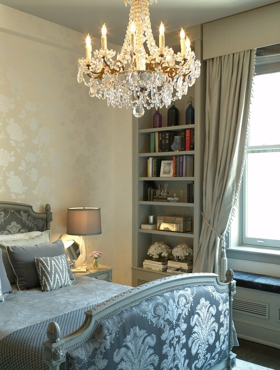
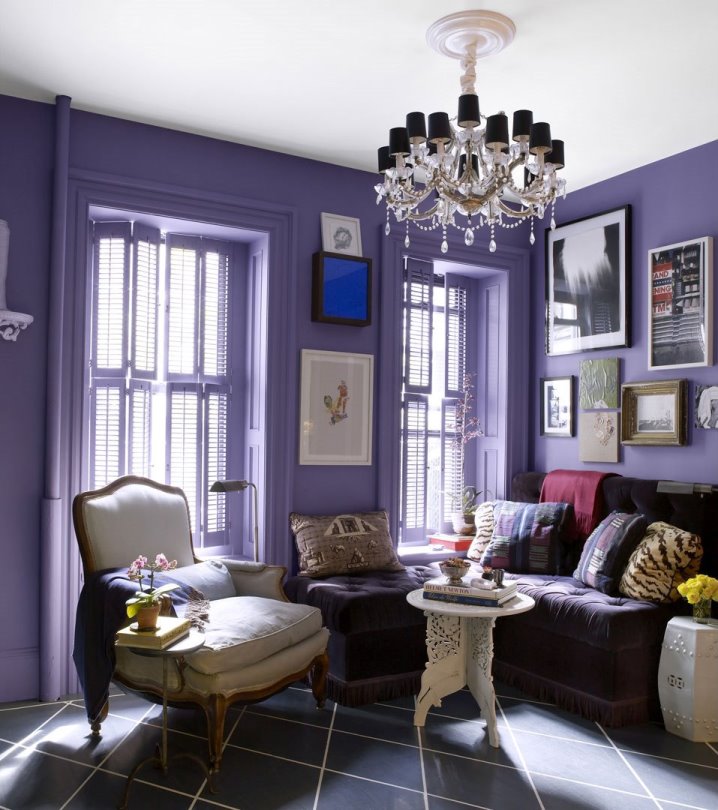
Color of the year 2018
Firm Pantone announces the color of the next year in every December which has an effect on interior design also. Ultra Violet no. 18-3838 is the color of the year in 2018.
Scientifically, it is not a color but a range of short wavelength which is beyond the range of visible light. The color given by Pantone is a cool, vivid and middle strong hue which contains more blue. It can be used well on bigger surfaces also, but it should be counterweighted by neutral colors (black, white, brown, grey, beige) because of its vividness. It is not a food color, so it should be used moderately in the kitchen and dining room, rather only on accessories. It is a popular color since years, not only in interior design.
The purple color always signed or meant a specific or mysterious thing during the history and in symbolism. For example, it was the color of mourning in the French Royal House. It is the favorite color of the clothes of magicians and fairies in tales. It is popular among children also.
Ask for help of an interior designer for making the color of the year 2018 appear in your home in style.


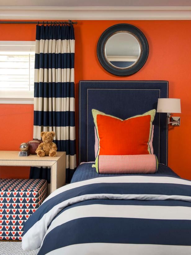
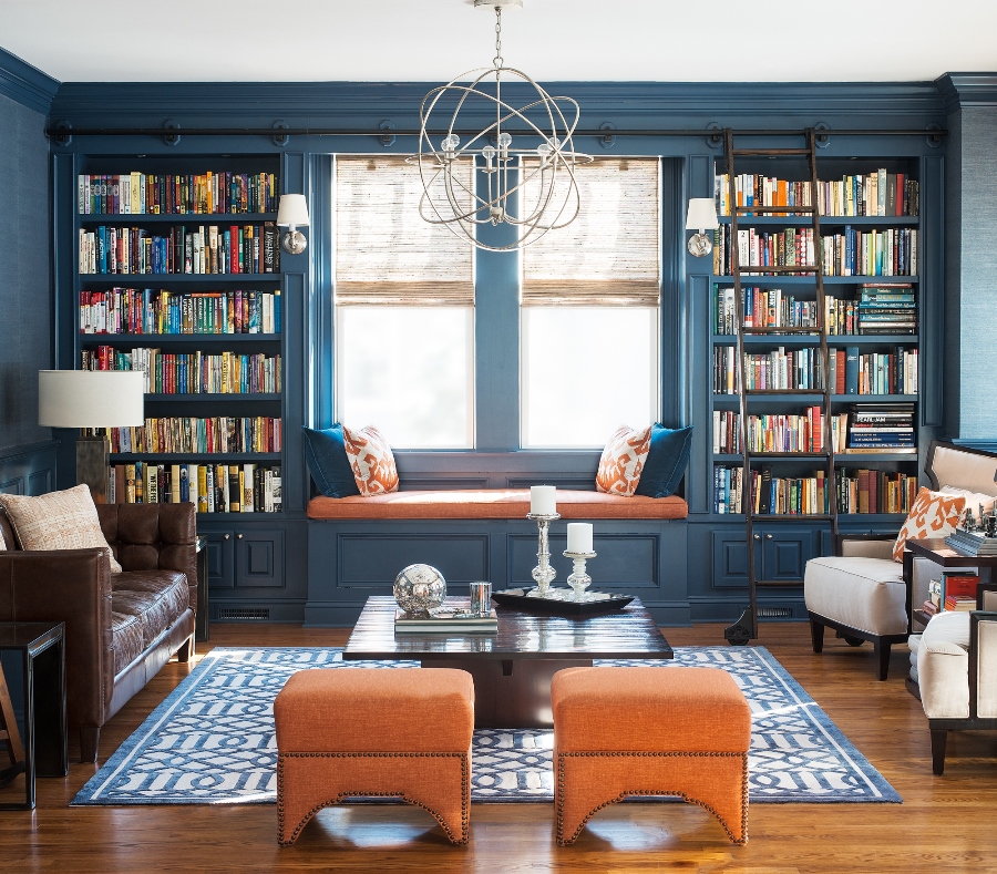
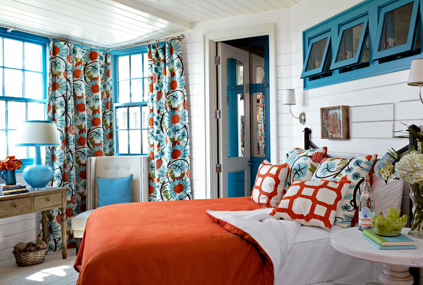
Color pairs 32.
Color pairs: blue-orange