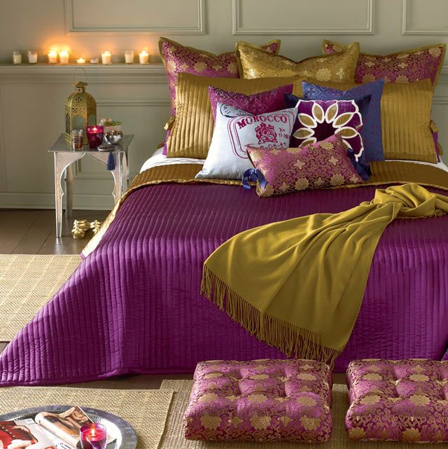
Bishop purple is a very bold, dominant hue which contains much more red than blue. It was named after the formal vestment of the ecclesiastical dignity.
Archives
Feng Shui – career
Job and career are important for everybody, because these provide livelihood. We can strengthen this life area also with the help of Feng Shui, improving our quality of live.
The area attached to this in our home is the living room in the case of men and kitchen in the case of women, but the living room represents this category in general. These are connected to marks of Sun and Moon, namely mean the nature of paterfamilias and materfamilias. This is so if there is a single person or a couple without children.
Usually these aims have to be reached (without limitation) in a career:
– help of promotion
– starting own proposition
– help changing workplace
– achieving honorable mention at workplace
It is true in every Feng Shui advice that it has to be customized to the certain person and space, there are no two identical cases. Generally speaking, energizing effect of red color helps improving the best of things connected with money/career. However, you have to pay attention to the quantity, because too much of everything can do harm. Besides, the effect on a person is not a negligible since there are many who doesn’t like this color. In this case pink and strong orange could also help. Small changes can create big difference, you don’t have to think of changing the sofa to a red one or painting the whole room.
We can activate the Wealth/Success corner (4th) of Bagua map with red color also. It’s the best to place here all the things connected to job (home office or just a desk). Don’t forget to activate 9th life area (Fame/Reputation) with it also in this case.
The aim should be set out firmly, we have to draw it clearly to ourselves what we want to reach. Writing this on a paper is the best, as detailed as possible. For example: what should be the profile of the new company, what kind of colleagues to have, minimum salary, working time and some similar. Be grateful for what you have already achieved: present job, position, salary etc. (Sometimes it’s not easy…). Attitude depends only on us, nobody can be positive instead of us.
Everybody is the master of his/her destiny, so changes can be achieved by oneself. Feng Shui provides the toolbar, an interior designer who has massive bases in the area, provides a helping hand for this.


Flower patterns
Flower and plant patterns have always played an important role in interior design. In the case of country properties, they showed the outside nature in inner rooms, in urban surroundings they made up for nature. There are almost endless ranges of wallpapers and fabrics in this topic, but there are some which are „evergreen”.
Rose symbolizes romance, femininity and country elegance. It can be found in almost every scale depending on style, from tiny patterns to wall-posters. These not necessarily follow the colors of the real flowers but it is not disturbing at all. We can find a proper accessory even for modern style as black-and-white and stylized (e.g. Macintosh rose) patterns.
The patterns, which depict only green or predominantly green plants are features of country styles, but they look good even in a children’s room. Ferns, topiaries, vegetables and ivy are good examples for this. Jungle pattern is in fashion for 2-3 years, it is used almost in every rooms. The scale of the pattern is mostly big. Green (depending on the hue) is a calming color and suggests close-to-nature. These can be found in „colorless” varieties also which provides wider scale of usage.
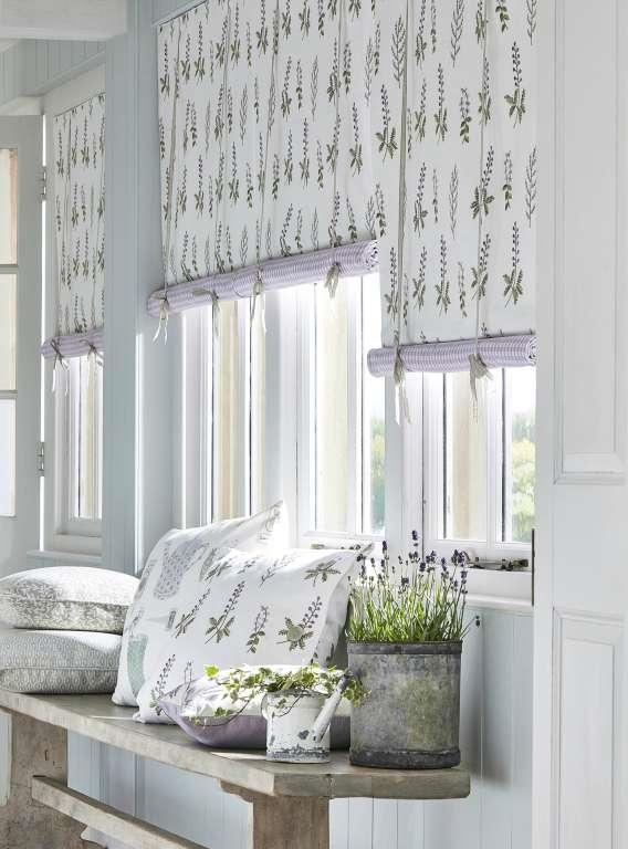
Lavender has unbroken popularity as epitome of Provence style. The color is given here: hues of lavender (purple). The scale of the pattern is small or middle. The country effect is evident.
Among fruit patterns there are more which may provide a more playful effect. They were frequently used by pop art, retro and disco styles. Of course, the totally classic variations are just as exciting, think about pomegranate and strawberry patterns of William Morris, for example.
Naturally, there are many other plants among patterns beside the mentioned above (e.g. tulip, leaves, poppy, dandelion and hydrangea). The biggest factories produce same collections of wallpapers and fabrics for harmonizing the furnishing of a room both in color and pattern.
Ask for help of an interior designer for creating a botanical themed interior.


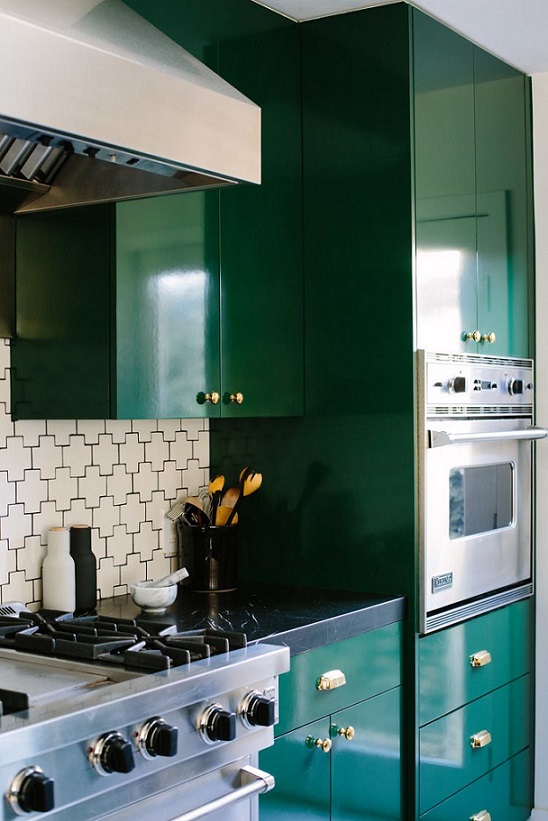
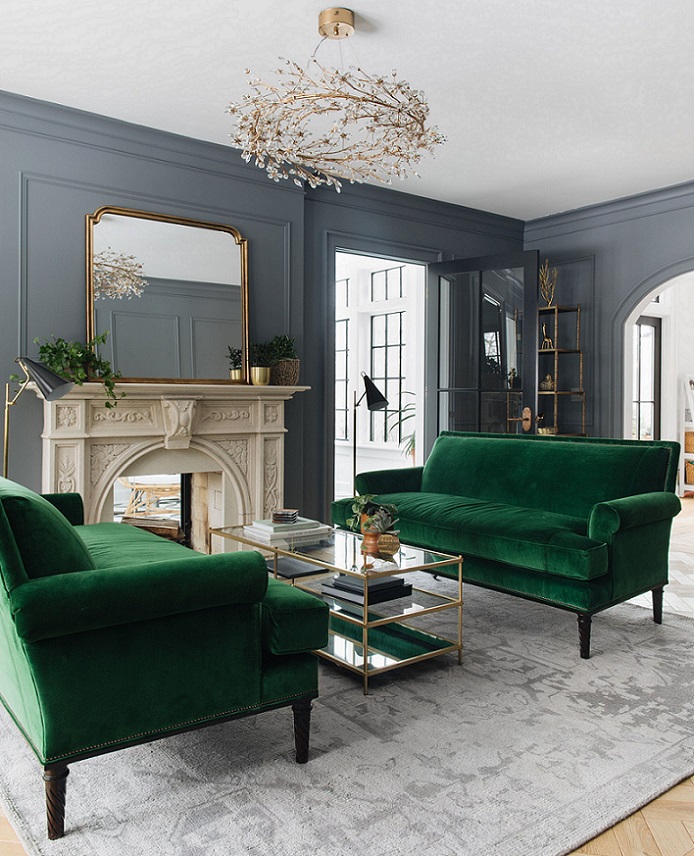
Emerald green
Emerald green is a strong, cool (with a tint of blue), dark hue of green which shows the precious stone’s luxury. This was the color of the year in 2013.

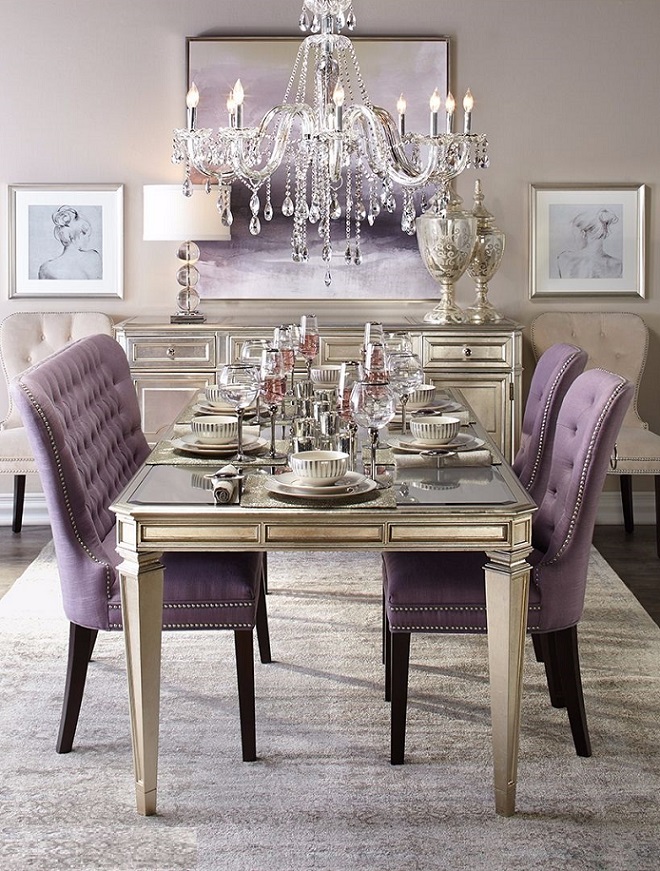
Glamour
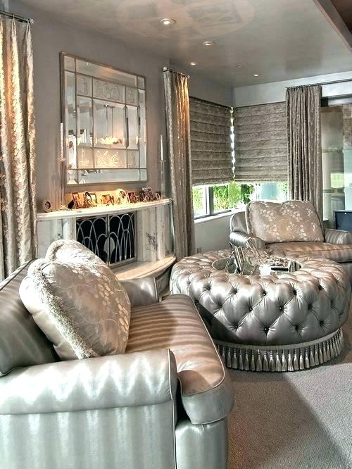
Glamour style is very fashionable since a couple of years. It is a feminine trend which has classic style marks also.
Basic colors are neutral: black, white, beige and grey. Light reflecting surfaces break the monotony of them. Glimmer is reached by using metallic (golden, silver, rose gold, chrome), glass/crystal/mirror and high gloss surfaces. This can be involved into the interior with lamps, small furniture, picture frames, mirrors etc.
Stacking of fabrics and creating luxurious softness are typical. Characteristics of the Baroque, the Classicism and the Rococo are recognizable, but the furniture bring back the classic lines and decorations in a simple way (e.g. cabriole leg, buttoned back, drawer pulls). Seats are fully upholstered, just like the bed. The total effect is elegant but inviting. The amount of cushions on the sofa, in the armchairs and on the bed suggests the biggest comfort. Velvet, fur and satin-like fabrics are perfect to this style.
Design is accented beside the functionality in the lighting. Chandeliers are placed even in the smallest rooms. Glass pendants reflect light. Lamp shades made of light transmittance fabric can be used for the more mysterious and subdued effect. Candles have important role because the romantic overtone is connected to the style.
Neutral base can be broken with some dashes of colors. Then the subdued but not obviously pastel colors appear, first of all blues, purples and pinks. Although the used colors can be warm hues only but the whole effect is marked by some kind of coolness, maybe just because of the quantity of glimmer.
The modern twist is represented mostly by artworks. Pictures on the wall, statues and other decoration objects are commonly contemporary pieces. Their colors and glamour integrate them to the interior.
The place can be popped up with a few but determining patterns, if it shouldn’t be reached (only) with colors. Damask pattern, the eternal classic, provides a good result here also. Geometric patterns fit for glamour style too (e.g. chevron, trellis, orderly stripes).
Since the style has a lot of modernized classic marks, therefore original antique pieces are not fit in these surroundings. They are not mixed with shiny-glimmering brand-new elegance but rival with them which cause an embarrassing outcome.
Ask for help of an interior designer for creating glamour style in your home.


TV on easel
It is very artful to place the TV on an easel


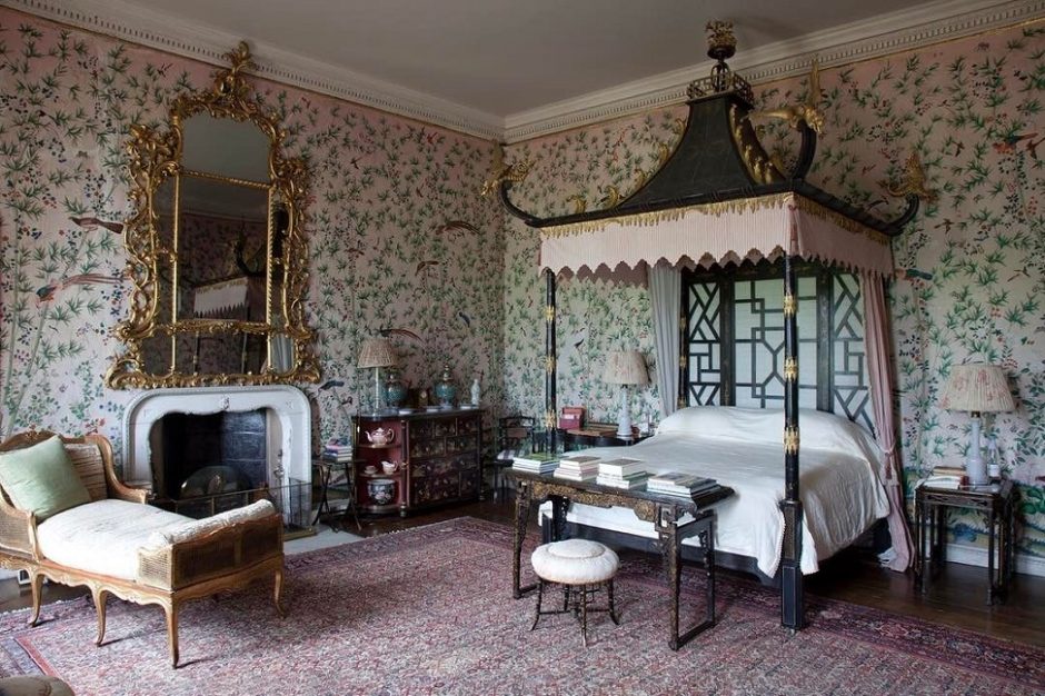
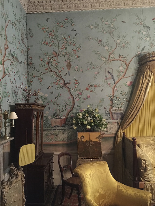
For Chinese New Year
Chinoiserie for Chinese Lunar New Year

My project 27.
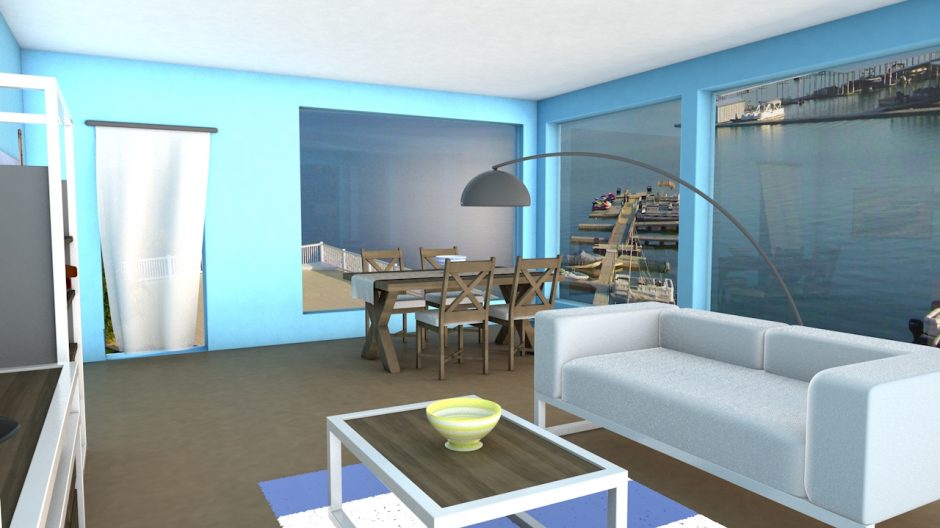
My prior work: waterside weekend house’s living room (furnishing plan for an exam)


Inspiration 9.
Get inspired by winter tit-bits
From Christmas to winter decoration
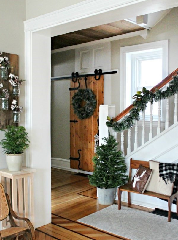
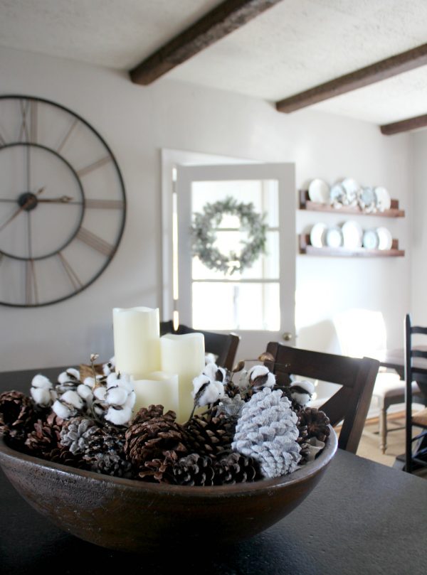
Christmas decoration goes back to the boxes after the holidays. The „emptiness” can be odd in the first few days because our home was resplendent in colors and lights for a month. However, the Christmas decoration can be transformed to a winter decoration with some clever tricks, this way the mood can stay until spring.
Firstly, take the red color out of the palette, because this reminds us to the feasts mostly. Let’s work with neutral colors. Plain evergreens should be placed in the vases instead of holy berry and other berry-branches. Cotton sprigs or just bare branches can be added to them.
Potted mini thujas/pines sprayed with faux-snow look good instead of Christmas table centerpieces. Color bubble ornaments in a bowl should be changed to whitened pine cones, for example. Fairy lights, Christmas ornaments and bows should be taken away from pine garlands. Let’s change the door wreath to a more neutral and simpler one. This can be made of pine cones, ivy, pine-branches etc.
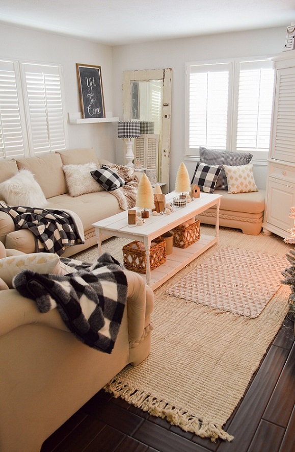
Blankets and cushions made of checked flannel or knitted material have a winter atmosphere also instead of seasonal pieces. The red color can be kept in this case if it fits for the mood of our home.
We don’t have to get rid of fairy lights also. They are nice mood lightings, for example in a big glass vase, in a bowl with full of apples, in the fireplace (during out of order) or fixed to the curtain rod, in these early darkening days. The same is true in the case of candles and tea lights.
The red poinsettia should be replaced with a white one. Any kind of faux-snowed decoration can stay if it is divested from its Christmas features, namely less glittering and colorful accessories are given to it.
Ask for help of an interior designer for decorating your home also.