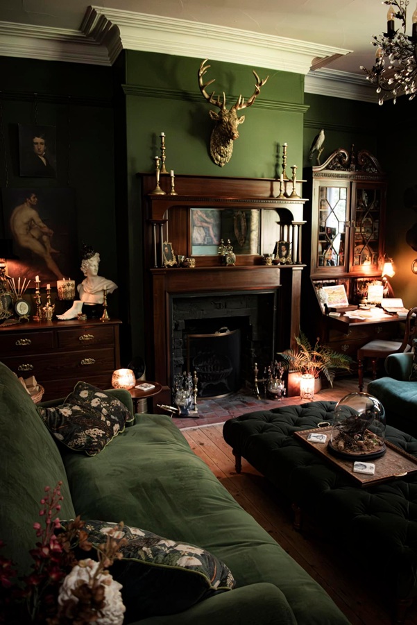
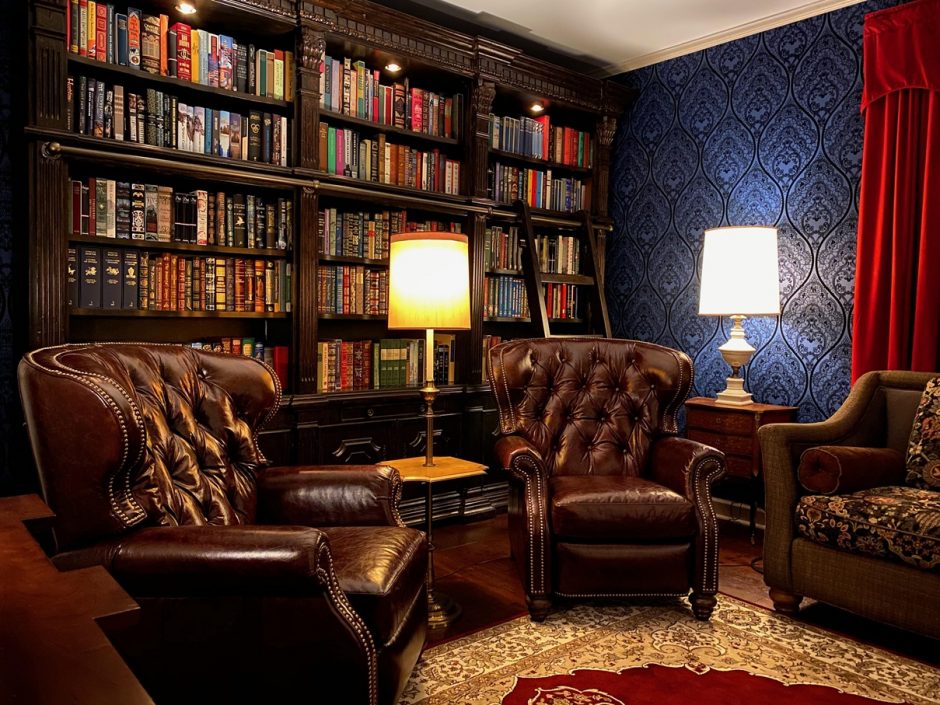
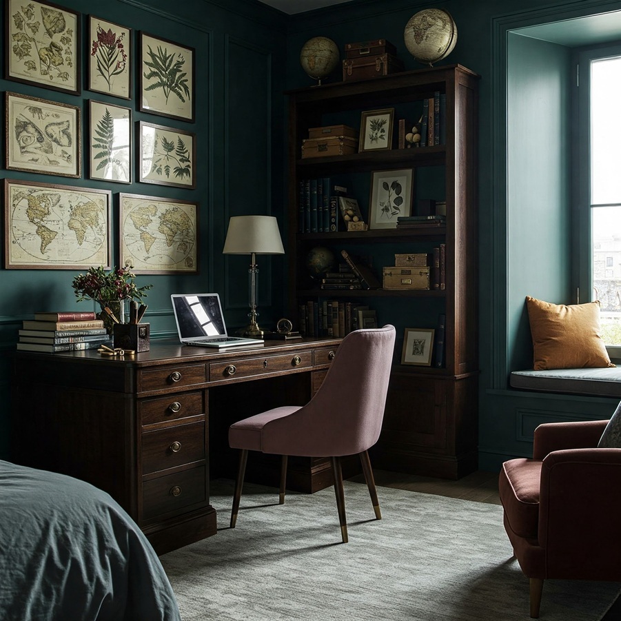
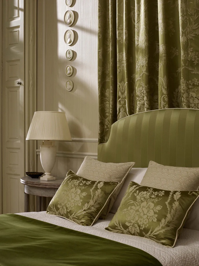
Dark Academia style is a recently popped-up trend in interior design. It is not just about decoration but conveys a whole lifestyle: finally, the classic literacy, desire of knowledge, love of literature and science are again in the spotlight. It draws heavily on Gothic and Victorian styles, but at the same time strives to create a sense of coziness and comfort.
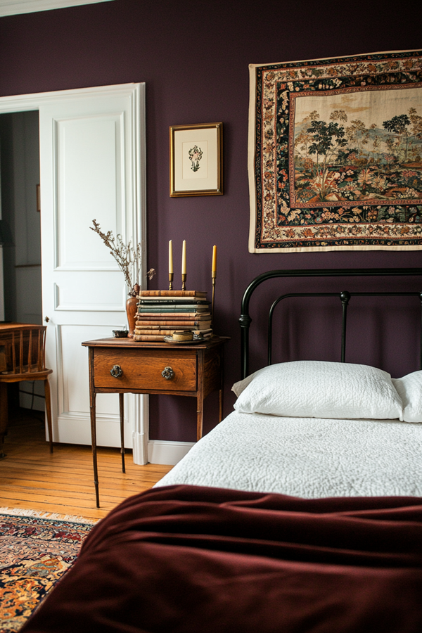
The most important characteristic of Dark Academia style is the color palette. Almost any rich, deep shade work well with it, creating a comfortable, contemplative atmosphere. Tha base colors can be: forest green, chocolate brown, burgundy, navy blue, charcoal, deep purple and of course, black. These are balanced by a bit lighter but elegant colors of the accessories: gold, cream, deep amber, dark red. The key is the balance between these.
The most effective way creating the style in a living space is using wallpaper. Classic patterns will be the good choices in this case also: damask, woven patterns (e.g. linen-imitation), toile, striped. The tone-on-tone effect is important, so the base color is dark and the pattern is a slightly lighter shade, maybe with a metallic effect.
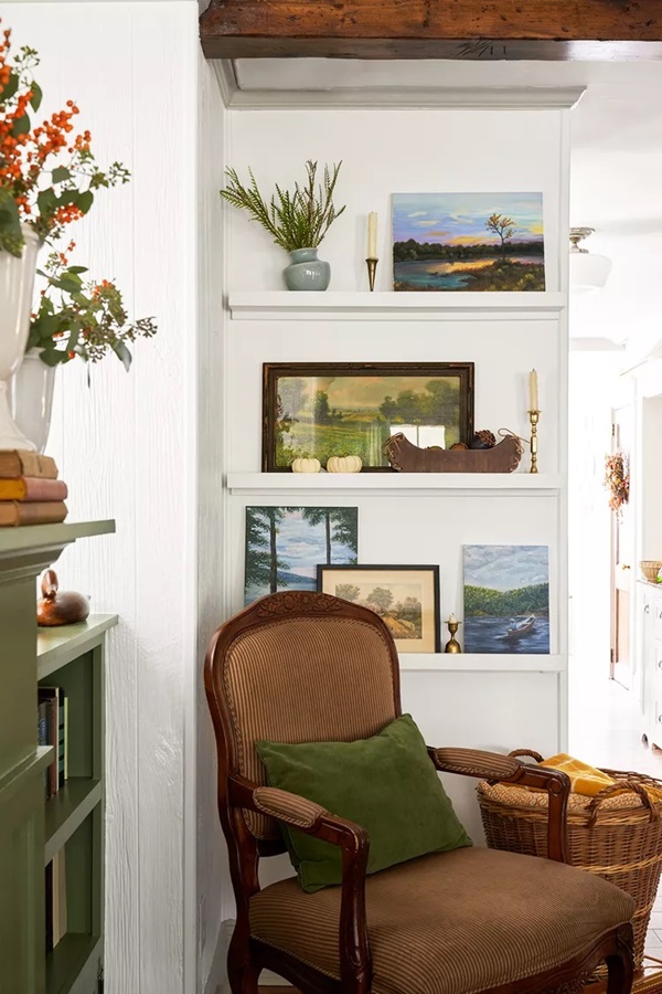
Let’s think about an old library or an office of a professor while furnishing a room. The most important furniture of the style are: bookshelves or bookcases, leather armchair, vintage wooden desk, bed with dark wood or black wrought iron-like headboard, buttoned upholstered chair and ottoman, (fake)fireplace.
Wall pictures are the basic elements of decoration. The theme can be various: old maps and celestial maps, botanical and anatomical prints, architectural drawings and engravings or reproductions of oil paintings (Renaissance, Baroque, Victorian) with proper subjects.
There is also a wide selection of other decorative elements, but the most important of these are books, in all quantities. Fill the shelves with volumes, their rows can be broken by other decorative objects. Other empty surfaces (tables, shelves, windowsill, mantel) can be decorated by objects that exude classic atmosphere. If the budget allows, use original vintage pieces. Copy of any ancient Greek or Roman marble statue, old scientific instruments (e.g. sextant, telescope, typewriter, globe) are suitable, and many candle-holders.
Candlelight will provide the basis for additional lighting. The light sources should be dimmable, as mood lighting suits this style best. Classic bronze is the good choice for light fittings, maybe with few chrystal decoration.
The textiles used exude warmth and luxury, such as velvet and wool. The pattern is sparse, restrained, creating a layered effect (herringbone, pinstripes, tartan). The mood is completed by heavy, rich curtains and drapery, Persian style carpet, thick blankets and cushions.
If you like plants in your home, choose only plants with decorative leaves and dark green shades (e.g. ferns, ivy, palms).
Ask for help of an interior designer creating the Dark Academia style in your home.
Archives
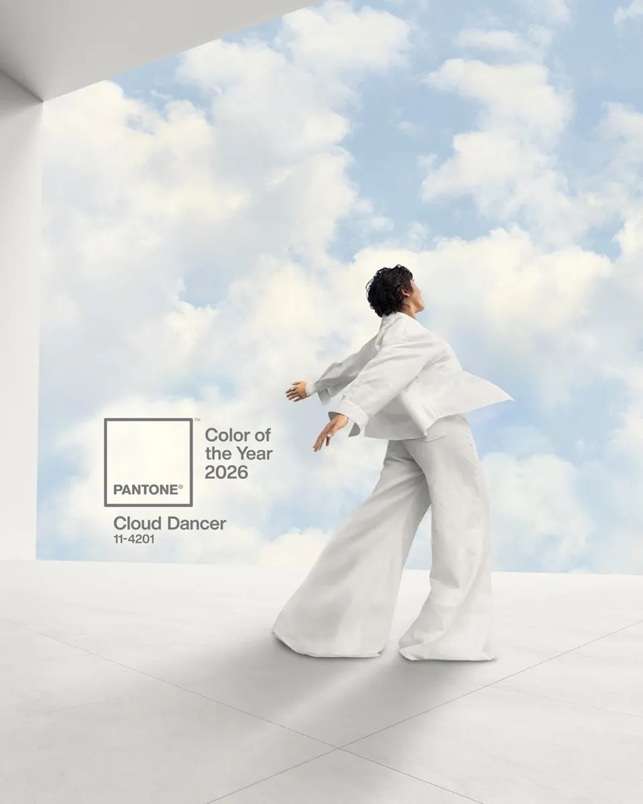
Color of the year 2026
Every December Pantone company announces the color of the next year which effects interior design also. Cloud Dancer no. 11-4201 is the color of the year 2026.
This is a shade of pure white, not actually a color, but rather allows all other colors to prevail. It symbolizes a new beginning, airiness and hope.
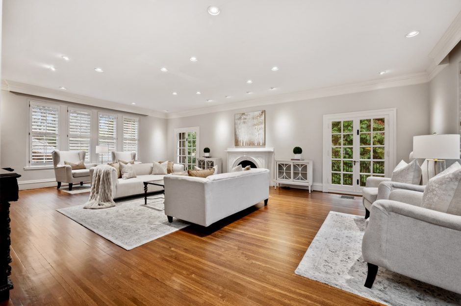
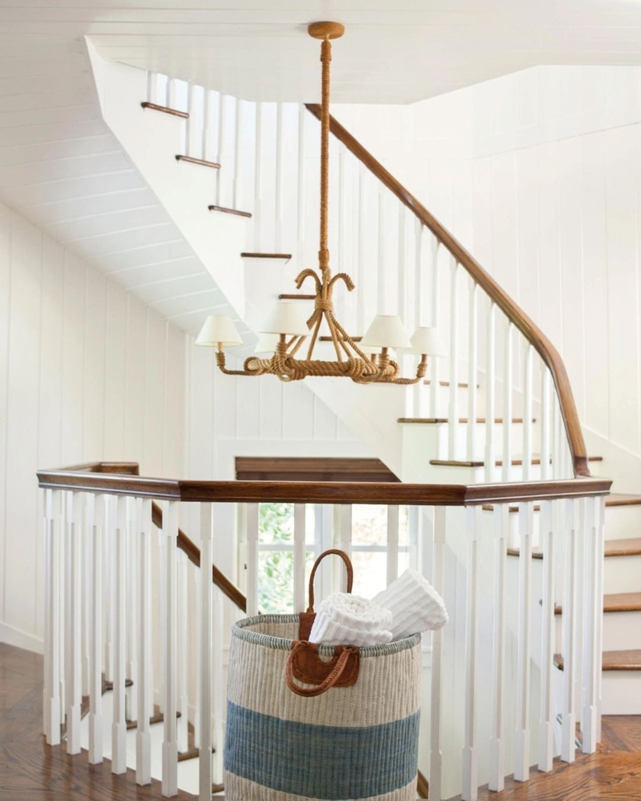
Feel free to use it in any room. However, keep in mind that if white dominates an interior, mix different textures during the furnishing process, so the space will gain depth and not resemble a hospital ward. Even in the currently fashionable, all-white homes, other colors are needed as a counterbalance, so our eyes can focus on every detail. For example, natural wood (floors, stair railings, wall panels) helps maintain a sense of purity and simplicity, dark colors make the space more modern through contrast, and pastel colors bring softness and femininity to the look.
Ask for help of an interior designer for making the color of the year 2026 appear in your home in style.
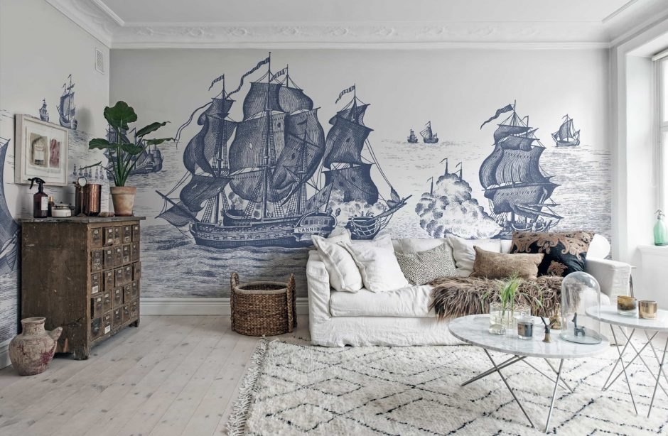
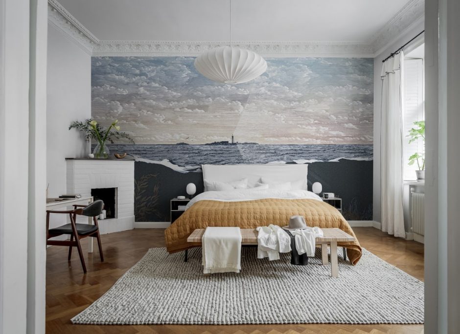
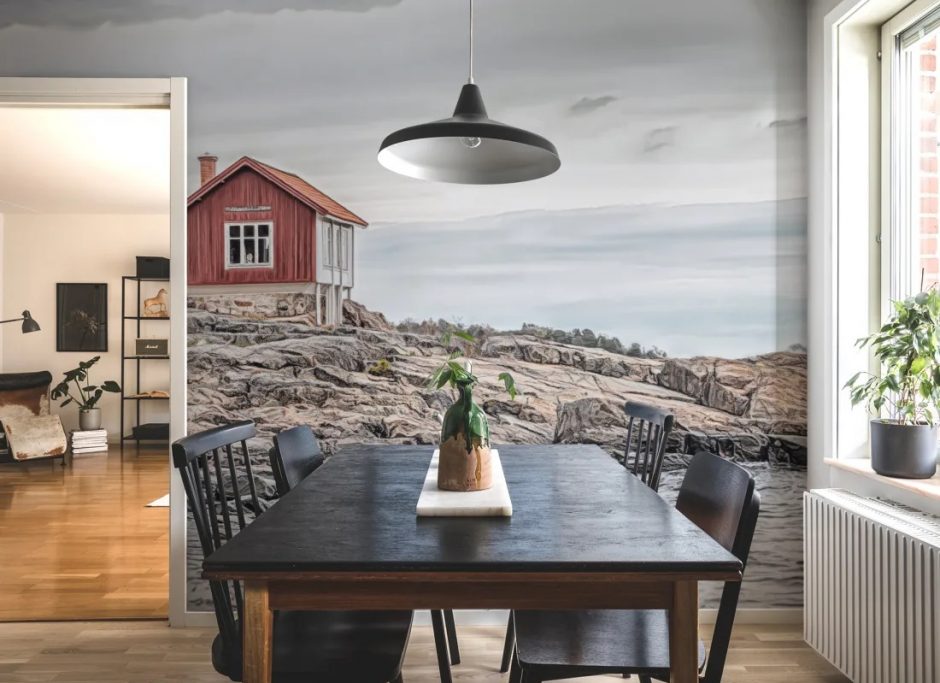
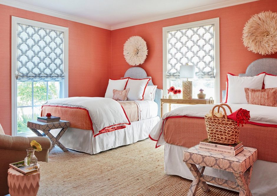
Seaside mood
Mural wallpapers with a seaside feel that won’t look strange in other seasons either
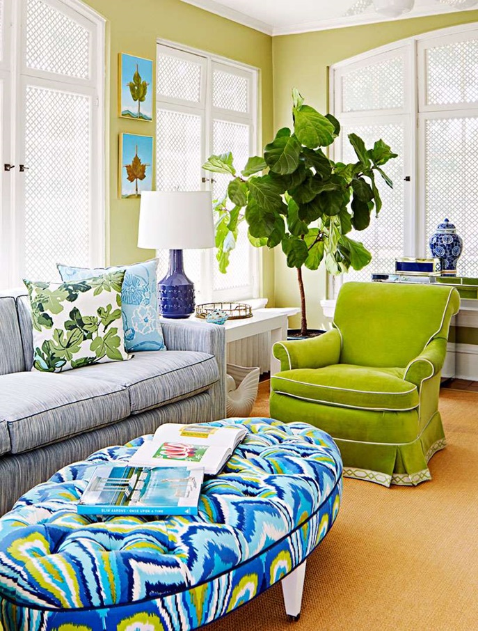
Tropical mood
A tropical vibe doesn’t require overly obvious decorative elements if the colors and textures match this style
Jacquard
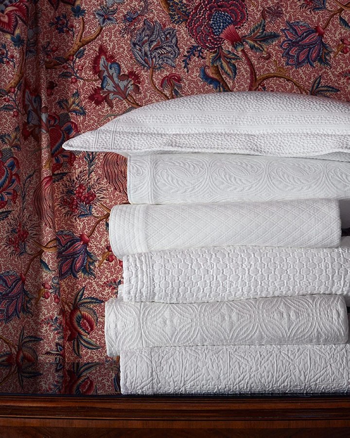
Recently, the use of Jacquard textiles has returned to interior decoration, mainly in the form of curtains, furniture upholstery, cushions, and bedspreads. The tone-on-tone patterned versions create a particularly elegant effect. Textiles made this way are quite durable and age beautifully, which is why it is easy to pair new upholstery with antique accessories (e.g. cushions).
The name Jacquard textile does not refer to the material itself, but to the method of weaving. In 1804, Joseph Marie Jacquard developed a device that, fitted to weaving machines, made it easier to produce patterned woven (i.e. non-printed) fabrics. Punched cards strung in an endless row controlled the weaving machine, which thus produced the pattern automatically instead of the laborious hand weaving that had been done previously. Each row of the punched card corresponded to a row of yarn in the textile. The yarn itself could be of many types: cotton, silk, wool. This made fabrics – usually single or two-tone – such as brocade, damask or matelassé (quilted textile) available to a wider range of customers.
This opened a door once again for the reuse of beautiful, antique textiles.

At Easter…
Although these are not seasonal accessories, they function as an extra decorative element at Easter
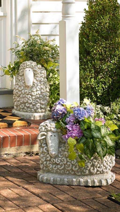
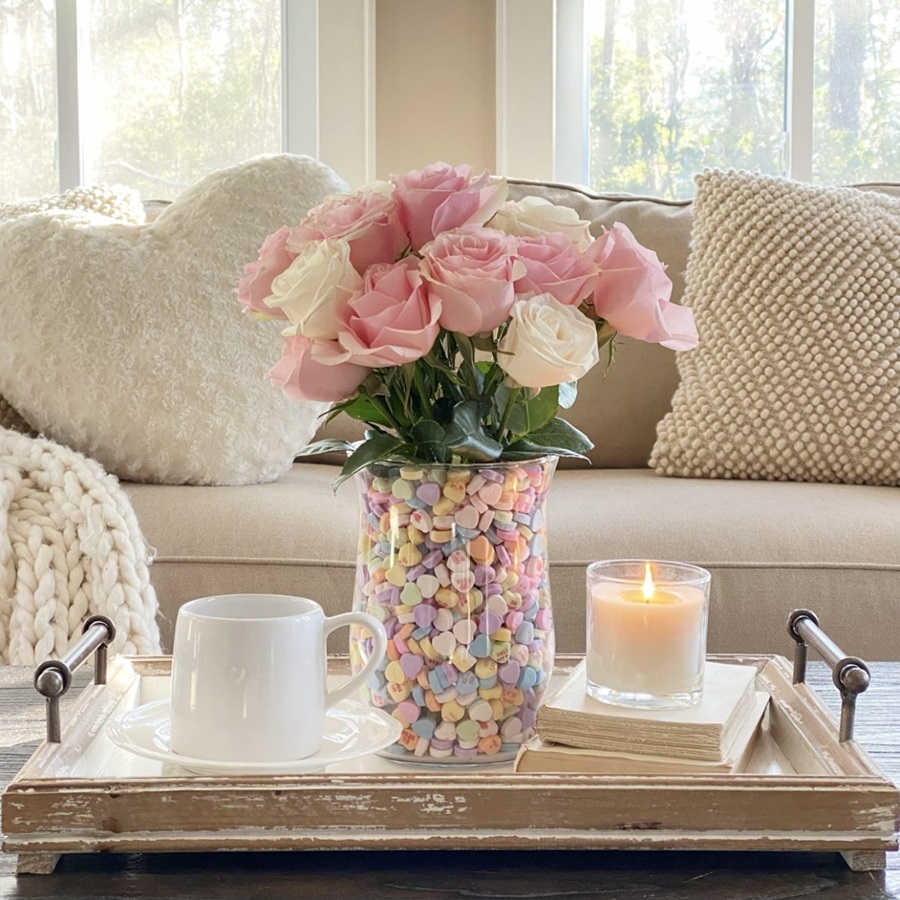
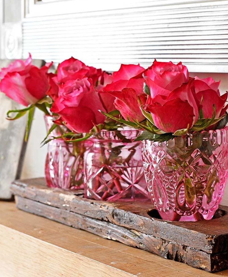
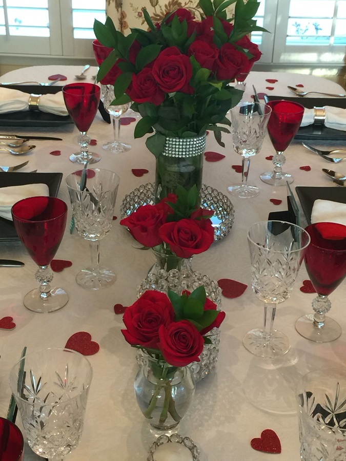
Roses
Red rose is one of the oldest symbols of love. However, for Valentine’s Day decoration, we can use any shade between pale pink and burgundy, matching the colors of the interior.
Color of the year 2025
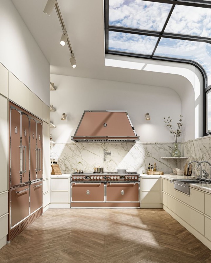
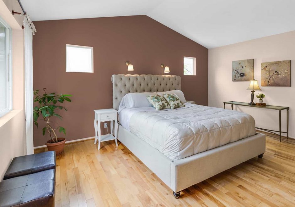
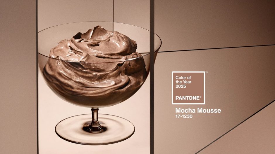
Pantone company announces the color of the next year in every December which has an effect on interior design also. Mocha Mousse no. 17-1230 is the color of the year 2025.
This is a warm milk chocolate brown hue, from the group of earth-tones. Just like the sweets that gave it its name, the color itself is quite intense and tends to overpower other colors. Although it is not particulary a dark shade, if used in too large a quantity, it can easily create an oppressive, dark effect, as it absorbs light and narrows the space. It is worth firstly combining it with light, neutral colors (white and off-white, cream, cool pastels) to remove the gloomy atmosphere, which can make the room seem boring and depressing. It can be used in any room in small quantities.
Ask for help of an interior designer for making the color of the year 2025 appear in your home in style.
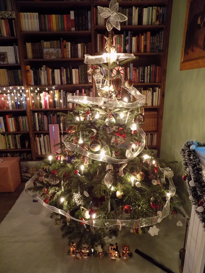
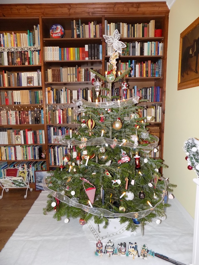
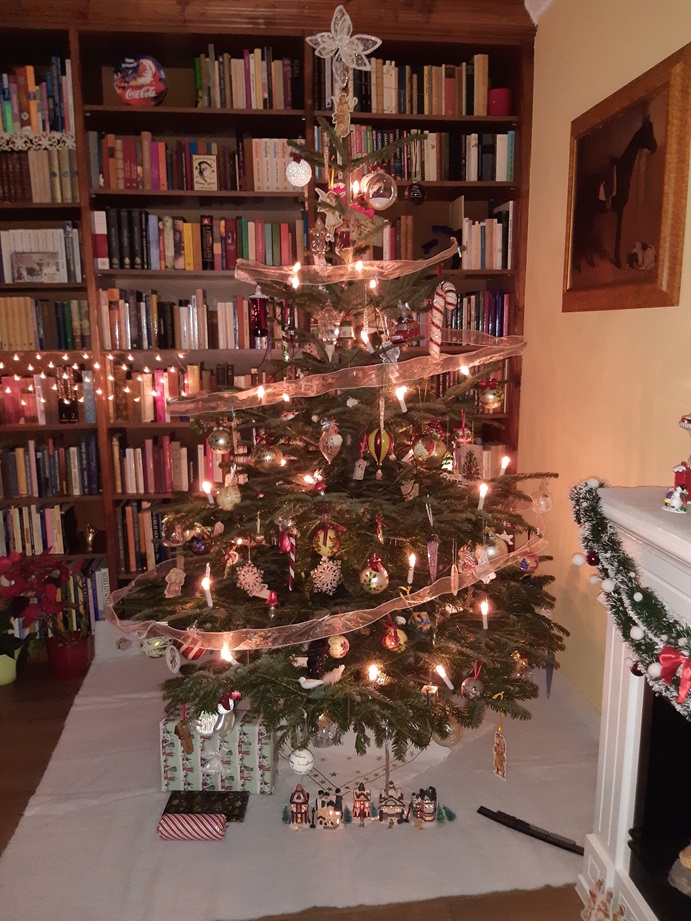
My Christmas trees 3.
My Christmas trees 2021, 2022, 2023
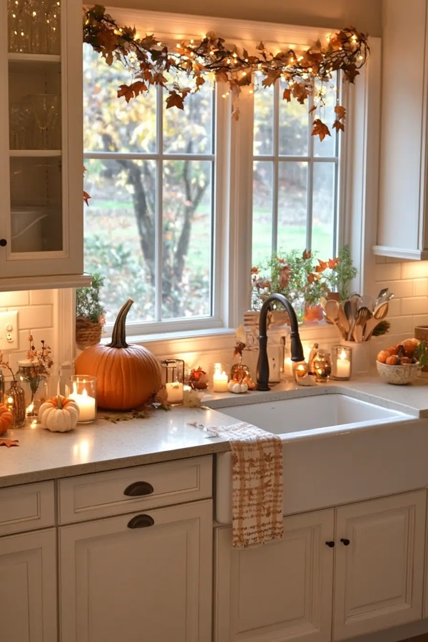
Decorating for fall
Autumn decorating can begin! Keywords: warm earth tones, natural textures, layers