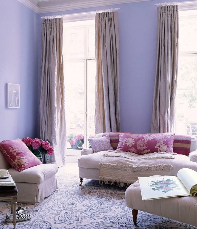
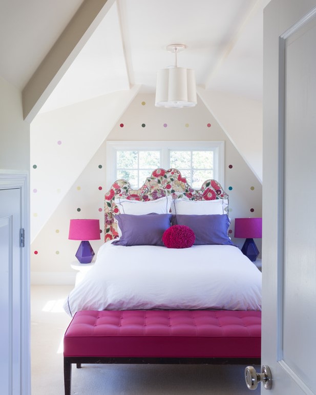
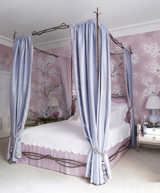
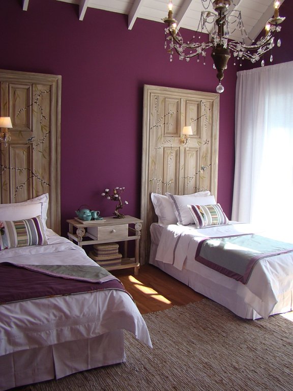
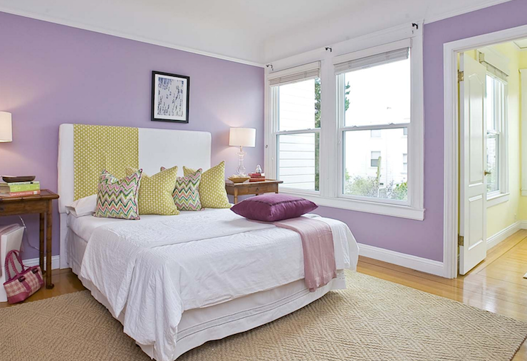
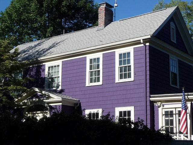
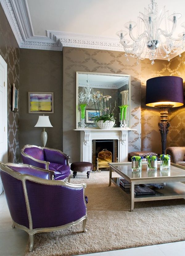
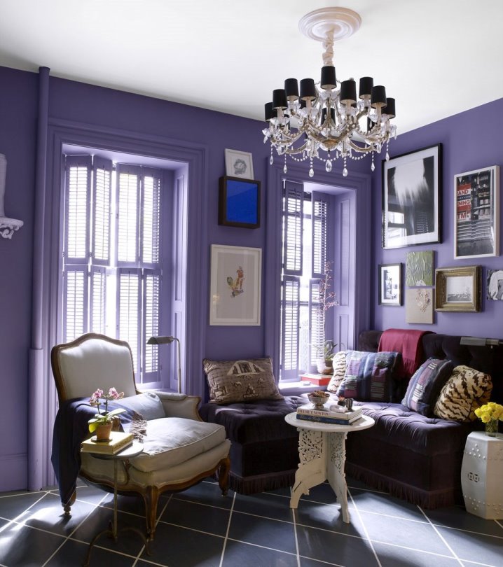
Bluish purples, mauves, purples – none of them is common or „safe” choice, but a pleasantly soothing mood can be achieved by them
Archives
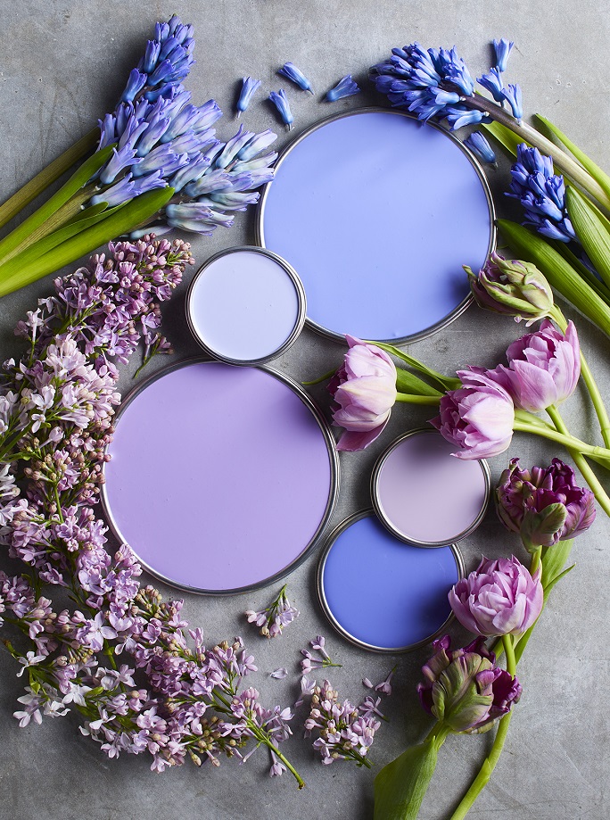

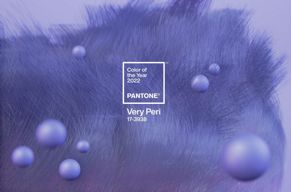
Color of the year 2022
Every December Pantone company announces the color of the next year which effects interior design also. Very Peri no. 17-3938 is the color of the year 2022, which is from periwinkle. It was created specifically for this occasion.
This is a soft, pleasing blue-violet hue, which looks like a pastel although it is not. The blue was mixed with pink rather than red, which gives the slightly airy effect. Since it contains much more blue than pink, it can be classified as blue. It gives you peace of mind, but also gives you curiosity.
It is a medium dark shade, so it can be used in larger quantities. It fits well for country and shabby chic styles, nursery, bedroom or even at home office. It can refresh a palette of neutral colors as it is a cool shade.
Ask for help of an interior designer for making the color of the year 2022 appear in your home in style.


Fuchsia
Fuchsia was patented in 1859 as an aniline dye. It was renamed magenta later, so the two colors are the same. This is a vivid, middark, purplish red hue. Originally it was named after the flower and renamed after the place of a victorious battle in 1859. Since it is a stron and energizing color, let’s use it moderate in interior design, rather as a focal point or pop-color. It can be a good alternative instead of using red.

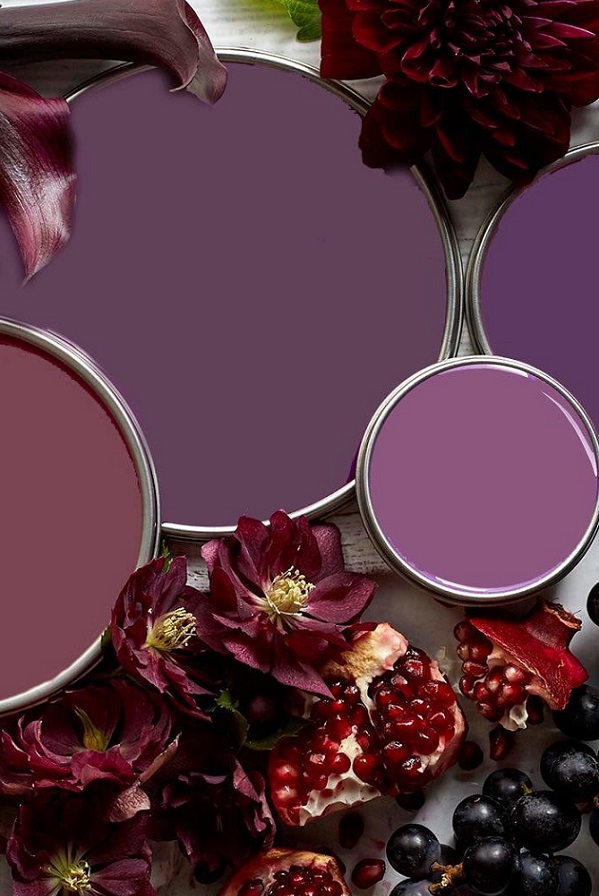
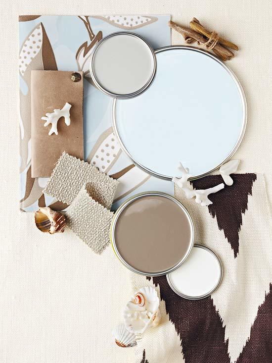
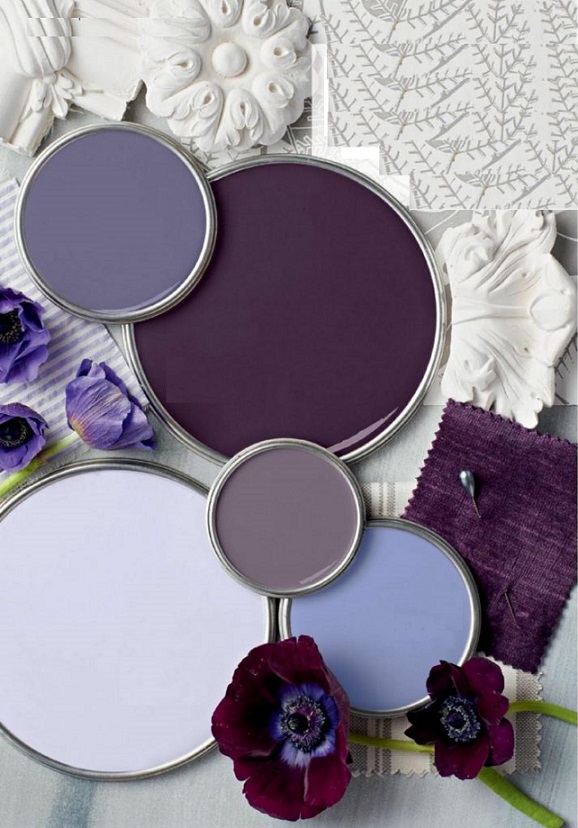
Paint palette 19.
Summer summoning color palettes
Bishop purple
Bishop purple is a very bold, dominant hue which contains much more red than blue. It was named after the formal vestment of the ecclesiastical dignity.
Paint palette 15.
Purple color palettes of three seasons


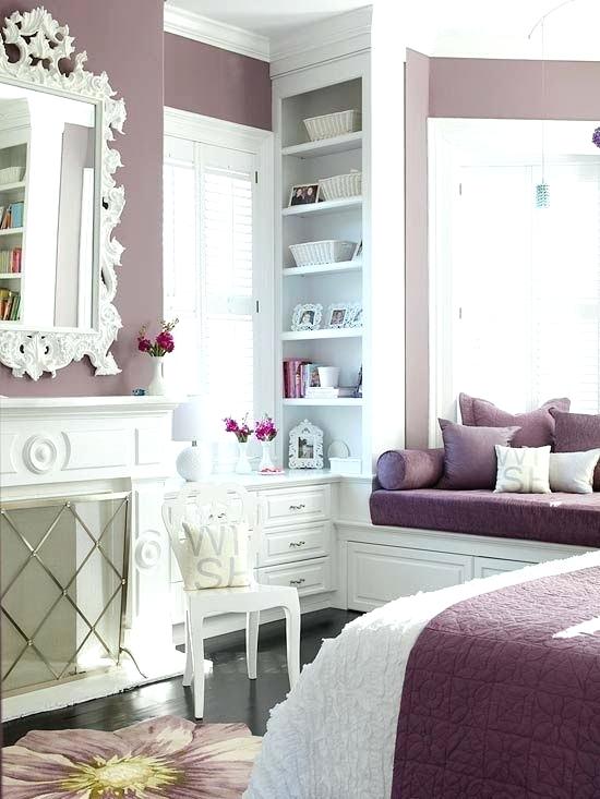
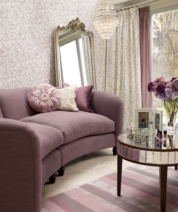
Mauve
Mauve is a soft shade of purple, it contains lots of grey and a tint of pink

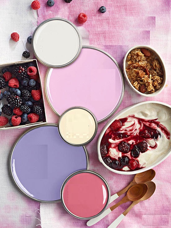
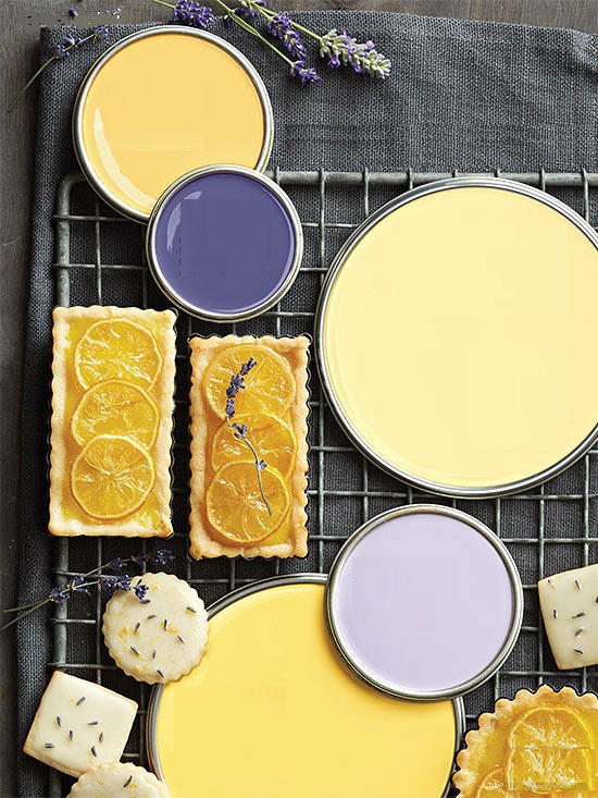
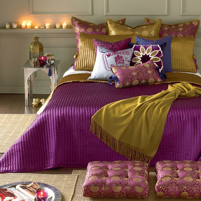
Color pairs 34.
Color pairs: purple-yellow


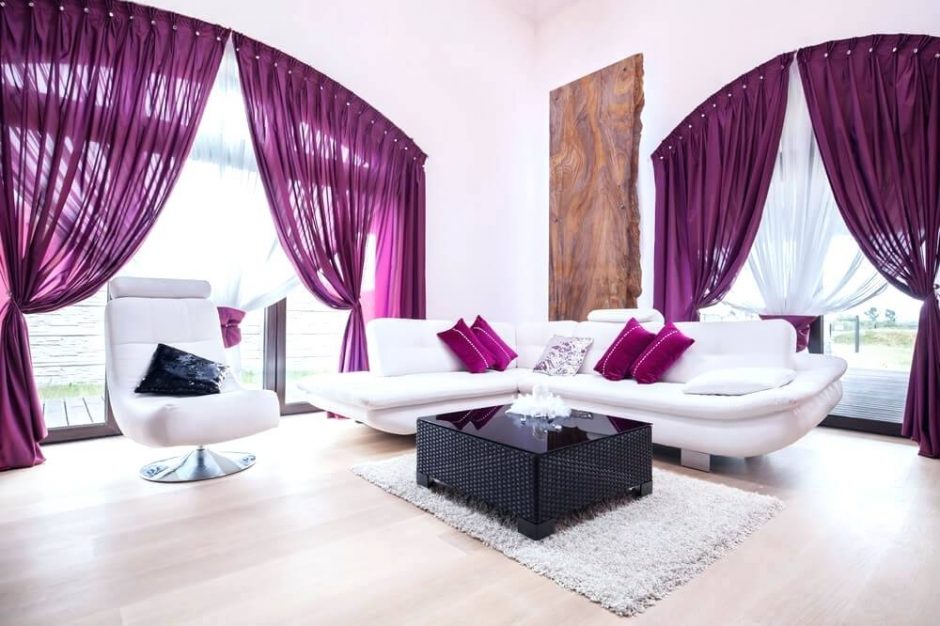
Color of the year 2018
Firm Pantone announces the color of the next year in every December which has an effect on interior design also. Ultra Violet no. 18-3838 is the color of the year in 2018.
Scientifically, it is not a color but a range of short wavelength which is beyond the range of visible light. The color given by Pantone is a cool, vivid and middle strong hue which contains more blue. It can be used well on bigger surfaces also, but it should be counterweighted by neutral colors (black, white, brown, grey, beige) because of its vividness. It is not a food color, so it should be used moderately in the kitchen and dining room, rather only on accessories. It is a popular color since years, not only in interior design.
The purple color always signed or meant a specific or mysterious thing during the history and in symbolism. For example, it was the color of mourning in the French Royal House. It is the favorite color of the clothes of magicians and fairies in tales. It is popular among children also.
Ask for help of an interior designer for making the color of the year 2018 appear in your home in style.


Color pairs 31.
Color pairs: purple-pink