Well-placed, decorative antique ornaments always lift the shine of an interior
Archives
Inspiration 1.
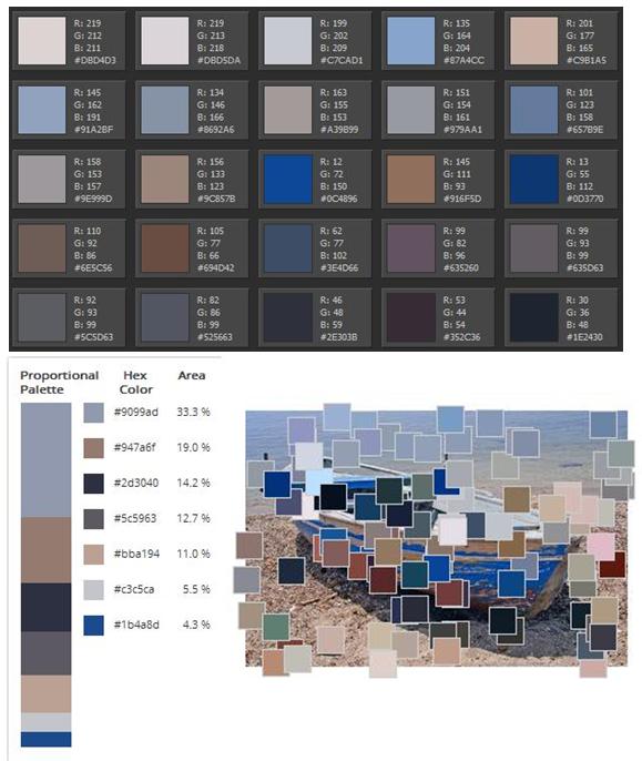
Use our favourite photo’s colors for decorating our home

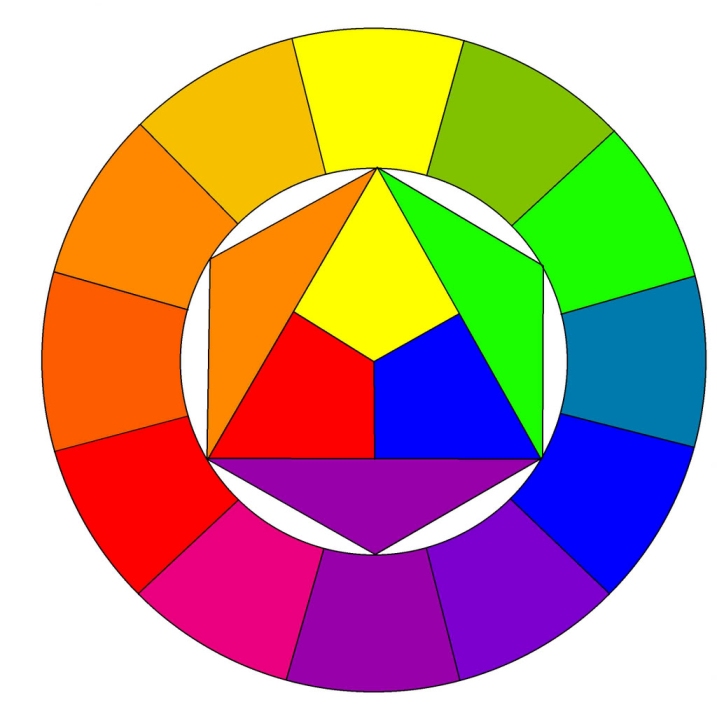
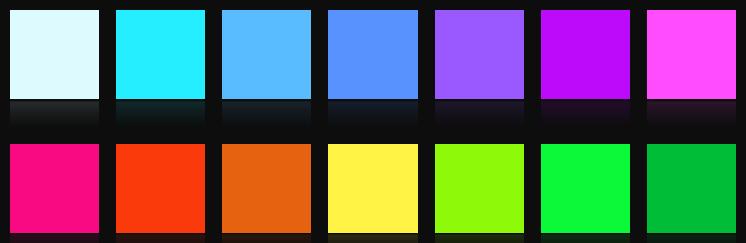
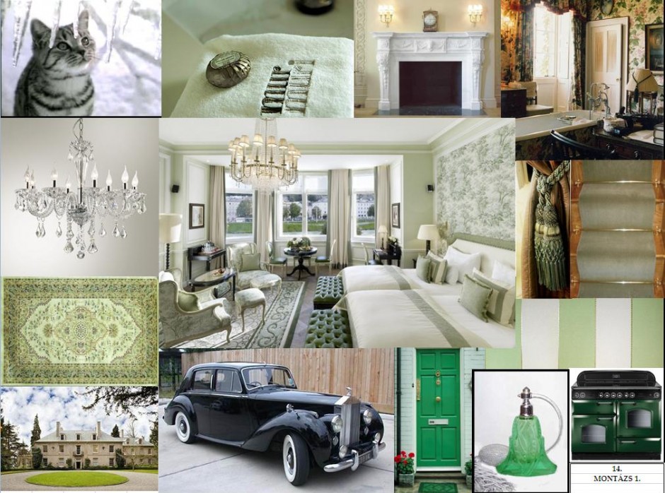
Supplementary colors
Supplementary colors are color pairs, that are located the opposite side of the color circle. They strengthen the effect of each other, resulting an eye-catcher pair. The color circle itself consists of three elementary (blue, yellow, red), three secondary (green, purple, orange) and six tertiary (transitions of the above mentioned) colors. The circle shows their relations also.
In interior design, we use them for reaching really striking, unforgettable experience and for defining focal points. If we would like to use them in the same share, a third, neutral color (black, white, cream) should be applied too. The supplementary color pair has to be used at a relatively low level in the space (e.g.: on decoration pillows, vases, pictures or on some smaller furniture). If both colors have to be emphasized, don’t use them in the same share, else the result will have unsettled or unfinished feeling without the required esthetics. One of them should me the main color, while the other is the secondary, as we have already seen it at the color balance. As a counterpoint, the supplementary should be used in small amount.
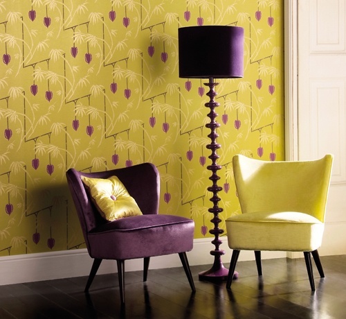
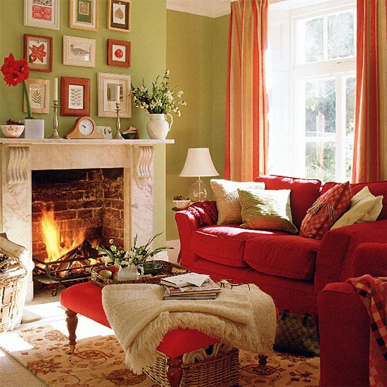
Most common pairs are green-red, blue-orange and purple-yellow combinations. If someone afraid of intensive colors, this scenario can be also realized with pastel colors as well: with pink-light green, lavender-vanilla and light blue-coral hues.
Using supplementary colors requires courage. If you are uncertain, but you would like to get a spectacular interior, ask help from an interior designer or color advisor.


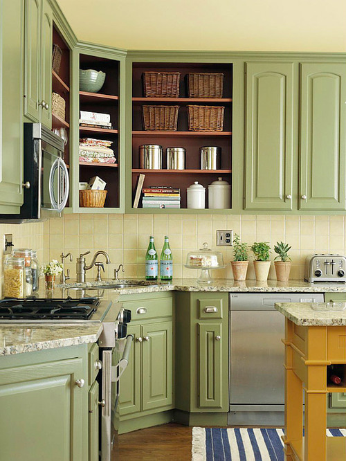
Kitchen renewal
The complete renewal of a kitchen is one of the more expensive operations. When we buy a new flat, the kitchen furniture is generally not fitting to our expectations. Not only the age can be the problem, but also the style or color. What can we do if we cannot afford large expenses, but still we would like a new kitchen?
The best situation is, if the furniture is made of wood. It can be painted to any color easily. First the surface must be sanded thoroughly. After a layer of primer paint, the final paint can be applied. For laminated or plastic covered chipboard, there are also paints available, with which they can be revamped. Doors can be decorated with moldings. A carpenter can cut and fit these to their place – we have just choose and paint the moldings to the color of the furniture – or to any contrast color as well. Wooden door panels can be removed and the carpenter can carve any pattern in them upon our need. This provides a little more classic feeling to the kitchen.
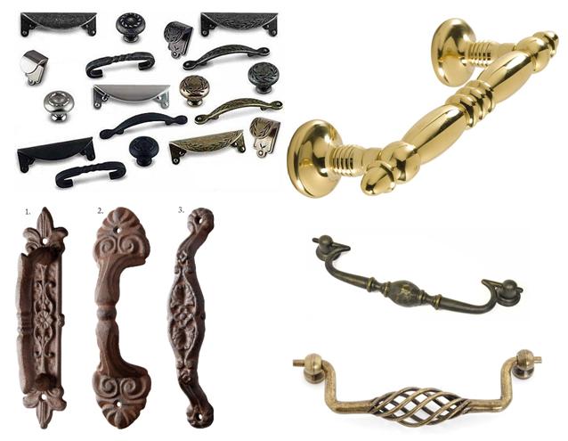
The fastest and simplest way to refresh the kitchen furniture is changing the handle knobs. The best if we can purchase knobs with the same hole pitch. There is a large palette of different colors, shapes and materials. Using patterned porcelain inlay or wrought iron (like) accessories, a vintage feeling can be realized. With copper or white porcelain, the result is more classic.
If we have no opportunity to change the wall and floor tiles, as a temporary solution, we can use a carpet fitting in color. Changing the water taps, implementing new blinds to the window (e.g.: Roman blinds), or purchasing decorative storing facilities mean low cost, but brings a great change. A real classic and spectacular view can be reached by using a smaller chandelier.
If you are not certain in the required changes in your kitchen within the budget available, consult an interior designer before beginning.


French Renaissance
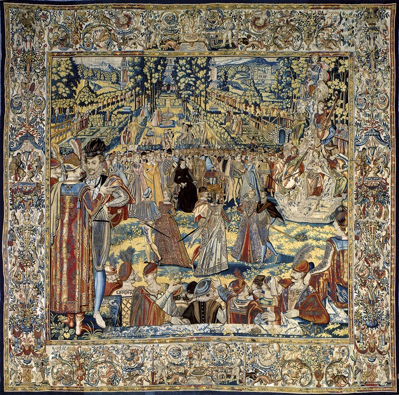
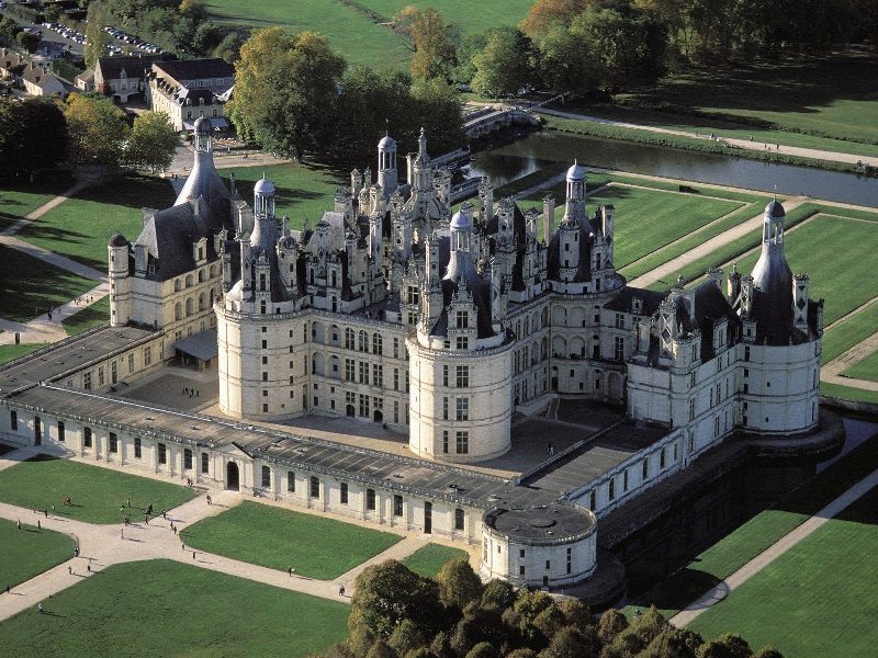
During the French Renaissance not only architectural and artistic works were outstanding, but the beauty of furnishing and comfort came into view also. This era is really hallmarked by two sovereigns: François I. (1494-1547) met the new trend following Gothic during his Italian campaigns. He immediately fell in love with the ornaments and anthropocentric vision. When he went home, he implemented these in France. Many Loire castles were built or rebuilt during his reign (e.g. Chambord, Chenonceau, Villandry). He invited Leonardo Da Vinci in his court. Cathrine de Medici (1519-1589) was born is Florence and grew up in the heyday of Italian Renaissance. She took this love to France, where she got married with the future Henry II. As a regent she spent big amounts for furnishing castles, re-buildings (Louvre) and art treasures.
The three-dimensional effect is the characteristic of Renaissance living spaces: huge fireplaces, imposing marble staircases, big collective spaces. The stone walls were covered by richly patterned tapestries which protected partly against cold also. Beds had legs against the coldness of the floor and bugs, and they had canopy which provided not only the private area but protected against draught also. This time it was already common to welcome important guests in bed.
The first versions of wardrobes (dressoire, cabinets) appeared beside chests as main storages. These were richly carved, showing the wealth and rank of the owner also. Furniture had architectural forms: colonnade, arches, sill etc. Framed structure, marquetry, veneer and inlays were first used this time. Chairs could be fix or folding. Upholstery appeared (leather, velvet) which provided more comfortable seating. Tables are not take-apart anymore, they are sturdy and imposing pieces on columnar legs.
The court moved from one castle to another because the large household could be fed by a city and surroundings only for a limited time. In this case, all the furniture, tapestries, cutleries, wardrobes etc. were carried. Paris became the permanent seat of French kings at the end of the Renaissance (during the reign of Henry III. and IV.).
Interior of those times may seem to be a bit over-decorated and outdated from today’s standpoint. But the then feeling and creating artistic values can be implemented in modern surroundings also. Ask for help of an interior designer for this.


Collections
The proper placement of different collections is not an easy issue. We don’t want to give it up, but we cannot store it as we would like to. The main reason is the lack of space or organization.
There are collections, which are evident to store, like books, stamps, DVDs, etc. We can find place for them on the bookshelf, the box under the TV or at the bottom of the coffee table. The unused space under the stairs or above the doors can be equipped by shelves to. But the real problem is caused by special collections to be exhibited in the department. We should find a worthy location for them, not to pick out from the drawer if we would like to take a look on them.
Sculptures, ceramics, glass objects look nice on a narrow shelf made for right this, lightened by spotlights or LED lights from above. Similarly suitable is a plasterboard niche-line as well. For maquettes, models, there are wall mountable storage compartments available. These later can be easily designed and implemented by us using some wood and paint.
In case of choosing the proper surface to place paintings, drawings and etchings, we have save them from direct sunlight which can be destructive. A glass covered frame can save avoid the contact with dust.
When collecting small objects (minerals, souvenirs from abroad, watches, etc) a good solution can be placing them on the top of a commode, the glass cabinet above the tv or under the glass surface of the coffee table. Let’s group the items by color, style, theme or form. Not only the living room can be the right place for them, but the hall, the bathroom (e.g. seashells or stones), or even the bedroom.
Important: avoid overdoing it! They souldn’t cover all corners of the room – if we haven’t got a separate room right for this purpose. If the collection grows too large, let’s try to sort: show only the nicest or favorite ones. The remaining others can be stored in a box in the cabinet. If you don’t know how to optimize the available space or how to exhibit your treasures the best way, ask help from an interior designer.


Spring
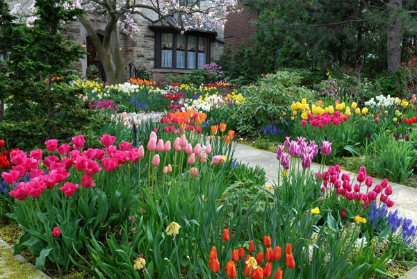
Spring is coming soon. The bright colors typical of the season can be brought in our home also – even all over the year.
If we look at a spring flower garden we can see that the several hues of bright green give the background for the vivid colors of the first flowers. Primrose yellow, fuchsia, white, bud-green, bright red and sky-blue are the most common. Any of them is impressive in a flat, how can they be showed together for the real spring mood?
The best solution for this is using white. It is a neutral background; the vivid colors can be harmonized with it. Let’s paint the walls white (or off-white), cover the larger furniture with white fabrics and choose a neutral and light floor covering if white will be too much for the latter. Use the jewelry-like colors for decoration and highlighting. Cushions, vases, pictures and carpets should be dazzling. Don’t forget the real, spring-like flowers also! Color and fragrance are the most important, the flat is filled even with cut or potted flowers. The big advantage of this interior is that it is easy to change because of the neutral background, if the composition is boring or it should be changed season by season.
Green can be the uniting color if we are brave enough or want to have this mood for a long term or just wish to follow the nature much more. Don’t be afraid of it, if it works in the nature, it will work in the flat also! Let’s paint the walls to a warm green shade, upholster some larger furniture with green or green patterned fabrics. In this case, choose a warmer mid-brown hue for the floor which can even symbolize the soil. Then use colors also on accessories and flower bouquets. Entering in such a room will make everyone smile.
Many people are afraid of bright colors, uncertain in using them in the case of their home. However, if you would like to feel the mood of your favorite flowers every day, ask for help of an interior designer for the proper composition.

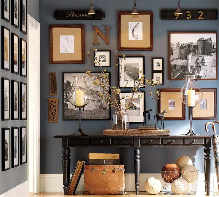
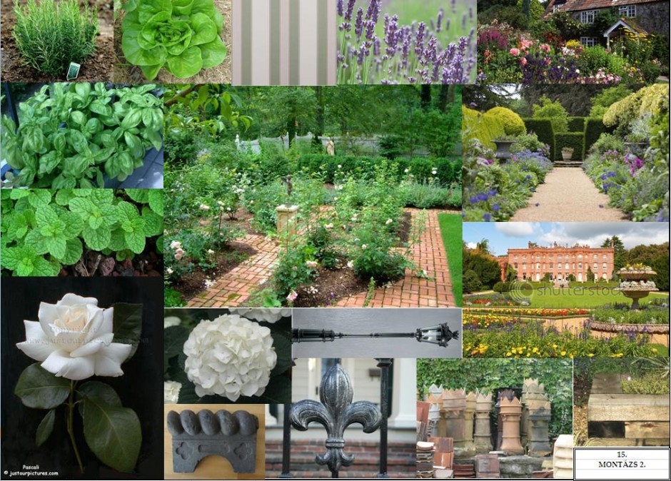
Montage
If someone hires an interior designer, one thing is sure: what should be the feeling entering the new flat. One is not certain in colors or furniture, just seen something somewhere which he liked. The feeling took him or her.
To express and understand this, making montages is important in interior design. But why we cannot do this ourselves? There are two ways to begin:
1. There are a lot of objects in our mind, that we would like to realize in the ready space (e.g.: fabrics, paint samples, photos of furnitures or lamps). We like one because of the color, other of the shape, a third one of the pattern. Or we just want that one or a similar. These can be attached on a A3 format cardboard sheet. We can arrange them and check how they will look like together. We can get a view of “all of things” getting in one space.
2. We would like to catch a certain style or feeling. In this case we haven’t got to use real accessories or materials. Everything is suitable that has adequate atmosphere. We can collect picture on Internet or we can cut them from newspapers. They can display a complete interior, or just one bouquet, teddy bear, book cover, etc. The goal is the MOOD.
Let’s start bravely with whatever variant. Its great fun and in addition to, a perfect tool for getting further ideas and organizing the lots of “I like this” things.


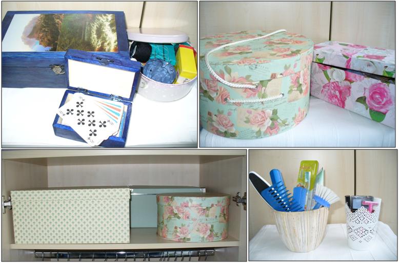
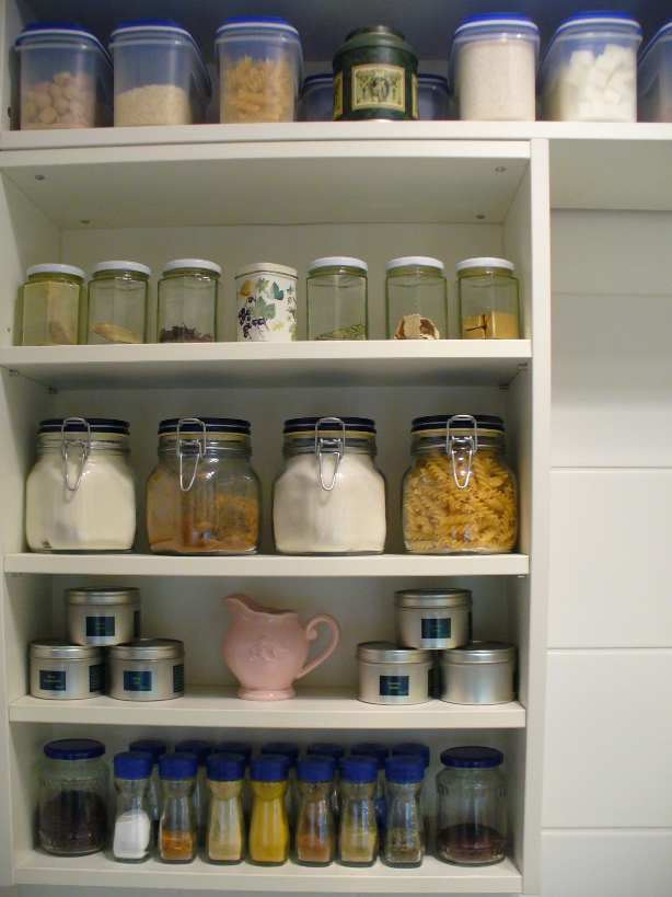
Storage
Everyone has already a problem with storing and the lack of storage. If this problem becomes permanent and has a negative effect on everyday life, it’s worth finally to do something for solving it.
First of all: tidy up! Although this is a cliché, but very true. Put everything to its place or at least to the place where it belongs if there would be enough space. Then spend some evenings or a weekend for selecting. Throw away or donate all the things which aren’t needed anymore: old bills, unused clothes for years, broken toys, piled-up plastic bags etc. If this is all what is done, we can be surprised how much space will get free in the house or flat! There will be empty drawers and shelves.
Then we can search for further storages. These help for gathering the things belonging to each other. However, regardless to the original function, almost everything can be a showy storage bin which even hasn’t to be hidden in a wardrobe. For example, the family photos waiting for selecting can be stored in a hat box. A mug can be a penholder, make-up cotton wool can be placed in a prettier jar, spare bathroom toiletries in a pot, sewing tools in an old cookie box, screws/nails in an herb glass with lid and so on. All of them can be even decorated fitting for the style. In the case of closed and similar boxes, it is practical to label them for knowing their content without opening.
If we have good handcraft, we can make a nice storage from a shoe box or a wooden box purchasable in a hobby shop with some paint and wrapping paper. If not, several fancy-boxes and special bins can be bought in various sizes, shapes and colors. An additional bin can be put in the drawers for small objects, for example which originally was made for ties or teabags. It’s easier to store the things of kids this way also and habituate them for tiding and order.
There can be a bigger problem: for example lack of cabinets or if more people live in a small place. In this case, ask for help of an interior designer, who design the custom-made storage cabinets, rearrange the space for the better use and customize the rooms fitting for the real functions and the needs of those who live there.


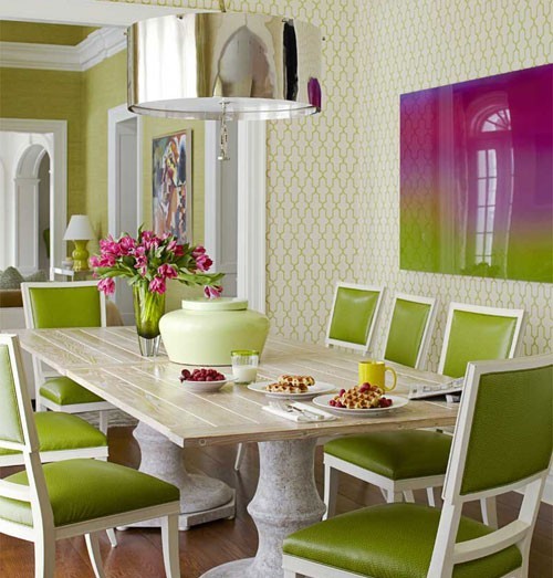
Color balance
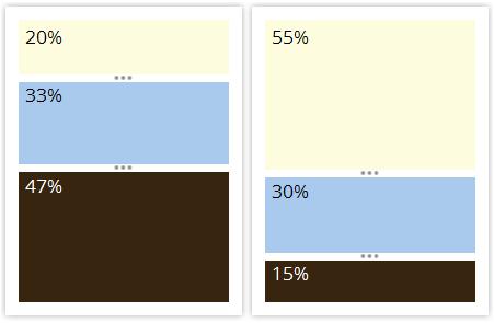
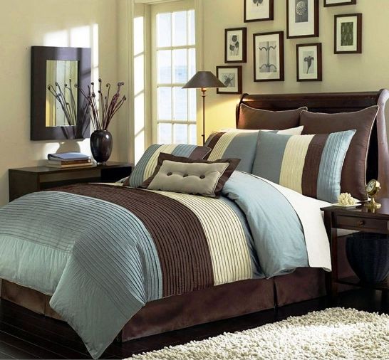
In an interior, color balance is almost as important issue as the style itself. Generally there are three main colors that are chosen into the palette of a room. Of course all colors of the rainbow can be presented additionally (think of the books, the cavalcade of objects given as a souvenir), but the mood is determined by the main colors. For example, let’s see a classic combination: chocolate brown – light blue – cream.
If we use all of the three in the same rate, the result will not be significant, there will be no focus point and our look will go around in the room. But if we modify the rate, the overall view will be much better immediately.
This means in the case of a room, that three walls and the floor can be brown (even a different hue), the main wall is light blue and the accessories (e.g. curtain and decorations) can be cream. If we would like more neutral result, the walls and the carpet are cream, the curtain and the couch are blue or having blue patterns and the wooden furniture, picture frames are chocolate brown. In all cases, good idea to insert objects, that combines all the three colors (e.g.: cushion, vase)
When choosing our favourite colors, we should check if they fit to each other and their rates must be determined for the required effect. If you are uncertain, ask the help of an interior designer or color advisor. One or two hours of consultation can be fully enough.