Using natural stone in our home results an exclusive and opulent effect. Marble, granite, limestone and other stones can be used for floor and wall covering, fireplace pavement, kitchen countertop, creating architectural elements, window sill, washbasin etc. However, it’s useful to know their features and proper ways of cleaning.
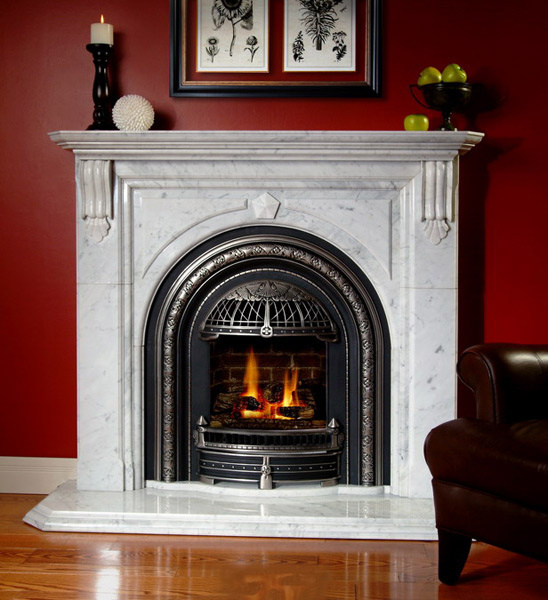
Marble is probably the most popular material. It is solid, resistant and well-carvable. The color range is wide (several shades of white, green, red, pink, black, grey and beige), the veins add classic look to the space. Sensitive to acidic materials, for example wine and coffee that can stain it easily. It can be cleaned with warm, mild soapy water. Strong and corrosive detergents make its surface matte, so avoid using them.
Granite can be used inside and outside also. Its surface is very resistant, no special protection is needed. Its pattern is commonly grainy. The polished surface keeps its shine for a very long time. Hues of brown-beige, black-white-grey, blue and red are among its colors.
Limestone is a more sensitive type of stone. It is porous, so it’s useful to impregnate it for long lasting. It is easily carvable and polishable, that’s why it is desired for in- and outdoor also. It can be purchased in warm colors (hues of beige and reddish and yellowish shades). It perfectly fits for Mediterranean style interiors.
Onyx has unique and strong pattern, for that very reason use it moderately. It is opaque cut in thin plates and can be lighted through from behind. It will be obviously the ornament of the room. Its colors are greenish, pinkish and brown-yellowish hues. Its surface can be cleaned with polishing liquid also.
Quartzite is a wear-proof, non-freezing, acid resistant and fine-grainy rock. This is the basic material of the so-called industrial „quartz”. Mashed natural stones and raisin are added to it for reaching the optimal features. Its surface is shiny, but can be glimmering in grains also. Generally, it is available in white, black, grey and beige hues, but it can be purchased in different shades of blue, red and brown also. It doesn’t need any special maintenance or cleaning.
Of course, there are several more stones that can be used in interior design. All of them have unique features and these have to be concerned for long lasting beauty. Ask for help of an interior designer for choosing the proper stone for the function and style.
Archives


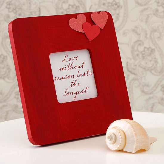
For Valentine’s Day
DIY decoration ideas for Valentine’s Day

Candle holders
Candles and tea lights are important parts of the Valentine’s Day decoration. The simplest way, if proper candles are placed in the candle holders bought in a shop and put in the place which should be conjured cozy. However, there are many further solutions which fit well in the classic interior, still unique and clever constructions. Let’s see some of them – not only for Valentine’s Day.
Let’s combine tee lights and fruits! Apple: cut a hole at the stem in which a tea light just fit. Bigger and heavier ones can hold long decoration candles also. Orange: cut the fruit in half, pick out its meat and put the tea light in the place of it. The flame won’t be visible, this way it gives a more mysterious light. When it warms up, it relieves essential oils and provides a pleasant fragrance in addition to the intimate atmosphere.
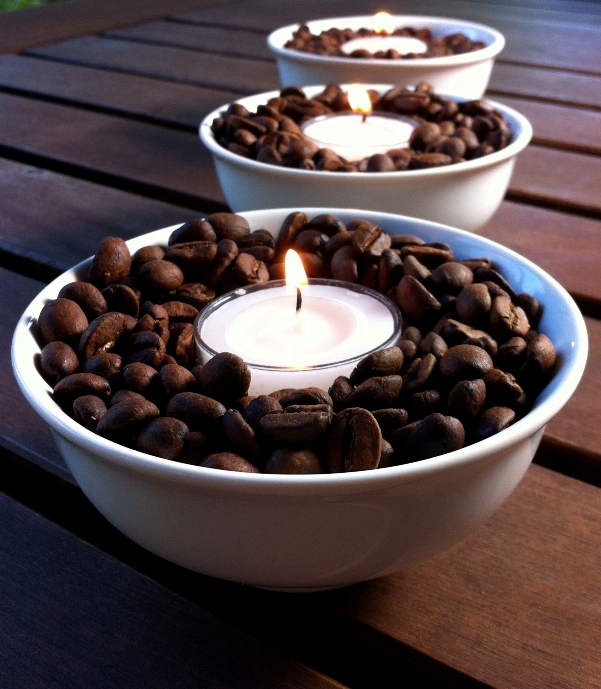
Let’s transform glass bowls and glasses into temporary candle holders. Fill them with sea-salt, peppercorns, coffee beans, rice or similar smaller things. If the pot is deeper, a thin candle can be put in it securely, but tea lights will look good in it also. Deeper bowls can be filled with water and floating candles and flower heads can be placed in it. Turning a goblet upside down there will be a stilted place just enough for a tea light.
Unused pieces of the dinner set: there are always some leftover pieces after setting the romantic dining table. The saucer, cake shovel, soft-boiled egg holder, ladle and metal napkin ring used as tea candle holders fade into the table set, this way the light of the candle will dominate.
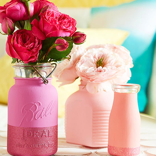
Main colors of Valentine’s Day are all shades of red and pink, just as white, gold and silver. Ask for help of an interior designer for creating a cozy decoration.


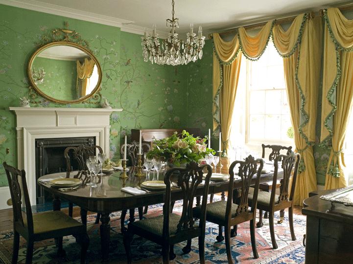
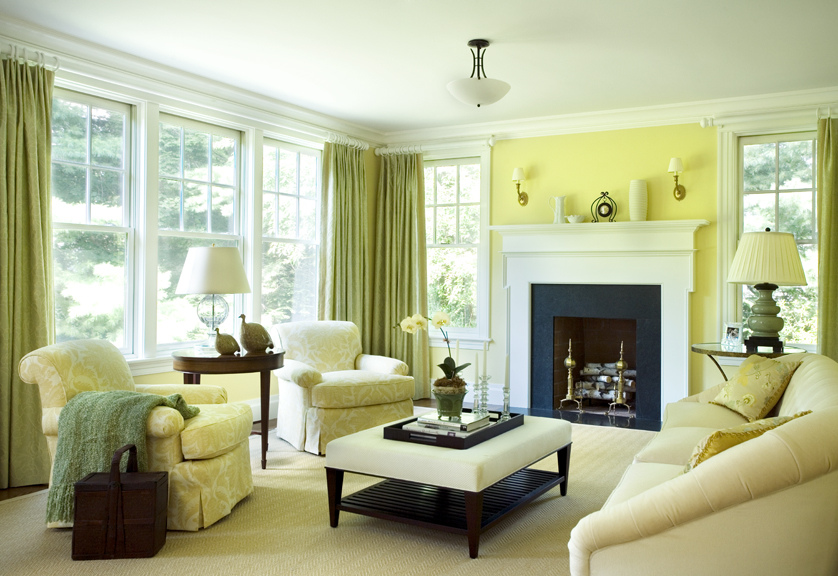
Color pairs 12.
Color pairs: green-yellow
Heating
One of the essential steps during building or renovation of a property is planning or changing the heating system. Frequently the circumstances are given, for example in the case of an apartment house which has to be adapted. Let’s see a short general review.
Underfloor heating is a popular solution. It is applicable with laminated floor or tiling. Its place has to be formed in the very beginning of the works. Advantages: invisible, releases heat on a large surface and energy saving. Disadvantages: continuous foot-warmth is not healthy for men and it heightens the allergy-inclination to dust.
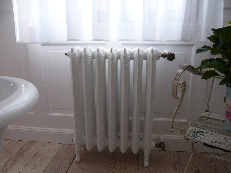
Radiators are given in the case of house-central heating, gas furnace and central heating, especially in apartment houses. These are placed under the windows in Hungary which makes e.g. the curtaining difficult. Decorative radiator can be bought in classic style which fits well for the general aspect and its color can be chosen from a catalogue. The sight can be more unified with a custom-made radiator cover.
Convector heating can be found in old apartment houses. There is free flame in it, so it cannot be covered. Nowadays the convectors in shops are not only functional but decorative also. Replacing it with an ethanol or electric fireplace can be a solution. Since these are placed under the windows also, the curtaining in this case is a huge problem.
Tile stove is fashionable again, both the wood-burning and gas-burning types. It could be a very special decoration element of the room. It keeps heat for a long time. Disadvantages: it requires a lot of space and its direct surroundings cannot be furnished because of the heat.
Wall-heating is a rarely applied solution. Pipes are placed inside the walls, with warm water circulating in them. Disadvantages: the location of pipes has to be carefully measured before hanging pictures, shelves, mirrors etc.
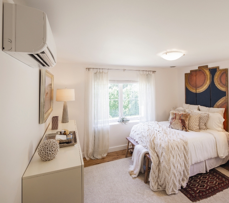
Heating-cooling air conditioners are powered by electricity. The internal unit can be placed anywhere on the wall from where the outdoor unit can be available with a proper slope. Disadvantages: it’s not economical, dries the air and there is a continuous air-flow.
Of course, there are further solutions or the combinations of the mentioned ones. Ask for help of an interior designer in time for planning the heating.


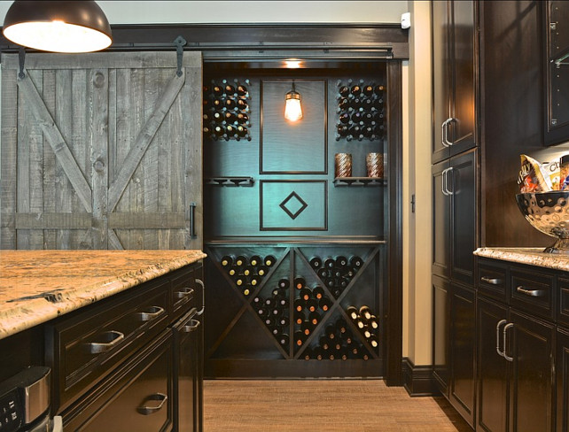
Wine storage
Some wine-storage ideas in classic style

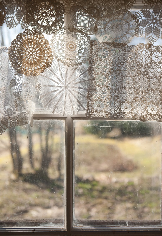
Old lace clothes
Many of us inherited a big amount of lace clothes from our great grandparents and grandparents which they cleaned, stored and starched with ultimate care. These collections contain pieces in several sizes, forms, thickness and colors. What can we do with them if we don’t want to sell them because of the memories? There are many possibilities for reusing them.
Old lace clothes were made of cotton by hand. It doesn’t worth to cut them because they almost immediately unravel. But they are easily dyeable and this way they could be fitted to the color palette of the room.
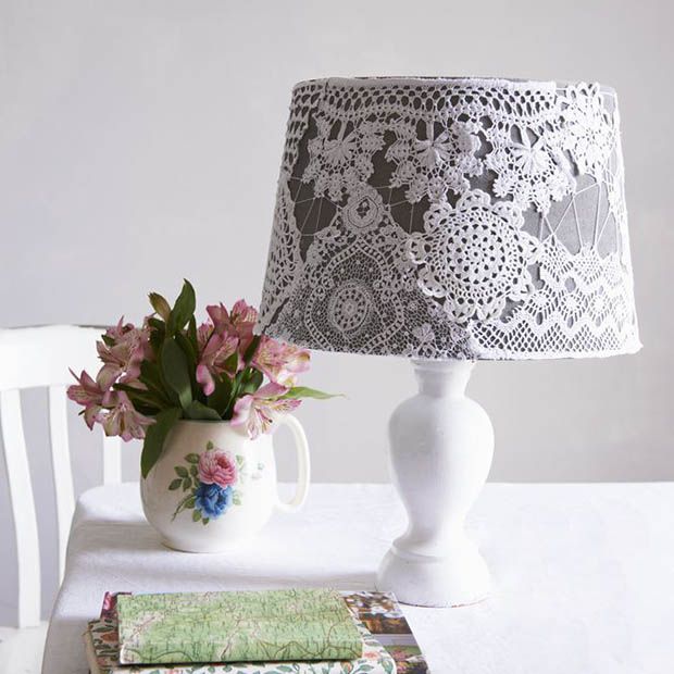
Let’s stitch the lighter, smaller pieces to each other by their edges and make a curtain of them. It doesn’t matter if the bottom or side of it is not straight. We can make it from even round shaped clothes, the outcome will be more unique. We can decorate the simple, plain lampshade with lace also. The simplest way: stick a narrow shelf stripe lace on the bottom of the shade for the vintage mood. Even the original fabric can be removed from the frame and the lace itself can be sewn to its place, but the lace has to be carefully starched before the procedure.
Let’s sew a patchwork-like blanket from the bigger, heavier clothes. If we don’t have enough for this, we can combine them with any cotton fabric. For example lace inset can be placed as decoration in the middle of the blanket, as overlay on the bottom or as edge on the four sides of it.
Let’s have a glass cut for the coffee table, flower stand or console table and put the showy lace clothes between the glass and the top of them. This way they will be protected from dirt but fulfill their function.
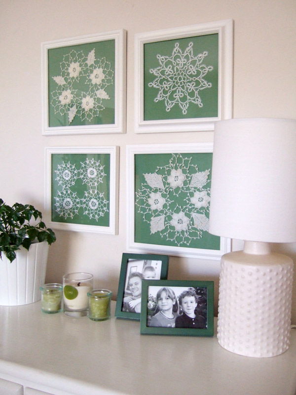
We can hang smaller laces in picture frames on the wall. If we don’t want to alter the white color of the clothes but the wall is white also, we can use colored mat board or ornamented frames for highlighting them.
Handmade objects made of quality materials are always valuable even if they don’t fit to our home. However, we can still enjoy them with a little fantasy, handiness and expending little time. Ask for help of an interior designer for more ideas of reusing them.


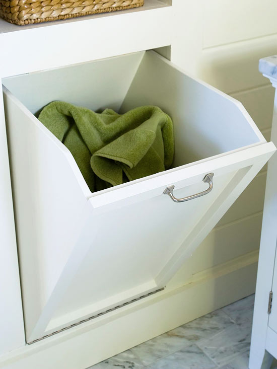
Secret storages
Discrete storing of laundry for the next washing

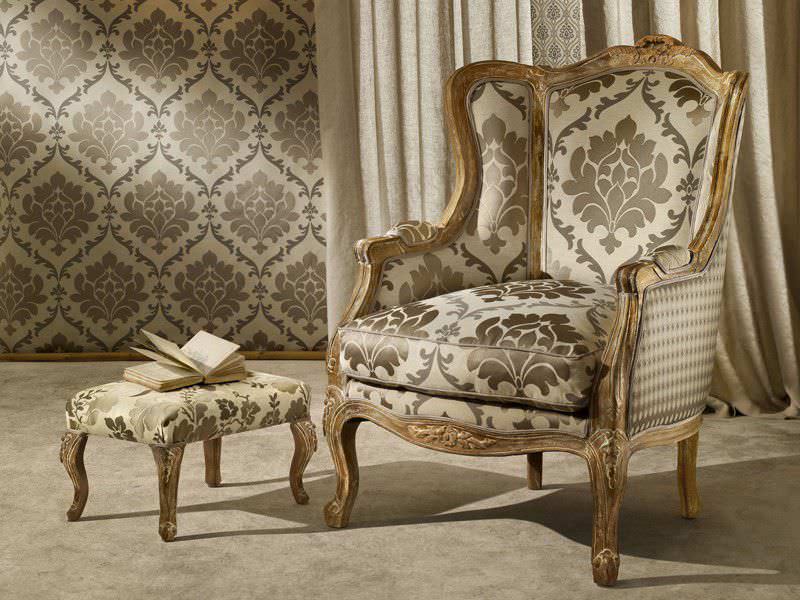
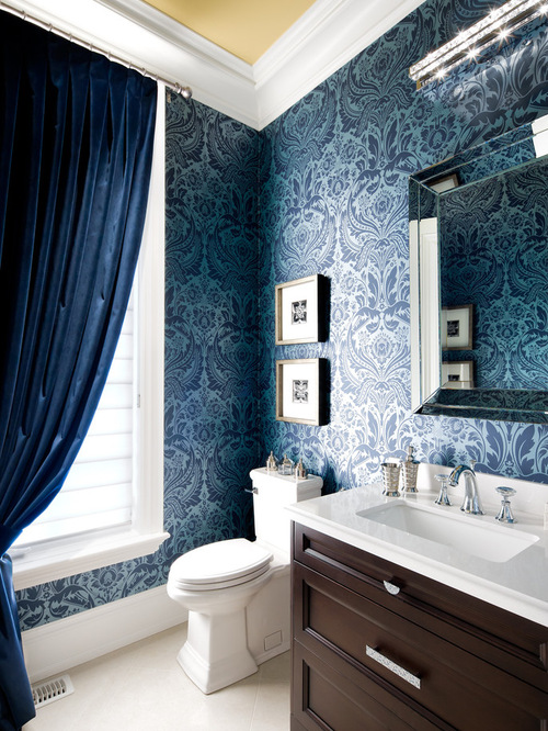
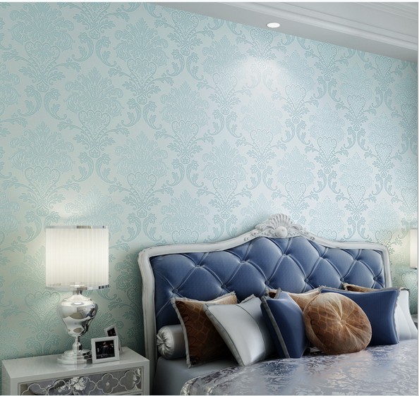
Damask pattern
Damask pattern – classic forever
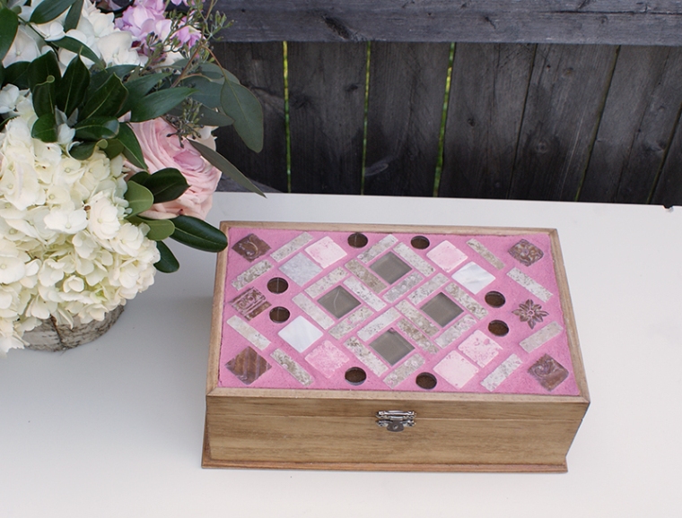
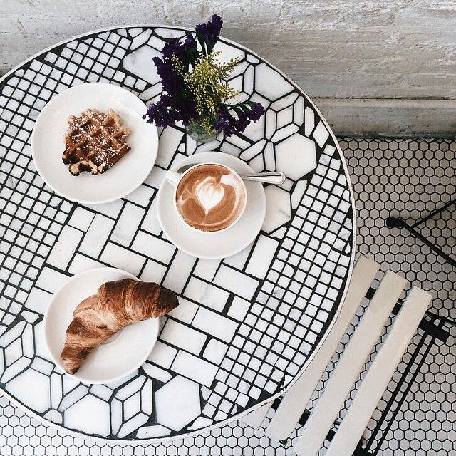
Mosaic
Mosaic tiles are popular in classic style homes also. First of all, they are used as bathroom wall and floor tiles, kitchen backsplash and pavement of swimming pools. In addition, there are many possibilities for using mosaic tiles, even they are purchased or made DIY.
A simple metal breakfast table can be made unique with covering its top with mosaics. Take care that the result should be as smooth as possible preventing the sway of plates/glasses. The method can be the same in the case of a coffee table or plant stand.
Let’s renew the covering of the fireplace with a color-matching mosaic inset but the area in the front of it can be paved with it also, preventing the wooden floor/carpet from sparkles.
It can be used outside also. Let’s tile the seat of the garden bench, this way it will look good when a cushion can’t be put on it (for example, on rainy days and in winter). Mirror and picture frames, storage boxes, pots, trays, bird feeder etc. can be also decorated with mosaic tiles.
The products in shops can be ordered in several sizes, shapes, materials and colors. There is a perfect one for every style but we can make mosaics DIY by cutting old plates, mirrors, bottles and tiles or even using pebbles, seashells and coins also.
Of course, there are many more using methods. If you like mosaic tiles also, ask for help of an interior designer for smart designing.