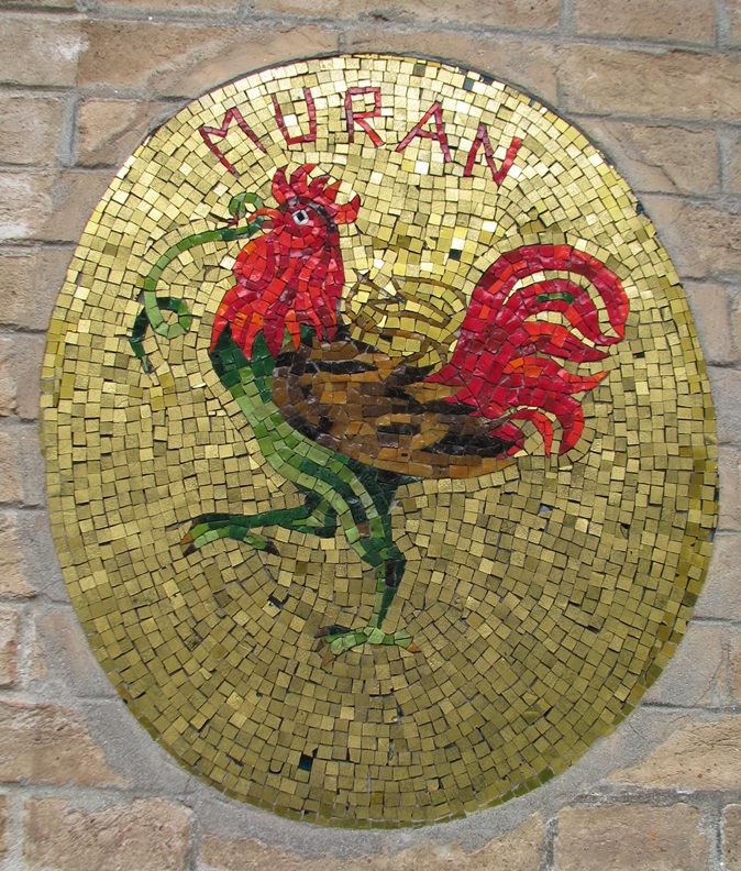
Murano is famous by glass production, it is 1,5 km far from Venice and lays on five islands. The Venetian glass blowing manufactories were expelled from the city because of the frequent fires and they then moved to Murano.
The glassmaking of the neighborhood was famous since the 10th century. The first rule book of glass manufacturers was dated in 1271 and updated continuously. The rules in it covered all the details of glass art: tools, rooms, prentices and masters also. The secret of glass production was strictly kept, since it was important export item of Venetian Republic. That’s why the people who were working there, it was forbidden to leave the Republic. Anyone who bespoke the secret of glass making to an outsider, was punished to death. The glassblowers got more privileges in exchange for this, for example they could be married to noble families.
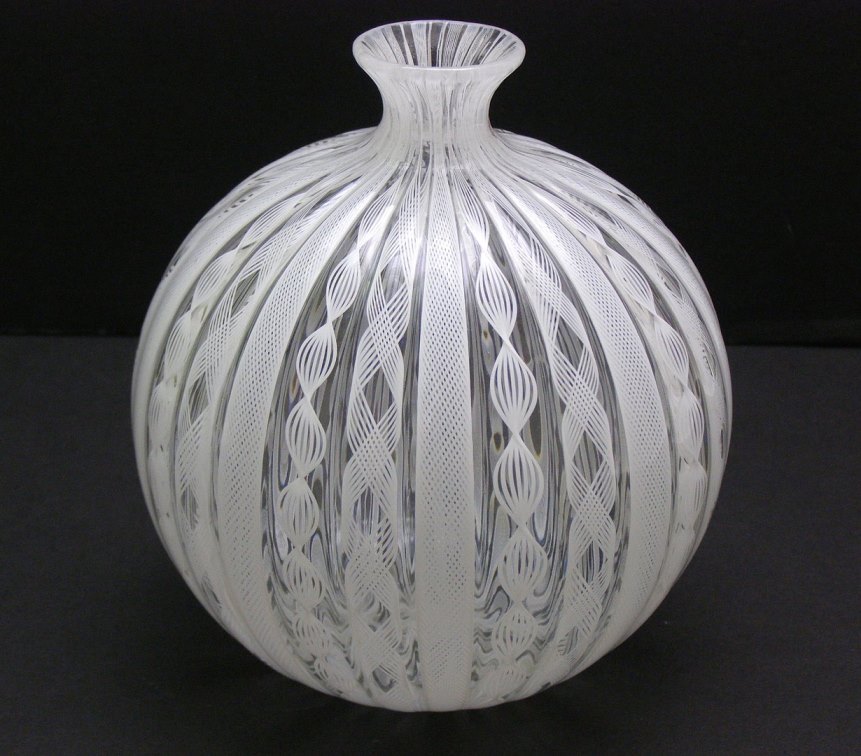
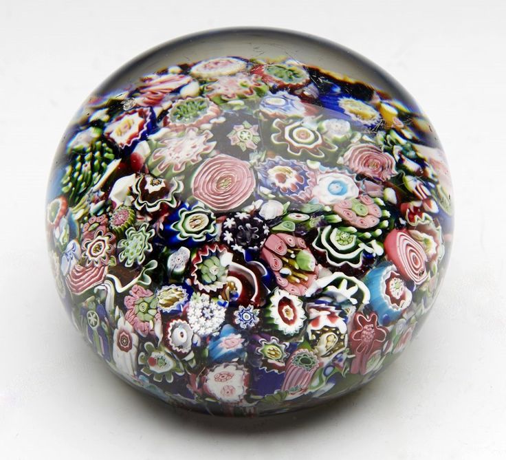
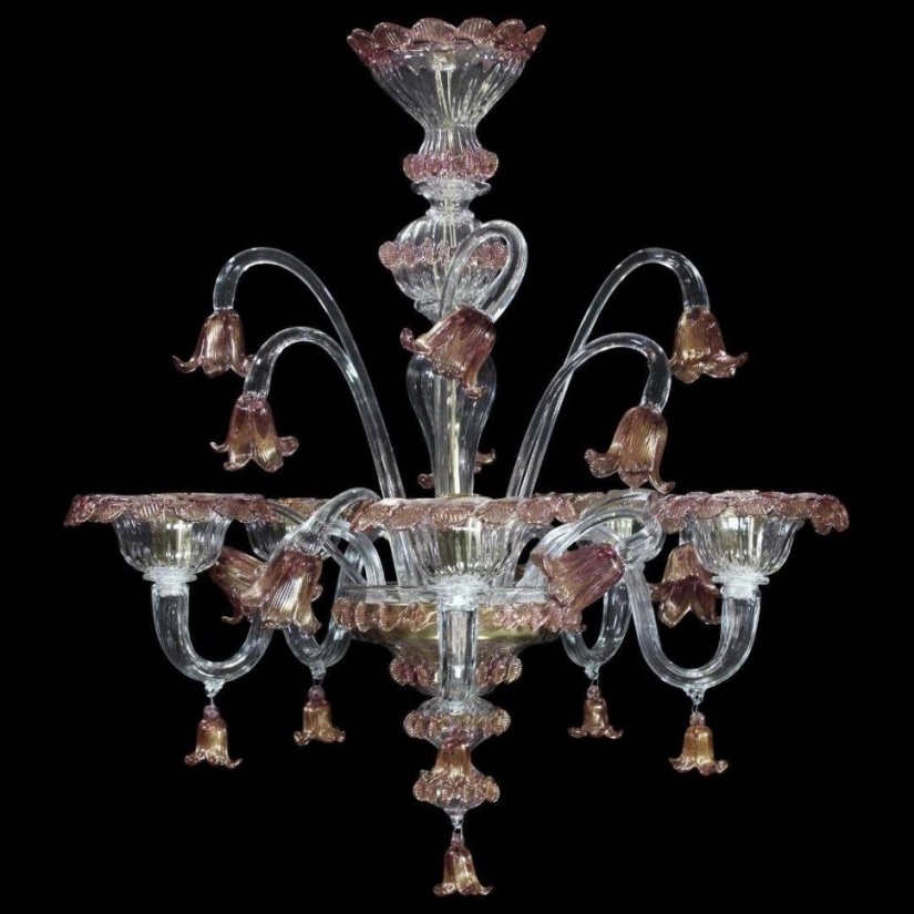
They were famous by the fine quality and special glass making techniques also. The most famous are crystal glass, enameled glass (smalto), gilded glass (aventurin), multicolored glass (millefiori), milk glass (lattimo) and faux precious stones made of glass. First they made only household objects (vases, plates, paperweights etc.). The product range was widened with other interior design objects, for example mirrors and chandeliers. A newly founded workshop began to produce glass tiles from 1854 for renovating the glass mosaics of the buildings. The product range was widened again in the turn of the century by the boom of tourism. They started to produce sculptures and other decorating objects, glass jewels and souvenirs. The session is not a top secret anymore, insomuch glassmakers make their products on the streets to entertain tourists. The Murano glass remained important export items. New household objects appeared in the product range fit for modern times: doorknobs, electric chandeliers, lampshades, handles of faucets etc. The quality is still the highest.
A bigger Murano glass object, for example a chandelier, can be easily the focal point of a room. If you would like to make your home special with a decorating or household object of this kind, ask for help of an interior designer for designing.
Archives

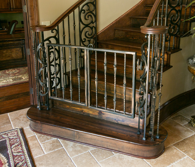
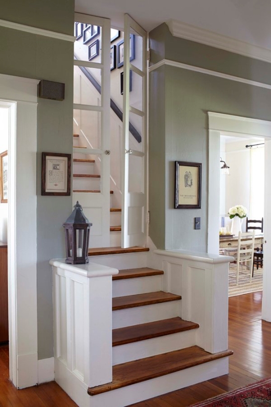
Separate upstairs
How can we separate the upper story of the house in case of open stairs

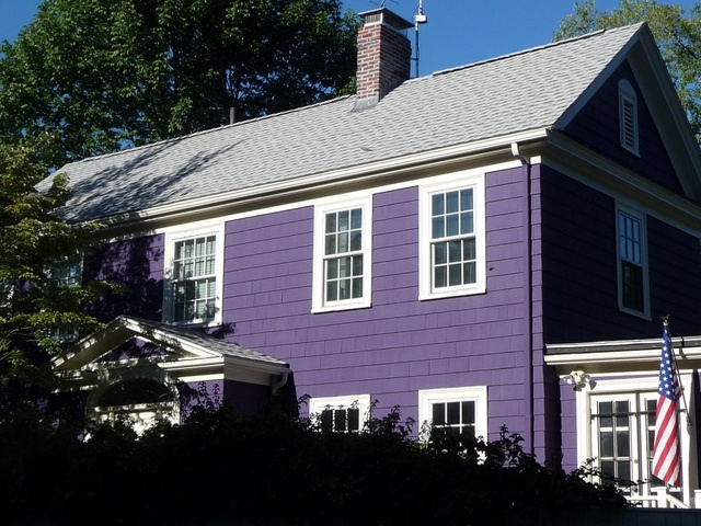
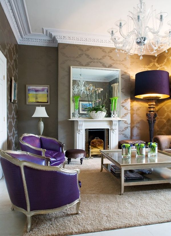
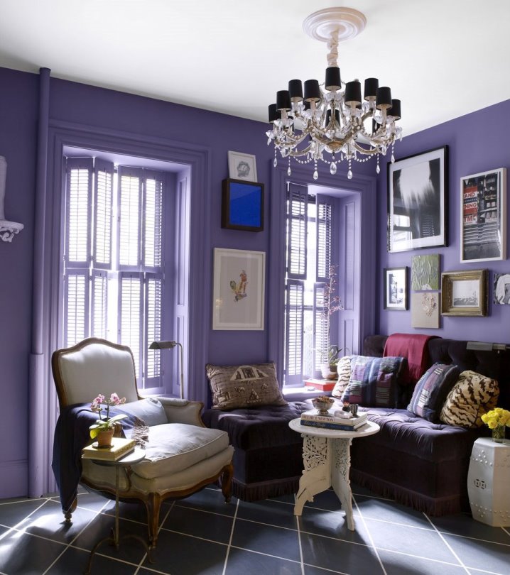
Color of the year 2018
Firm Pantone announces the color of the next year in every December which has an effect on interior design also. Ultra Violet no. 18-3838 is the color of the year in 2018.
Scientifically, it is not a color but a range of short wavelength which is beyond the range of visible light. The color given by Pantone is a cool, vivid and middle strong hue which contains more blue. It can be used well on bigger surfaces also, but it should be counterweighted by neutral colors (black, white, brown, grey, beige) because of its vividness. It is not a food color, so it should be used moderately in the kitchen and dining room, rather only on accessories. It is a popular color since years, not only in interior design.
The purple color always signed or meant a specific or mysterious thing during the history and in symbolism. For example, it was the color of mourning in the French Royal House. It is the favorite color of the clothes of magicians and fairies in tales. It is popular among children also.
Ask for help of an interior designer for making the color of the year 2018 appear in your home in style.


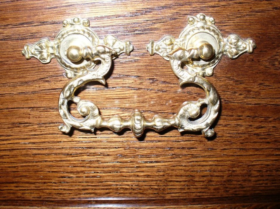
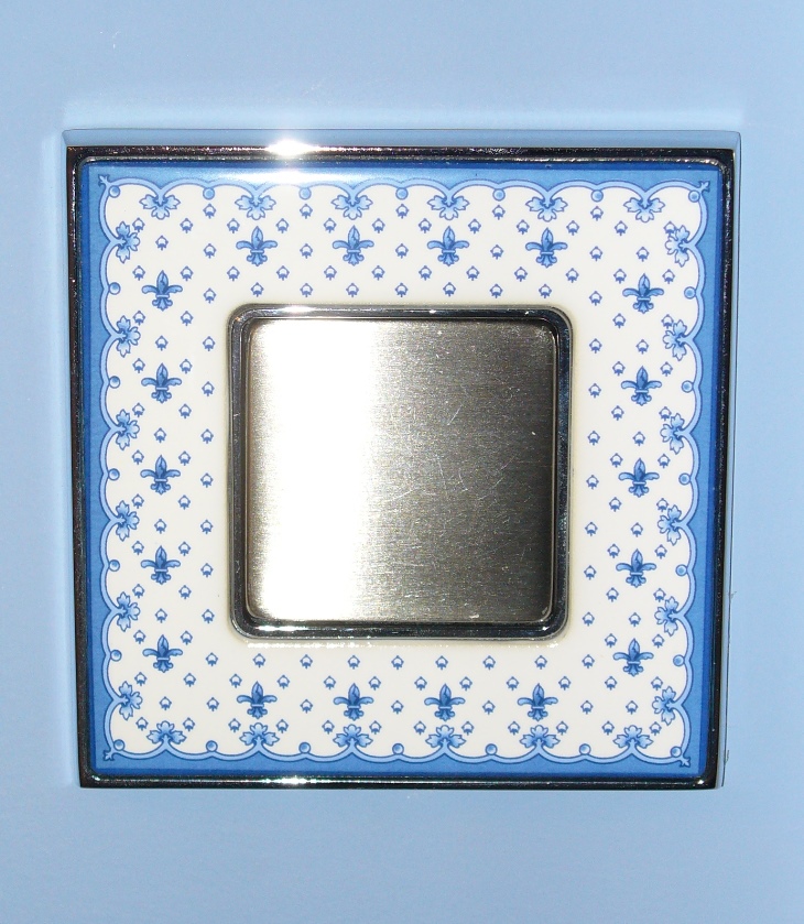
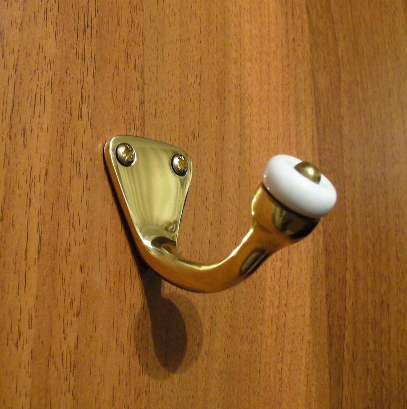
My project 17.
Small details of a classic style interior: brass-porcelain hanger, porcelain inlaid switch, custom made brass handle
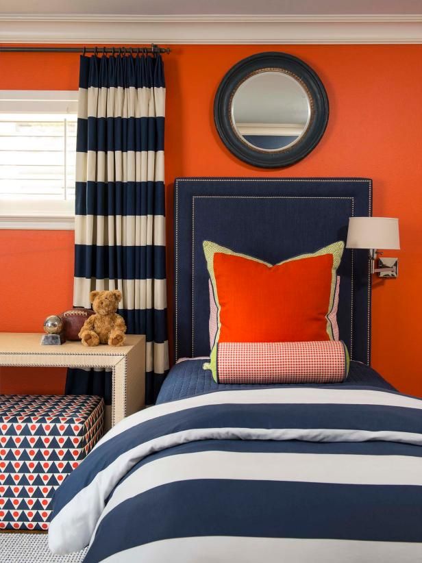
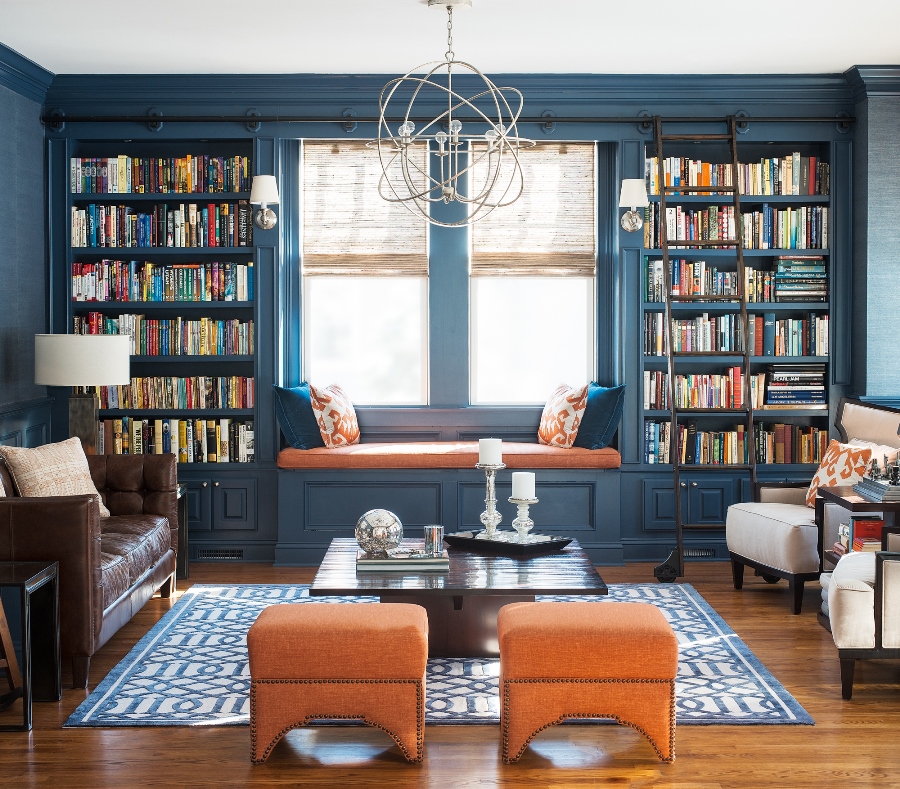
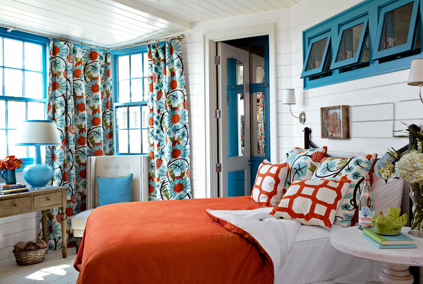
Color pairs 32.
Color pairs: blue-orange
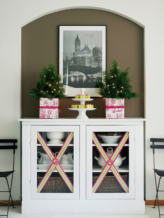
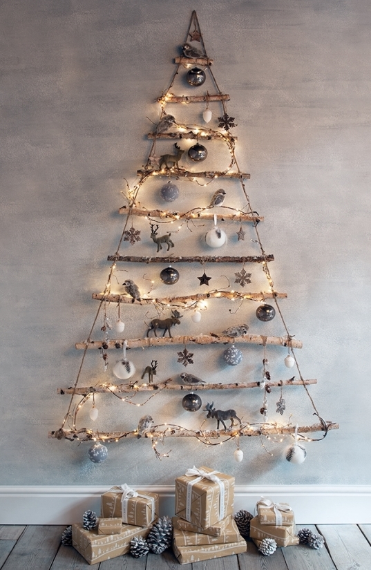
Instead of christmas tree
Some ideas for those who can’t or doesn’t want to buy a christmas tree


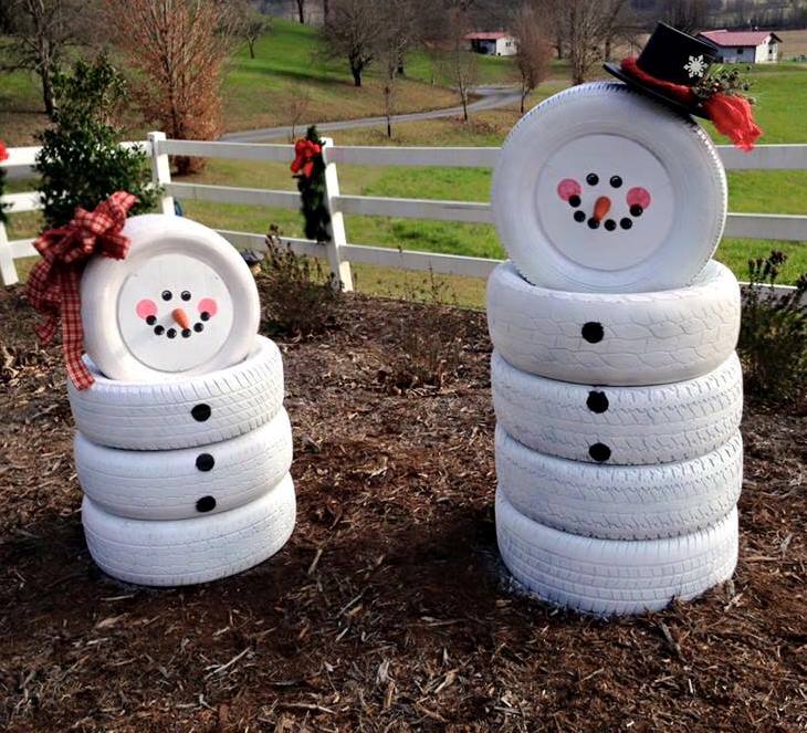
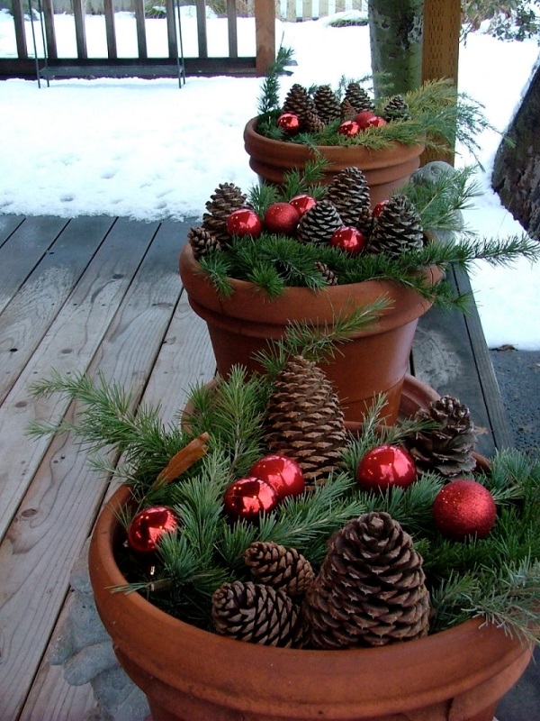
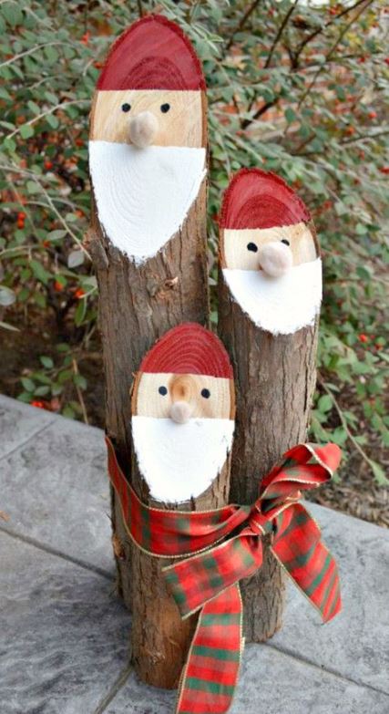
Outdoor christmas decor
DIY outdoor christmas decoration ideas
My project 16.
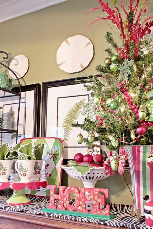
Waiting for Christmas – in classic style

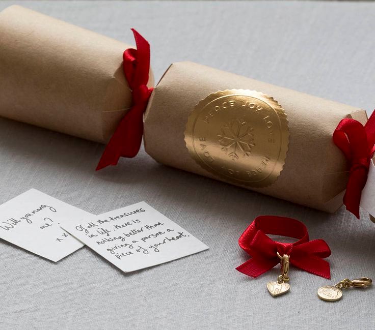
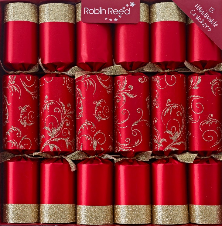
Christmas cracker
Christmas cracker is a popular tradition in the United Kingdom, Ireland and Commonwealth countries. The happy and playful gift was adopted by many countries already, but it is frequently used on other festive or even birthday parties also.
Its base is a zig-zag segmented cardboard tube which is wrapped in color paper, just like a huge fondant. Commonly red, green and gold colors are dominant. When it is pulled apart by two people at its two ends, it has a mild bang sound. As to the tradition, it is a part of the Christmas table set, there is one of it on every plates of the guests. There are small objects inside the cracker: a paper crown (which is worn during the dinner), a quote or riddle, a small toy, for adults another small thing instead of toy (for example bijou).
Its origin dates back to the 1840s. It was invented by a sweets-seller in London, to wrap bonbons in a similar tube. When the sales began to decline, he did a trick and inserted love messages on papers near the sweets. The idea of adding the crackle element came when he heard the crackle of logs on the fire. The variation with presents was introduced and made popular by his son.
Christmas cracker set commonly of 3, 6 or 12 pieces are sold in several places in the Anglo-Saxon countries. It can be purchased in several sizes and all colors of the rainbow. The sets for children and adults are separated. However, it can be made easily by DIY with a toilet paper roll and a Christmas wrapping paper.
Let’s try this funny present this year if you would like to surprise your family at the festive table.


Other christmas shades
Choose not the common shades of red and green for a fresher look of traditional christmas decoration