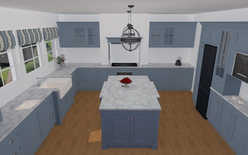
Designed for a competition: house in the style of an english country manor
More pictures: https://classicinteriors.hu/en/references/21-references/67-references17
Archives
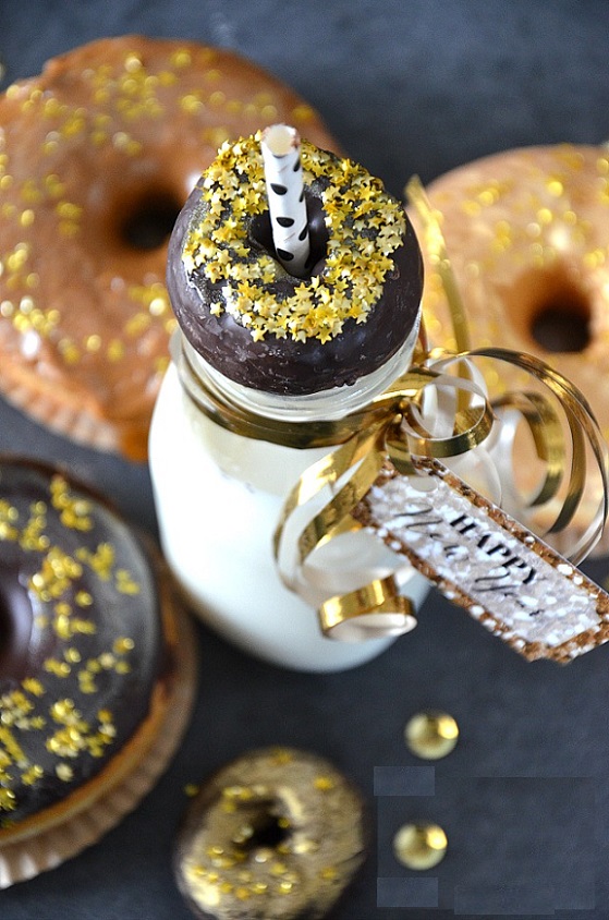
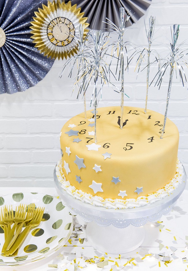
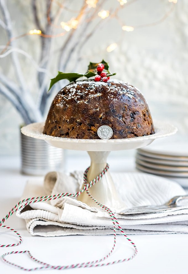
Edible decoration 3.
Edible decorations for New Years Eve

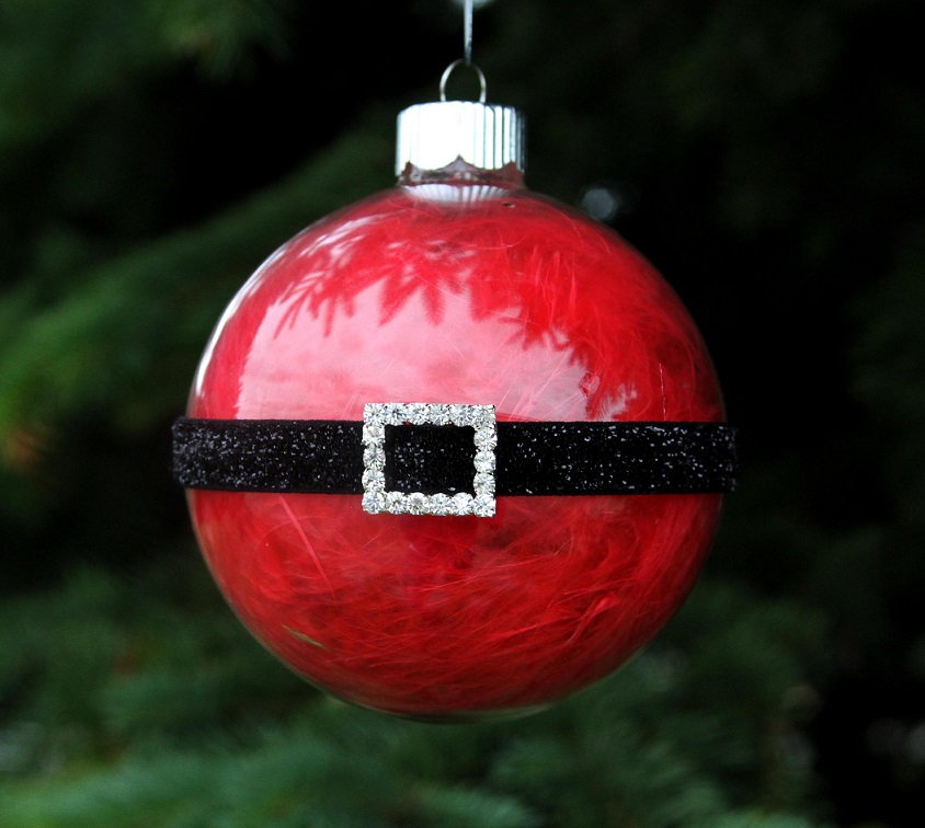
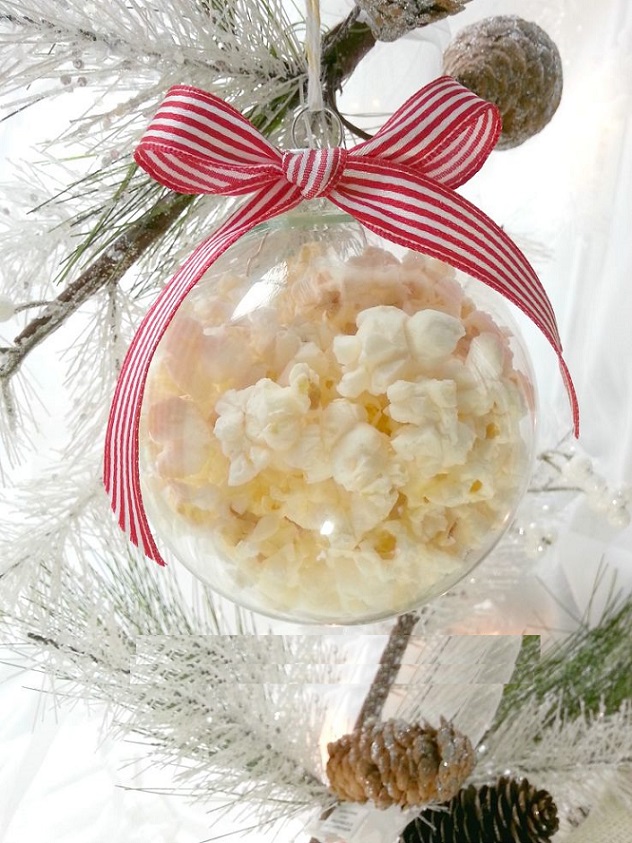
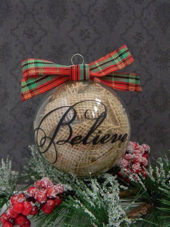
Christmas balls
Decorate the ready-made, empty christmas balls in our unique style
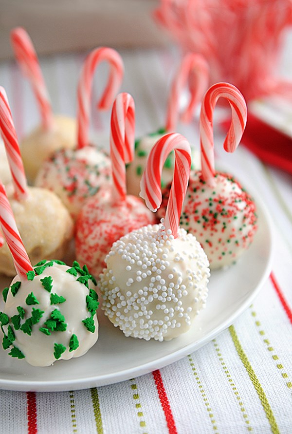
Edible decoration 2.
Edible decorations for Christmas
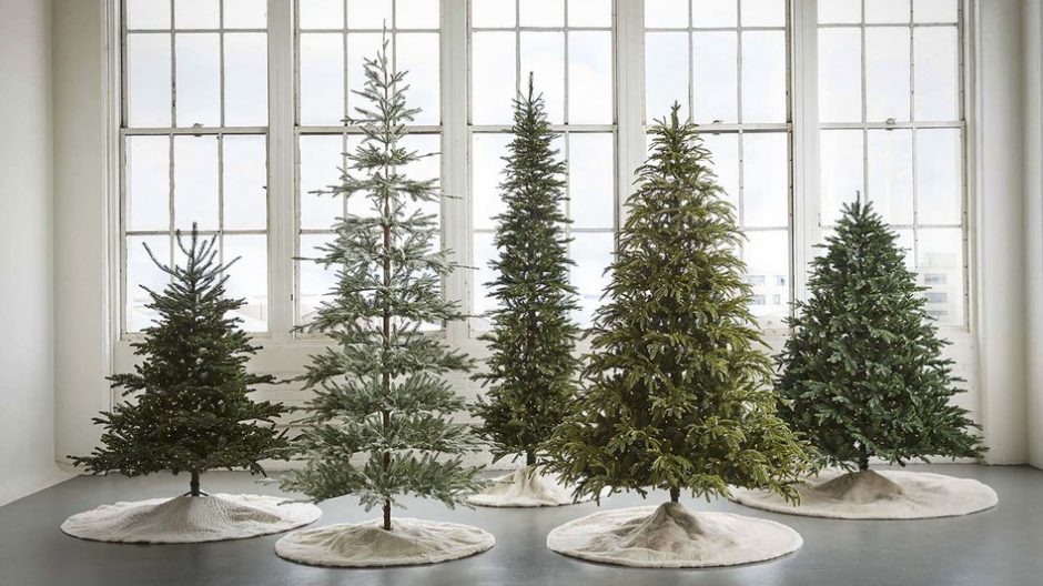
Real or artificial Christmas tree?
Before every Christmas, there is a question: shall we buy a real or an artificial Christmas tree? Here are some thoughts which might help to decide.
Real pine tree: unlike common misbelieves, forests are not destroyed because of Christmas trees. Hungarian producers deal with breeding of pine trees, dedicated to this purpose. Just like in the case of wheat or carrot. New trees are planted in the place of those that were sold, this way the circulation remains. Since it is grown and transported locally, max. 200-250 kilometers far, its ecological footprint is low. Cut trees thrown out in January are taken away for firewood or chopped. Of course, it decomposes. If there is place for it, potted pine tree could be a good option: it can decorate the garden for many years. There are some markets, to where the trees can be brought back after the holidays.
Artificial pine tree: It is made of PVC, mostly in China. Transportation can be measured in thousands of kilometers, so its ecological footprint is significant. PVC is environmentally harmful, though it is reusable with a large energy expenditure (this happens very rarely). It has no fragrance of course. Its advantage: the question of Christmas tree is solved with one-time payment for years. It is quite durable with proper storage, doesn’t shed its needles and doesn’t need watering. It is always perfectly neat and can be purchased in several colors, sizes and finishes.
Ask for help of an interior designer for festive decoration of your home also.


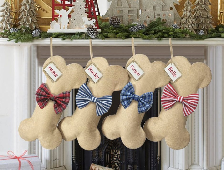
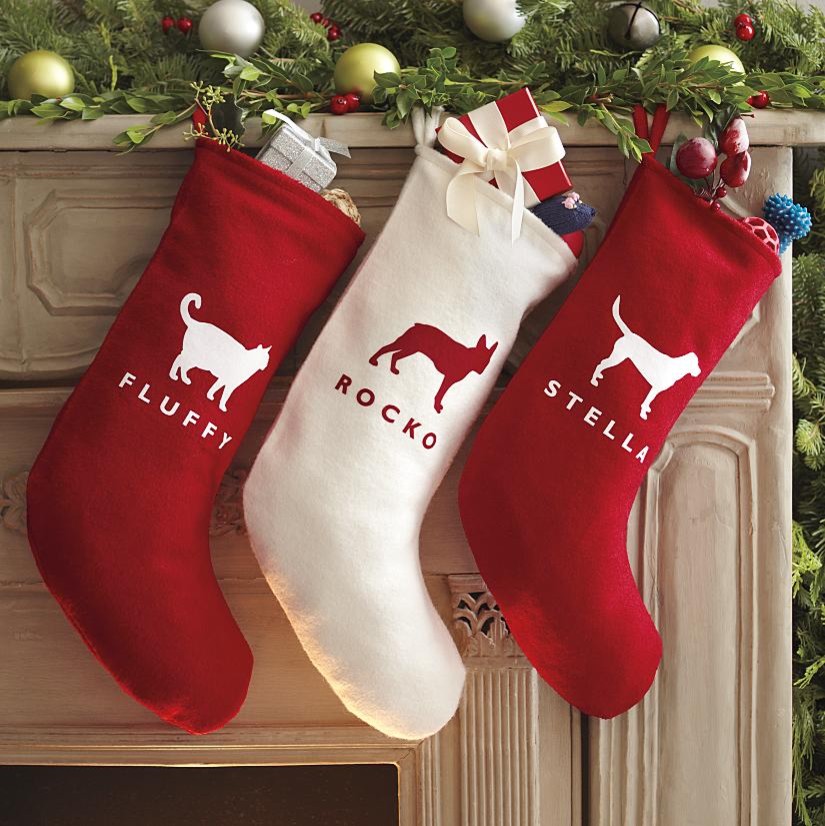
Animal christmas
Don’t forget the christmas presents for our pets

My project 24.
In christmas mood with classic colors


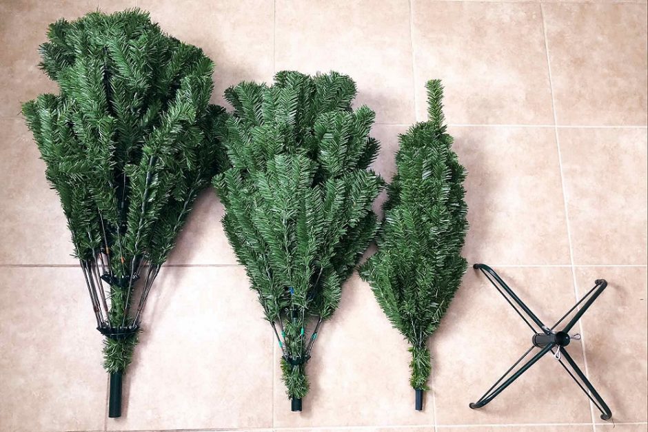
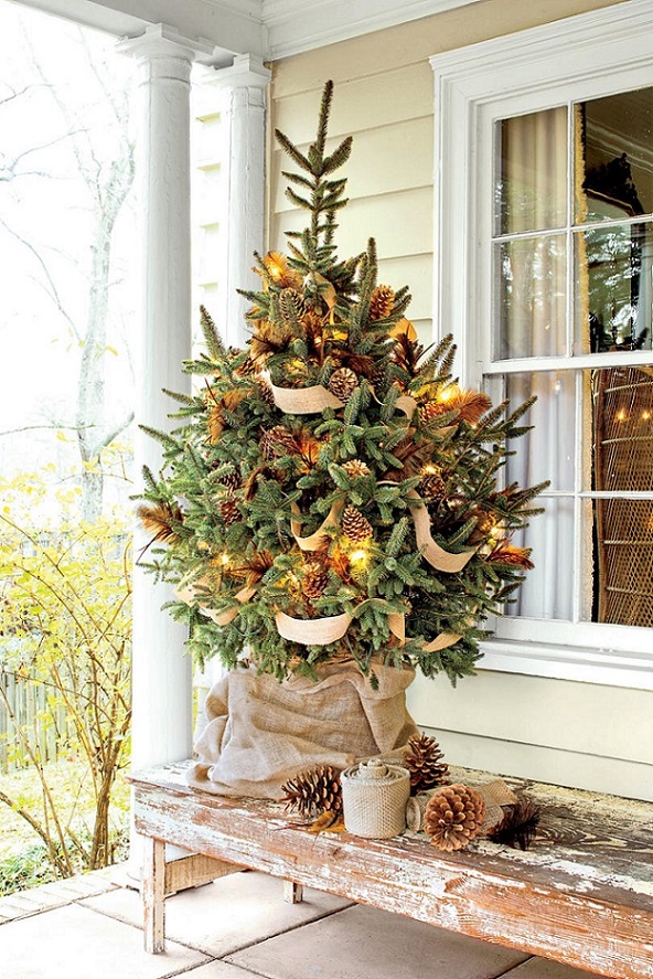
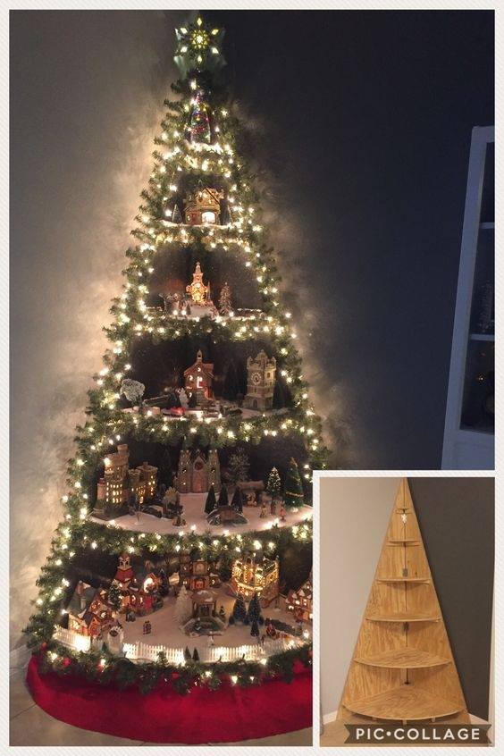
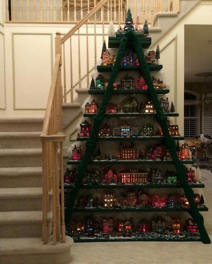
Built christmas tree
„Built” christmas trees for DIY fans

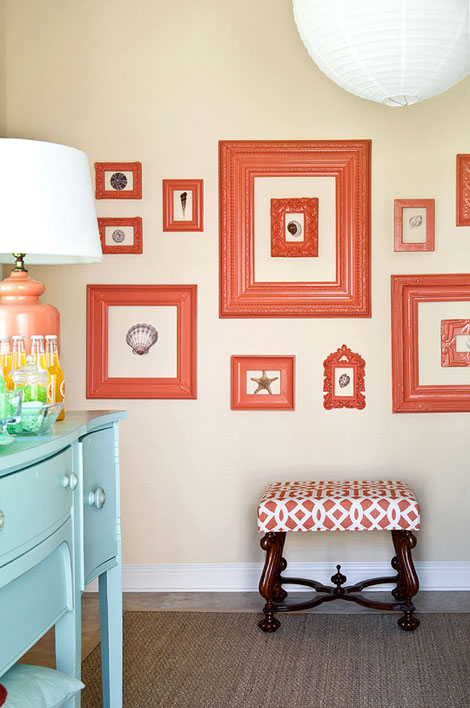
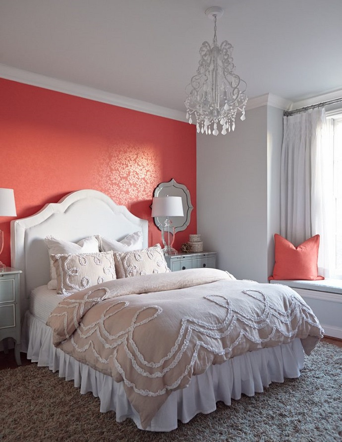
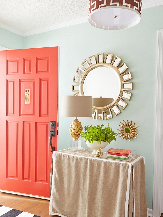
Color of the year 2019
Every December Pantone company announces the color of the next year which has an effect on interior design also. Living Coral no. 16-1546 is the color of the year in 2019.
This is a bright orange color mixed with a tint of pink. It is a warm hue which symbolizes the wildlife and brings joy. Because of these features, perfect dashes of color and focal points can be created with it. Since it is a quite strong, energizing hue, it worth to use less in a bedroom, but can be freely used anywhere else.
It is present in interior design for a long while as an additional color, thanks to the seaside style. A neutral or a darker color palette can be easily popped-up with it. A shade of turquoise blue is its supplementary color which can be connected to water also.
Ask for help of an interior designer for making the color of the year 2019 appear in your home in style.

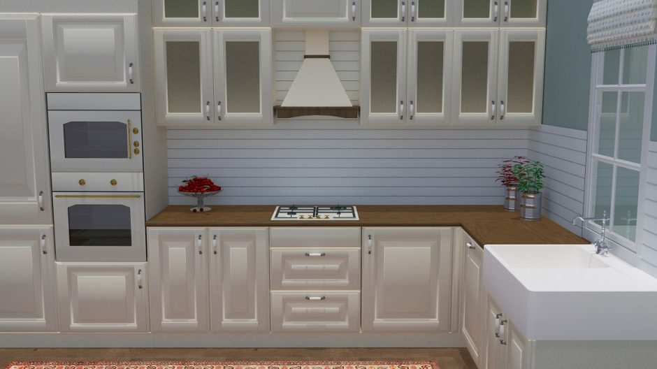
My project 23.
Designed for a competition: family home’s kitchen where the whole family takes part in cooking