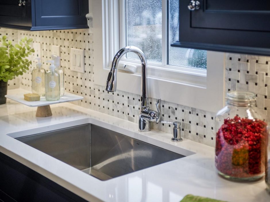
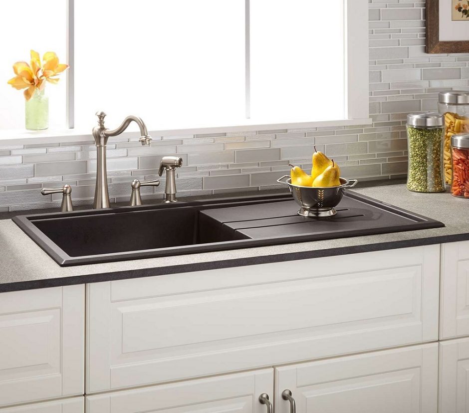
What kind of kitchen sink should be chosen: single bowl, double bowl, with or without drainboard?
Archives

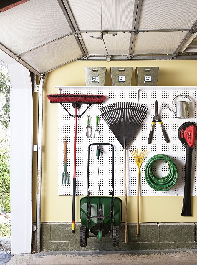
Storage in the garage
Many stuff can be stored even in a small garage with clever storage solutions: garden tools, sport equipments, seasonal decorations, DIY corner etc. make use of wall surfaces and expand towards the ceiling.


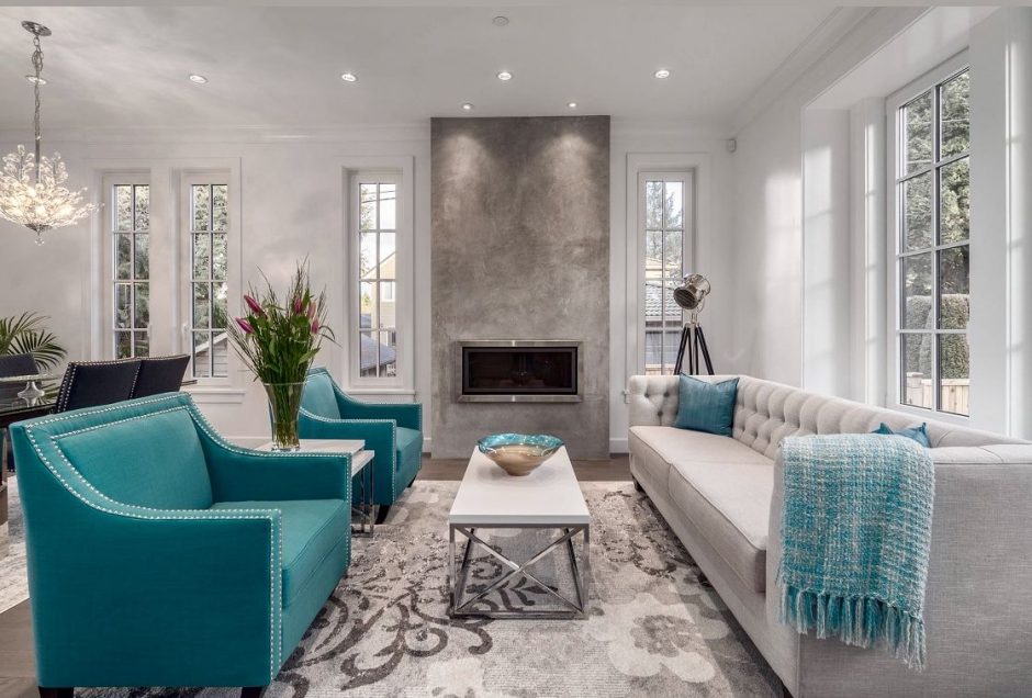
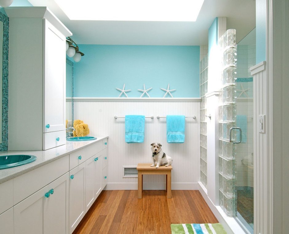
Turquoise 2.
Turquoise is a bright, happy shade of blue, containing green. It is the color of the Carribean waters and Mediterranian sea so, we mainly associate with water and seaside by it. It is a very good complementary color for the neutral colors (white, grey, beige, brown etc.), vitalize the space. It is popular in interior design. In larger quantities, use it in rather sunny rooms. It was named after the semi-precious stone.

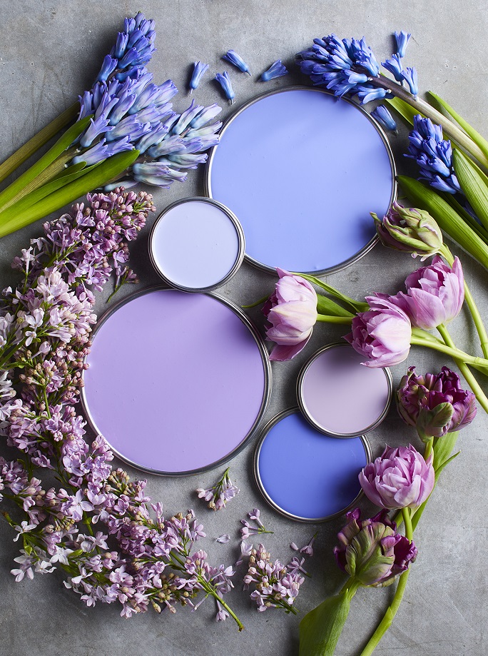
Paint palette 28.
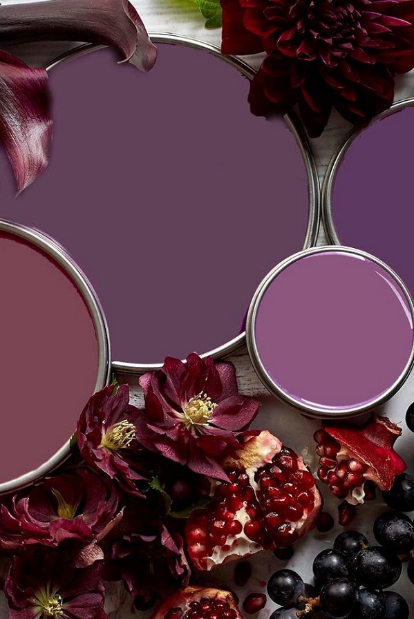
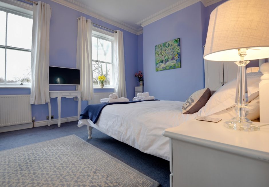
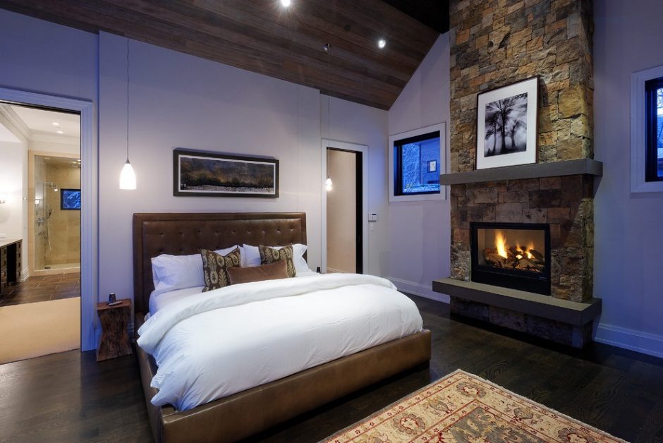
Bluish purples, mauves, purples – none of them is common or „safe” choice, but a pleasantly soothing mood can be achieved by them

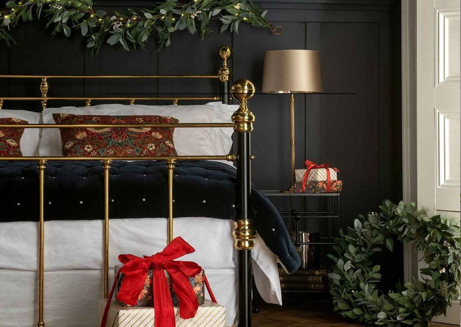
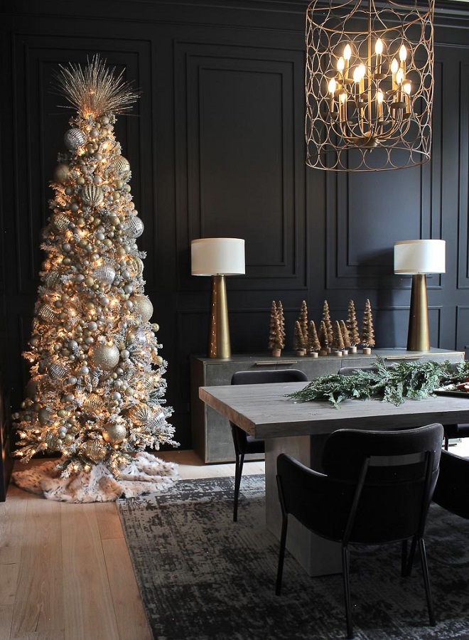
Black Christmas
Black is not exactly a Christmas color, but with a little glitter, anything is possible

Hiding tree stand 2.
Ideas for hiding the not-so-estethic Christmas tree stand

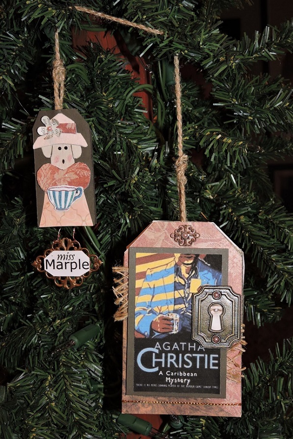
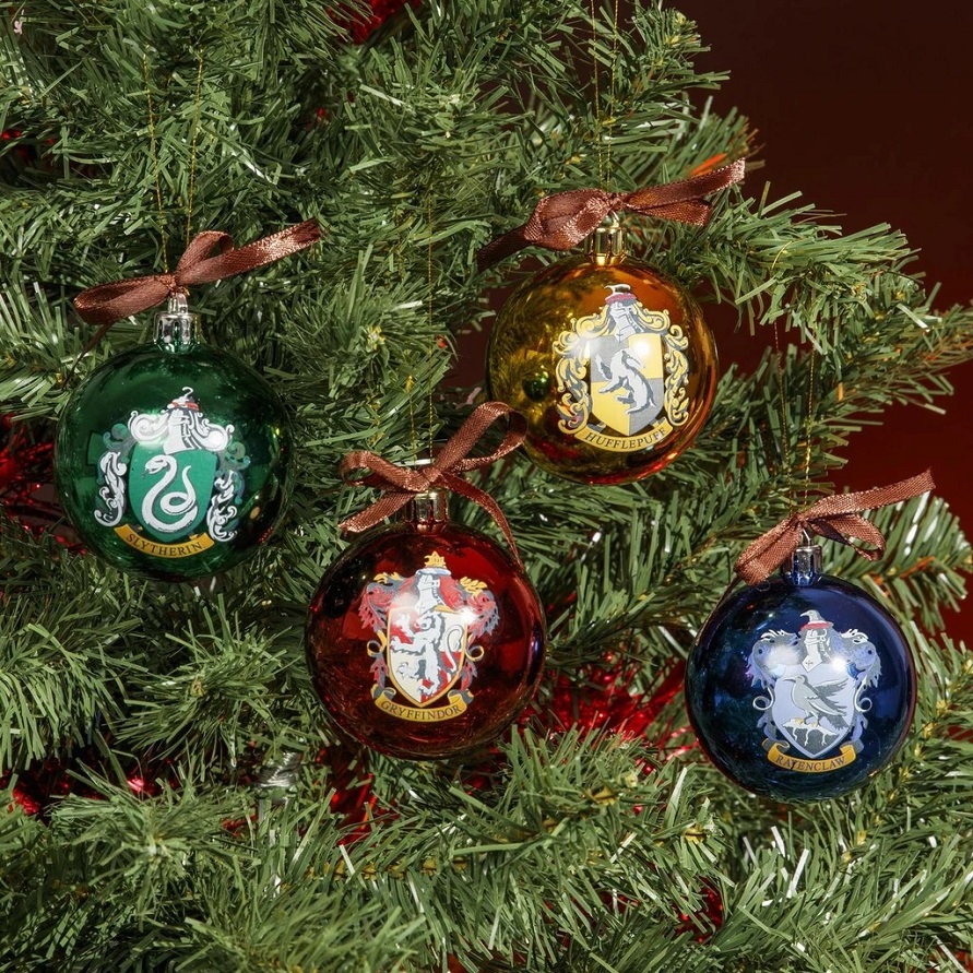
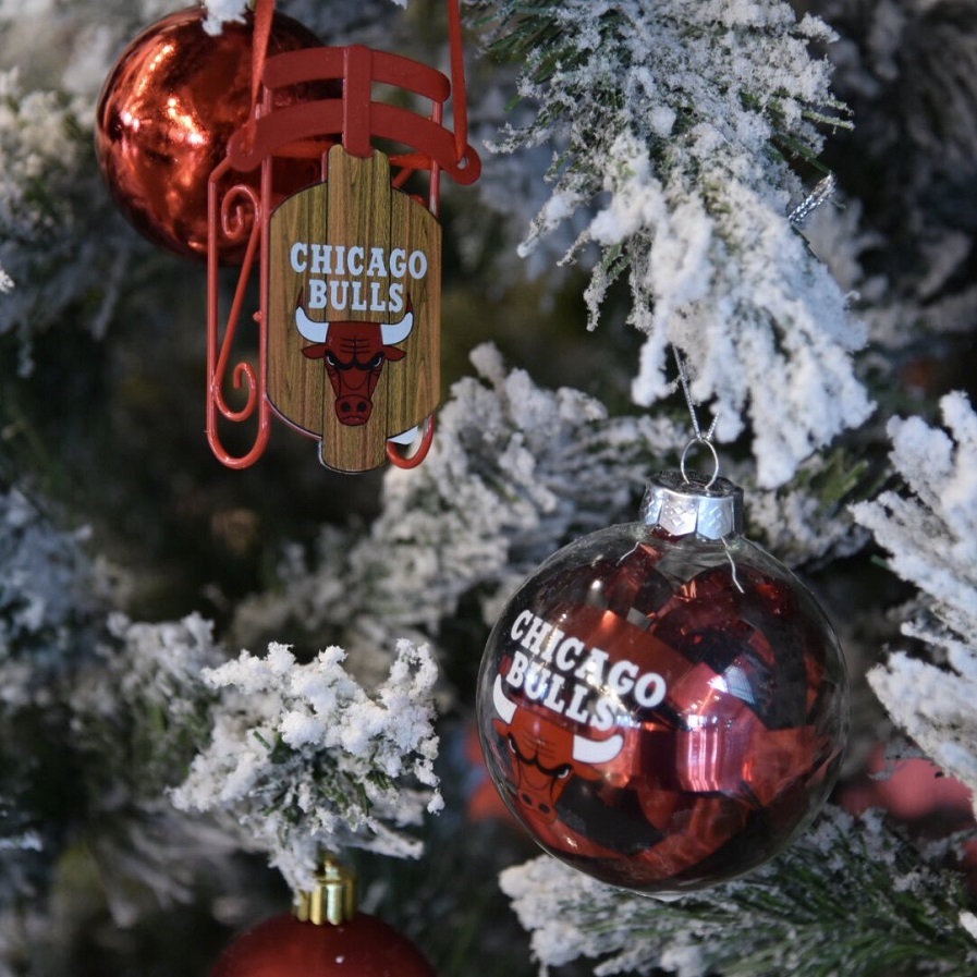
For fans
Christmas ornaments for fans
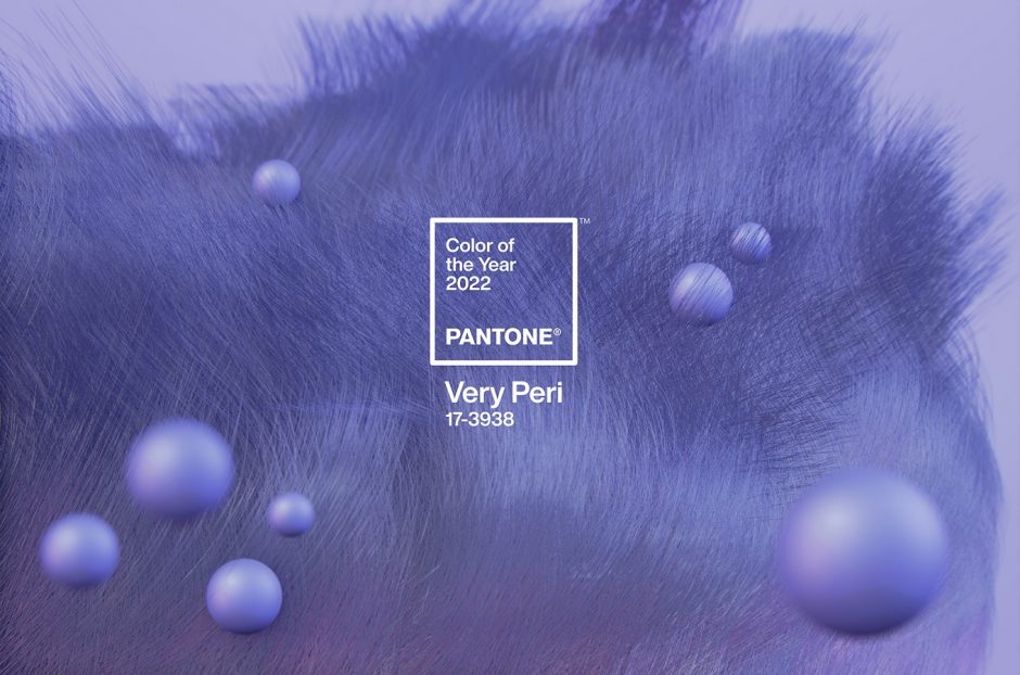
Color of the year 2022
Every December Pantone company announces the color of the next year which effects interior design also. Very Peri no. 17-3938 is the color of the year 2022, which is from periwinkle. It was created specifically for this occasion.
This is a soft, pleasing blue-violet hue, which looks like a pastel although it is not. The blue was mixed with pink rather than red, which gives the slightly airy effect. Since it contains much more blue than pink, it can be classified as blue. It gives you peace of mind, but also gives you curiosity.
It is a medium dark shade, so it can be used in larger quantities. It fits well for country and shabby chic styles, nursery, bedroom or even at home office. It can refresh a palette of neutral colors as it is a cool shade.
Ask for help of an interior designer for making the color of the year 2022 appear in your home in style.


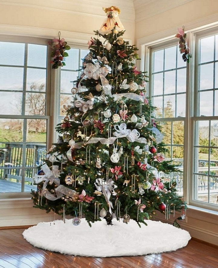
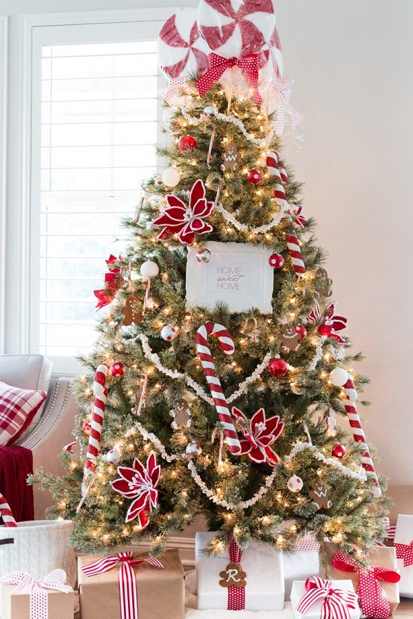
Tree toppers
Unusual topper ideas for the Christmas tree

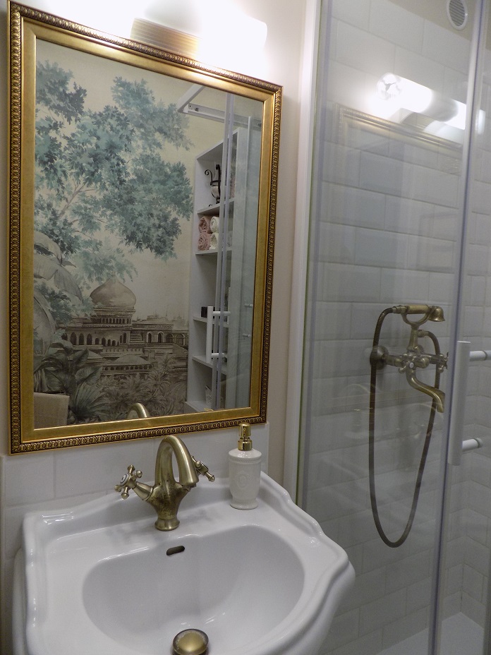
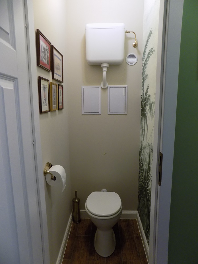
My project 40.
Changing style in a small bathroom and toilet
There is a Coordonné wallpaper from Biggie Home in the focal point
The previous photos are here:
https://blog.classicinteriors.hu/?p=6427&lang=en