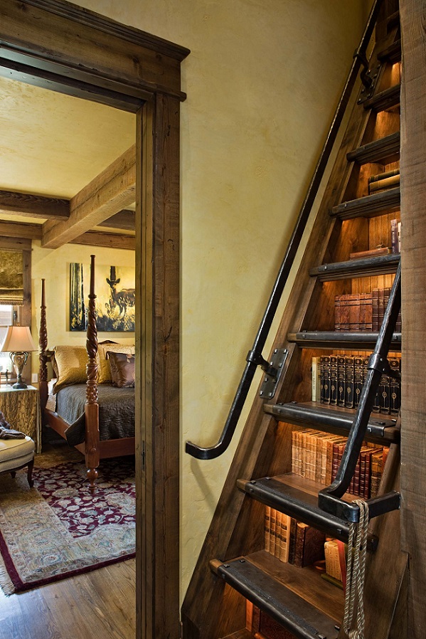
A book collector can create bookshelves anywhere
Archives

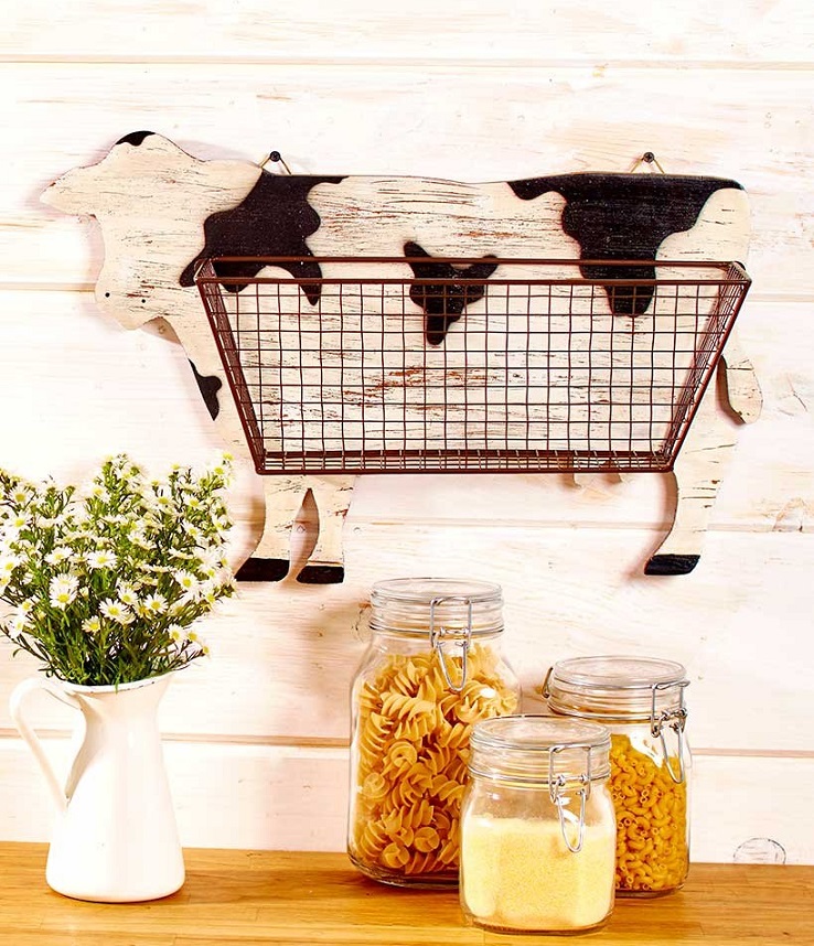
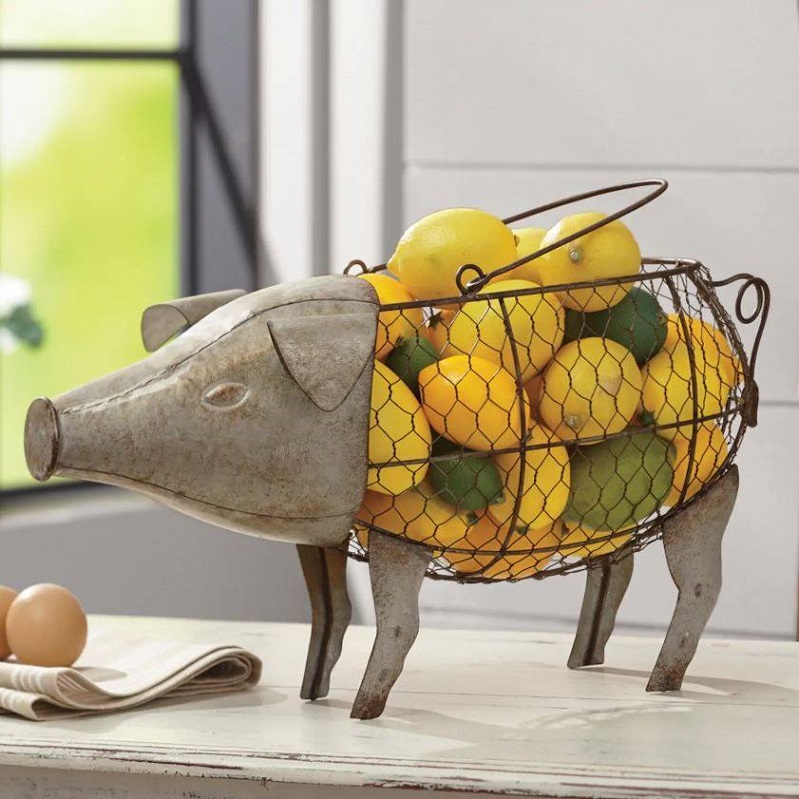
Wire basket
Funny, still decorative kitchen wire baskets

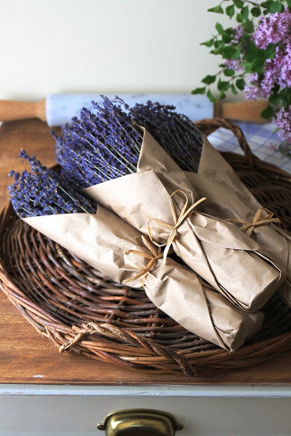
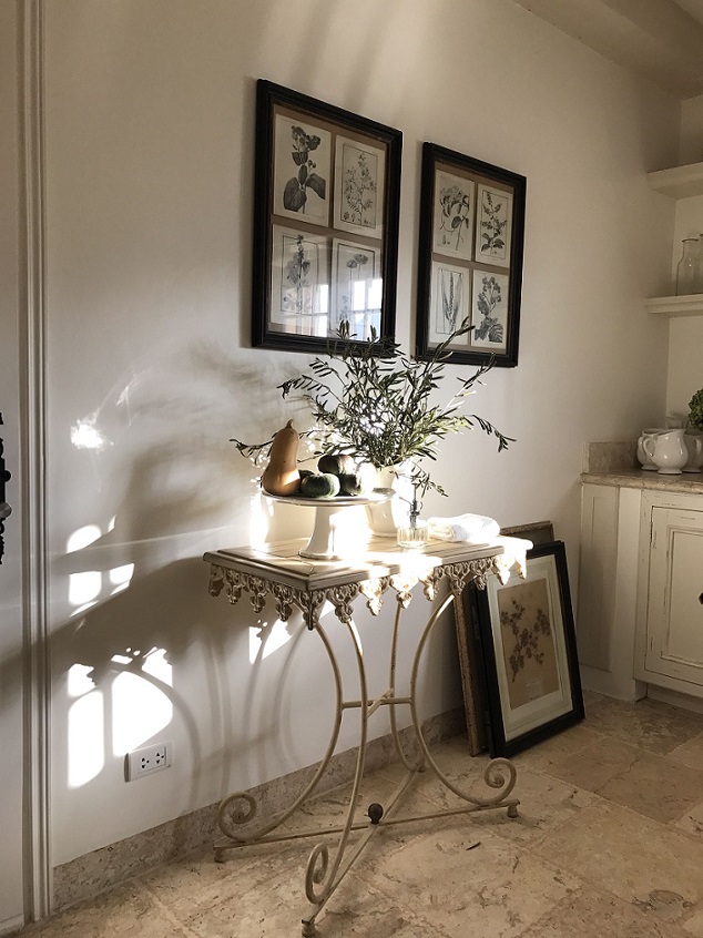
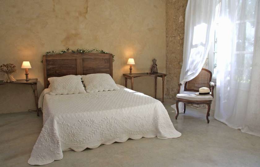
Provence style
Provence style has a continuous popularity since years all over the world. Maybe it captures people with its calming effect.
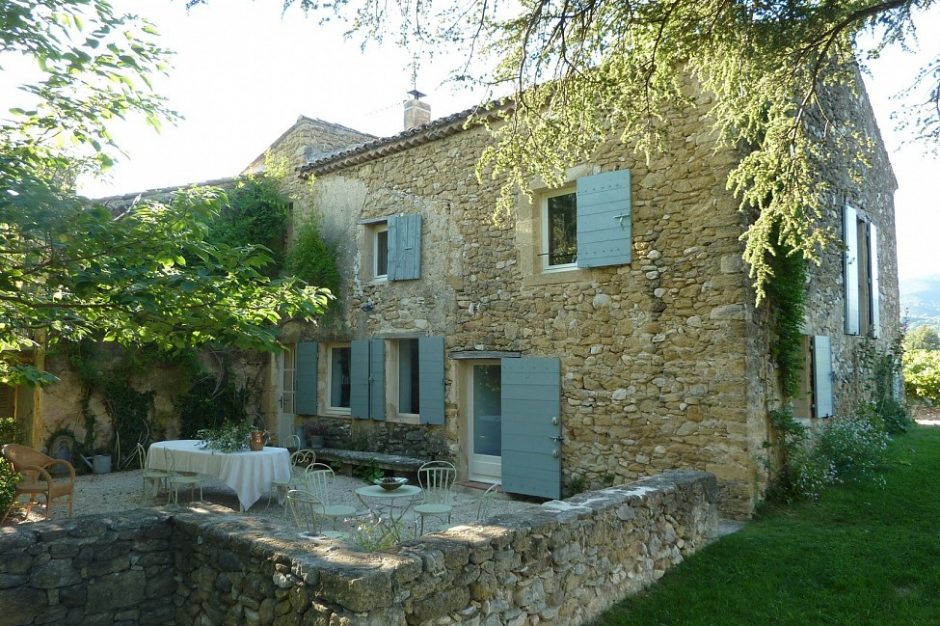
It contains the essence of French country style. Houses were commonly built of freestone, they became the integral part of nature with their unplastered walls. There are shutters on windows, since the interiors have to be protected from strong sunshine. This makes the heavy curtains unnecessary, commonly only cotton voile curtains are on the windows. Frequently French doors are on the ground floor instead of windows. The patio has an outdoor room function. Since the weather is nicely warm, most of the meals are kept here also. The table is placed in the shadow of a pergola or a bigger tree.
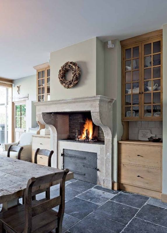
The thick walls protect the house from extreme warming-up. Doors and windows are remained open, this way the cool breeze can blow through the inner rooms also. Walls have light painting. The floor is terracotta or stone paved in the community spaces and bathrooms, there are old wooden floor in the bedrooms. The mood is given by the shabby elegance of wooden furniture and old household objects. It is an important fact, that all of these are original pieces which served generations, so they weren’t made by paint-and-wear technique. They descend in the family or are flee market finds. They can be put on their place after a careful cleaning. Wrought iron accessories and small furniture are common also. These are frequently light colored (off-white, cream, green). The most significant furniture items in the kitchen are the sideboard cabinet, the huge solid wood table and the stone fireplace. Everything was made by hand all over the house from natural local materials. The domination of neutral colors is broken by muted shades (blues, greens, pinks and purples). Nature shows itself in the decoration also. Lavender is the first in the row of flowers, but wildflowers are beloved decorating elements as well.
Ask for help of an interior designer for creating Provence mood in your home.
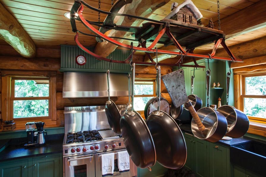
Pot rack
DIY hanging pot racks in the name of recycling


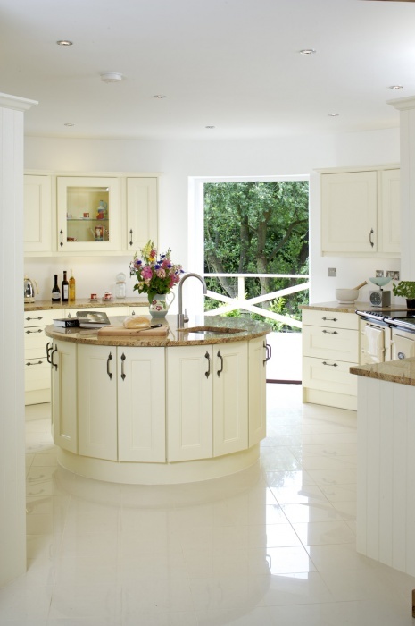
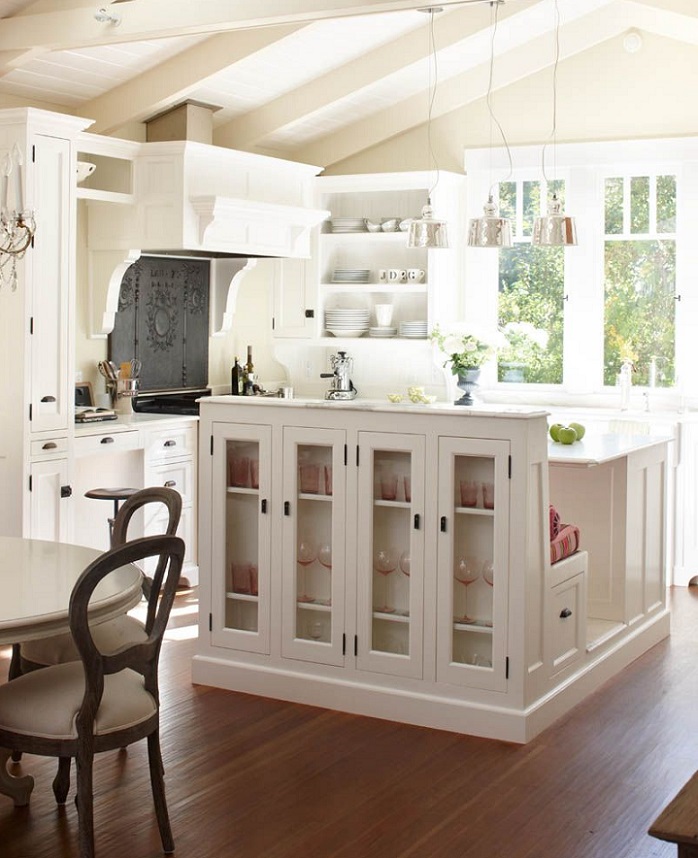
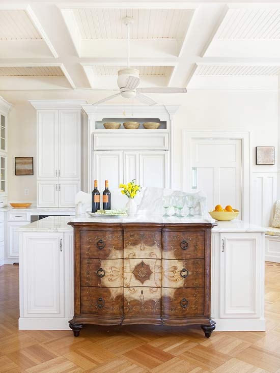
Kitchen islands
Unique and clever kitchen islands
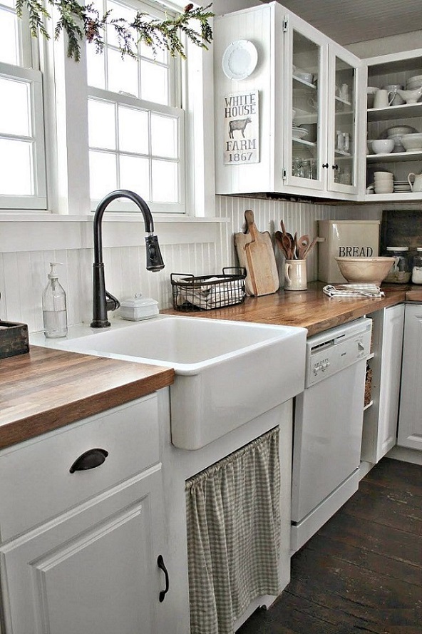
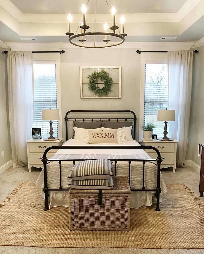
Farmhouse style
Farmhouse style: neutral colors, natural materials, vintage accessories and decoration elements
Feng Shui – career
Job and career are important for everybody, because these provide livelihood. We can strengthen this life area also with the help of Feng Shui, improving our quality of live.
The area attached to this in our home is the living room in the case of men and kitchen in the case of women, but the living room represents this category in general. These are connected to marks of Sun and Moon, namely mean the nature of paterfamilias and materfamilias. This is so if there is a single person or a couple without children.
Usually these aims have to be reached (without limitation) in a career:
– help of promotion
– starting own proposition
– help changing workplace
– achieving honorable mention at workplace
It is true in every Feng Shui advice that it has to be customized to the certain person and space, there are no two identical cases. Generally speaking, energizing effect of red color helps improving the best of things connected with money/career. However, you have to pay attention to the quantity, because too much of everything can do harm. Besides, the effect on a person is not a negligible since there are many who doesn’t like this color. In this case pink and strong orange could also help. Small changes can create big difference, you don’t have to think of changing the sofa to a red one or painting the whole room.
We can activate the Wealth/Success corner (4th) of Bagua map with red color also. It’s the best to place here all the things connected to job (home office or just a desk). Don’t forget to activate 9th life area (Fame/Reputation) with it also in this case.
The aim should be set out firmly, we have to draw it clearly to ourselves what we want to reach. Writing this on a paper is the best, as detailed as possible. For example: what should be the profile of the new company, what kind of colleagues to have, minimum salary, working time and some similar. Be grateful for what you have already achieved: present job, position, salary etc. (Sometimes it’s not easy…). Attitude depends only on us, nobody can be positive instead of us.
Everybody is the master of his/her destiny, so changes can be achieved by oneself. Feng Shui provides the toolbar, an interior designer who has massive bases in the area, provides a helping hand for this.


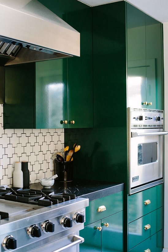
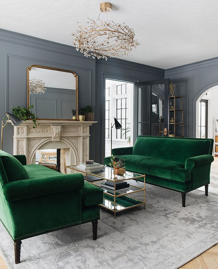
Emerald green
Emerald green is a strong, cool (with a tint of blue), dark hue of green which shows the precious stone’s luxury. This was the color of the year in 2013.

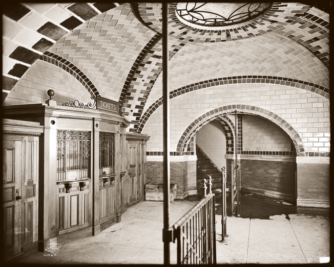
Subway tile
The ceramic “subway” tile appeared at the beginning of the 1900s in the stations of New York subway inaugurated in those days. It became popular very soon, so it appeared in pre-war homes as kitchen and bathroom pavement. Easy to clean, reflects light and doesn’t absorb grease. It didn’t change at all in over hundred years. Its modern variations are different only in size and color.
The most frequently used size is 10×20 cm. It’s easy to count with and to handle. Size 7,5×15 cm is also a classic one. Models with size 10×30 and 7,5×30 cm represent the modern line.
The shiny surfaced is the absolute traditional, original type. Matt surface came in fashion a couple of years ago, rustic/vintage styles were serviced with cracked glazed variation.
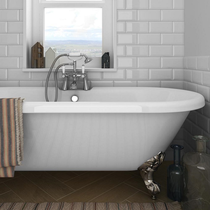
There are two types of surface. Beveled: all four edges are cut angularly, so it is three dimensional. Simple: its surface is flat and plain which is different from an ordinary wall tile only in size.
Among colors, white was always the most popular – just like today. Cream, sage green, dark green and black belong to classic colors also. Current trends here are: turquoise, grey, lime green, mauve etc. We can surely find a perfect one for our taste.
The size of the applied interstice for metro tiles can be between 2-5 mm. Wider one can be applied for the beveled type. Traditionally, its color is the same as the tile’s, but using a different colored interstice is popular also. White-grey pairing is the most common which gives it a more modern, industrial look. Interesting space can be reached with a bold colored (red, green etc.) interstice.
Decor elements can be also purchased for metro tiles. They can be combined with self-patterned or color printed elements. The really special metal (golden, silver colored) decoration elements can be bought by piece, the others by square meters. Long and narrow finials and square beveled complementing pieces can be found in the collection.
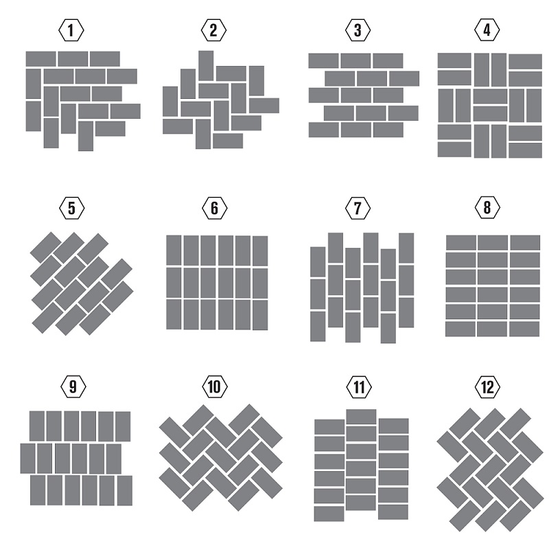
We can try several tiling patterns. The classic half-offset brick pattern never goes out of fashion. Herring bone and double basket wave are popular for a long time also. The modern solution is without any offset, where all the interstices align.
Since it is a perfectly traditional and simple-lined tile, it fits for almost every style, especially the shiny beveled type. That’s why it’s easy to pair with other pavements. Maybe it’s the most elegant with wooden like tiles, but it can be put with concrete tiles, black-and-white paving, old bricks or even polished concrete floor.
Ask for help of an interior designer for choosing the proper pavements.


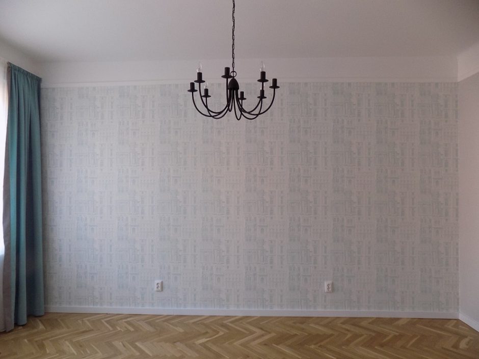
My project 26.
Downtown flat renovated for renting (without furniture)
More photos: https://classicinteriors.hu/hu/referenciak/20-referencia/62-referencia16