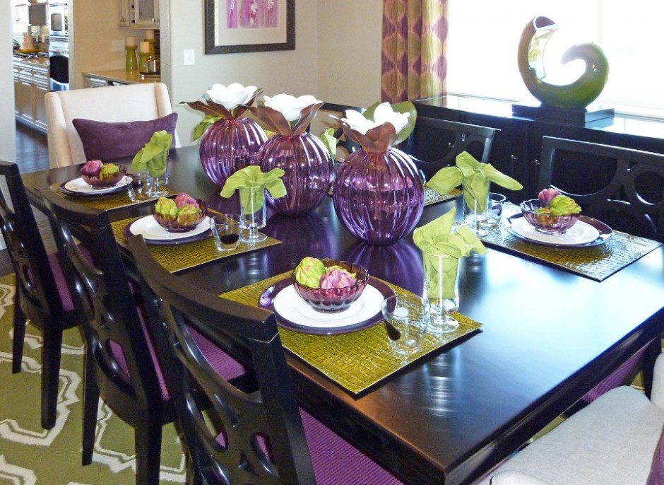
Color pairs: purple-green
Archives


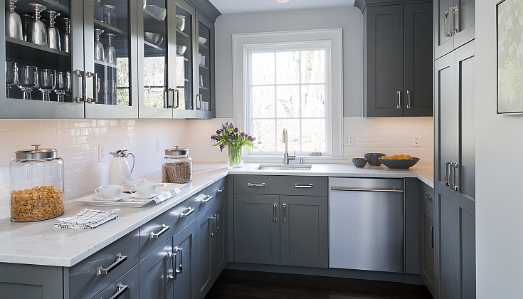
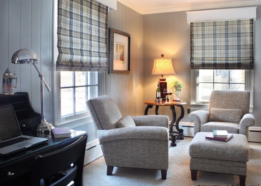
Grey
Who says that grey is unfeatured and boring?

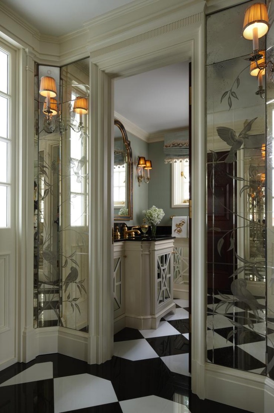
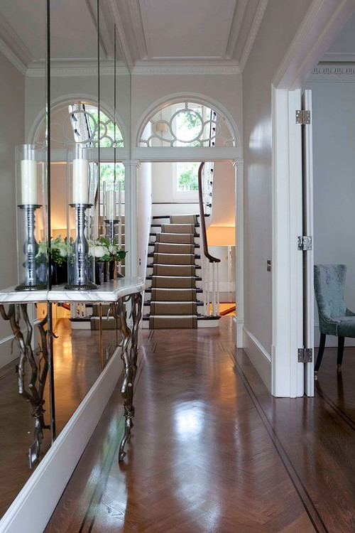
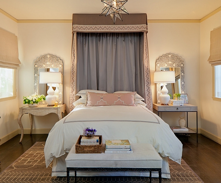
Mirrors
In old times mystic power was assigned to mirror, frequently it was thought as a door to other worlds. It still has an important role in our lives, not only in dressing but as a useful element in interior design also.
The main feature of mirror is reflecting the light and doubling the sight of the objects. This is exploited when a space is furnished with it. If light can’t be brought in a room, for example an inner corridor or hall, hang bigger mirrors on the wall, even opposite to each other, this way the light will be reflected to and from between them. This is the solution if the space is narrow also. Even one single big mirror can multiply the sense of space. They can be used as decorations instead of pictures. Let’s hang old faceted mirrors in different sizes on the wall in a desired arrangement. They will be as elegant as paintings.
However, some things have to be considered when placing them. In a bedroom a mirror should be placed only if it is not visible from the bed because in the other case we would react to every single movement of ourselves and falling asleep would be harder. In the dining room it should be placed on such height that the guests sitting at the table couldn’t see themselves in it while eating. It is practical to hang a full size piece near the entrance door, this way a last checking glance on the dress can be done when leaving.
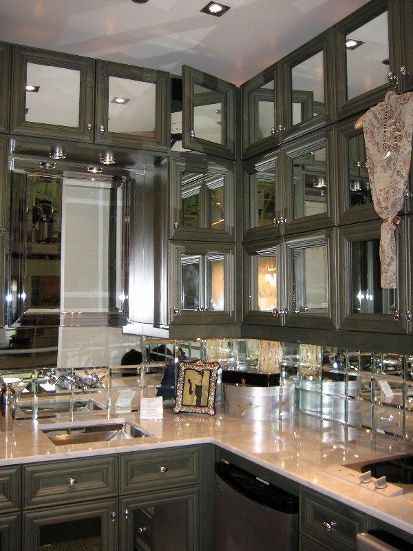
It is a decorative solution in a kitchen to put antiqued mirrors in the doors of the upper cabinets instead of glass. This can be a good option for the backsplash also between the two cabinets instead of tiling. Pieces in floor to ceiling size can be placed in the gardrobe, home fitness room or bathroom.
If you think that some mirrors could renew your home also, ask for help of an interior designer for choosing and placing the proper pieces.

Red
Red is one of the three elementary colors. The most striking member of the color wheel, that’s why it is beloved by many people. Its complementary is green.
As a physiological effect, red increases blood pressure, has exciting effect on nervous system, fasten metabolism, it’s activating effect increases vitality but causes stress and makes one nervous at the same time. It is the most noticeable at daylight. We associate to love, sexuality, fire, blood and war by it. It means danger and prohibition in symbolism, that’s why it is used for danger signals in traffic. It is frequently used at groups of disaster protection and healthcare companies, just think about Red Cross and fire departments. In old times red was one of the most expensive clothes dyes which was made of cochineals or dye-murexes, thus only the rich could afford it, so it was connected with wealth also (e.g. carmine edged togas of ancient Romans, robes of the cardinals). The red lamp quarter got this name not by chance also.
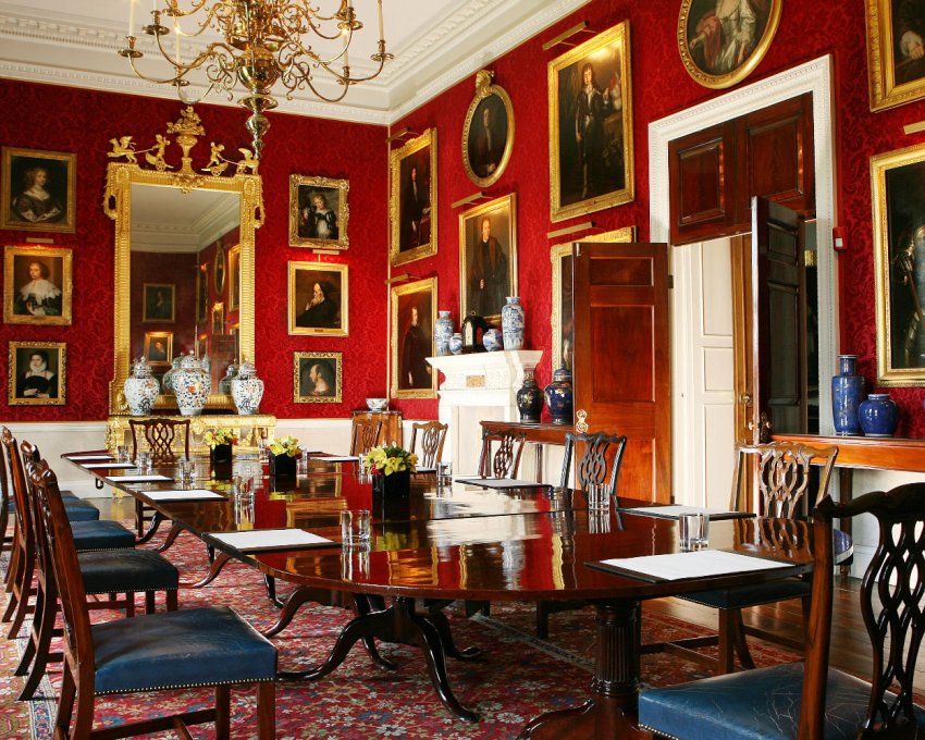
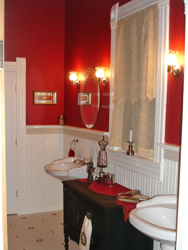
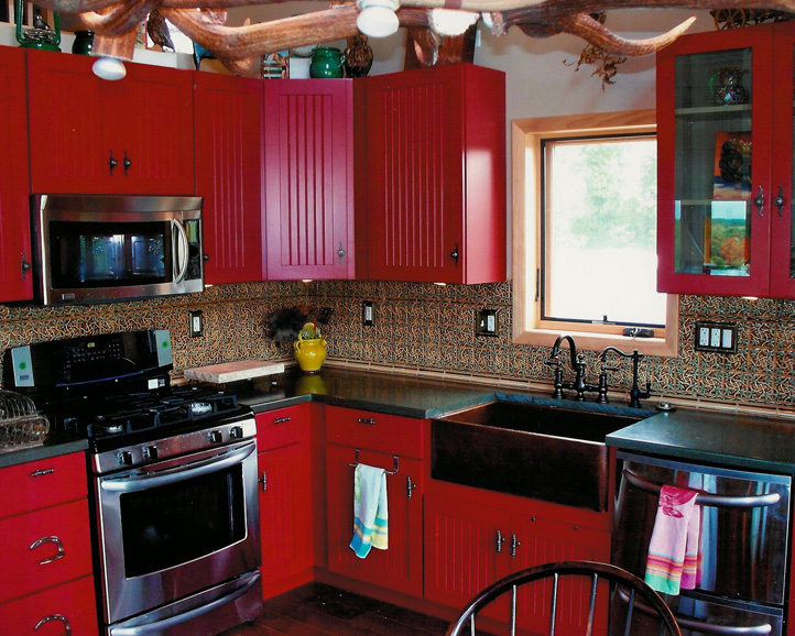
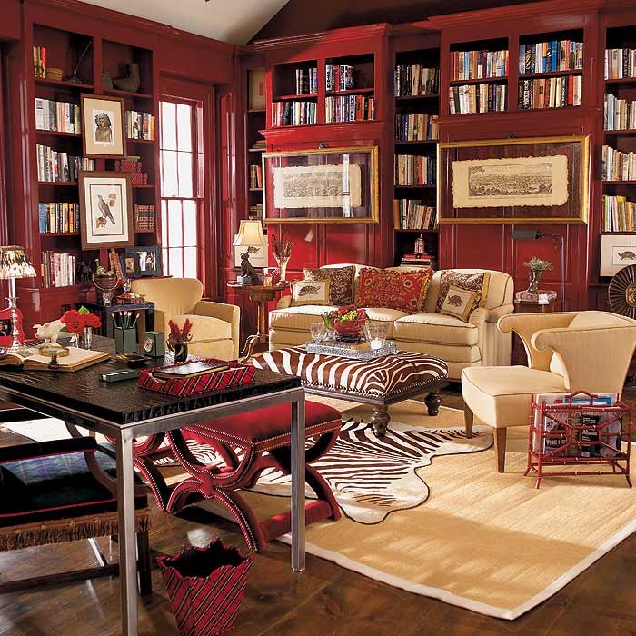
Red has the most intensive narrowing effect among warm colors, that’s why we feel the room in this color much smaller. It is a food-color, so fits well for dining room and kitchen but it can be used in home office too because of its stimulative effect. Many people paint the walls of their bedroom red because it is the color of love. But this is not a good solution for a long term, it causes sleep disorders and nervous tension. The bedroom should be calming, if red is desired to bring in anyway, it shouldn’t be seen from bed. For example, lay a red carpet, paint red only the wall behind the bed, put a bedspread or cushions on the bed which will be put away before sleeping. Handle it cautiously anyhow, because it is a very intrusive and aggressive color. Use it rather on accessories or as a focal point at home. Its strength can be blunted with white or cream. It looks very good in combination with black, dark brown or grey. Its deeper tones are more elegant, for example claret or burgundy red. These were frequently used as background color for gilded framed paintings as a gallery.
Feng Shui assigns red to fire element. It is the color of Jang, the male side. It belongs to the 1st chakra (root). This is the color of good luck in China.
It is used by very dashing, fast-expanding, mass-producing companies in business life as color of their logos or products. It comes into view immediately on the shelves of the shops or in the advertisements.
It’s not an easy task to create a real elegant red interior, so ask for help of an interior designer-color adviser already for planning!
Brown
Brown is gained by mixing red and green colours, thus all the three base colours are involved. This is the most liked ground colour. It has warm and cold hues, the laters have greyish tone. Brown is considered as masculine colour.
This colour is associated to force, safety, maternity, simplicity, diligence. According to physiological effect it is relaxing, protecting. It’s also a food colour, first we associate to the fine cookies. In ancient Egypt, good dreams were marked with brown colour. In the medieval and early modern Europe it was one of the basic colour of the clothing of poor people, since they couldn’t afford the dyed fabrics. In England however brown was the determining colour of the wardrobe of the perfectly elegant gentlemen for long time.
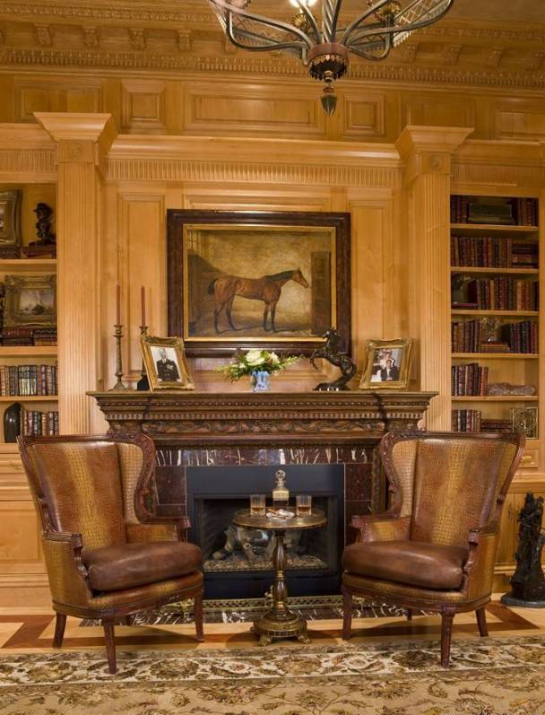
Since natural wood and leather are also brown, in interior design this is generally and frequently used. Using as wall paint, it gives depth to the space, as floor cover it gives stability. Dark hues can replace black – as its warm tone alternative – when we would like to emphasize something. It can be used in any room, but in case of dark brown walls, the proper lighting should be also provided. It is regular in historical styles, mainly the deeper hues. Combined with gold, a luxurious interior can be produced. Together with white, cream or beige, the result is classically elegant. Nowadays it is still very popular, it fits to practically any style.
Feng-shui associates brown with the earth element. Light hues are assigned to Jin, the feminine side, while dark hues to the Jang, the masculine side colours.
For advertising, it is used by companies that providing luxurious products or services to their customers, e.g. sweets, wellness, etc.
Most people like brown in their homes, but to avoid “cave like” result, it has to be used with sense. If you would like an elegant and stylish brown interior, ask for the help of a colour adviser.


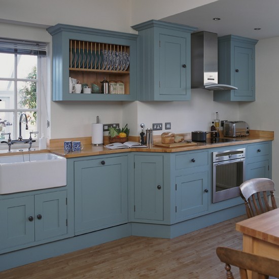
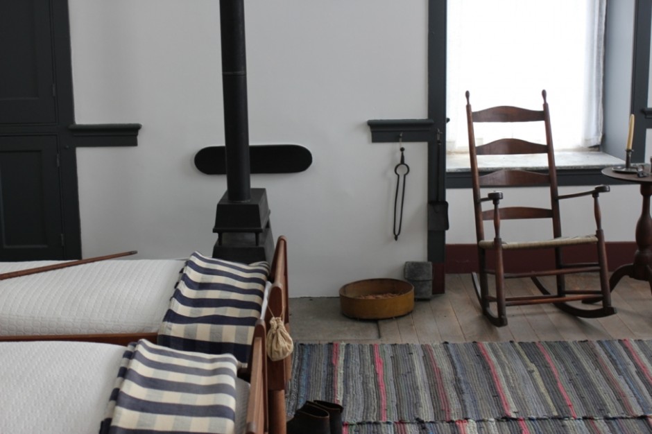
Shaker style
The shakers are a religious community established in the 18th century. The members moved from England to North America. They are famous about their love of peace, puritanism and the equality between the genders.
Shaker style is simple, practical and thrifty. All household objects are produced by themselves. Forms are determined by function. Ornamentation hardly used, if they do, they are most often the heart, hand and star motif. Paints are made of natural materials. Most characteristic colors are rust brown, aquamarine, ocher, sage green, claret and beige. Most of the fabrics used are made of wool, cotton or linen, which are simple and monochrome textiles, sometimes with a small chequered pattern. From warn fabrics they sew patchwork blankets or rag rugs.
Furnitures are simple, wooden ones. Door panels of wardrobes have frame insert structure. Ladder backed chairs can be hanged up when out of use. They make wall-mounted hangers on which almost anything can be hung securely. Also characteristic item is the thin sheet box, which has a round or oval shape and requires high skills to prepare.
The function and simplicity oriented way of thinking of shakers can be actual even todays modern world. Kitchen furnishing in shaker style can be a definitive element of classic or rural style kitchens. Placing some shaker storage boxes can decorate a work room, living room or bathroom. Using their color palette we can realize a warm, friendly interior with natural feeling.
Ask an interior designer to help implementing shaker style in your home.


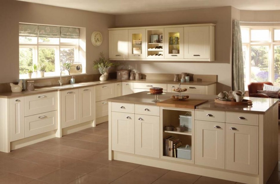
Neutral colors
Natural, neutral colors are considered as the base elements of interior design. Many people think they are dull and impersonal, although they can be used versatile – resulting really wonderful interiors.
Some of the most well known natural colors are beige, taupe, creme, light hues of grey, egg shell, sand, ecru, lightest hues of brown, etc. Both cold and warm tones. Nature provides them ready-made. Let’s think about different stones, raw linen, wooden materials and sizal.
Nature colors are excellent background for vivid colors. They weaken strong, warm hues and strengthen the cold ones. If we are uncertain, which colors we would like to see in our home, let’s paint the walls first with the colors mentioned above and apply neutral fabric for larger furniture. After it, this base can be decorated with more intensive colors we like, e.g. on cushions, curtains, accessories. If we don’t like the result, the color of the decoration can be changed easily until we find the proper ones.
Neutral colors have calming, eye-relaxing effect. They fit to almost every interior design styles, we can use this palette bravely. They are perfect choice for French country style, Gustav style, or seashore style. Even the warm hues widen the space, since they are regularly light hues. For a more characteristic effect, darker tones also can be selected. Combining different textures, the view can be even more exciting.
Although using natural colors is considered to be a safe solution, it’s not easy to select them properly to get a really nice result. Ask help from an interior designer for reaching the optimal.


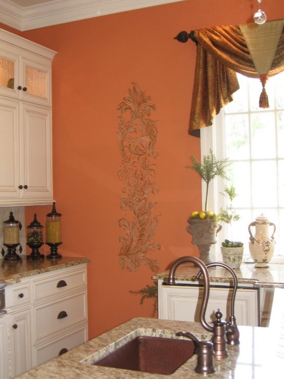
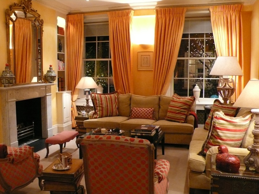
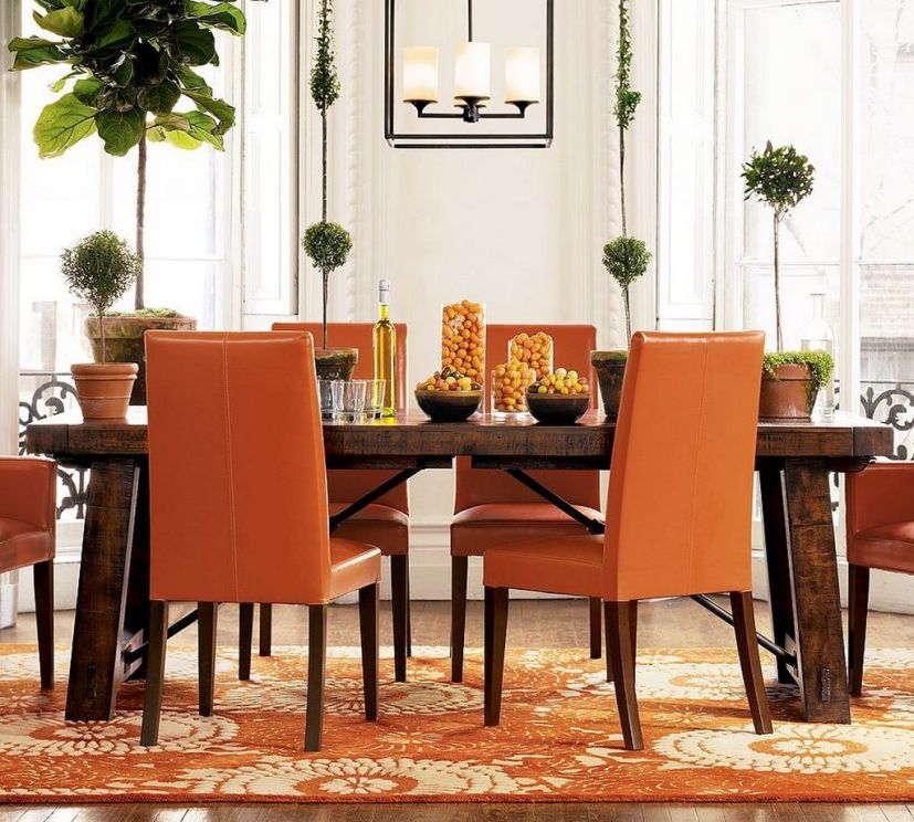
Orange
Orange is derived from mixing two primary colors, red and yellow. By this, we call it a secondary color. This is considered to be the funniest color. It has no cold hue. Blue is its complementary.
At physiologic effect, orange is relaxing and irritant at the same time. Increases appetite and creativity, it has positive effect on sexuality and human relations. In symbolism, orange is associated to strength, endurance, happiness and youth. We associate to fire, sunset, autumn, fruits by it.
It replaces red perfectly. Energizing without increasing blood pressure. While striking color, doesn’t dominate fully its surroundings and not so provocatively irritating than red. It includes the fun of yellow and the feeling of sunshine also. A soil color, frequently used in interior design for vitalizing spaces decorated with other soil colors. We can use it bravely in living room, dining room, duller shades in child room or bedroom. Combining with crème and brown, it can be weakened, resulting and elegant interior. As warm colors generally, it also narrows the space feeling. Vivid hues are perfect for tropical or Mediterranean interiors.
In feng-shui, orange is the color of the male side (Jang). Assigned to the 2nd chakra (sex).
In business world, many designers chose this color for catching attention or highlighting, since it is not aggressive. Used frequently for advertising of food and toy manufacturers.
Using too much of orange can also be depressing. For implementing a cozy, classic interior in orange, ask help from an interior designer.

Carpet
Carpet has an important role in interior design. It gives warmth to the room, defines areas, can be a focal point and mutes sounds.
Wooden floor or a floor paved with showy stones are beautiful, however they are cold for the feet and it can be tiring standing or walking on them for a long time.
The main role of the carpet in a living room is defining the area. Furniture almost floats in the room if not connected to each other by something. When choosing a carpet, pay attention to the size. It is an elegant and classic solution if at least the front legs of the chairs, armchairs and sofas are on the carpet. When gathering for watching TV or around the fireplace, the carpet gives the frame for this. We can seat there comfortably even without slippers because of the warm and soft textile, or we can even sit on the floor.
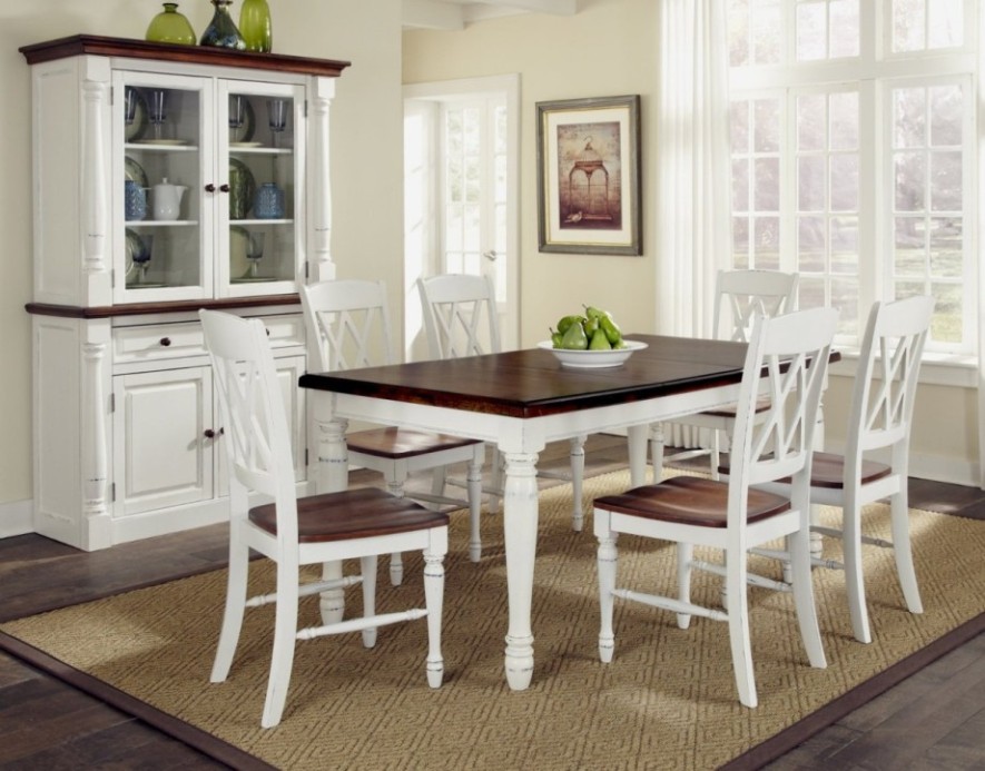
Let’s choose a carpet in the dining room with a size that the legs of the chairs shouldn’t slip down even if the guest stands up and pushes it back.
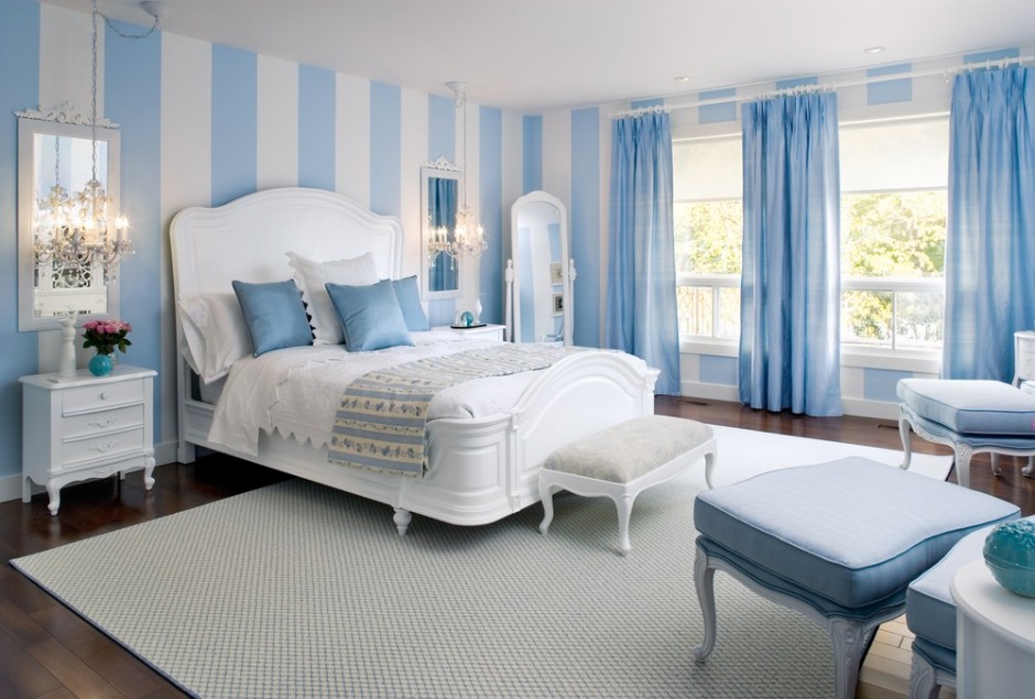
Wall to wall carpet is quite good in a bedroom, however not everyone likes it. It can be a good solution if the carpet is placed only under the bed or at least smaller rugs on both sides of it, this way the feet don’t touch the cool floor when getting out of bed. This provides a more comfortable feeling and the day begins better.
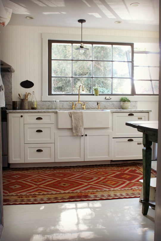
It is worth to place a smaller rug on the kitchen stone floor where we walk or stand the most, for example at the front of the sink. It should be made of an easily cleanable material with looped and not cut threads, as far as possible.
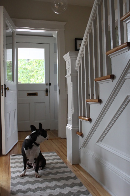
In the hallway, through the corridors, we can guide our guests with the carpet.. Let’s put it inside from the entrance door to draw attention to the shoes should be taken off. Since these are the most frequently used areas of the house/flat, it is practical to buy one here which bears well the harder usage.
Don’t place rugs in bathroom and toilet. Let’s use here a so-called bathmat designed right for this purpose or lay down a towel.
Looking for a warm, welcoming and comfortable space? Ask for help of an interior designer for choosing the proper carpet for your home.

Black
Black means the lack of colors and light, so technically it cannot be considered as color. Anyhow, it has an important role in interior design and fashion.
In the symbolism, black is usually associated with death, evil, darkness and fear. In western cultures, black is obituary color. At the same time, it is also prestigious and powerful. Black increases the intensity of other colors. Combined with yellow, it means danger at different signs, just as originally in the nature.
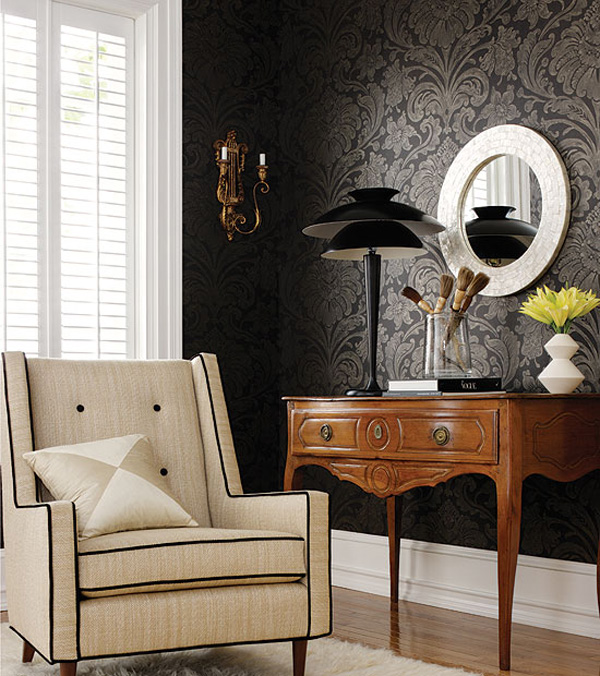
In interior design, we use it for emphasizing. With a black curtain, we can turn the lines of the window more definite. A black outline of a wallpaper motif strengthens the effect. In light interiors we can focus the view by creating focus points with black decoration items. Therefore it’s advisable to hide the black TV screen, so not to be in the focus. Using black provides the feeling of elegance, luxury and formality. Ideal background for paintings.
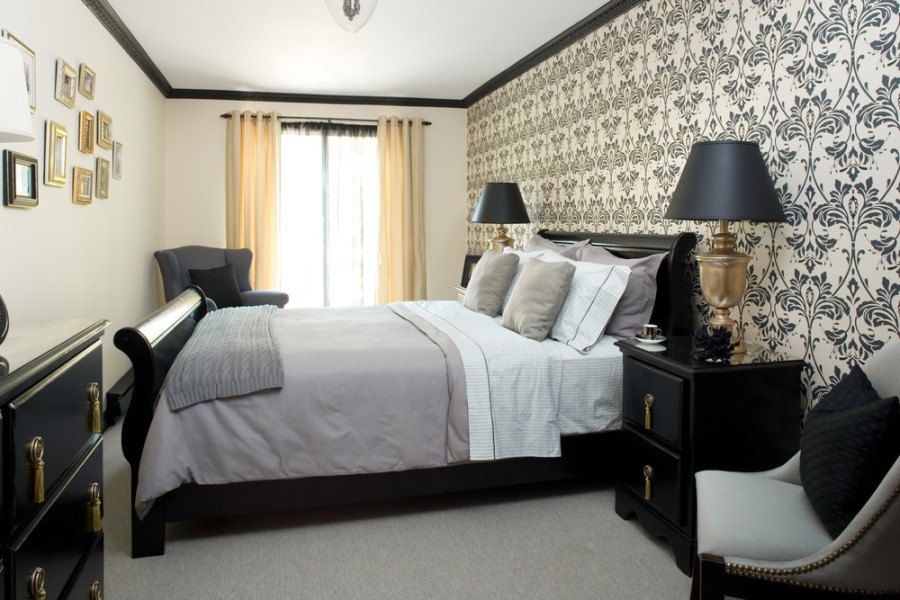
If we are brave enough, we can create definitely black interior also! With proper lighting it won’t be depressing at all, even all the walls are painted black. The most elegant result can be achieved if combined with white or cream. But we can also emphasize only one wall with wallpaper printed with black motif, selecting similarly upholstered heavy furniture. The contrast of glossy and matte surfaces should be considered all the time. Using different textures of black, the view can be even more exciting. Black is often used in different styles such as e.g.: art deco, chinoiserie and empire. Excellent choice for flooring, it gives stability, practically anchors the furniture. In bedroom a moderate use is recommended, only at feminine accessories, such as lace edging or sexy lampshade. Combined with silver, gold or crystals, the result will be really luxurious.
Feng shui connects black with water element, the color of Jin, the female side.
In business world, black expresses elegance and monetary value. Just think about black suites, tuxedos, luxury cars or gala dresses.
People usually afraid of this color when it comes to interior design. Anyhow, really spectacular and classy life area can be implemented using black. For achieving the desired effect, ask for help from an interior designer/color expert.