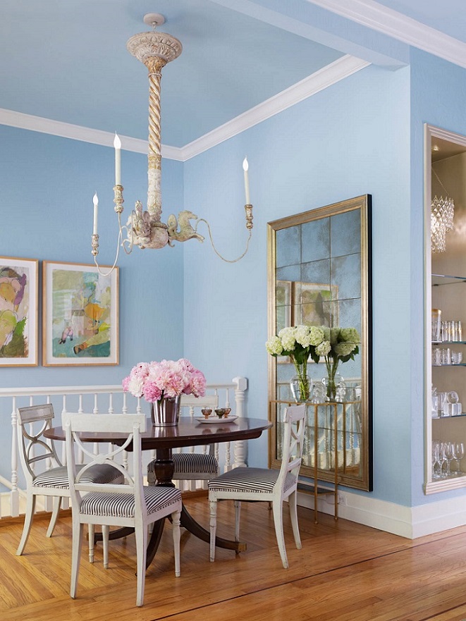
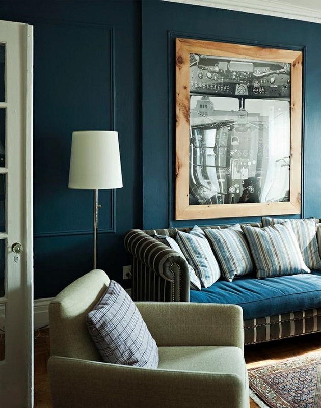
Every December Pantone company announces the color of the next year which effects interior design also. Classic Blue no. 19-4052 is the color of the year 2020.
This is a calming, medium dark blue, which is a cool but not too cold color. “Classic” attributive suggests that this hue is timeless, elegant and diffuses harmony. It symbolizes reconveyance of old values.
It is perfect both for base color and focal point. Since it is not a vivid color, it can be used in a large amount, even on all the four walls. A neutral color palette can be easily popped-up with it, without being too determining. Blue is not a food color, so use it moderately in the kitchen and dining room. It fits well for almost all styles.
Ask for help of an interior designer for making the color of the year 2020 appear in your home in style.
Archives


Babyblue
Baby blue is a pastel shade of azure. As its name indicates, it has a strong associative relationship with newborn boys. However, it can be made more mature by combining it with brown, black or beige.
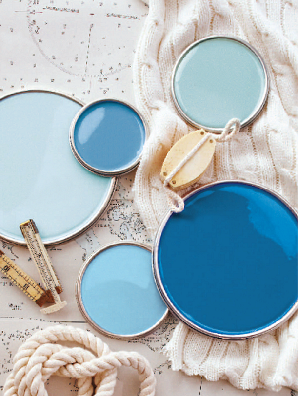
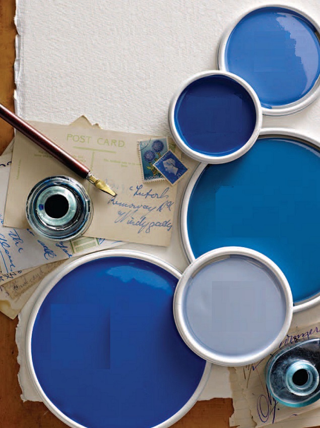
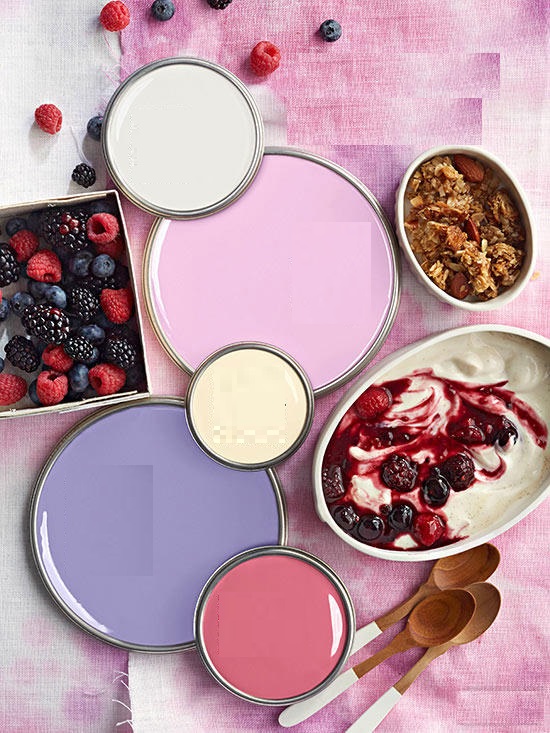
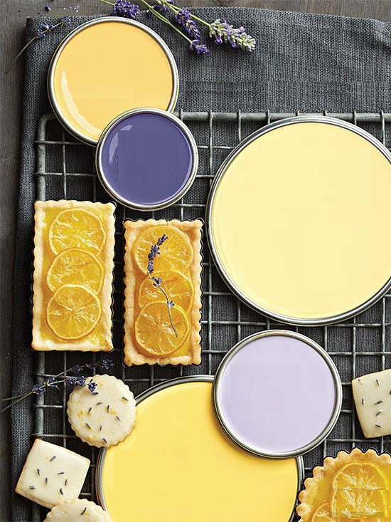
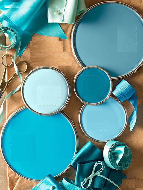
Paint palette 20.
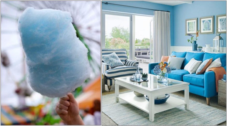
Cooling blue color palettes for hot summer days
Inspiration 10.
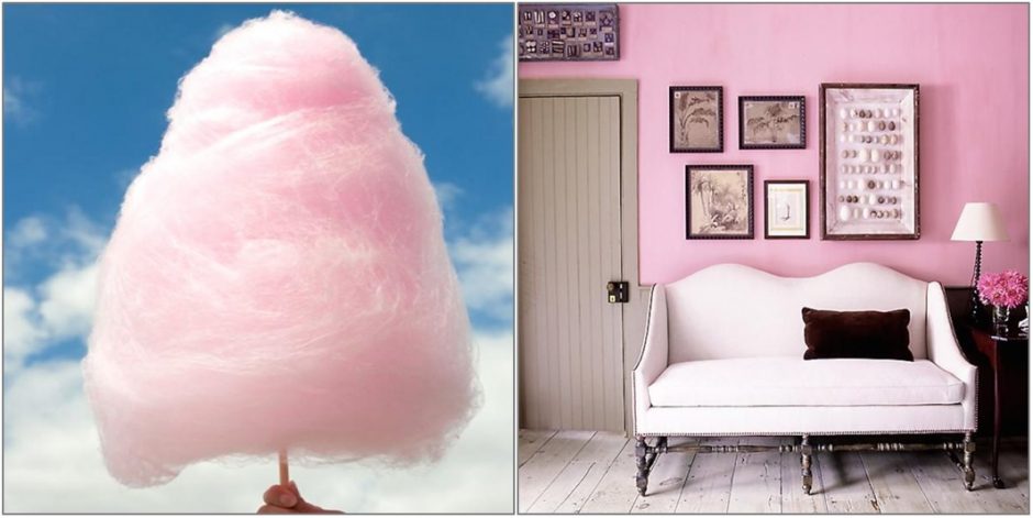
Summer, cotton candy, merry colors

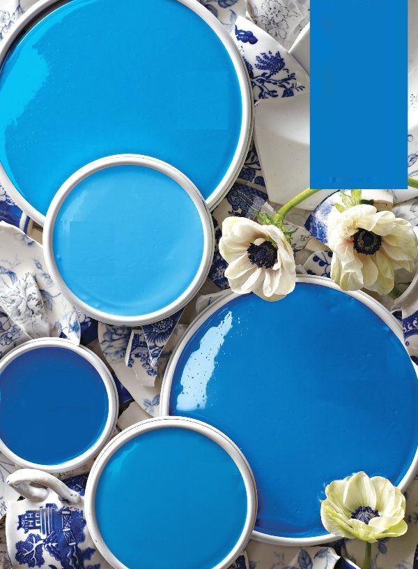
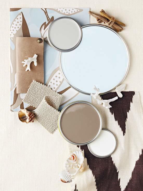
Paint palette 19.
Summer summoning color palettes
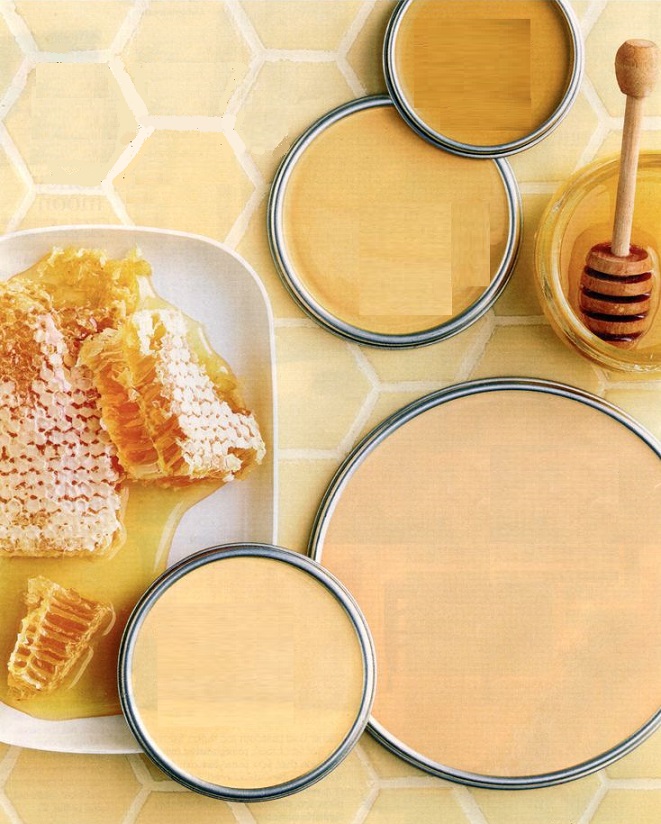
Paint palette 17.
Paint palettes inspired by hobbies
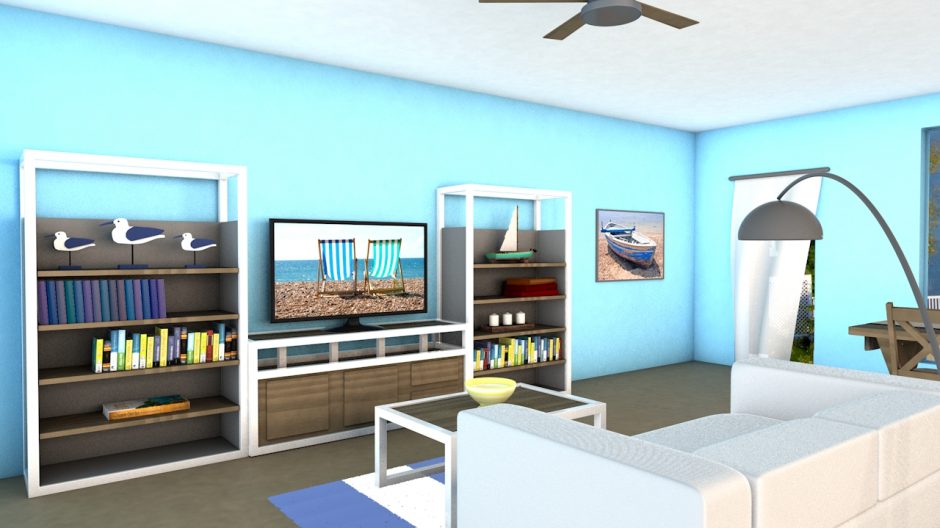
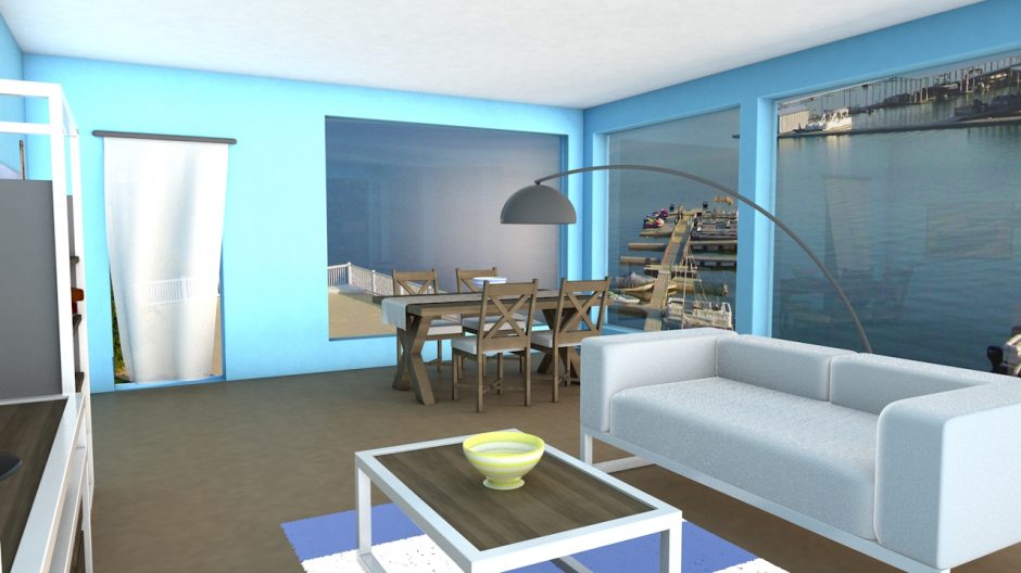
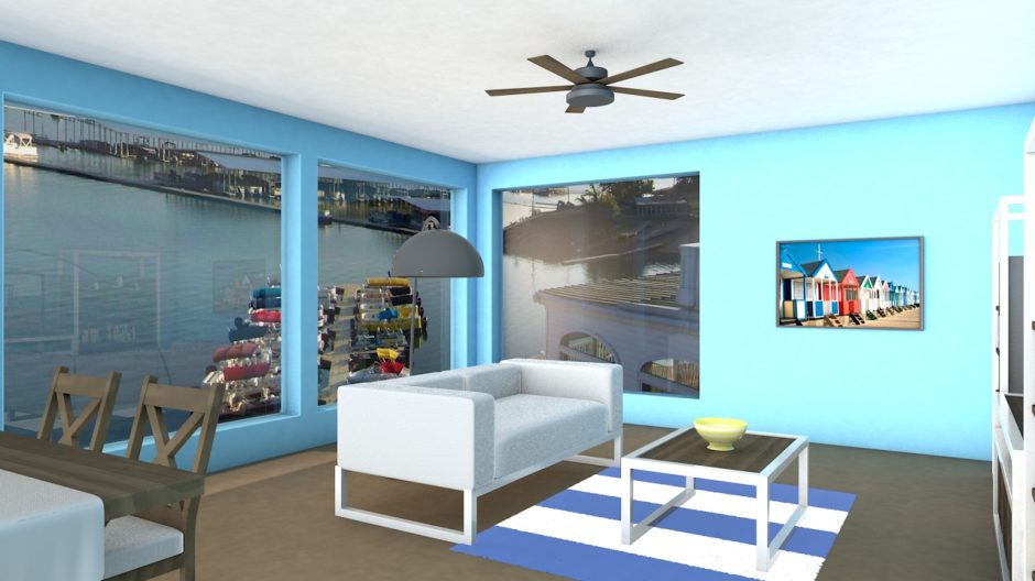
My project 27.
My prior work: waterside weekend house’s living room (furnishing plan for an exam)
Petrol blue
Petrol blue is a dark, greenish hue with a tint of grey, named after petroleum.


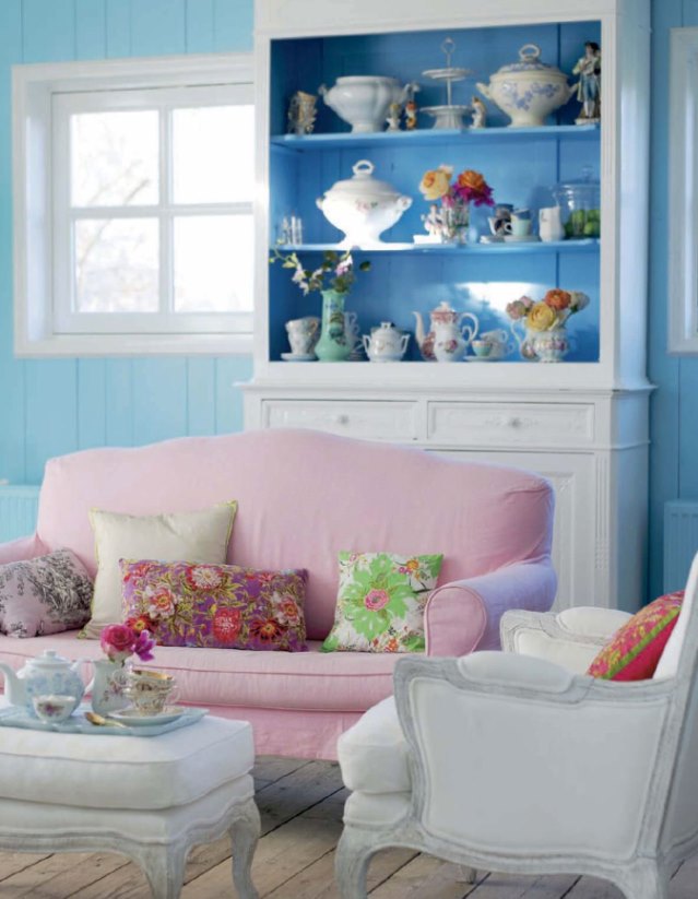
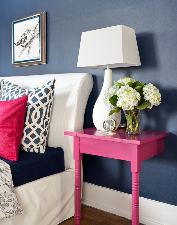
Color pairs 36.
Color pairs: blue-pink
My project 20.
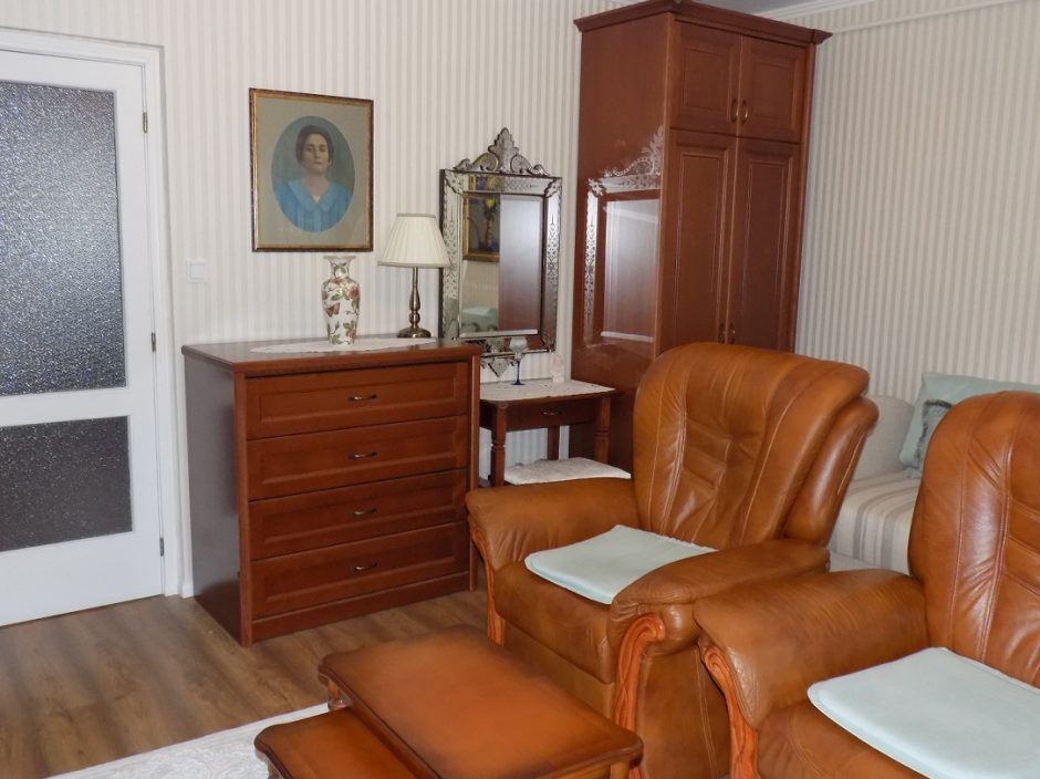
I recently finished the interior design plan of this living room for a kind couple. The room is 22 sqm and has bedroom function too. The request was to freshen and make it cosier by keeping the sofa set and day-bed. The owner fell in love with this type of wardrobe-set, so the main task were choosing the proper elements, planning the furniture set and custom-made ordering. The wallpaper took a bold decision. Finally I found one of which had fine color to made elegant background for the furniture. It is a block apartment, so stripes help heighten the room and mouldings complete the view. The light turquoise of accessories and fabrics is perfect for offsetting the shades of brown. The chosen furniure set did not contain the proper coffee table, finally I found one in an auction website, perfect in style and color. I had to solve the storage of remembrancers, books and TV.
More photos: http://classicinteriors.hu/en/references/21-references/59-references14