The pastel versions of the primary colors – the color wheel works with muted tones in the same way
Archives
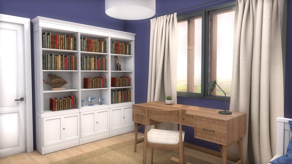
Indigo
Indigo is a dark but not vivid bluish-violet hue. It is the inner color of the rainbow, near blue. It was named after the natural blue dye which is extracted from the Indigo shrub.
Those who like dark colors in their home can use it even on all four walls. It gives depth to the space, but it also radiates elegance. If we want to pair it with other colors, pay attention to its clear purple tone. Thanks to this, it has less formal effect than clearly blues with similar tones and intensities. It can be well combined with both pure white and natural, neutral colors. To create a masculin interior, choose the shades of brown for pairing.

Turquoise 2.
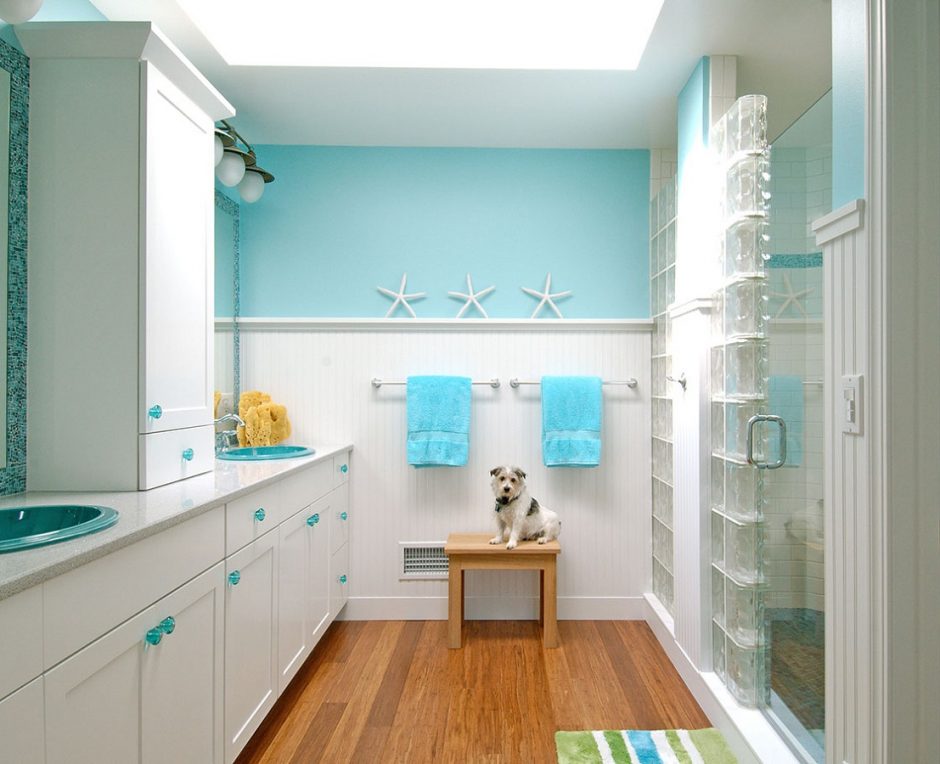
Turquoise is a bright, happy shade of blue, containing green. It is the color of the Carribean waters and Mediterranian sea so, we mainly associate with water and seaside by it. It is a very good complementary color for the neutral colors (white, grey, beige, brown etc.), vitalize the space. It is popular in interior design. In larger quantities, use it in rather sunny rooms. It was named after the semi-precious stone.

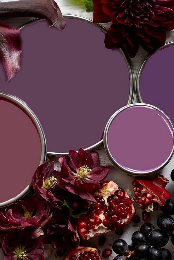
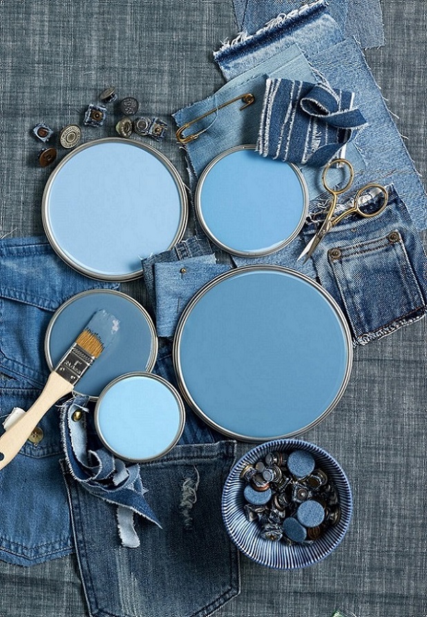
Paint palette 28.
Bluish purples, mauves, purples – none of them is common or „safe” choice, but a pleasantly soothing mood can be achieved by them
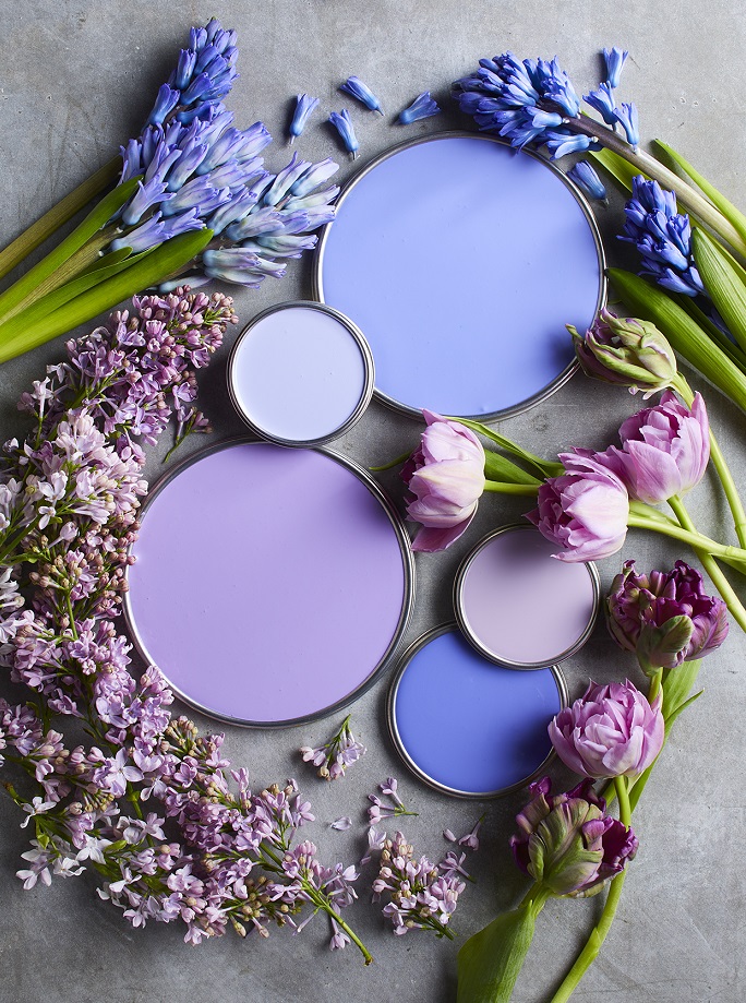

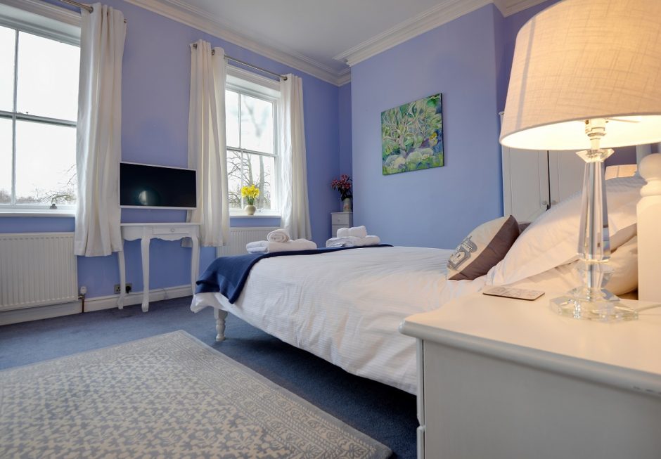
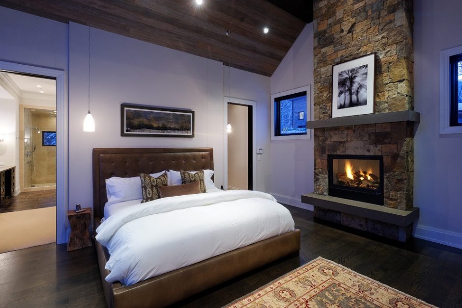
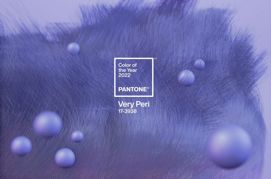
Color of the year 2022
Every December Pantone company announces the color of the next year which effects interior design also. Very Peri no. 17-3938 is the color of the year 2022, which is from periwinkle. It was created specifically for this occasion.
This is a soft, pleasing blue-violet hue, which looks like a pastel although it is not. The blue was mixed with pink rather than red, which gives the slightly airy effect. Since it contains much more blue than pink, it can be classified as blue. It gives you peace of mind, but also gives you curiosity.
It is a medium dark shade, so it can be used in larger quantities. It fits well for country and shabby chic styles, nursery, bedroom or even at home office. It can refresh a palette of neutral colors as it is a cool shade.
Ask for help of an interior designer for making the color of the year 2022 appear in your home in style.


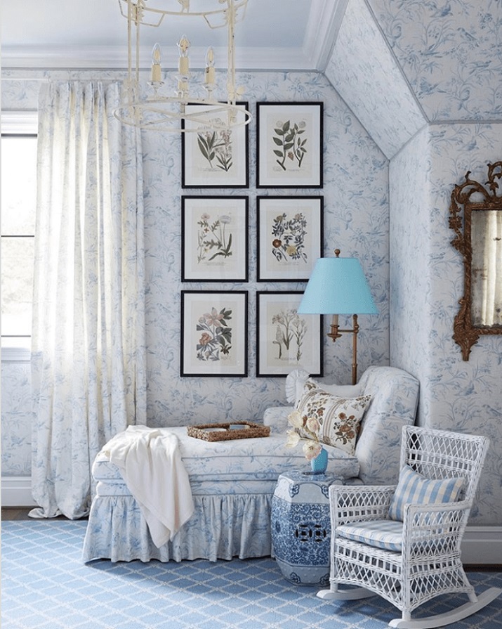
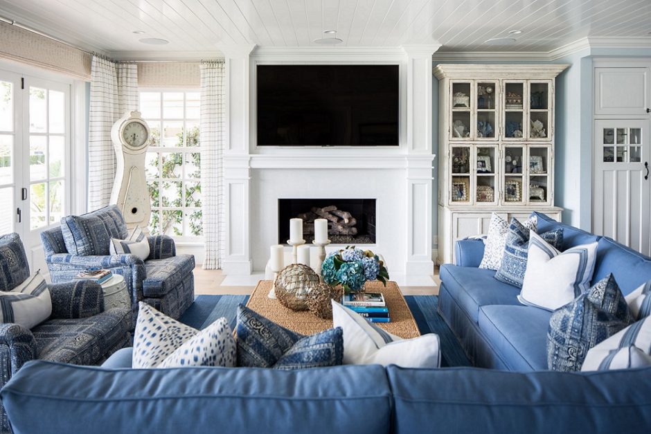
Blue-white
Blue-white is a classic pair which never goes out of fashion
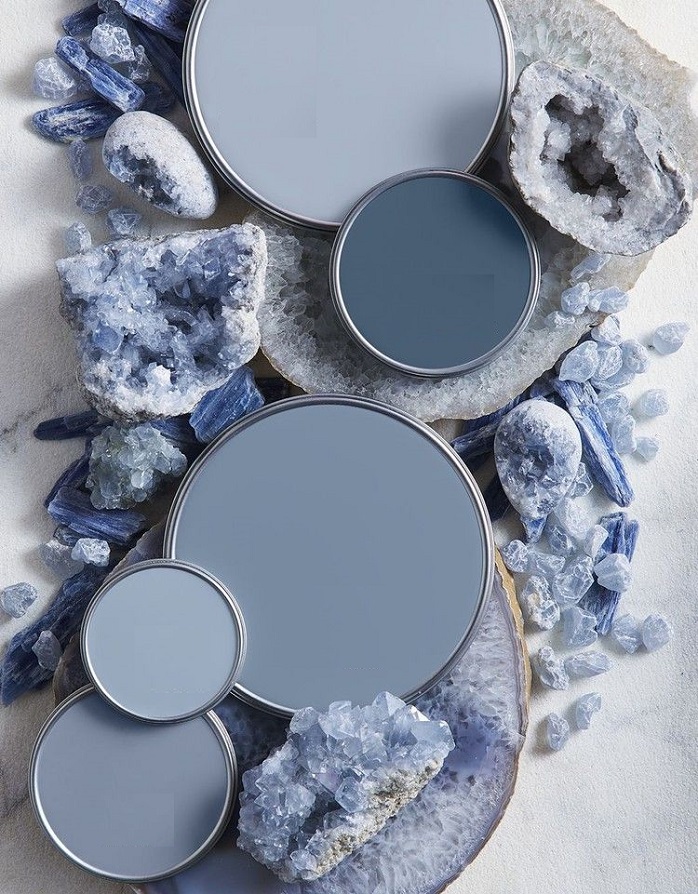
Paint palette 26.
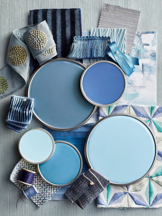
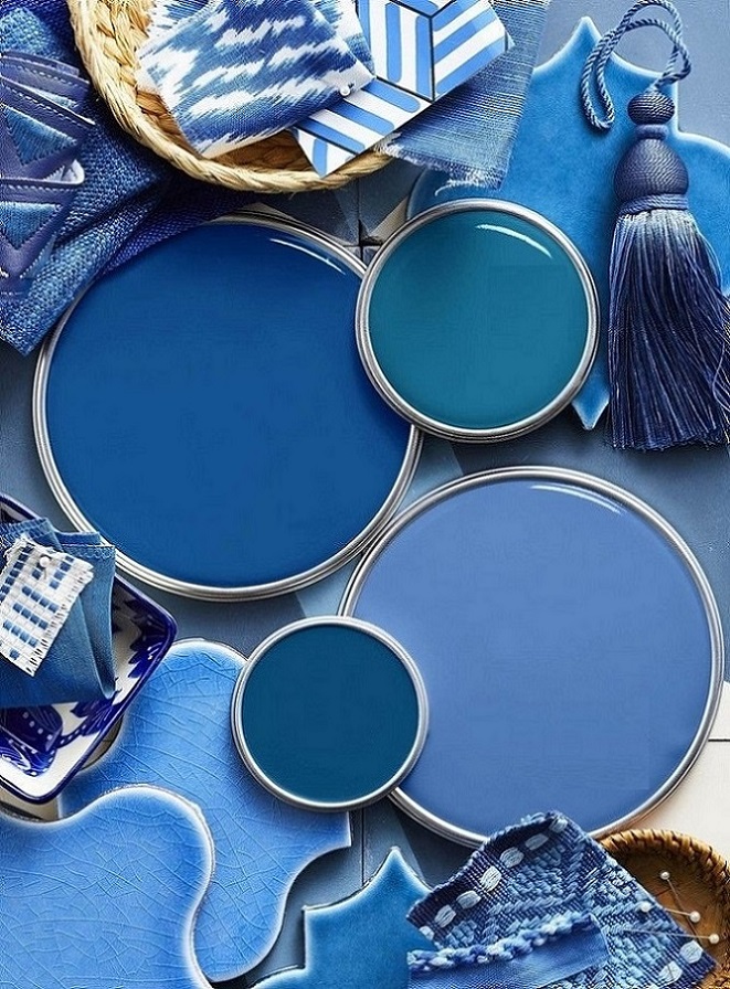
Fresh blue palettes from intensive to subdued tones
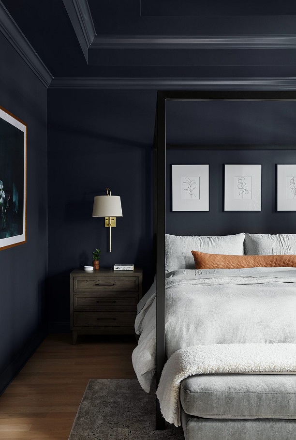
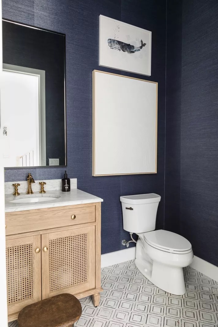
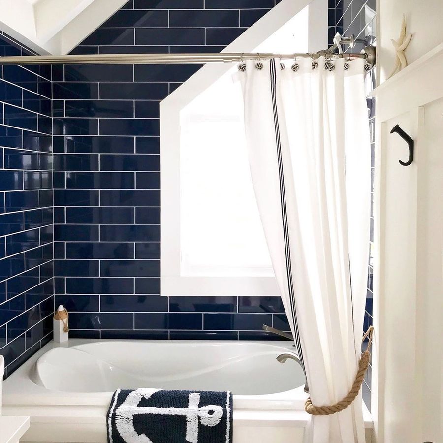
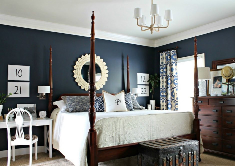
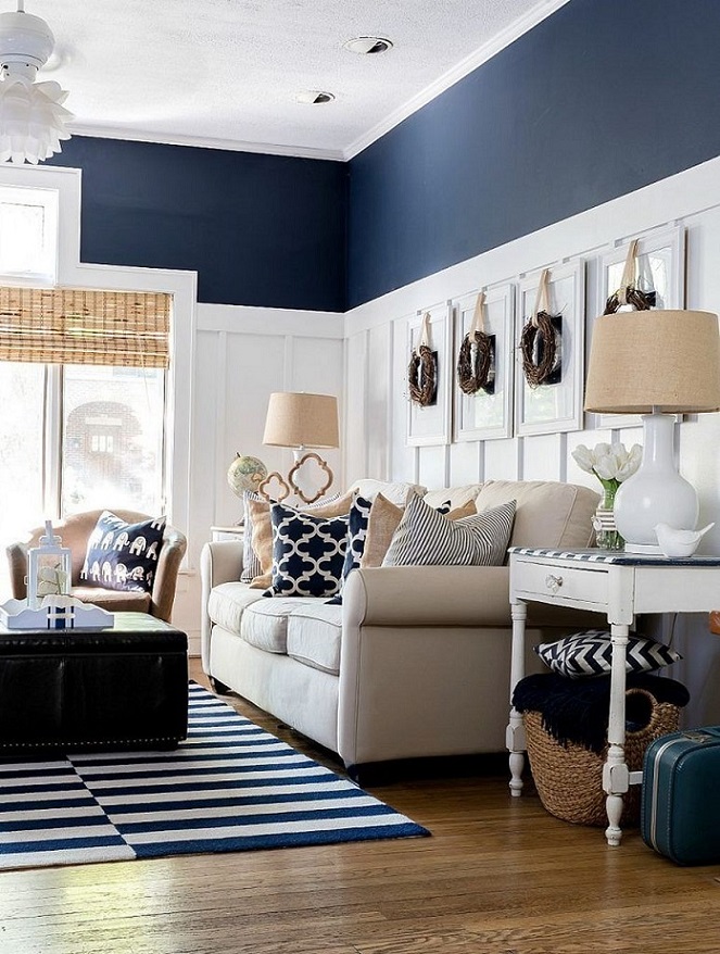
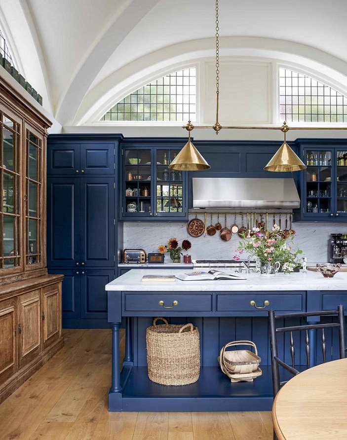
Navy blue
Navy blue is a really dark shade, which gives elegance and depth for the space. It can be used instead of black if it would be too rigid or sombre. It got its name from the color of clothes worn by officers in the Royal Navy since 1748 and adopted by other navies around the world. It looks best paired with white.
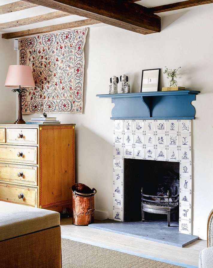
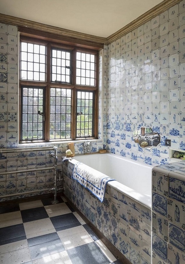
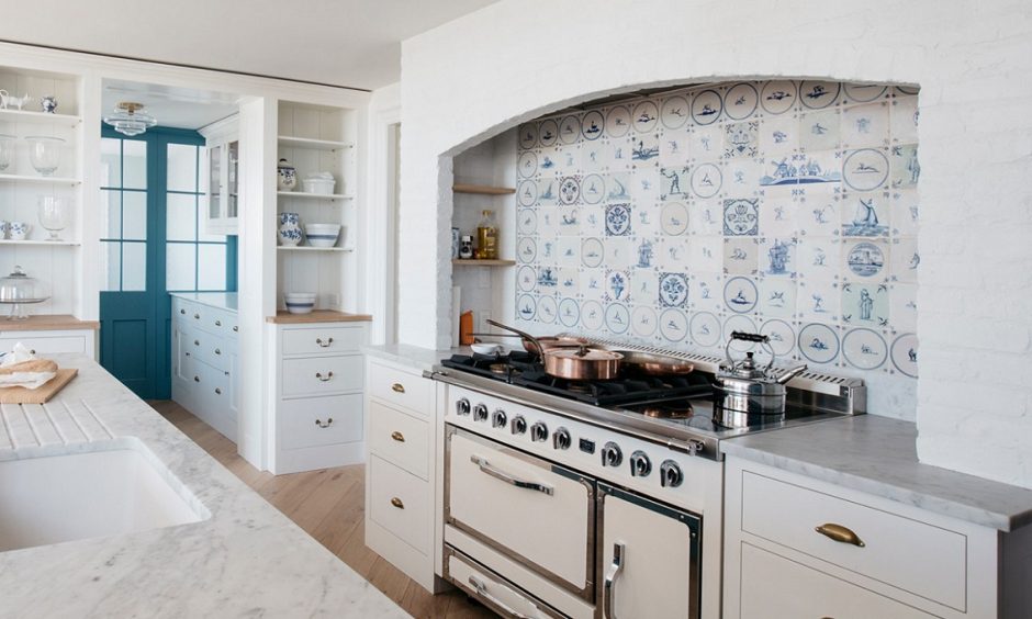
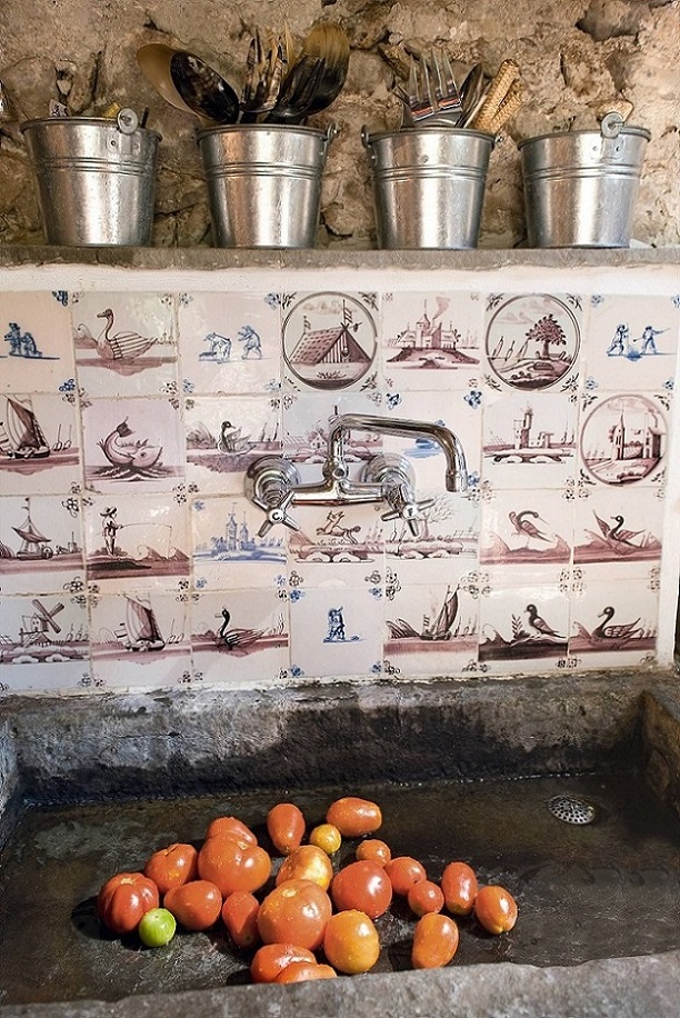
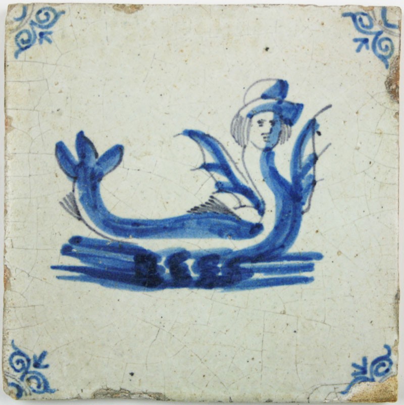
Delft tile
The invention of Delft pottery in the mid-1600s was a response to the popularity of Chinese porcelain products imported by the Dutch East India Company. The tin-glazed earthenware was a cheaper alternative of the expensive import goods. In the 1640s the Delft potters started to use personal monograms and factory marks, and the tiles became works of art this way.
The white glazing imitated well the whiteness of porcelain. The hand painted pattern has mostly a wonderful shade of blue, but brown is also frequent. Delft products first copied the patterns of Chinese imports, but later motifs of Dutch life appeared, for example tulip, windmill, sailing ship and farming scenes. The pattern featured a merman wearing a top hat is produced since 1650 until today! Large patterns consisting of several pieces are preferred also, mostly as kitchen backsplash.
As wealth spread in the mid-class, tiles were more and more popular in homes. Most of them were around fireplaces and in kitchens because they could be easily cleaned. Delft tiles reached other countries in Europe also. In England, the new technique of transfer printing allowed for Delft-style tiles to be mass produced.
Some Dutch company manufacture these products by the original methods, this way they can be ordered newly, not just antique pieces are left. Really spectacular focal points can be created by using them, almost in any room. Ask for help of an interior designer for this.
My project 33.
Designed for a competition: modern farmhouse style for a family home in a small village