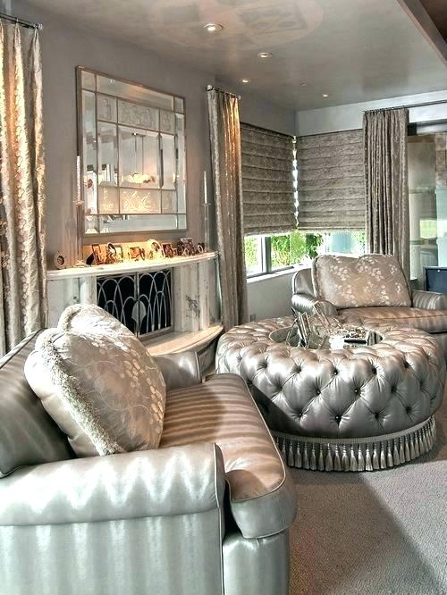
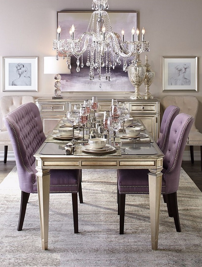
Glamour style is very fashionable since a couple of years. It is a feminine trend which has classic style marks also.
Basic colors are neutral: black, white, beige and grey. Light reflecting surfaces break the monotony of them. Glimmer is reached by using metallic (golden, silver, rose gold, chrome), glass/crystal/mirror and high gloss surfaces. This can be involved into the interior with lamps, small furniture, picture frames, mirrors etc.
Stacking of fabrics and creating luxurious softness are typical. Characteristics of the Baroque, the Classicism and the Rococo are recognizable, but the furniture bring back the classic lines and decorations in a simple way (e.g. cabriole leg, buttoned back, drawer pulls). Seats are fully upholstered, just like the bed. The total effect is elegant but inviting. The amount of cushions on the sofa, in the armchairs and on the bed suggests the biggest comfort. Velvet, fur and satin-like fabrics are perfect to this style.
Design is accented beside the functionality in the lighting. Chandeliers are placed even in the smallest rooms. Glass pendants reflect light. Lamp shades made of light transmittance fabric can be used for the more mysterious and subdued effect. Candles have important role because the romantic overtone is connected to the style.
Neutral base can be broken with some dashes of colors. Then the subdued but not obviously pastel colors appear, first of all blues, purples and pinks. Although the used colors can be warm hues only but the whole effect is marked by some kind of coolness, maybe just because of the quantity of glimmer.
The modern twist is represented mostly by artworks. Pictures on the wall, statues and other decoration objects are commonly contemporary pieces. Their colors and glamour integrate them to the interior.
The place can be popped up with a few but determining patterns, if it shouldn’t be reached (only) with colors. Damask pattern, the eternal classic, provides a good result here also. Geometric patterns fit for glamour style too (e.g. chevron, trellis, orderly stripes).
Since the style has a lot of modernized classic marks, therefore original antique pieces are not fit in these surroundings. They are not mixed with shiny-glimmering brand-new elegance but rival with them which cause an embarrassing outcome.
Ask for help of an interior designer for creating glamour style in your home.
Archives


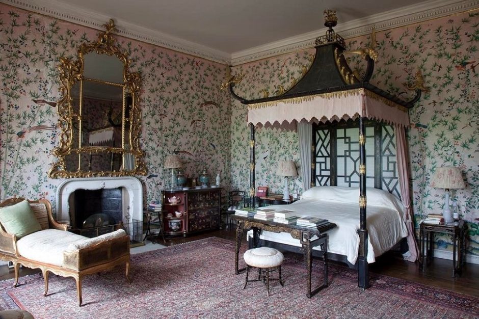
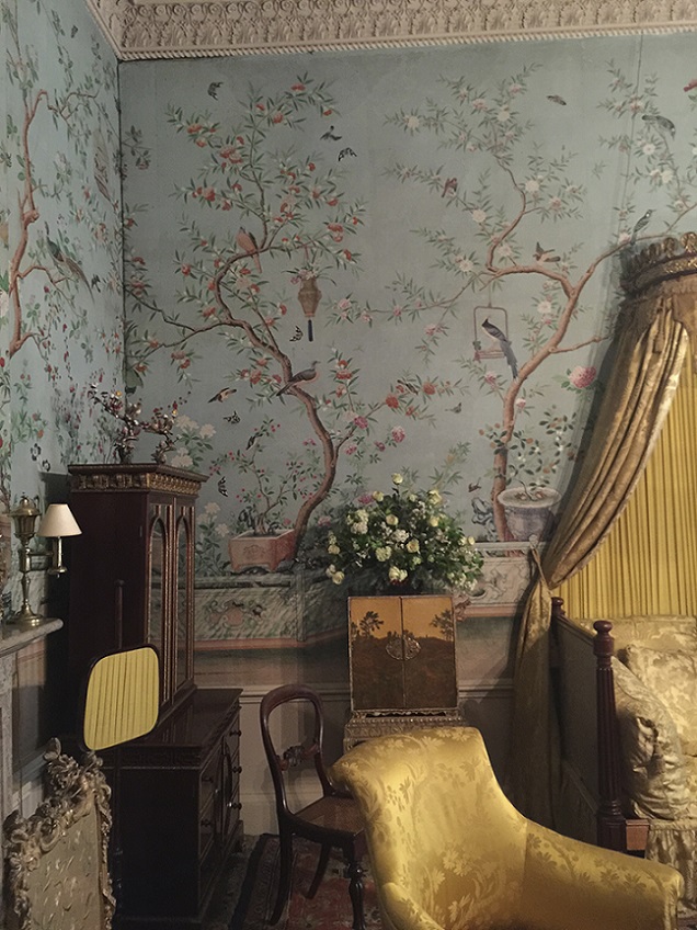
For Chinese New Year
Chinoiserie for Chinese Lunar New Year

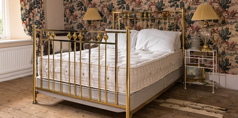
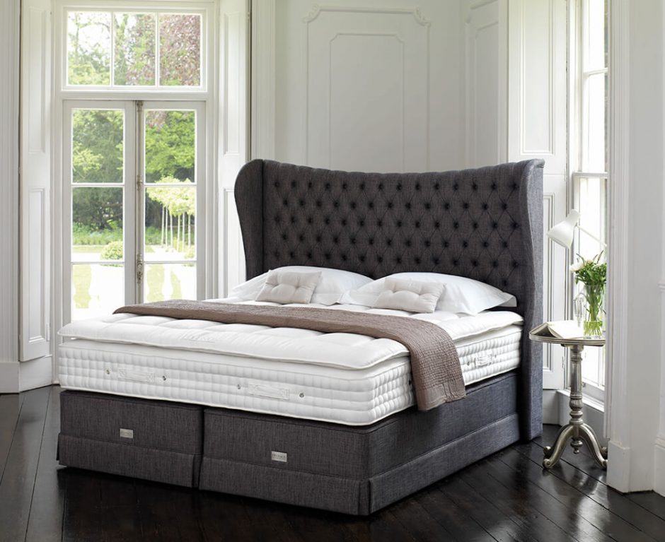
Mattress
Never buy a bed mattress by someone’s opinion/recommendation! Always try the different types of mattresses and choose the most comfortable one.

Inspiration 9.
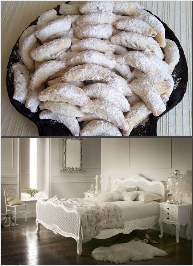
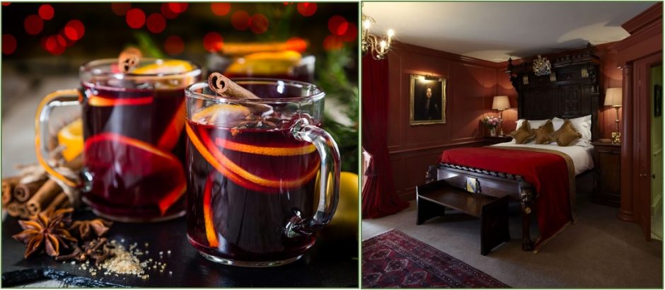
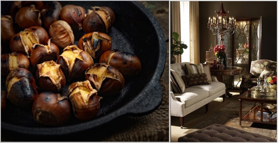
Get inspired by winter tit-bits
My project 26.
Downtown flat renovated for renting (without furniture)
More photos: https://classicinteriors.hu/hu/referenciak/20-referencia/62-referencia16


My project 25.
Designed for a competition: house in the style of an english country manor
More pictures: https://classicinteriors.hu/en/references/21-references/67-references17
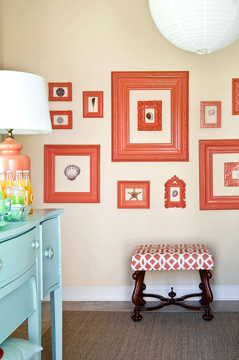
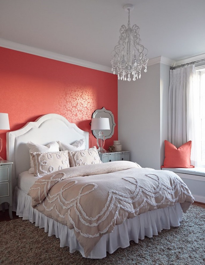
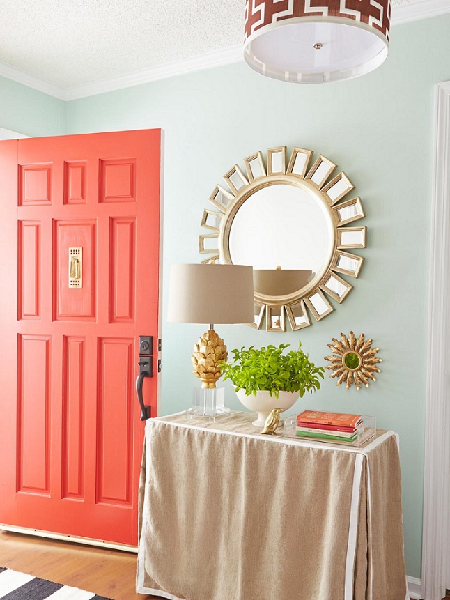
Color of the year 2019
Every December Pantone company announces the color of the next year which has an effect on interior design also. Living Coral no. 16-1546 is the color of the year in 2019.
This is a bright orange color mixed with a tint of pink. It is a warm hue which symbolizes the wildlife and brings joy. Because of these features, perfect dashes of color and focal points can be created with it. Since it is a quite strong, energizing hue, it worth to use less in a bedroom, but can be freely used anywhere else.
It is present in interior design for a long while as an additional color, thanks to the seaside style. A neutral or a darker color palette can be easily popped-up with it. A shade of turquoise blue is its supplementary color which can be connected to water also.
Ask for help of an interior designer for making the color of the year 2019 appear in your home in style.

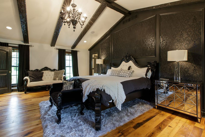
Black Friday
Some black for Black Friday


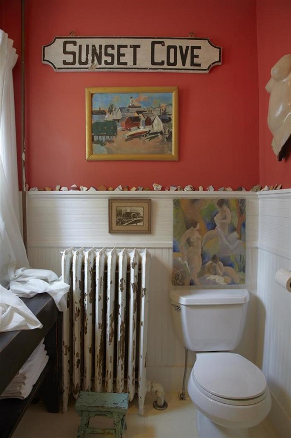
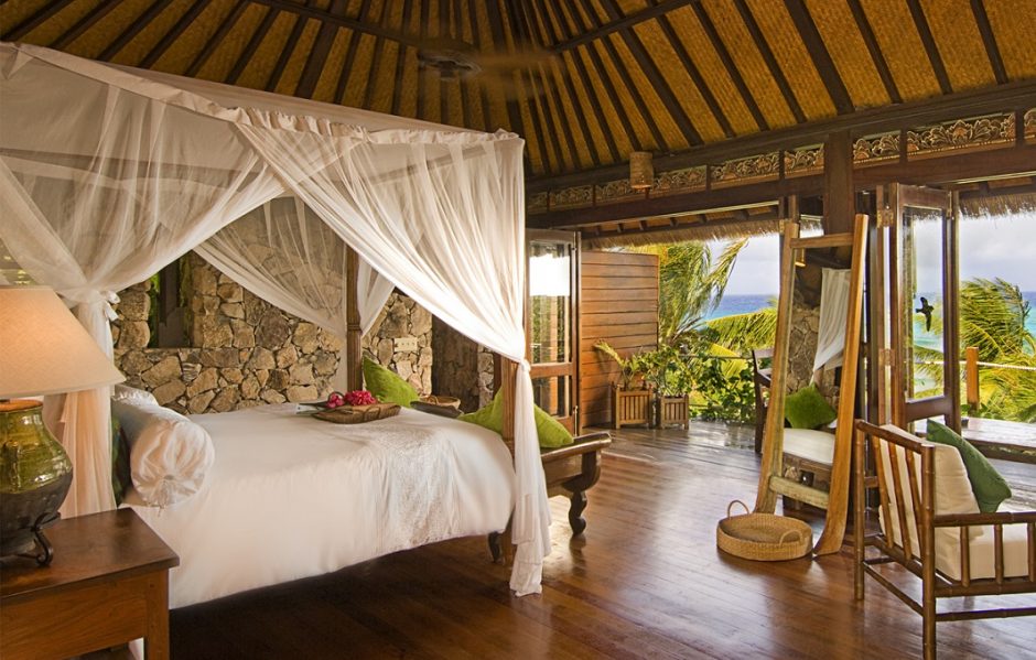
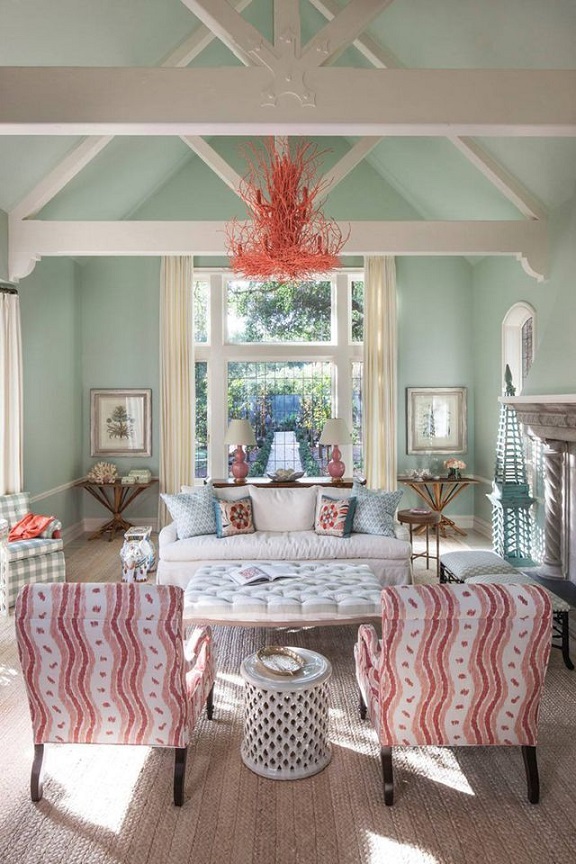
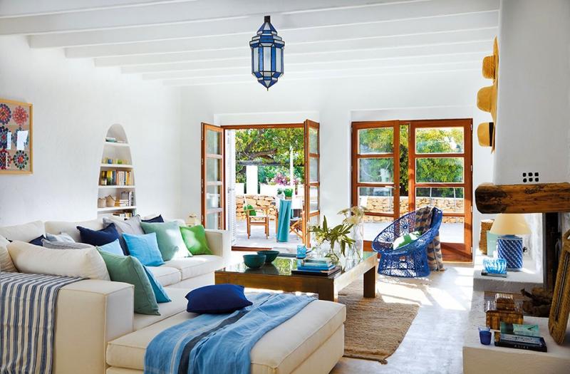
Seaside colors
Although summer is over, seaside style is popular independently from seasons. It means travelling, mental and physical freedom, serenity and calmness for most people. However, the question arises in interior design: which beach is desired to be evoked at home? Although the accessories specific to the style(s) (seashells, cord, objects connected to sailing, driftwood etc.) are the same, there is a significant difference in color usage among beaches of various places.
In the case of Mediterranean countries commonly white is the basic color but very light sand and hues of beige can be used for the base also. The leading colors paired to this are turquoise blue and green, cobalt blue and sky blue – all of them are bright shades.
It reflects well the cooler weather of the North-European sea-sides that mostly the primary colors are chosen besides the white or off-white base: navy blue, red, bright yellow, probably supplemented with dark orange and grass green.
Light grey is the basic color in Canada and in the northern counties of USA, following the austere weather. It can be both warm and cold hue. The colors paired with this are much more moderated: steel-blue, storm-grey, greyish brown, dark red, navy blue and less often blue water.
Really warm seaside of Florida and California are favorite holiday destinations also. The base can be white but some kind of light beige too. The colors used are quite subdued: blue water, mint green, coral, light yellow, light turquoise, maybe pink.
Warm weather and rich vegetation of Indian Ocean’s archipelago is reflected in that the basic color is frequently among the warm but dark browns of tropical woods. White accompanies to this as contrast and freshening element. Bright greens, pink, turquoise and canary yellow are the pop of colors (exotic flowers).
Of course, listing could be continued. The mentioned above shows well that seaside style has many faces, so it is important to make it clear before implementing, what this style really means to us. Mostly a nice memory is the basis which indicates the place also. Ask for help of an interior designer for reaching the desired result.

Art Deco
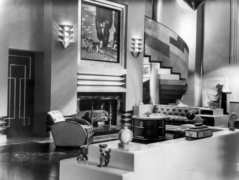
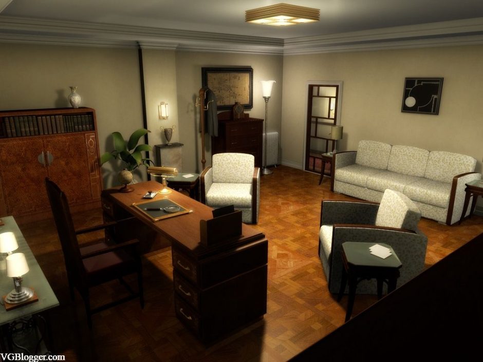
Art Deco was the determinative style of the 1920-30s. It was named after the abbreviation of Exposition des Arts Décoratifs et Industriels Modernes exhibition in 1925.
The style included almost all innovations of the age (e.g. aviation, electricity) but willingly used ancient cultures’ symbols as a source (e.g. rising sun, pyramid). These appeared as stylized geometrical figures. The human bodies on statues and relieves were a bit angular, masculine (even the women!) and dynamic. In architecture, skyscrapers were the breakthrough (e.g. Empire State Building, Rockefeller Center, Chrysler Building).
Chrome and bakelite – the new materials – specified the interiors. Extra shiny surfaces could be created by both. At the same time, they were combined with very expensive materials: ivory and silver on furniture, diamonds and platinum on jewelry. Black, white and yellow were dominant colors of the strong and high contrast palette. The style itself embodied luxury and elegance. Both mass production and unique manual production had a role.
Renowned artists were requested for furnishing not only private houses and public buildings, but for example the interiors of ocean liners and luxury trains. The style became simpler after the world-wide economic crisis, but still remained extravagant.
Art Deco is popular again. Accessories, wallpapers, furniture in the style can be bought in several shops. Take care not to overdose the used patterns. Ask for help of an interior designer for this.