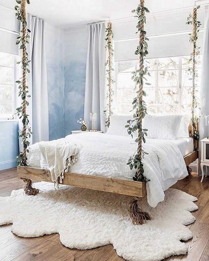
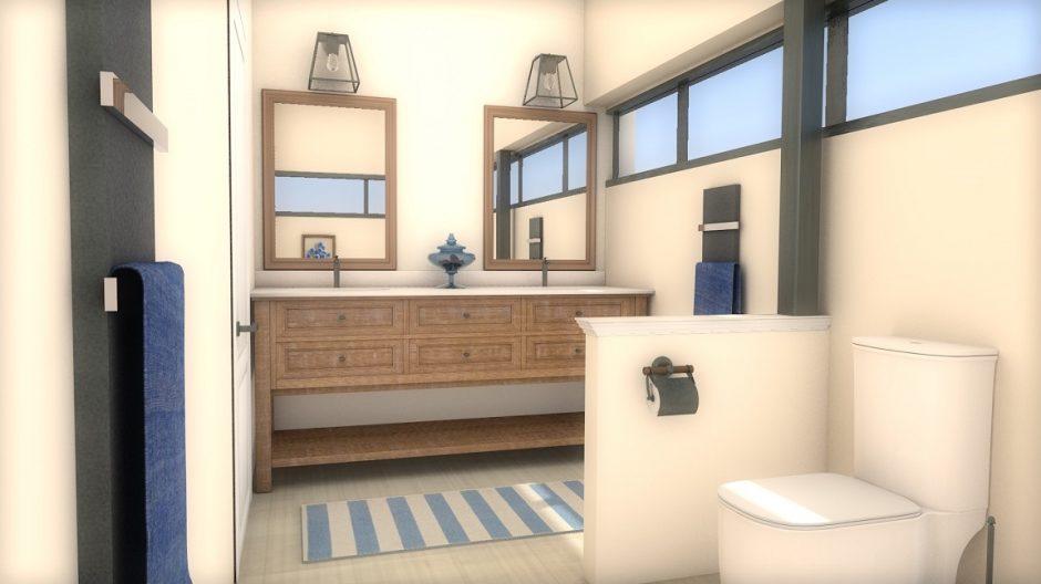
The room is felt more spacious because of „floating” furniture
Archives


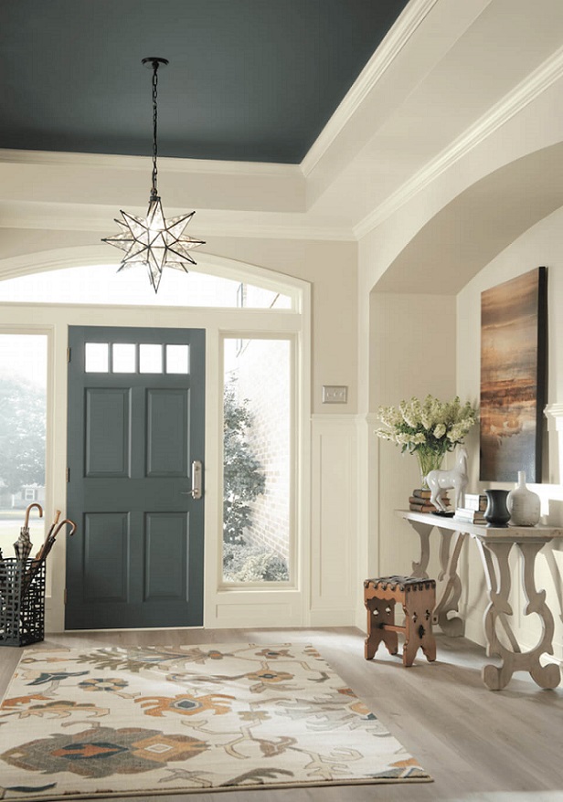
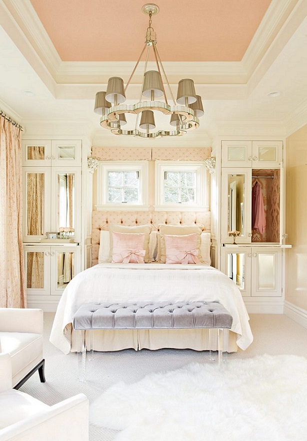
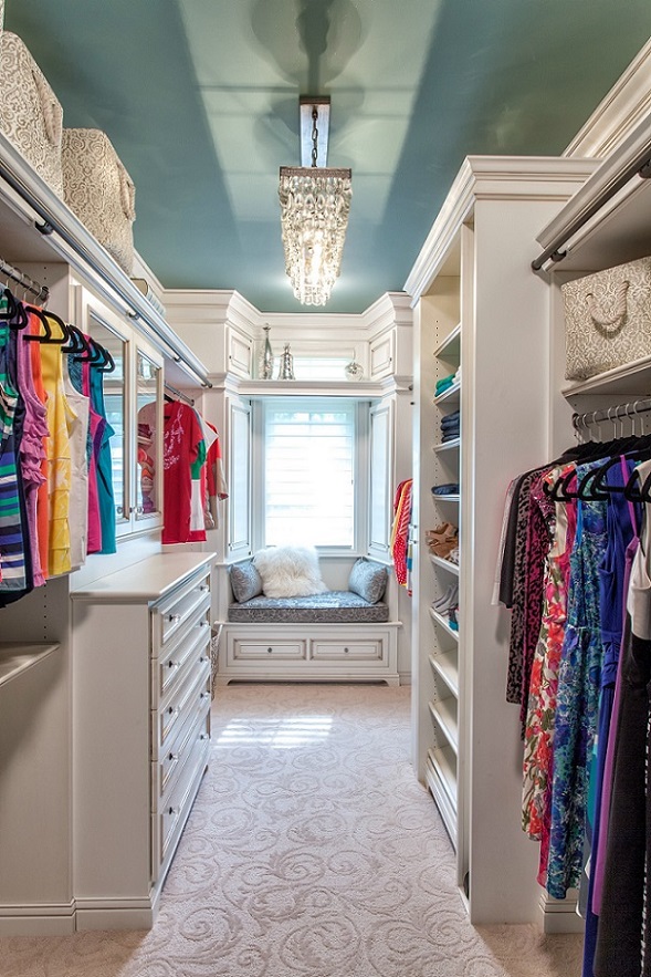
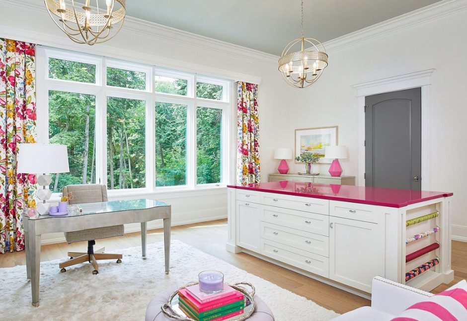
Color ceiling
Don’t be afraid of painting a color ceiling!
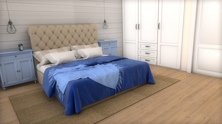
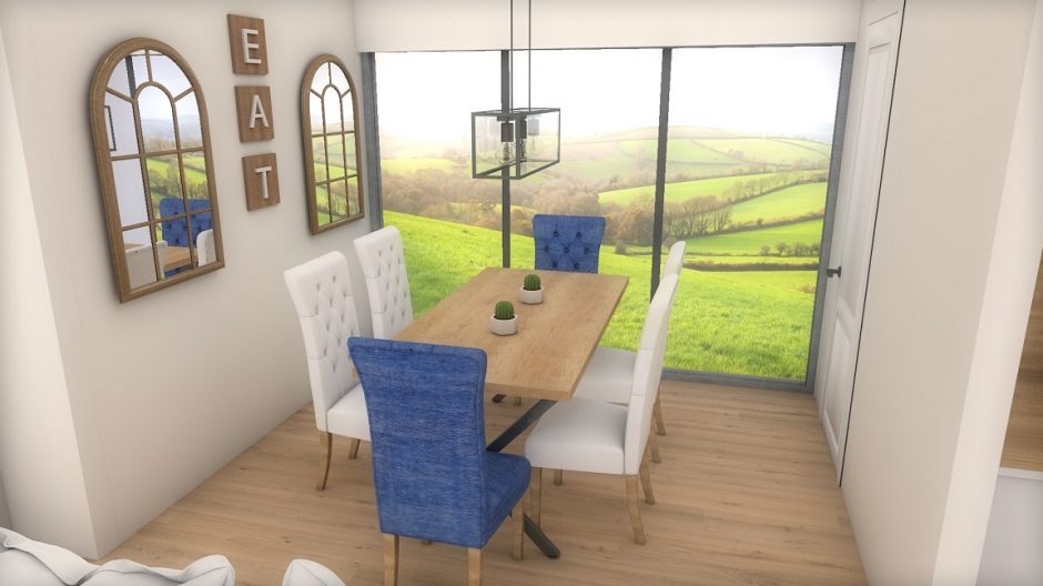
My project 33.
Designed for a competition: modern farmhouse style for a family home in a small village


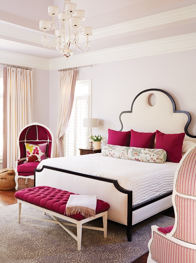
Fuchsia
Fuchsia was patented in 1859 as an aniline dye. It was renamed magenta later, so the two colors are the same. This is a vivid, middark, purplish red hue. Originally it was named after the flower and renamed after the place of a victorious battle in 1859. Since it is a stron and energizing color, let’s use it moderate in interior design, rather as a focal point or pop-color. It can be a good alternative instead of using red.

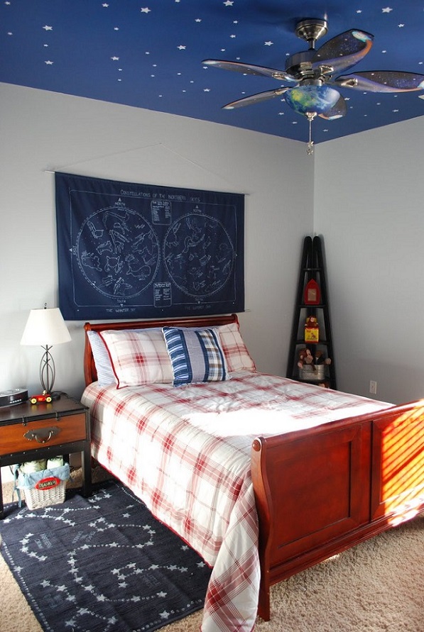
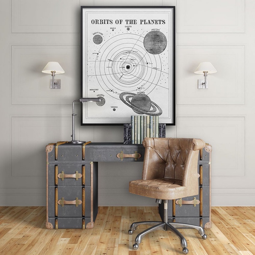
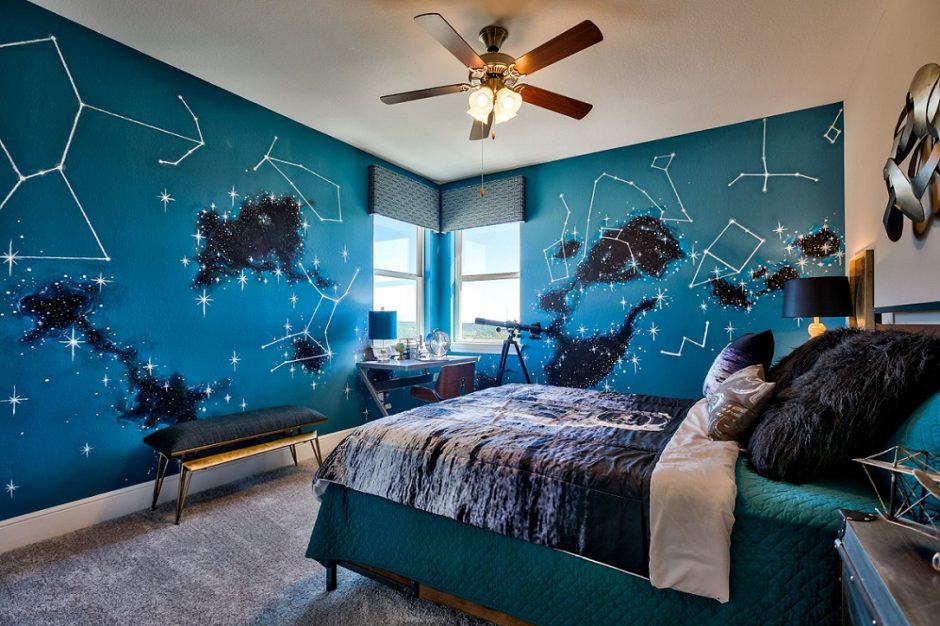
Variations 8.
Variations for a theme: astronomy
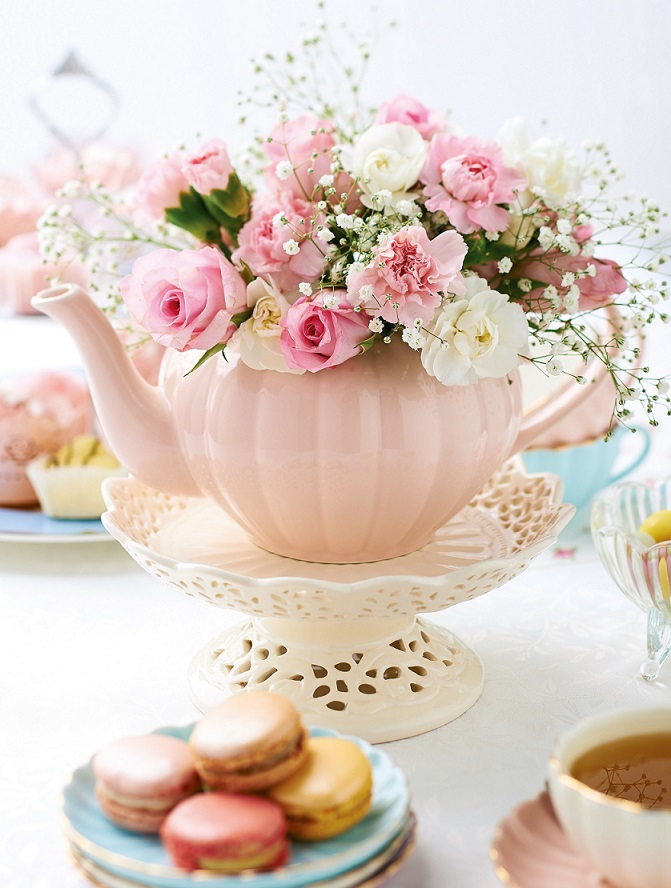
Instead of a vase
If there is no proper vase for flowers…


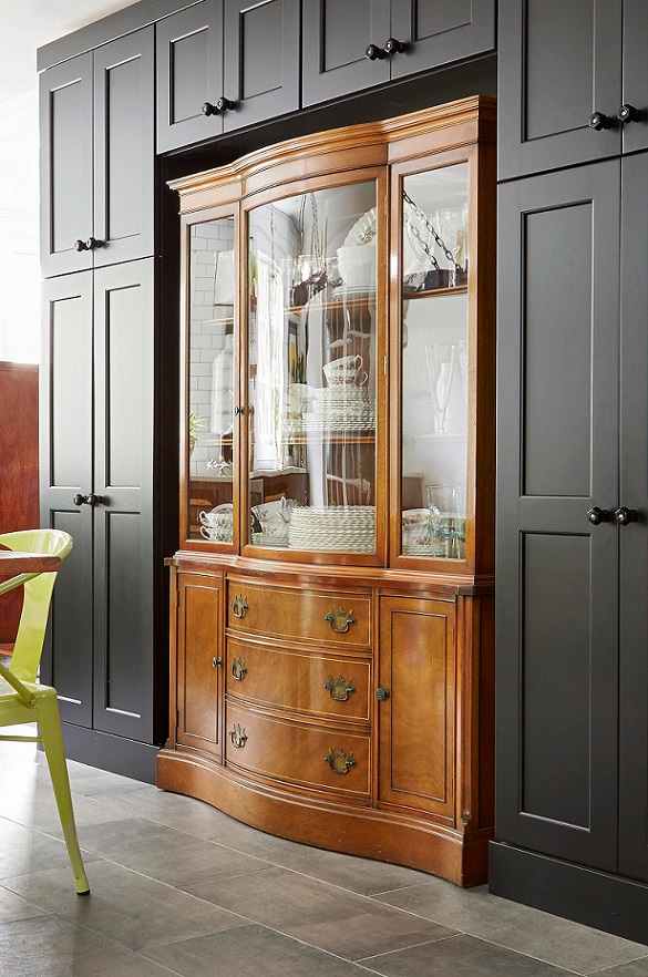
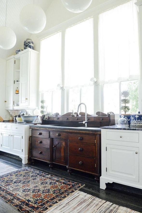
Antique in modern surroundings
Our antique furniture can be integrated well in a room furnished with modern furniture. The result may be surprising but has an elegant effect anyway.
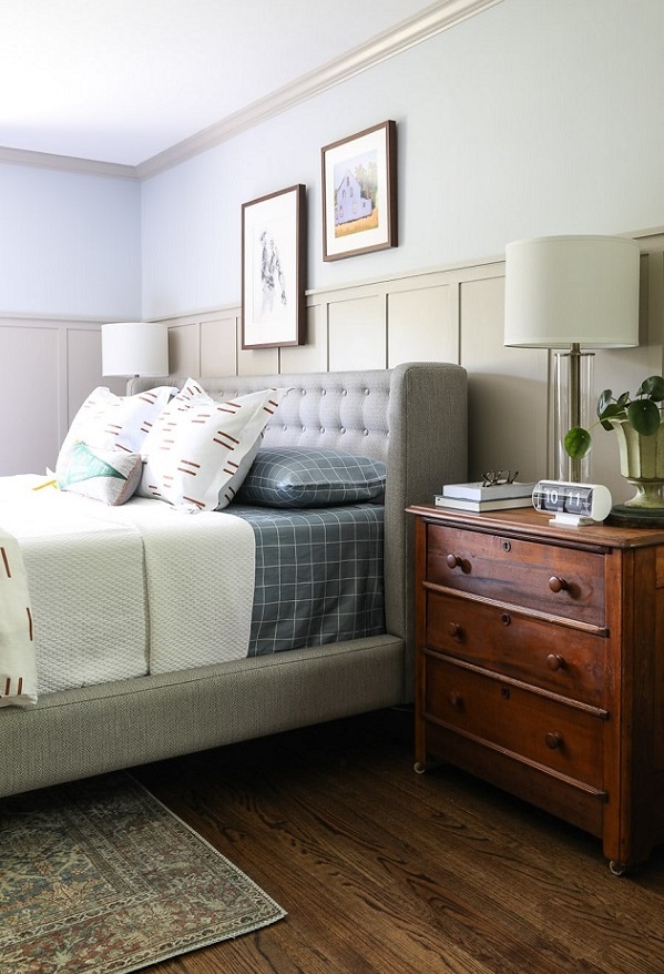
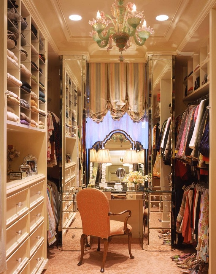
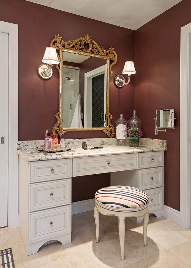
Dressing table
Dressing table can be placed in the bedroom, in the bathroom or in the walk-in wardrobe also

Advisory 2.
Interior design advisory, color and style advisory, advisory based on Feng Shui at Classic Interiors.
Even after working hours or at the weekend, when you have time also.
It can be pre-calculated, so you decide how much time to spend with it.
Visit my website for further details: http://classicinteriors.hu/en/

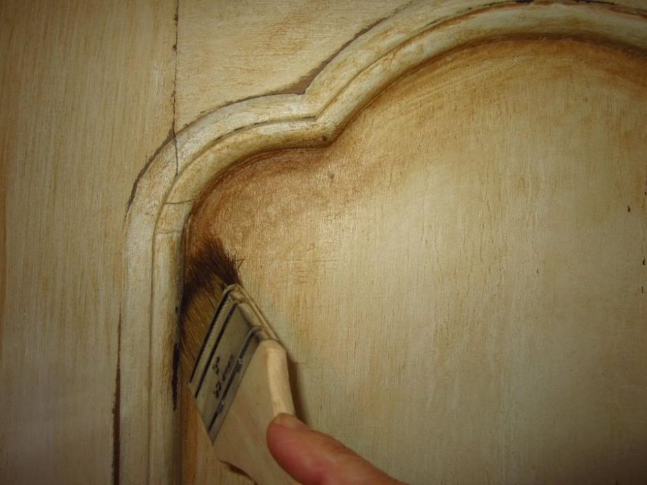
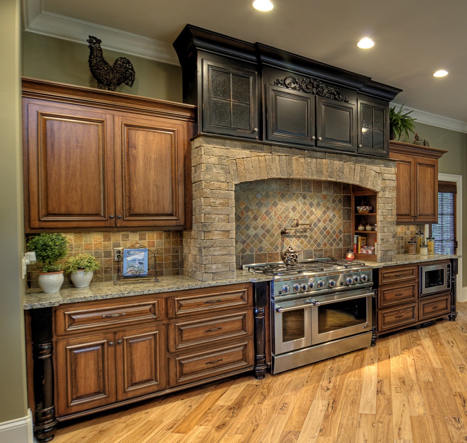
Umber
Umber is a yellowish, dark brown hue. It is made of a natural earth pigment which was named after its source, Umbria region of Italy. Both raw and burnt versions are used. Nowadays, umber brown is mostly used during aging furniture painting method: an antique look can be reached with applying it in a thin layer on a different color base, as shadowing.