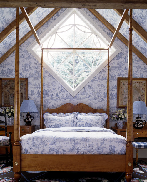
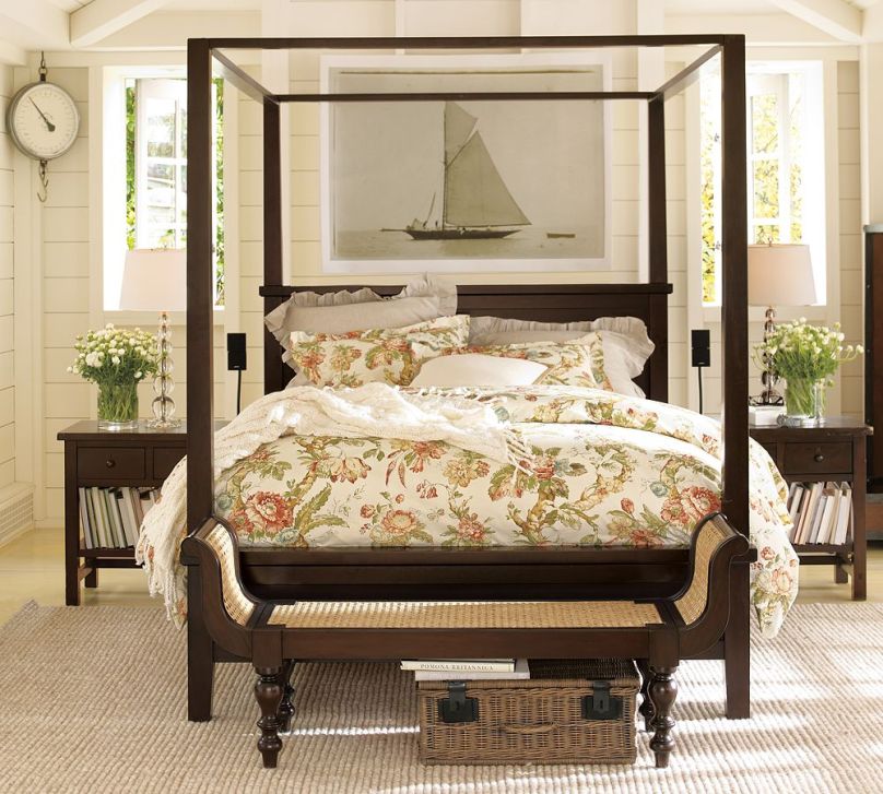
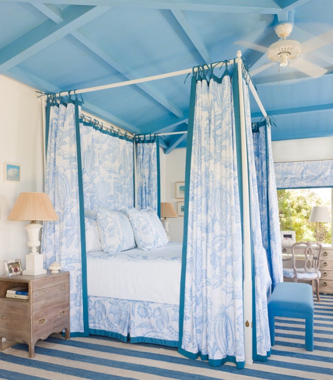
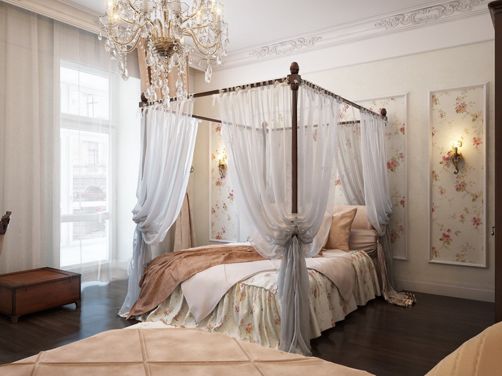
What can be more romantic than a four poster bed?
Archives
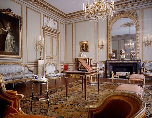
Louis-styles
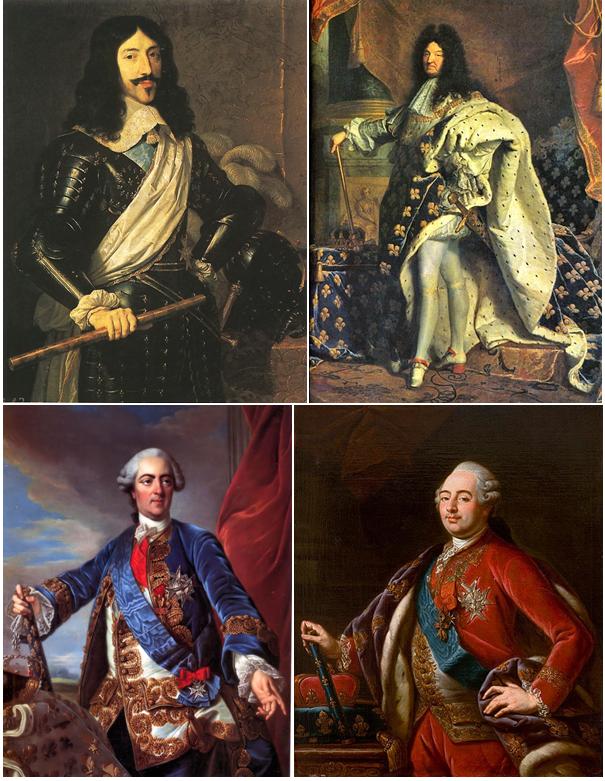
The interior design styles of the era between 1610 and 1793 in France are called Louis-styles after the four reigning kings.
Baroque was half-baked and the effect of Renaissance was strong under Louis XIII. (1601-1643). That’s why the interiors were moderately decorated. Although furniture was richly carved, they were natural in color and large-scaled. Their architectural elements were determining. Chairs are upholstered, most of them are not folding. Louvre was the seat of the king by this time. Impact of Baroque began at the end of his reign.
Louis XIV., the Sun-king (1638-1715) was the lover of pomp. Baroque reached its peak under his reign. The aim was using the more decorating motifs, gildings and exotic materials in every fine arts. He had the castle of Versailles rebuilt to a world famous palace of the king. Boulle is the most known name in the field of furniture, he became famous by his marquetry. He used ormolu, tortoise shells, brass, noble woods by chance. Mansart created lasting in architecture. He is known by the roof type named after him. The beauty of the gardens were the works of Le Nôtre. The geometrically arranged flower beds, fountains, long promenades are spectacular even nowadays. The colorful frescos and murals of Versailles are the works of Le Brun.
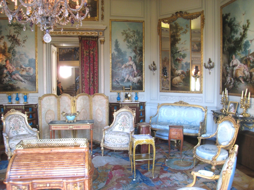
Louis XV. (1710-1774) was the great-grandson of the Sun-king. Rococo is the style of his era which was marked by over-decorating, shell motifs, chinoiserie and feminine interior details. The fashion was dictated by his two famous lovers, Madame Pompadour and Madame Du Barry. Porcelain manufacturing started, the lace-manufactures and silk-weavers were sponsored for the most splendid fabrics which were matched with goods from abroad. The walls were covered by fabrics or wallpapers, furniture were lacquered and painted, the decorating C and S pieces were used inordinately.
The reign of Louis XVI. (1754-1793) was the era of Classicism. The ancient Roman buildings, sculptures and household objects found in excavation of Pompei had a big influence on the people of the age. The stifling over-decoration was followed by a more moderated style: the decoration elements of ancient times were used again, the shapes of furniture became clear, the lines straightened. Even dressing fashion turned to a more comfortable direction. Patterns and decorations of idealized country life were used on fabrics, porcelains and other household objects.
The revolution terminated Louis-styles and the ancient régime also. Several buildings, paintings, valuable statues, porcelains etc. were perished during the huddle and terror of years because of the intentional vandalism and fire-raising of the mob. These are lost forever for posterity.
Fortunately, enough sources and pictures remained for falling in love with any of the Louis-styles and for desiring to implement them at home. A good interior designer can help to realize this dream by refreshing and fitting it to the sizes of present flats/houses.


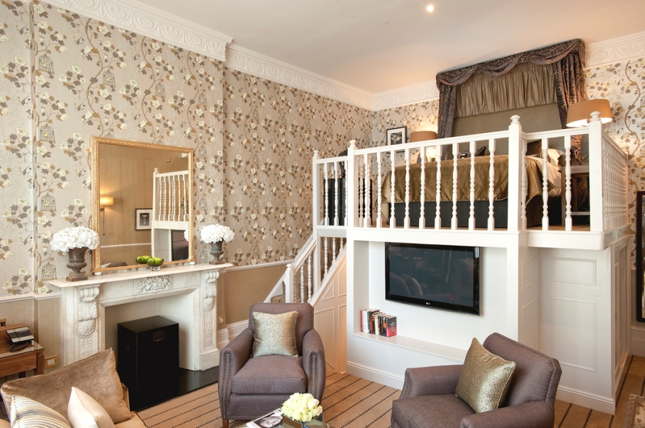
Lofted room
A well thought-out and choosy implemented loft doesn’t diminish the sense of space


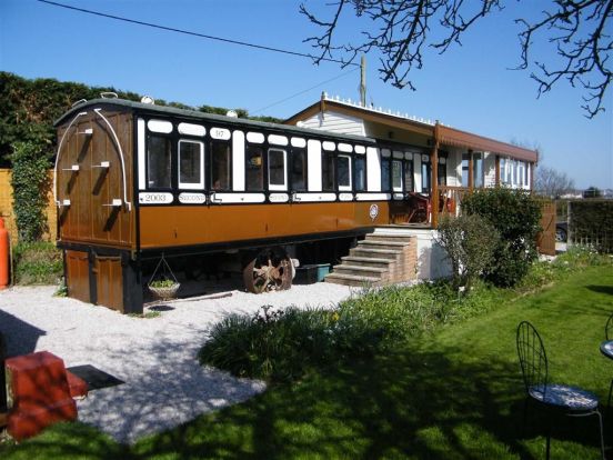
Train as home
A railway carriage can be conjured to a cosy home in classic style


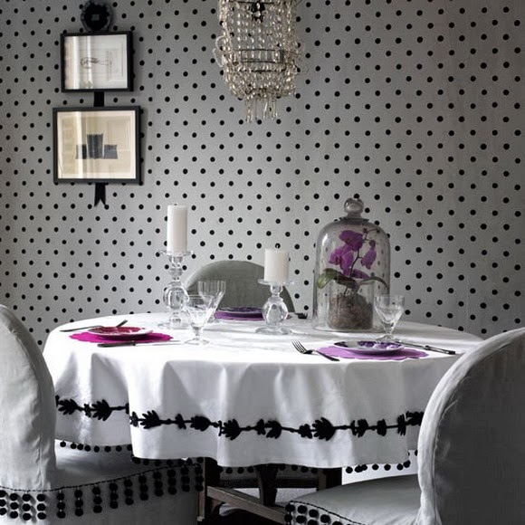
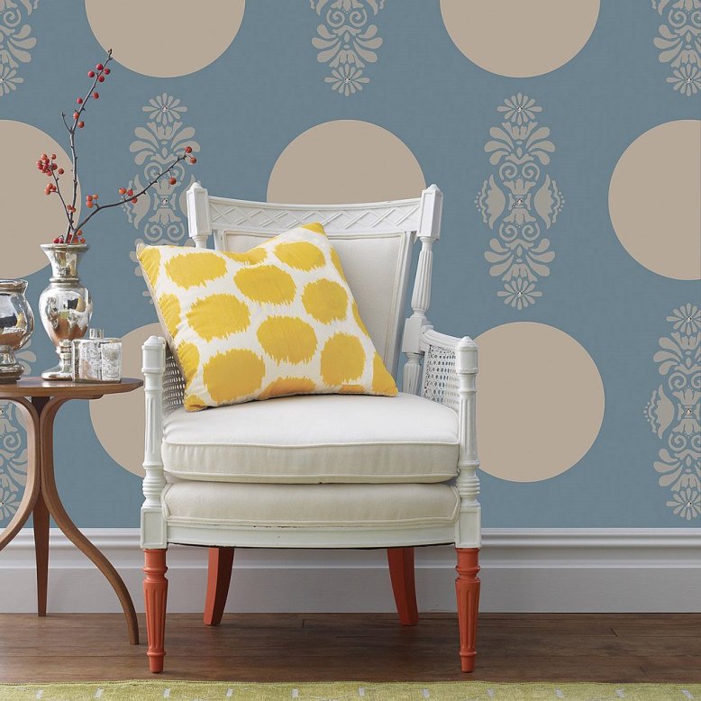
Dotted
Dotted materials are in fashion again in interior design

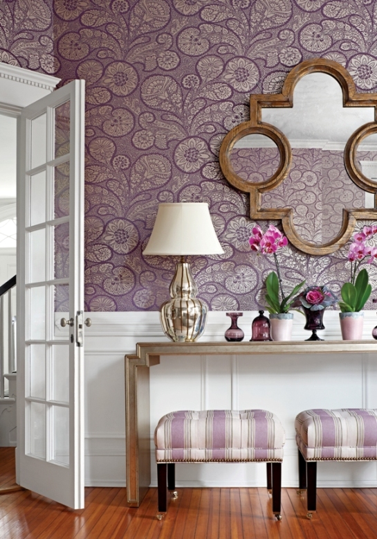
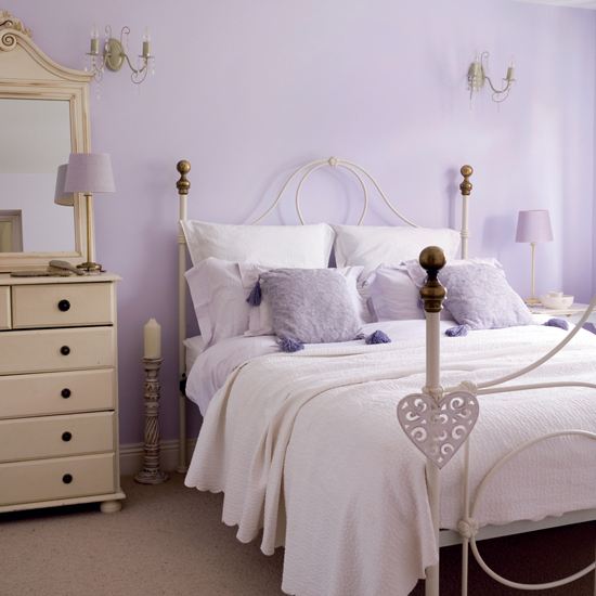
Purple
Purple is derived by mixing to primary color, blue and red – by this, we call it as a secondary color. The complement is yellow.
Physiological effect: strong hues of purple release energy, help creativity and memory. Pastel hues are relaxing, provide the feeling of protection, work against insomnia. In symbolism, it is associated to knowledge, mystique and wisdom. In movies and storybooks, dark hues are often displayed on the clothes of wizards, while light hues can be seen on dress of fairies. Reminds us to splendour and richness. Long ago it was a color of mourning of the French royal house.
Purple can be cold and warm color depending on blue or red component predominates. Relatively new color in interior design, nowadays it is very popular. Darker and stronger hues can be perfectly combined to white, black or grey. Light hues look good with crème or light green. Combining purple with silver results a luxurious effect. It can be perfect in bedroom, child-room or playing room (light hues), or in wardrobes, home office or movie room (dark hues). Lavender is a favourite color of romantic, country styles. Since it is not a food color, we can use it carefully in kitchen, dining room, maybe on the accessories. Purple is the most loved color of 75% of the children under the age of 13.
According to feng shui, purple strengthens in changes and provides spiritual help. Assigned to the 6th chakra (third eye).
Since this color is a little bit “too much” in itself, and it can have strong, dramatic effect, for implementing a tasteful purple interior, ask help from an interior designer.


Patchwork
Patchwork is in fashion again – choose an old, hand-made piece for the unique look


Built-in attic
Building in the attic is one of the best methods for increasing the useful floor space of a house. Such a reconstruction raises not only the value of the property but very comfortable living space can be created with applying some rules.
Pay attention to the quality of insulation because it can largely affect the costs of heating-cooling in the future. Take care of the latter, because these rooms have to be more intensely heated in winter and cooled in summer. The livability of the attic depends on the proper amount of light. If it is possible, more or bigger windows should be built in. If they can be placed only on a high level, let’s choose pieces with handles on their lower part. Since sunshine can be a problem in summer, proper shading should be provided. Mostly roll-up blind or light-reflecting window-foil might be the solution but common curtains shouldn’t be neglected either because of the sloped roof! It can be just as elegant as in an ordinary living room or bedroom, with clever solutions. Attic might be darker in winter than other rooms, so the proper implementing of artificial lighting has to be attended already at the beginning of the works.
A built-in attic can be suited to several functions. In the case of a bedroom, the bed shouldn’t be placed under the skylight because it can disturb the calming rest. If the wardrobe will be here, dehumidifying is a very important task. In the case of children’s room or playroom, safety is a must, especially if there is a balcony also. It’s worth to use additional sound-proofing in the case of a movie or TV room. The proper darkening can be solved here easier. This kind of space can be good for a hobby room or home office also. Take care of placing the desks for avoiding hitting the sloping roof when standing up from the chair. A wider tabletop can be used for this.
Always ask for help of professionals for building-in an attic. Consult with an interior designer for optimizing the final furnishing and for the best usage of the space.


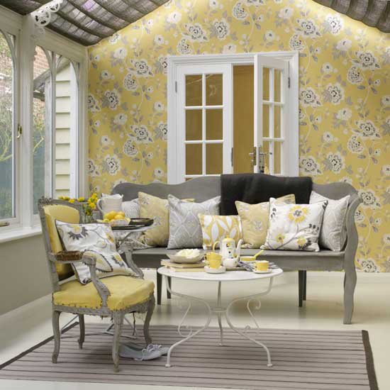
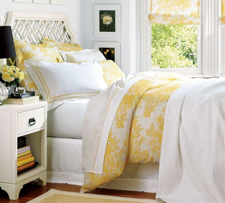
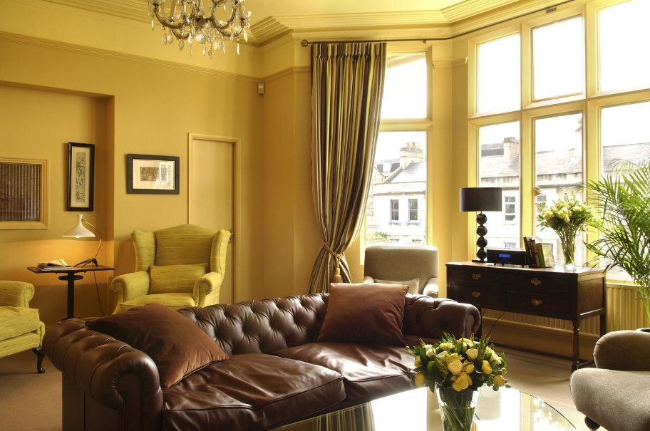
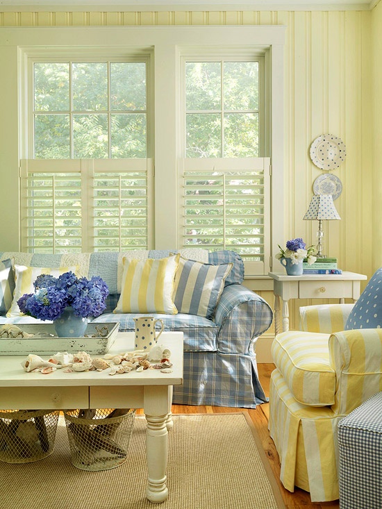
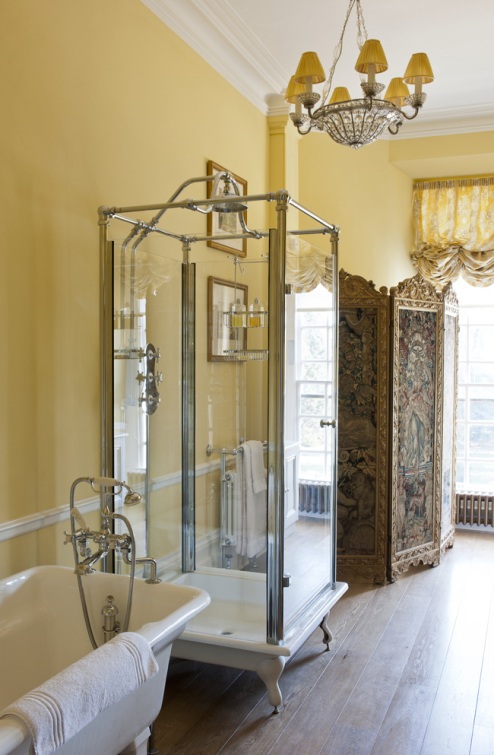
Yellow
Yellow is considered to be the most happy color. One of the three basic color, its complementer is purple.
As a physiological effect, yellow decreases depression, increases brain activity and strengthens the neural system. Helps learning improving the concentration ability. We can associate on sunshine, gold and spring by it, therefore its presence makes us glad. In symbolism, yellow is the color of honour and loyalty, at the same time cowardice and envy is assigned to it. Combined with black, it is used for attention signs such as mother nature (e.g.: wasp, spotted salamander).
A warm color. Makes spaces shiny and warm. If there is not enough natural light, this problem can be solved with it. In design, combined with white it results a light, combined with brown it results a classic interior. With grey, the result will be elegant, with blue it gives youthful effect. In a black and white interior, yellow is a perfect focus point on smaller accessories or furniture. Vivid hues of yellow are ideal for dining room or kitchen, while pale hues can be applied in any room. Fits correctly to country style. A very light hue of yellow is cream, which is popular and widely used.
Feng shui assigns yellow to ground element. The color of Jang, the masculin side and the 3. chakra (navel). In ancient China, only the emperor wore yellow, since it was a divine color. In Egypt, yellow is the color of mourning.
Yellow must be used carefully, since its vivid hues make the space stunning. It can be easily overdosed, so if you would like to create a tasteful yellow interior, ask help from a color advisor.
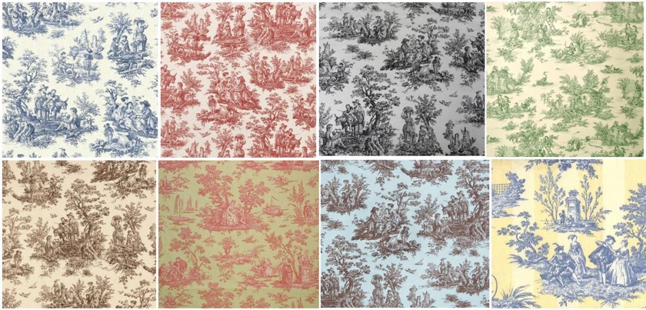
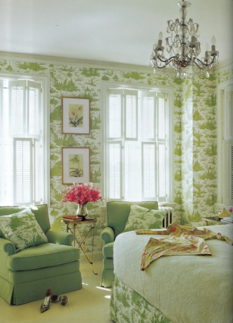
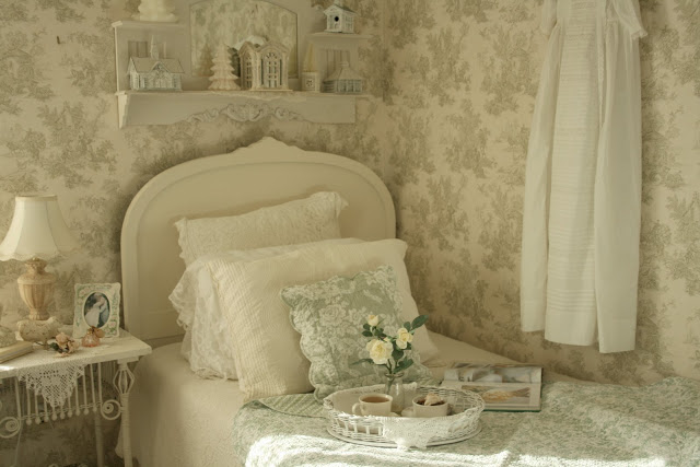
Toile pattern
„Toile de Jouy”, or shortly „Toile” pattern has a French origin. The word toile itself means linen and Jouy is the name of a small town at the East part of France. These type of fabric had produced there since the 18th century. „Toile de Jouy” means canvas from Jouy.
Patterns are printed in one color on the fabric. The base is generally white, or beige. The pattern is repetitive at the whole area of the textile. It displays mostly idyllic scenes, such as rococo noblemen dressed to shepherd or shepherdess, fishing, flower picking or picknick groups, surrounded by landscape and building parts. Colors used for the patterns are originally the black, dark blue and red, but there also were green, brown or pink versions. These fabrics were used to upholstering furniture, covering walls or curtains. The toile pattern itself can appear on wallpapers, porcelain sets, tablecloths and beddings, etc.
In the recent years, toile pattern became popular again and widely used in interior design. Colors are much more variant and vivid nowadays, designers pair practically any background color with any pattern color. The scenes remain bucolic and idyllic. In chinoiserie topic we can find Chinese related scenes instead of them.
The pattern itself is very versatile. Can be applied in country style and also in a baroque, elegant interior as well, or even in a child-room. The furniture and accessories will give the final view, we can emphasize it with choosing the color of the material.
If you love this pattern, but afraid of having it too dominant, or just want to realize a romantic and elegant atmosphere, ask help from an interior designer for planning.