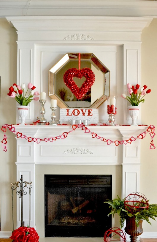
14th of February is Valentine day and celebrated worldwide. This is the day of love. Its origin is not clear. The mating period of birds starts at the middle of Februery, maybe this observation led to the emergence of this feast. Traditionally love is assigned to this day, but we can give surprises not only our love, but our family and friends as well.
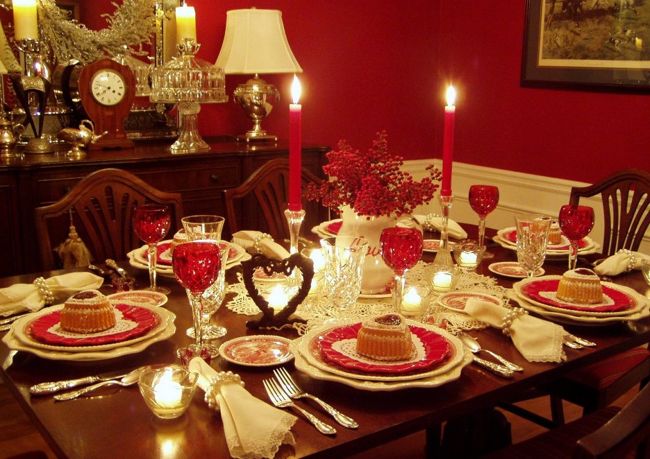
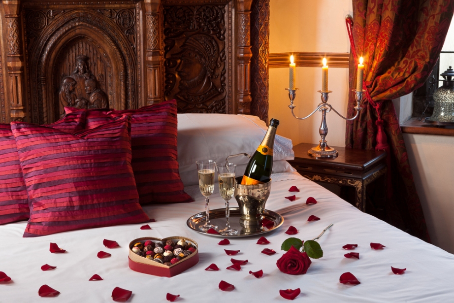
Its traditional decoration motives are rose, heart, Amor, arrow and pigeon. Customized colors are red and all shades of pink. Celebrate this day with a complete home decoration, not only a romantic dinner. Hang a heart shaped decoration on the front door made of red roses or pink paper flowers. Place colourful candles, garlands made of hearts and small puttos on the mantle. In the bedroom, we can change the blankets and the cushions to red, the lampshades can be decorated by boas, cushions can be scattered with flower petals and a heart can be formed by candles on the floor. In the bathroom, place candles to the bathtub and shelves. Hang out red or red edged towels. Pour rose scented bubble bath into the bath water. Dinner table should be decorated by candles and red plates, which can be part of the everyday, other coloured dinner set. Red glasses and damask nepkins are also decorative. A bucket of rose looks good everywhere. If you feel red color too dominant, combine it with lot of white, thus only the important motifs will strike your eyes. For a less formal, youthful mood let’s apply the hues of pink instead of red.
If you would like to surprise your loved ones with a special Valentine’s Day mood, ask help from an interior designer for decoration.
Archives


Photos for selling our home
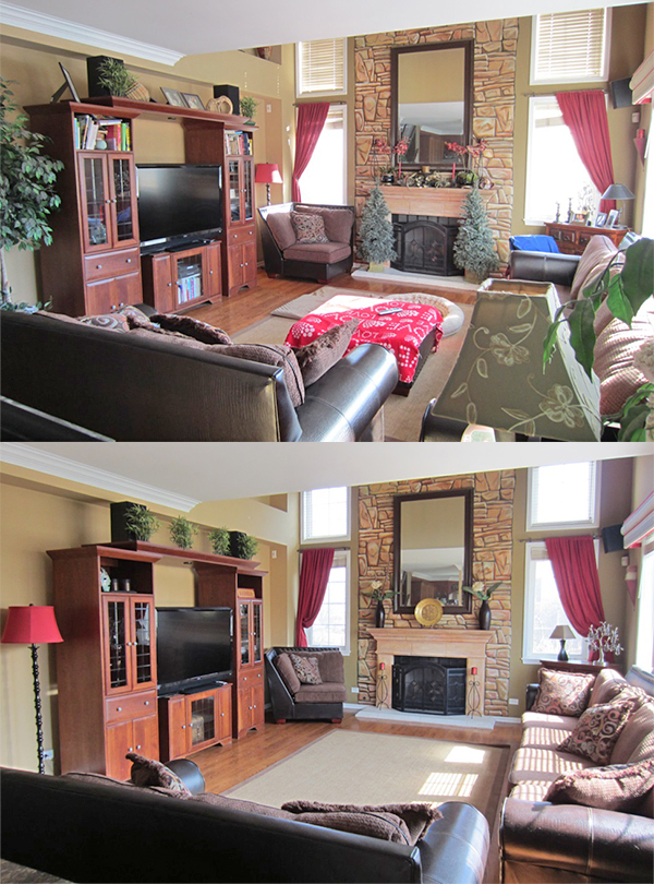
When selling a property, the most important part of the advertisement – beyond floor map – are the pictures taken of it. According to the experience, it’s not quite obvious how to take some such quality photos, which will “sell” the property for us.
Before we start, let’s clean up! It’s a great mistake if we think, that the several weeks old mist or the lack of mopping will not be noticed on the pictures. Another essential task is tidying up. Everything should be put to its place and let’s check, how could be the space even more spectacular. Let’s look at a few interior design magazines and get some ideas from the photos in them: there is no mess, color- and style cavalcade or too many decorations. It’s advised to move from room to room and always prepare the given room for the perfect photo. This can be quite difficult task when the property is inhabited, since the amount of personal objects and furniture should be decreased to a level acceptable by an outsider. If necessary, move the excess chair or commode to another room during taking pictures. Most of the decorations should be placed behind closed doors and the remaining should be arranged nicely. Let’s turn on all the lights even in daylight! Use wide angle lens to catch the most of the room in one frame. Emphasize the good features, such as large window, cozy alcove or the beautiful hardwood flooring. At bathroom and kitchen, the feeling of hygiene is the most important. Here the metal surfaces should be shiny, glass doors and mirrors should be freshly cleaned to show the glamour. If possible, let’s provide a picture of all the rooms to the advertisement.
Some disincentive examples that are regularly appear among property advertising: drying underwear in the bathroom, full trash bin in the kitchen, unmade bed in the bedroom, or dirty clothes on the floor. Although the prospective buyer will purchase the property not our personal objects, yet all this counts a lot with him when deciding, whether he comes to see the apartment or house, or not. In case of a house, choose a shiny day for taking outdoor pictures for the sake of real bright colors. The principle of order still should be valid: tidy up the garden, trim the grass, even stairs and paved parts should be washed up. Take several photos of both the house and garden from different angles.
If you would like to distinguish your advertisement among the lots of others, ask home staging advices from an interior designer for the preparation.
Variations 1.
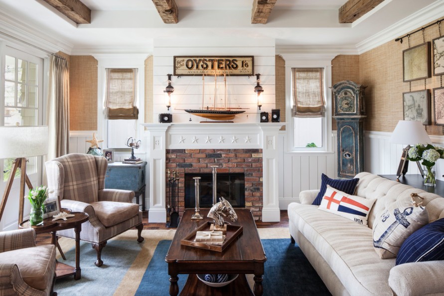
Variations for a theme: shipping
Color pairs 1.
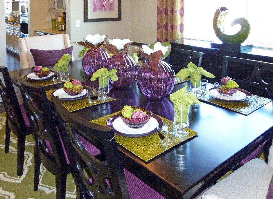
Color pairs: purple-green


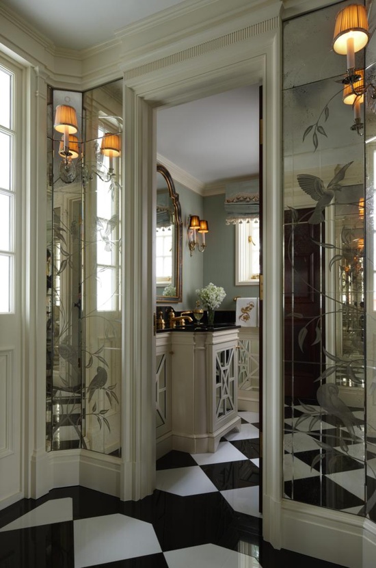
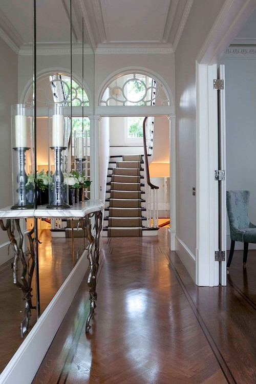
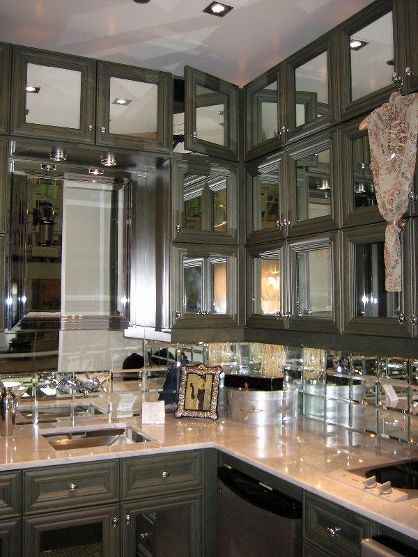
Mirrors
In old times mystic power was assigned to mirror, frequently it was thought as a door to other worlds. It still has an important role in our lives, not only in dressing but as a useful element in interior design also.
The main feature of mirror is reflecting the light and doubling the sight of the objects. This is exploited when a space is furnished with it. If light can’t be brought in a room, for example an inner corridor or hall, hang bigger mirrors on the wall, even opposite to each other, this way the light will be reflected to and from between them. This is the solution if the space is narrow also. Even one single big mirror can multiply the sense of space. They can be used as decorations instead of pictures. Let’s hang old faceted mirrors in different sizes on the wall in a desired arrangement. They will be as elegant as paintings.
However, some things have to be considered when placing them. In a bedroom a mirror should be placed only if it is not visible from the bed because in the other case we would react to every single movement of ourselves and falling asleep would be harder. In the dining room it should be placed on such height that the guests sitting at the table couldn’t see themselves in it while eating. It is practical to hang a full size piece near the entrance door, this way a last checking glance on the dress can be done when leaving.
It is a decorative solution in a kitchen to put antiqued mirrors in the doors of the upper cabinets instead of glass. This can be a good option for the backsplash also between the two cabinets instead of tiling. Pieces in floor to ceiling size can be placed in the gardrobe, home fitness room or bathroom.
If you think that some mirrors could renew your home also, ask for help of an interior designer for choosing and placing the proper pieces.

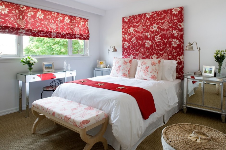
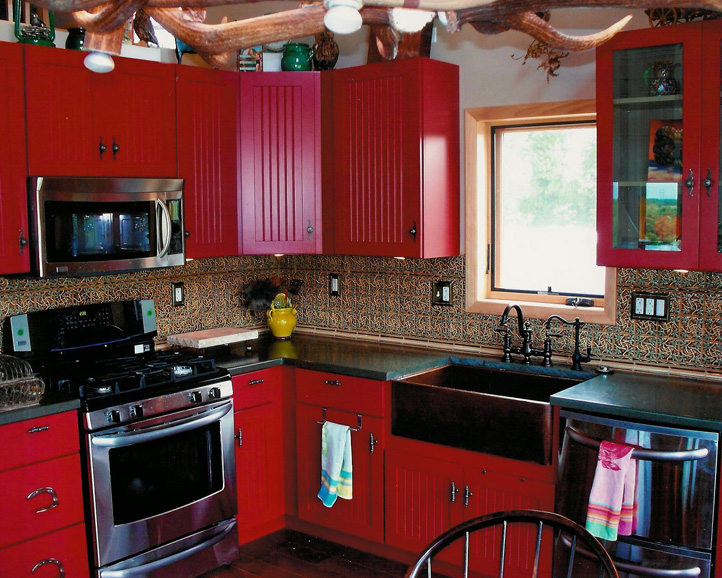
Red
Red is one of the three elementary colors. The most striking member of the color wheel, that’s why it is beloved by many people. Its complementary is green.
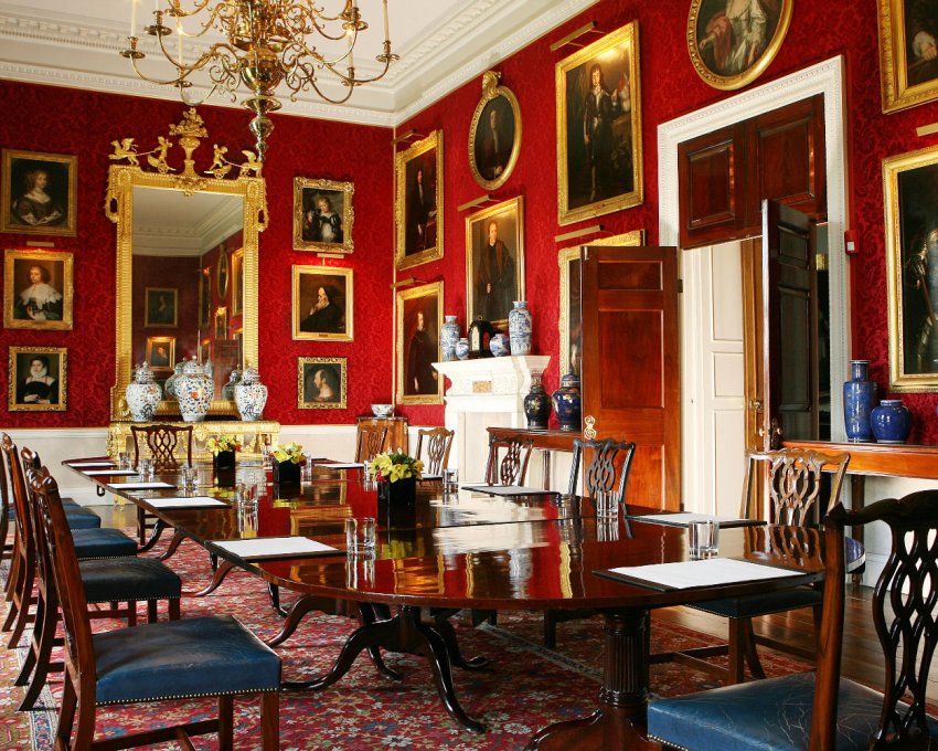
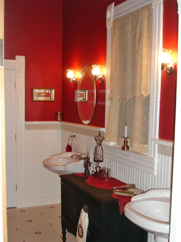
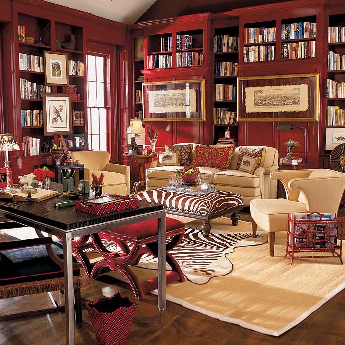
As a physiological effect, red increases blood pressure, has exciting effect on nervous system, fasten metabolism, it’s activating effect increases vitality but causes stress and makes one nervous at the same time. It is the most noticeable at daylight. We associate to love, sexuality, fire, blood and war by it. It means danger and prohibition in symbolism, that’s why it is used for danger signals in traffic. It is frequently used at groups of disaster protection and healthcare companies, just think about Red Cross and fire departments. In old times red was one of the most expensive clothes dyes which was made of cochineals or dye-murexes, thus only the rich could afford it, so it was connected with wealth also (e.g. carmine edged togas of ancient Romans, robes of the cardinals). The red lamp quarter got this name not by chance also.
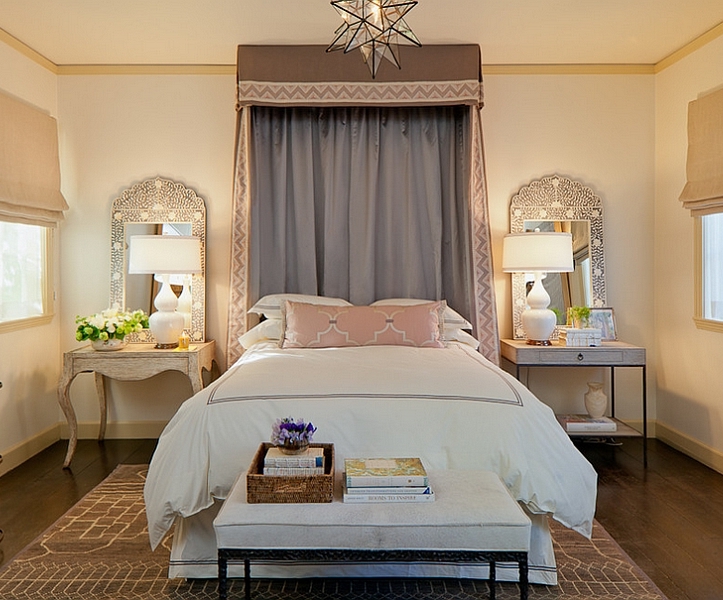
Red has the most intensive narrowing effect among warm colors, that’s why we feel the room in this color much smaller. It is a food-color, so fits well for dining room and kitchen but it can be used in home office too because of its stimulative effect. Many people paint the walls of their bedroom red because it is the color of love. But this is not a good solution for a long term, it causes sleep disorders and nervous tension. The bedroom should be calming, if red is desired to bring in anyway, it shouldn’t be seen from bed. For example, lay a red carpet, paint red only the wall behind the bed, put a bedspread or cushions on the bed which will be put away before sleeping. Handle it cautiously anyhow, because it is a very intrusive and aggressive color. Use it rather on accessories or as a focal point at home. Its strength can be blunted with white or cream. It looks very good in combination with black, dark brown or grey. Its deeper tones are more elegant, for example claret or burgundy red. These were frequently used as background color for gilded framed paintings as a gallery.
Feng Shui assigns red to fire element. It is the color of Jang, the male side. It belongs to the 1st chakra (root). This is the color of good luck in China.
It is used by very dashing, fast-expanding, mass-producing companies in business life as color of their logos or products. It comes into view immediately on the shelves of the shops or in the advertisements.
It’s not an easy task to create a real elegant red interior, so ask for help of an interior designer-color adviser already for planning!
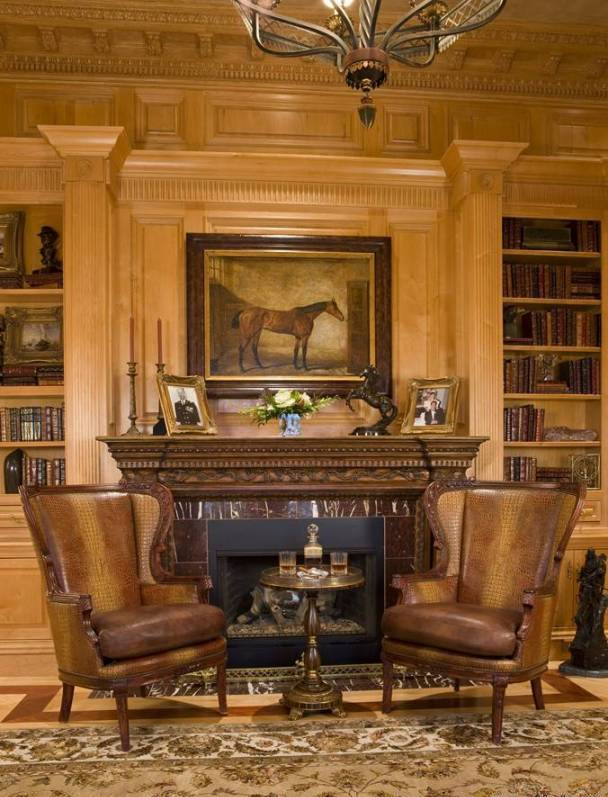
Brown
Brown is gained by mixing red and green colours, thus all the three base colours are involved. This is the most liked ground colour. It has warm and cold hues, the laters have greyish tone. Brown is considered as masculine colour.
This colour is associated to force, safety, maternity, simplicity, diligence. According to physiological effect it is relaxing, protecting. It’s also a food colour, first we associate to the fine cookies. In ancient Egypt, good dreams were marked with brown colour. In the medieval and early modern Europe it was one of the basic colour of the clothing of poor people, since they couldn’t afford the dyed fabrics. In England however brown was the determining colour of the wardrobe of the perfectly elegant gentlemen for long time.
Since natural wood and leather are also brown, in interior design this is generally and frequently used. Using as wall paint, it gives depth to the space, as floor cover it gives stability. Dark hues can replace black – as its warm tone alternative – when we would like to emphasize something. It can be used in any room, but in case of dark brown walls, the proper lighting should be also provided. It is regular in historical styles, mainly the deeper hues. Combined with gold, a luxurious interior can be produced. Together with white, cream or beige, the result is classically elegant. Nowadays it is still very popular, it fits to practically any style.
Feng-shui associates brown with the earth element. Light hues are assigned to Jin, the feminine side, while dark hues to the Jang, the masculine side colours.
For advertising, it is used by companies that providing luxurious products or services to their customers, e.g. sweets, wellness, etc.
Most people like brown in their homes, but to avoid “cave like” result, it has to be used with sense. If you would like an elegant and stylish brown interior, ask for the help of a colour adviser.


Shaker style
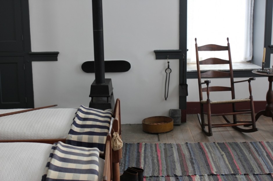
The shakers are a religious community established in the 18th century. The members moved from England to North America. They are famous about their love of peace, puritanism and the equality between the genders.
Shaker style is simple, practical and thrifty. All household objects are produced by themselves. Forms are determined by function. Ornamentation hardly used, if they do, they are most often the heart, hand and star motif. Paints are made of natural materials. Most characteristic colors are rust brown, aquamarine, ocher, sage green, claret and beige. Most of the fabrics used are made of wool, cotton or linen, which are simple and monochrome textiles, sometimes with a small chequered pattern. From warn fabrics they sew patchwork blankets or rag rugs.
Furnitures are simple, wooden ones. Door panels of wardrobes have frame insert structure. Ladder backed chairs can be hanged up when out of use. They make wall-mounted hangers on which almost anything can be hung securely. Also characteristic item is the thin sheet box, which has a round or oval shape and requires high skills to prepare.
The function and simplicity oriented way of thinking of shakers can be actual even todays modern world. Kitchen furnishing in shaker style can be a definitive element of classic or rural style kitchens. Placing some shaker storage boxes can decorate a work room, living room or bathroom. Using their color palette we can realize a warm, friendly interior with natural feeling.
Ask an interior designer to help implementing shaker style in your home.


Pictures
When decorating our home, walls are important issue. The simplest way is hanging paintings on them. But what can we do if we cannot afford really expensive paintings in our classic style apartment or house?
First possible solution is using empty frames. We can purchase several, decorative old frames in different sizes (e.g.: blondel or Florentin style) in the same color. They can be placed on the walls together, visually acting like several pieces of one artwork. Symmetry is not a perquisite; they should only look nice together. Don’t be afraid to repaint the less valuable frames if required.
Remaining wallpaper or fabrics can be also used for decoration. Cut them into the frames best fitting to the interior, and hang them up covered with glass. Since the same wallpaper or fabric already has been used at another point of the flat, the view will be reflected making the space much more organic. Old newspapers, handworks, nice wrappers, postcards, dried flowers or maps also can be framed such a way.
If we have the talent for painting, we can create some paintings ourselves as well. Defined topic or expression form are not required, the essence is the color harmony with the style of the room. We can paint even single stripes, squares or patches. With the proper frame, we can get a perfect DIY accessory.
Family photos are also available for decorating a classic interior. Have your favourite photos being processed in black and white or sepia, not to disturb the mood of the room with their bright colors. Montages can be assembled from them fitting into a bigger frame, or they can be arranged in several different smaller frames side by side, covering a larger surface.
Nowdays many companies provide large scale, quality printing of any picture. We can chose photos from their database that are fitting to our home. There is a huge selection of color, theme, size as well and they even offer framing too as a service. Blind framed canvas print is also an available solution. Ask help from an interior designer for the selection of pictures, paintings fitting perfectly to your home.


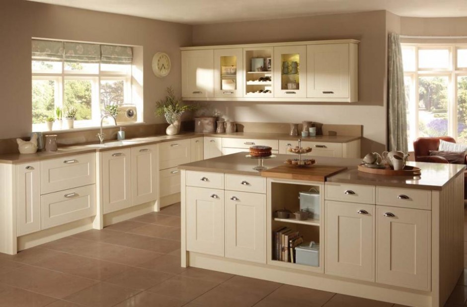
Neutral colors
Natural, neutral colors are considered as the base elements of interior design. Many people think they are dull and impersonal, although they can be used versatile – resulting really wonderful interiors.
Some of the most well known natural colors are beige, taupe, creme, light hues of grey, egg shell, sand, ecru, lightest hues of brown, etc. Both cold and warm tones. Nature provides them ready-made. Let’s think about different stones, raw linen, wooden materials and sizal.
Nature colors are excellent background for vivid colors. They weaken strong, warm hues and strengthen the cold ones. If we are uncertain, which colors we would like to see in our home, let’s paint the walls first with the colors mentioned above and apply neutral fabric for larger furniture. After it, this base can be decorated with more intensive colors we like, e.g. on cushions, curtains, accessories. If we don’t like the result, the color of the decoration can be changed easily until we find the proper ones.
Neutral colors have calming, eye-relaxing effect. They fit to almost every interior design styles, we can use this palette bravely. They are perfect choice for French country style, Gustav style, or seashore style. Even the warm hues widen the space, since they are regularly light hues. For a more characteristic effect, darker tones also can be selected. Combining different textures, the view can be even more exciting.
Although using natural colors is considered to be a safe solution, it’s not easy to select them properly to get a really nice result. Ask help from an interior designer for reaching the optimal.