Colors of autumn in our home
Archives


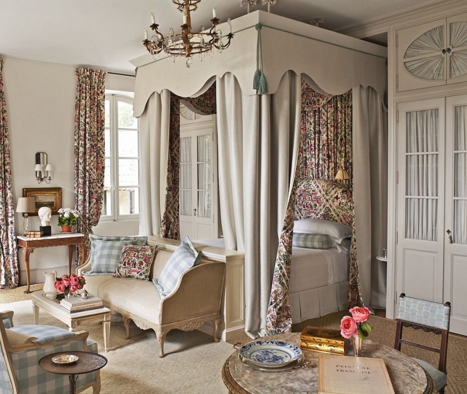
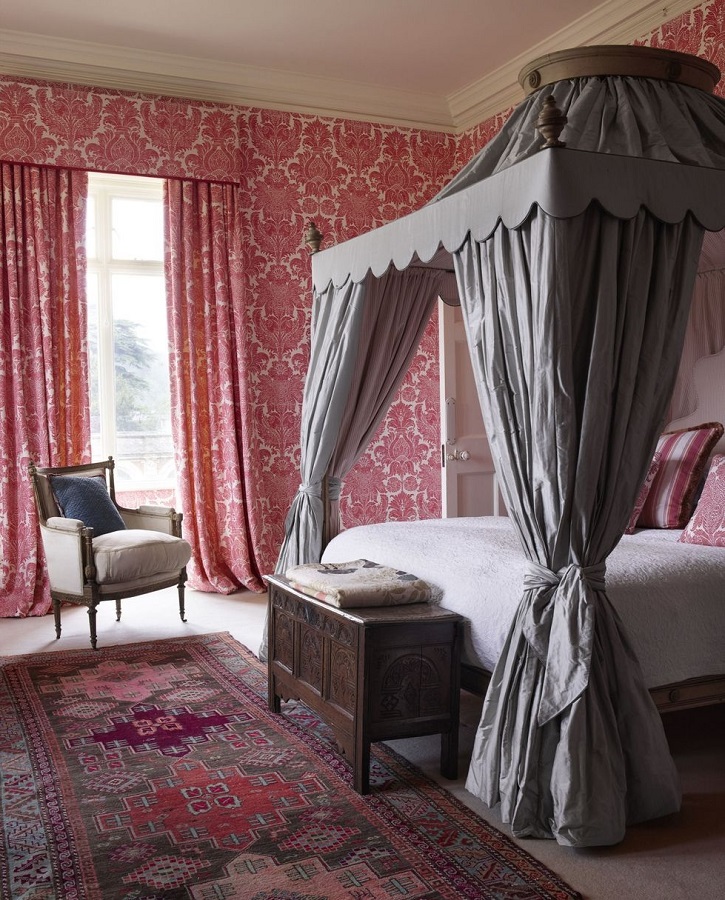
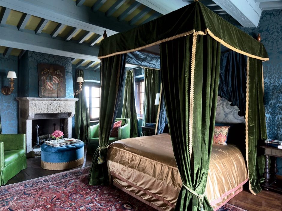
Canopy bed
Beyond decoration, four poster bed with canopy had a real practical function in old times: it protected against cold and draft and provided a private place when more people slept in a room
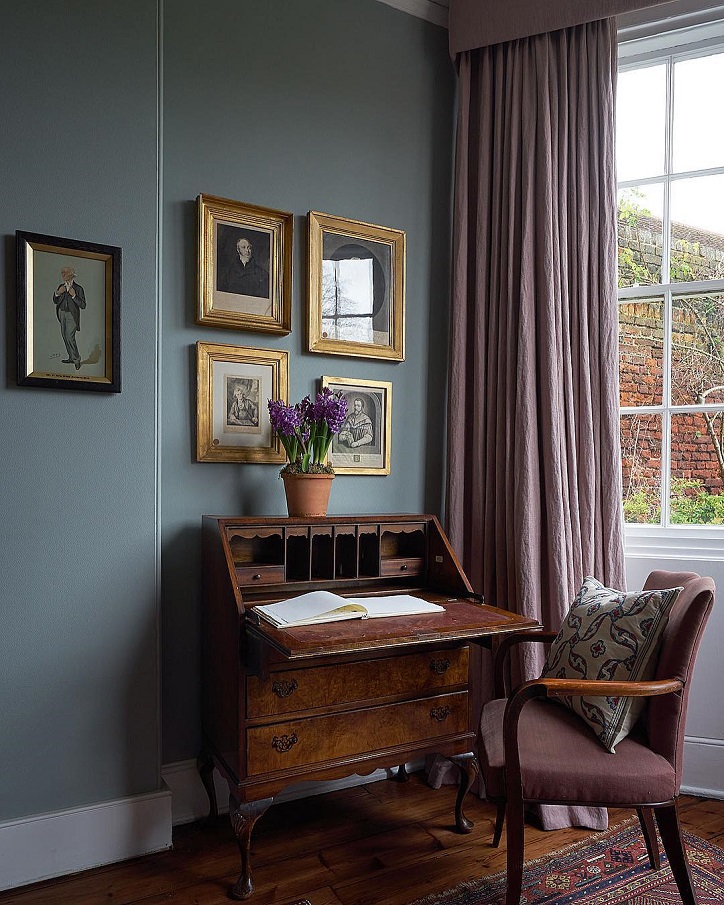
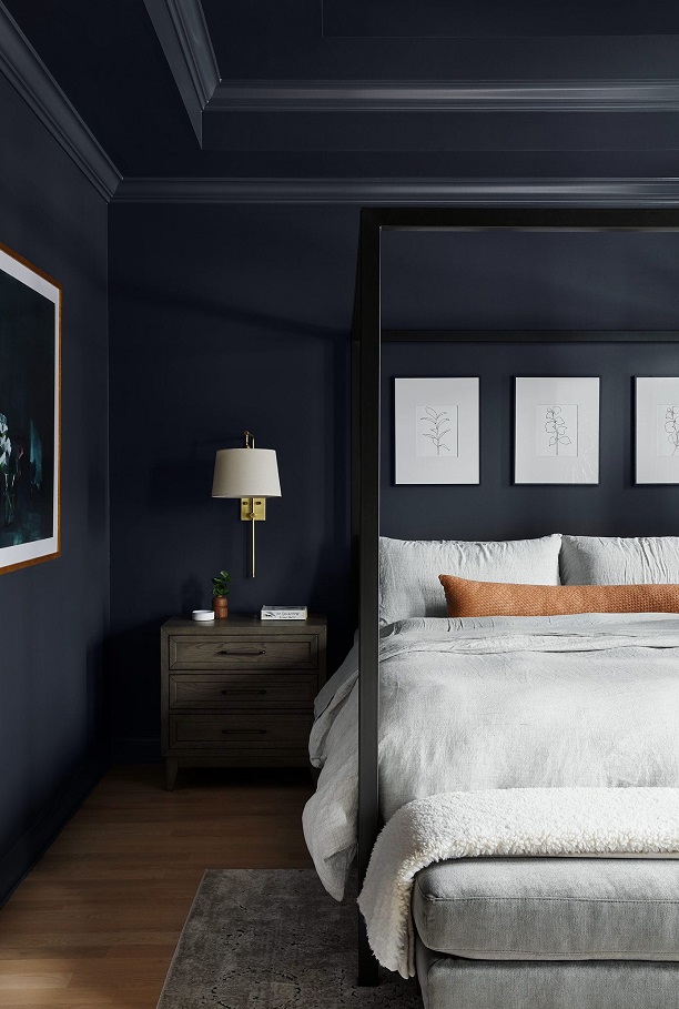
Indigo
Indigo is a dark but not vivid bluish-violet hue. It is the inner color of the rainbow, near blue. It was named after the natural blue dye which is extracted from the Indigo shrub.
Those who like dark colors in their home can use it even on all four walls. It gives depth to the space, but it also radiates elegance. If we want to pair it with other colors, pay attention to its clear purple tone. Thanks to this, it has less formal effect than clearly blues with similar tones and intensities. It can be well combined with both pure white and natural, neutral colors. To create a masculin interior, choose the shades of brown for pairing.

Summer colors
Colors of summer in our home

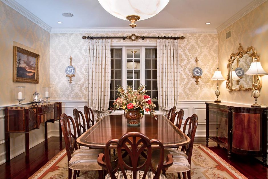
Traditional
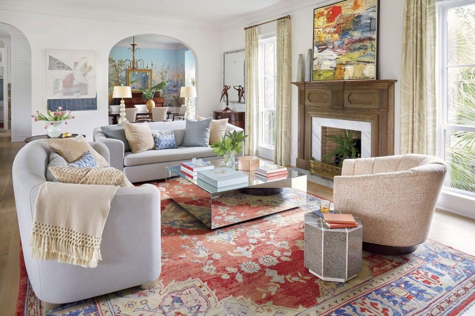
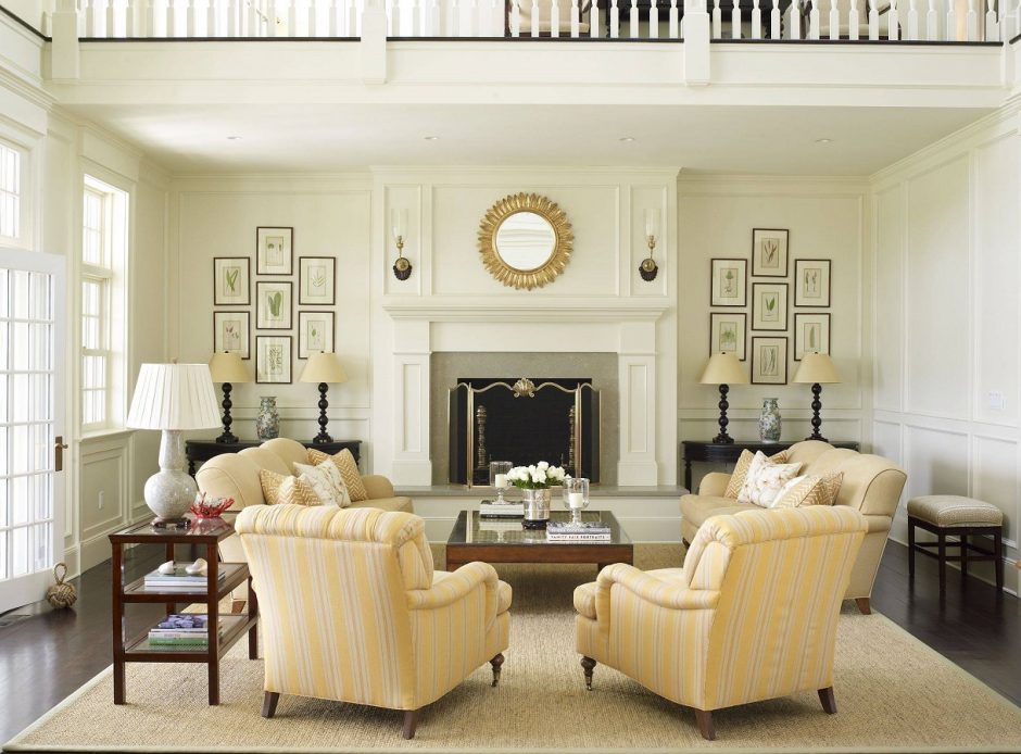
One of the main pillars of traditional interior design is symmetry
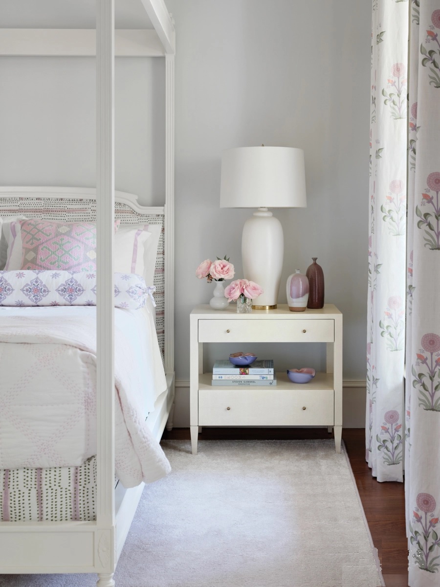
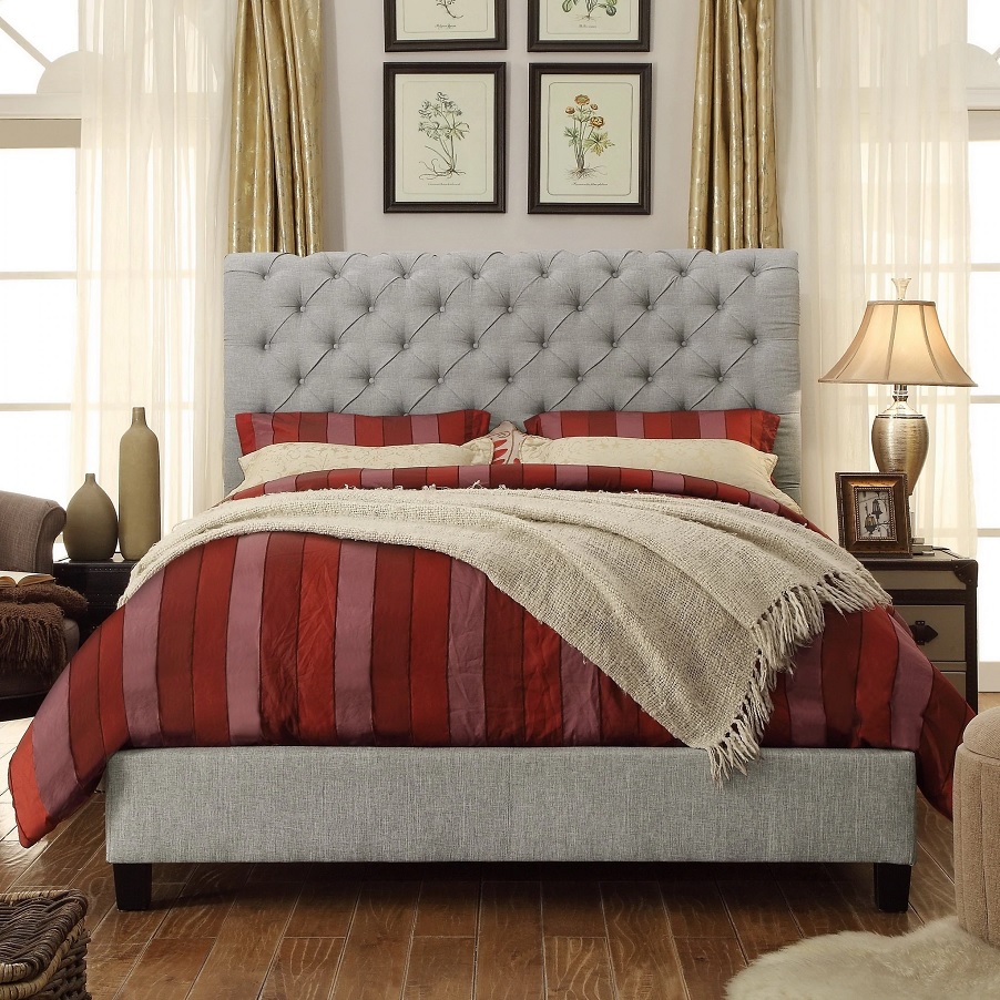
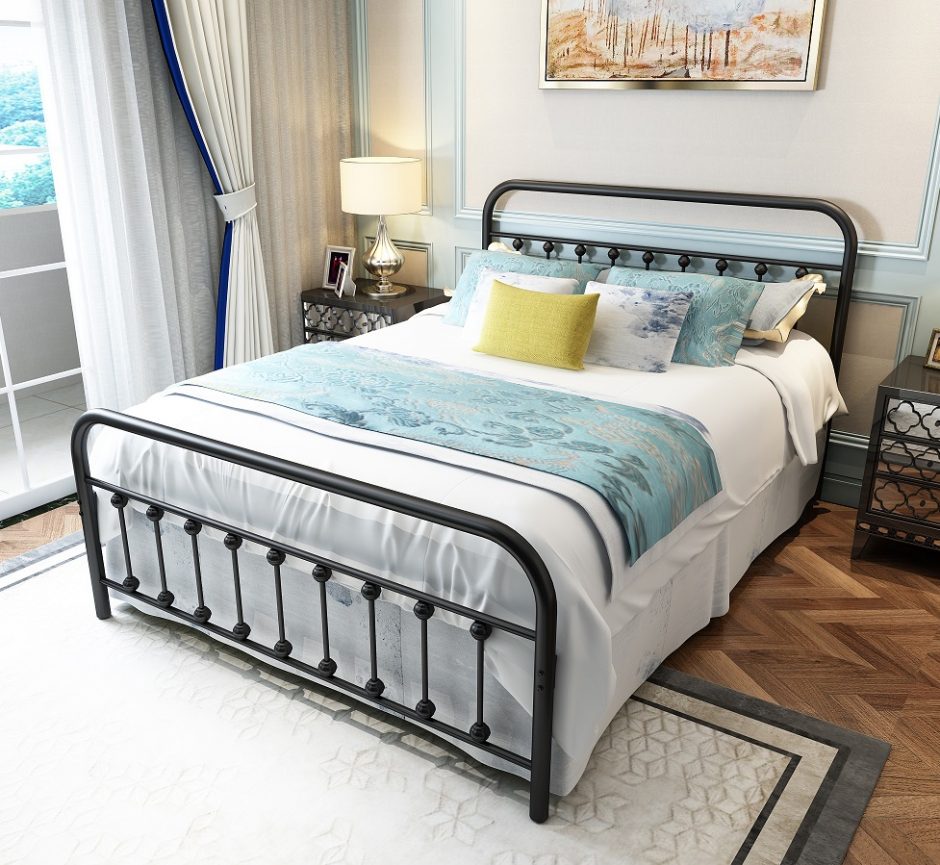
Bed frames
What kind of bed frame should be chosen: full upholstered, made of wood or metal?
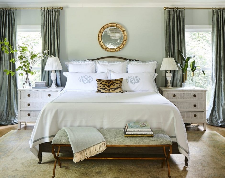
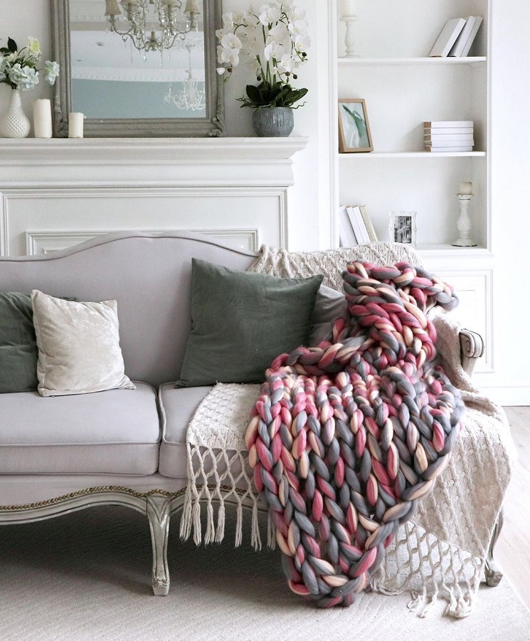
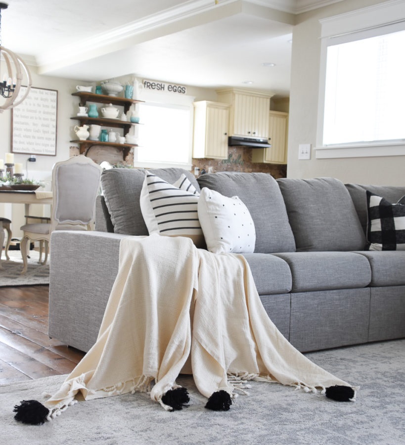
Throw blanket
The throw blanket „carelessly dropped” on the sofa or at the end of the bed can be not only a pop of color but also bring movement to the space, making it a great decorative element
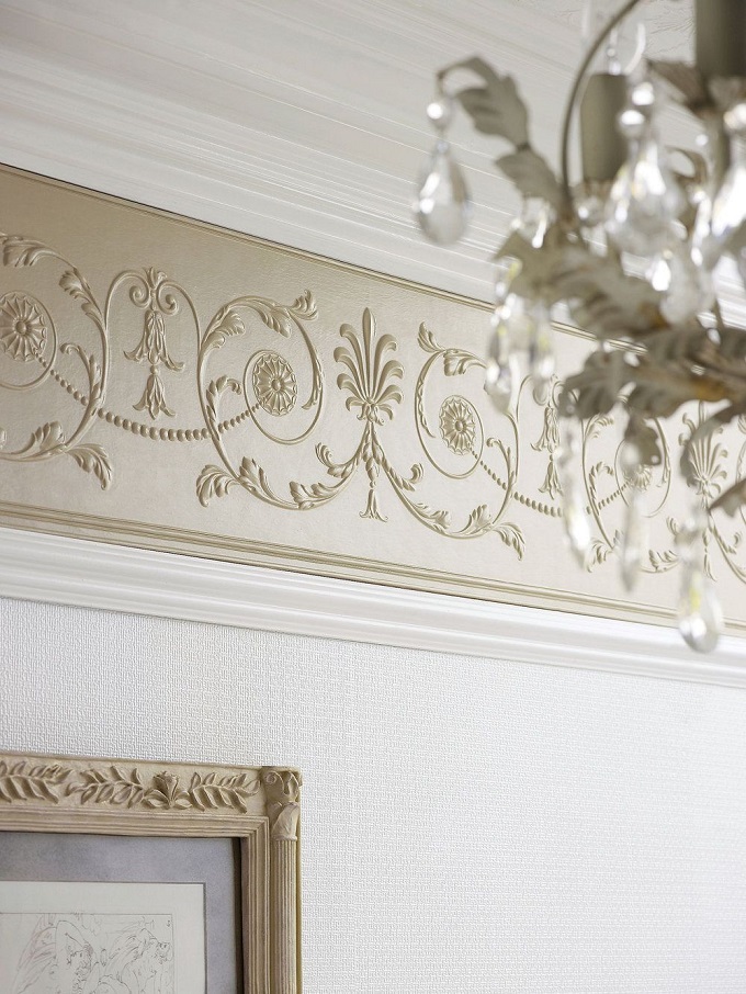
Wallpaper border
Many still insist on the use of wallpaper border. According to experts, it will also come into fashion again. How don’t let it be old-fashioned? Always choose a pattern that matches the style and colors of the room, and its height should fit the height of the room. Put it right below the cornice, do not leave a space between them and do not put it instead of the cornice! This way it won’t sqeeeze the space either.

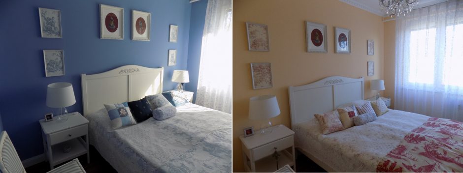
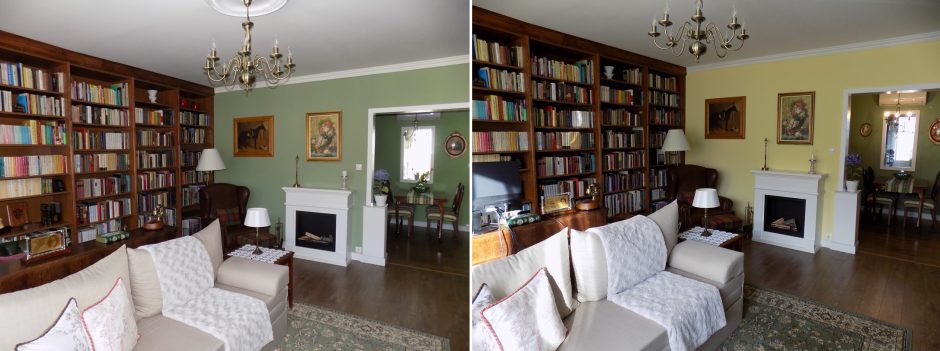
My project 41.
After seven years, it’s time of change 🙂 before-after

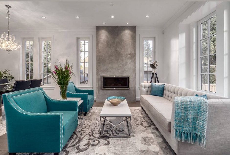
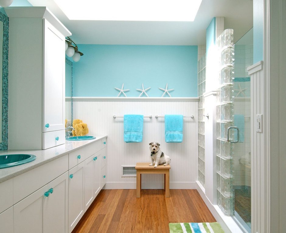
Turquoise 2.
Turquoise is a bright, happy shade of blue, containing green. It is the color of the Carribean waters and Mediterranian sea so, we mainly associate with water and seaside by it. It is a very good complementary color for the neutral colors (white, grey, beige, brown etc.), vitalize the space. It is popular in interior design. In larger quantities, use it in rather sunny rooms. It was named after the semi-precious stone.