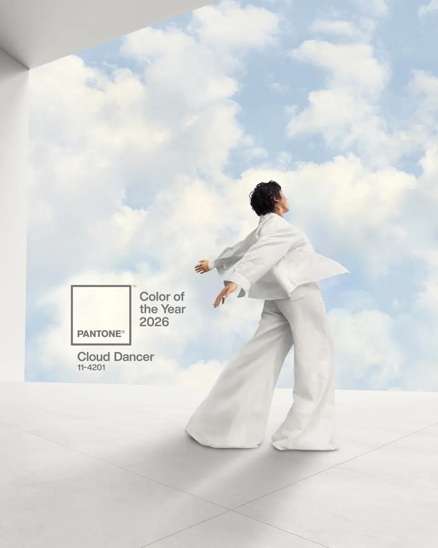
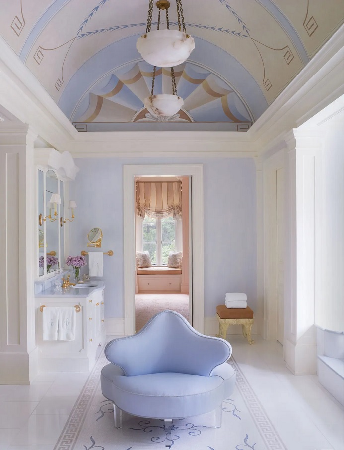
Every December Pantone company announces the color of the next year which effects interior design also. Cloud Dancer no. 11-4201 is the color of the year 2026.
This is a shade of pure white, not actually a color, but rather allows all other colors to prevail. It symbolizes a new beginning, airiness and hope.
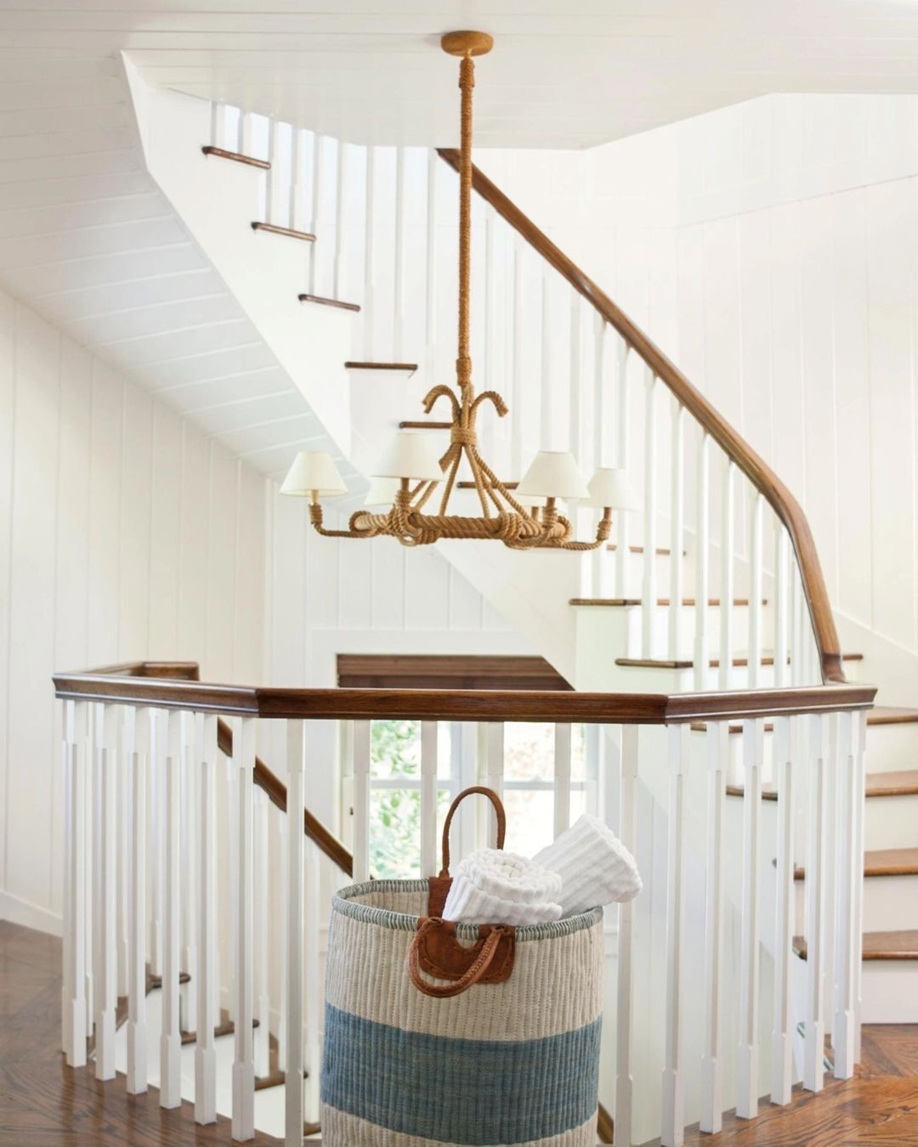
Feel free to use it in any room. However, keep in mind that if white dominates an interior, mix different textures during the furnishing process, so the space will gain depth and not resemble a hospital ward. Even in the currently fashionable, all-white homes, other colors are needed as a counterbalance, so our eyes can focus on every detail. For example, natural wood (floors, stair railings, wall panels) helps maintain a sense of purity and simplicity, dark colors make the space more modern through contrast, and pastel colors bring softness and femininity to the look.
Ask for help of an interior designer for making the color of the year 2026 appear in your home in style.
Archives
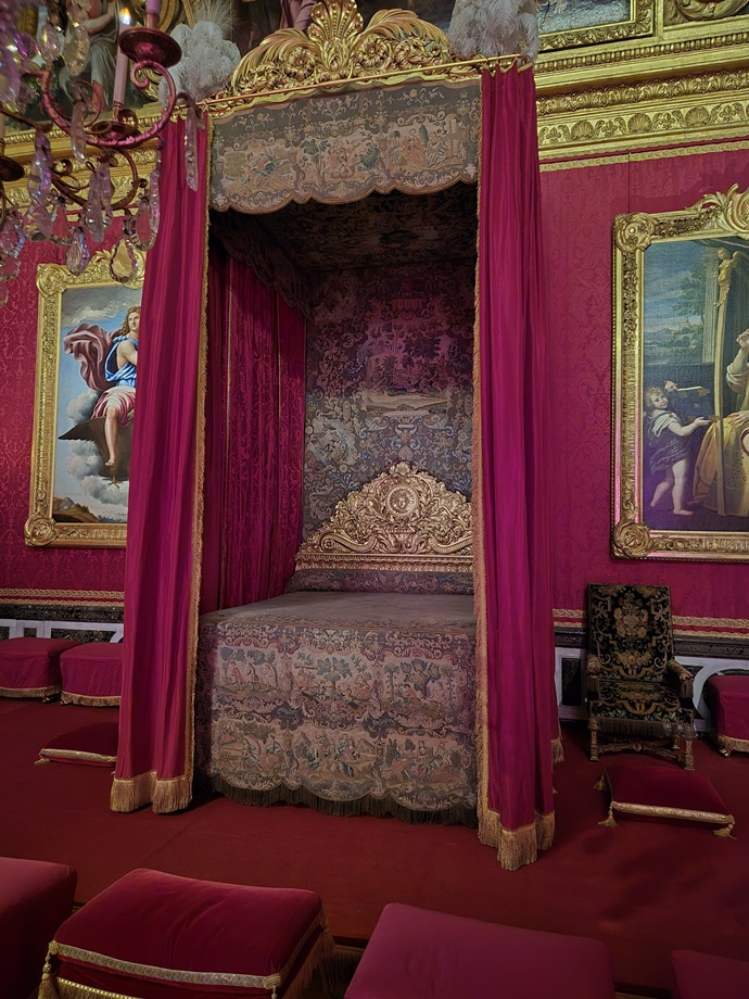
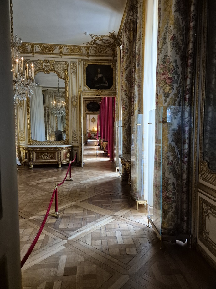
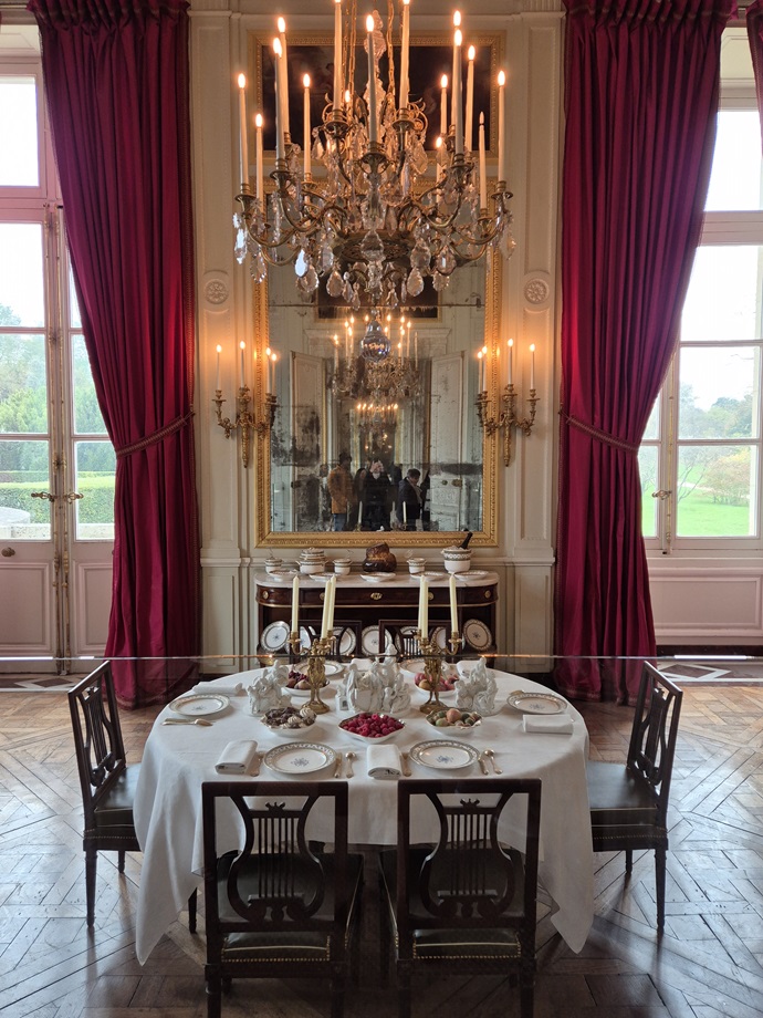
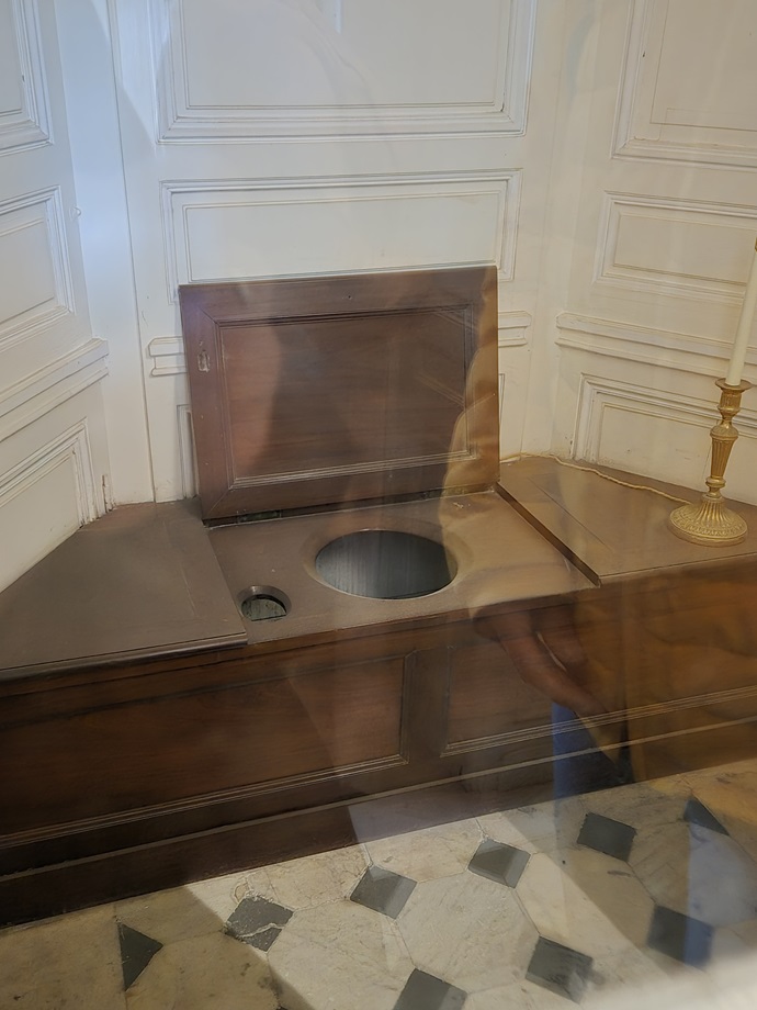
Palace of Versailles and Petit Trianon
Some details of the Palace of Versailles and Petit Trianon through the eyes of the visitor (2024)
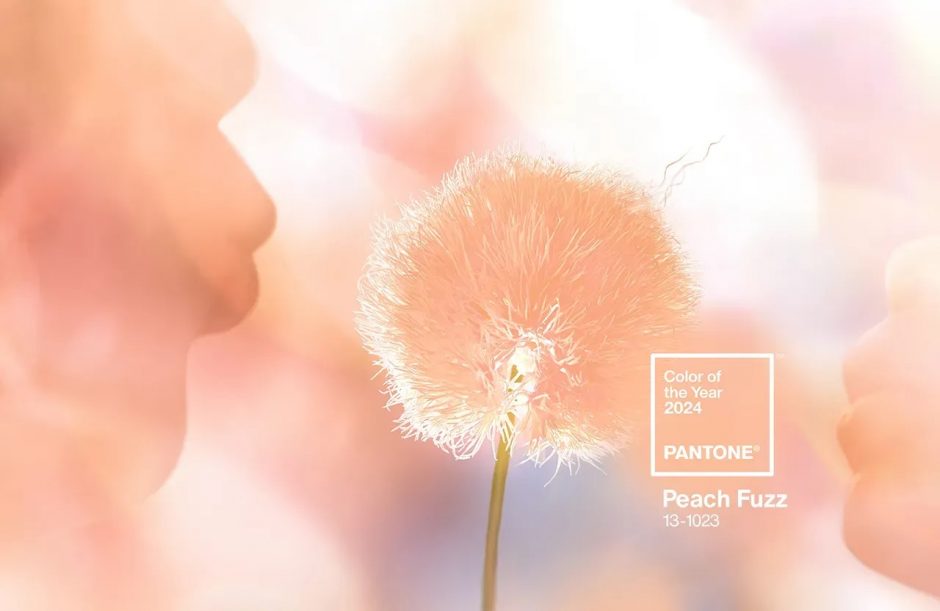
Color of the year 2024
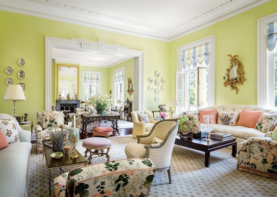
Pantone company announces the color of the next year in every December which has an effect on interior design also. Peach Fuzz no. 13-1023 is the color of the year 2024.
Its base is orange, mixed with a good amount of pink. It is a soft, restrained color that reminds us of softness, homeliness and tranquility. A more airy, pastel effect can be achieved if mixed with white.
A feeling of excessive sweetness or femininity can be avoided by combining it with black and white. Its complement is baby blue, it looks good with shades of brown and gray, as well as mint green and sage green. It can also be used on large surfaces, but it also functions as a showy pop of color on accessories. It can be used in any room.
Ask for help of an interior designer for making the color of the year 2024 appear in your home in style.


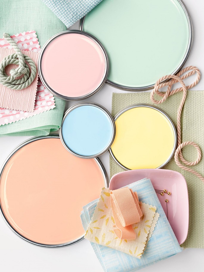
Pastels
Pastels are a family of colors of any hue characterized by relatively high lightness and low saturation. They get a place in almost all interior design styles because they are restrained and most of them give a neutral background. For example, the popular beige, powder and cream colours belong here also. Pastel colors can be boldly used on large surfaces, they combine well with each other and expand the feeling of space. They are named after an artistic technic. With the chalks applied here, such bright, airy colors can be achieved.
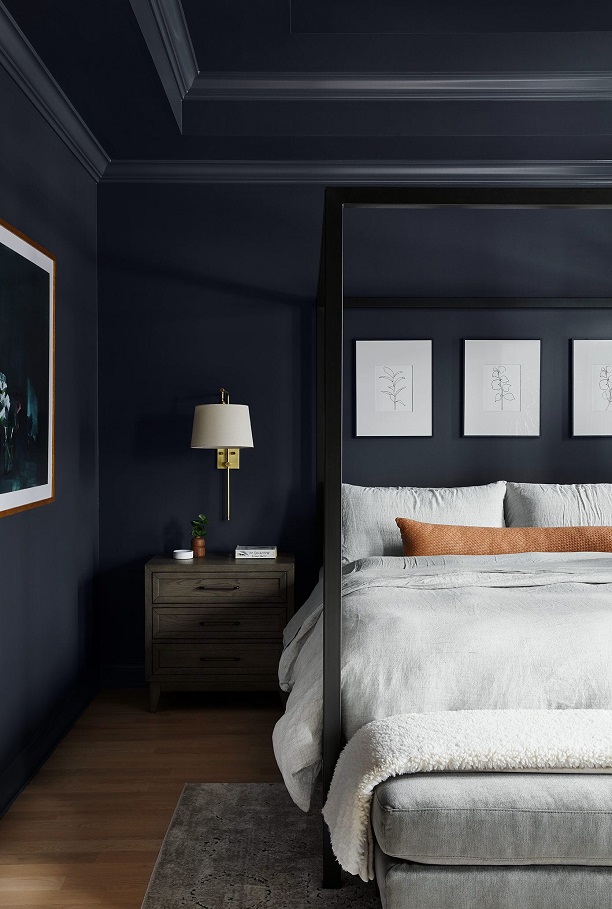
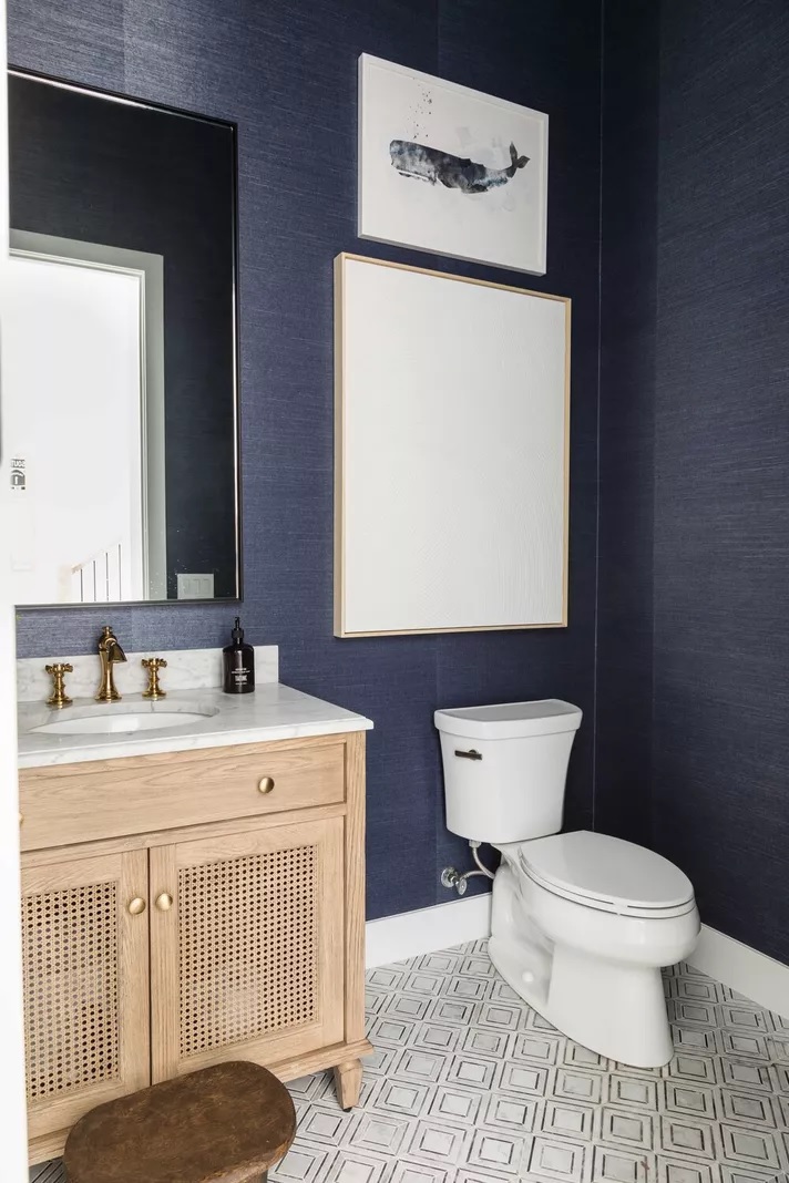
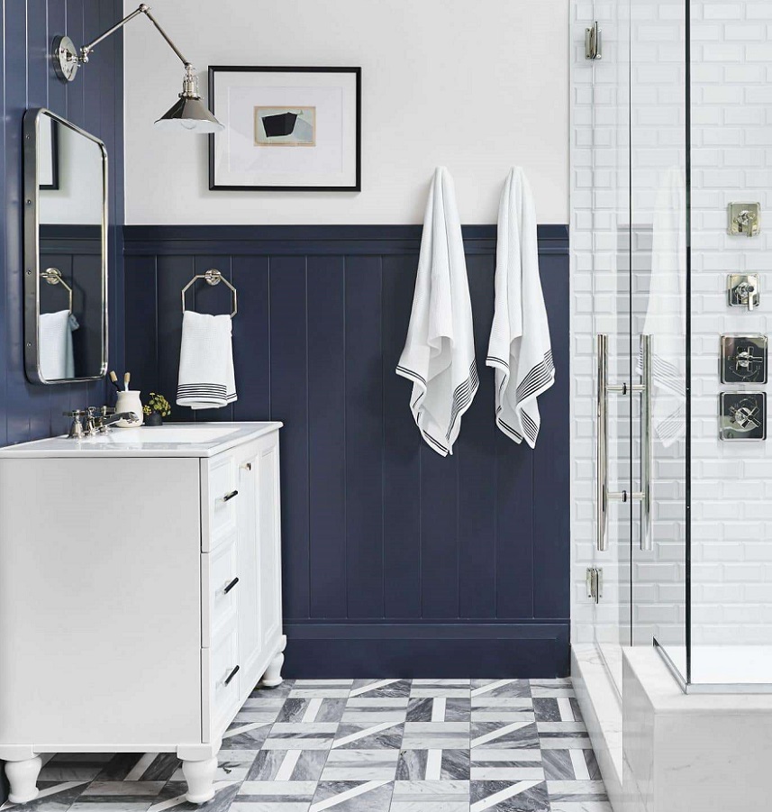
Indigo
Indigo is a dark but not vivid bluish-violet hue. It is the inner color of the rainbow, near blue. It was named after the natural blue dye which is extracted from the Indigo shrub.
Those who like dark colors in their home can use it even on all four walls. It gives depth to the space, but it also radiates elegance. If we want to pair it with other colors, pay attention to its clear purple tone. Thanks to this, it has less formal effect than clearly blues with similar tones and intensities. It can be well combined with both pure white and natural, neutral colors. To create a masculin interior, choose the shades of brown for pairing.

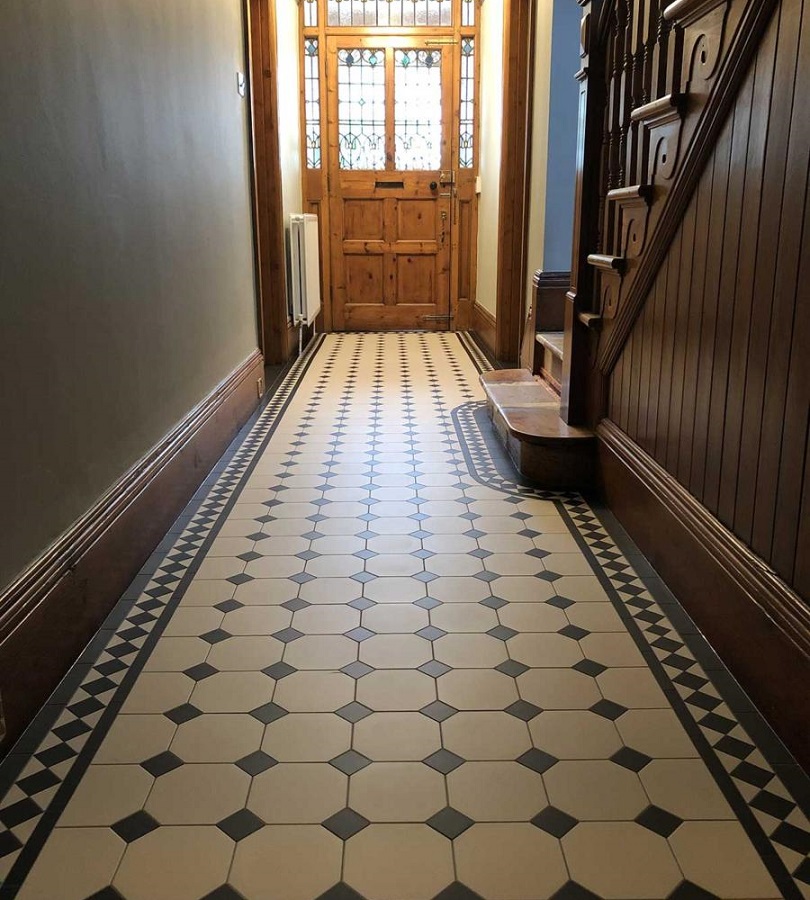
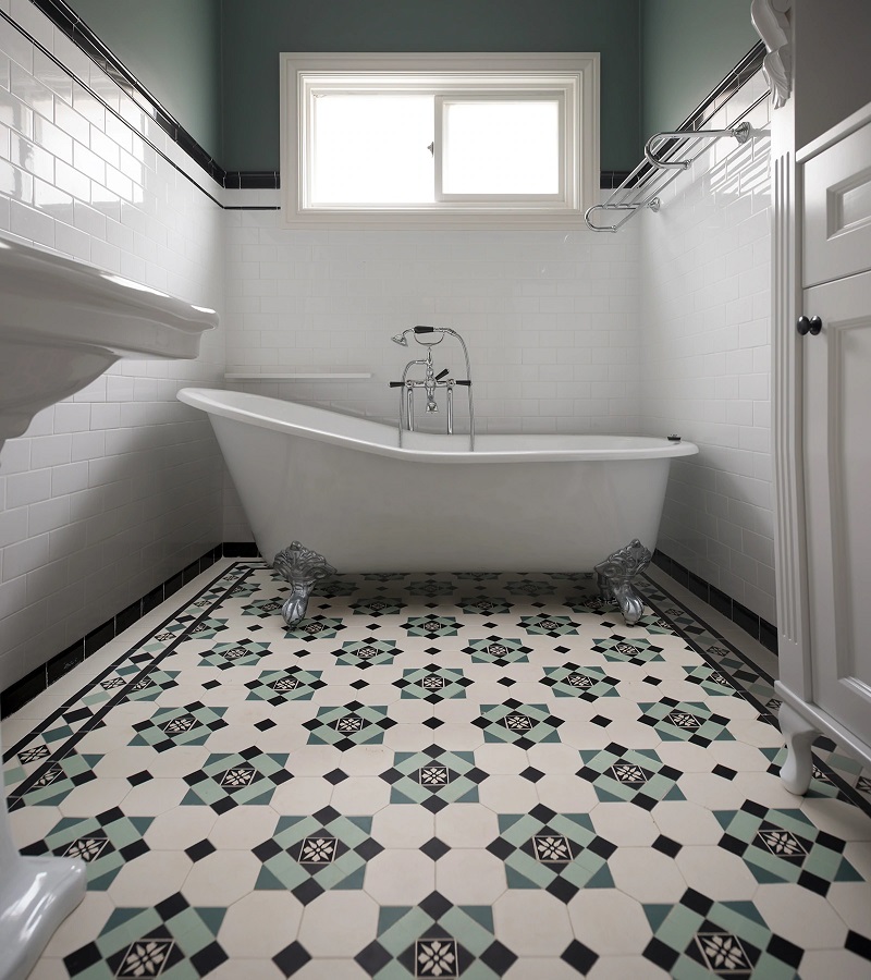
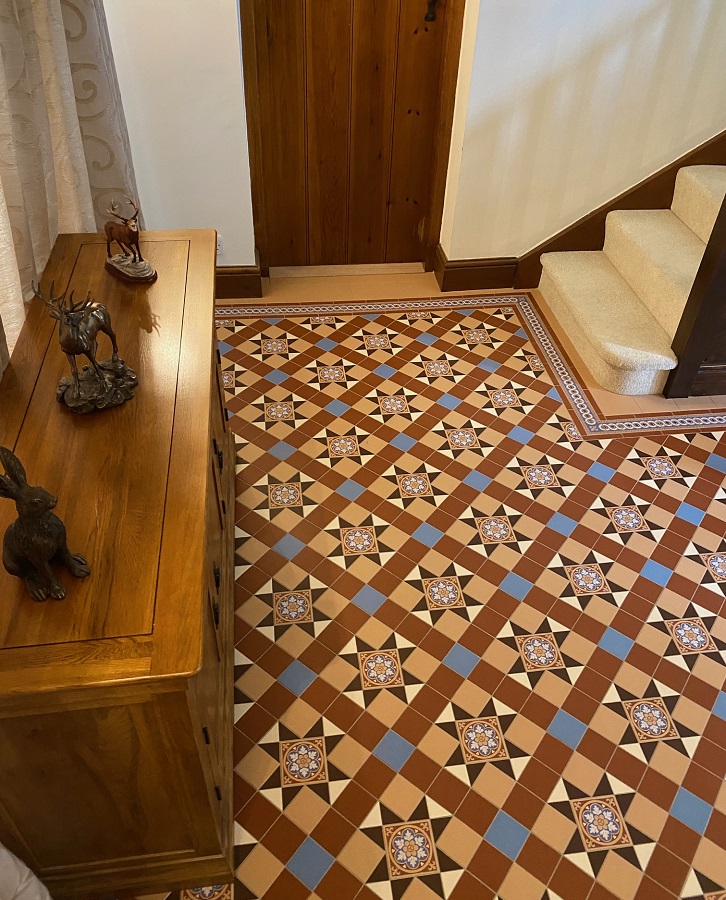
Floor tiles
The well-designed and elaborately laid floor tiles will be a real eye-catcher, which increase the value of the property
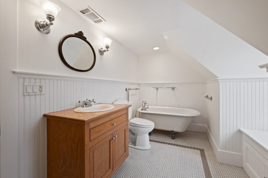
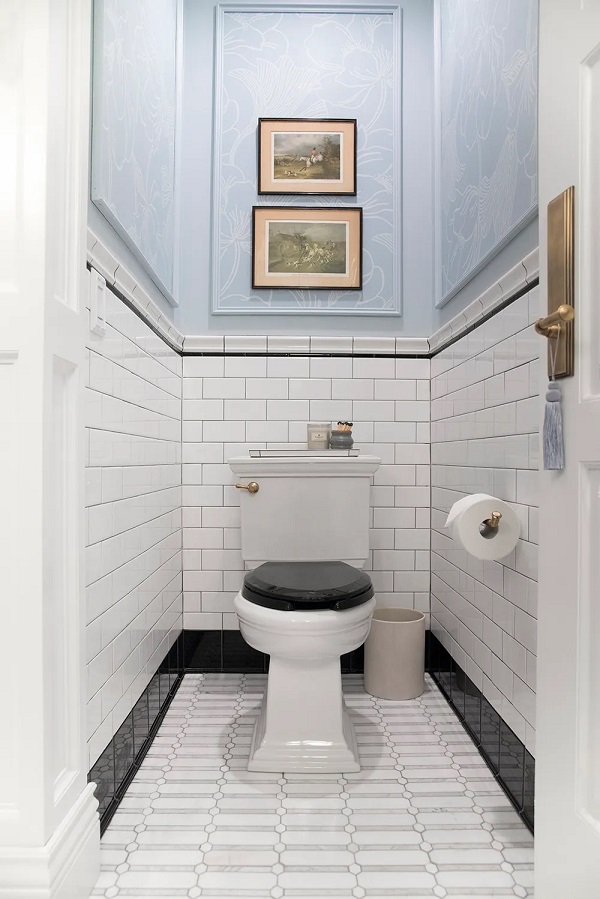
Service rooms
The rarely used service rooms (e.g. laundry, pantry, toilet) should also be decoratively furnished, as they are equally part of our home, even if practicality is their main criteria


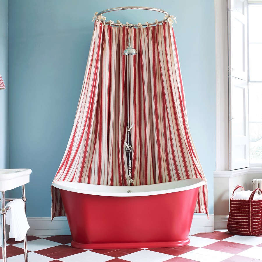
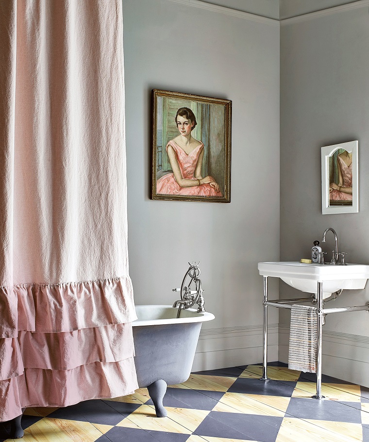
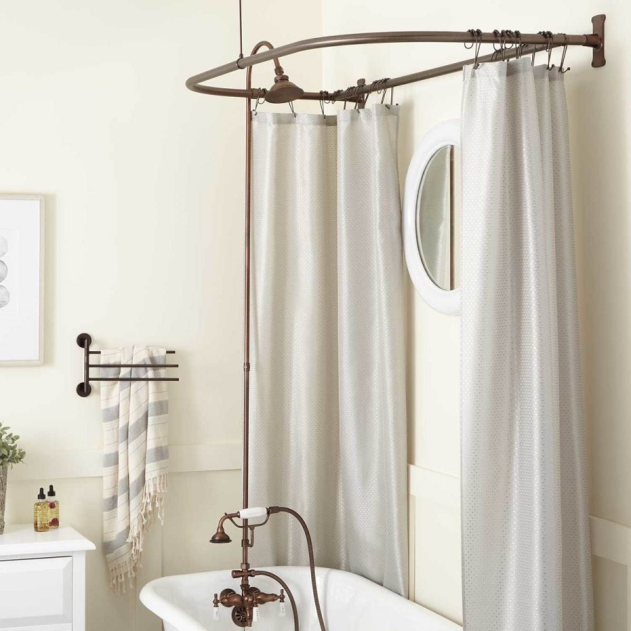
Shower curtain 2.
Shower curtains in a more elegant design
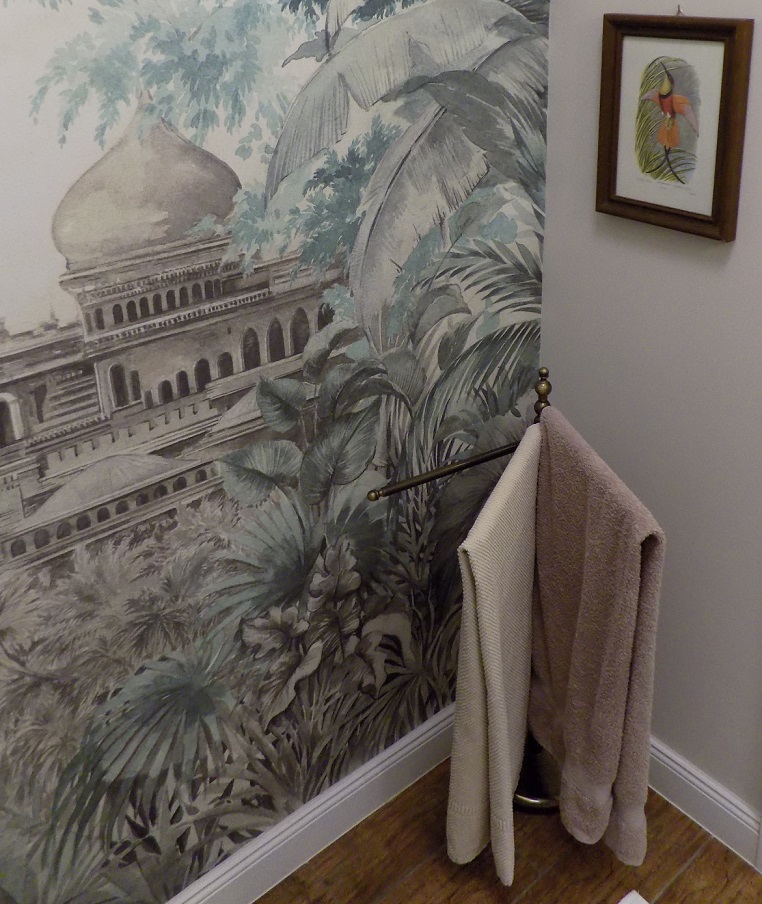
Towel storage
How to store towels in use in the bathroom: on wall/door hangers, on wall/door rails, on freestanding towel rack?

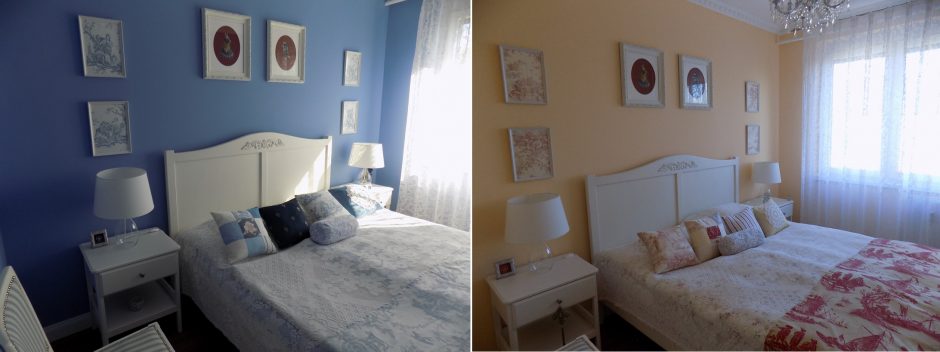
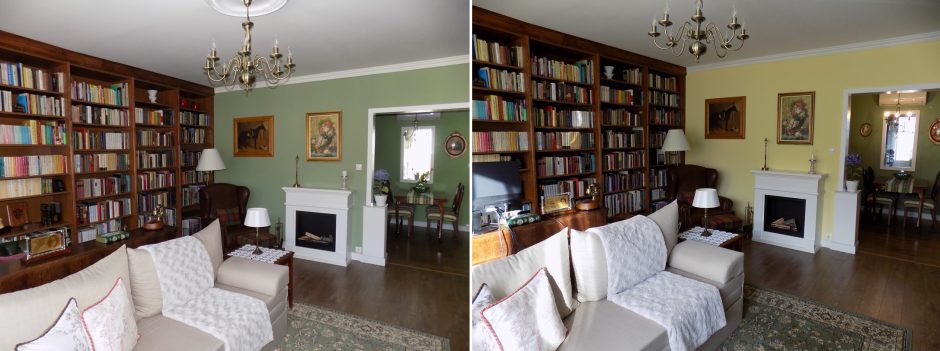
My project 41.
After seven years, it’s time of change 🙂 before-after