Hotel Bambara in Felsőtárkány through the eyes of the guest (2019)
Archives


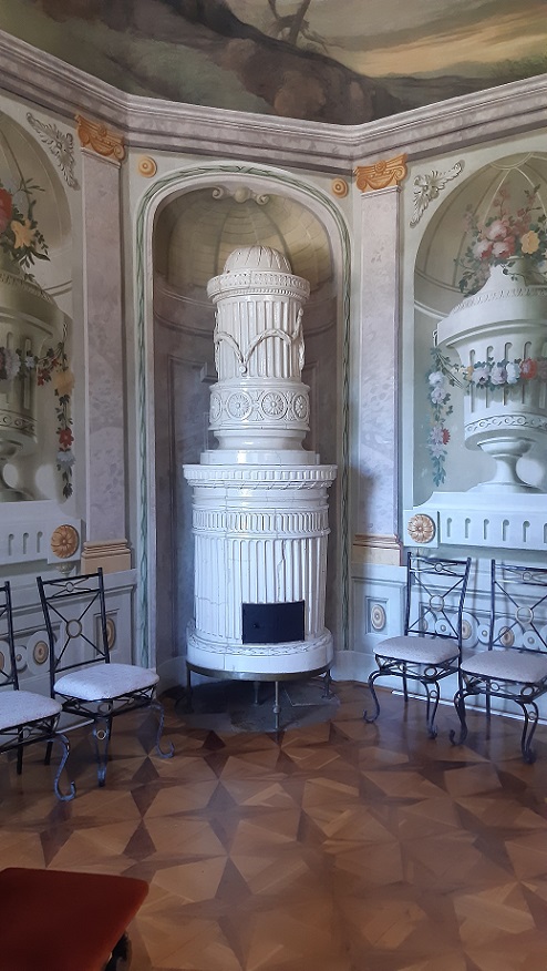
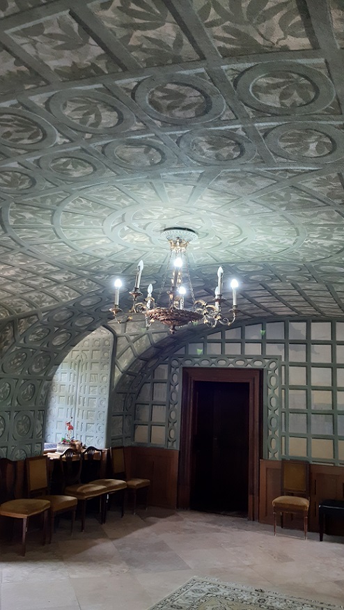
De La Motte castle
De La Motte castle in Noszvaj through the eyes of the visitor (2021)

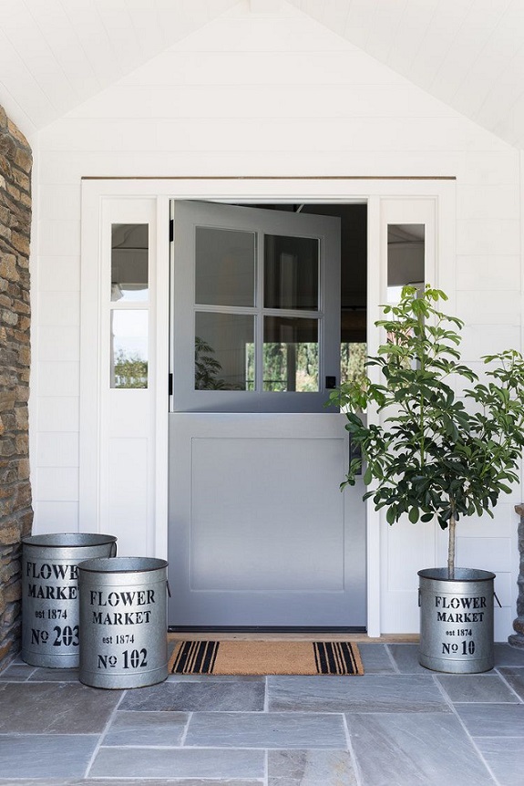
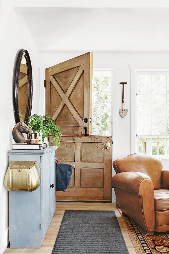
Dutch door
Dutch door (with two, separately opening parts) fits firstly to country style houses

Services
Classic Interiors:
– interior design
– interior design advisory
– home staging
– Feng Shui based interior design and advisory
– color- and style advisory
References and further informations:
https://classicinteriors.hu/en/references

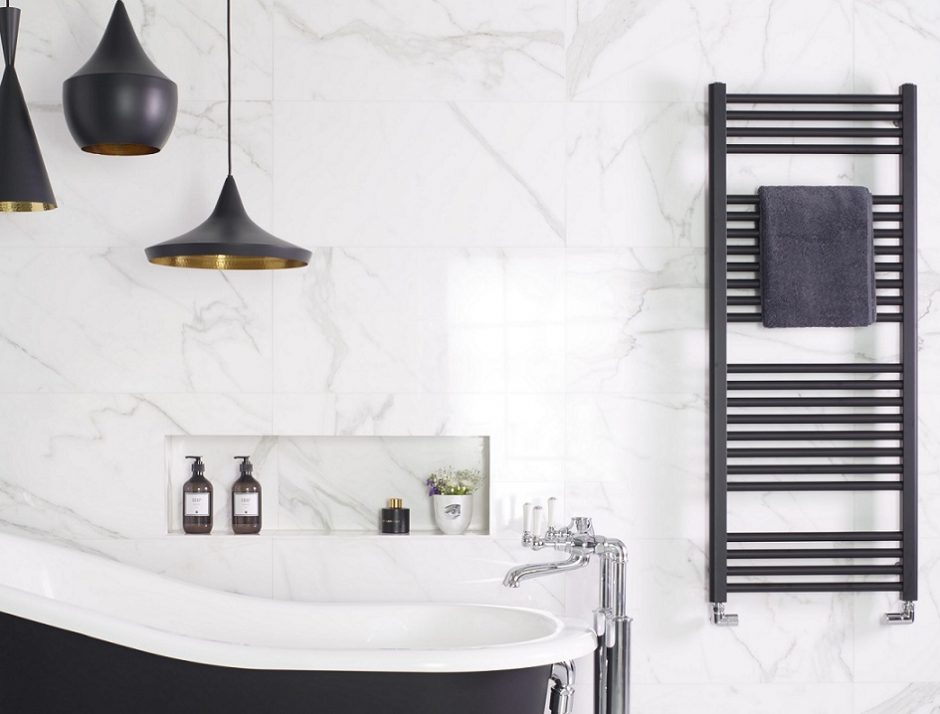
Black metal
Black metal home accessories are more and more fashionable

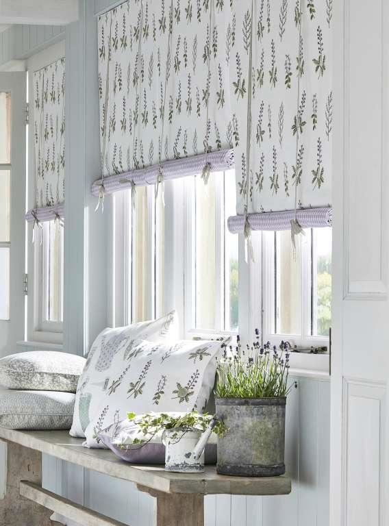
Flower patterns
Flower and plant patterns have always played an important role in interior design. In the case of country properties, they showed the outside nature in inner rooms, in urban surroundings they made up for nature. There are almost endless ranges of wallpapers and fabrics in this topic, but there are some which are „evergreen”.
Rose symbolizes romance, femininity and country elegance. It can be found in almost every scale depending on style, from tiny patterns to wall-posters. These not necessarily follow the colors of the real flowers but it is not disturbing at all. We can find a proper accessory even for modern style as black-and-white and stylized (e.g. Macintosh rose) patterns.
The patterns, which depict only green or predominantly green plants are features of country styles, but they look good even in a children’s room. Ferns, topiaries, vegetables and ivy are good examples for this. Jungle pattern is in fashion for 2-3 years, it is used almost in every rooms. The scale of the pattern is mostly big. Green (depending on the hue) is a calming color and suggests close-to-nature. These can be found in „colorless” varieties also which provides wider scale of usage.
Lavender has unbroken popularity as epitome of Provence style. The color is given here: hues of lavender (purple). The scale of the pattern is small or middle. The country effect is evident.
Among fruit patterns there are more which may provide a more playful effect. They were frequently used by pop art, retro and disco styles. Of course, the totally classic variations are just as exciting, think about pomegranate and strawberry patterns of William Morris, for example.
Naturally, there are many other plants among patterns beside the mentioned above (e.g. tulip, leaves, poppy, dandelion and hydrangea). The biggest factories produce same collections of wallpapers and fabrics for harmonizing the furnishing of a room both in color and pattern.
Ask for help of an interior designer for creating a botanical themed interior.


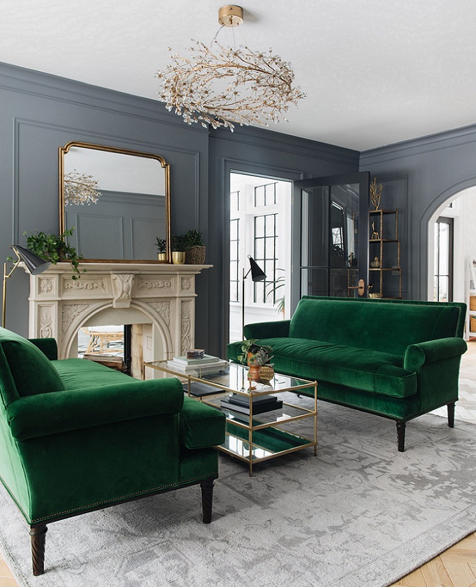
Emerald green
Emerald green is a strong, cool (with a tint of blue), dark hue of green which shows the precious stone’s luxury. This was the color of the year in 2013.

Mudroom
So-called mudroom is a common room in houses with garden in many countries. It is a useful area which helps to separate the inner parts of the house from the outdoor dirt.
The mudroom is placed near the backdoor of the house. It’s worth to create one in the case of a lifestyle in which intensive garden works, animal welfare and walking on the neighboring fields or forests has an important role.
Since it is for getting rid of dirt and mud here, it is important to make it easily cleanable. The floor has tile pavement: it is covered with ceramic tiles, bricks or natural stones. Walls are covered to dado level or at least painted with washable wall paint.
There is enough storage space (hangers, shelves, boxes) for the took-off dirty clothes, boots, umbrellas etc. Commonly it is staffed with a sink also where not only hands can be washed but even the freshly picked flower bouquet can be arranged. It is common among dog owners that this is a built-in washing basin where the pet can be washed after a long walk, before the dog enters the house with them.
Let’s treat it as a real room. It should have a window and proper lighting. Don’t neglect its furnishing, the design, it should be connected with the other part of the house.
If there is not enough space for a separate mudroom, it can be jointed with other rooms, for example, the back part of the laundry room. If the house has only one entrance door, the windshield at the front of the hall can have this function. If there is an entrance from the garage, one of its corners can be used for this also.
Ask for help of an interior designer for creating your country house.


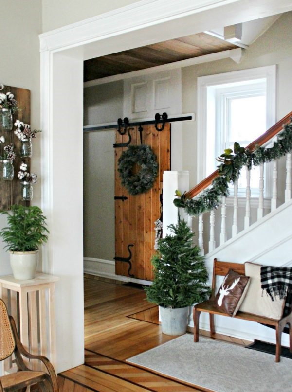
From Christmas to winter decoration
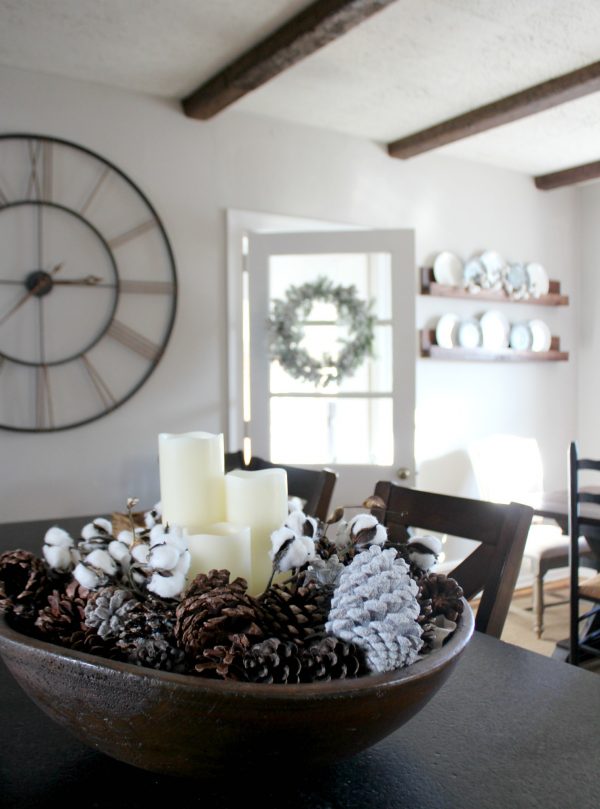
Christmas decoration goes back to the boxes after the holidays. The „emptiness” can be odd in the first few days because our home was resplendent in colors and lights for a month. However, the Christmas decoration can be transformed to a winter decoration with some clever tricks, this way the mood can stay until spring.
Firstly, take the red color out of the palette, because this reminds us to the feasts mostly. Let’s work with neutral colors. Plain evergreens should be placed in the vases instead of holy berry and other berry-branches. Cotton sprigs or just bare branches can be added to them.
Potted mini thujas/pines sprayed with faux-snow look good instead of Christmas table centerpieces. Color bubble ornaments in a bowl should be changed to whitened pine cones, for example. Fairy lights, Christmas ornaments and bows should be taken away from pine garlands. Let’s change the door wreath to a more neutral and simpler one. This can be made of pine cones, ivy, pine-branches etc.
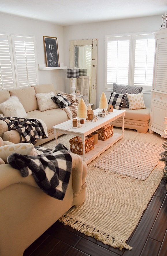
Blankets and cushions made of checked flannel or knitted material have a winter atmosphere also instead of seasonal pieces. The red color can be kept in this case if it fits for the mood of our home.
We don’t have to get rid of fairy lights also. They are nice mood lightings, for example in a big glass vase, in a bowl with full of apples, in the fireplace (during out of order) or fixed to the curtain rod, in these early darkening days. The same is true in the case of candles and tea lights.
The red poinsettia should be replaced with a white one. Any kind of faux-snowed decoration can stay if it is divested from its Christmas features, namely less glittering and colorful accessories are given to it.
Ask for help of an interior designer for decorating your home also.


My project 24.
In christmas mood with classic colors


