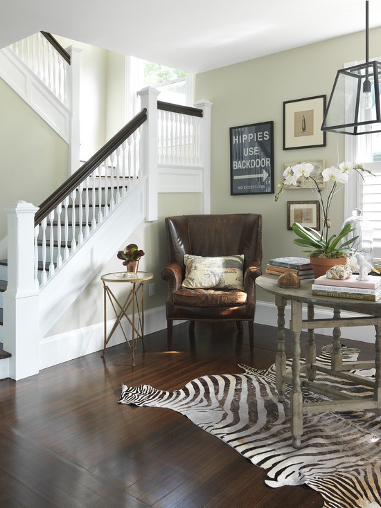
It may sound odd but there is a connection between interior design and animal protection. Many people like animal patterns, skins and motifs but there is always an alternative solution instead of using real materials made of animals. We can meet clients for whom it’s important that their home fulfills the animal protection principles.
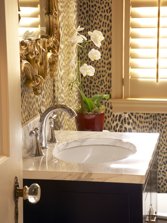
Leather is the most commonly used animal material. It has several good characteristics and it is very decorative. Usually we use cow, pig, goat and lamb leather. These animals are slaughtered for their flesh, their skin-utilization is a plus, this way it isn’t waisted neither. Using this kind of leather is not against the animal protection. We can also use poromeric imitation leather instead of a real one. Its look and feel are very similar to real leathers, it breaths also and remains comfortable in heat. The material is polyurethane on textile base. It’s durable and easy to clean. Nowadays market leader textile factories produce lifelike and high-quality printed fabrics in exotic and domestic animal patterns. Exotic looking faux-furs are another good solution. These are high-quality products too and also perfect for upholstery and carpet uses.
Stags and deers shed their antlers in every year. Forestry officials gather them to be sold. These can be used for household or decoration objects looking good in classic interiors. Horns of cattle are also frequently used for this purpose. We can choose objects with similar colors and surfaces instead of real animal origin products. Many factories produce high-quality faux trophies and artificial animal leathers.
For me, not only energy saving and green architecture are important issues, but also the protection of the fauna. An alternative solution can be beautiful, chic and comfortable also, what’s more environmentally friendly.
Archives


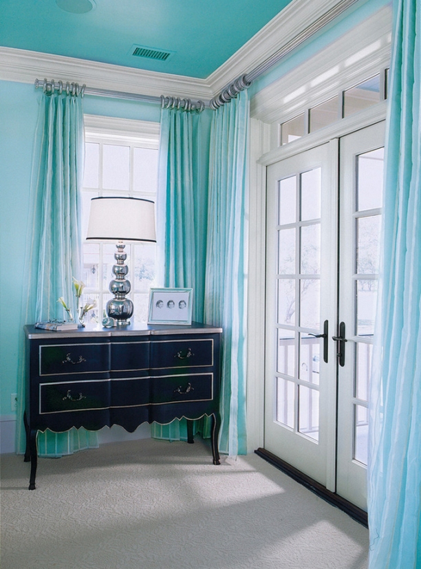
Turquoise
Turquoise is a happy, cool and juvenal color


Wallpaper
Using wallpaper is popular again in the recent years, thanks to the good quality and exclusive assortment. Designers create their new patterns following the fashion and their color usage adjusts to this also. However, the manufacturing companies still have wide range of wallpapers for the classic style lovers, the truly outstanding companies – in the case of a customer order – reproduce a product from their decades-old books with pleasure also.
Wallpaper can be used on walls or on the ceiling, all over the surface or creating a focal point, or even as decoration on furniture and doors also. It is practical to ask for a sample in the shop before purchasing, this way the effect can be seen in the light of our home. Since the samples are small, in the case of bigger patterns the final effect is upon our imagination. Further showy solutions can be reached by combining painting and wallpapering. Some high-quality manufacturers use their own paints for their wallpapers, this way no need to go from shop to shop with the samples, since the ordered colors will perfectly match.
Always buy the glue recommended by the manufacturer for the wallpaper and strictly follow the instruction manual when applying. If the job is done by a professional, all information should be given to him. The technique to be used depends on the material, thickness and pattern of the wallpaper. If the wall is uneven, it has to be plastered and grinded before wallpapering, only this can provide nice result.
The size of the wallpaper’s pattern is as determining as its color. The scale effects the total result. For example, too large pattern can be easily overwhelming in a small bedroom and can affect a more narrowing feeling, however a small and dense pattern can be lost in a spacious living room and it is enjoyable only at close.
It is also a much simpler process to choose wallpaper with a help of an interior designer, we can trust in his/her skills as to colors and patterns. With his/her 3D visualization we don’t have to rely on our imagination, how the chosen wallpaper will show in our home.


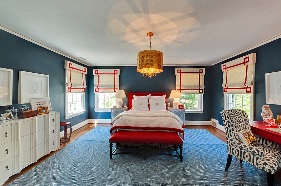
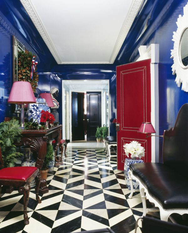
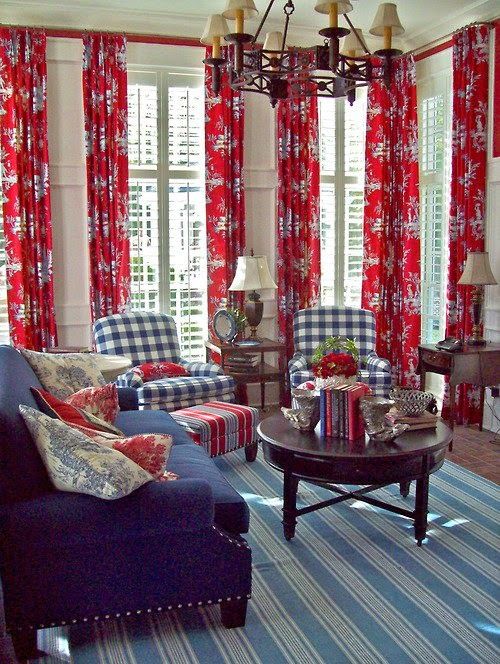
For 4th July
Red-white-blue interior ideas for the american Independence Day
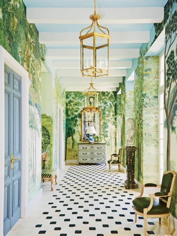
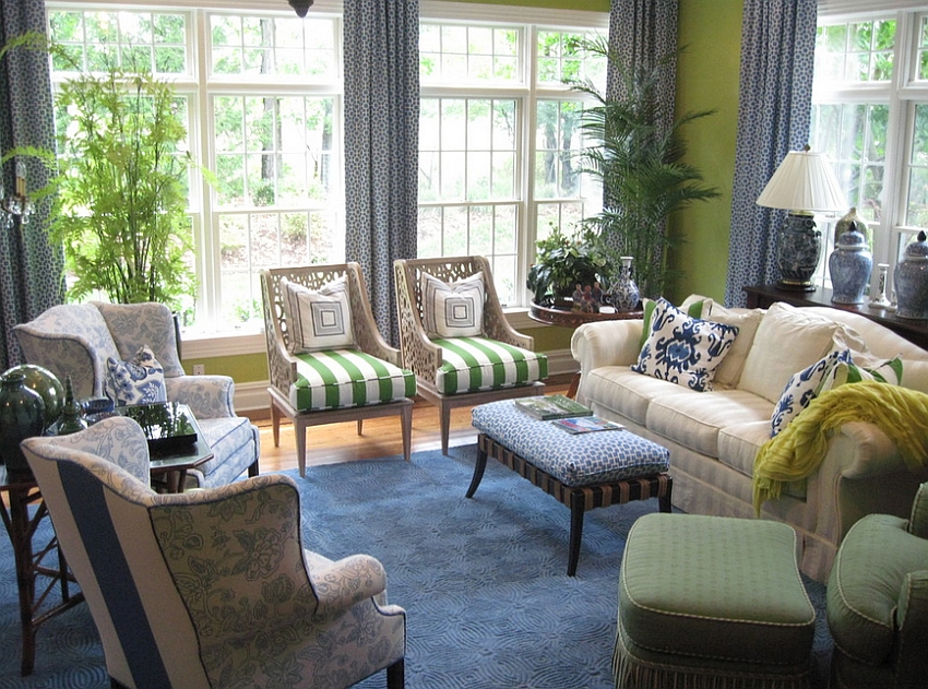
Color pairs 6.
Color pairs: blue-green
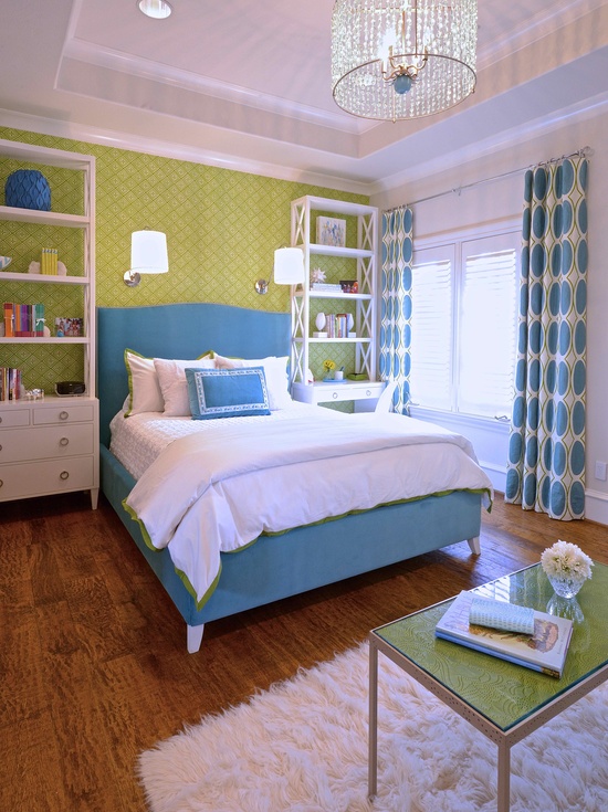
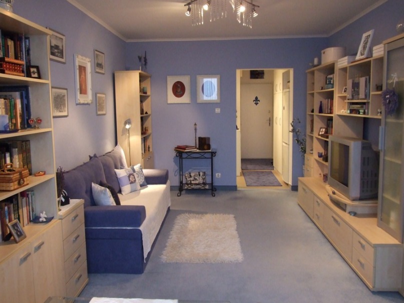
My project 1.
One of my prior projects: 38 sqm block apartment in calming blue
Further pictures: https://classicinteriors.hu/en/references/21-references/35-references02


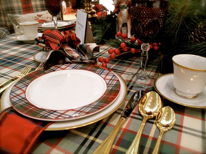
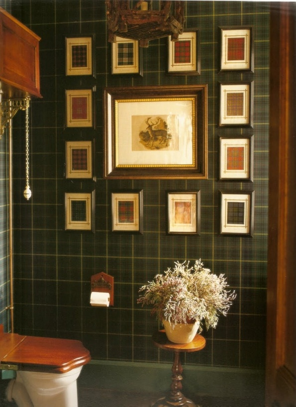
Tartan
Tartan is associated with the Scottish heritage.
The pattern itself consists of stripes with different widths and colors which cross each other in 90° angle, this way they create a grid pattern in both directions which has a checked pattern effect. There are same stripes in width and color on both sides of the main stripe in vertically and horizontally also, so the pattern is completely symmetrical. This differentiates tartan from other similar checked patterns. The order of the threads is reversed mixing the two colors with this and „creating” a third one.
On the contrary to the popular belief, in old times rather institutes, regions and families had the same clothes, not the clans. The pattern was connected later to the Scottish nationality and costume. First it was only used on textiles for clothing, these were made of almost only wool and were colored with natural dyes. Artificial dyes became widespread in the Victorian era allowing new color variations to be used.
Nowadays tartan isn’t limited only to clothes, or to the fabrics at all. It appears on objects made of any material, be it paper, porcelain or plastic. Because of this fact, there are many possibilities for using the pattern in interior design: not only on upholsteries but on wallpaper, lampshade, dinner set, carpet etc. The variations of it with red-green color combinations are associated with Christmas mood.
If you also like it and want to make tartan the part of your home, ask for help of an interior designer.


Photos for selling our home
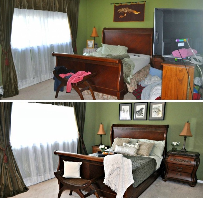
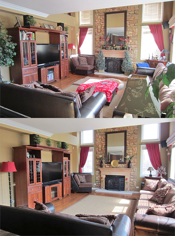
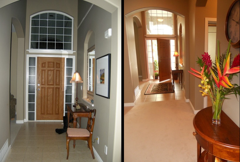
When selling a property, the most important part of the advertisement – beyond floor map – are the pictures taken of it. According to the experience, it’s not quite obvious how to take some such quality photos, which will “sell” the property for us.
Before we start, let’s clean up! It’s a great mistake if we think, that the several weeks old mist or the lack of mopping will not be noticed on the pictures. Another essential task is tidying up. Everything should be put to its place and let’s check, how could be the space even more spectacular. Let’s look at a few interior design magazines and get some ideas from the photos in them: there is no mess, color- and style cavalcade or too many decorations. It’s advised to move from room to room and always prepare the given room for the perfect photo. This can be quite difficult task when the property is inhabited, since the amount of personal objects and furniture should be decreased to a level acceptable by an outsider. If necessary, move the excess chair or commode to another room during taking pictures. Most of the decorations should be placed behind closed doors and the remaining should be arranged nicely. Let’s turn on all the lights even in daylight! Use wide angle lens to catch the most of the room in one frame. Emphasize the good features, such as large window, cozy alcove or the beautiful hardwood flooring. At bathroom and kitchen, the feeling of hygiene is the most important. Here the metal surfaces should be shiny, glass doors and mirrors should be freshly cleaned to show the glamour. If possible, let’s provide a picture of all the rooms to the advertisement.
Some disincentive examples that are regularly appear among property advertising: drying underwear in the bathroom, full trash bin in the kitchen, unmade bed in the bedroom, or dirty clothes on the floor. Although the prospective buyer will purchase the property not our personal objects, yet all this counts a lot with him when deciding, whether he comes to see the apartment or house, or not. In case of a house, choose a shiny day for taking outdoor pictures for the sake of real bright colors. The principle of order still should be valid: tidy up the garden, trim the grass, even stairs and paved parts should be washed up. Take several photos of both the house and garden from different angles.
If you would like to distinguish your advertisement among the lots of others, ask home staging advices from an interior designer for the preparation.
Ceiling
The ceiling is the sixth side of the room which we often forget. In old times, the ceiling was rarely left white, it was mostly richly decorated or colored. Why cannot we evoke this practice?
The style of the room can be highlighted with the color or decoration of the ceiling, it can complement the sight of furnishing or even can be an additional twist for the mood. For these, the first and most important question is: what is the room height? The dark painted ceiling visually gets lower, while the light colored raises the eye. It can be for example coffee brown with 250cm room height also if a cozier mood is required – let’s say in the case of a library – and it can be painted in light blue with 360 cm room height if an airy effect is desired – for example in a bedroom. Note, that the color of the walls is reflected to the ceiling and vice versa. Besides colors, decoration elements can help in emphasizing the ceiling: stuccos, mouldings, rosettes. These can be made of gypsum, polystyrene or wood. Their basic color is commonly white but can be painted to any desired color. Rosettes usually placed to the fixing of chandeliers and pendants. Its diameter should be a bit smaller than the chandelier’s. But this rule can be broken if the oversized decorating element is designed for attracting the guest’s eye upward as entering. Crown mouldings hide the joint of the wall and the ceiling, this way they visually make the room higher. The mouldings are placed on the wall right below the ceiling. If these are painted to the color of the ceiling, the room seems to be lower. Stuccos can be placed in the corners or even around the rosette. The desired decoration is up to the taste. Their effect can be buffered with painting the whole ceiling to a plain, neutral shade.
A similar effect can be reached with hand-painted decoration of the ceiling instead of decorating elements (stencil, pictures, stripes etc.). This is a much cheaper solution but requires great handcraft. Even faux-beams can be placed if the style of the flat/house allows it. They don’t have to be necessarily painted to a different color as the ceiling to be highlighted. Metal tile is a showy solution also.
Get inspiration from visiting old historical buildings, it can be a castle, museum or a public institution in such a building, then ask for help of an interior designer for implementing these in your home also.


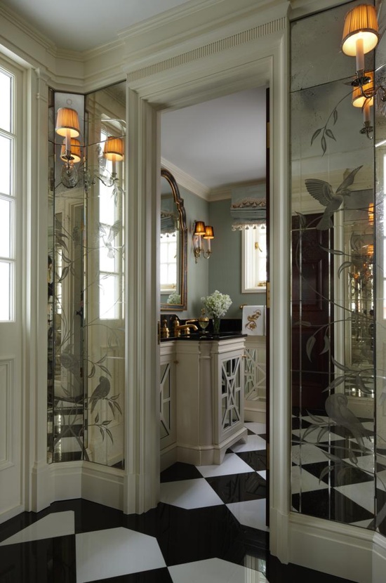
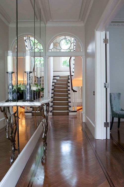
Mirrors
In old times mystic power was assigned to mirror, frequently it was thought as a door to other worlds. It still has an important role in our lives, not only in dressing but as a useful element in interior design also.
The main feature of mirror is reflecting the light and doubling the sight of the objects. This is exploited when a space is furnished with it. If light can’t be brought in a room, for example an inner corridor or hall, hang bigger mirrors on the wall, even opposite to each other, this way the light will be reflected to and from between them. This is the solution if the space is narrow also. Even one single big mirror can multiply the sense of space. They can be used as decorations instead of pictures. Let’s hang old faceted mirrors in different sizes on the wall in a desired arrangement. They will be as elegant as paintings.
However, some things have to be considered when placing them. In a bedroom a mirror should be placed only if it is not visible from the bed because in the other case we would react to every single movement of ourselves and falling asleep would be harder. In the dining room it should be placed on such height that the guests sitting at the table couldn’t see themselves in it while eating. It is practical to hang a full size piece near the entrance door, this way a last checking glance on the dress can be done when leaving.
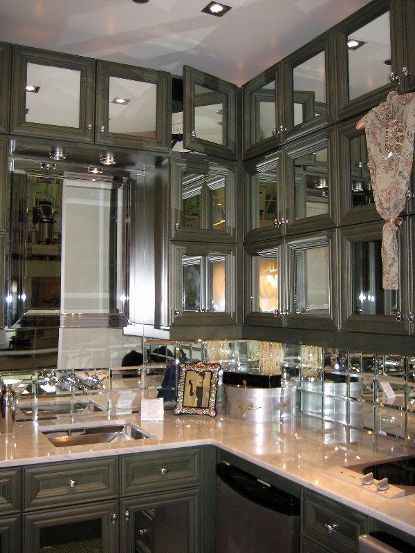
It is a decorative solution in a kitchen to put antiqued mirrors in the doors of the upper cabinets instead of glass. This can be a good option for the backsplash also between the two cabinets instead of tiling. Pieces in floor to ceiling size can be placed in the gardrobe, home fitness room or bathroom.
If you think that some mirrors could renew your home also, ask for help of an interior designer for choosing and placing the proper pieces.