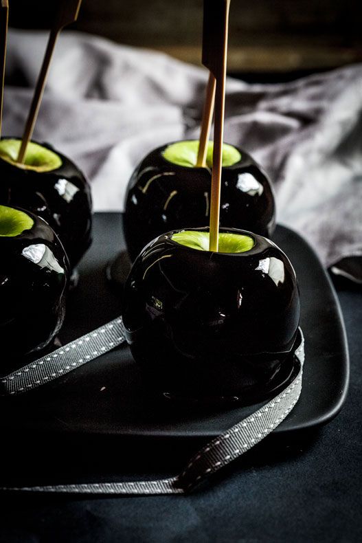
Edible decorations for Halloween
Archives


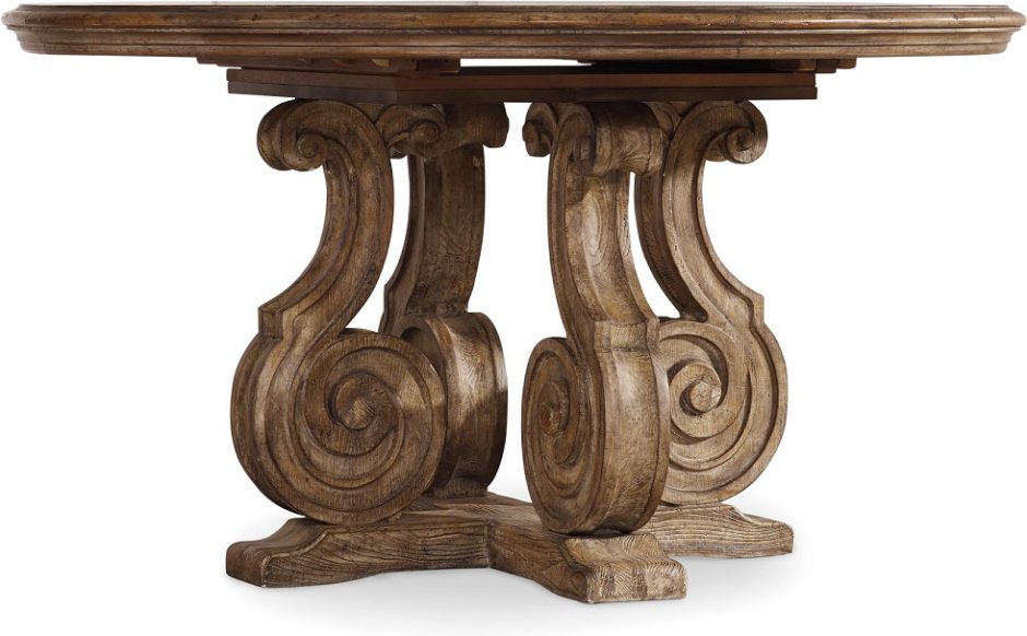
Decoration motifs 2.
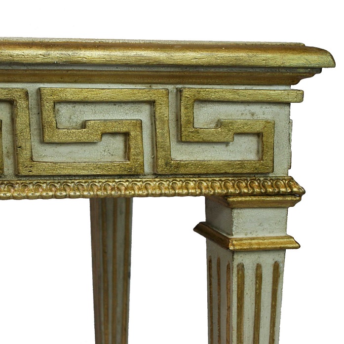
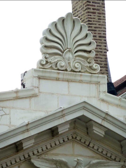
Classic architectural and furniture decoration motifs: palmette, volute (scroll), meander
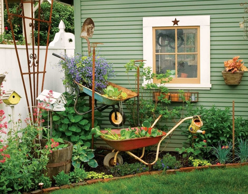
Wheelbarrow decor
Wheelbarrow can be useful not only for gathering fallen leaves


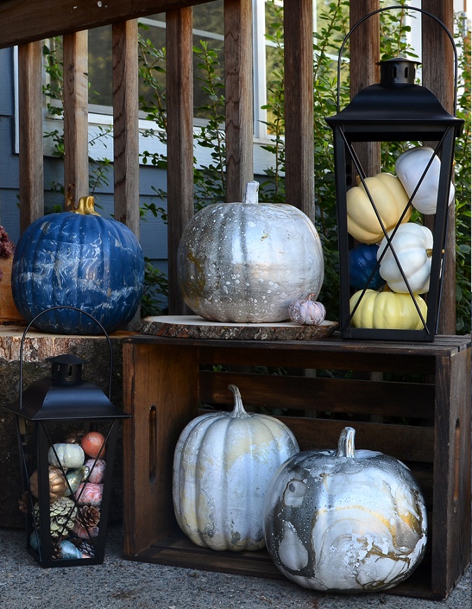
Different autumn colors
The typical warm colors of autumn are orange, burgundy red, rust-brown, sunny yellow and the like. Usually these are preferred as decorations. Many people think that these colors don’t fit for their home or their personality and search for another solution instead for autumn decoration. In addition, there are many other possibilities.
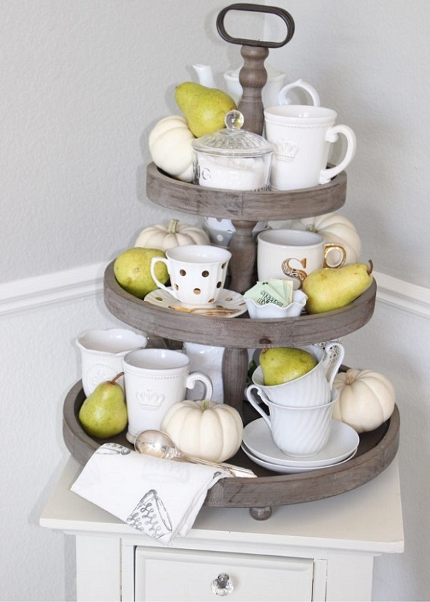
Pumpkin is a typical decoration element. There are white, dark green and greyish green species besides the orange and yellow varieties. These colors can be much better fit in an interior where white is the dominating color for example, or the colors of accessories are quite different from the warm palette (turquoise, powder pink, lavender etc.). Pumpkins are easily paintable, this way they can have almost all of the colors in our home.
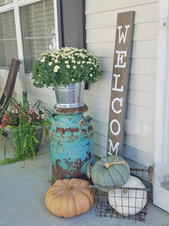
For natural colored, more rustic interiors, choose a close-to-nature decoration in similar colors not to break the unity. For example, this can be a bouquet of wheatears in a vase, a bunch of brown branches tied with linen band, crops (acorn, walnut, pinecone etc.) in a bowl or balls made of bast.
If crops are in the center of the decoration, we can find fruits and berries of which colors fit more to our home: Granny Smith apple (green), yellowish green pear, Bodinier’s beautyberry (purple), Chinese privet (dark blue berries). Many species of chrysanthemum and asters can be purchased in Hungary, the white flowered of these can be perfectly neutral but impressive decorations.
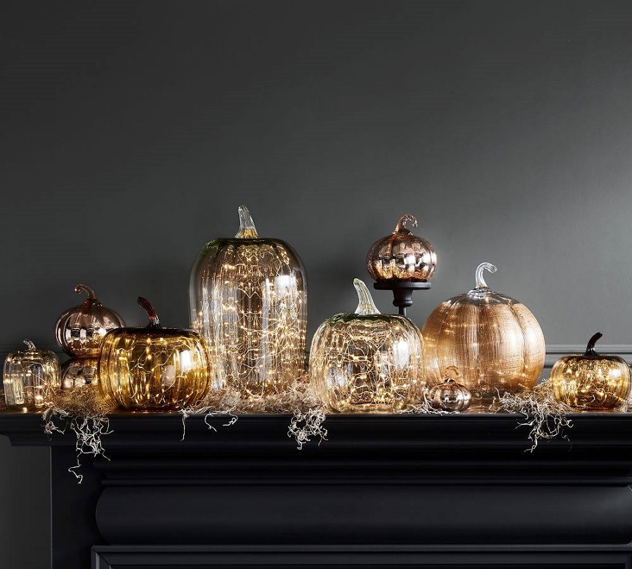
As the days are more and more short, mood lightings get role again. The warm white light garlands can make any interior cozy. They can be placed for example in a glass vase or among the garlands on the fireplace or they can even frame a mirror. There are many color and shape variations of candles, these can be easily harmonized with the colors of the interior. Their warm lights give the mood.
Ask for help of an interior designer for seasonal decoration of your home.

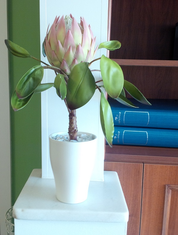
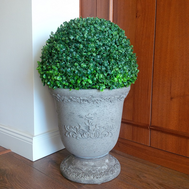
Artificial flower
Qualitative and classy artificial flowers look good in every interiors

Advertising objects
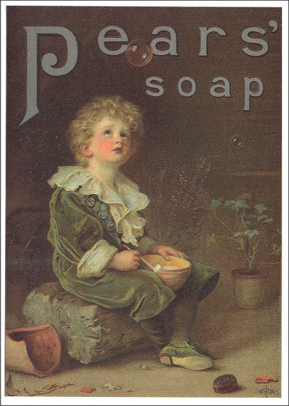
Advertisement has thousands of years history. For example Egyptian papyri, a Chinese bronze plate, wall and rock paintings in Africa and South-America certify this. The bigger part of the population couldn’t read in Europe in the medieval ages, so their attention was attracted for the services and goods by pictures (e.g. trade-signs). The first newspaper advertisements appeared in England in the 18th century. Thomas J. Bratt was the father of the modern advertisement who used Bubbles painting of Sir John Everett Millais for the advertisement of Pears’ Soap. The first advertising agency was founded in Philadelphia in 1842. Ads were already on the radio from the 1920s. Television got the leading rule in advertising from the 1950s. Separate channels were started for advertising and immediate shopping by the appearance of cable television (1980s). Internet gave new perspectives in this field from the 1990s. Of course, there are still many printed advertisements beside these, for example on vehicles, giant placards and leaflets. Original packaging of products is among these also.
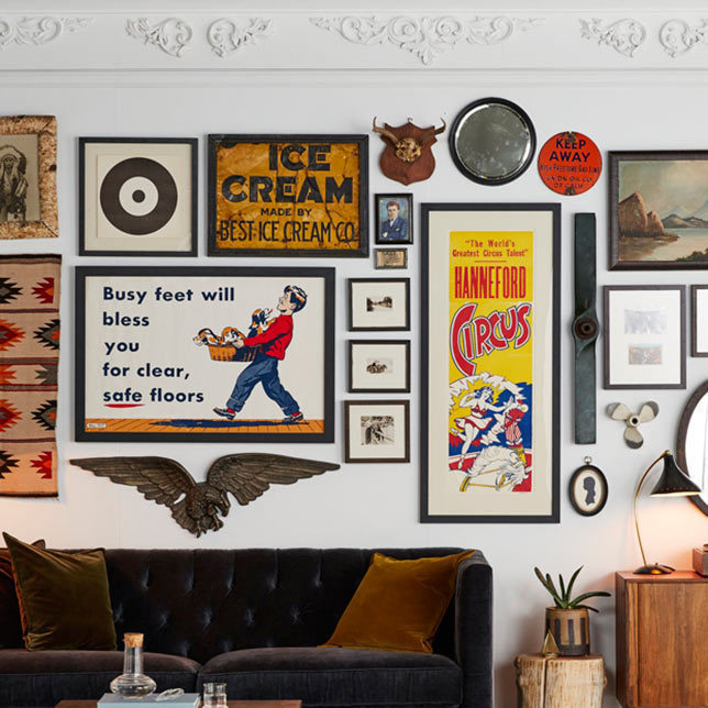
Ads on TV, internet and e-mail are spectacular but not touchable. However, ads of „old times”, first of all placards, trade-signs, sandwich-boards (wood, metal, cardboard) are already very valuable and even sought after by collectors. A rarer piece is not only a good investment but a great decorating possibility at home also: hanging on the wall as a picture, standing on the mantelpiece or on a shelf, being a part of a vintage collage, getting a new function (e.g. tray, top of a table) etc. They can be focal points by their sizes or colors.
Ask for help of an interior designer for perfect displaying of your collection.

Antique-vintage-retro
The following three words are commonly used in interior design and related books. Sometimes still it’s not obvious when to use which.
Antique: marker of furniture, objects of art, or artisanship older than 100 years, independently of style. Its age, originality, condition, the manufacturer and rarity is important for collectors (full collection in case of a set). A restoration gives them back their original pomp.
Vintage: marker of objects that are younger than 100 but older than 15 years, concerning rather to their condition than age. It is a classification of strongly used, shabby surfaced furniture and household objects which marks even a style. It means rethought, reused, modified/renewed objects also. Giving vintage look to a new object is a distinct genre. It is not equivalent with the shabby chic style.
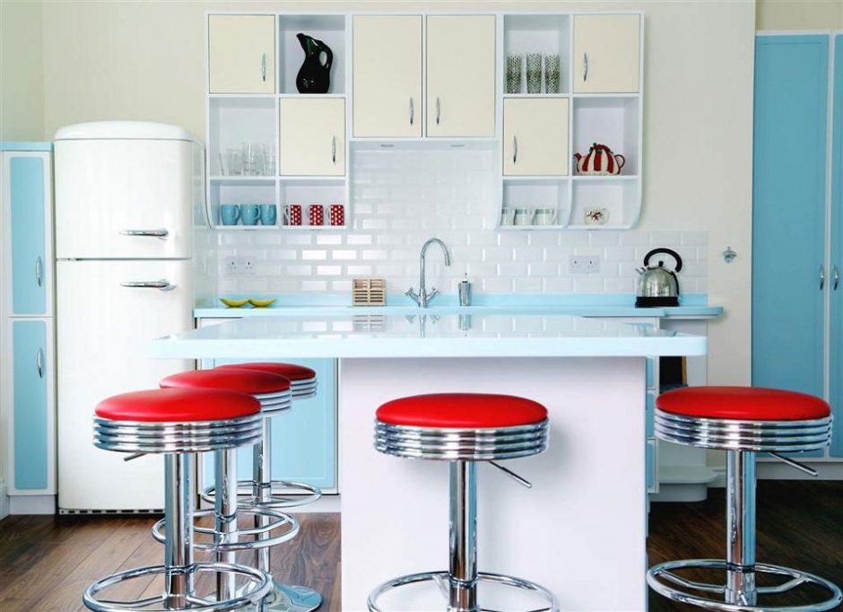
Retro: marker of household and decoration objects of years from the 50s to (presently) the 80s. Their age is old „only”. It is also a marker of objects that are new but made look like in the style or shapes of this era. Collectors are motivated by nostalgia and emotional bondage but of course originality and condition are also important. Retro has a pejorative meaning, “out of fashion”.
In case of uncertainty, ask for help of a professional dating an object.

Painting techniques
When we buy a picture for decorating the wall at home, most of the cases the technique it was made is secondary. Its beauty matters and if it fits for the surroundings and if the size is good. Maybe it is right. But it’s worth to know broadly the painting techniques because it may affect the value of the picture and if in doubt, it helps to define its age or origin also.
The pigment of tempera is dispersed in an oil-water emulsion. The emulsifier keeps together these two components. The simplest one is lecithin can be found in egg. Its yolk and albumen are mixed with powder pigments. The paint can be distempered before drying. This was used also by the ancient Romans, but the medieval icons were made by this technique too.
Oil paint changed tempera during the Renaissance. The pigment is dispersed in drying oil (linseed oil, nut oil, poppyseed oil). Its appearance coincides the evolvement of landscape painting which specialties are best implemented by this technique. The paint is dense, sticky, dries slow, so the colors and lines are mixable and shapeable still on the canvas. It hardens after drying and produces a shiny and resistant surface. The artists always mixed the paint freshly until the possibility for hermetic storage.
In case of aquarelle (that is watercolor painting), easily soluble pigments are mixed with water and it is applied in dilute state on the paper which is firstly wet. Fine, light, opaque colors are produced this way. This technique was used at first for sketching, later it became an individual art. It was most popular in Europe in the 18th-19th centuries, but primeval cave paintings and ancient Egyptian murals were made by water-based paints also.
Pastel is a transition between drawing and painting. Powder paint extruded to rods with minimal bonding are used for applying to the dry paper. The paper has special surface, it is grainy or on the contrary, velvety for better dispersing the powder on it. The colors are mixable longer on the paper, the picture is formable by finger, brush or even a piece of rag. Pastel appeared in France at the end of the 15th century, it was one of the favorite techniques of impressionism.
Engraving is the summary name of multiplier graphical arts. It has two groups. 1. Relief printing: the part of the picture which shouldn’t mark are dented into the surface. Printing ink is applied to the rest of the surface which is transferred to the paper. E.g.: wood-engraving lino-cut, stone engraving. 2. Gravure printing: lines of the picture are dented into the surface the paint is being applied here and it is cleaned from the topping parts. The paper is pressed into the hollows and the ink is transferred this way. E.g.: line engraving, etching, acid-washing.
In case of uncertainty in purchasing a painting, ask for help of a professional.

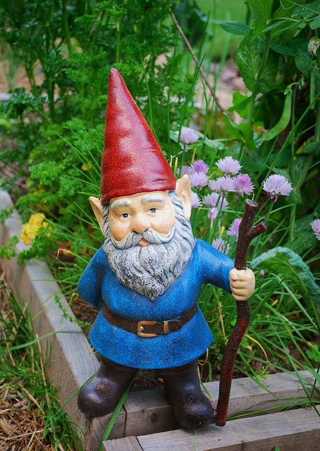
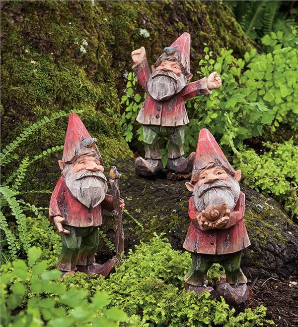
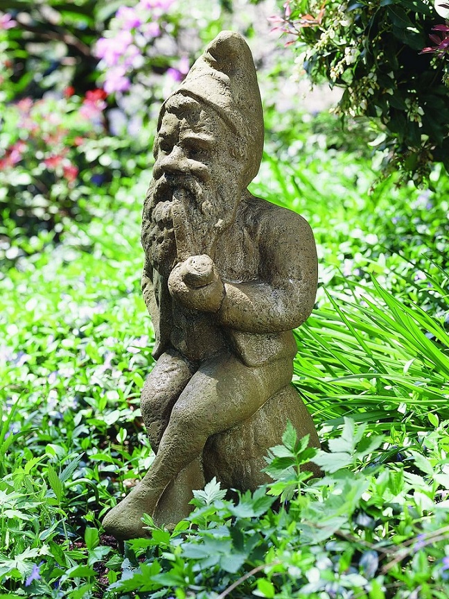
Garden gnome
This week is Garden Gnomes’ Week. These little figures reputely bring luck, protect and fertilize the garden
Classic from modern
When classic style lovers buy a completely renovated flat, they frequently have to face with the fact that the newly built-in materials (kitchen cabinet, lighting, tiles, doors and windows etc.) are totally modern. Since these were included in the price and probably, they didn’t choose a flat in such a condition randomly, only a few of them would undertake a full conversion just for the classic style. How could be this solved with a low budget and few works to meet our conception at the best?
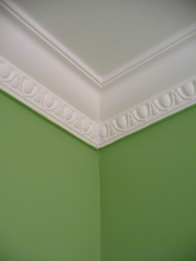
Choosing the proper wall color means a lot for the sight, since one of the advantages of classic styles is that the desired mood can be easily created even with colors. Painting can be done before moving in and it is much cheaper and faster than wallpapering. Placing polystyrene crown molding is always worth. It not only heightens the room but it is an elegant solution also. Rosette fits perfectly for chandeliers. Faux wall panel frames made of polystyrene laths can be put on the walls which look good even in the same color as the wall. However, this material is very vulnerable, so be careful not to hit it.
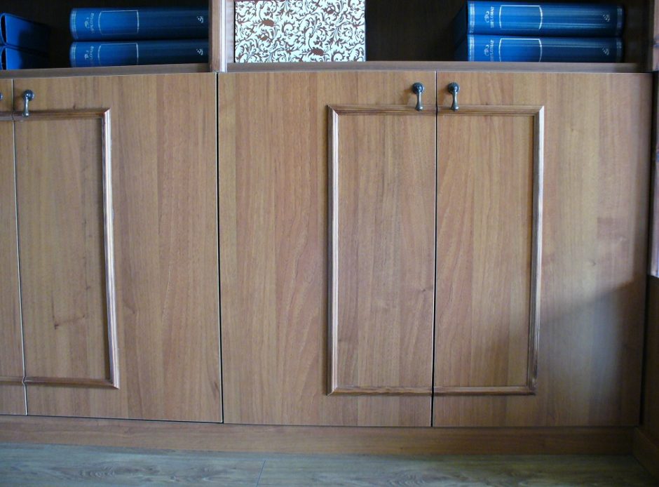
Let’s glue a frame made of thin laths on the plain surfaces of the built-in wardrobes and kitchen cabinets, just like if they would be real framed. A prefabricated decor panel can be used for this purpose also. Both of them can be painted / burnished to the color of the furniture. Changing the handles is a really simple procedure and amends a lot.
If there is no possibility to change the lighting and the chandelier is modern, or there is a multi-light spot, don’t be frustrated. Glass beads similar to crystal chandeliers’ decoration can be purchased in several hobby shops – let’s make the garlands DIY and fix them with small metal rings to the lamps. Its modernity can be moderated with this and some glamour can be smuggled in.
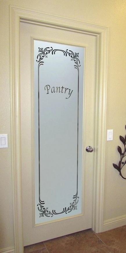
If the doors have completely plain surfaces, they can be popped up in the similar way as the cabinets. In the case of a glassed variation, self-adhesive foil can be a solution to make it more classic, for example with a lace motif.
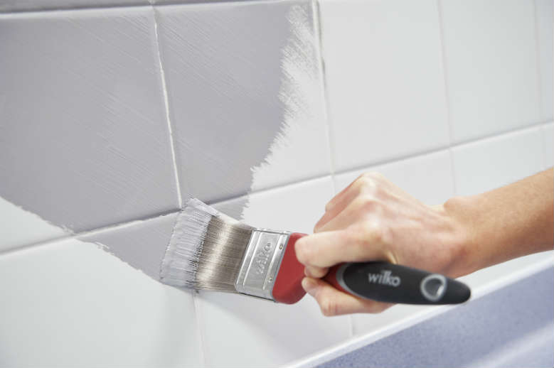
Most of the inappropriate floor can be covered with a fitting classic style carpet. The modern tile in the bathroom is a harder thing. If the color is good, we can distract the eye from it with classic style accessories (storage boxes, decorative glasses, pictures on the wall). If its color is too modern and it doesn’t fit for our concept at all, it can be painted also. However, it should be known, that this is not a long-term solution, it lasts approx 2-3 years (in the case of a proper implementation) and it could happen that the painting has to be renewed during this time.
Above the low budget was in focus, of course, more spectacular solutions can be done with a bigger amount. Many similar questions can come up in the case of a modern interior. Ask for help of an interior designer for the solution.