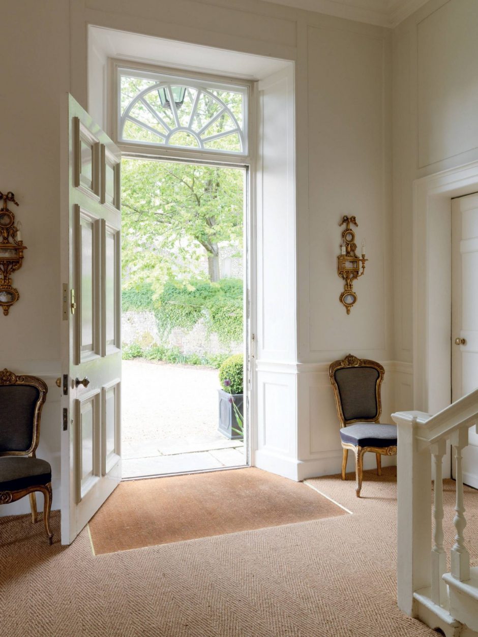
Designed for a competition: visualization of an exhibition stand – the focal point is a Wendy Morrison rug
Archive | September 2021


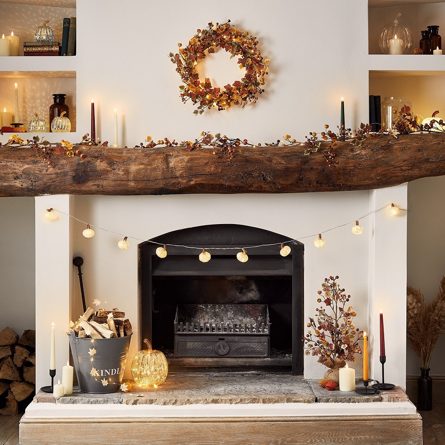
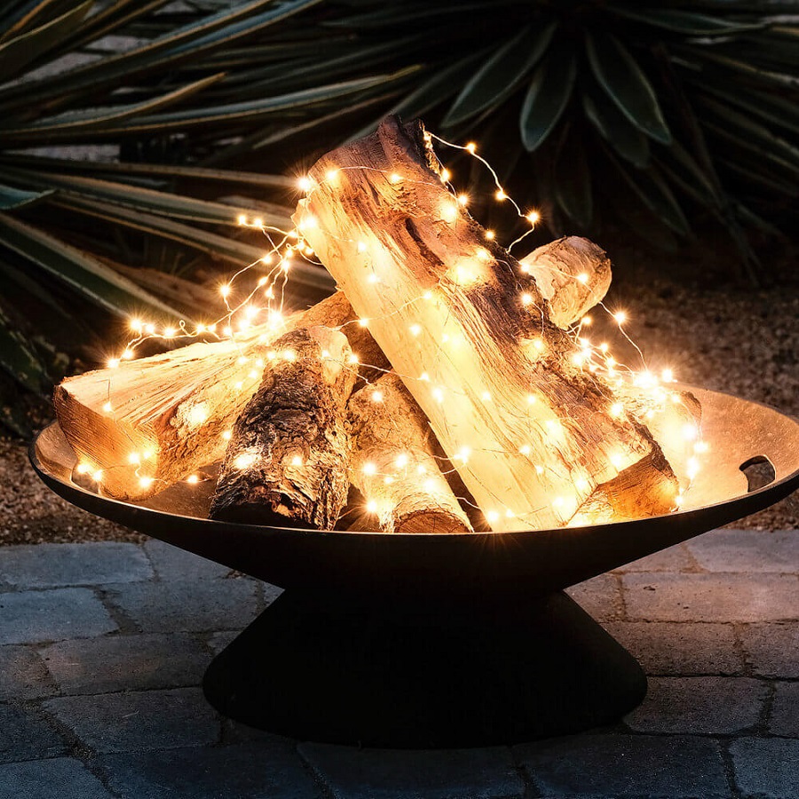
Fall lights
Play of autumn lights

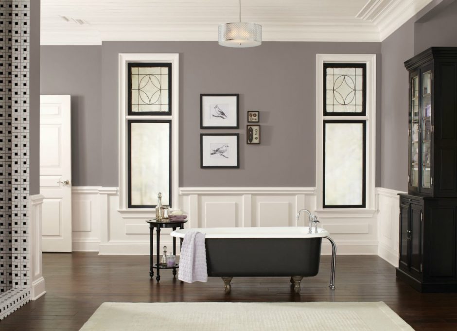
Off-white
Off-white is a shade of white with a few yellow undertone. It used alongside pure white can appear dirty – so, avoid this combination. It is used in interior design if pure white might look too rigid or intense. Off-white is a good complementary color for both strong colors and neutral palette and looks like white. For example, when painting door and window frames, wall panels, mouldings, it is worth trying next to the selected wall color.

My project 27.
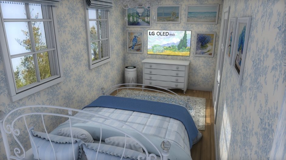
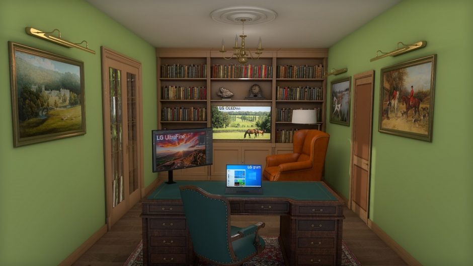
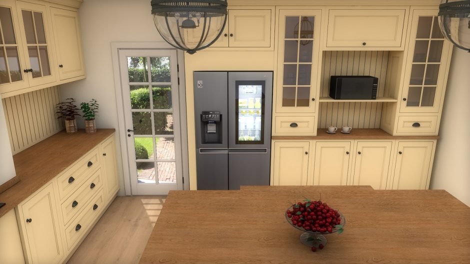
Designed for a competition: modern electronic equipments in classic style interiors
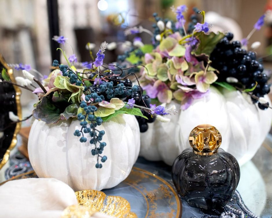
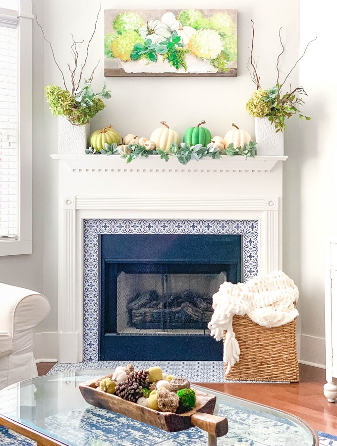
Without color orange
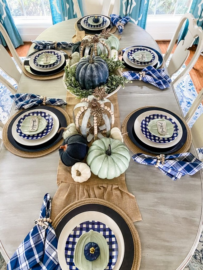
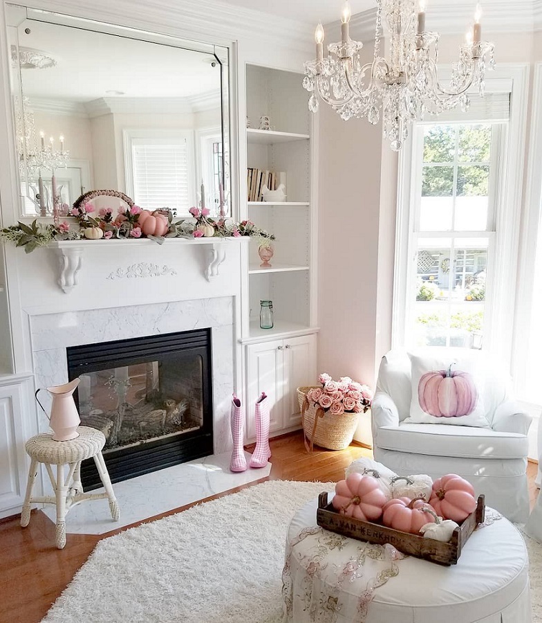
Fall decor ideas – without using color orange
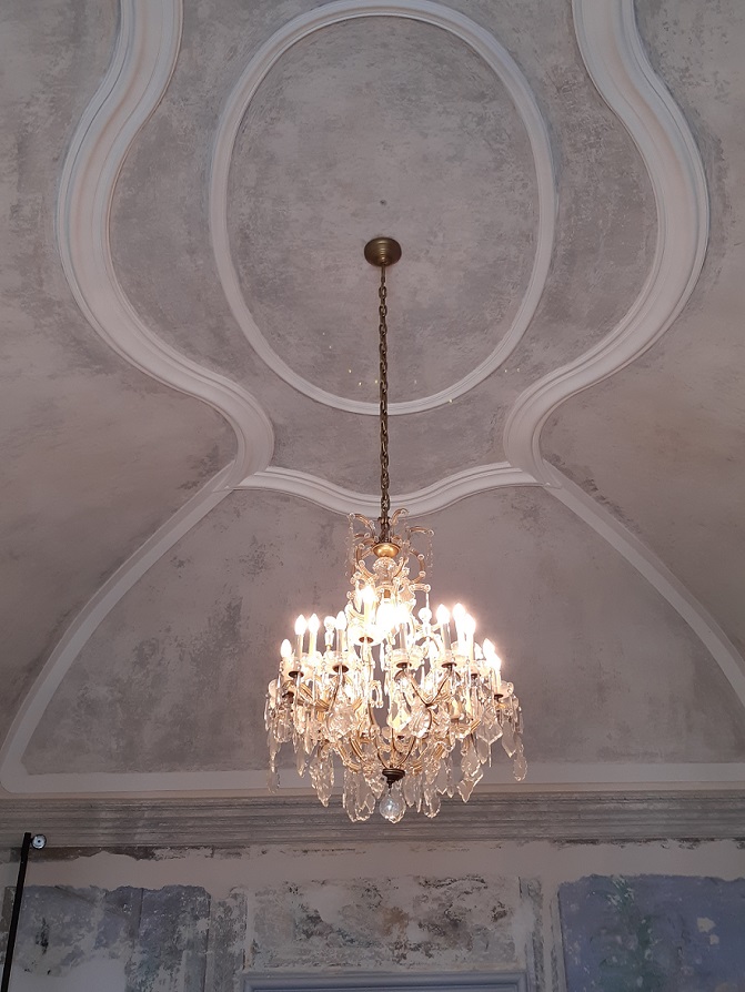
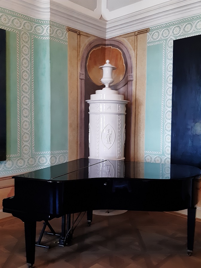
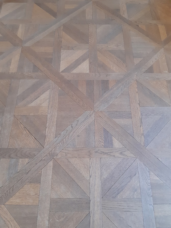
Dubniczay-palace
Dubniczay-palace in Veszprém through the eyes of the visitor (2021)
Tone-on-tone
If patterns are needed but don’t want them too dominant, tone-on-tone is the solution
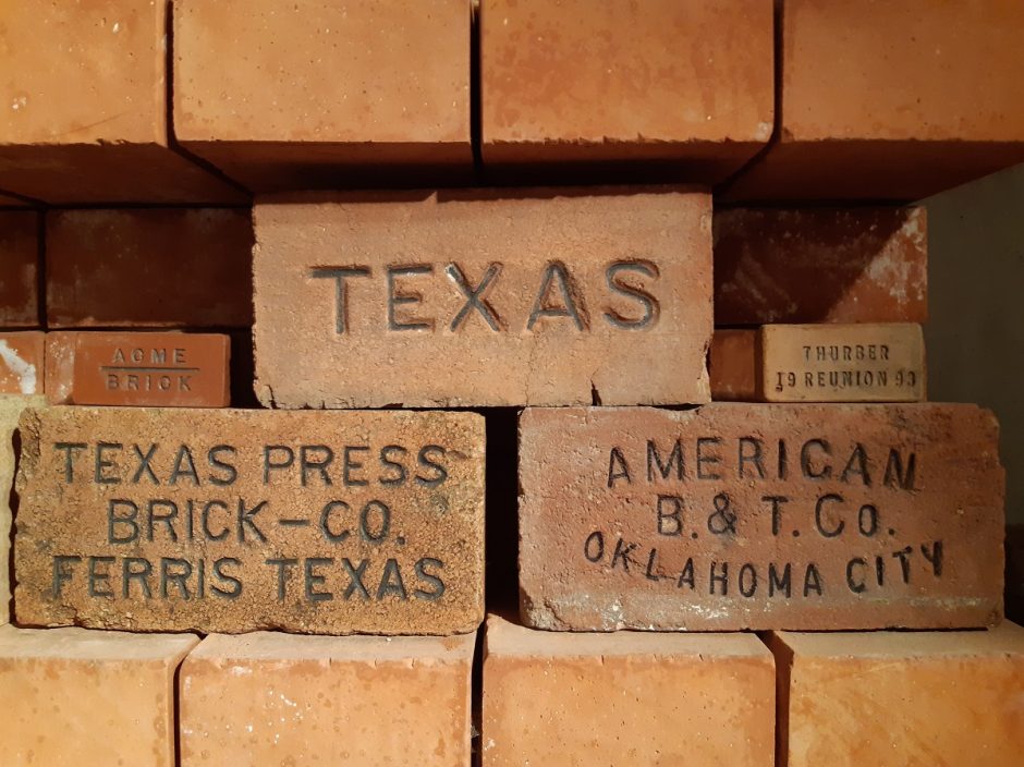
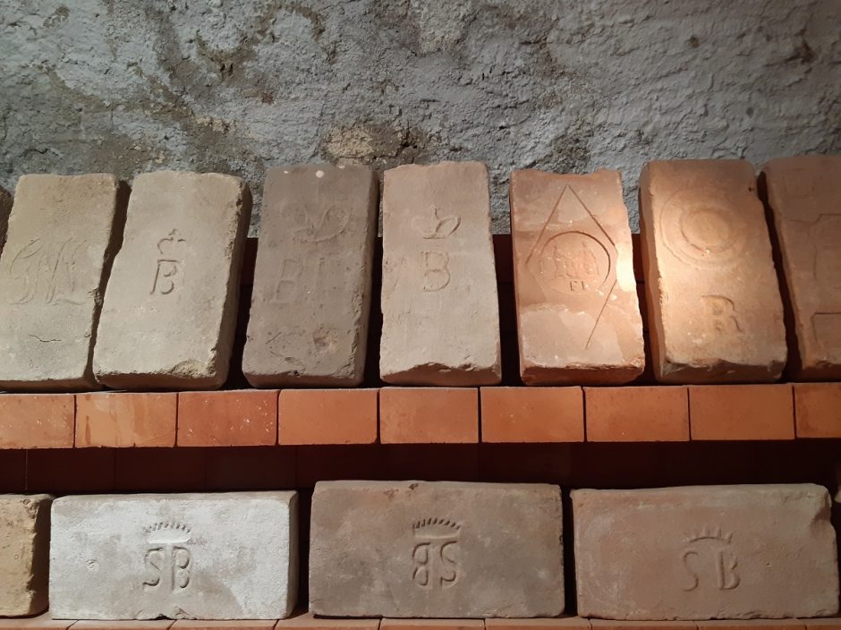
Bricks
Collection of stamped bricks in the Tegularium in Veszprém

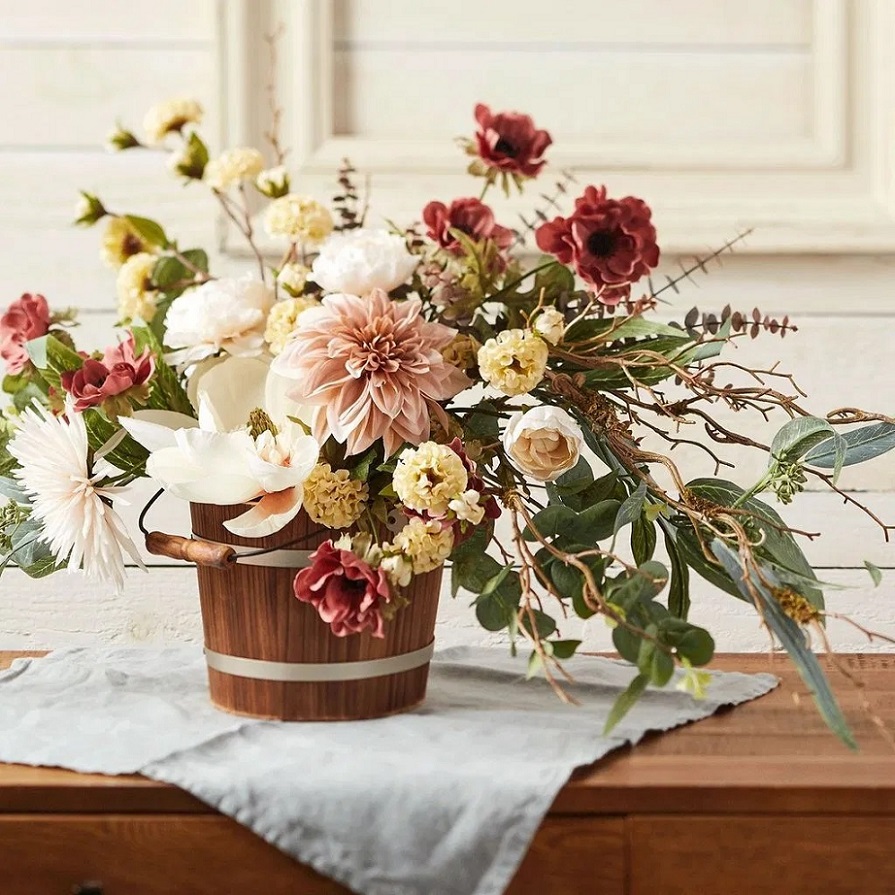
Flower decor 4.
Autumn flower decoration ideas