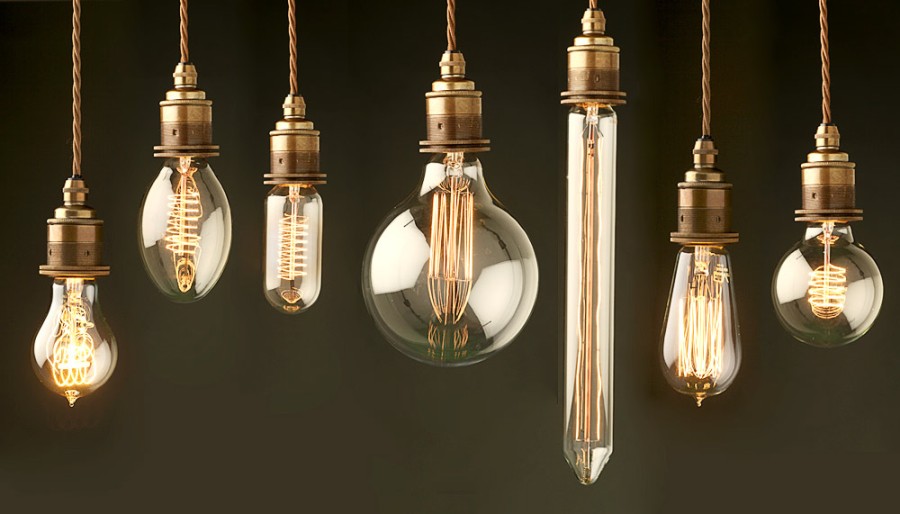
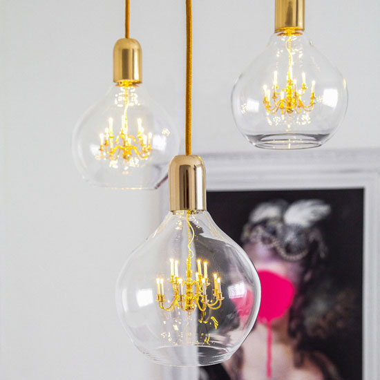
Classic lighting reinterpretation – more modern but still elegant look
Archives

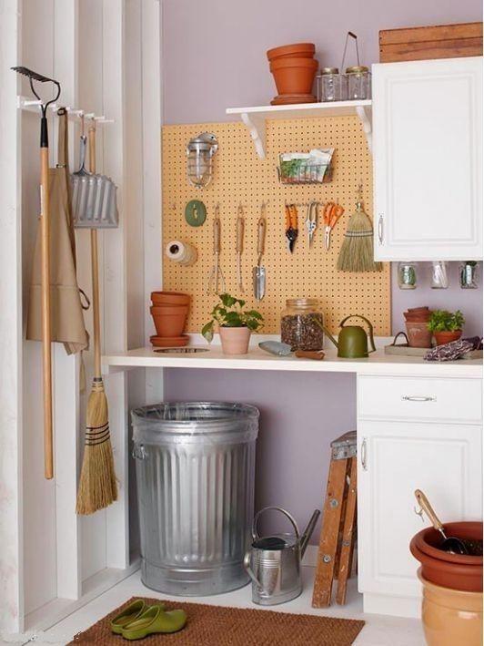
Garden tools storage
After gardening season store our garden tools in a clear, dry, ordered way for the winter for keeping them useful in the next season in beautification of our garden


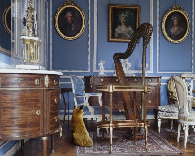
Colonial style
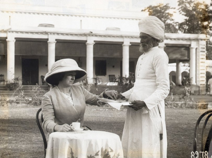
When the British conquered India in the 19th century, they founded colonies throughout the country. Many families moved there to perform tasks and for the hope of getting rich. But the climate of the continent was very unusual for them: suffocating hot air, monsoon rain, high humidity. The houses they built and also the furnishing served for ventilating cool breeze and sheltering from sunshine, this way making the surroundings more tolerable. Colonial style was born.
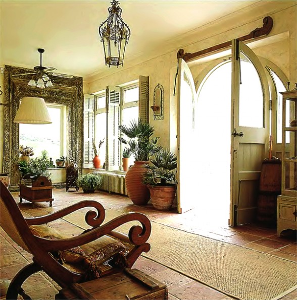
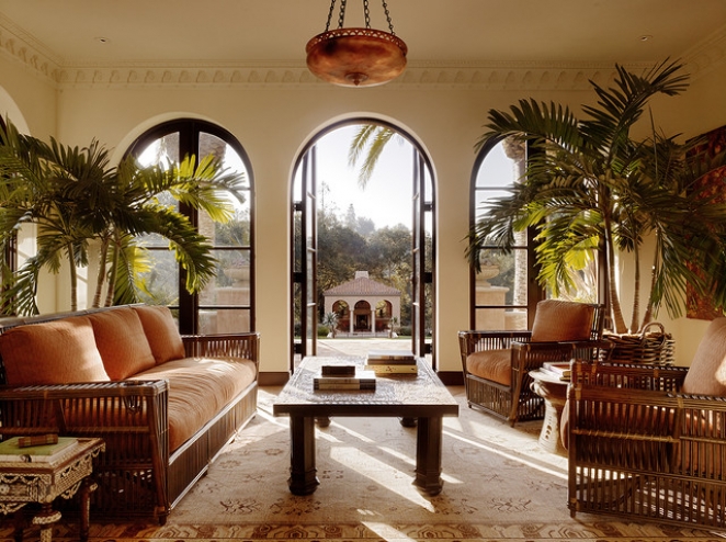
The most significant features of colonial architectural style are house-length verandas, where the outreached roof is supported by pillars, huge doors and windows with shutters and high ceiling. Houses are single-floor or two-storied.
They used local materials for furnishing. Dark brown (ebony, teak, mahogany) wooden floor and furniture are typical. Moving the air was solved by ventilating fans which were made of local, natural wood or grasses also. They even integrated decoration elements and patterns. The shapes of furniture however remained British. The seat and/or back is frequently wicker. Upholsteries are airy, usually white or beige. They guarded against insects with muslin curtains which were laid on the four-poster bed too. Walls are light (white, creme) which give contrast with dark furniture and feel cooling. Huge potted palms, ferns and other green plants were placed throughout the house.
They kept the typically British elegance and comfort. Sophisticated household objects made of porcelain, silver or crystal are inevitable. These were imported from the mother country. Clothes remained formal despite of hard conditions, just the used materials were lighter and mostly white.
Ask for help of an interior designer to realize the mood of colonial style in your home.


TV series
Popular TV-series in authentical surroundings
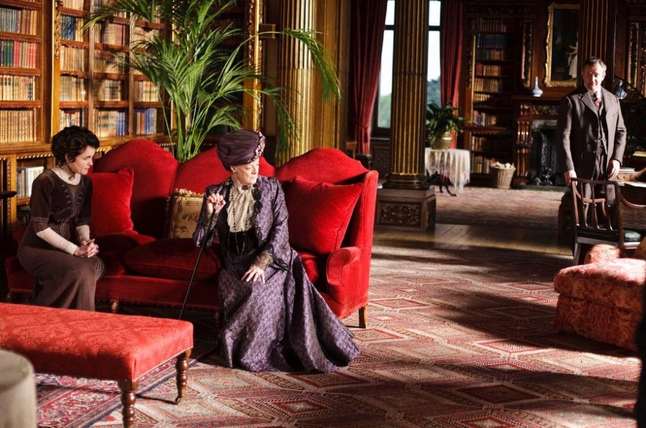
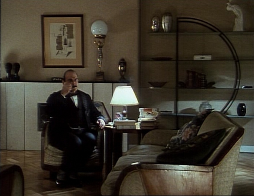
– Poirot: art déco
– Downton Abbey: victorian
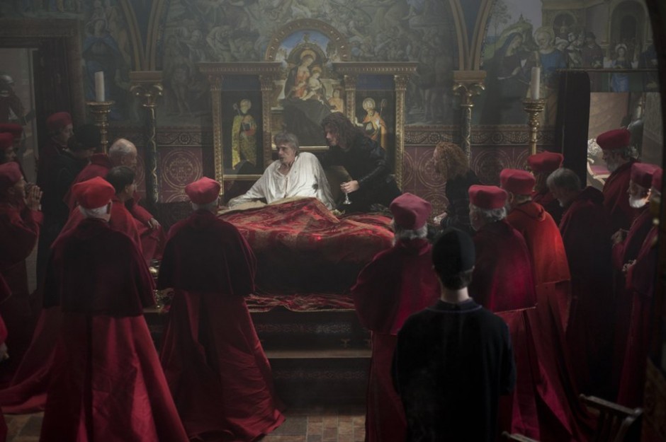
– Borgias: reneissance
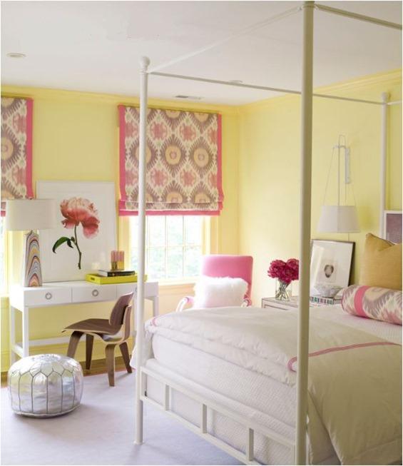
Color pairs 9.
Color pairs: yellow-pink


Work of Thomas Kinkade
Thomas Kinkade was born on 19th of January in 1958 in Placerville, California. By the age of four, it was clear that he would become an artist. „I was always the kid who could draw.” – he remembers – „I had this talent, and it was the one thing that gave me some kind of dignity in the midst of my personal environment.” He became an excellent painter aged 16, during the apprenticeship at the known artist, Glen Wessels.
He attended University of Berkley, then Art Center College of Design in Pasadena. In 1980, after graduating, he travelled to New York with his friend, while they made sketches at every station of the trip. They visited with these the publisher Waton Guptill, who published the sketching handbook in 1982.
The success of the book led them both to Ralph Bakshi Studios where they created background art for the animated feature film Fire and Ice (1983). Kinkade soon began to explore the depiction of light. Probably this intensive work with films was the base of his master depicting of light. He got the nickname Painter of Light during this time. After the film, he earned his living as a painter, selling his originals in galleries throughout California.
Recurring features of Kinkade’s paintings are their glowing highlights and pastel colors. His works often portray bucolic and idyllic settings such as stone cottages, main streets and streams. He painted mainly his hometown’s streets and the surroundings. His pictures were called kitschy many times, but he didn’t mind it. He was criticized because he sold his works in reprint also. He is one of the most popular painters in China and Thailand, fakes are frequent there. Interesting information: mostly his winter landscapes can be chosen on the largest electronic postcard sending portals in Christmas category.
He received many awards for his works. He was inducted into the California Tourism Hall of Fame in 2002. He was selected to commemorate the 2002 Salt Lake City Winter Olympics and he was also honored for his contributions to improving the welfare of children. He was selected two times to paint the National Christmas tree in Washington, D.C. He was the most awarded artist in the past 25 years in 2004. In 2005, he was named the Graphic Artist of the Year.
More books and movies were made about his life. He died at his home on 6th of April in 2012. He is buried in Saratoga.
Since all of his works are very colorful and almost burn because of the painted light, they have to be placed in an interior with an eye of a professional. Ask for help of an interior designer for this.


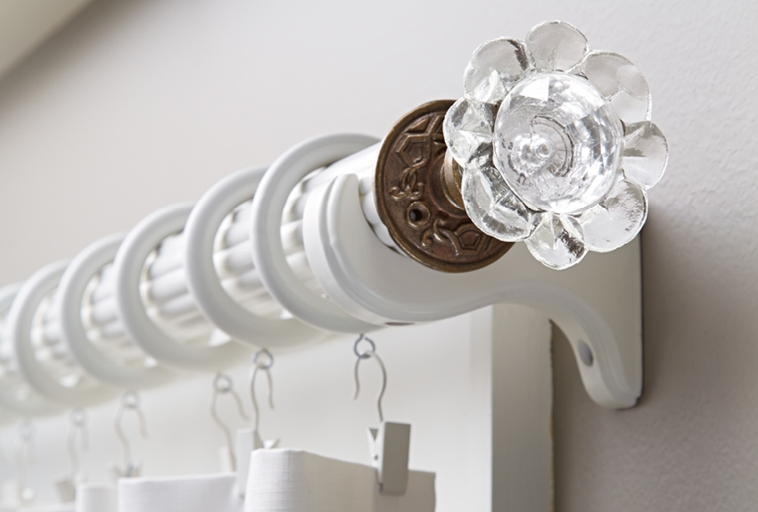
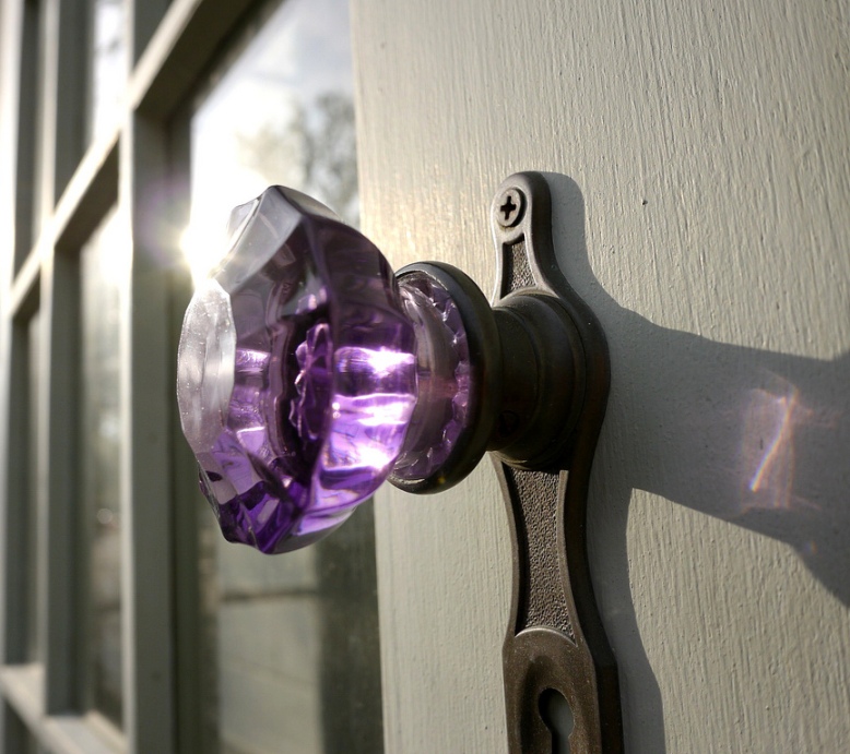
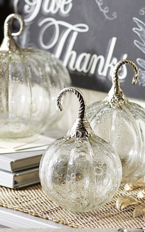
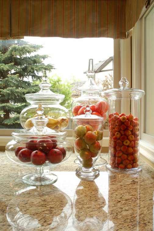
Unique, made of glass
Made of glass: common household objects with elegant implementation
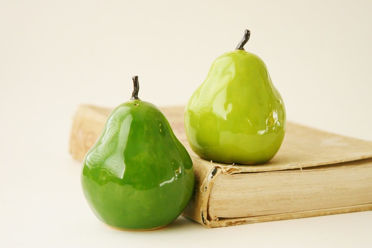
Faux fruits
Faux fruit decoration with taste
Special color hues
Hues of colors had several names over time. Some of them are slightly different from each other but fashion always dictates something new. It was the same case with historical styles. Classic and popular hues are used by several companies, but of course there are differences between the colors in spite of the same name. It matters on what kind of surface we use them: wall paint, fabrics, porcelain etc. Let’s see some examples:
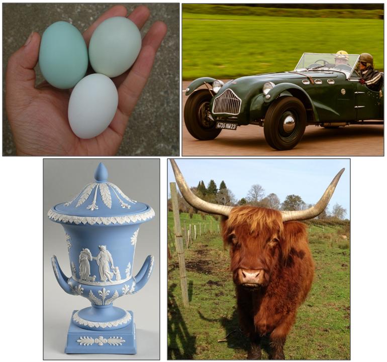
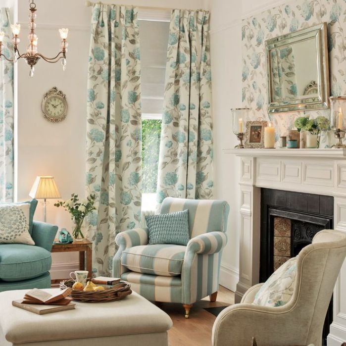
Duck Egg Blue: it is a light, soft, mildly greenish blue color with a tint of grey. Its darker hues are pastel shades also. Originally it was used on Chinese porcelains, it came to Europe from there. The name was given after the color of Mallard duck’s egg. It fits for several styles and looks good in every room, creating a calming, friendly and inviting interior. Impossible to overdose.
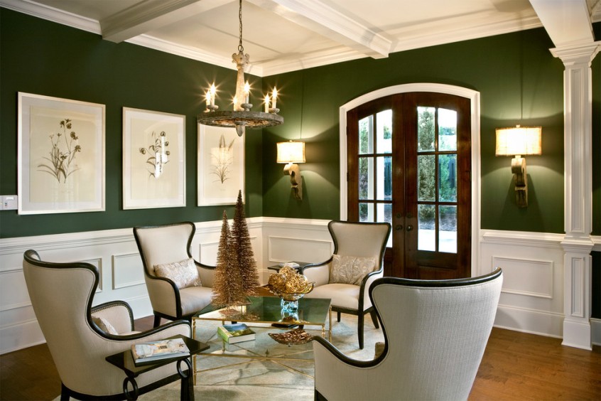
British Racing Green: originally it is a deep, almost black color, the lighter and brighter hues of it are also widespread. As the name indicates, there is a connection with car racing, it was chosen for the color of Napier racing cars in 1903. Elegant, traditional, dark color deepening the space. Using on bigger surface requires appropriate lighting.
Wedgewood Blue: a light but quite bold blue color with a tint of grey and purple. It was named after the Wedgewood porcelain manufactory founded in 1759, which used this color hue on its matte surfaced products (jasperware). It creates an opulent mood but this can be heightened by combining with white. Airy but dominant hue.
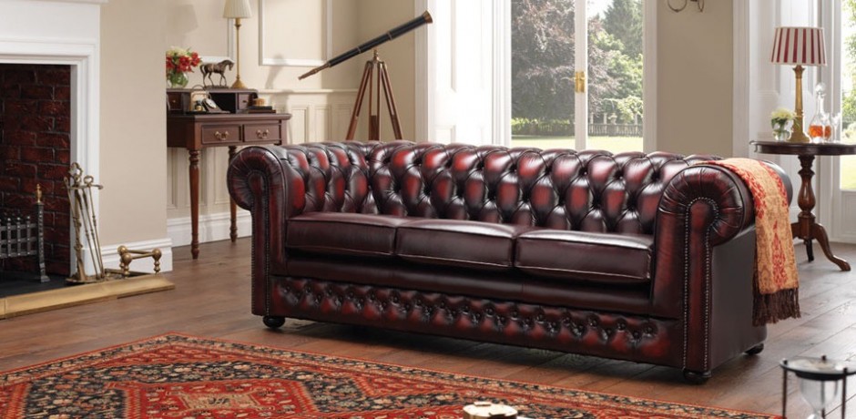
Oxblood Red: a warm deep red color with dark brown and purplish tones. The name was firstly mentioned around 1700. It was a popular autumn-winter color, frequently used for traditional leather furniture. More elegant than most of the red hues, strong but not obtrusive. It has to be counterweighted when applied on a big surface (e.g. wall).
For choosing the proper color, if possible, take the object of which’s color we like. If this is impossible, ask for help of an interior designer-color adviser for the perfect choice.
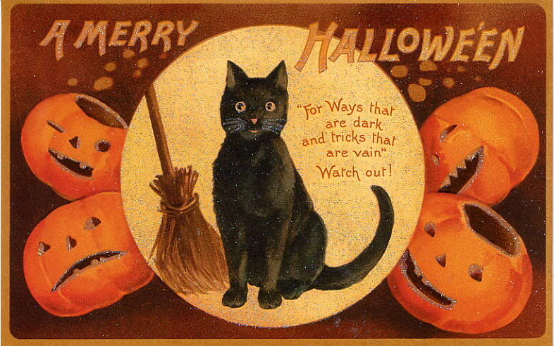
Old postcards 4.
Halloween on old postcards