It frequently comes in everyday life that somebody likes cold colors, and somebody rather prefers warm ones. Anyway, few of them know what this really means.
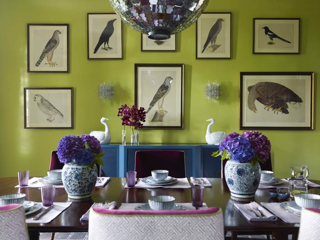
Colors, namely the spectrum, can be visible by sunshine going through a prism. Violet is on the one end and red is on the other end of it. Based on physics, cold colors are with short wavelength and warms are with long wavelength. Commonly the known partition: purple, blue and green are cold colors and red, orange and yellow are the warms. But it is not so simple.
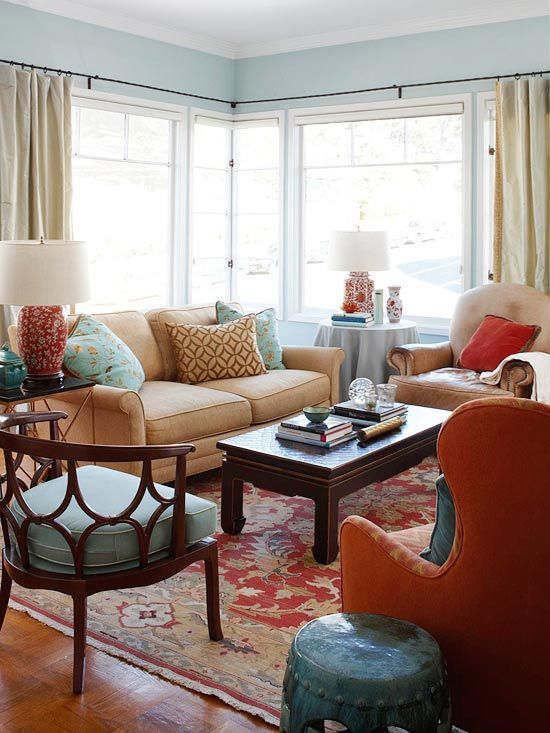
All color has cold and warm hues too, except for orange. For example, green can be colder or warmer depending on the fact that there is a larger amount of blue or yellow in it. But the difference is distinct if cobalt blue and turquoise blue are put beside each other. Cold-warm feel is realized commonly in relation to each other with the effects of the surroundings. Color theory based on seasons divides colors to four groups: spring = warm, bold colors, summer = cool, pastel colors, autumn = warm, earthy colors, winter = cold, vivid colors.
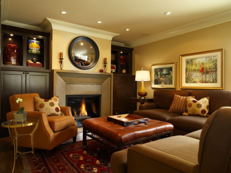
Cold colors widen the space, these objects seem to be farther. Warm colors on the contrary, narrow the space, these objects seem to be closer. Painting also takes advantage of these features for creating perspective, in interior design they can be used for improving the sense of space. Researches prove that an interior furnished with cold colors is felt 2-3 degrees cooler than a room furnished with warm colors at the same temperature.
Cold-warm contrast is an important tool when using contrasts. A spectacular and stirring effect can be reached not only in interior design but even in fashion too. The same color strength level is important or else light-shadow contrast comes into view which can even cause disharmony.
Ask for help of an interior designer for choosing the proper colors and color-groups.