Follow Classic Interiors on facebook too!
https://www.facebook.com/Classic.Interiors.CST/
Thank you for likes and shares.
Archive | September 2018

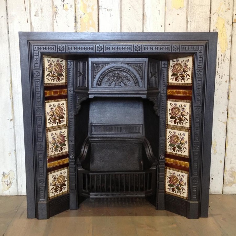
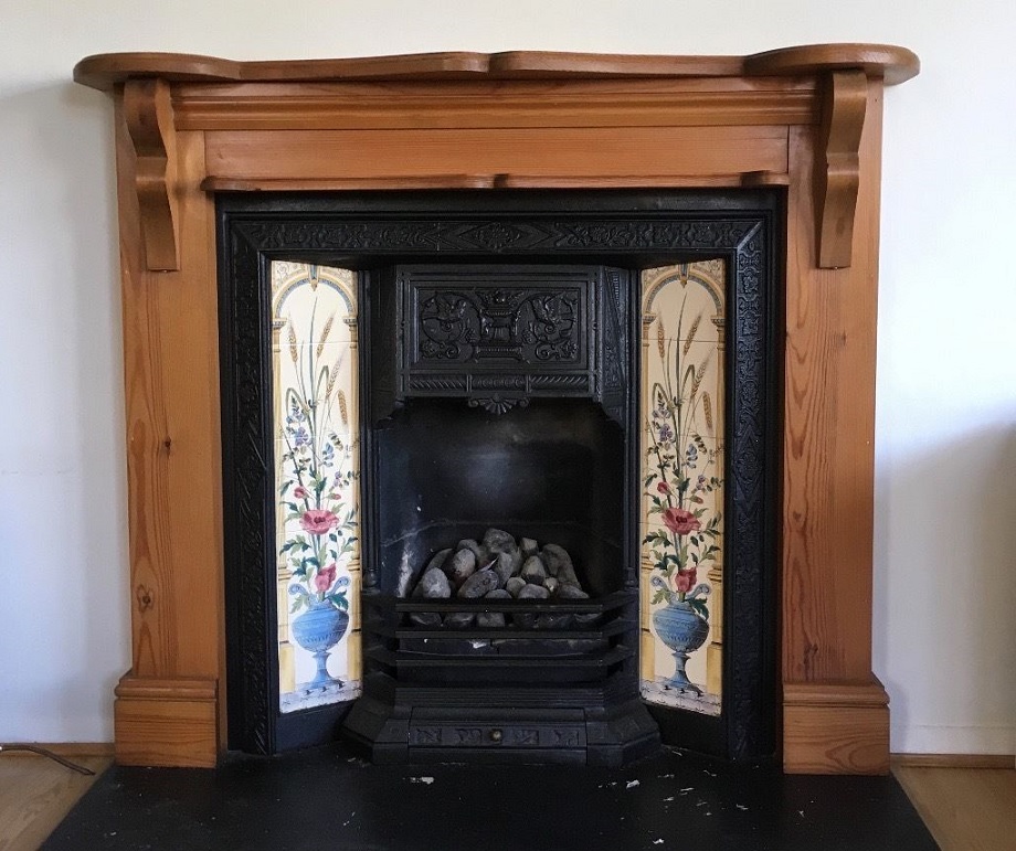
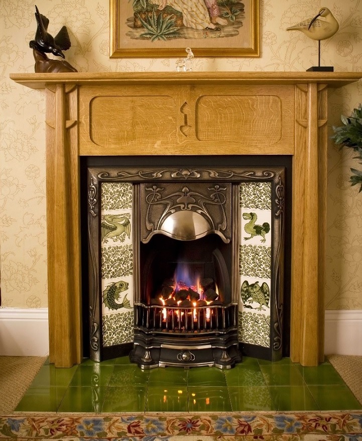
Fireplace inserts
Marvelous antique tiled fireplace inserts
Different autumn colors
The typical warm colors of autumn are orange, burgundy red, rust-brown, sunny yellow and the like. Usually these are preferred as decorations. Many people think that these colors don’t fit for their home or their personality and search for another solution instead for autumn decoration. In addition, there are many other possibilities.
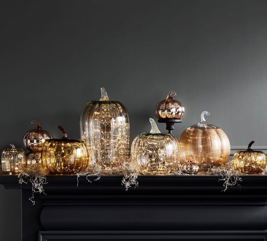
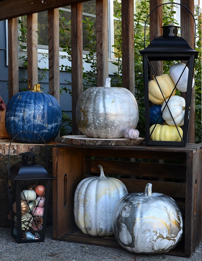
Pumpkin is a typical decoration element. There are white, dark green and greyish green species besides the orange and yellow varieties. These colors can be much better fit in an interior where white is the dominating color for example, or the colors of accessories are quite different from the warm palette (turquoise, powder pink, lavender etc.). Pumpkins are easily paintable, this way they can have almost all of the colors in our home.
For natural colored, more rustic interiors, choose a close-to-nature decoration in similar colors not to break the unity. For example, this can be a bouquet of wheatears in a vase, a bunch of brown branches tied with linen band, crops (acorn, walnut, pinecone etc.) in a bowl or balls made of bast.
If crops are in the center of the decoration, we can find fruits and berries of which colors fit more to our home: Granny Smith apple (green), yellowish green pear, Bodinier’s beautyberry (purple), Chinese privet (dark blue berries). Many species of chrysanthemum and asters can be purchased in Hungary, the white flowered of these can be perfectly neutral but impressive decorations.
As the days are more and more short, mood lightings get role again. The warm white light garlands can make any interior cozy. They can be placed for example in a glass vase or among the garlands on the fireplace or they can even frame a mirror. There are many color and shape variations of candles, these can be easily harmonized with the colors of the interior. Their warm lights give the mood.
Ask for help of an interior designer for seasonal decoration of your home.

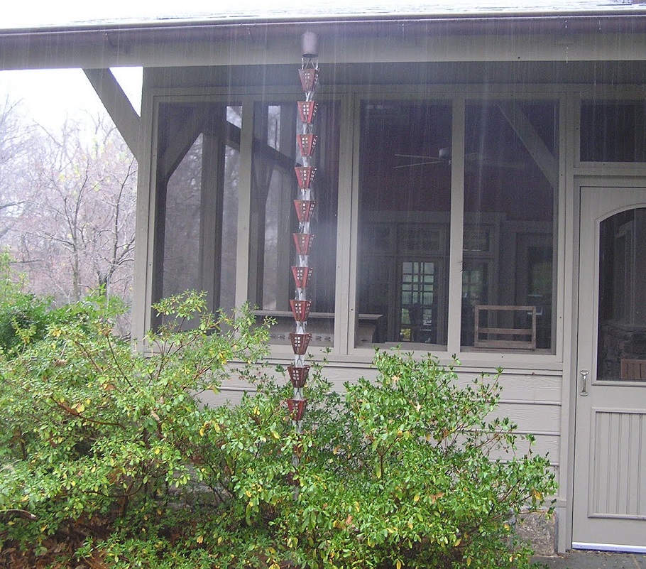
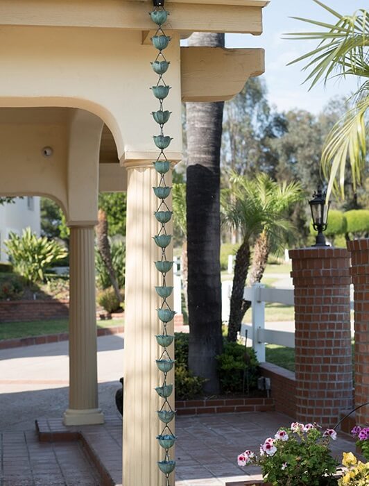
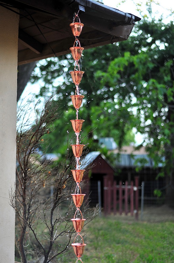
Rain chain
Use a decorative rain chain if don’t want to brake the view of the salient roof
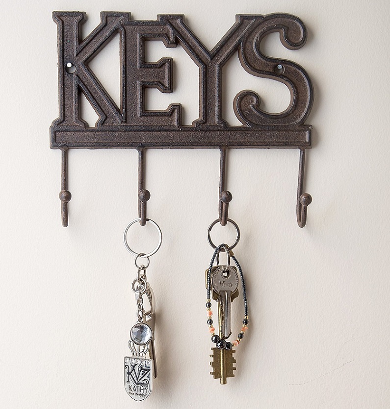
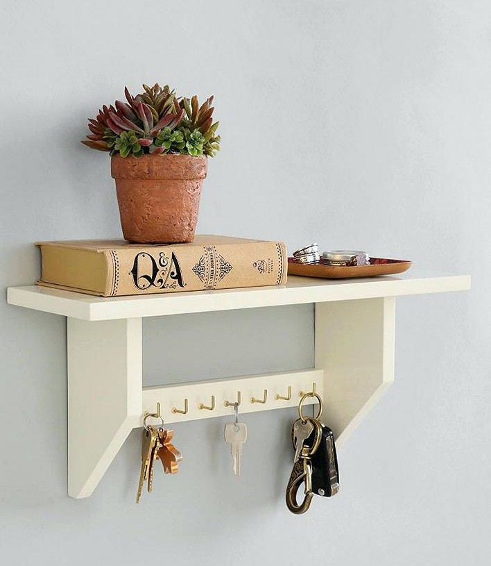
Key holders
Somebody just drops the keys onto the shoe cabinet. Somebody puts them in different places and than tries to find them. A decorative wall mounted key holder is the solution.

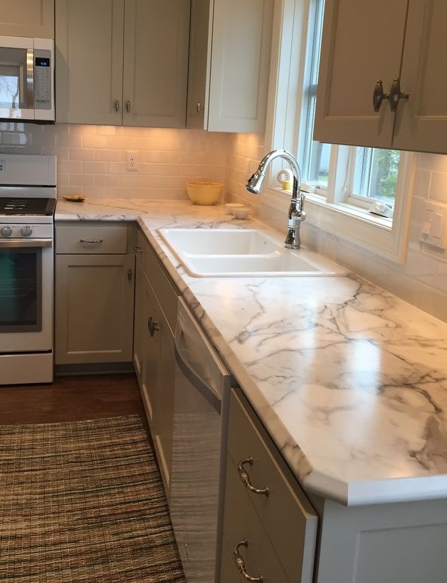
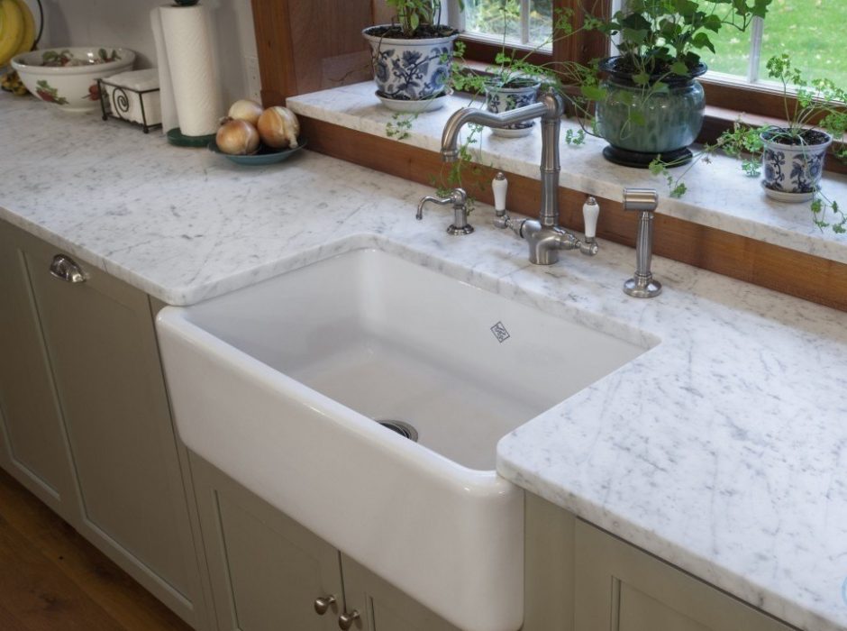
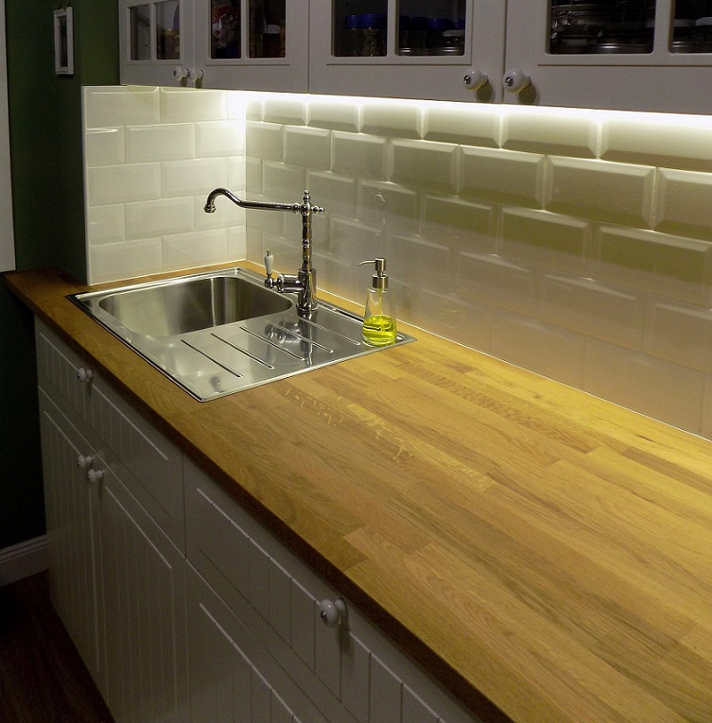
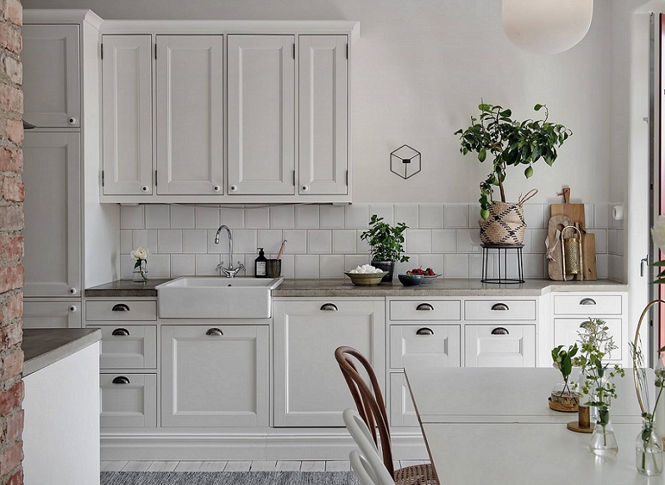
Countertop
The material of the countertop is a major issue during a kitchen renovation. The difference between prices of materials is quite high, so it really matters what we choose.
The main advantage of the wooden countertop is its beauty, beside the fact that it is a natural material. However, we need to know that it is quite sensitive and needs proper care. It has to be oiled at least twice a year. Whatever splits on it, it has to be wiped off immediately, because even clear water can leave mark on it. The surface of the wood is quite vulnerable, hot dish shouldn’t be put on it either.
Countertops made of natural stones, for example marble or granite, are not only beautiful but very sturdy also. They are scratch and heat resistant, but marble is sensitive to acid liquids (e.g. red vine, coffee). They have great weight, so the proper kitchen cabinet frame and support are highly important.
Corian is an artificial stone-like material, with acrylic base. Its surface is very repellent, and almost impossible to scratch it. Available in wide color range. The coloring and patterning are in the material, this way abrasion may not be noticeable. It is shapeable by heat, so e.g. sink can be formed in the material of the countertop.
Maybe glass countertop is a less widespread solution. Its main advantage is availability in almost any color, pattern or shape. It is made of at least 12 mm thick, heat resistant safety glass. If it is injured, can’t be repaired, only changed. It is antibacterial and easy-to-clean.
Laminated countertop is the most cost effective solution. The base is chipboard covered with a thin decor layer at the surface. The choice of colors and patterns are huge: several faux stone, concrete and wood patterns are available. It is scratch and heat resistant but sensitive to water on cut edges (e.g. place of cooker and sink). In the case of injury, the surface can’t be repaired.
Ask for help of an interior designer for planning your kitchen.


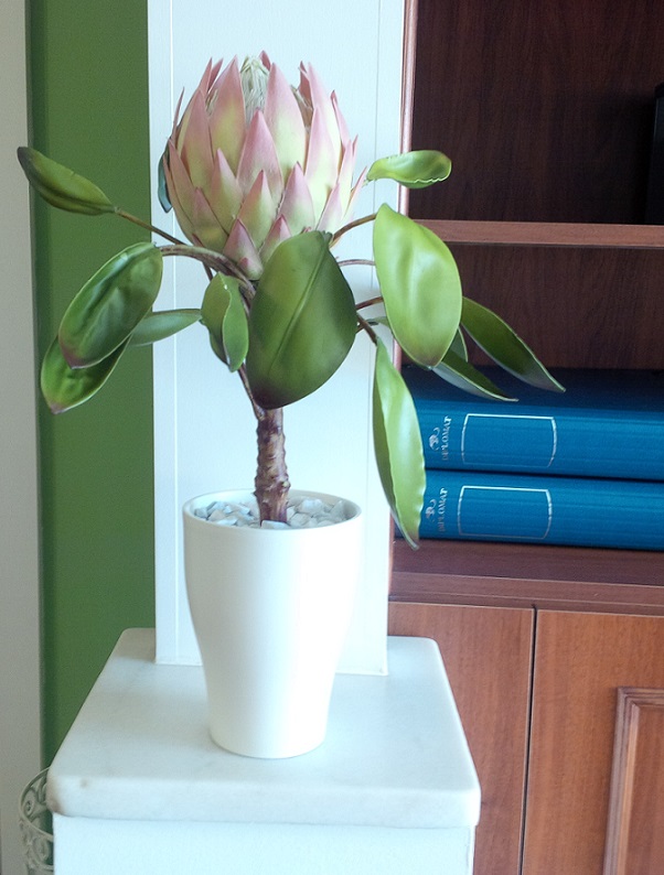
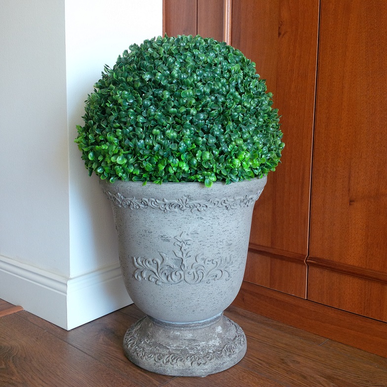
Artificial flower
Qualitative and classy artificial flowers look good in every interiors

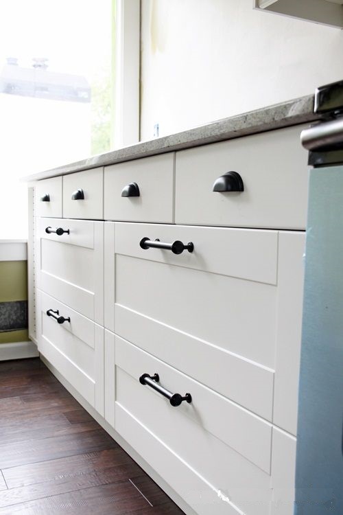
Different handles
Use different handles/knobs on the lower and upper kitchen cabinets or doors and drawers – the effect will be more stirring

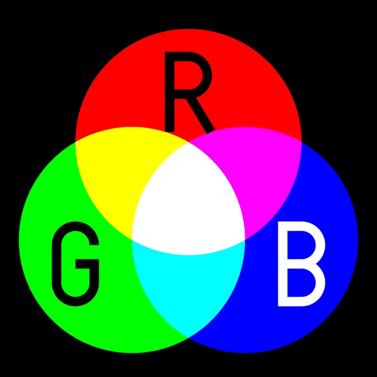
Color systems
The various color systems and their codes can be a real labyrinth for laymen. Which one is used and when? What do these codes show us if we don’t see the color itself? Without limitation, here is a short guide about it, using Duck Egg Blue as an example.
RGB (Red Green Blue): this is a color mixing standard used by monitors, displays and TV screens. It shows the amount of these three components (red, green, blue) in the mixed color. This is an additive color mixing method. Their value can be between 0 and 255. If all the three is 0, the result is black, if all the three is 255, that gives white. The RGB code of one of the shades of duck egg blue is: 165, 186, 177.
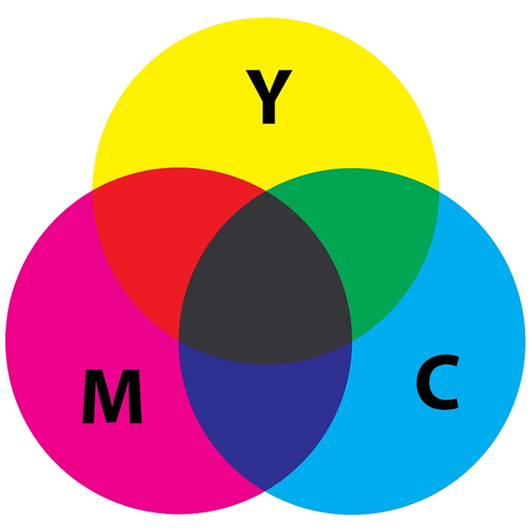
CMYK (Cyan Magenta Yellow Key): it is used in pressed materials, it is a subtractive color mixing method (the mix of the similar amount of the colors effects black). The individual colors are applied on the paper as small dots in a grid. Mixing is solved by traversing the grids. This way the dots just partly cover each other. The code contains these traversing angles. Duck egg blue is: 11 0 5 27 in this system.
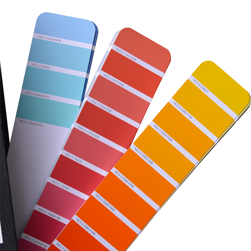
NCS (Natural Color System): it is used for mixing wall paints, colors are programmed in the mixing machine by this protocol. It contains numbers which mean rates in %: first pair of numbers=darkness (how close the given color is to black), second pair of numbers=color intensity/saturation, third pair of numbers=the rate of the second color in the mix. It contains letters which mean the contained colors: B=blue, R=red, Y=yellow, G=green and N=neutral. The S=standard at the beginning of the code. Example: S 3010-B90G (duck egg blue). 30=darkness, 10=saturation compared to the main basic color, B=blue, 90=%G, G=green.
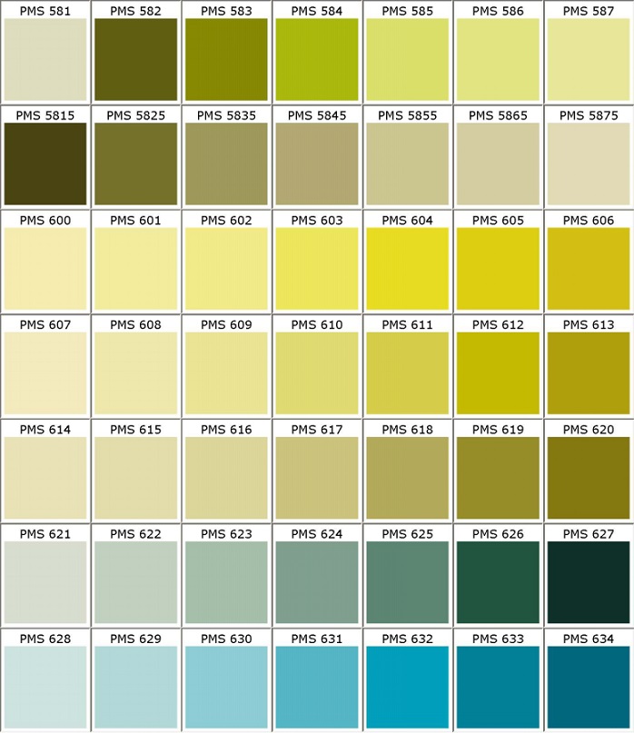
PMS (Pantone Matching System): it is the standardized color system of Pantone company, it is general and universal, namely by using this code, the color of any product (fabric, plastic, paint etc.) will be the same as the desired all over the world. Logos of greater companies, flags of countries, symbols of associations etc. are defined by this method. It is different from the above mentioned that it contains completely artificial colors also, for example neon colors or metallic colors. All the colors get a three or four digit number code beside their fantasy name. The color is similar to duck egg blue: 5507 C
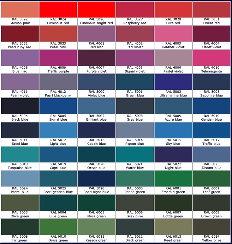
RAL (Reichs-Ausschuß für Lieferbedingungen und Gütesicherung): it is a German color system used in Europe. Its code is a four digit number. The first number indicates the color group to which the given color belongs: 1xxx yellows, 2xxx oranges, 3xxx reds, 4xxx purples, 5xxx blues, 6xxx greens, 7xxx greys, 8xxx browns, 9xxx whites/blacks. For example, colors of traffic signs are defined by this, but most of the producing companies (door, window, radiator etc.) use this when defining their color range. The RAL color nearest to duck egg blue is 7038.
Ask for help of an interior designer for choosing the proper colors for your home.
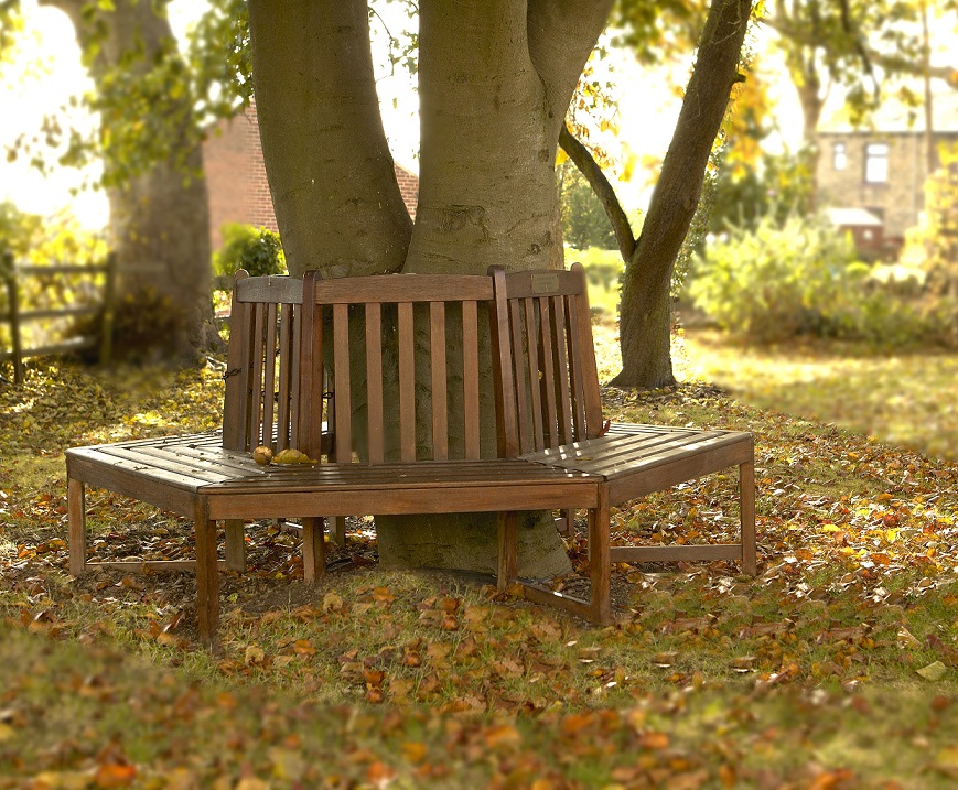
Around the tree
Tree bench – cosy sitting place below the autumn foliage